#but also plz use references it is my biggest weakness that i dont
Text

soo @drizzit i don't know if you were expecting an actual answer but I love rendering gold/silver actually so i'll answer haha
I'll tell you that my method was derived from a video I saw like one time and then just ran with the vibes. it might help you but it also would probably be most beneficial when used with actual references lol which I am very bad at using
short version, the shinier you want something to look the bigger the difference between the base and the darker colors and also the more solid the shading should be. if its textured (metal or fabric) it'll reflect less and therefore have less extreme color difference and less solid shades. I also tend to put all my gold pieces on one layer (and silver its own, essential one layer per type of metal) so I can shade in larger sweeping strokes
more with examples under the readmore bc this got kinda long oops

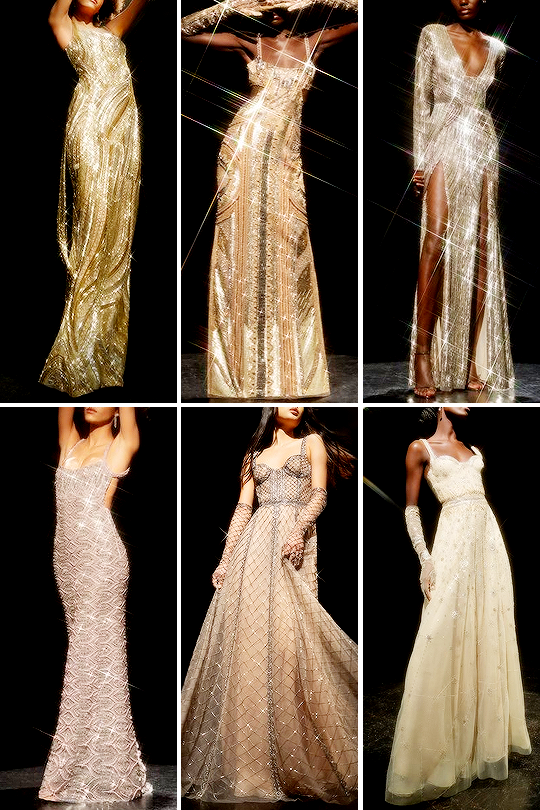
So here's some places where I wanted things to be shiny and chrome. To give it that look i pick a base color, then I pick a waaaay darker color to be the darkest shading, for silver that'll be dark gray or black and for gold I typically use a darker yellow/brown. Then I pick one or two lighter shades in the metal and then sometimes white
below is a typical three colors I use for gold

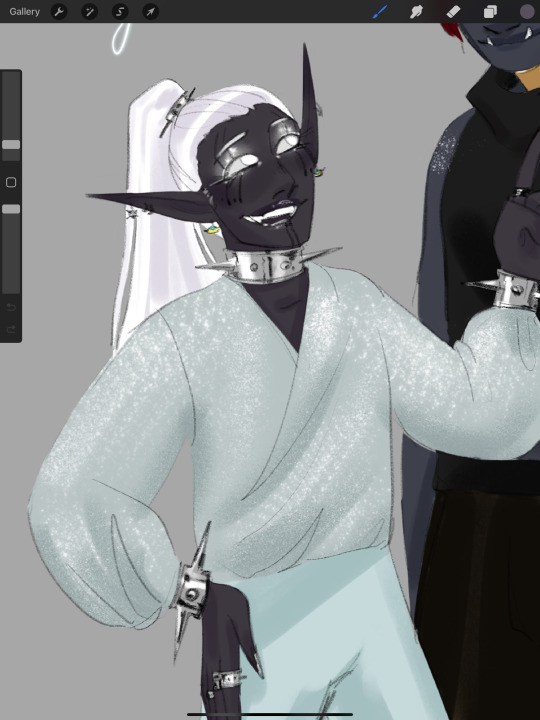
dont be afraid to use A LOT of the dark color, because the shinier and chromier an object is the more its going to reflect, see below and look how much of the object is NOT silver/gray in color because its reflecting so much. ALSO the different color areas are going to be more solid, like in the silver choker in the first pic where its solid lines of black and gray or below where large, smooth swaths of it is white/black/dark gray
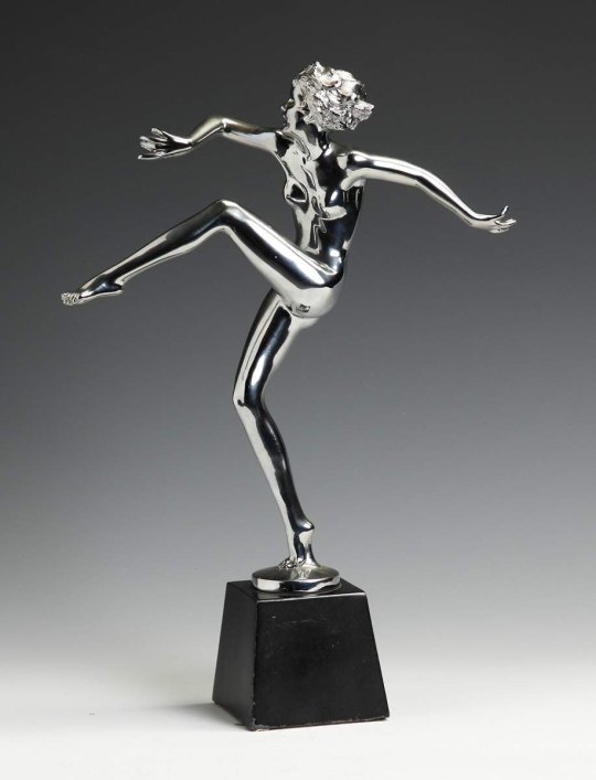
adding a sparkle can also help lol, procreate has a premade shine brush

if an object is textured it will reflect less so you can do less extreme difference between colors and use softer, grainier brushes, below are some reference examples of how those textured metals look


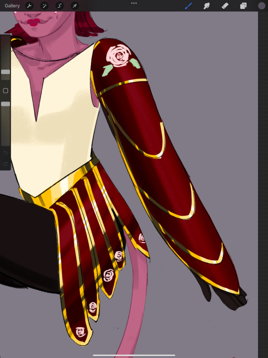
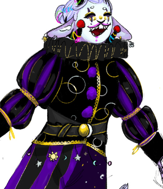
here is a design I made with both gold fabric and textured gold pieces, the shading on the cloth is a lot less... rigid? solid? then the chromes and the dark color not quite as dark, same with the belt buckle. Also the brush i use is softer and with more of a grain so it's less solid and more diffused over the texture
these can be applied to more complicated designs. Typically I like to work with long sweeping strokes because i like to do things fast and a lil lazy. This isn't always going to end up with the most REALISTIC end result but hey, it works. you should still consider things like 'where is the light?' 'where are the objects and things that might reflect on the metal?' but if you want to get nitty gritty use a ref
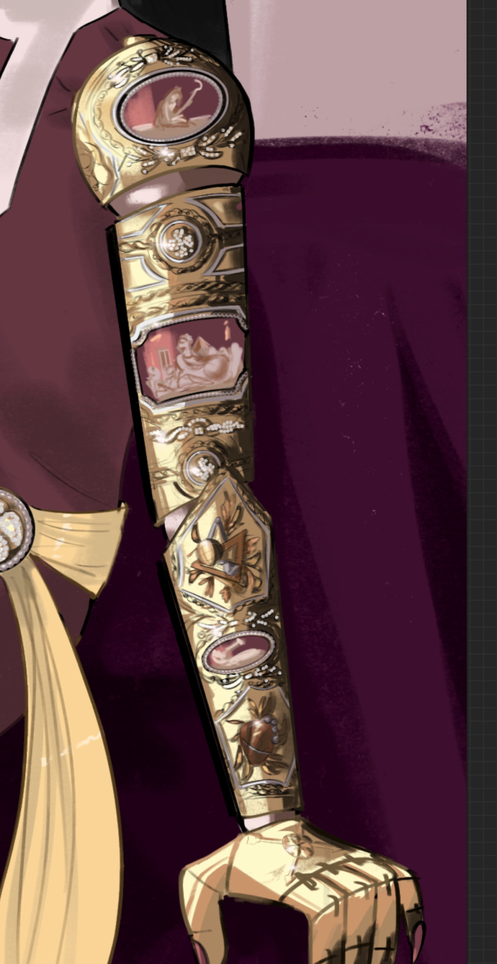
below is an drawing i did where I started coloring the arm with large sweeping strokes down the whole arm and then I went in and did the detail work to give the decorations depth
i hope any of this made sense lol
#art tips#but also plz use references it is my biggest weakness that i dont#I’ll just post it here in case anyone else finds it useful
15 notes
·
View notes
Last Seen Blogs

ptxdhuske
PTX Dhuske

djs-horny-blog-lmao
we post hypnofic here

caazzies
HEDA

blackjohnjay
Fly Since 85

dany-campy-art
Art in love