#bubblemen
Text
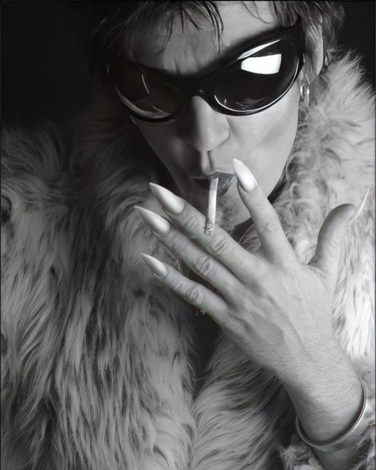
Daniel Ash of Bauhaus, Tones on Tail, Love and Rockets, Poptone & Bubblemen, here as captured in 2001 for a promo pic by Chris Jensen.
"Post-Punk.com: Do you think the whole association with Bauhaus being Goth is ridiculous?
Daniel Ash: It’s a weird one. To me, the whole Goth thing is very one dimensional. It’s sort of cloak and dagger. It’s ok, it has its place, it’s fun, but we just find it funny that we’re thought of as that (…) I think a lot of it is the imagery, but we never actually spoke about what we looked like when we started out. We never mentioned wearing black, never mentioned makeup or any of it. I know for Peter and myself, we were pretty obsessed with the whole Bowie thing, and the visuals were really important to us, so without even saying anything it was like, “Damn right I’m gonna wear eyeshadow and have a funny haircut because that’s where I come from and that’s what I feel like.”
…Ironically, we’re just like the original Bauhaus movement, which is art for function, the opposite of gothic. It was about art being very simple and functional, which is just like the music that we made. However, we were very flamboyant visually, so we had those two juxtapositions going on. It’s almost like a contradiction between the visual side and the musical side. I’ve got to be honest. We find the whole Goth thing a joke, really, we sort of laugh about it. We were an art band. We all went to art school. We were like an experimental art band. I think that’s accurate to say that."
(via)
95 notes
·
View notes
Text
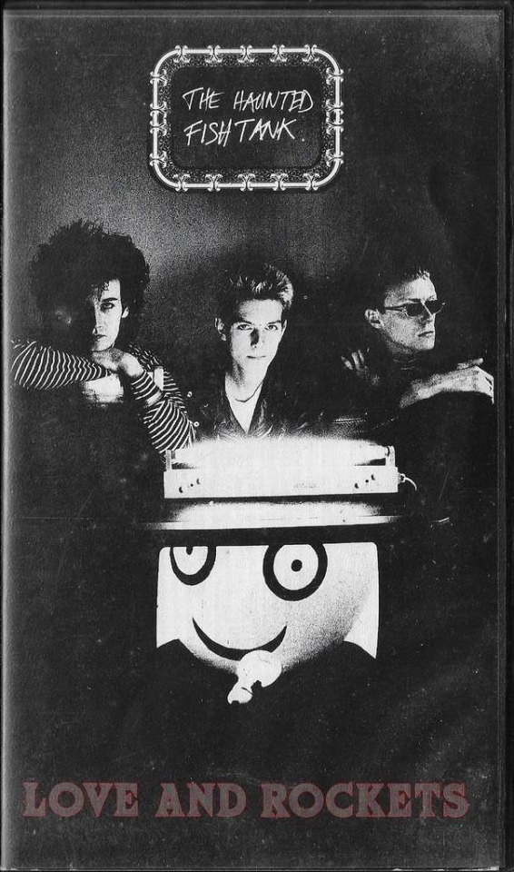
I just love this cassette
96 notes
·
View notes
Text

Daniel Ash.
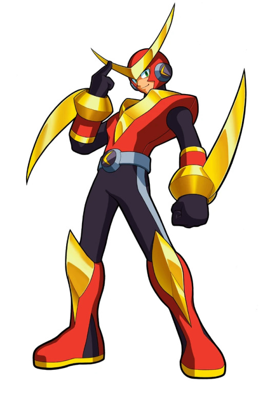
Daniel Gaston Ash (born 31 July 1957) is an English musician, songwriter and singer. He became prominent in the late 1970s as the guitarist for the iconic goth rock band Bauhaus, which spawned two related bands led by Ash: Tones on Tail and Love and Rockets. Recently, he reunited with bandmate Kevin Haskins to form Poptone, a retrospective of their respective careers, featuring Kevin's daughter Diva Dompe on bass. He has also recorded several solo albums. Several guitarists have listed Ash as an influence, including Dave Navarro of Jane's Addiction, Kim Thayil of Soundgarden, Hide of X Japan and John Frusciante of the Red Hot Chili Peppers.
- Wikipedia.
#daniel ash#bauhaus#tones on tail#love and rockets#black and white photography#monochrome#poptone#singer songwriter#musician#english musician#english singer-songwriter#gothic rock#goth rock#alt rock#alternative rock#post punk#electronic#b&w#dark glam#the bubblemen
14 notes
·
View notes
Text

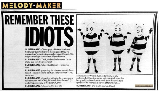
#love and rockets#the bubblemen#daniel ash#i found this on a facebook group it's not mine#but holy shit imagine seeing this in front of you lmaooooo
8 notes
·
View notes
Photo
7 notes
·
View notes
Text
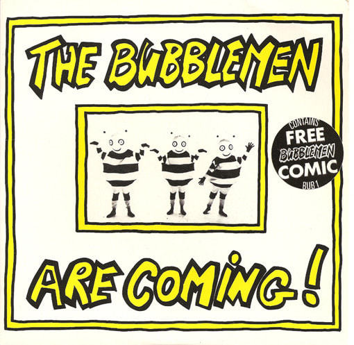
Nobody even fucking knows what my icon is i thought everyone would know the love and rockets novelty spinoff group the Bubblemen that have made like 2 songs ever but i guess not
15 notes
·
View notes
Text
they should put the bubblemen in fortnight. I dont even play fortnight but they should still do this
4 notes
·
View notes
Text
Comparing Megaman robot masters to Megaman Battle Network netnavis part 2: The very belated one
Soooooo I totally forgot I was doing this. Shows how bad last summer was if my brain melted to the point I forgot
Oh well, time for the next batch
Score so far is 5-2 in favour of the navi because I count ties as a point for both, and I feel like that gap’s gonna get larger
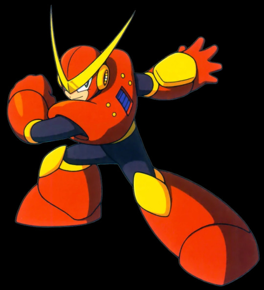
First, MetalMan and MetalMan.exe
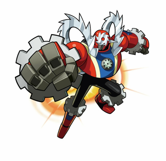
God these designs fuck (affectionate)
Not a big fan of the yellow on the robot master, and I enjoy the addition of gears and the mechanical fists to make .EXE more metal themed rather than just buzzsaw themed
Point for MetalMan.exe, raising the score to 6-2
Next, AirMan and AirMan.EXE

Ehhhh, they’re both...alright? Kinda dumpy in different ways
Not sure I like the addition of green to the Navi design, but do like its slightly more threatening fan
But there’s just something truly iconic about the classic design, even if I didn’t grow up with it. I also prefer the overal bulkiness compare to the inexplicably lanky thighs of .EXE...
It’s a tie, 7-3.
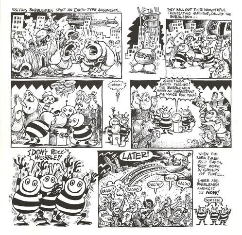
Okay, next up is...next up are the Bubblemen
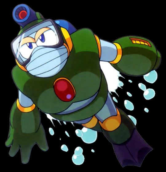
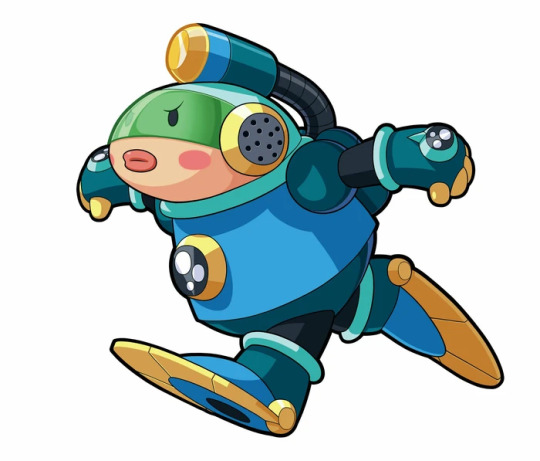
...it’s a race to rock bottom, folks. Another victim of the random chibi-fication but instead of ruining a solid design it’s just another version of a really ugly look
Why the cheek marks and the fat lips? But then again why give a robot a diving mask? Why make a water robot green?
I’m half tempted to remove a point from BOTH games’ score but instead I’m awarding both games a point as compensation for having to look at these two.
8-4
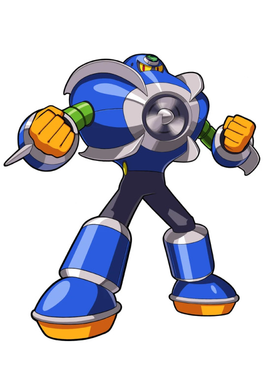
Thankfully the next up are a nice change of pace, pun semi-intended, QuickMan and QuickMan.EXE
Both are really solid designs, but even putting my personal navi bias aside I do like that .EXE looks like something that can move fast. And all the sharp edges make the idea of simply getting in his way a fatal choice.
9-4, but it was REALLY close this time.
Skipping over CrashMan since I guess they didn’t want to think about how overpowered a program with CRASH in it’s name would be to fight, we move on to FLASH, AH AAAAAAA~

...this batch (with one notable exception) so far has really been the ‘close to the original’ round, huh?
Ironically given the name, I like the mostly darker colour scheme for .EXE, since it makes the actual flashing parts POP a bit more.
10-4 and that’s mainly because the pauldrons on the robot master being light blue annoys me for some reason, otherwise it’d’ve been a tie.
Next up is a dumpy guy dressed as a lighter and a screaming Hellbeast that looks like a lighter that uses child blood as lighter fuel
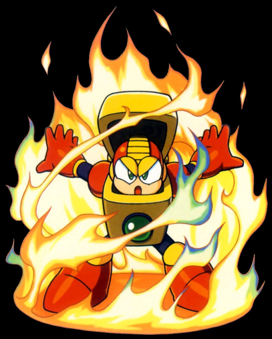
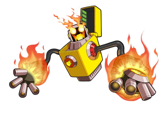
The best glow up in this batch and the best navi partner of Mr Match...oh do I have a burning desire to tear into the last one of his fire trio but I’ll wait until the 6th round.
Even if I didn’t have a bias, I just love the jack’o lantern look to .EXE’s face. They really went hard in on the fact that Navi don’t HAVE to look humanoids and I love it.
11-4
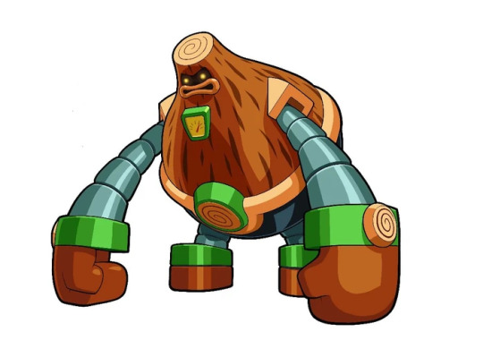
And last we have...Oh, nice, WoodMan
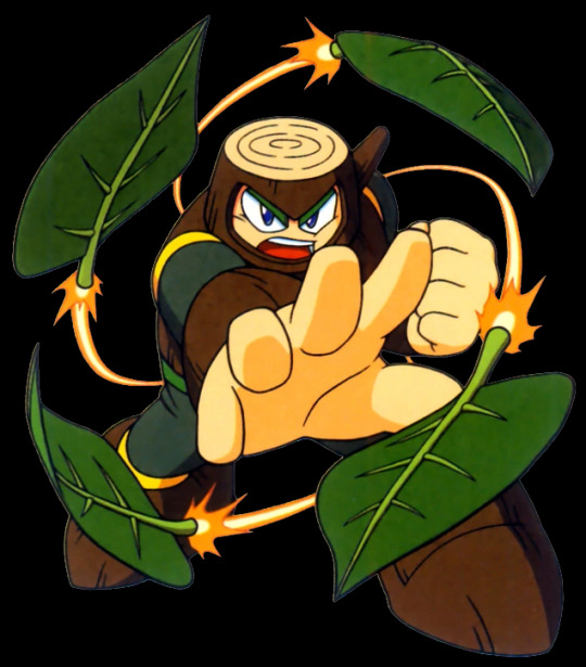
The only Robot master who isn’t mostly red or blue in this batch so my eyes are happy. the yellow accents are weird but do help pop against his otherwise dull tone-mm? Oh, how rude of me, I forgot to get a picture of your decendent, WoodMan.EXEEEEEEEEEEEEEYYYYYIKES!
....HE LOOKS CONSTIPATED!
I mean I guess they were going more for the wooden golem look but...why give him big meaty lips? Why does his arms look more robotic than the actual robot master? On MetalMan.EXE that makes sense since mechanical bu-WHY DOES HE HAVE A FUEL GAUGE?!
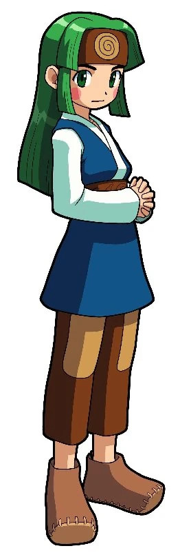
...I’m dissapointed Battle Network. At least you made his operator an absolute cutie.
11-5. The gap got larger but the classic series is still clinging on
Gonna try and make this at least a twice weekly series since the Legacy Collection will be out soon, even if currently my funds won’t let me buy it until my next paychecque...stupid illness taking out a week and a bit...
Er, anyway I’ll try and have the 3rd batch out tomorrow, be good people
6 notes
·
View notes
Text
Getting requested to draw Daniel Ash getting fucked by the bubblemen……uhm……I am not! doing that!!
7 notes
·
View notes
Photo
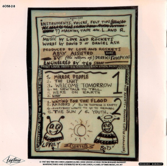
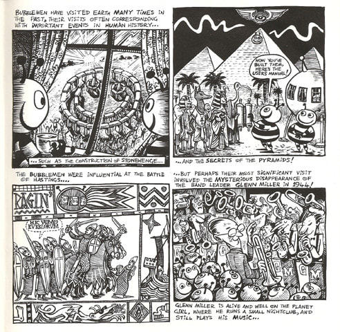
Some of the various Bubblemen that dwell in the CD booklet for Earth • Sun • Moon
20 notes
·
View notes
Text
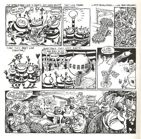
bubbleman posting time
48 notes
·
View notes
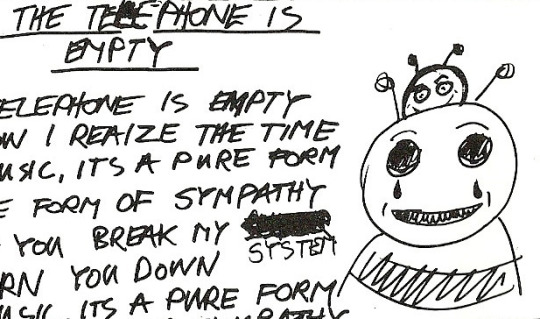
Photo
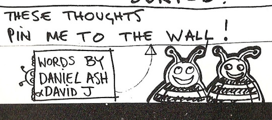
hi, please look at this bubblemen sketch. thank you.
36 notes
·
View notes
Text
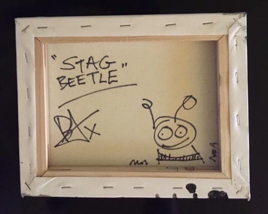
this picture tells me that the bubblemen are like 8 feet tall
it also radiates the most evil energy i have ever encountered
2 notes
·
View notes
Video
youtube
2 notes
·
View notes
Last Seen Blogs

ask-the-critters
S-M-I-L-E Everyday!

krikwahmmett
🎃 don't take metal too seriously 🎃

lobo-66
Doghouse

basarsayilgan
Başar Sayılgan

master7uk
Untitled