#been trying to emulate baroque painting art style
Text
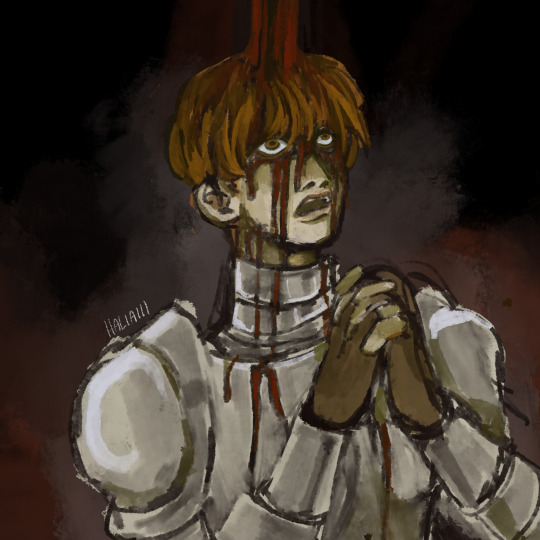
d’arce sketch
#been trying to emulate baroque painting art style#fear and hunger#funger#fear and hunger darce#darce cataliss#my art#art#digital art#illustration#procreate#sketch#fanart#fear and hunger fanart#haliai art
462 notes
·
View notes
Photo

Thomas Yeomans interviewed by Steve Mallon [Originally published in Crack Magazine]
Thomas Yeomans is an artist working primarily in moving image.
Having studied at the Slade School of Fine Art and the Royal College of Art, Thomas now lives and works in London. Drawing broadly from pop culture, advertising, and the darker recesses of the internet, his elegant and unsettling work has earned him solo shows in London and Manchester, along with countless group exhibitions across Europe over the past four years. Last week we spoke to Thomas about the influences and ideas behind his videos.
You graduated from the Royal College of Art in 2012- how has it been living and working as an artist since leaving?
In a few respects it’s been really shit- having no money or working a lot for very little money. But in so many other respects it’s been so amazing. I’ve met some really exciting people and been able to show in some really exciting places around the world. We’d all love to have more money and more time but right now I get to make and show my work and that’s the best thing I could have hoped for since graduating.
I noticed from the bio on your website that you were on the MA Painting course at the RCA but the work you make is predominantly film-based now- how did that come about?
I think I was trying to be too clever with the paintings I was making. I was copying Ikea and John Lewis print patterns- appropriating abstract shapes and colours that have mass appeal- generic but desirable. The paintings just looked gross. I realised I was interested in mimicking lots of visual languages that exist to compel their audience in one way or another. I wanted to better understand ideas like persuasion, appeal and desire. At some point I felt there was more fertile ground in appropriating moving image to explore this. With ‘Painting’ written over the entrance to the building I felt I could understand my practice better as image-based; whether as paint on canvas or projection on a wall. I think my videos are really painterly.
Can you tell us about the main ideas you try to express in your work?
I suppose ultimately I’m expressing my feelings. That I’m in ecstatic awe of the baroque pictures I take from mainstream culture but also deeply troubled by and cynical of the physical impact and emotional manipulation they can exert on us.
You co-opt a lot of corporate aesthetics in your videos- stock footage and the tropes of aspirational advertising for example. What draws you to this kind of imagery?
The efficacy of a medium to persuade a recipient into changing their behaviour fascinates me. An ideographic animation, a sentimental piece of music or some footage that at first seems generic but when recontextualised appears sinister – these are the tools of corporate capitalist visual ideology that persuade us to buy into non-physical goods or services. Broadband, TV, phone contracts and so on. I don’t think my work subverts these strategies, as I’m sure we’re all aware of their power over us. But I do seek to divert these tropes into new meanings in order to create a slippage or space in which to better consider their power.
In a lot of your work you seem to be dealing with, or talking about triteness. Is it always about critique or is there something more reverent at play too- reasserting overlooked value or meaning in a cliché by changing its context maybe?
Both. It’s in my contrary nature to receive something with reverence and immediately find it disgraced as a result. When something becomes cliché or trite we tend to feel we have control over it- we recognise it’s machinations and almost laugh it off. But perhaps that’s exactly what needs mining- the material that has become so assimilated into mass consciousness we no longer accept its power. Like shampoo adverts that haven’t changed since the 80s.
There’s also a lot of quite menacing imagery referencing internet culture in some of your videos. Often its presented with a very aggressive, rapid-fire style of editing. What kind of relationship do you have with the internet as an artist?
I have a very obsessive relationship with the internet. Most of my studio time is spent browsing. I see the internet as providing a post-cinematic landscape of co-authorship across multiple platforms, multiple devices, multiple timelines and multiple places. The fragmented narratives that can be constructed online in real time is endless, immediate and- yes- rapid. By taking video and sound from the web and re-stitching it together into fast paced works I feel I’m emulating a common place, mass activity of parody, appropriation and collage that previously existed as a strategy of the avant-garde.
Which artists or artworks have inspired you the most?
I think artists like Jon Rafman, Amalia Ulman and Petra Cortright are doing interesting things. I love everything Diplo touches right now and can’t wait to see Rihanna at Wembley in June. I think she’ll always inspire me the most.
Lastly do you having any forthcoming exhibitions or current projects you’re working on?
I’m excited to have just been asked to participate in a live broadcast of video art through a TV Channel being launched in New York in February. I’ve always wanted to be on TV.
See more of Thomas’s work at his website and Vimeo
0 notes
Text
Interior Decorating, Home Design, Room Ideas: October 2012
amzn_assoc_placement = "adunit0"; amzn_assoc_search_bar = "true"; amzn_assoc_tracking_id = "smarthome2008-20"; amzn_assoc_search_bar_position = "bottom"; amzn_assoc_ad_mode = "search"; amzn_assoc_ad_type = "smart"; amzn_assoc_marketplace = "amazon"; amzn_assoc_region = "US"; amzn_assoc_title = "Shop Relarted Products"; amzn_assoc_default_search_phrase = "Bathroom Wash Basin"; amzn_assoc_default_category = "All"; amzn_assoc_linkid = "37dc757faf31b6fb71b130e547768646";
Check out these collection of bathroom ideas by Italian company Cerasa. With in-floor bathtubs and deluxe furniture the circumstances they carry about is akin to those gotten in spas. Clearly most of the ideas do need many room and we expect any of these would get room in a special apartment setting.
Delpha brings a collection of ultra stylish bathroom interiors for you. The designs are inspired by nature, pop culture, baroque and urban interiors.
Each bath area runs on a central theme where the fixtures and accessories are thoughtfully arranged. Most of the designs sport brightly coloured walls with rich use of textures. Some walls have mosaic tiles which are like jewels studded in a luxurious haven of purity. Going by the images, it looks as though this Delpha collection is targeting the luxury end of the market meant for people willing to pay the extra dollar.
Browse through for more inspiration.
I have a huge style crush on Hans Blomquist, stylist, art director, and author.Whether he’s being moody or lighthearted, masculine or feminine, I get him. Right down to the soles of my feet.
I discovered him slowly, as I found myself drawn to images from various sources, all connected by one name – his. Infatuation. Then I ordered his book, The Natural Home, and…love. Admittedly, his book will not be for everyone. If it’s color and contemporary design that move you, his is not the book for you. But if you love the moody, patinaed, textured, quirky and eclectic, with a distinctly European style, this book is most definitely for you. What can I say? He’s everything I hope for in a stylist.
Personalize your little ones play and sleeping areas with their favorite theme, without the need for time consuming painting or costly wallpaper. In a shared room situation, emblazoning your children’s names above, or on, toy chests and beds provides individuality, and establishing clear zones may help to avoid sibling squabbles. Using stickers to add color and fun to key pieces of furniture could even make an old wardrobe, or plain crafting table, into a child friendly piece. Fill a plain wall with a special nursery rhyme, or highlight a cherished item with a sweet spray of flowers.
Get creative by allowing sticky characters to interact with elements of the room, make a headboard into a perch under a line of cute birds, or balance creatures above door fames, skirting boards and light switches. Try making your own artwork by applying them to card stock and framing, and let matching elements loose on the surrounding wall for a ‘picture come to life’ effect. Wipe clean stickers that emulate note pads are perfect for a teen’s room, they can jot down homework notes, or doodle love notes, and simply wipe clean for next week!
Designing a child’s bedroom can be very challenging considering the fast pace in which kids are growing up these days. It’s hard enough keeping up with endless influx of technological gadgets before finding ways to store all of these “next best things”. But alas, there are fun innovative storage solutions disguised by splashes of color that would make any room look like a three dimensional Picasso! In these beautifully designed rooms below, the perfect balance of practicality and creativity has been achieved and will easily appeals to parents and children alike.
There are many good furniture designs, a lot of different materials that compose a beautiful desk. Some of them save space in the room because a designer created a functional design that would not only deal with your problem of having too little room for a desk but also look incredible in that small space. Some of the desks are suited only for large rooms that accentuate their gorgeous shape. And then there are those desks that can transform from a small, one-man workstation to a large, conferential table. It all depends on your taste and needs.
White is a Royal color – it’s the color of purity and beauty. This amazing color combines with almost any other, with it you can create any interior – from minimalist to a vintage romantic one. A white bedroom looks relaxing, inviting and calm, it’s like sleeping on a cloud. You may use not only pure white, add some colorful accents to make the space more dramatic. Don’t hesitate to use beige – that’s a one more classical color, or dark furniture to highlight that everything is white. Vintage furniture, shabby nightstands and crocheted bedspreads will give a romantic shabby chic touch to the interior. Floor tiles, impressive futuristic furniture and modern accessories give your bedroom a minimalist look. Choose your style, fill the room according to your dreams and enjoy your white paradise!
Chocolate appears to be dripping down the walls at this cafe in Opole, Poland, by interior designers Bro.Kat.
With its stunning pool and impeccable style, The Sotogrande House is fit for a celebrity. The credit for its design goes to Spanish architectural firm A-cero. The design is fresh and exciting and you can’t stop but admire how serene the whole home looks. White dominates throughout and except for this minor(?) challenge of keeping it that way we really can’t find anything else to crib about this fabulous home.
This is a gray and white apartment interior designed by Lanciano Design. This apartment has modern design with dark gray and white as the main color theme. The white color used for the walls, ceilings and some furniture, give a clean and modern expression for the interior. The dark gray color is used for floors and some other furnitures. This color give an elegant expression on this apartment. This apartment designed with great views through the big windows, allowing the occupants to enjoy the surrounding view and also let natural light to go inside the apartment.
White and Gray Apartment Interior Design
In India ink, acrylic, pencil and plywood Jennie Ekström creates a fantasy world of her own where children, strange birds and middle aged women reside in an overgrown fairytale garden. Jennie lives in Enskede where she is working as an Illustrator and artist. The exhibition takes place at Linnman Gallery. Don’t miss it if you’re in the neighbourhood.
I really like the decent color scheme used in this lovely apartment decorated by Mood House. There is a nice combination of old and new decor all over the place and also some very clever styling ideas. Highlight here is for sure the living room with the very cool pendant lights and variable shelving unit but also the work area is very nicely decorated with all the small details like artwork or work tools on wall.
Lovely apartment decorated by Mood House
I am very excited and impressed with DaVinci project House of tayone. Delve into the detail unique designs, each decorated in industrial style chic. Look closely to find an array of ideas to add character and whimsy to a blank canvas of space.
I love the brown in these types of rooms! I think it’s like the little bit of yummy sugar in the tea. If you want to minimize brown in your home, what about using rustic woods (woods that are so worn they are almost bluish-gray) as a compromise? That would get you closer to graphite, I had a very hard time picking out just a few of the photos, but I hope you enjoy the massive picture bomb!
It sure adds a lot of warmth to the interiors, and that is always nice in the colder months.
Louise Poulsen, the company making lights designed by such a great names as Arne Jacobsen or Poul Henningsen recently presented a new promo shots that were taken in a house of artist Tenka Gammelgaard. And as you can imagine, it looked great! These lamps really fits her style, and as Tenka said herself, she wouldn’t have said no to keeping them all. You can see a behind the scenes story on Tenka’s blog here.
If you are in Copenhagen in the coming month, make sure to pop over to Louis Poulsen’s showroom to check out Tenka’s exhibition there, together with more photos of her home.
Today we are featuring Modern stylish kitchen design – An Excellent collection of modern Kitchen design ideas from Italian company Dada. This model is elegant without being affected, and is truly designer-oriented right down to the smallest details of everyday objects.The bedroom is one of those places that takes time to decorate. You can always improve it because you always get bedroom ideas. This time it’s Hulsta to get our inspiration from. We are immensely impressed with their bedroom concepts. Clean shapes, amazing eye-friendly colors and designed for those who need their room to be either beautiful and able to store all their stuff. Would you put something like this in your bedroom? Which one do you like the most?
Your work environment directly influences your mood and ability to generate inspiration and creativity. Creative workplaces usually have interesting and visually stimulating elements throughout the space. Featured here are 10 creative workplaces that would succeed at inspiring any designer.
This 130 square meters large apartment in Helsinki have a really nice and cozy atmosphere – almost country like. All the wood and natural materials are providing warmth in the otherwise mostly white minimalistic space. Big dining table, fireplace and stacked wood piles – what a great place!
Another example of how cool can the small place be, this little beach house belonging to Belgian/South African couple is very sweet! It certainly have the scandinavian feel – white floors, white walls, very clean and full of light, this combined with nicely selected furniture (those wooden chairs are great) creates wonderful atmosphere as made for summer relaxing.
Today HomeDesign9.com introduce to you are some very sweet pics from the stylist Aaron Hom.I love all the decors and furniture he uses, Eames, Jacobsen, Nelson, Saarinen… there is everything. My fave is the first one – white room with wooden wall unit, but all other places are gorgeous as well!
Happy Monday lovelies I hope you had a fulfilling weekend!. One of the last projects of the wonderful photographer Petra Bindel are these fantastic photos from the new catalogue of the Dutch company Muuto. I really like the nice pastel pink, yellow & turquoise colors that they are using for the line and the styling is so beautiful!
Let’s come with me to Barcelona, Spain, today and take a peek into this beautiful home. The neutral toned color scheme and the high ceilings and windows give this apartment an airy and spacious look. The clean lined place is decorated with modern furniture but the wooden accessories and several rugs give warmth to the various rooms.
Can you believe that this lovely apartment in Malmö, Sweden, measures less than 50 square meters? The white walls, high ceilings and white washed gives this apartment (which is for sale by the way) a spacious feel.
This beautiful Mas (a country house or farm in the South of France, usually made of stone) is located in Uzès, right in the heart of the Provence. The house is beautifully renovated and decorated with materials such as wood, stone and metal. I think this is a perfect combination of modern elements and traditional features.
Moroccan riads are always a great source of inspiration. Ryad Sharai is one of the biggest riads in Marrakech. It is hidden behind a weather-beaten door in a narrow street in the Bab Tharzout quarter. A riad is a house with a patio and this gorgeous riad has quite a large patio. It has seven bedrooms, all situated around the patio and the pool. Behind the labyrinth of rooms there is a staircase leading to the terraces. From there you have a magnificent view of the city and the Atlas mountains. The cosy cushions make this place very inviting!
Grey can be a bit boring but this color will warm up with a touch of soft pink. These beautiful images are shot by photographer Line Klein. The lovely pink lamps in the image above are from Studio Snowpuppe.
Today some dark colored interiors. I think the dark hues fit the wet and gloomy weather here in The Netherlands. I like these images but I do prefer a bit of color here and there. How do you feel about using darker colors in your home?
I love a beautiful exposed wall. These brick walls give an industrial character to a space. Here some example of an exposed wall in a kitchen, living room and even a bathroom.
Today Japan is known for its minimalism and simplicity because of their Zen culture. But how to make a Zen-home in a girlish style? How to combine calmness and little sweet details? Here is a nice example how to do it. The interior is done in a truly Japanese way: with cherry blossoms, traditional colors, natural wood and simple shapes, nothing bizarre. Despite of it, there are many nice girlish details like pastel colors, beautiful accessories and lots of flowers everywhere. I love the decoration of the wall with hooks. It looks natural and is very functional – you can place shelves or hang some things on them. This interior is an amazing example of exquisite and functional combination of styles.
Teenagers are hard to please, but this gallery of goodies is bound to put a smile on their face; gorgeous spaces for girls, and cool lad pads full of fresh ideas and new colorways.
The attention grabbing storage shelves flank every available space, keeping teenage clutter off the floor and schoolbooks at hand when studying.Unfortunately, teenage life can’t always be about going out with friends and having fun, these crucial years are also a time to shape future careers and hone a craft; so here is a wealth of teen workspaces to inspire those developing minds!
Via Alex GoreThis laid-back attic space utilizes space up to the rafters to house an extensive selection of literature and reference books, with the desk situated to take full advantage of the largest source of natural light. Ideas for teen rooms are something young people looking to refurbish their rooms seek. We had a request at home-designing and we hope this post would help such people out.
This cheerful home design, rendered by Denis Khramov, is littered with colorful hits throughout its pure white decor. Carefully placed base notes of black ground the airy scheme whilst still keeping the overall look refreshing and youthful.
Large edgy artwork adorns the gallery white walls, picking up on the homes colorful accessories, such as an extensive book collection and a rainbow of scatter cushions on the sofa. ‘Island Views‘ is an inviting Caribbean villa overlooking a calm ocean scene, and filled with fresh and simple décor, African sapele wood ceilings and artistic lighting.
Add wow factor to your plain walls with these set of tips on creating unusual wall art ideas and altogether unconventional ways to fill up your blank spaces.
Via Cream Bikes and ThingsA huge frame makes a masterpiece out of your old bicycle, or a very arty storage space for your current one!
Looking as though a half crazed artist has just stormed out of this building in a creative frenzy, this hipster loft from B&B Italia is brimming with colorful imagination and eccentric flair.
This clever example of interior layout, by the team at Fertility Design, experiments with the introduction of retractable glass doors within the heart of a home, to divide off rooms for quiet and privacy at certain times of the day, whilst still providing the opportunity of creating a free flowing open plan space when desired.
The sliding doors in this example provide a barrier around the home office area for times when total concentration is needed away from the hubbub of the rest of the family home. Born in France and raised in London, stylist Marietta Beasley’s current loft in Atlanta, Georgia blends European style with New York ’70s art colony cool — when she acquired her space 15 years ago she was the first person to get a certificate of occupancy in the downtown area. Now it’s both home and studio, with an every changing collection of inspirating pieces from all over the world.
Designed by architectural trio Mårten Claesson, Eero Koivisto and Ola Rune, Widlund House, located on the Swedish island of Öland in the Baltic sea, looks out onto a mesmerizing vista of everchanging blue sky and water. Built to withstand the often fierce weather — fogs and storms are common here — the house takes full advantage of the view while being a snug retreat when it clouds over. Inside, decor is minimal, keeping the focus firmly on the atmospheric surroundings.
A Finnish graphic design couple show that having great taste doesn’t preclude having a mischievous sense of humour as well — their stylish home has a playful touches everywhere. So fun — that plaster hippo head is especially awesome.
Love this gorgeous Stockholm home on the Swedish Fantastic Frankproperty site — unsurprisingly it’s sold, but happily we can still admire these lovely photos.
Built in 1862 in the village of Vedbaek, a port located about 20 kilometres from Copenhagen, this former fishing shack is now a peaceful home for a couple who have opted to raise their children away from the city where they work, so they can enjoy a quieter home life. They commissioned Danish architect Jonas Bjerre-Poulsen, founder of the agency Norms Architect Copenhagen, to expand and modernize their tiny home, with an emphasis on light as a major component of the redesign. The extensive use of white, clever storage, minimal furniture and open spaces makes their house feel far larger than it actually is — even on the greyest days it feels light and airy. Lovely.
With its striking design and easy flow between indoor and outdoor spaces, the Bali, Indonesia home of Valentina Audrito and Abhishake Kumbhat and their two children showcases their work perfectly — in 2005 Valentina and Abhishake founded the Word of Mouth design group, where they create objects, clothes and accessories as well as designing commercial spaces (Valentina is an architect too). Fascinating mix of glam, traditional and modern.
I’m loving Sylvie Rochon’s cheerful Montreal apartment, furnished with great vintage finds — particularly mid century modern pieces (something Sylvie has a real eye for, as the owner of Spoutnik, a vintage furniture shop there). With its crisp white background and fantastic use of colour accessories, her space has a fresh and contemporary feel — it all feels very modern, even when you know almost everything in it is vintage. Lovely.
Artist Carouschka Streijiffert is a Stockholm-based artist who works in a variety of media — painting, sculpture, collage and carpets. When it came to finding a space where she could both work and live, she chose what was originally a series of attic lofts at the top of an early 20th century building — one where the pigeons had taken up residence. After having her application to create roof openings approved, a skylight for the studio and small round windows were installed, while (due to the aging structure of the building) steel beams and poles were put for support and a birch and concrete floor added. When it came to decorating her home, Carouschka chose to play up the industrial style of her space and highlight its interesting architecture. The entire renovation was a lot of work and headaches, but the final result, a lovely, light-filled home that looks out over the rooftops of old Stockholm on the Baltic Sea and Lake Mälaren, is more than worth it.
Love the fantastic use of colour in this bright Victorian end-of-terrace villa in north London — just amazing.
Love this pretty cottage in Mousehole, Cornwall — a converted net loft built in the 1800s on 17th-century foundations. Beautiful soft tones and textures, all with details that reflect the home’s seaside location.
I admire the long term view of Dutch felt artist Paula Leen and her partner Kees Middendorp in the province of Friesland, 80 miles north of Amsterdam — they lived in their home for 16 years before they finally purchased and renovated it. The results are poetic and beautiful.Swedish cinematographer Bengan Widell’s rustic cabin on Gotland is a peaceful retreat from his fast paced career in film — days here are spent either in happy solitude watching nesting eagles and spectacular thunderstorms over the bay, or more socially with visits from his five daughters. His cabin is an old fisherman’s shack, over 100 years old and — after some necessary renovations to replace dilapidated wood walls and ceilings — kept in a simple state. There’s no electricity, as Bengan prefers the soft glow of kerosene lamps at night, and a gas fridge and an old wood burner are the only appliances. Surrounding by stunning scenery, Bengan finds it to be the perfect antidote to a busy life filled with travel and people.
The post Interior Decorating, Home Design, Room Ideas: October 2012 appeared first on Home Design.
from Home Design https://homedesign9.com/interior-design/2012_10_01_archive/
0 notes
Text
Final Major Project
In this project you will be looking at the work of an established artist (past or present), dissect the materials and techniques that they employ in the creation of their paintings, and emulate these techniques in the creation of your own work.
There are a variety of elements to this assignment which will all be outlined below.
Collect no less than 5 images from the artist of your choice.
If you have no idea about what you want to paint, then take some time and look at a variety of images and movements ( Google “list artist movements”)


So in this case I’ve chosen to look at the work of Artemisia Gentileschi.
First lets do some preliminary research on her. It doesn’t have to be too in depth but you should identify the broader movements that an artist is a part of and some of their contemporaries. If you have chosen a famous artist, this will obviously be easier than some random person you like on Instagram. If you’re unsure of where your artist fits within art history we can look at the work together and I’ll help you out.
So, by just looking at the first paragraph of Artemisia’s wikipedia page I’ve found out the following.
“Artemisia Gentileschi or Artemisia Lomi (Italian pronunciation: [arteˈmizja dʒentiˈleski]; July 8, 1593 – c. 1656) was an Italian Baroque painter, today considered one of the most accomplished painters in the generation following that of Caravaggio. “
Now lets ask ourselves. What is Baroque painting? And of course google will tell us.
“Baroque art was meant to evoke emotion and passion instead of the calm rationality that had been prized during the Renaissance. Among the greatest painters of the Baroque period are Velázquez, Caravaggio, Rembrandt, Rubens, Poussin, and Vermeer. Caravaggio is an heir of the humanist painting of the High Renaissance.”
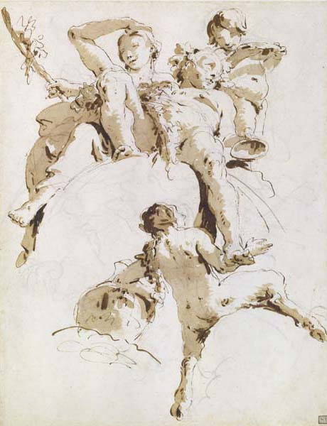
So suddenly we see that our artist isn’t just a lone genius struggling in a garret. They’re part of a larger movement that almost always involves a conversation with their contemporaries (besides “Outsider Art” which we love because it truly does stand alone). So now let's look at some works from her contemporaries. For this assignment you must save 5 images depicting other works made during the same time.
Now you’ve got a good amount of images to work with. If you need to find a way to save these images to your phone you can download an image downloader app (sometimes google images can’t be downloaded directly like the good old days). If you wish, you can compile these images into a PDF (ONLY A PDF… No really, a PDF! Protable Document Format. PDF) and I’ll print them out for you.
Analyzing your images and taking note of technique, materials, and processes.
Ask yourself the following questions.
How is the paint applied? Is it done quickly, or more methodically.
What’s the subject matter in the paintings? Is it a landscape, a figure, a historical painting, an abstract painting, etc. ?
Does the painting involve glazing and layering, or is it all done “alla prima” (all at once, wet in wet)
What did their preliminary sketches look like? This isn’t mandatory since sometimes they can’t be found. But it is a very helpful tool in discerning just how they painted.
5. What materials and techniques are used in the painting? Were there any special materials that an artist is using to help achieve their goals?
You will have multiple classes to work on these projects. For this reason it is important to begin with some preliminary sketching. These don’t need to be highly modeled and finished works, but should show the major value changes that you’re going to be working with. You must have no less than 5 preliminary sketches. These are best done in brush and ink since you want to see the value changes. If working from a photo, you will be using a grid to make sure your image will fit your canvas properly.
We will all be meeting individually to discuss more in depth the characteristics of each work, so everyone’s path may be a bit different. For instance, if you wanted to make a photorealistic painting in the style of Marilyn Minter then you’re going to need a very different approach than with Artimesia Genteleschi. Remember that artists create what’s called a “studio practice” and this practice often involves a very methodical approach to the creation of their work. Try to identify and see how all of these steps create a finalized work.

You must track your progress every single day from here to the end of class. That means taking a lot of photos of your work and progress. This isn’t an assignment you just hand in at the end of the semester. It’s a project which is dependent on your constant documentation of the work, If you finish a painting early, then you’re going to need to start another painting, and continue to document working every day. This documentation needs to represent at least 4 hours of work a day, I don’t just want to see small changes every day. It should be evident what was achieved during every class, and there should be significant changes that show clear progress. It’s perfectly fine to document failures as well.
What should I document ?
You will be required to take at least 1 photo a day of your progress, and also write down what you did during that day. This is just a simple reflection and telling of events. A simple way to do this is to write it down, and take a photo of it.
And example would be “sketched in basic shapes, and blocked in major values”
Remember you’re trying to make a recipe for a painting so it’s important to identify each step.
No, you can’t paint your dog…


0 notes
Last Seen Blogs

mloor
Sin título

rocc-1
Untitled

luxekook
LUXEKOOK

theblackpoets
Black Poets on Tumblr

waddellkeegan
The Blogging of Dowd 400