#bctsingularity
Text
Finished Book
Here is a Demo of my finished book and it’s contents! It works much better through my PC compared to the tablet I’m borrowing.
youtube
1 note
·
View note
Video
youtube
STUDIO Installation...
1 note
·
View note
Text
Poster.
Developing the poster for studio over the last couple days has had its ups and downs. Some times where I thought it was the worst piece of design ever made and other times where it was alright. In the end I talked to my father who's a graphic designer and he set me on the path to make a quality piece of design.
Throughout the development stage we designed two posters for different layouts. Here are the two designs.
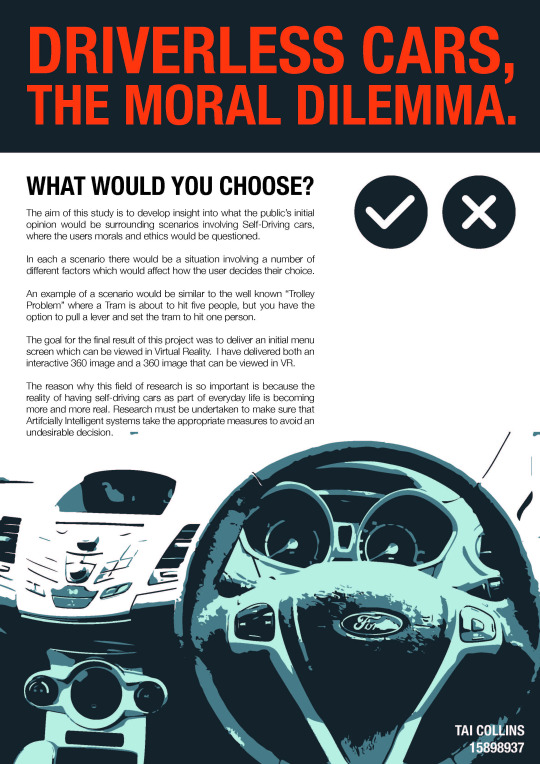
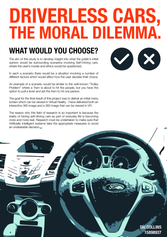
Now the second one down below was the initial piece which I had created except the type and layout wasn’t as polished. THe first image was actually the one my father and I worked on. Ironically when I had finished these two (same type layout, size, etc) I asked people around studio on what they thought was better between the two and nearly everyone said the second one. Reasons were things like the white space at the top works better, or that the navy blue headline was unnecessary. So thats the reason why I have chosen to go with the second image as my poster for that reason.
An artist that I have always loved is Wolfgang Weingart, a german born graphic designer who basically shaped whats known as Swiss Typography. Back in High school I studied him for one of my main artists so I was already quite familiar with his work. Here’s one of my favourites.
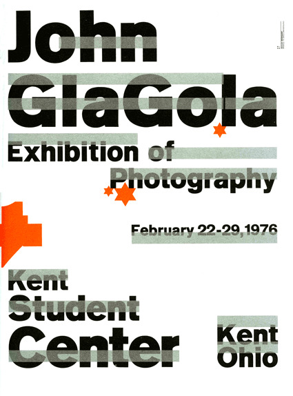
The simple use of the type face along with the bright orange creates a piece which has an awesome typographic layout and some bright colours which stray away from the simple black font. And this use of simple typography is what I wanted in my poster so I just used Helvetica Neue Condensed Bold for my heading and coloured it orange not because of the example here but because Orange and navy blue just look nice together.
1 note
·
View note
Text
Studio Update:
So there’s been a few assignments I’ve been working on, one is done and handed in, trans D is basically finalized and there’s studio.
So the studio project I’m working on is coming along nicely, apart from a nice snag in which my images aren’t apparently VR images, thanks cardboard camera. Hence I’m going plan B, YAY!
Plan B for me was to still have the interactive setup just I’m going to take out the middle-man aka cardboard camera. The images will be in a VR format to view from a phone’s gallery instead of needing the app now, all in all probably more efficient and easier to use. I’ll be uploading all the images I have in this case onto my online portfolio for people to download and view at the exhibition, self advertising i know but hey if it works it’s a nice bonus.
So there is a few small things left to finalize; being the conceptual and contextual statements and making the poster look pretty. Here’s hoping there’s no more issues until after the exhibition!
1 note
·
View note
Text
Dance Practice 4
Unedited versions:
youtube
youtube
I’d say I’m pretty happy with what we came up with today. We changed some dance steps because it just didn’t work out for us. We added new ones as well and so we’re 95% finished with the choreography. Just need to rehearse again and polish it then we’ll be ready to film it.
I didn’t realise that it was out of focus when I pressed record...
youtube
1 note
·
View note
Text
Hospital Bound Creative Workflow
So this is an interesting challenge my workflow has faced. I’ve been by my partners side comforting her through sever abdominal pain. It’s also equally busy at my job as I’m working in a chocolate shop on Easter. So my time this week has been split between helping an understaffed chocolate store and helping a sick young lady. And during this time it has been extremely difficult to continue working, however I’ve done my best to do so. I’ve adapted my workflow temporarily to fit with these disruptions and while it has of course slowed down considerably, it’s still going. This is how I adapted:
I quickly realized that while my partner was awake it would be impossible to get studio work done, and while at work it was too busy to sneak in blog posts. So this left me either before work or after my partner fell asleep. Both of which resulted in an 1-3 hours less sleep. Which is fine because it’s temporary - A week or two at max. So with this in mind I’ve set out to maximize every moment I have. The hospital is a 20 minute walk to my house, so after my partner falls asleep I use the walk to either listen to relative podcasts or browse for leads and things to study. When I get home I quickly heat up dinner (I cooked a weeks worth of meals and froze them in preparation), shower and then get to work.
The past few days I’ve been brainstorming designs and sketching whilst recording it. This video should be up by the end of the week, unfortunately video editing and uploading is quite time consuming and at this point I have none to consume. But aside from that I’ve separated and ordered my task lists to show me quick tasks I can get done at the hospital versus tasks I need to be at home to do. I’ve had to put off some tasks, however I gave myself a false deadline of about 2 weeks so this shouldn’t hinder my schedule too much.
In conclusion, it’s been a stressful week but a useful opportunity to push my working capacity to it’s limit. The biggest issue is the hours of sleep I’m missing, however the schedule I’m running requires it. I will continue developing this temporary workflow. Hopefully not for too much longer though.
2 notes
·
View notes
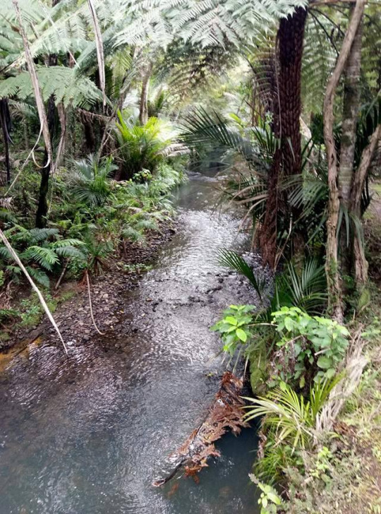
Text
Taking a day off
I felt I need a rest from work and uni so I spend today in the outdoors whilst also gathering sounds. I collected sound of the river, ocean, wind and a bunch of native birds. It was a fun day and great to get out and about.
1 note
·
View note
Text
UI in VR
Doing some research into UI in VR I found two really great articles of what aspects of design need to be used to successfully create a good looking UI. The first article https://medium.com/startup-grind/4-things-i-learned-designing-user-interfaces-for-vr-cc08cac9e7ec was from a designer that was the lead UI designer for the Disney product team. The article goes on to talk about 4 main things that they learnt from being on that team. The first being that Print design has never been more important in creating UI for VR. The reason for this is because in Print design you have to think about the various aspects of typography like size, weight and readability. You need to design with the idea that people are going to be next to it, just like they would be if they were looking at a billboard, poster, or book. At the end of the article there is a TL;DR by the author which I will include. “ Print has solved this for the real world. No need to reinvent the wheel for the virtual world.”
The second point, make your UI as less crowded as possible. This is because people will already be overwhelmed by the space they are in, filling it with UI will be disorientating and it can lead to people becoming nauseous. The way that the author says that they solved this was by putting the UI off to the side of the initial ‘cone of focus’. By making them intentionally look around for the UI you are also achieving the goal of getting them immersed into the space around them. TL;DR “Users might gaze naturally in the center after invoking a thumbnail. Putting your targets out of the natural gaze position will prevent accidental clicks.”
Third point was about making sure you mock it up in VR first. The reason for doing this is because rather than just seeing in 2D actually being able to see it in VR. As the author puts it “You give yourself permission to see it in the world it’s designed to be in.” Rather that seeing things on a screen you get to visualise them spatially. TL;DR Design comps are great, but you really need to see it in a headset to get an idea of what you’re designing.
This part is important for me as this is what I need to do for my summative. Being able to have something that people can immerse themselves in is a huge goal I need to achieve.
Last point is feedback. Getting people to try and give criticism is even more important with VR as there is so much that can distract the user. Getting people’s opinion is crucial as everyone is different. TL;DR “Give your users some feedback when they’ve hovered over something interactive. The more the better, because a VR environment can be pretty distracting.”
This is just the first article I read and will update on the second one tonight.
2 notes
·
View notes
Text
Studio Final:
To finish off this studio’s segment of posts I will say that It’s finished. The project is done and all set up. I would have liked it to be somewhat different, but due to technicalities of what a VR image is (thanks cardboard camera by the way) I could not have the entire image to be viewed, so there’s just segments of the actual panoramas. In saying this I hope that people can see the project for what it is, an approach of creating something that we can’t imagine due to the AI singularity.
I wanted the presentation of the project to be simplistic due to my concern that the idea might be hard to understand, therefore I wanted people to be involved and there to be a lack of imposing ideas written or shown in the exhibition.
Here’s to a good exhibition everyone!
0 notes
Text
Plan B
My dance partner stood me up twice now. I asked him yesterday if he can do today. No reply. So this morning I sent him a really long text saying that I really need the choreography to be done in like 3 weeks, PLUS, I have to film it as well. I even offered to buy him lunch just because I need him so much for my project. But I also said that if he’s not keen anymore on helping me, he can just say so and I will be fine with it. He replied saying he just got caught up with work and his new relationship and that he will come in for dance practice tomorrow.
I came up with a back up though if he does bail on me again. This video that my lecturer, Laurent, shared on our Google+ page helped me to come up with this idea for my back up plan:
vimeo
Rebecca Archer documented people interacting with a self-facing camera and asked them to do simple (but really not so simple) tasks.
“Humans are just bizarre enough. They don’t need too many props, too many things thrown at them to do things. It’s literally: set up a camera, set up a template, and they’ll give you the magic.” - Rebecca Archer
What she said there helped me do something similar for my video project, which I will use as my plan B, but will most likely include as well in my final cut if the dance will pull through and work out for me in the end.
So what’s my plan B?
My plan B is, I would have a few people do some tasks for me and I would document it. I would basically film them sitting on a chair interacting with normal everyday objects and with tech gadgets/devices. The reason for doing this is to show (in my video project) humans’ interaction with technology, more specifically, how it changed their interaction with fellow human beings. This will help progress the narrative in my video. The audience would be able to understand more of what the message is through having clips of that in.
1 note
·
View note
Link
“nests” was a concept design for cheap homeless sheltering. They boiled down the design to bare necessities. This included:
- A bed
- Lights
- Electricity source
- Insulation
- Keypad Entry
- Toilet
The project was unsuccessful because there were many flaws in the concept. The design was unappealing, the necessities were expensive, they chose short lifespan solar power panels over generator or grid power. However they still raised almost $3000nz, which makes it clear there’s a market demand for homeless and poverty housing solutions. And the demand is coming from working people who want to see the world changed for the better.
1 note
·
View note
Text
Creating my final submission
Creating my final submission was fun! For some reason I have fun designing user interfaces, and using photoshop and illustrator. Time flies, even when I'm pulling quite long days trying to accomplish it on time!
I'm definitely happy with how it went. I created a A1 poster, half of it was dedicated to an app flowchart that showed what the app would semi look like, and showing where buttons would be placed and what they would do, and what functions the app provides in terms of searching for walks, like a filters option and comparing different walks.
The filters, sort, and compare features were all inspired by the Research paper I read from Jenny Gove at Google that I have previously talked about.
Taking into account the article I read from Steven Hoober and how people hold their phones, I put buttons in parts of the screen that are easiest accessed by everyone, such as in the navigation screen and camera screen, the buttons don't go all the way into the corners like most apps do, because a lot of users would find this difficult to easily reach, so I put them closer to the middle.
I the kept a simple design, because John Maeda once said "Simplicity is about living life with more enjoyment and less pain". I took this as somebody using my app would want something they can enjoy and not be confused about how the app works.
I then created a short video that shows how the app would work if I actually made it, using an app called Augment, that allowed me to create a still model of a prototype route.
Here is my final work!
The only problem was with the actual printing!! Unfortunately, the printer that was used changed the colour of the background of some of the screens. They were meant to be a light grey, but they came out like a dull pink colour. It doesn't affect much, just doesn't look the most appealing.
0 notes
Text
First go at AR
After a lot of trouble shooting I finally got to test out my first AR unity project. I took a picture and set up a mark on my countdown oneCard. Then setting it up to test a 3D model I have made in blender. Just a bit of experimentation, but it’s a lot of fun!
youtube
3 notes
·
View notes
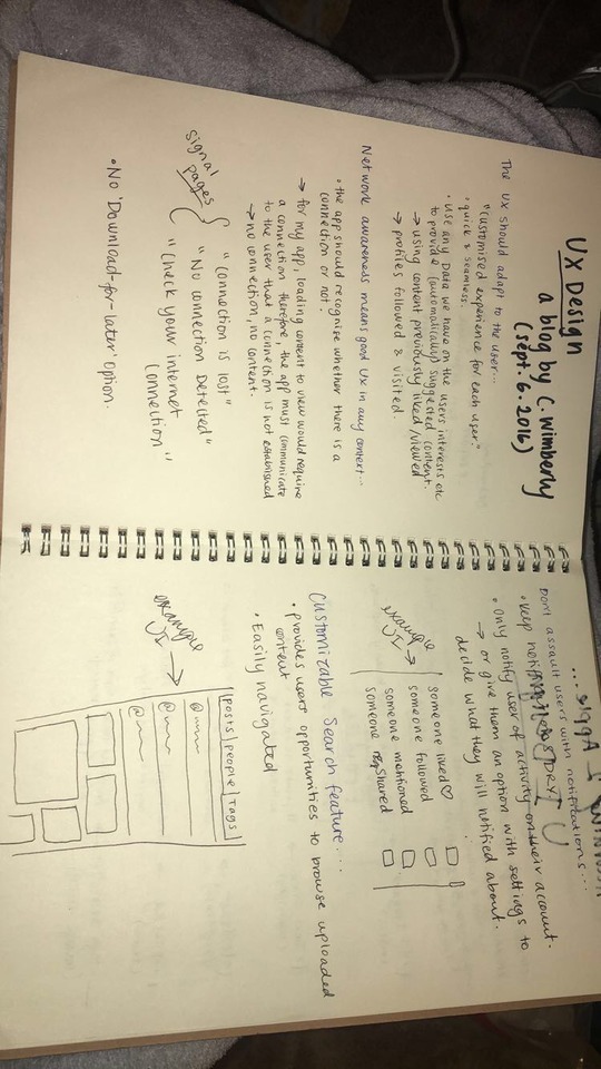
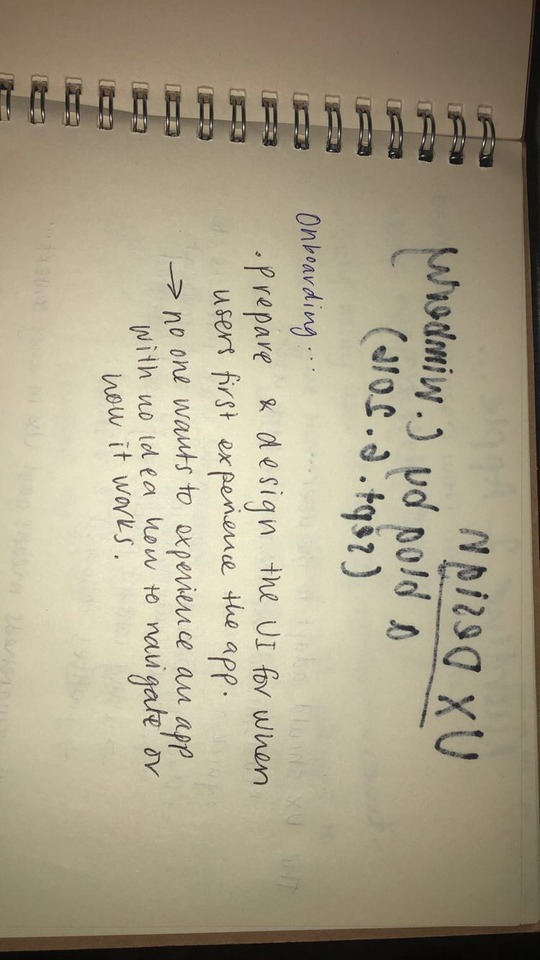
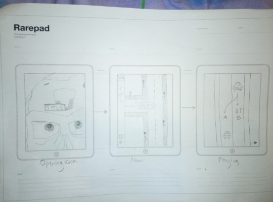
Text
App wireframes and progress
Hi!
Seems its been a while since I have have updated my blog... Lets just say I didn’t get as much done in the break as I wanted to. But I did have new direction in how to go about going from a design stage to actually making the app. Talking to my dad about the app design process he talked about first making Wireframes of different designs. So i’ve made a couple wireframes getting design ideas from great IPad UI examples. So here they are...
The inspiration for this set came from a set of designs that the World Wildlife Fund made (WWF for short) I loved the simplistic look of it with only having an image and a photo so I sort of took the same idea and did something similar with mine. Now I may not be using a terminator in my final image but I wanted a laugh and couldn’t think of what to put there at the time. I guess it does still fit the theme right?

https://nz.pinterest.com/pin/85286986665483961/
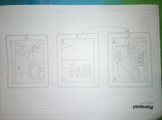
This next one was stemmed from the idea of a Mercedes IPad design. First seeing the car made me think of having all the titles, menus, and the actual game based around the car. I think this has a lot of great potential with the different sequences possible, even the idea of adding a VR option could be available. I am definitely going to create a more in-depth wireframe for this idea. (I’ll be honest I’ve just had a light-bulb moment and I have a lot to do now).
1 note
·
View note
Last Seen Blogs

alekasander-blog
Maznev Boxing Team

imfeelingindigohbu
i’m missing you like shit today

therafsimonswoman
The Runway Through My Eyes

baozidejiazhi
豹鞭一根喜欢来吃

makokeepsajob
Mako From The Legend Of Korra Fan