#and im upset that it doesn't feel like dynamic depicted the book
Text
Rating different versions of the SoN cover out of 10
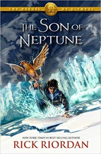
A classic. Honestly gorgeous, some of John Rocco's finest work. The color scheme? Spectacular. The ice/water/glaciers? Incredible. Sopping wet and angsty Percy? Hell yeah. I also appreciate that you can't really see Percy's face, which is ideal because it means that the art really doesn't do much to influence a readers perception of what Percy looks like in their mind, which is actually really nice. 10/10.
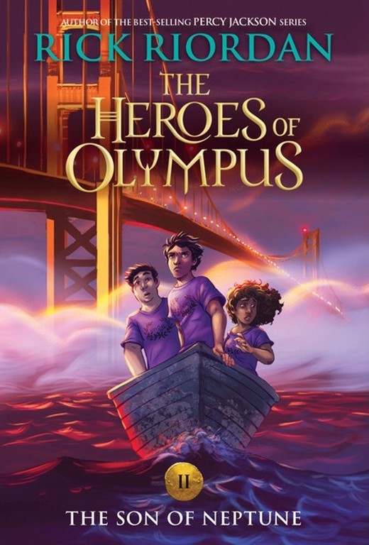
So like... the questers go to Alaska on their quest, so I don't really get why the artist of this decided that the coolest setting for this cover would be the golden gate Bridge?? Like yeah, sure. They technically are near there. But it's a weird vibe anyways. Also, I don't love seeing the characters faces, especially when they aren't portrayed as super intense powerful demigods... so yeah, not a great vibe. Everything else is pretty, tho. 7/10.

If I could find an HD version of this I think it'd be super cool. Right now my biggest issue is with the image quality, so I'm trying to ignore that and pass judgement. The font feels weird, and the border is kinda strange, plus the colors are mehhhhh, but it is kinda neat. I like that it takes place in Alaska, and has Percy's silhouette with the eagle. 7/10.
No offense but where the fuck did this come from??? This one loses a point because the scene depicted never actually happened in the books (unless I'm hallucinating and forgot), but otherwise, it's super cool, super sexy cover design. 9/10

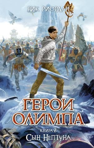
Im sure it'd look better with better image quality. But like... not that much better. 3/10

Percy and Frank look like twins, and I don't love any depiction of Hazel that has her be super skinny with wavy hair instead of curly/kinky. Also, I'm pretty sure Arion is a different color?? But aside from that, its really cool. I like the mix of colors with the blues/reds/purples (though I don't love the mix of yellow/white text, and would prefer them being traded for a gold), I like the dynamic pose, I like the semi-accurste scene from the book (some artistic liberty is never a bad thing). Overall, really not all that bad. 8/10
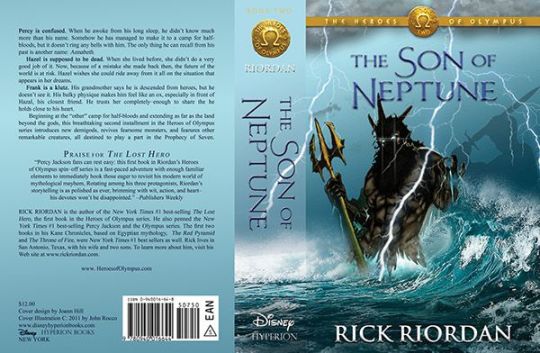
Again with seeing Percy's face. At least he's better than the original character design, but still. I would've liked if this was a little less realistic bc it gets into uncanny valley territory for me, and I'd like more vibrant colors and maybe a different font/color pallette for the text. But I do love seeing Percy with the eagle, and it's really really cool to see the undead warriors bc I never really got a good impression of what they looked like/how scary they were/how many their were. This really gives some good imagery. I don't like a lot of the other choices about color/realism stuff, but the portrayal of this scene is really cool. 8/10

Ahhhh, i am a slut for high quality images. Mmmmmmmmm. Give me a moment.
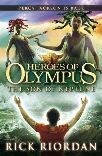
Okay, anyways. This is a little weird bc why is Percy standing in the middle of the ocean while he punches some gorgons? I'm cool with some artistic interpretation, but this just doesn't make a ton of sense. I do like seeing the water fists though (there something for you to think about-- water fisting. I'll wait for the fic), and I like that you can't see Percy's face, and I like the armor. It's weird that the title is so small when the series title is so big. It also looks like the cover of a book that was turned into a movie, which I personally find triggering, so that lost it a point. 6/10
1) what's wrong with his arms
2) what's wrong with his shirt
3) why is he ten years old
4) why does he have that haircut
5) thats... so much green
6) is he hugging the gorgons?
7) is he... HALLUCINATING the gorgons??
8) omg look at the difference between the gorgons hair and their skin TAKE IT BACK
I don't mean to be rude or anything. But
-2/10. I would not read this book and I'm upset i had to look at this cover.
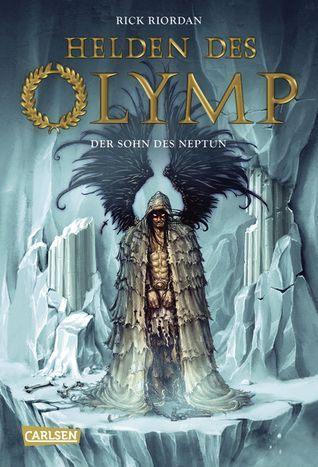
Portraying Daddy Thanatos on the cover feels like false advertising. Its not baddddd... but it is weird. I'll give it a confused 5/10 with room to grow.
#son of neptune#covers#cover art#art#rick riordan#percy jackson#thanatos#frank zhang#hazel levesque#rating
106 notes
·
View notes
Last Seen Blogs
cheeseburker
SPACE • TIME • PLACE

pusatherbalrambutwarsabiak-blog
Distributor Herbal Rambut Warsa Biak

diffarentmc
DiffarentMC/AndréAlexanderKiefer

thegoodthegrandandtheugly
Fate/stay bitching

k1speed-blog
K1 Speed - Indoor Go Karting