#also i finally found a font that works for a watermark instead of having to handwrite digitally w shaky hands so we're winning
Text
*offers you a chuuya in these trying times*
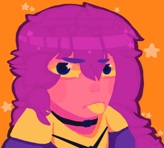
#hi...... just realized it's been a good bit since i've posted any art here#also my artstyle's changed a good bit so#SURPRISE [THROWS THIS AT YOU]#also i finally found a font that works for a watermark instead of having to handwrite digitally w shaky hands so we're winning#enjoy the chuuya. this was super fun to draw#bsd#bsd chuuya#bungo stray dogs#digital art#art#my art ✩ alistair draws#also apparently i've only rlly shown chibi art here?? hello???? i swear i draw full on faces...... i just forget tumblr exists...
8 notes
·
View notes
Text
Signal | 4: Priming, Priming, More Priming, and Heart-wrenching Failure.
This week we decided to focus on priming our fellow studio members, specifically to see how susceptible 18-22 year olds are to priming and suggestion. Also on the ‘to do’ list we needed to finalise our concept, and identify the methods we would be using to bring it to life. Another team in our year had mentioned that they would be going to a sensory deprivation maze in Queen St, so that was also a possibility we considered attending alongside them to find out more information about how you can play with people’s senses in order to achieve a desired result.
When it comes to priming, and trying to influence the subconscious of our test-subjects we need to take a subtle approach in order to avoid letting them know what we are doing. The first thing that we looked at was the use of posters and images. How can we subtly influence people with the use of image placement? Font types, the prominence of certain colours and design layouts are especially important. Something to keep in mind when utilising colours is that “It is evident that the perception of a colour is influenced not only by its brightness and saturation, by the nature of the coloured surface and by surrounding colours” (W R Crozier. 1996). Alongside visual layouts, perhaps we could use Sound? We had a look at sound triggers associated with thirst, and drinking and found that the following noises trigger a feeling of thirst within people; Can opening, ‘ah’ sound after a drink, Gulping, Drink pouring, Fizzing, Popping, Slurping, Ice cracking in a glass, and Rain.
We started our priming by putting up an ‘image board’ in our workspace, filling it with images of random brands prominently featuring the colour blue, with the Pepsi logo scattered throughout the images. We have chosen to attempt to influence people to choose Pepsi over Coke because of the large and obvious competition between the two brands, and the association people have with Coke being the ‘more powerful brand’. In preparation for the tests we would be running, we also had a look at some of Derren Brown’s videos where he uses priming techniques to great effect. (Derren Brown. 2006). On top of these videos we had a look at Fonterra’s various Anchor campaigns. A set of older advertisements by Fonterra appear more artful, and focus on the idea of ‘strength’ (Blank Canvas. Anchor. 2017), to me these ads are trying to reinforce how drinking milk gives strength. However, another campaign focused on images of children smiling, and teeth.

(Anchor: Must be Milk. 2015) The advertisements now seem to try to focus on ‘growth’ and the benefits of milk in growing bodies and teeth. These are just two examples of how companies forge associations with images and ideas to influence the public’s mind.


Running our priming tests was an interesting process. We had our image board set up, a few empty bottles of Pepsi on the desk, and a Phillips Hue lamp on the table set to Pepsi blue. We decided to ask people a few surveys, giving them some paper with questions to fill out. Unknown to the subjects, the paper was tinged slightly blue, the font was the same font used in the Pepsi logo, the font colour was Pepsi blue, and the background had a watermark of the Pepsi logo very faintly in white. Everything was priming the test-subjects on Pepsi. According to all the research we did this should theoretically have a noticeable effect. After testing a pool of people we stopped our testing as a common theme had started to appear. Despite everything we were doing priming Pepsi, every single person’s answer was the opposite. Coke. Why was this the answer on the tops of everybody’s minds? Simple: Coke is everywhere.

This threw us for a loop. We told ourselves “everything we researched said we had at least a chance of success” but according to the results not one of our tests showed the desired outcome. I think this is where we started to encounter problems. We lost a bit of our drive. We had no direction anymore, as it seemed that what we wanted to do wasn’t going to work. I decided to have a think about what we should be doing from here on with the Final Idea. Perhaps instead of an interactive piece, have a visualisation of how advertising and priming can affect spending habits? Or do we take a step back and have a look at light sequences? Perhaps even craft an advertisement of our own?
By the end of the week we felt like we had gotten nowhere. A common question we asked each other was “what do we want to do? Where do we actually want to go with this concept?” Sangeeta came over and asked us what our core question was, our core purpose. And when we replied with our original intention about seeing how susceptible people are to suggestion we were lost, and to be honest we had lost track of our direction. We decided to go away over the weekend and rethink what we were doing. Hopefully we would come back on Monday with some enthusiasm and some more ideas.
REFERENCES:
The psychology of color preferences. W R Crozier. 1996. REV. PROG. COLORATION VOLUME 26 63 . http://dev.sdc.org.uk/knowledgevault/chris/1996RP063.pdf
Derren Brown - Subliminal Advertising. Christopher Hughes, 2006. https://www.youtube.com/watch?v=ZyQjr1YL0zg
Anchor - Blank Canvas. M+AD. 2017. https://www.youtube.com/watch?v=E1-1m5TBDNg
Anchor Milk: Must be Milk. bestadsontv. 2015. https://www.bestadsontv.com/ad/68135/Anchor-Milk-Must-Be-Milk
0 notes
Text
17 Ways to Get More YouTube Subscribers (2018)
In this post you’re going to learn how to get more YouTube subscribers in 2018.
In fact:
These are the exact strategies I used to grow my channel from zero to 165,900 subscribers.
And today I’m going to show you how I did it…
…and how you can do the same thing.
1. Use “Power Playlists”
“Power Playlists” are like regular playlists… but better.
Here’s exactly how they work:
You see, most playlists are organized by topic.
But Power Playlists are different.
Instead of topics, Power Playlists are organized by outcomes.
Here’s an example from my channel:
As you can see, the title of that playlist is an outcome:
Which makes people MUCH more likely to watch my playlist… and subscribe.
And that leads us to…
2. Publish LONG Videos (10+ Minutes)
Yup, this goes against conventional wisdom.
But stay with me.
I recently did the largest YouTube ranking factors study ever.
And we found something surprising:
Longer videos rank better in YouTube.
For example:
A few months ago I published this video.
As you can see, my video is almost 14 minutes long:
And that’s one of the main reasons that it ranks #1 in YouTube for the keyword: “backlinks”:
3. Promote Videos In Your End Screen
Here’s the deal:
The more of your videos someone watches, the more likely they are to subscribe.
The question is:
How do you get people to watch 2, 5 or even 10 of your videos?
Promote another video in your End Screen.
Here’s an example from my channel:
This simple “Next Video” has led to TONS of bonus views and subscribers:
Here’s how you can do the same thing:
First, include 10 seconds of time at the end of your videos specifically for your End Screen.
Here’s what mine looks like:
Then, use YouTube’s End Screen editor to add a link to a related video:
That’s all there is to it 🙂
4. Branding Watermark = Subscribe Button
This is the ultimate YouTube subscriber hack.
You probably know that you can add a Branding Watermark to your videos.
This watermark lets viewers subscribe to your channel inside of your video.
Unfortunately, most Branding Watermarks are completely ignored.
For example…
Last year I added this watermark to all of my videos:
And it did absolutely nothing.
So I decided to try something new.
Instead of a watermark that looked cool…
…I used one that looked like a normal YouTube subscribe button.
And it worked!
My new watermark generated 70% more subscribers than my old one.
Pretty cool.
5. Focus On Quality… Not Quantity
When I first started my YouTube channel, I read the same advice over and over again:
“If you want to grow your channel, you need to upload videos on a regular basis”
As it turns out, this is HORRIBLE advice.
I’ll explain.
When I first started my channel I published videos on a consistent schedule…
…but no one watched them.
And the few people that watched my videos didn’t even bother to subscribe.
It was REALLY frustrating.
So I decided to change things up.
Instead of quantity, I decided to focus 100% on quality.
And this “quality over quantity” approach worked like magic.
Flash forward to today and my channel generates over 200k views per month from only 24 total videos:
And because I pour my heart and soul into every video, 7k people subscribe to my channel every month:
6. Reply To EVERY Comment
This is one of the EASIEST ways to get more subscribers.
In fact, YouTube’s internal data has found a clear correlation between replying to comments and subscribers:
Why does this help?
Well, most YouTubers never reply to comments.
Which means you instantly stand out when you do.
That’s why I do my best to reply to as many comments as I can.
(Especially right after a new video comes out)
7. Write a Compelling Channel Description
Your YouTube Channel Description is HUGE.
Sadly, most Channel Descriptions look like this:
Imagine that you’re considering subscribing to that channel.
Is that description going to make someone lunge for the subscribe button?
Probably not.
Contrast that weak description with this one:
This about page works because it:
Tells you what the channel is all about
Gives you important information on the channel (like the upload schedule)
Includes a strong call to action to subscribe
Here’s a template to help you write your own Channel Description:
Pro Tip: Sprinkle in a handful of keywords in your description. This can help your channel rank better in YouTube search.
For example, I sprinkled in a few different keywords that people searching for my content would use…
…like “SEO”, “link building” and “content marketing”.
8. Funnel People to “Subscriber Magnets”
This is working GREAT for me right now.
Here’s the step-by-step process:
First, head over to your YouTube Analytics.
And click “Subscribers” → “YouTube Watch Page”.
Next, identify the video that brought you the most subs last month:
(This video is your “Subscriber Magnet”)
In my case, this ONE Subscriber Magnet from my channel brings in as many subscribers as 13 other videos from my channel… combined.
Why is this important?
Your Subscriber Magnet video is PROVEN to generate subscribers.
And if you can get these video in front of more people, you’ll get more subscribers
Here are 3 ways to get more eyeballs on your Subscriber Magnet.
First, feature that video in your End Screen.
Second, make a playlist that starts off with that video:
Finally, promote that video in a card:
You can even make your Subscriber Magnet your channel trailer.
For example, Evan Carmichael uses his high-converting Steve Jobs video as his trailer:
That way, Evan’s high-converting video gets in front of everyone that visits his channel page
9. Use an Awesome Channel Icon
Your Channel Icon shows up EVERYWHERE on YouTube.
That’s why it’s really important to use the right one.
So if you’re a personal brand, use a high-res headshot:
If you’re a company channel, use a version of your logo designed for YouTube.
For example, ESPN rounded their logo so it works perfectly as a Channel Icon:
10. Create a Channel Tagline
Let’s face it:
Most YouTube channels do NOTHING to stand out.
And hey, I’m not judging.
In the early days of my channel I completely ignored my channel’s positioning.
And it was one of the main reasons that I struggled.
Once I started to strategically position my channel, my views and subscribers shot up like a rocketship.
Fortunately, you don’t need an MBA to position and brand your channel.
In fact, all you need to do is create a simple tagline.
Here’s the 3-step process:
First, identify ONE thing that makes your channel unique or different.
Maybe you’re a busy mom that can deadlift 500 pounds.
Maybe your channel teaches software companies how to grow their blog.
The exact “thing” doesn’t matter.
As long as it’s different than the other channels in your niche, you’re set.
For example:
My videos teach people marketing strategies they can use to grow their business.
But if I made my tagline “I teach marketing strategies” or “I help you grow your business”, I’d blend in with thousands of other channels on YouTube.
So I decided to focus on the ONE thing that my channel focuses on:
Higher rankings and more traffic.
Second, put that tagline in big font on your Channel Art.
Here’s mine:
Finally, say your tagline in your Channel Trailer.
11. Heart Awesome Comments
A while back YouTube launched “Creator Hearts”.
Creator Hearts make it easy to highlight awesome comments from your community:
Now for the interesting part…
When you heart a comment, that person gets a notification:
And according to YouTube’s own data:
That’s right:
Heart notifications get 300% more clicks than average.
So whenever someone leaves a solid comment, hook them up with a heart:
As you just saw, this will bring them back to your video… and make them VERY likely to subscribe.
12. Make a Killer Channel Trailer
Here are 3 tactics for making a channel trailer that converts:
Kick things off with your tagline
Start your trailer off with your channel’s tagline.
(Don’t have a tagline. Check out technique #10 from this post)
For example, I say my tagline (“Higher Rankings and More Traffic”) within the first 5 seconds of my trailer:
Stick to 60 seconds (or less)
YouTube themselves say that shorter trailers convert best:
That’s why I made my trailer about a minute long:
Show off your best stuff
Your trailer is a GREAT opportunity to promote your best content.
That’s why the middle of your trailer should be a 20-30 second highlight reel.
For example, my trailer includes LOTS of clips from my other videos:
That way, viewers can quickly get a feel for the type of content that I publish.
13. Create Videos That CRUSH Watch Time
Yup, Watch Time is a massively important YouTube ranking factor.
And not just for YouTube SEO.
Videos with high Watch Time numbers get promoted more often on the YouTube homepage:
And in the Suggested Video sidebar:
That’s why YouTube states that:
Question is:
How do you maximize Watch Time?
Use lots of Pattern Interrupts.
Definition
An event that changes a person’s thought patterns.
Pattern Interrupts make your videos more dynamic…
…which keeps people watching.
That’s why I use TONS of Pattern Interrupts in every video.
Including graphics:
Jump cuts:
And corny jokes:
Remember:
Pattern Interrupts don’t need to be anything fancy.
For example, check out this video from Safiya Nygaard:
Safiya uses lots of super simple Pattern Interrupts (like camera angle changes and simple graphics) to keep things fresh.
14. Embed YouTube Videos In Blog Posts
Your blog is a HUGE untapped source of views and subscribers.
Why?
Well, if someone’s reading your text content, they clearly like your stuff.
Which means they’re primed to subscribe.
That’s why I embed lots of videos in my blog posts.
Sometimes the video makes up an entire step or tip:
But I also embed videos as a way for people to learn more about something from the post:
Either way, these embeds get my videos in front of more people.
And not just random people.
I’m showing my videos to people that are SUPER likely to subscribe to my channel.
15. End Videos With a Strong CTA
When someone get to the end of your video, they think:
“What’s next?”
And unless you give them something to do, they’re going to click over to another video from another channel.
So tell them to subscribe to your channel.
And don’t be afraid to tell people exactly what to do.
For example, here’s how I end all of my videos:
I literally tell people to click on the subscribe button below the video.
That way, there’s no guesswork or thinking involved.
And that’s one of the main reasons that so many people subscribe right after watching one of my videos:
16. Promote Your Channel In Ebooks, Webinars, Presentations and Lead Magnets
The next time you create ANY piece of content, ask yourself:
“How can I funnel people from this content to my channel?”
For example, I include a link to my channel in every lead magnet:
I even promote my channel in podcast interviews:
17. Optimize Your Channel Page
When someone lands on your channel page, two things can happen:
They leave right away
They watch more of your videos and subscribe
And I can tell you from experience that an optimized channel page can increase your subscribers by 2-5x.
For example, my channel used to look super unprofessional:
Needless to say, VERY few people that landed on my page decided to subscribe.
That’s when I decided to put more time and effort into my channel page.
Specifically, I hired a pro designer to make my Channel Art:
And I organized my videos so that my best stuff appeared at the top:
That said:
There’s no “perfect” way to organize your Channel Page.
But here’s a template that I notice a lot of top YouTubers use:
Bonus #1: The “Social Media Preview”
I used to share my videos on social media like this:
And my posts got BURIED.
Why?
Because Facebook, LinkedIn and other social media sites want to keep people on their platform.
Which means they don’t like posts that send people to YouTube.
Well, I recently discovered a way around this problem:
The “Social Media Preview”.
And this simple strategy has helped me get INSANE views on social media:
In fact, one of my recent Social Media Previews got over 30k views on LinkedIn:
Here’s how to do it:
First, grab a 30-90 second clip from your YouTube video.
This clip should be a single technique, idea or point.
Next, upload that clip as native content.
This is key.
Like I mentioned earlier, social media sites want to promote native content on their platform.
And there’s data to back this up.
Native video Facebook posts get 10x more views than posts that linked to YouTube.
Finally, include a link to your video as the first comment on the post.
That way, if someone wants to see more, they can easily head over to the full video on YouTube.
And you’re set.
Bonus #2: Include a Subscribe Link in Your Channel Art
You probably know that you can link to external sites in your Channel Art:
But what you may not know is that you can sneak in an extra subscribe button there.
Here’s an example:
All you need to do is create a YouTube subscribe link:
Then, add that link as one of your Channel Art links:
Make sure to give your link a compelling title:
And when someone clicks on that link, they’ll see this high-converting prompt:
Nice.
Now It’s Your Turn
And now I’d like to hear from you:
Which strategy from today’s post are you excited to try first?
Or maybe you have a question about something you read.
Either way, let me know by leaving a comment below right now.
Source link
0 notes
Photo
New Post has been published on http://twoarticles.com/17-ways-to-get-more-youtube-subscribers-2018/
17 Ways to Get More YouTube Subscribers (2018)
In this post you’re going to learn how to get more YouTube subscribers in 2018.
In fact:
These are the exact strategies I used to grow my channel from zero to 165,900 subscribers.
And today I’m going to show you how I did it…
…and how you can do the same thing.
1. Use “Power Playlists”
“Power Playlists” are like regular playlists… but better.
Here’s exactly how they work:
You see, most playlists are organized by topic.
But Power Playlists are different.
Instead of topics, Power Playlists are organized by outcomes.
Here’s an example from my channel:
As you can see, the title of that playlist is an outcome:
Which makes people MUCH more likely to watch my playlist… and subscribe.
And that leads us to…
2. Publish LONG Videos (10+ Minutes)
Yup, this goes against conventional wisdom.
But stay with me.
I recently did the largest YouTube ranking factors study ever.
And we found something surprising:
Longer videos rank better in YouTube.
For example:
A few months ago I published this video.
As you can see, my video is almost 14 minutes long:
And that’s one of the main reasons that it ranks #1 in YouTube for the keyword: “backlinks”:
3. Promote Videos In Your End Screen
Here’s the deal:
The more of your videos someone watches, the more likely they are to subscribe.
The question is:
How do you get people to watch 2, 5 or even 10 of your videos?
Promote another video in your End Screen.
Here’s an example from my channel:
This simple “Next Video” has led to TONS of bonus views and subscribers:
Here’s how you can do the same thing:
First, include 10 seconds of time at the end of your videos specifically for your End Screen.
Here’s what mine looks like:
Then, use YouTube’s End Screen editor to add a link to a related video:
That’s all there is to it 🙂
4. Branding Watermark = Subscribe Button
This is the ultimate YouTube subscriber hack.
You probably know that you can add a Branding Watermark to your videos.
This watermark lets viewers subscribe to your channel inside of your video.
Unfortunately, most Branding Watermarks are completely ignored.
For example…
Last year I added this watermark to all of my videos:
And it did absolutely nothing.
So I decided to try something new.
Instead of a watermark that looked cool…
…I used one that looked like a normal YouTube subscribe button.
And it worked!
My new watermark generated 70% more subscribers than my old one.
Pretty cool.
5. Focus On Quality… Not Quantity
When I first started my YouTube channel, I read the same advice over and over again:
“If you want to grow your channel, you need to upload videos on a regular basis”
As it turns out, this is HORRIBLE advice.
I’ll explain.
When I first started my channel I published videos on a consistent schedule…
…but no one watched them.
And the few people that watched my videos didn’t even bother to subscribe.
It was REALLY frustrating.
So I decided to change things up.
Instead of quantity, I decided to focus 100% on quality.
And this “quality over quantity” approach worked like magic.
Flash forward to today and my channel generates over 200k views per month from only 24 total videos:
And because I pour my heart and soul into every video, 7k people subscribe to my channel every month:
6. Reply To EVERY Comment
This is one of the EASIEST ways to get more subscribers.
In fact, YouTube’s internal data has found a clear correlation between replying to comments and subscribers:
Why does this help?
Well, most YouTubers never reply to comments.
Which means you instantly stand out when you do.
That’s why I do my best to reply to as many comments as I can.
(Especially right after a new video comes out)
7. Write a Compelling Channel Description
Your YouTube Channel Description is HUGE.
Sadly, most Channel Descriptions look like this:
Imagine that you’re considering subscribing to that channel.
Is that description going to make someone lunge for the subscribe button?
Probably not.
Contrast that weak description with this one:
This about page works because it:
Tells you what the channel is all about
Gives you important information on the channel (like the upload schedule)
Includes a strong call to action to subscribe
Here’s a template to help you write your own Channel Description:
Pro Tip: Sprinkle in a handful of keywords in your description. This can help your channel rank better in YouTube search.
For example, I sprinkled in a few different keywords that people searching for my content would use…
…like “SEO”, “link building” and “content marketing”.
8. Funnel People to “Subscriber Magnets”
This is working GREAT for me right now.
Here’s the step-by-step process:
First, head over to your YouTube Analytics.
And click “Subscribers” → “YouTube Watch Page”.
Next, identify the video that brought you the most subs last month:
(This video is your “Subscriber Magnet”)
In my case, this ONE Subscriber Magnet from my channel brings in as many subscribers as 13 other videos from my channel… combined.
Why is this important?
Your Subscriber Magnet video is PROVEN to generate subscribers.
And if you can get these video in front of more people, you’ll get more subscribers
Here are 3 ways to get more eyeballs on your Subscriber Magnet.
First, feature that video in your End Screen.
Second, make a playlist that starts off with that video:
Finally, promote that video in a card:
You can even make your Subscriber Magnet your channel trailer.
For example, Evan Carmichael uses his high-converting Steve Jobs video as his trailer:
That way, Evan’s high-converting video gets in front of everyone that visits his channel page
9. Use an Awesome Channel Icon
Your Channel Icon shows up EVERYWHERE on YouTube.
That’s why it’s really important to use the right one.
So if you’re a personal brand, use a high-res headshot:
If you’re a company channel, use a version of your logo designed for YouTube.
For example, ESPN rounded their logo so it works perfectly as a Channel Icon:
10. Create a Channel Tagline
Let’s face it:
Most YouTube channels do NOTHING to stand out.
And hey, I’m not judging.
In the early days of my channel I completely ignored my channel’s positioning.
And it was one of the main reasons that I struggled.
Once I started to strategically position my channel, my views and subscribers shot up like a rocketship.
Fortunately, you don’t need an MBA to position and brand your channel.
In fact, all you need to do is create a simple tagline.
Here’s the 3-step process:
First, identify ONE thing that makes your channel unique or different.
Maybe you’re a busy mom that can deadlift 500 pounds.
Maybe your channel teaches software companies how to grow their blog.
The exact “thing” doesn’t matter.
As long as it’s different than the other channels in your niche, you’re set.
For example:
My videos teach people marketing strategies they can use to grow their business.
But if I made my tagline “I teach marketing strategies” or “I help you grow your business”, I’d blend in with thousands of other channels on YouTube.
So I decided to focus on the ONE thing that my channel focuses on:
Higher rankings and more traffic.
Second, put that tagline in big font on your Channel Art.
Here’s mine:
Finally, say your tagline in your Channel Trailer.
11. Heart Awesome Comments
A while back YouTube launched “Creator Hearts”.
Creator Hearts make it easy to highlight awesome comments from your community:
Now for the interesting part…
When you heart a comment, that person gets a notification:
And according to YouTube’s own data:
That’s right:
Heart notifications get 300% more clicks than average.
So whenever someone leaves a solid comment, hook them up with a heart:
As you just saw, this will bring them back to your video… and make them VERY likely to subscribe.
12. Make a Killer Channel Trailer
Here are 3 tactics for making a channel trailer that converts:
Kick things off with your tagline
Start your trailer off with your channel’s tagline.
(Don’t have a tagline. Check out technique #10 from this post)
For example, I say my tagline (“Higher Rankings and More Traffic”) within the first 5 seconds of my trailer:
Stick to 60 seconds (or less)
YouTube themselves say that shorter trailers convert best:
That’s why I made my trailer about a minute long:
Show off your best stuff
Your trailer is a GREAT opportunity to promote your best content.
That’s why the middle of your trailer should be a 20-30 second highlight reel.
For example, my trailer includes LOTS of clips from my other videos:
That way, viewers can quickly get a feel for the type of content that I publish.
13. Create Videos That CRUSH Watch Time
Yup, Watch Time is a massively important YouTube ranking factor.
And not just for YouTube SEO.
Videos with high Watch Time numbers get promoted more often on the YouTube homepage:
And in the Suggested Video sidebar:
That’s why YouTube states that:
Question is:
How do you maximize Watch Time?
Use lots of Pattern Interrupts.
Definition
An event that changes a person’s thought patterns.
Pattern Interrupts make your videos more dynamic…
…which keeps people watching.
That’s why I use TONS of Pattern Interrupts in every video.
Including graphics:
Jump cuts:
And corny jokes:
Remember:
Pattern Interrupts don’t need to be anything fancy.
For example, check out this video from Safiya Nygaard:
Safiya uses lots of super simple Pattern Interrupts (like camera angle changes and simple graphics) to keep things fresh.
14. Embed YouTube Videos In Blog Posts
Your blog is a HUGE untapped source of views and subscribers.
Why?
Well, if someone’s reading your text content, they clearly like your stuff.
Which means they’re primed to subscribe.
That’s why I embed lots of videos in my blog posts.
Sometimes the video makes up an entire step or tip:
But I also embed videos as a way for people to learn more about something from the post:
Either way, these embeds get my videos in front of more people.
And not just random people.
I’m showing my videos to people that are SUPER likely to subscribe to my channel.
15. End Videos With a Strong CTA
When someone get to the end of your video, they think:
“What’s next?”
And unless you give them something to do, they’re going to click over to another video from another channel.
So tell them to subscribe to your channel.
And don’t be afraid to tell people exactly what to do.
For example, here’s how I end all of my videos:
I literally tell people to click on the subscribe button below the video.
That way, there’s no guesswork or thinking involved.
And that’s one of the main reasons that so many people subscribe right after watching one of my videos:
16. Promote Your Channel In Ebooks, Webinars, Presentations and Lead Magnets
The next time you create ANY piece of content, ask yourself:
“How can I funnel people from this content to my channel?”
For example, I include a link to my channel in every lead magnet:
I even promote my channel in podcast interviews:
17. Optimize Your Channel Page
When someone lands on your channel page, two things can happen:
They leave right away
They watch more of your videos and subscribe
And I can tell you from experience that an optimized channel page can increase your subscribers by 2-5x.
For example, my channel used to look super unprofessional:
Needless to say, VERY few people that landed on my page decided to subscribe.
That’s when I decided to put more time and effort into my channel page.
Specifically, I hired a pro designer to make my Channel Art:
And I organized my videos so that my best stuff appeared at the top:
That said:
There’s no “perfect” way to organize your Channel Page.
But here’s a template that I notice a lot of top YouTubers use:
Bonus #1: The “Social Media Preview”
I used to share my videos on social media like this:
And my posts got BURIED.
Why?
Because Facebook, LinkedIn and other social media sites want to keep people on their platform.
Which means they don’t like posts that send people to YouTube.
Well, I recently discovered a way around this problem:
The “Social Media Preview”.
And this simple strategy has helped me get INSANE views on social media:
In fact, one of my recent Social Media Previews got over 30k views on LinkedIn:
Here’s how to do it:
First, grab a 30-90 second clip from your YouTube video.
This clip should be a single technique, idea or point.
Next, upload that clip as native content.
This is key.
Like I mentioned earlier, social media sites want to promote native content on their platform.
And there’s data to back this up.
Native video Facebook posts get 10x more views than posts that linked to YouTube.
Finally, include a link to your video as the first comment on the post.
That way, if someone wants to see more, they can easily head over to the full video on YouTube.
And you’re set.
Bonus #2: Include a Subscribe Link in Your Channel Art
You probably know that you can link to external sites in your Channel Art:
But what you may not know is that you can sneak in an extra subscribe button there.
Here’s an example:
All you need to do is create a YouTube subscribe link:
Then, add that link as one of your Channel Art links:
Make sure to give your link a compelling title:
And when someone clicks on that link, they’ll see this high-converting prompt:
Nice.
Now It’s Your Turn
And now I’d like to hear from you:
Which strategy from today’s post are you excited to try first?
Or maybe you have a question about something you read.
Either way, let me know by leaving a comment below right now.
This article is copyright ezinearticles on website http://www.twoarticles.com 2018
0 notes
Text
The latest alterations I have made to my typeface was the D, I felt as if something was missing and after gaining some feedback from Alan he helped me realise that the letter ‘D’ didn’t look right because of the thinner lines on the left side of the letter, so I have now added the same thickness on both sides of the ‘D’ and it now flows better with the rest of my letters and creates a more cohesive feel.

This is also my typeface in a variety of different point sizes, I’ve come to the conclusion that this typeface should only be used for titles as it loses its value going any lower than 30pt. It’s quite a powerful font and I think it loses the power if it’s too small. But if it needed to be small, that is where the logo would come in.

The point sizing here is 30pt, 60pt, and 100pt, I think these three sizes are the best way to use this typeface.

The developments of my logo consisted of using the first letter of my typefaces name ‘D’ and using that was the logo itself. Since the daisy is apart of the system I wanted to try and include it into the logo. I had some suggestions from Raul that I could try and use the daisy as an asterisk instead of including the flower as a part of the ‘D’ because it is already feminine enough.

And this is what I’ve settled on as my final logo, both elements will be used separately or together. I’ve decided to keep it simple, but use the daisy as an element that can be my brands “watermark”. This way I have a few more elements to work with when designing the business card, poster, double-page spread, and website.

Here are some websites and a double page spread that I found and particularly liked and felt that my typeface could work well within these designs.


This


0 notes
Text
Final Major Project - Using Axure To Make My App
Now that I have my logo and icons all chosen, I can progress to putting my app together by using Axure. I usually use Marvel to create my prototypes, but this would mean making all of my screens in Adobe Illustrator, and puts a limitation on the features I can incorporate into my app. This method of prototyping works with flat .jpg images of each page, making it more graphic design based than experimenting with interactions and software to create a realistic app.
With Axure, I am able to add pop-ups, colour changing buttons, and found out through researching that I can embed my busking videos into it. I can also add commands so that error messages appear, users will be able to type in text input fields, and basically use it as a real app would function, only minus the camera function. Axure is industry standard and used by many design agencies by UX professionals to create wireframes, app prototypes, and website prototypes, and is something I want to learn to use in a lot more depth to prepare me for the working world, so I feel that this project is going to be a challenge and will help me with that.
When creating the first digital prototype, I was also bearing in mind the feedback which I had received from the paper prototype Guerrilla test, ensuring I made the relevant changes as I went along.
To start with, I downloaded the free student version of Axure onto my iMac as when I previously used it to create my Metrolink application for the HCI unit, I worked from the uni computers.
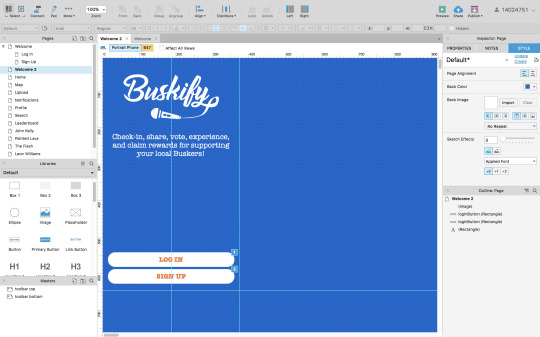

I then created a new document, and set the sizes of the app to the correct dimensions of an iPhone 6/7 screen (647 x 375), to set the guidelines for the space I need to work inside of, and referred to my paper prototypes to begin creating all of the separate pages required. I first experimented with some colours which I thought may compliment the orange I had chosen for my logo, but eventually decided to keep it as simple as possible and use white, orange, and greys.
After having my font (American Typewriter) and colours sorted, I could then progress to create more pages and link them all together. One thing which I wanted to do was include error messages to avoid mistakes, something important within UX design. To do this, on the sign up/log in pages I added ‘on click’ properties to the buttons, meaning that if a user tries to click ‘sign up’ before they have filled in all of the required text fields, an error message pops up and will not allow the user to continue until they have added their details. (You can see all the separate commands I added on the right-hand panel below).

Here is the preview of what happens when a user tries to continue without filling in all of the text input fields:

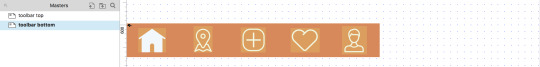
The next step was to create the main content and pages for my app. Because all my testing participants liked the icons I used in the toolbars, I replicated these using Adobe Illustrator, and added them to the top and bottom toolbars. I then made these toolbars ‘masters’, so that I could simply drag them onto each page and they would lock into the same position. To make the app feel more real, I then duplicated each icon but in white, so that when a user clicks on a page, the page icon would change colour. I placed these duplicates over the top of the orange ones and set them to ‘hidden’, and then added commands to each page e.g. ‘when home page loads, show ‘whiteHomeButton’, and hide all other white buttons’.
Home:
Once all of the main page templates were created, I then began to add the content. My first challenge was to add the busking videos which I filmed previously. To learn how to do this, I researched a lot online and found out that I could create some code in order to embed my videos into Axure as .mov files. I did this and tested my app, and it worked, but only on my computer, as to have it working on iPhones and other devices, I would need to host the videos online, which would cost a lot for my own domain. As an alternative, I embedded the videos into widgets called ‘inline frames’, via the YouTube embed option, as I had already uploaded the videos to YouTube. You can see this here in Axure, and also in preview mode:


Doing this also made my app run a lot quicker as it was no longer handling and retrieving large video files. The only down side was the YouTube watermark which I couldn’t remove, but if I were to create a prototype for a professional company, I would be working with a team of coders and have a budget to work around complications such as that.


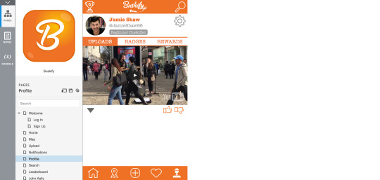
Also on the home page, I created some interactions, similar to the ones in the toolbars. When a user clicks on the ‘like’ or ‘dislike’ buttons, they change colour, and clicking on the drop down arrow shows information about that video, using the ‘slide down’ function. The information tab shows which busker is tagged and where the video was taken, and the comment tab shows user comments. It also displays how many likes, dislikes and views the video currently has. I spent a long time playing with the colours and positioning on these information boxes, and will be seeing what the target audience thinks of them on the next Guerrilla test. The home page also scrolls instead of simply being static.
Map:
For the map page, I wanted to create the actual map in illustrator, as my Buskify app has quite a clean feel and I didn’t want all the labels and text on google maps to distort that. To do this I traced over a screenshot of Manchester City Centre, and imported it as an image and sized it to my app screen. I then added locations of buskers and added ‘hotspot’ widgets, so that when a user taps on one, the busker’s username and a link to their profile would show. I also created a pop up notification for when the user loads the map page, informing them that they are in a Buskify hotspot and to click the ‘check-in’ button to receive a reward. The check-in button then deactivates and sets to 50% opacity when the user has tapped it.

Notifications:
I set up the app so that once the user checks in with a busker on the map page, they then receive a notification that they have won a prize in their reward wallet on their profile. This took a lot of time to figure out, as triggering interactions within separate pages is a lot harder than clicking a button to make a notification appear. As you can see in the right hand panel, I had to set an ‘onLoadVariable’, which is set to show or hide different notifications based on what the user clicks on in the rest of the app. e.g. if they check-in or upload they will show different notifications (currently set to hidden in the yellow panels).
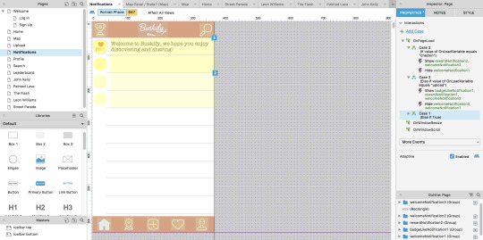

You can see this in preview mode above. I also created some little icons in Adobe Illustrator which represent each different kind of notification. Creating all of the assets and positioning/sizing them probably took most of the time creating the app because the smallest thing which was off made it look unprofessional.
Camera:
For the upload page I didn’t know what to do, as I cannot configure Axure to function with the iPhone camera, and so is really the only part of the app which cannot function realistically. To represent the user filming a band, I used one of the photos I took of the buskers, and added ‘upload’, ‘record’, and ‘AR’ (augmented reality) buttons, keeping this page as simple as possible.
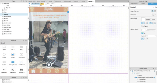
As you can see above, when the user clicks the upload icon (bottom right corner of this page), I set it so that a notification slides down saying that it ‘cannot currently upload a video due to iPhone privacy settings’, because of the fact that this prototype is unable to deal with any content that I haven’t already implemented.
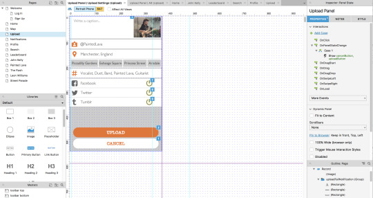
If the user hits the record (central) button, they are directed to the upload settings page, where they can actually type in a caption, the busker and location is tagged, and users can click on the green on/off buttons in order to share the video to their social media accounts. The uploaded video will then appear on the user’s profile.
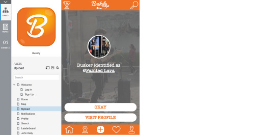
Finally within the camera page is the augmented reality feature. When the user clicks on this, the app determines if the buskers have a profile and identifies them. The user can then follow this link to view their profile, or close the notification.
Profile:
The profile page holds a few different sub pages (profile settings, uploads, badges, and rewards). To hold these different pages within the main page, I created dynamic panels so that the top profile image and details stay put, and the below content changes when the user clicks on the links to the different pages.
As I already mentioned, when the user uses the camera page to capture a video, it then posts to their profile page. You can see this above on the main ‘homepage’ of the profile page. To do this, I had to set the video and it’s assets to ‘hidden’ and set an OnPageLoadVariable to show the video if the user clicks on ‘upload’, meaning the profile page is empty until the user does this.
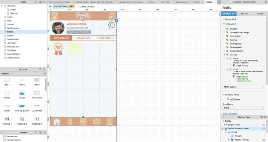
Here on the badge page the user gains their badges for completing different tasks, or reaching certain goals. For example, the one above becomes visible once the user likes a video, and the hidden one beside it when they upload a video. This gives them motivation to collect more and keep using the app.
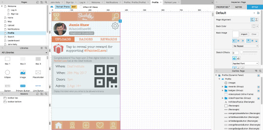
The rewards page is where rewards are stored from when the user checks-in with different buskers, earning whatever rewards they are offering for supporting. I set this reward so that when it is tapped on, a free digital gig ticket slides down, and can then be hidden again on a second tap. used the free gig ticket as the example because my Guerrilla test proved that users wanted rewards other than free songs, making the app more appealing.
All of these embedded functions took me a long time to set up and get them to work smoothly.
Busker Profile:
I styled the busker’s profile pages very similar to the user’s profile page, except without the rewards, badges and settings, and instead placed links to the busker’s personal social media websites (which they set up themselves via their version of the app). Here is where all of the videos which they are tagged in (by normal users) appear, based on if the user tags the busker, or if they are located within the busker’s hotspot when the video is captured. Users can also view likes and comments on each video.

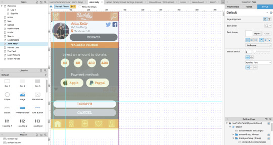
I also incorporated my ‘donate’ section like in my paper prototypes, adding a large button to the top of the profile so that the user’s attention is focused towards it. I then added a drop-down overlay which appears when the user clicks ‘donate’, allowing them to then select an amount and payment method, with the buttons changing to orange once they are selected. I used the guidelines to ensure all my buttons and content was aligned correctly or centred on the phone screen template.
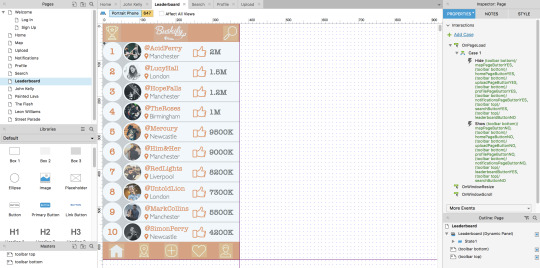
Leaderboard:
The leaderboard page is the final page which I created as it was the most simple, it is just a static page, with each busker’s profile image placed next to their tag and ‘like’ score. I added more images after the guerrilla feedback said that this page looked a little too text heavy on my paper prototypes. Realistically, all of these buskers would have their own profiles and this leaderboard would be linked up to each of them, so users could view all of the most liked/popular busking videos.
Overall, I am very happy with the outcome of my first digital prototype, and the fact that I managed to figure out how to embed all of my video content successfully without many glitches. I still think that the overall appearance and interactivity of the app could be improved, but I will wait for the feedback from my next Guerrilla test to alter these things, so that I can improve it based on valid target audience feedback.
Here is the link to my first digital prototype, it can be tested on an iPhone 6, 7 or on a laptop or computer:
http://wqv6p1.axshare.com/#c=2
0 notes
Last Seen Blogs

taemin0
ummm

bunn1gvtz
Genya’s Tooth

fgcstrong
MrPopo187

kawaiiballoontriumph
Untitled

carpediem-abattlecry
🎵🎶🎵🎶