#also TO BE CLEAR!! this was just a NEW library card bc i RECENTLY MOVED!!! i am not a library non-user i would never
Text
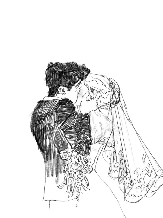
"Birds do not often sing in Semptember, but one sand sweetly from some hidden bough while Gilbert and Anne repeated their deathless vows. Anne heard it and thrilled to it; Gilbert heard it, and wondered only that all the birds in the world had not burst into jubilant song..."
Anne's House of Dreams, L.M. Montgomery
yes, i got a library card at 4am just so that i could read anne and gilbert's wedding. and what.
#proud of this one 😈i spent 4ever getting gilbert's longing in the smooch justtttt right#anne of green gables#anne's house of dreams#lm montgomery#my art#yeah we're out here making anne of green gables fanart in 2023. lets go lets fucking go#also TO BE CLEAR!! this was just a NEW library card bc i RECENTLY MOVED!!! i am not a library non-user i would never
1K notes
·
View notes
Text
Designing Adobe’s Brand Illustration Style

The process of building an overarching graphic illustration style for Adobe products
Context
Illustrations are emerging as a vital part of the user experience, as they help express the brand directly into a product. At Adobe, we’ve had a lot of important discussions around the need for a unified brand illustration style. As our products evolve, we want to make sure we’re building better brand recognition with our users, and build deeper connections between user and product.
As you may have gathered from past articles by my teammates (such as Sonja Hernandez’s brand system article and Anny Chen’s filetype icon case study), there are a lot of considerations to take into account for a product landscape as big as ours. Adobe’s offering includes over 100 products, services, and communities, from creative tools to communication and marketing tools. How do we provide a creative and playful illustration style which can scale to a company and product lineup like Adobe’s?
A brief history of illustrations in Adobe products
Before we started exploring color illustration in our products, our Icon team had already established a more linear illustration style in 2016, which is still widely used in our products. These linear illustrations are typically used for informative contexts, in areas like empty states and user onboarding flows.

Welcome to CC assets by Marco Mueller
Initially, we wanted to integrate this linear style created by icon designer, Marco Mueller, with our new brand illustration system to make the transition between these two areas as seamless as possible. I tried adding figures interacting with the linear elements to create stories. The style of these original figures was actually inspired by the illustration used on the Acrobat 5.0 packaging way back in 2001.

Early illustration style experiment (L) Adobe Acrobat 5.0 Package Illustration (R)

Adobe Capture on-boarding illustration

CC library illustration
We had several internal discussions about this style after its first release — Khoi Vinh, principle designer at Adobe, raised some concerns regarding the visual identity. Regardless of its interesting historical origin, this approach used a combination of vector shapes and human figure, which has been widely used in the tech industry. So our team decided to revisit this project and explore other directions.
“But it is worth taking a step back to examine the way our products use illustration and trying to understand why we’ve all settled on this particular approach.” — Two Very Different Kinds of Illustration, Khoi Vinh
I was honored to collaborate with a remarkable illustrator and artist at Adobe, Kyle Webster, for this project. This time around, we set out with a few goals for the illustration style: We wanted to demonstrate Adobe’s commitment to world-class illustration through creativity and playfulness. The illustrative language needed to allow for variety within the style, so that it may be expanded over time across the system of products and messaging, and allow for additional illustrators to contribute. We also wanted it to feel unique to Adobe, and not “owned” by another company.
First, Kyle tried to see if we could add more visual elements to help enhance the existing illustration style. As you can see, he added more personality to the figures by including skin color, details in clothing style, and shadows to bring more depth to the characters.

“While it was fun to see how far I could push the style away from the original source material, while retaining a more traditional human form in the drawings, it became apparent that this direction would not be as flexible as we wanted, nor would it give us room to really play and experiment. I’m glad we changed direction and Emma did a wonderful, thorough exploration that set us on the right path to develop a unique and adaptable visual vocabulary.” — Kyle Webster
As Kyle stated, this initial exploration was still pretty close to the original style, and after a few more brainstorming sessions, we decided to move even further away from the standard human figure to explore a more abstract visual vocabulary.
It’s time to ditch the trend…

Adobe Spectrum Inclusive Design Mobile Banner
We exist in a software landscape where illustrations are becoming more uniformed and — for the lack of a better word — generic. Often, illustrators are removing personal, creative characteristics of people in their illustrations in order to capture a wide diversity of people. They focus a lot on figures, and don’t experiment a lot on how to express their ideas more abstractly.
In Meg Robichaud’s inspiring article, You Can’t Just Draw Purple People and Call it Diversity, she discusses the inclusive issues of in-product illustrations. I wanted to shift the focus away from trying to represent human diversity in every single illustration, and in doing so open up different possibilities for expressing the same user concepts through abstract shapes instead.
Establishing principles and exploration
Illustration is an intuitive and subjective art form, which can make it challenging to translate into a systematic language that works across multiple platforms and products.
In order to experiment and define a new style, I restrained my explorations with four tenants:
Human forms and perspective
Texture
Shapes
Color
I’ll spend some time here talking about each, and guiding you through some examples.
Human forms and perspective
Including human forms can build an immediate connection with users, but to what level can we abstract those forms and still connect? Do we always need to have fully concrete figures involved? Do we need to include perspective details, such as shadow and dimension?
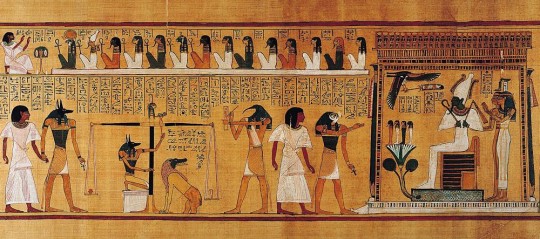
The Weighing of the Heart: In Spell 125, Anubis weighs the heart of Hunefer. This spell is first known from the reign of Hatshepsut and Tuthmose III, c. 1475 BC. Image from Beyond Hieroglyphs: The Art and Architecture of Ancient Egypt

Side profile explorations
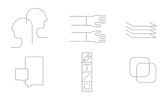
Inspired by the style of Ancient Egyptian art , where the heads are painted in profile with little to no shading, I tried a series of side profiles and arm/hand combinations that could be assembled in different ways to tell stories.
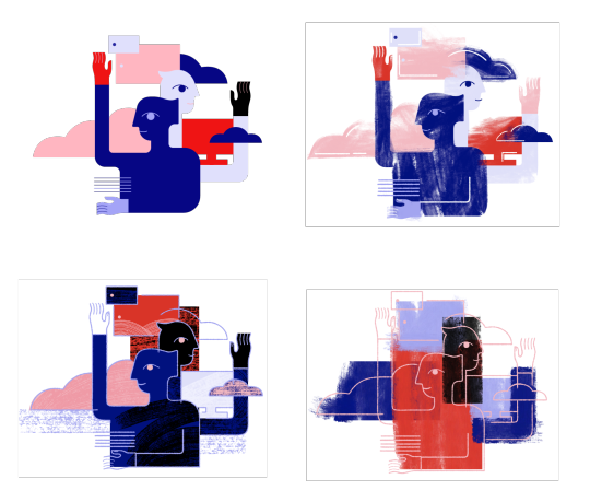
Texture

Kyle’s explorations of textures
Texture is another great way to bring these shapes to life and give them a human touch that adds personality and a distinct style. Kyle curated a series of brushes that could generate a subtle but intriguing texture in the illustrations. We played with a range of texture styles and compositions outlined in the above study. Ultimately, we preferred the openness and airy look of Option A in terms of composition, but also liked the brush stroke effects in Option E and how it was integrated with the forms. From there, we decided to combine the two styles and keep exploring.
Shapes

Alexander Rodchenko and Varvara Stepanova’s famous Books! poster (1924) employs a stark grammar of simple geometry and flat color to promote a campaign for worker education, the image is from The easy guide to design movements: Constructivism
Shapes play a huge role in our design principles, and they also help connect this new style with the more informative illustrations that were developed earlier. Coming from a background in graphic design, I wanted to experiment with mixing geometric elements into our style to create a minimal and contemporary look. I’ve always been inspired by Suprematism and Constructivism, two significant art movements and philosophies in graphic design. Both art movements focus heavily on using basic geometric forms and the importance of composition to create an impactful visual design.

Shapes I used in the illustrations
Colors

Colors can strengthen the connection between illustrations and a product, so we generated color palettes that were based off of the product’s brand color theme and then included additional colors that would complement the main colors. We wanted to allow for more flexibility in color combinations, and so the additional colors are open to the designer to pick and choose what makes the most sense for each illustration. The only other guideline we provide around color is how they are layered, so the darkest color is only ever used for line work and figures. The medium and light colors are for solid shapes and background.
Defining the visual language
Storytelling and Abstraction Level
To find the right visual language for telling a story, I tried to assemble the elements I talked above. Below are some examples from the early exploration.
The idea was simple: use the least amount of elements to express the most out of a story.
I tried to reduce the number of figures in the illustration. The idea was simple: use the least amount of elements to express the most out of a story. The two illustrations at the bottom can clearly convey this concept while distilling the form down to its essence.
Textures and lines
At this stage, I was trying find the sweet spot of line, texture, and shape combination in each illustration that would be visually interesting enough and still feel balanced to the eye:
The goal was to have a clear definition between foreground and background, layers and dimension, and to create unexpected and interestingly arranged interactions between lines and shapes that would reinforce the messages.
Linear shape explorations
Showcase
Here are some illustrations that I created based on this new system. You may notice them in the most recent release of Document Cloud (Acrobat) and this week’s Creative Cloud release. Keep an eye out for these and more in upcoming releases of your favorite Adobe apps!

Acrobat DC On-boarding card


Creative Cloud Mobile on-boarding cards

Creative Cloud Mobile on-boarding cards

Adobe I/O Console XD Plugins Webpage

Adobe Illustrator CC 2019 on-boarding banner
0 notes
Last Seen Blogs

erin-lindsay--cpd
Don't f*ck with my city.

carnalcervidae
Snack Maniac

gomzdrawfr
It is what it is

superhirocreative
Superhiro Creative

acer--saccharum
Witch of the Northwoods