#alanart
Text
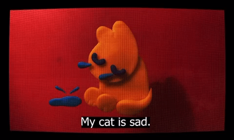


My cat is sad.
#GIFs of my most recent animation project. Yes it’s based off of that one sad cat poem everyone on here was crazy about at one point#alanart#animation#fast gif#flashing
8K notes
·
View notes
Text

Now in Encore style: what bein friends is about! ^^
#alanart#mother series#earthbound#mother 2#ness#ness earthbound#paula jones#paula polestar#paula earthbound#jeff andonuts#jeff earthbound#prince poo#poo earthbound#pixel art#sprite edit#mother encore#artists on tumblr#woohoo i love tags
522 notes
·
View notes
Text
YAY <3
#I am a fan of how people turned Edgar into a little devil computer guy based on how he was drawn on the movie posters#wanted to join in on the fun + do some animation practice#electric dreams#electric dreams 1984#alanart
4K notes
·
View notes
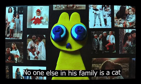
Text


*crickets chirping* Hello lbp3 fans
453 notes
·
View notes
Photo
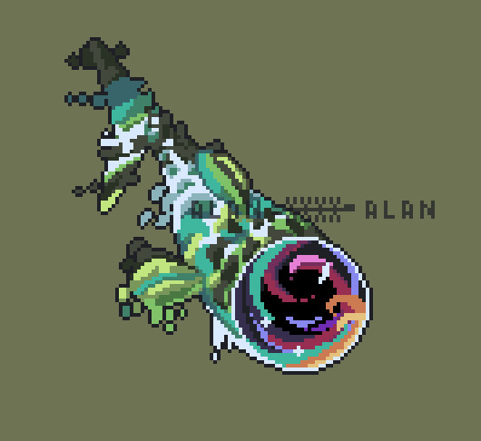
the
#dredge#dredge fanart#fucked up and evil fish#fish i guess#fish#pixels#pixel art#horror#fishing game#voideye#alanart
253 notes
·
View notes
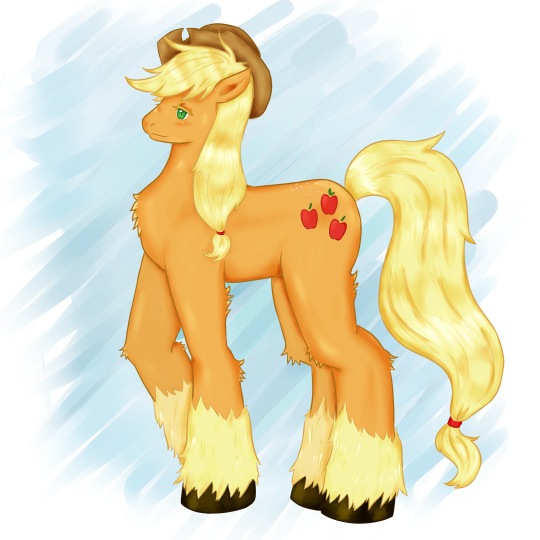
Text
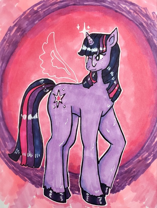

um.. horse
#alanart#traditional art#i got alcohol markers awhile back and so far ive mostly used them for cartoon horse#mlp#mlp: friendship is magic#rainbow dash#twilight sparkle#world cold and dark. cartoon horse show soft and bright
8 notes
·
View notes

Text
pride in wayhaven, day 6 - drag !!! ☀️ @wayhavensummer
#gahdamn ive been busting my ass for the past two days to get this done on time JDSIOSADJ#anyways!#biggest questions surrounding this:#does rico have a drag name? ..maybe..#(la sirene is the working one but yk)#is rico padded or is his big juicy posterior filling out his leggings? who knows.#how is rico keeping that mf tucked for so long? another question that may never be answered.#i also drew some feathers but ... it was tragic JDSAOJIS#okay let me go now#OH WAIT THE PURPLE SUIT THAT FARAH IS WERAING>>> yeah I like that.#okay fr !#twc#wayhavensummer#creeks#rico n farah🥰#alanart!
47 notes
·
View notes
Text
Watercolor Exchange / Art Supply Haul with Luna Howell
My friend Luna Howell sent me the most adorable package as part of a watercolor exchange that we did together. She is just a super generous and nice person and I was so excited when I got the package in my mailbox.
She sent me some green tea candy from Japan and the cutest Totoro themed note in addition to all the watercolors she sent along!
So here are the colors that she sent:
Name Pigment Brand Jaune Brilliant #2 PR 108, PO 20, PW6 Holbein Shell Pink PO 73, PW6 Holbein Vermilion Hue PO 73, PR 254, PY 110 Holbein Quinacridone Opera BV 10, PR 122 Holbein Monte Amiata Sienna PBR 7 Daniel Smith Potter’s Pink PR 233 Daniel Smith Kyanite Genuine Daniel Smith Primatek Serpentine Genuine Daniel Smith Primatek Fuchsite Genuine Daniel Smith Primatek Imperial Purple PB 29, PV 19 Daniel Smith watercolor stick Sap Green PO 48, PY 150, PG 7 Daniel Smith watercolor stick Quinacridone Burnt Orange PO 48 Daniel Smith watercolor stick Burnt Sienna PBR 7 Daniel Smith watercolor stick
Holbein Watercolors
These are the colors I was really most interested in checking out. I have never worked with Holbein watercolors before and they are not exactly easy for me to access. There are also not a lot of very detailed reviews of these paints.
The first thing I noticed is that these paints arrived melted. Luna packed the watercolor half pans into a small plastic baggie, and these had melted and gotten all over the other watercolors.
I thought this was kind of weird especially considering that it is only early spring and still very cool where I live.
That made me wonder if there is honey inside. There is no honey in these pains, but they use, gum arabic as the binder, and glycerin as a moisturizer. I can only assume that they use a lot of glycerin!
The pans rewet very easily (probably because of all of that glycerin) and they have this extremely smooth and creamy feel.
I had expected the colors that contain white to be very chalky and all, but they are actually surprisingly vibrant. Of course, they are still opaque that is something that can't be avoided.
Something that shocked me about Holbein paints is that they seemed to dry even more vibrant than how they appeared when wet. That's the opposite of how watercolors normally work!
Not only that, but the whole buying the Quinacridone Opera is much more vibrant than Winsor and Newton's Opera, which is saying something since that is already such a saturated color. Also, the color seems to be holding up a lot better than the Winsor and Newton version.
You can, however tell that they definitely don't use very much dispersants like ox gall, because the colors do not move very much in water.
Because of all of these things, I’m really really interested in trying out more colors from buying. The colors seem to be very smooth, very finely ground, and extremely vibrant and pigmented.
Daniel Smith
All the other colors that Luna sent me were Daniel Smith colors.
Potter’s Pink
Potters pink is a dusky, granulating, desaturated pinkish color.
It's one of those colors that is really overlooked by the majority of watercolorists. That's probably because it's not really the most useful color on its own. But in mixtures is really where it shines.
I played around with this color for a bit and found that it makes an interesting beachy than color when mixed with raw sienna. When mixed with quinacridone magenta, you get a sort of rose madder hue, and when added to greens, it causes them to granulate with darker, desaturated flecks. It also mixes well with cerulean blue to form grays and dull lavender colors.
Monte Amiata Sienna
You should know that I have an obsession with yellows by now. I am also particularly picky about my earth yellows.
Monte Amiata Sienna could probably be considered a type of raw sienna or yellow ocher, but it is much clearer and more transparent than either of these colors. If you wanted a raw sienna with little granulatioand much more saturation, this would be it.
Primatek
I've never tried the Primatek series before. Most of what I've heard about them is that some painters buy them for the glitter that some of the colors have, which was never particularly interesting to me. I've also heard some people simply call them curiosity colors that are not useful in real painting.
So when I got to try these and realized how useful they can be, I was very surprised!
Kyanite Genuine is a beautiful, dark, granulating color that is perfectly suited for dark skies, or stormy water.
Fuchsite Genuine is this color that seems very saturated and sits somewhere in between pthalo blue and phthalo green on the turquoise/teal side of the color wheel. If you are obsessed withthese colors, it's very easy to make a vibrant turquoise or teal starting with this color.
Serpentine Genuine is the best out of this bunch, and it's a granulating single pigment green that has flecks of Brown in its undertone.This collar made me want to get all of the single pigment greens in the Primatek line! It's perfect for landscapes!
Watercolor Sticks
I had also never tried the Daniel Smith watercolor sticks before, and it was a very interesting experience working with them.
You can't really call these crayons, because they are too soft to really draw with. At least in my climate. I have read that softness of the sticks varies a lot depending on the humidity of your climate.
They feel closer to something like an oil pastel or an oil state, but even then, I would say that in stick form these are only useful for adding texture to a painting. For most watercolors these would be much more useful when cut into pieces and put into half pans, which is just what I'm going to do.
Thank You Luna!
I learned a ton from this watercolor exchange, and I'm so happy that Luna and I got to know each other through it! Thank you so much for your generous package Luna!
Links
Luna’s Instagram
Luna’s Website
HK Holbein Artist Materials
Potter's Pink - Pinkcolor (PR233) 15ml Tube, DANIEL SMITH Extra Fine Watercolor from Daniel Smith Art Supplies
AlanArt: Paint Review: Potter's Pink PR233
Daniel Smith PrimaTek Watercolors from Daniel Smith Art Supplies
Daniel Smith Watercolor Sticks
0 notes
Text


Sometimes in life you will meet a random girl
#another assignment. I hope you all enjoy#fun fact: based these guys off a drawing of similar characters I did around a year ago#alanart
5K notes
·
View notes
Text

~ Does a place called paradise wait beyond the azure skies? Bright as day…
#alanart#mother series#earthbound beginnings#mother 1#earthbound zero#earthbound#ninten#ninten mother 1#magicant#artists on tumblr#(I am so proud of this)
165 notes
·
View notes
Text


Just chilling just having fun
#snorlax has a costume in pokémon unite. whatever that is. that looks like this and I lost my moind#idk I just saw an image of it and had to draw it. whoever decided on this costume for them knew me#pokémon#snorlax#alanart
5K notes
·
View notes
Photo

babygirl alert
something is wrong with him
99 notes
·
View notes
Text

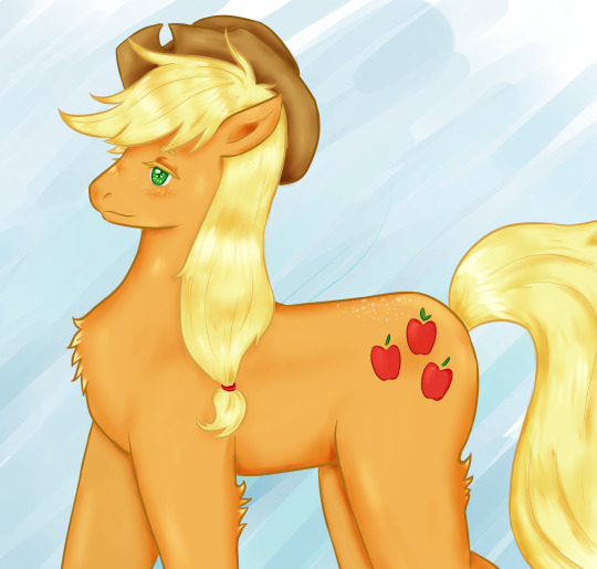
best pony
4 notes
·
View notes

Last Seen Blogs
xamka-wirnes
Anime, manga

gadgetmonster
Gadget Monster

sashaboto
My url Now
yb-five
Ring ring. It’s Cthulhu. Better Pick Up

thaysapereira5
Moda, Beleza, Bem Estar, Mensagens !