#after 3 years of doing graphic design and dealing with fonts for ads the font for all the love is my fave omg
Text
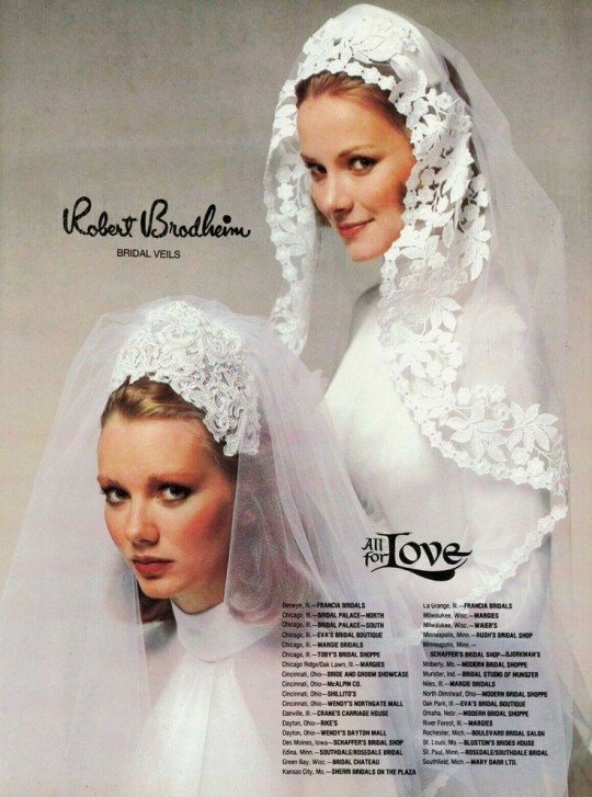
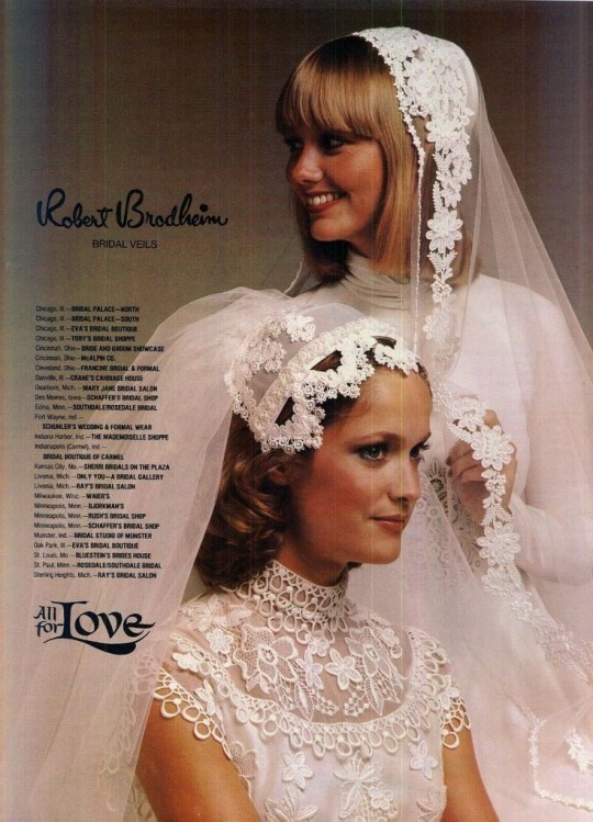
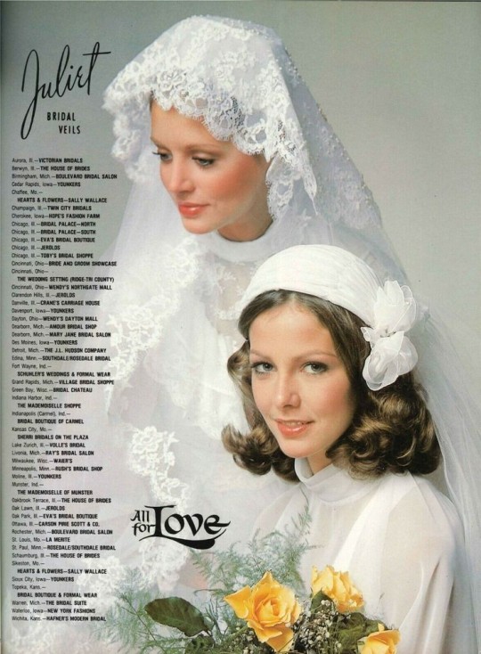
70s Bridal Veils
#70s#1970s#1976#1978#bridal veil#brides#fashion#ugh I love old wedding stuff#after 3 years of doing graphic design and dealing with fonts for ads the font for all the love is my fave omg
22 notes
·
View notes
Note
What is something you wish more people understood about you or if you prefer about your job or hobbies?
Hey Lovely!!
Ahhh, oh gosh SO much, honestly.
So I'm a graphic designer by trade, and an illustrator and freelance designer as my side gig, and my hobbies are art-related as well.
FOR SURE, I have to say that I wish people respected designers as the creatives we are. I've GENUINELY had clients who think all I do is hit a "design ad" button and BOOM it's done, and don't think they should have to pay me because – and this is ONLY because I've been doing this for 20 years – I can finish a print ad in under an hour, and booklets under 5, not taking into account the AMOUNT OF CHANGES and STUPID things I have to talk people out of to not make them look bad.
Some other things:
Microsoft Word is not a design program. I HATED this when I worked at the Paper. Good fucking LORD the amount of times I've had to rebuild an ad because the client couldn't resize it themselves and couldn't understand why if they moved something everything fucked up is astounding.
Canva is good for mocking up design, but I'm sorry, you're NOT a designer if you learned design in Canva. I know it sounds gatekeepy and pretentious, and I am sorry about that, but even with Canva you need to know SOME principles of design to get something appealing out of it. A designer, after-all, MADE your templates you're working from. We're everywhere. We're a silent bunch that's under-appreciated. You're never going to get the precision and nuance and a proper eye that you'll get from a designer. Sure you'll get quick and dirty designs, work fine for socials, but I LOATHE when people send me shit they made in Canva that I have to, once again, rebuild because they can't figure out how to resize in Canva and complained to me that Canva isn't making it look nice when they export it (to be fair, that's a them problem, the tools ARE there for you to do that stuff)
When your designer tells you one thing and you're trying to push for another, your designer is trying to save you the embarrassment of your "vision". We know what we're doing. We spend most of our days knowing market trends and what will make eyes go to your advertisements and products.
Strokes don't fix everything.
I can't read your mind. PLEASE, if you wanted an element there from the start, you need to tell me, and not tell me I'm a fucking moron who should have guessed by the blobs you drew on a napkin as your layout.
Fuck AI; I see the benefits of it for smaller things like content aware fill to add a bit more height to a stock photo I'm using, or the smart-select to route a photo faster, but literally that's all I see useful for it.
I know there's loads more I'm missing, but I've seen SO much that I'm numb to a lot of things and tend to just "autocorrect" stuff without even thinking anymore.
I love my job though, I really do. The joke in my industry is that "I get paid to play in Photoshop all day long" and there is some truth to it after doing this for nearly 20 years. But I wish people would understand that we are trained professionals who want to make them look good, and to do that I need time and money. We are literally background characters for the main protagonists, and the pay isn't great unless you're really lucky (which I am, but it took me 12 years to finally get in where I am), and I wish people would stop saying my job is easy.
It literally is not. Think of it as retail, but you deal with the same people every single day nitpicking the tiniest things over and over again despite you telling them countless times that 6pt font is probably the smallest you should go, but no 3 pt must be on this ad.
Anyway. 🙃
My favourite though is Layout Design. I love designing the booklets and mailers we do at my job, because I get to be super creative. My boss is pretty lenient with me, since "you've been here longer than all of us, you know better than me how this works", so I get to have fun.
Thank you for this question :) And gonna promo myself here, if anyone ever needs design or layout services, I'm your gal :)
#steph replies#about me#graphic design#ask me anything#i love answering questions about my profession#because it's literally the only thing i'm good at#i pride myself on my skills
27 notes
·
View notes
Text
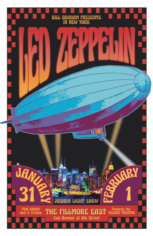
David Edward Byrd: Inspiring “Wowie-Zowie” for Over 50 Years
With a career that spans over half a decade during the art, music and technological revolution, David Edward Byrd has developed iconic posters and illustrations associated with the best of the rock and theatre era.
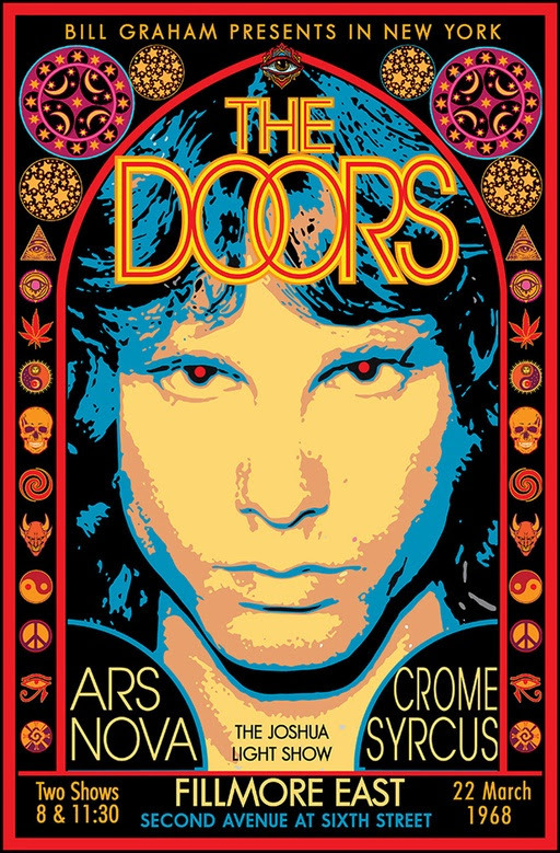
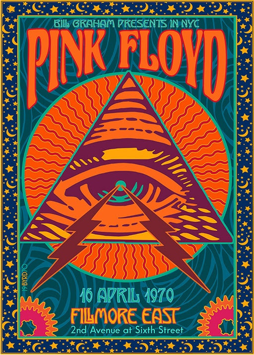
David has been creating posters since his days at The Fillmore East in NYC where he created the famed 1968 Jimi Hendrix poster now in the collection of MOMA, NYC. As well, he created the poster for The Rolling Stones 1969 Tour, TOMMY by The Who, The Grateful Dead, & the legendary 1969 Woodstock Poster. He quickly moved on to Broadway, where he created images for Follies, Godspell, Jesus Christ Superstar, Hot L Baltimore, The Magic Show, & Little Shop of Horrors amongst many others. He was Sr. Illustrator at Warner Bros. Consumer Products for 12 years where he worked on everything from Bugs Bunny to Harry Potter. He has had Retrospective Shows in Los Angeles, New York & Seattle. He now lives in the Silver Lake area of Los Angeles with his husband of 39 years, Jolino Beserra, a renowned Mosaic Artist.
ORDER A CUSTOM ILLUSTRATION
Q. Any reason why you chose to illustrate for 60s rock bands in particular?
David Edward Byrd: I was the poster artist for the Fillmore East in NYC from its opening on 8 March 1968 to 27 June 1971 when it closed for good. At this same time, I was also creating posters for the Broadway Theatre (“Follies”, “Godspell”, etc.). As Rock Posters have a much higher profile than Theatre Cards, I chose that area to illustrate. Also, Theatre is about THIS play right NOW, while 60s Rock is about 60s Rock in general.
Q. What kind of changes do you see when you compare the posters that were created in the 60s to the ones that are created today?
David: The rock poster artist EMEK is a great example of the younger generation’s expertise in the art form (see “Coachella”). Whereas, David Singer is an example of the “Old Garde” moving on to create new imagery (see “Moon Alice”). I still create more East Coast imagery, I think . . .
Q. One of your Hendrix posters is ranked among Billboard’s Top 10 Rock Posters of all time. What was your thought process/ inspiration while you created the poster?
David: Before coming to Manhattan in 1967 I had worked as a freelance Architectural Draughtsman, so I was familiar with the tools of that trade, and thus I decided to apply this craft to the 1968 Jimi Hendrix Experience poster. I created Jimi’s & his band-mates hair using a hexagonal grid with small circles on the grid representing cosmogenic pixels that one might perceive after ingesting certain popular chemicals of the time (see “Acid”). Each small circle was drafted with a drop-bow compass on the center point of the hexagonal grid.
A laborious process, but worth the time . . .
Q. The poster you created for the Woodstock Festival was rejected because it was too risque in 1969. Do you think it would have received a different response if it was designed today?
David: Absolutely — an entire sexual revolution has occurred over the last 50+ years. Ironically, the nude female in the center of the poster was copied from the 1847 painting “La Source” by Jean Dominique Ingres, which seemed a perfect symbol for a poster representing “An Aquarian Exposition” (the “Water Bearer”). But the Wallkill City Council thought otherwise (exposed breasts & pudenda a no-no). I had a similar experience with the NY Times treatment of my “Tommy at the Metropolitan Opera” full-page ad in the Sunday Times, which featured a nude Tommy rising into Pinball Heaven — the Times editor chose to paint a crude Black Marker Jockstrap over his very modest genitalia, alas.
Q. What would you describe interacting with so many rock artists like? Any favorites whose company you enjoyed?
David: Manhattan & San Francisco are light-years apart both culturally & artistically. The West Coast artists created Psychedelia and Neo-Nouveau and are due to the many encomiums they have received for this. David Singer and I were friends and we traded posters. David created the most Fillmore West posters (60 total) of any artist on the planet. For me, his posters are the Apex of the West Coast work. Victor Moscoso influenced my design sense with his vibrant close-value posters (see “Sopwith Camel”) and continues to do so today.
Q. Can you describe your experience at Warner Bros. How were those 12 years different from working elsewhere?
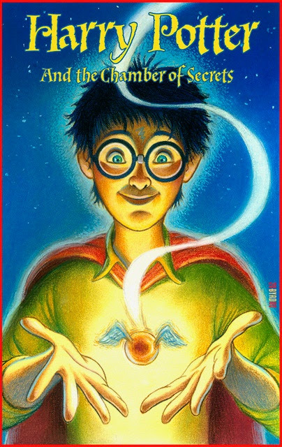
In 1991, I took the position of Senior Illustrator at Warner Bros. Creative Services, which I held till 2002 • Besides creating illustrations, backgrounds and style guides for all the Looney Tunes & Hannah-Barbera characters, I got to create commemorative plates for The Franklin Mint, souvenir posters for the Batman series of films, style guides for feature films such as Space Jam, The Wizard of Oz, and television shows such as Friends, The Cartoon Network and Scooby-Doo • My department was responsible for the Bugs Bunny Postage Stamp, the first cartoon character on a U.S. Postage Stamp • I created special signed pieces for The WB Studio Stores Galleries based on The Masterpiece Series style guide art that I painted in 1999 • I also did a great deal of work on the style guides for two of the Harry Potter films: Harry Potter & The Chamber of Secrets and Harry Potter & the Prisoner of Azkaban.
One rarely sees the Graphic Collections of major museums on display, so being part of a museum collection as a poster artist does not put one on the creative map, so to speak. But it is a nice thing to tell one’s sweetheart.
Q. Your work is displayed in 23 museums at the moment, including the Louvre in Paris. Do you find it a rare accomplishment considering you are an illustrator and not a painter?
As I have often said if I had remained a painter I probably would not be in any Museum at all. But this is not for me to know. One rarely sees the Graphic Collections of major museums on display, so being part of a museum collection as a poster artist does not put one on the creative map, so to speak. But it is a nice thing to tell one’s sweetheart . . .
Q. From Fillmore East to Broadway to Warner Bros, how has your style evolved over the years?
My art-chops improved immensely in the last 20 years. I hope it is somewhat evident. My work was hit-or-miss in the beginning but things have gotten better of late.
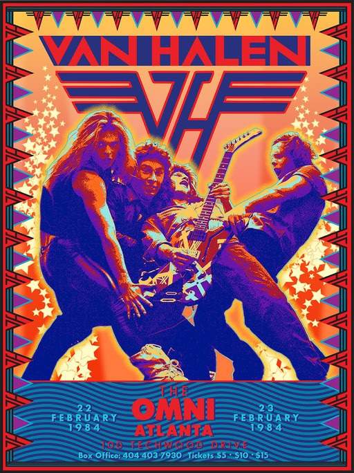
Q. Can you name some of your favourite posters which you have worked on?
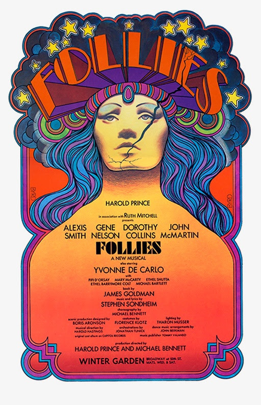
“FOLLIES” 1971
“HENDRIX EXPERIENCE” FE 1968
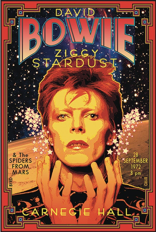
“BOWIE” Carnegie HALL 1972
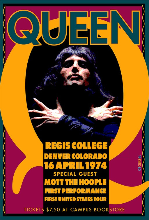
“QUEEN” 1st Tour 1974
“PRINCE” DNA 2013
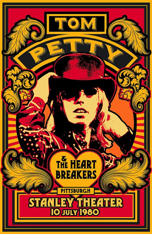
“TOM PETTY” 1980
“NY DECO EXPO” 1974
LED ZEPPELIN FE 1969
Q. What is your process like when coming up with an illustration or a poster?
1.) Collect Reference & inspiration in Folder.
2.) Create rough pencils for scanning.
3.) Collect possible Fonts.
4.) Build rough designs on Mac
5.) Choose 1 main color and build up from that
6.) Proof printing
Q. What software do you use to create your illustrations?
ADOBE SUITE (PhShop; Illustrator; InDesign) + Typestyler
Q. Lastly, what do you always aim to achieve through your illustrations?
Eye-Fun • Immediacy • Gotcha • Who-Is-This-Guy? • Wowie-Zowie
3 notes
·
View notes
Text
ZSUITE REVIEW – BECOME A PRO FROM SCRATCH
Generally, zSuite OTO is a 4-in-1design app containing Youzign, Gifzign, Mockzign and Logozign that enables anybody to create engaging and stunning Graphics, InfoGraphics, Logo, Gif, Mockup, many more... from scratch. Since zSuite is niche-independent so it's going to provide you with unlimited choices for marketing campaigns, introducing a new product or promoting new.

Another fantastic part is, the industrial License included enables you to be a real freelancer by supply professional design service and charge hundreds dollars. Such a possible land, is not it?
So, what's inside these 4 design apps that make zSuite stick out? Go on reading and you'll know.
Martin Crumlish is the name behind this product. His name is really famous for showing up on leaderboard so frequently. Apart from being a gifted digital marketer, Martin also specializes in creating software helping people deal with traffic generation, designing website,... Some of his previous products that made thousands of sales: Social Mobi Surveys, Social Mobi App, WP Dollar, SocialNeos,...
ZSuite was born after 4 years exploring and generating by Martin with his partners Magnus and Bertand. It passed through several tests through the years and perfected.
Besides including 4 strong design apps, zSuite is filled with other awesome benefits. Let's dig into these 4 software first then I will show you the rest.
App 1: YOUZIGN
Use Youzign in form of:
Youzign online platform
Youzign Desktop app
Youzign WordPress Plugin
Youzign Android and iOS mobile programs
Features inside Youzign:
Unmatched drag n drop interface
Borders and shadows
60 design formats and preset sizes
Huge pool of templates, never battle for inspiration again
Supports any languages on Earth
Share designs with any other user
Smart guides that will assist you maintain straight lines and design properly
100s of built-in high resolution images and icons sorted in categories, such as arrows, backgrounds, patterns, buttons, play buttons for videos, mascot characters, and much more we are adding graphics every day.
One-click wallpapers, tee-shirt designer
Background removal
Instant preview technology
Create from scratch or start with a picture
Free access to Youzign market, easily sell your designs
All design formats constantly monitored and updated
Integrated into 50+ top marketing programs
Organise your designs in folders, create unlimited folders
Save designs as templates and re-use unlimited times
Millions of integrated copy-right free pictures
Retrieve your designs on your favourite apps with Youzign API
App 2: GIFZIGN
Gifzign is a Desktop app for PC and Mac that helps you to:
Turn any video on Youtube, Vimeo or your personal computer to a GIF in just a few seconds
Record a video from your camera or screen and turn it into a GIF
Customize your GIFs with text and graphics
Add other special effects like looping, instagram-like filters, and more
Produce cinemagraph with any uploaded, cloud video or recorded video
Select different GIF Player styles with dynamic behaviors
Select different frame mockups
App 3: MOCKZIGN
Mockzign is a Desktop app for PC and Mac that helps you to:
Simultaneously create 100+ mockups using a single picture add
100+ different mockup templates
Create notebook mockups, apparel mockups, tablet mockups, desktop mockups, telephone mockups and more
Easily edit and edit your mockup pictures; resize, crop or rotate to fit your display
Upload an image from your computer or beam from any place on the internet with one click
Produce mockup that are prepared for printing and also optimised for the internet
App 4: LOGOZIGN
Logozign is a Desktop app for PC and Mac that helps you to:
Create unlimited logos on your own and clients the easy way
Layout with No specific skills needed
Immediate real-time downloadable logo mockups
Monogram features included
Mascot features included
Modern icon library with millions of icons
Use different logo styles and containers
Choose Modern design criteria
Upload and use your own fonts
Save your logo project and continue editing later
Upload SVG files and continue editing them with Logozign to Improve your logos
Last but not the least, in order to offer you a decent with experience, the team will bring you some other amenities
Commercial license is included so that you can sell your designs and keep 100% profits
YOUSTART Video Training Course: Everything you need to know about getting started with Youzign, visual advertising and launch your brand online even if you have zero design skills.
24/6 Support: there should be some time you battle hard to manage a couple of tasks, then don't hesitate to contact for support
30-day money back guarantee
Weekly training webinars: Join the zSuite for one hour of free training each Friday. Plus instant access to nearly 2 years (100+ webinars) value of recorded training.
Now, let's take a look at some people's opinion about these 4 apps:
Prior to coming to zSuite, perhaps you must use these 4 software instead. All take you monthly recurring fee, at $73 a month! Oops! This price is not certainly profitable for business owners who has low-budget, a newbie or a startup. That's why you should seriously think about getting zSuite, meaning using a access to 4 design apps with the same outstanding features and the cost is really affordable. $67 one time payment for forever using.
The second reason is, you know Upwork -- the most significant labor market for freelancer?
Companies, Organizations, Entrepreneurs are hungry for these kinds of designing service. The demand keeps growing all of the time. For people who don't need to do dead-end job , you can try getting a professional designer working at home. Since zSuite has all types of necessary, niche-independent templates and design together with complete customization, it enables you to develop your imagination from zero and make money from it.
HOW TO GET IT TO WORK?
You need to be curious how it performs in action. So, please listen to my next illustration on a few basic design
Building a LOGO WITH LOGOZIGN
There are 4 sections You Need to notice when creating a Logo: Name, Slogan, Symbol and Container
Step 1: Name your own Logo, and make a Slogan
Step 2: Upload SVC in Symbol segment and make some adjustments
A few alterations on text: Size; Font, Spacing, Color
You have a stunning Logo like below:
Step 3: Save and Download
You may also save Transparent version when clicking on it in Container section.
Here is the main DASHBOARD
Step 1: After you log in, hit the"NEW DESIGN" button to begin create a new one
As you can see, apart from Facebook, you have the ability to create impressive cover for virtually all of the social platforms such as Twitter, Youtube, Instagram, Pinterest,...
Step 2: Designing procedure
There are 4 sections: Background, Graphics, Text, Filter, Upload
Search Graphics on Pixabay based on key word
After adding text and correct it, you can also insert your designed logo on the cover
Step 4: Save and Download
Building a GIF AD USING GIFZIGN
Step 1: Choose from the GIF library or decide to upload your own/ record a new one
Step 2: Make a few adjustments
Upload your intended logo
Adjust the length of the GIF
Go to Filters if you want to test what kind of color is suitable
Step 3: Save the GIF and it will appear on the dashboard so that we can preview it
Step 1: Choose a kind of mug you would like to design
Step 2: Click on"PLUS" button that I highlight on the step 1 picture to upload your intended logo
Step 3: Hit download on the right corner
Above all, zSuite also instructs carefully on how to upload all these logos, covers or GIF in your Facebook or other social media network. A summary video for you to recap everything you can do with
To be clearer, please watch the DEMO VIDEO under:
youtube
https://uprafficoto.com/
1 note
·
View note
Text
ZSUITE REVIEW – BECOME A PRO FROM SCRATCH
ZSUITE REVIEW -- WHAT IS IT ABOUT?
Normally, zSuite OTO is a 4-in-1design program containing Youzign, Gifzign, Mockzign and Logozign that allows anyone to create stunning and engaging Graphics, InfoGraphics, Logo, Gif, Mockup, many more... from scratch. Since zSuite is niche-independent so it's going to provide you with unlimited choices for marketing campaigns, introducing a new product or promoting brand.

Another fantastic part is, the Commercial License included enables you to be a true freelancer by supply professional design service and charge hundreds dollars. Such a possible land, isn't it?
So, what's inside these 4 design programs that make zSuite stand out? Go on reading and you'll know.
ZSUITE REVIEW -- ABOUT THE CREATORS
Martin Crumlish is the name behind this product. His name is truly well-known for showing up on leaderboard so frequently. Besides being a gifted digital marketer, Martin also specializes in creating software helping individuals deal with traffic generation, designing website,... Some of his previous products that made thousands of sales: Social Mobi Surveys, Social Mobi App, WP Dollar, SocialNeos,...
ZSuite was created after 4 years researching and generating by Martin together with his partners Magnus and Bertand. It passed through several tests through the years and perfected. They all hope to provide you with the ultimate design package
Besides including 4 powerful design programs, zSuite is filled with other amazing benefits. Let's dig into these 4 applications first then I will show you the rest.
App 1: YOUZIGN
Use Youzign in form of:
Youzign online platform
Youzign Desktop program
Youzign WordPress Plugin
Youzign Android and iOS mobile programs
Features inside Youzign:
Unmatched drag n drop interface
Borders and shadows
60 design formats and preset sizes
Huge pool of templates, never struggle for inspiration again
Supports any languages on Earth
Share layouts with any other user
Smart guides to assist you maintain straight lines and design correctly
100s of built-in high resolution graphics and icons sorted in categories, such as arrows, backgrounds, patterns, buttons, play buttons for videos, mascot characters, and much more we are adding graphics daily.
One-click wallpapers, tee-shirt designer
Background removal
Instant preview technology
Create from scratch or start with an image
Free access to Youzign market, easily sell your designs
All design formats constantly monitored and upgraded
Integrated into 50+ leading marketing programs
Organise your layouts in folders, create unlimited folders
Save layouts as templates and re-use unlimited times
Millions of integrated copy-right free images
Retrieve your layouts on your favourite apps with Youzign API
App 2: GIFZIGN
Gifzign is a Desktop program for PC and Mac that helps you to:
Turn any video on Youtube, Vimeo or your computer to a GIF in just a few seconds
Record a movie from your camera or screen and turn it into a GIF
Customize your GIFs with text and images
Add other special effects such as looping, instagram-like filters, and more
Produce cinemagraph with any uploaded, cloud video or recorded video
Select distinct GIF Player styles with dynamic behaviors
Select different frame mockups
App 3: MOCKZIGN
Mockzign is a Desktop program for PC and Mac that helps you to:
Simultaneously create 100+ mockups using a single picture add
100+ different mockup templates
Create notebook mockups, attire mockups, tablet mockups, desktop mockups, telephone mockups and more
Easily edit and customise your mockup images; resize, crop or rotate to fit your display
Upload an image from your computer or beam from any place on the internet with one click
Produce mockup that are prepared for printing and also optimized for the Online
App 4: LOGOZIGN
Logozign is a Desktop program for PC and Mac that helps you to:
Create infinite logos on your own and customers the easy way
Design with No specific skills needed
Immediate real-time downloadable logo mockups
Monogram features included
Mascot features included
Modern icon library with millions of icons
Use different logo styles and containers
Choose Modern design standards
Upload and use your own fonts
Save your logo project and keep editing afterwards
Upload SVG documents and keep editing them with Logozign to add to your logos
Last but not the least, in order to offer you a decent with experience, the team will bring you some other amenities
Commercial license is included so that you can sell your layouts and keep 100% profits
YOUSTART Video Training Course: Everything you will need to know about getting started with Youzign, visual marketing and launching your brand online even if you have zero design skills.
24/6 Support: there should be some time you struggle hard to handle a few tasks, then feel free to contact for support
30-day money back guarantee
Weekly training webinars: Join the zSuite for one hour of free training every Friday. Plus instant access to nearly two years (100+ webinars) value of recorded training.
Now, let us take a look at a few people's opinion about these 4 apps:
Prior to coming to zSuite, perhaps you must use these 4 applications instead. All take you monthly recurring fee, at $73 a month! Oops! This price isn't certainly profitable for business owners who has low-budget, a newbie or a start-up. That's why you need to seriously think about getting zSuite, meaning using a access to 4 design programs with the same outstanding features and the price tag is truly affordable. $67 one time payment for forever using.
The next reason is, you know Upwork -- the most significant labor market for freelancer?
Companies, Organizations, Entrepreneurs are hungry for these sorts of designing service. The demand keeps growing all the time. For those who don't want to perform dead-end occupation anymore, you can try getting a professional designer working at home. Since zSuite has all kinds of necessary, niche-independent templates and design together with complete customization, it enables you to develop your imagination from zero and earn money from it.
HOW TO GET IT TO WORK?
You must be curious how it performs in action. So, please listen to my following illustration on a few fundamental design
Building a LOGO WITH LOGOZIGN
There are 4 sections you have to notice when creating a Logo: Name, Slogan, Symbol and Container
Step 1: Name your Logo, and make a Slogan
Step 2: Upload SVC in Symbol section and make some alterations
A few alterations on text: Size; Font, Spacing, Color
You have a gorgeous Logo like below:
Step 3: Download and Save
You can even save Transparent variant when clicking on it in Container segment .
MAKING FACEBOOK COVER WITH YOUZIGN
Here's the main DASHBOARD
Step 1: After you log in, hit the"NEW DESIGN" button to start create a new one
As you can see, apart from Facebook, you have the ability to create impressive cover for virtually all the social platforms such as Twitter, Youtube, Instagram, Pinterest,...
Step 2: Designing process
There are 4 sections: Background, Graphics, Text, Filter, Upload
Search Graphics on Pixabay based on keyword
After adding text and correct it, you can also insert your designed logo on the cover
Step 4: Download and Save
Then you can download in form of PNG; PDF; JPG
Building a GIF AD USING GIFZIGN
Step 1: Choose from the GIF library or Opt to upload your own/ record a new one
Step 2: Make a few adjustments
Upload your designed logo
Adjust the length of the GIF
Go to Filters if you want to test what kind of color is suitable
Step 3: Save the GIF and it will appear on the dashboard so that we can preview it
Making Mockups (for MUG) with Mockzign
Step 1: Choose a kind of mug you want to style
Step 2: Click on"PLUS" button that I highlight on the step 1 picture to upload your designed logo
Step 3: Hit download on the right corner
Above all, zSuite also instructs carefully on how to upload each of these logos, covers or GIF on your Facebook or other social networking network. A summary video for you to see everything you can do with
To be clearer, please watch the DEMO VIDEO under:
youtube
https://uprafficoto.com/
1 note
·
View note
Link
Top 25 eye-catchy business card design trends for 2021
Business card design is a real brand opportunity! Check out the top business card design trends for 2021 that will tie your brand together.
The days of generic business or contact cards are long gone. Today, your business card needs to sell what you are selling and significantly impact the viewers’ minds. Instead of thinking of your business card design as an afterthought — think of it as an opportunity to showcase your brand.
Your business card design is like a handshake that leaves potential clients impressed and inclined towards choosing you over the rest.
A powerful yet simple and easy to read business card portrays you as a professional who is savvy and tasteful. It also shows potential leads that you are someone to do business with.
A great business card design is your calling card as an entrepreneur, quite literally. A well-executed business card design gives insight to people about your approach towards the business and leads them to think that if you can create an impressive business card, wonder what you accomplish for your clients. Each year comes with some great new business card design trends, with each trend spiking a wave of inspirations for many designs to come.
Here we have 25 eye-catchy business card design styles all set, ready, and making the rounds for 2021.
These designs or their adaptations are bound to impress your clients:
1. Understated and Tasteful
When it comes to design, “Less is More” is a golden rule that always works. Appropriate and tasteful use of fonts, colors, white space makes the understated look a sellout. More companies are going with this clean look in order to communicate the necessary details such as name, phone number, email id, website, etc. while maintaining a sophisticated look in-line with their brand personality.
Image Source: plantmade
2. Heavy and Strong Cardstock
Business owners often focus on a handful of aspects while designing a business card such as the Font, Colour, Layout, etc. Printing and Cardstock GSM are a few crucial features that are often overlooked in searching for a great business card design. Using the right cardstock can be instrumental in setting the right tone for your brand personality. Heavy and thick cardstock translate that your business stands for substance and quality, two essential qualities customers look for. Most businesses prefer a 24 point cardstock to create a lasting impression for their business. Ask your business card maker for some cardstock samples before choosing the one that suits your needs and meets the budget requirements.
Image Source: Publicide
3. Die Cut Business Cards
Each day millions of business cards are exchanged worldwide, and most of them get lost amongst the piles of cards in a desk drawer, never to be seen again. Choosing a shape different from the generic rectangle for your business card gives it a finding chance. You can enhance your logo’s outline by adding it to the card design’s edge or even create a die-cut for the company’s initials. These add flair to the design and make the business card and, therefore, the business memorable. In case you do not wish to opt for a dramatic card shape, you can choose a portrait-style business card instead of the traditional landscape design.
Image Source: nvision-that
4. Big and Bold Typefaces
Companies usually avoid using bold designs, fearing it would come as too strong. In 2021, this trend seems to be changing, and more organizations are adopting the mantra of “Bold. Strong. Exceptional.” The key is to ensure that the card design’s solid colors are the same as used across all marketing tools such as brochures, posters, etc. You should use the same typeface being used in all other marketing campaigns to reinforce brand identity.
5. Rustic and Natural style
Vintage was the new look in 2020. What started as a somewhat whimsical theme trend for weddings and furniture has made its way to graphics as well. Today, companies are looking for a more rustic and natural style for their business cards to portray long-standing relations.
Image Source: autosmasestilo
6. Interactive Business Card
Business cards used to be a one-way communication platform where the business owners would share their details with prospective clients. The use of interactive design is one of the business card design trends which has reformed this. In 2019, you will find a lot of unique designs that are great for user engagement. Such designs make your business memorable for years to come if appropriately executed.
Image Source: feeldesain
7. Focus on Branding Elements
It is always recommended to keep in mind the various surfaces where you will be using your brand’s focal elements such as your logo. Hence as you set out to create a logo, consider how it can enhance a business card design. But in case you already have a logo design ready, and in place, you can add it cleverly on your business card to make a larger impact. Companies are now opting for designs with the branding elements as the star.
8. Minimalist Design
Minimalist design trends have been gaining popularity not only for business cards but also when it comes to other marketing tools such as a logo or Email Signature. The clean and simple design makes it easier for users to focus on the relevant details such as your contact information, company details, etc.
Minimalistic design settings also provide ample area to add clear and modern fonts in various settings. The designer can also add a single bright element to introduce intrigue or keep the design simple based on the client’s needs.
Image Source: Creative Market
9. Bright Painted Edges
Edges were one of the most underutilized spaces of a business card design. But with the new trends of using a single color and bold typefaces, painted edges have emerged as the latest business card trends. Bright edges give a business card a distinctive look. It creates a unique visual element as compared to traditional business cards.
Image Source: brokeradvocate
10. Artsy and Fashionable
The audience has a significant influence on the execution of a companies design. For instance, the first step you take towards building a brand is designing a logo, and the very first question a logo designer raises is the kind of audience you are targeting.
Nowadays, companies have stepped out of the shadows of traditional cards that all looked the same, no matter the brand personality, product, or even the industry. Now, if you are dealing in areas such as fashion, home furnishings, handicrafts, etc., you can create your business card to mirror the tastes and preferences of your audience.
Image source: Zcache
11. Transparent and Clear Business Cards
The trend of using transparent and clear materials to design business cards is a breath of fresh air in the world of conventional business cards. Most of the business cards come off as similar, while clear cards have the potential to shine in the limelight. You can choose to keep your business card as entirely transparent or partially based on your design preferences.
Image source: Pinterest
Image Source: Cleverhippo
12. Recycled Cardstock
Companies are becoming environmentally friendly each year and looking for more ways to give back to nature. This also sends a powerful message to the audience that you care about the ecosystem and indulge in positive impact activities. Recycled printing materials are, therefore, no longer limited to paper bags and notepads in 2019. Now business cards printed over recycled cardstock are gaining popularity because of the environmental benefit as well as the potential to connect with the audience emotionally.
Image Source: reubenmiller.typepad
13. Plantable Business Cards
What’s better than a business card that has contributed to the environment by being recycled? A business card that can be planted! The trend of plantable business cards is growing on people. The material is textured recycled paper with seeds embedded below the surface. All that needs to be done once the card has served its purpose is to tear it and bury it. This process forges a bond with the customer making your brand memorable for them.
Image Source: Stationary Scoop
14. Glow in the Dark
Who doesn’t love the glow in the dark elements? Business cards need not be serious; adding fun or humorous features can go a long way in adding to the brand’s memorability. This trend is undoubtedly staying with the companies for a while since more companies are opting for mirroring their brand personality in their marketing campaigns.
Image Source: behance
15. Tearable Cards
A client will remember the cards which are not only relevant but also involves them taking action. For instance, this business card for a divorce lawyer can be torn in half and shared by both the parties. This would leave a lasting impression on the clients more than a conventional business card. The key is to note that both parts of the card have the contact details to still serve the purpose, even after being torn.
Image Source: Pinterest
16. Multi-Tool Business Card
In 2020, companies were focused on lasting impressions. Multi-tool business cards provide users with small tools that can be used for performing some useful functions. Imagine how much impact it will make on your clients if your business card, instead of being tossed aside in a pile, becomes a keepsake for them.
For instance, this business card can also be used in minor issues and maintenance of your bike. Apart from setting you apart from the crowd, such designs also help you convey your audience that you care about their convenience and needs.
Image Source: sevenwaysto
17. Business Card that is also a Seed Packet
Another alternative to using a seed paper that eventually gets destroyed is creating a small sleeve that carries seeds. This would ensure that there is a contribution to the environment, and the client will also remember your brand for a long time.
Image Source: Pinterest
18. Cards made up of Fabric instead of Cardstock.
When it comes to using recycled materials in the marketing, it is not limited to just paper. The latest trend for business cards, especially in the furnishings and fashion industry, uses fabric swatches from the leftover cloth to create attractive business cards. These industries run on creativity, and using fabric business cards provides a brand new avenue to showcase even more creativity.
Image Source: Pinterest
19. Unusual Materials
Using unusual material for your business cards automatically provides an added advantage over everyone else. It makes your business card stand out and add an innovative touch to your marketing campaign. As you hire a freelancer or a graphic design services agency, sit with them and discuss at length how some unconventional materials can be utilized for your business cards. You can also use an online graphics tool such as Designhill and create your own simple design, which can then be printed on the surface you want for your business card.
Some yoga studios consider creating business cards with rubber just like a yoga mat. A cheese store creating a business card shaped like a cheese grater and a protective sleeve is another example of how non-traditional materials can create some powerful and unique business cards while showcasing brand philosophy.
Image Source: Jemome
20. Edible Cards
Edible business cards are great for companies offering edible items. The business card can be your product samples such as chocolate, cookie/cracker, meat, or fruit leather with your information engraved on the surface. This sparks maximum engagement with the customer and ensures that they remember your business for a long time. Add to that the intrigue of trying more of the merchandise once they have had the first taste, and you have a lead conversion. The key is to make sure that the item has a longer shelf life and would be welcomed by the masses.
Image Source: Pinterest
21. Sample Business Card
Business cards serve the purpose of telling the prospective clients more about your business, sometimes even when you are not present there physically. There is no better way of introducing your company than serving a sample of your product along with your business card. For instance, this business card also doubles up as a teabag, which helps users sample the tea they offer.
Image Source: Pinterest
22. Sliding Business Cards
Sliding business cards employ the effect of movement to capture users’ attention. It adds a playful or even whimsical element to the business card. The user can slide one part of the card to view contact information, or the sliding action can result in an implied message for the client.
For instance, in this card design for Caroline Boisvert, a training and development consultant, designer Michel Valois was able to create something interactive, meaningful, unique, and yet simple at the same time in the form of a sliding business card. As the user slides up the tab to reveal Caroline’s name, it shows growth. They are able to convey that the growth has begun even as you make the first contact. Impressions like these may appear subtle but have a lasting impact in the long run, especially when it comes to branding.
Image Source: Behance
23. Business card design with QR Code
The QR code is the new kid on the block. From payments, registration, identification to even tattoo designs, QR codes are everywhere. Adding a QR code that takes the user to your website is a new way of combining traditional and modern marketing techniques beautifully.
Image Source: 708 Media
24. Thermo Sensitive Cards
What started as a unique business card trend for photographers initially has caught up with everyone else. The business cards made with black colored heat-sensitive material turn to different grey shades with various heat and finally white at body temperature. This is yet another trend coming up to interact with the clients using the business card.
Image Source: Fast Company
25. Coaster Cards
Who would have thought coaster as business cards would be the talk of town one day? But today, more and more companies, especially the restaurants, event planners, caterers, etc. have embraced this trend for their business cards. Not only are the business cards reusable as coasters obviously, but they also act as great conversation starters at events when appropriately designed.
Image Source: webfx
Final thought
Whether you think you need it or not, your business needs that boost of fresh energy that a creative business card design brings. Anything that gives your business an edge over the competition is always welcome. It also proves that you take the business seriously and are a professional through and through.
With great graphic design ideas on your side, you can create a unique and innovative identity for your business while generating leads simultaneously. The best part is you don’t have to be restricted to using the unsaid rules for designing a business card anymore. You can combine more than one of these trends for 2019 and create a spectacular design for your business card.
0 notes
Text
Brandfy Review Discount And Bonus
Brandfy Review - Are you searching for more knowleadge concerning Brandfy? Please check out my straightforward evaluation about it prior to choosing, to review the weak points as well as staminas of it. Can it be worth your time and effort and cash?
Presenting Brandfy - What Is It?
Brandfy is a new cloud technology but basic to use graphics software that helps anybody, specifically the newbies, to produce magnificent graphics with expertise in mins.
Why is Brandfy so cool?
Brandfy is the excellent platform for graphics production. With Brandfy any person cand be a graphic designer.
You can access it whenever and it features the most impressive attributes that enables your imagination to be complimentary and also to create an ideal and authentic visuals, for you, your business or your clients.
With Brandfy you have any design you need for your internet site or social networks, video clip, advertisements as well as much more, at your fingers.
Moreover, there are ready-to-use layouts for fast and sensational outcomes. These templates can be made use of as well as also customized according to your own wishes.
So, here is what you can do with this gorgeous Brandfy:
Branding:
Logo design
Business Card
Motto Generator
Social network:
Square Image
Cover
Story
Post
Advertisements:
Picture Ads
Square Ad
Banners
Video Advertising:
Youtube Thumbnail
Shopping:
Item Discussion
10 Beneficial Devices to Craft Beautiful Video for Social Network (Part 1)
Aesthetic web content is the money of sharing on social media sites. Text-only updates can just share a lot and also obtain thus far. Below are 3 statistics that prove the well worth of visual advertising.
Initially, 66% of all social networks articles are or consist of aesthetic web content.
Second, forget socials media understood for their aesthetic material, like Instagram and also Pinterest, that permit photo sharing. In 2013, Facebook became the largest image sharing internet site, with its customers publishing 350 million images every day.
Third, use of photos was ranked as one of the most essential social networks optimization technique, in a 2014 study by Adobe and Software Application Guidance.
As well as, it's not just limited to social networks ... Content with pertinent aesthetic material additionally obtains 94% even more sights than a web content method without it. Even social media sites systems now concentrate on visual advertising and marketing in their redesigns.
It's clear:
Social media network customers enjoy to connect with aesthetic content. But, there's one difficulty numerous online marketers may deal with in developing social networks graphics as well as integrating visuals into their content technique ...
Creating social media graphics and also general website design pictures that are compelling, on a shoe-string budget plan, without employing any kind of exterior help like graphic developers or specialist image editors.
About 5 years back, local business owners can have said this was a significant trouble. They might require to wrestle with Photoshop as well as various other graphic style editing and enhancing Brandfy devices.
Now, we've got a variety of fantastic photo editing and enhancing devices, on the internet photo editors and also picture editing and enhancing applications that enable us to craft sensational graphics for our content technique quickly.
In this blog post, I'll present you to 10 amazing image editing devices featuring a large range of modifying alternatives.
All set to find your creative side and also end up being the only graphic developer you'll ever need?
Allow's go.
1. Pablo
This is a free online photo editor by the brilliant Buffer team. With it, you can craft social media-friendly photos super quick.
You're admitted to 25+ fashionable font styles, 600k+ searchable pictures and a range of sizes to match various social media sites platforms.
You can choose from a range of templates and also filters and likewise post your own image/logo and add text overlay and also quotes.
As soon as you're done, the Brandfy picture editor tool enables sharing on social media sites platforms, including the post to your Barrier line and also downloading the visuals.
If you're surfing the internet and like a certain quote/image, then Pablo also has a Chrome expansion that you can download and install below. As soon as you float over an image, you'll see a Pablo icon in the lower ideal edge. Clicking this symbol will open the Pablo dashboard, in a brand-new home window.
The most effective component is that you can access every one of these features without even logging in. Right here's a fast 30-second tutorial for Pablo 2.0, launched by Barrier in October, 2015.
Brandfy Review & Overview
Creator: Rusu Marian
Product: Brandfy
Release Day: 2019-Jul-15
Release Time: 11:00 EDT
Front-End Price: $25
Sales Web Page: https://www.socialleadfreak.com/brandfy-review/
Niche: General
Exactly How Does Brandfy Job?
Action 1: Select Live Builder or Usage Templates (If you select- Usage Templates- there various types of ready-to-use themes as well as you can customise according to your requirements. If you select- Live Building contractor- you can create that visuals that you want from scratch as well as you have all the plan you need, like a specialist graphic developer);.
Step 2: Add text as well as personalize it;.
Action 3: Choose or publish image/choose icon, after that personalize them;.
Tip 4: Download and install the graphic developed, with simply one click.
What i like the most at Brandfy?
You can enjoy this wonderful tool- LIVE HOME BUILDER- that provides the greatest chance to create something brand-new and genuine, to draw in the interest of as lots of consumers as possible.
This choice-- Real-time Contractor- consists of:.
Different professional background that you can personalize with the colour you want.
Text- here you write the text that you require, after that you can choose the font style, design and the colour.
Photos- right here you can publish something that you like or you can make use of the Brandfy pictures which are spectacular. These pictures can be personalized as a result of image filters such as: Grayscale, Invert, RemoveWhite, Sepia, Sepia2, Blur, Emboss.
Icons which are organized right into the adhering to classifications: Arrowheads, Business, Dialogue, Emoticons, Safety, Sports
Export/ Save
With this Live Builder you can produce the coolest graphic as you desire, starting from scratch, however having everything available like the best visuals developer.
What I didn't like at Brandfy?
Brandfy also offers a Pro version with more professional backgrounds and also aspects as well as design templates, each month, so you will have many possibilities to choose from, so you will not recognize what to choose.
Brandfy Rate & Assessment
$ 24,95 - For An Extremely Restricted Time, Once Financial Investment Today-- No Regular Monthly Costs.
Just $27/Month - You can Obtain INSTANTANEOUS Access to Brandfy PRO with Design Templates Club.
All these above await you to make use of at simply $24,95 One Time Settlement very restricted time. Simply click here to see Brandfy and also you'll obtain instant access to whatever.
Costs expose the high quality and also the leading graphics crammed in one awesome product- Brandfy- that you can have it, now. Additionally, there is a Pro variation of Brandfy.
Pro variation comes with brand-new and expertly plan, each month. I recommend it to you, if you need occasionally to develop new and awesome things.
So, if you like to do great graphics and you wish to receive, each month, NEW as well as COOL TOOLS such us: themes, backgrounds as well as components, this indicates PRO BRANDFY is MADE FOR YOU.
Moreover, PRO will certainly thrill you with Picture Cropper, that will certainly reduce your operate in the cropping procedure and also assurances you will not shed money in search of the right individuals to make your excellent graphics for you.
Unlimited accessibility to Cloud Files. Cloud Data Technology enables you to keep all the files you developed total automat.
All this pro functions will conserve your time due to the fact that it provides you the complete bundle every month with every little thing you require. Now, at just $27 On a monthly basis.
Brandfy Verdict
Brandfy is a developing software device that is high-quality as well as easy-to-use.
So, the most effective means to convince on your own that Brandfy is so marvellous, is to simply acquire it now at an Unique Release Cost for just one-time repayment as well as take pleasure in the combination of simplicity and also professionalism and trust incorporated in an authentic method.
0 notes
Text
How to optimize your website images
Given the nature of its services, a moving company needs to provide customers with a proper visual presentation of what they offer. After all, people need to connect with your moving business on a personal basis in order to put their trust in its expertise and hire you. And one of the ways to accomplish such an effect comes through the use of optimized images on your website. Not only does it help you establish a stronger initial bond with site visitors and attract more high-quality to your website, but it also boosts your SEO efforts in the process. In this article, we explore the importance of image optimization and how to optimize your website images.
There are many ways to improve your website performance, and one of them is to optimize your website images
Running a good website can genuinely benefit your business. As a mover, you probably have a lot of images on your website as well as a blog. Perhaps, you’ve noticed that sometimes, you can’t see images or they appear to load too slow. Images are an essential part of website optimization and can significantly improve but also worsen the user’s experience. Therefore, you need to learn how to optimize your website images and make your website an attractive place for your customers.
Why is it important to optimize your website images?
Despite popular belief, images provide more value than merely a decorative element on your website. Instead, they are the visual portrayal of your brand to online users. They are the link between the services your offer and how customers see those services and your entire business in comparison to your competitors. More so than that, your moving company SEO development relies on the quality of your website images as well.
Images that are not blurry and trigger emotional reactions in others can engage them in the same ways in which content can. When you combine the two with the use of captions, readers can connect with the visual appeal of the image much like social media posts. Additionally, including alt tags for each of your images provides positive points in the eyes of search engines, giving a description for each of the images to crawlers and bots. Let’s take a closer look at the top benefits optimizing your moving company website images:
You can reduce page loading speed
Page loading speed is one of the crucial factors for online consumers today. The amount of time someone needs to spend to get the products/services/answers they need will have a significant influence on their next decision. That is why websites need to ensure that their page loading speed is always shorter than 3 seconds, as per Google parameters.
The fact is that the longer it takes your web pages to load and respond to changes, the higher the chances of users leaving your website will be. Now, there are many ways to boost your page loading speed, optimizing your image being among the most efficient ways among them. The size of the images can influence the overall load of the page, making it more difficult for devices to load the page itself. By reducing the size of the image, you can reduce the size of the page – making it easier to load on different devices.
High-quality images are great, but heavy-sized photos can slow down the load speed
Google rewards websites with optimized images
Websites with irrelevant content and poor quality images have less chance of ranking high on search results pages in comparison to optimized ones. That is why it is so important to ensure that your business implements all the tools that digital marketing for moving companies offers. Page loading speed, image optimization, font styles – these are all important elements that search engines use when ranking websites for SEO efforts.
It improves User Experience (UX)
Whether we are talking about inner pages or blog posts, your PPC landing pages, social media posts, or email marketing campaigns – images make a big difference in how your target audience reacts to it all. High-quality images that convey your message can create a lasting impression on users. Therefore, it is all the more important for you to make sure to optimize your website images in the process. So, if movers want to boost user experience for their websites and promotional campaigns, optimizing images plays a key role in this task.
Attract more visitors to your website
People respond positively to visual elements today. Social media platforms portray much of this truth in the likes and shares when it comes to images and videos. When you choose to make the added effort to optimize your website images, you create a strong chance that people will feel inspired to share it with others, earning your potential leads and links in the process. Most of all, this can expand your overall reach, helping your moving company develop as it attracts new audiences and leads in the process.
A simple guide on how to optimize your website images
To optimize your website images means to make their size appropriate, but still, preserve the satisfying quality. Furthermore, it includes optimizing your images’ SEO – improving the page’s ranking on Google search. Before we start on ways how to do it, be sure to do one more thing. You need to determine your website value and see what the problems it may have are. It’s not only about the images – there are maybe some other things you should optimize, too. Then we can proceed to the image optimization. Here’s how to do it.
Check the file format
Images come in different formats, but only some of them are suitable for website pages and faster load. Decide what you want to achieve by posting an image and decide on one of these image formats:
PNG – one of the most common formats across the web. The advantage of using a PNG image is that you can compress its size without losing the quality. However, PNGs are usually ‘heaviest’ in size.
JPG – another standard image format. The great thing about JPG images is that they carry small size and minimal change in quality. However, loss of quality does happen every time you resize them – especially in small details of the image.
GIF – gif format has become very popular in recent years. These are small size images with a limited number of colors. However, they are not used for large, beautiful images, but for animation. You can use them for icons and exciting graphics.
TIF – this format shows the highest quality, but also huge file size. Therefore, it’s not commonly used on the web, but for commercial print works.
Reduce image size …
Large image files are harder to load and therefore, take more time. That’s why when you want to optimize your website images, you need to first think of their size. You should remember that a large pixel size doesn’t always mean the highest quality. If you have a lot of images, you can reduce their size online easily at once, or do it in some other software like Adobe Photoshop.
…while thinking about its quality
Yes, it’s true that images shouldn’t be too large so the website can load faster. However, you shouldn’t overdo it. Reducing a size too much usually means low-quality images. It’s okay to reduce the image quality by 10-20%, because it doesn’t show, but anything more than that can be harmful.
Learn about the compression
Images can be compressed in two ways – lossy or lossless compression. In lossy compression, the images, usually JPEG formats, lose some of its data – which is not a big deal but helps to reduce the file size. When an image is compressed in a lossless way, it doesn’t lose any of the information or the quality.
To benefit your website, be sure to optimize your website images correctly
Use relevant images
Putting pictures on your page shouldn’t just be a random task you do. Dedicate your time to find quality images that are relevant to the content you create. They should describe the text you are writing and complete it the topic. This way, they will leave an impression on your readers and inspire them to read more.
Include captions
Captions should be included in almost all images on your website. That is an interesting way to describe an image but also include it in search results on Google.
Write alt tags to optimize your website images
Alt tags are very often forgotten, even though they are a very important piece of image optimization. To maximize your website images correctly, be sure to include alternative text to raise the relevance of an image and help users who can reach the image and caption to understand what’s on it. Alt tags and captions are easily important when using WordPress, so don’t forget to add them with your images.
Extra tip: If you use WordPress for writing your content, you need to think about its safety. Even though it is the most commonly used CMS, there is a level of risk you should always consider. Therefore, learn about how to secure your WordPress website and don’t think about the possible dangers.
Start boosting your brand through the images you use
Despite how times are changing and how digitalization is sweeping the world, a picture is still worth a thousand words. Today, this old proverb is even more true than before, given how many images there are online, and how fast users go through each of them. That is why you need to make the effort to ensure that each of the images connected to your brand can help it grow. By making the images on your website better, you also develop your brand as a moving company in the process.
For additional assistance on how best to optimize your website images or take your website to the next level, make sure to reach out to our movers’ website design team today!
The post How to optimize your website images appeared first on Movers Development.
from How to optimize your website images
0 notes
Text
Translating Design Wireframes Into Accessible HTML/CSS
About The Author
Harris is a web developer with a strong passion for digital equality. He works at Deque Systems as the Principal UI Engineer building awesome web applications. …
More about
Harris
…
The most efficient way to build accessible websites and apps is to “shift left” by incorporating accessibility testing into the earliest stages of your development and design process. In this article, Harris will walk you through the process of analyzing a wireframe from an accessibility perspective and making coding decisions to optimize for accessibility in both design and development phases.
All too often, accessibility doesn’t cross a designer’s mind when creating user interfaces. Overlooking accessibility considerations in the design phase can trickle down through to your website or application and have a large impact on your users. Whether it is usability testing, creating prototypes, adopting an accessible pattern library, or even just annotating wireframes, designers must incorporate accessibility into their workflow. Instead of overloading QA engineers to find accessibility defects, thinking of accessibility from the start, or “shifting left,” can have a tremendously positive impact on the content you create.
Shifting Left
There are many studies that show the changes in the cost of fixing defects at different stages of the development process. Based on the cost of fixing a defect at the design stage as having a factor of 1x, these studies show cost differences that increase to 6x during implementation, 15x during testing after code commit, and as high as 100x if caught after the defect makes it into production. Research by the NIST estimates the defects fixing costs being as 10x during integration testing and 15x during system testing but only 30x in production.[^2] Regardless of what your organization’s actual costs are, one thing is certain: catching defects in the design and development phase is orders-of-magnitude less expensive than later in the process.
Deque has assembled data from 20 years of accessibility testing. Based on our data, a trend that we have seen over the last five years, as Web applications have increased in complexity, is that the number of defects per page has been increasing steadily to between 30 and 50 defects per page. These defect numbers often dwarf any functional defect rates and amplify the value in shifting accessibility testing and fixing as far left in the process as possible.
Around 70% of accessibility defects can be avoided through the appropriate combination of automated and guided testing during the design and development process.
This article is aimed at giving you an overview of how this can be achieved.
The Design Phase
Annotations
Annotations are textual or graphical explanations added to a design to inform the implementer of intent. Similar to a designer annotating things like color and font-size, accessibility information must also be conveyed in designs. Let’s dive into a simple audio player widget and assess what kinds of annotations we will need.
Our audio player will consist of three controls:
A control to go to the previous track (when applicable)
A control to play and pause the currently playing audio track
A control to go to the next track (when applicable)
(Large preview)
Name, Role And State
The accessible name of a component will dictate what an assistive technology user will be informed of when interacting with it. It is very important to annotate each of our audio player controls because, visually, they are represented with iconography alone and no textual content. This means that we will annotate the 3 controls with accessible names of “Previous track,” “Pause,” and “Next track.”
Next, we want to think about the purpose of each of these 3 controls. Since they are clickable elements that perform audio player actions, the obvious choice of role here is “button”. This is not something that should be assumed through the design but, rather, this is something that designers must annotate to ensure the implementers add this semantic information to the controls. Having the roles mapped out from the start will save you from having to go back and add them to the controls after the implementation has already taken place.
Finally, just as designers map out how a control appears when hovered, they must be thinking about the various states of their widget in terms of accessibility. In the case of our audio player, we actually have quite a few states to annotate for the implementer. Starting with the “Previous track” button, we know that it should be disabled when there is no previous track to play. The play/pause button should toggle the audio player between the playing and paused states. This means we need to annotate that the accessible name needs to match that state. The button’s accessible name should be “Pause” when audio is playing and “Play” when audio is paused. For the “Next track” button, we should annotate the fact that it should be disabled when there is no next track. Lastly, the hover and focus states for each of the buttons should be annotated so keyboard users have some visual indication of the currently focused control in the audio player.
(Large preview)
Interaction for the entire component
When on first track: disable “previous track” button
When on last track: disable “next track” button
When playing, display the “pause” button and hide the “play” button
When not playing: display the “play” button and hide the “pause” button
After clicking “play”, place focus on the “pause” button
After clicking “pause” place focus on the “play” button
Usability Testing
Usability testing, a UX research methodology in which a researcher has a user perform a series of tasks and analyzes their behavior, is a very important stage in the design phase. Information gathered from usability testing is vital in shaping digital user experiences. Performing this testing with users with disabilities is extremely important because it allows your team to get an idea of how easily these users will be able to interact with the content they are creating. If you are doing usability testing on an existing system, you will be able to get a very realistic scenario set up for the participant which is great when it comes to users who rely on various assistive technologies.
If you are doing usability testing on a non-existing system, be prepared to deal with accessibility challenges surrounding the output of design software. The interactive prototypes outputted from these tools are often extremely different from what the end product will be in a browser or on an OS platform. In addition, these “functional prototypes” are usually extremely inaccessible. If possible, find a close alternative out in the wild that you can use in your prototype’s place, which can give you a good idea of how your participants will interact with your system. For example, if you are building a new mobile navigation component, find an existing one on the Internet, and do usability testing with it. Determine what worked in this alternative and learn what needs to be improved. Either way, always be prepared to make accommodations for your usability testing participants based on their disabilities. Ensuring that the tests go smoothly without any roadblocks will not only make your participants happy but will also allow you to get through more testing in less time.
Pattern Libraries
Pattern libraries are collections of user interface components and are extremely beneficial in both the design and the development phases. Having a sufficient set of UI components at your fingertips makes building fully functional applications much easier. For the designer, these components help keep a nice consistency across your application which improves the overall experience for your users. For the developer, having fully-tested, accessible, reusable components help produce high-quality content rapidly. These components should be treated with special care in terms of accessibility because they will presumably be used numerous times through your application(s).
Work With the Developers
Speaking with fellow developers and designers at conferences and meetups, I frequently hear of divided teams in which the designers and developers work in complete isolation from one another. Not only should developers be included in the design phase in things like design review meetings, but designers should also be included in the development phase.
Collaboration is key when it comes to creating awesome accessible content.
Oftentimes, developers are privy to implementation details that can help shape design comps or even pivot an approach to solving a design problem. Likewise, designers can help keep developers in check when it comes to implementing their designs accessibly because detail-oriented aspects such as spacing and specific color usage can have a huge impact on accessibility. While the developers implement a design, designers should pay close attention to things like focus indication, tab order, reading order, fonts, colors, and even accessible names and alt texts of images. Because, after all, what good are all of those amazing accessibility-specific annotations if the developer ignores them?
The Development Phase
Automate Accessibility Testing
Us developers love the idea that certain things in our workflows can be completely automated. Thankfully, there are many amazing accessibility automation libraries available, which your team should leverage to assist in creating sustainable accessible interfaces. Static analysis tools such as eslint-plugin-jsx-a11y can provide immediate feedback to developers warning them of potential accessibility issues while they are coding. Developers can even set their text editor up to display these warnings right as they type code, catching these defects live as they pop up.
Accessibility rules engines, such as axe-core, can be integrated into almost any framework or environment and can help catch many extremely common accessibility issues. A great way to ensure your entire team is creating accessible content is to integrate these types of tools into your CI (continuous integration) and CD (continuous delivery) pipelines. Writing accessibility-specific test cases (unit or end-to-end) is another great form of automation. On my team, we have all of the above configured so no pull requests can even be merged until all of our accessibility automation tests have passed. This means we can guarantee minimal accessibility defects even make it to our dev servers and definitely won’t make it into production.
Manage Accessibility Defects Systematically
Accessibility issues should be treated no differently than security or functionality defects. They should be triaged and prioritized regularly with the rest of the “normal” workload. Measuring progress and gathering metrics specific to accessibility defects can also be useful, especially if your team is just beginning to ramp up on accessibility. This can also help identify your system’s weak points or bottlenecks. If your team participates in sprint retrospectives (or something similar), accessibility should be a talking point. Reflecting on what works and what doesn’t is a healthy exercise and can lead to enhancements in your team’s overall approach towards sustainable accessibility.
This Cool axe Beta tool
We’ve talked about accessibility automation, which is a great starting point for testing. However, inevitably, a human must pick up where the robots leave off to get full accessibility testing coverage. Manual testing requires a deep understanding of accessibility as well as the W3C Web Content Accessibility Guidelines, or “WCAG.” The axe Beta application assists in getting you through this manual testing without having to be an expert in accessibility. It has a large suite of Intelligent Guided Tests, which ask extremely simple questions and does all of the heavy liftings for you!
Given that we always strive to automate everything, one might react skeptically to the assertion that accessibility testing cannot be fully automated and requires a human brain to cover all bases. However, let’s take images as an example and what information, if any, they provide in the context of a webpage. An accessibility automation library cannot derive informational intent by scanning or processing an image. Even if we feed a machine learning algorithm an image and it can spit out a perfect description of what is in that image, it doesn’t know what that image conveys in the context of the page. The information a given image conveys, or whether that image is used solely as decoration, is completely up to the author of the content.
Tying It All Together
Having accessibility in mind from the very beginning of development makes creating accessible content much easier than making these considerations late in the software development lifecycle. Baking accessibility into the ideation, design and implementation of your software creates a more sustainable product.
Set your team up for success by utilizing resources such as WCAG, ARIA, ARIA Authoring Practices, and Stack Overflow. Prevent accessibility defects from finding their way into your software by leveraging accessibility automation libraries and integrating them into your continuous integration servers. Our team has worked hard on filling in the gap between automated and manual testing, we’d love for you to give axe Beta a try! If accessibility defects are handled systematically, not only can you rid your applications of these issues, but you can prevent them from finding their way back in the future.
Do you want to join me in a free workshop on this exact topic? Register for our upcoming Translating Design Wireframes Virtual Workshop which will be split into two 3 hour sessions.
(ra, il)
Website Design & SEO Delray Beach by DBL07.co
Delray Beach SEO
source http://www.scpie.org/translating-design-wireframes-into-accessible-html-css/
source https://scpie.tumblr.com/post/624282958381088768
0 notes
Text
Translating Design Wireframes Into Accessible HTML/CSS
About The Author
Harris is a web developer with a strong passion for digital equality. He works at Deque Systems as the Principal UI Engineer building awesome web applications. …
More about
Harris
…
The most efficient way to build accessible websites and apps is to “shift left” by incorporating accessibility testing into the earliest stages of your development and design process. In this article, Harris will walk you through the process of analyzing a wireframe from an accessibility perspective and making coding decisions to optimize for accessibility in both design and development phases.
All too often, accessibility doesn’t cross a designer’s mind when creating user interfaces. Overlooking accessibility considerations in the design phase can trickle down through to your website or application and have a large impact on your users. Whether it is usability testing, creating prototypes, adopting an accessible pattern library, or even just annotating wireframes, designers must incorporate accessibility into their workflow. Instead of overloading QA engineers to find accessibility defects, thinking of accessibility from the start, or “shifting left,” can have a tremendously positive impact on the content you create.
Shifting Left
There are many studies that show the changes in the cost of fixing defects at different stages of the development process. Based on the cost of fixing a defect at the design stage as having a factor of 1x, these studies show cost differences that increase to 6x during implementation, 15x during testing after code commit, and as high as 100x if caught after the defect makes it into production. Research by the NIST estimates the defects fixing costs being as 10x during integration testing and 15x during system testing but only 30x in production.[^2] Regardless of what your organization’s actual costs are, one thing is certain: catching defects in the design and development phase is orders-of-magnitude less expensive than later in the process.
Deque has assembled data from 20 years of accessibility testing. Based on our data, a trend that we have seen over the last five years, as Web applications have increased in complexity, is that the number of defects per page has been increasing steadily to between 30 and 50 defects per page. These defect numbers often dwarf any functional defect rates and amplify the value in shifting accessibility testing and fixing as far left in the process as possible.
Around 70% of accessibility defects can be avoided through the appropriate combination of automated and guided testing during the design and development process.
This article is aimed at giving you an overview of how this can be achieved.
The Design Phase
Annotations
Annotations are textual or graphical explanations added to a design to inform the implementer of intent. Similar to a designer annotating things like color and font-size, accessibility information must also be conveyed in designs. Let’s dive into a simple audio player widget and assess what kinds of annotations we will need.
Our audio player will consist of three controls:
A control to go to the previous track (when applicable)
A control to play and pause the currently playing audio track
A control to go to the next track (when applicable)
(Large preview)
Name, Role And State
The accessible name of a component will dictate what an assistive technology user will be informed of when interacting with it. It is very important to annotate each of our audio player controls because, visually, they are represented with iconography alone and no textual content. This means that we will annotate the 3 controls with accessible names of “Previous track,” “Pause,” and “Next track.”
Next, we want to think about the purpose of each of these 3 controls. Since they are clickable elements that perform audio player actions, the obvious choice of role here is “button”. This is not something that should be assumed through the design but, rather, this is something that designers must annotate to ensure the implementers add this semantic information to the controls. Having the roles mapped out from the start will save you from having to go back and add them to the controls after the implementation has already taken place.
Finally, just as designers map out how a control appears when hovered, they must be thinking about the various states of their widget in terms of accessibility. In the case of our audio player, we actually have quite a few states to annotate for the implementer. Starting with the “Previous track” button, we know that it should be disabled when there is no previous track to play. The play/pause button should toggle the audio player between the playing and paused states. This means we need to annotate that the accessible name needs to match that state. The button’s accessible name should be “Pause” when audio is playing and “Play” when audio is paused. For the “Next track” button, we should annotate the fact that it should be disabled when there is no next track. Lastly, the hover and focus states for each of the buttons should be annotated so keyboard users have some visual indication of the currently focused control in the audio player.
(Large preview)
Interaction for the entire component
When on first track: disable “previous track” button
When on last track: disable “next track” button
When playing, display the “pause” button and hide the “play” button
When not playing: display the “play” button and hide the “pause” button
After clicking “play”, place focus on the “pause” button
After clicking “pause” place focus on the “play” button
Usability Testing
Usability testing, a UX research methodology in which a researcher has a user perform a series of tasks and analyzes their behavior, is a very important stage in the design phase. Information gathered from usability testing is vital in shaping digital user experiences. Performing this testing with users with disabilities is extremely important because it allows your team to get an idea of how easily these users will be able to interact with the content they are creating. If you are doing usability testing on an existing system, you will be able to get a very realistic scenario set up for the participant which is great when it comes to users who rely on various assistive technologies.
If you are doing usability testing on a non-existing system, be prepared to deal with accessibility challenges surrounding the output of design software. The interactive prototypes outputted from these tools are often extremely different from what the end product will be in a browser or on an OS platform. In addition, these “functional prototypes” are usually extremely inaccessible. If possible, find a close alternative out in the wild that you can use in your prototype’s place, which can give you a good idea of how your participants will interact with your system. For example, if you are building a new mobile navigation component, find an existing one on the Internet, and do usability testing with it. Determine what worked in this alternative and learn what needs to be improved. Either way, always be prepared to make accommodations for your usability testing participants based on their disabilities. Ensuring that the tests go smoothly without any roadblocks will not only make your participants happy but will also allow you to get through more testing in less time.
Pattern Libraries
Pattern libraries are collections of user interface components and are extremely beneficial in both the design and the development phases. Having a sufficient set of UI components at your fingertips makes building fully functional applications much easier. For the designer, these components help keep a nice consistency across your application which improves the overall experience for your users. For the developer, having fully-tested, accessible, reusable components help produce high-quality content rapidly. These components should be treated with special care in terms of accessibility because they will presumably be used numerous times through your application(s).
Work With the Developers
Speaking with fellow developers and designers at conferences and meetups, I frequently hear of divided teams in which the designers and developers work in complete isolation from one another. Not only should developers be included in the design phase in things like design review meetings, but designers should also be included in the development phase.
Collaboration is key when it comes to creating awesome accessible content.
Oftentimes, developers are privy to implementation details that can help shape design comps or even pivot an approach to solving a design problem. Likewise, designers can help keep developers in check when it comes to implementing their designs accessibly because detail-oriented aspects such as spacing and specific color usage can have a huge impact on accessibility. While the developers implement a design, designers should pay close attention to things like focus indication, tab order, reading order, fonts, colors, and even accessible names and alt texts of images. Because, after all, what good are all of those amazing accessibility-specific annotations if the developer ignores them?
The Development Phase
Automate Accessibility Testing
Us developers love the idea that certain things in our workflows can be completely automated. Thankfully, there are many amazing accessibility automation libraries available, which your team should leverage to assist in creating sustainable accessible interfaces. Static analysis tools such as eslint-plugin-jsx-a11y can provide immediate feedback to developers warning them of potential accessibility issues while they are coding. Developers can even set their text editor up to display these warnings right as they type code, catching these defects live as they pop up.
Accessibility rules engines, such as axe-core, can be integrated into almost any framework or environment and can help catch many extremely common accessibility issues. A great way to ensure your entire team is creating accessible content is to integrate these types of tools into your CI (continuous integration) and CD (continuous delivery) pipelines. Writing accessibility-specific test cases (unit or end-to-end) is another great form of automation. On my team, we have all of the above configured so no pull requests can even be merged until all of our accessibility automation tests have passed. This means we can guarantee minimal accessibility defects even make it to our dev servers and definitely won’t make it into production.
Manage Accessibility Defects Systematically
Accessibility issues should be treated no differently than security or functionality defects. They should be triaged and prioritized regularly with the rest of the “normal” workload. Measuring progress and gathering metrics specific to accessibility defects can also be useful, especially if your team is just beginning to ramp up on accessibility. This can also help identify your system’s weak points or bottlenecks. If your team participates in sprint retrospectives (or something similar), accessibility should be a talking point. Reflecting on what works and what doesn’t is a healthy exercise and can lead to enhancements in your team’s overall approach towards sustainable accessibility.
This Cool axe Beta tool
We’ve talked about accessibility automation, which is a great starting point for testing. However, inevitably, a human must pick up where the robots leave off to get full accessibility testing coverage. Manual testing requires a deep understanding of accessibility as well as the W3C Web Content Accessibility Guidelines, or “WCAG.” The axe Beta application assists in getting you through this manual testing without having to be an expert in accessibility. It has a large suite of Intelligent Guided Tests, which ask extremely simple questions and does all of the heavy liftings for you!
Given that we always strive to automate everything, one might react skeptically to the assertion that accessibility testing cannot be fully automated and requires a human brain to cover all bases. However, let’s take images as an example and what information, if any, they provide in the context of a webpage. An accessibility automation library cannot derive informational intent by scanning or processing an image. Even if we feed a machine learning algorithm an image and it can spit out a perfect description of what is in that image, it doesn’t know what that image conveys in the context of the page. The information a given image conveys, or whether that image is used solely as decoration, is completely up to the author of the content.
Tying It All Together
Having accessibility in mind from the very beginning of development makes creating accessible content much easier than making these considerations late in the software development lifecycle. Baking accessibility into the ideation, design and implementation of your software creates a more sustainable product.
Set your team up for success by utilizing resources such as WCAG, ARIA, ARIA Authoring Practices, and Stack Overflow. Prevent accessibility defects from finding their way into your software by leveraging accessibility automation libraries and integrating them into your continuous integration servers. Our team has worked hard on filling in the gap between automated and manual testing, we’d love for you to give axe Beta a try! If accessibility defects are handled systematically, not only can you rid your applications of these issues, but you can prevent them from finding their way back in the future.
Do you want to join me in a free workshop on this exact topic? Register for our upcoming Translating Design Wireframes Virtual Workshop which will be split into two 3 hour sessions.
(ra, il)
Website Design & SEO Delray Beach by DBL07.co
Delray Beach SEO
source http://www.scpie.org/translating-design-wireframes-into-accessible-html-css/
source https://scpie1.blogspot.com/2020/07/translating-design-wireframes-into.html
0 notes
Text
So You Think You Can Be an Anime Brand Manager
Before I joined Crunchyroll as part of our events team I spent over a decade at FUNimation (I still have to remember to not use all caps when writing the word ‘FUN’ anymore). During my time there I had a variety of different jobs. One of those jobs early on in my time there was as a Brand Manager. A Brand Manager’s main job (during my time there) was to oversee launches and promotions for DVD releases. This was around the mid to late 2000s, so before streaming became the main way to watch anime and DVD multi-part box sets ruled the land.
Over the years I worked as a Brand Manager, I and other Brand Managers came across a lot of different experiences with the brands we worked on. Some of these were challenging or at the very least entertaining. The idea came to me that if I find these things entertaining some anime fans might, as well. So I decided to make a workshop to host at conventions about what it was like being a Brand Manager in anime and throw people into some of the more interesting situations that some of us had come across. Of course, I could not share the exact details of these events or any names. Partners stop being your friend-DA when you break your NDA. We had to make a fake anime series, so Ninja Blood War Host Club in Space was born!
Adam in the Brand Manager workshop days!
Working with some other people in the company we came up with a summary, taglines, general information, and even some art. Now having all these assets I wrote up six different parts of launching a brand and gave each scenario a selection of possible outcomes for people to choose from as how to deal with each situation. I gave the workshop the name, “Shoot The Hostage - An Adventure in Brand Management” to help get people to attend. The term “shoot the hostage” referred to the famous moment from the Keanu Reeves '90s action movie classic Speed, which had the idea of stopping a gunman from taking a hostage by shooting the hostage in the leg so the gunman had to let them go to get away. Basically trying to make the best, but difficult, decision possible in a bad situation. I don’t remember how many conventions I took this to but it was fun to watch people try and tackle a multitude of surprises at each one.
I have not hosted this workshop in a long time, but found myself thinking about it again recently. I thought it would be fun to share it online now since the anime world has grown so much with streaming, Crunchyroll, and more, making this more of a snapshot of anime brand management from over a decade ago... but I couldn’t find the original file! Pretty sure I lost it on some old hard drive. Then Lauren on our events team reminded me she went to one of these workshops before she worked at Crunchyroll. She still had the original paper copy I handed out to everyone in attendance, and now you have it as well!
I hope you enjoy reading this as much as we enjoyed putting it together. Excited to see what answers you decide to go with for each of the scenarios thrown at you. Now you are the Brand Manager - good luck!
Ninja Blood War Host Club in Space
Fact Sheet
Number of episodes: 26
Release packaging strategy: Two 13-episode box sets, 3 months apart
Episode running time: 22 minutes
Licensor: Super-Lucky-Fun-Time! Consortium Project
Original Production Studio: Kermit
Rights: DVD, Merchandise, Broadcast, download to own, streaming (5-7 minute clips)
Possible US retailers:
Online - Congo.com, Correcthings.com
Brick & Mortar - Great Purchase, MoonCoast, Ceiling*Mart, and misc. local anime shops
Available high-res art:
Character art, 8 images (one of each of the main characters)
Promo art, 4 images
Japanese DVD art, 6 images
Misc. images, 15 images
Summary:
Koyuki witnesses his ninja clan fall to the forces of DREAM, a rogue host club bent on conquering the universe one teenage heart at a time. Led by the impossibly charming Shinji Blue, DREAM waltzes toward galactic domination - until Koyuki infiltrates their ranks, disguised as a transfer student from Gamma Prime.
Koyuki abducts Shinji and escapes DREAM's orbital stronghold, but a freak cosmic storm forces a crash landing on Silk-X, an uncharted hot springs world. To get off the planet, the brooding ninja and handsome host must work together to find the ancient Blood Rose. It's definitely not going to be easy. Silk-X's only inhabitants are women -- and the natives are restless!
Taglines:
In space, no one can hear you scream with delight!
Their Lethal Charm won't be enough.
Step #1: Initial Branding - (12 months before street date)
All right, you've studied your brand, watched all the episodes, and are familiar with your resources. You're about to sit down with the all the key department heads for the creative kick-off meeting (this is the meeting where the core ideas and plans are first created) and you need to decide who is the demographic (target age range, gender ratio, and general psychograph) as well as start to create an initial brand look.
Issues: The brand has an underlying 'cute' storyline and a decent amount of comical moments, but what will reach the largest audience as well as being truest to the brand is focusing on the characters and the action. Everyone does not agree on what would be best to focus on internally.
Do you...
a) Not care about what they think and move forward with what you want. You are the Brand Manager. Remember, it's your ass on the line.
b) Go with the opinion of others in spite of your own since you will have to work with them on this project and you don't need it to be any more difficult than it already is.
c) Keep everyone's opinion in mind and not make a final decision on what you want to do until after the meeting.
d) Go with what you believe in but be willing to compromise.
e) Go with what you believe in and be willing to debate your decision until most everyone agrees.
Step #2: DVD Packaging - (10 months before street date)
You and the Graphic Artist for the brand are going through the 35 pieces of art that Japan sent over to decide what to use for the two 13-episode box set releases for the show. The original DVD images mostly appeal to people who have already seen the show (It was a big hit on Japanese TV) and you would rather not use them for the covers. Luckily you have explained this to the Licensor and they understand.
Issues: Unfortunately, most of these images come with rules on how they are to be used set by the Licensor. Here are the rules - which you got months after licensing the brand:
All promo art is only to be used for promotional materials.
5 specific images from the Misc. images group were exclusive to Japanese cell-phone game images and can only be used for cell phone games.
5 other specific images from the Misc. images group can only be used for calendars.
2 more specific images from the Misc. images group are not to be used at all since the artist who drew them and the director of the series had a 'disagreement.'
Do not crop or vector any character images.
This leaves you the 8 pieces of character art for limited use, the 6 original DVD covers you don't think work best for the brand, and 3 Misc. images. These last three images have issues as well since one is from their Christmas special, another is a group shot at the beach, and the last one is a great image but it's horizontal, which US retailers don't like.
Do you...
a) Pick the two best original Japanese cover images and call it a day.
b) Ask for forgiveness, not approval and crop the character images together to create the best DVD covers.
c) Work with your Graphic Artist to make the packaging design super amazing and put some of the unchanged character art on the cover.
d) Explain to Japan that that they need to provide more artwork, but this will force the street date to move.
e) Go with the horizontal image and let your Sales department push it through to the US retailers.
Step #3: Media Plan - (6 months before street date)
You have finished your media plan for the brand and the print ads are about to start being sent out to publications. The back of the box is still in for approval but you have a picture of the front and spine of the first box set at the bottom of the ad. This is important so that people will know what the box looks like when they go pick it up at their local retailer.
Issues: You receive an e-mail from the licensor concerning your ad that reads as follows:
"you can not show the font and spine of the box because that would imply that there is a back of the box, and the back of the box is not yet approved.”
The print ads have to be at the first four publications within 48 hours. You would call them about this issue but it is Bronze Week, a national holiday, in Japan and your contact won't be back in the office till 5 days from now.
Do you...
a) Pretend you didn't see this e-mail till after you sent out these ads and hope the licensors don't see them.
b) Remove the box from the print ad.
c) Use just the front of the box, making it more 2-D, to try and get around the issue.
d) Give the ad space to another Brand Manager to use for another brand and rework your media plan.
e) Send out the print ad and explain to the licensor why you decided to ignore their request when they get back.
Step #4: Fan Feedback - (4 months before street date)
You have distributed your 60-second brand trailer all over the internet for people to get excited about. The trailer was designed to reach your target demographic in both the anime fan and mass-market areas. It is an intro to the series for both those familiar with it or not.
Issues: Some of the more hardcore fans do not like that the trailer doesn't show off each and every subplot and underlying storyline throughout the series in those 60 seconds. Adding to the railing of hate that is being posted online about the trailer, most of the fans that don't like the trailer are arguing what the focus of it should be. There seems to be at least six different schools of thought on this issue.
Do you...
a) Spend the next few days online explaining to the fans why the trailer is the way it is.
b) Contact one of the larger anime press websites about sending out your message to the fans that can be summed up as, “screw the little bastards.”
c) Re-cut a new trailer taking in account what you think could make it more fan friendly. You will need to cut back on the number of brand trailers you plan to make for the series overall to give the Trailer department time to do this.
d) Remove the trailer and post clips from the show earlier than you had planned.
e) Do nothing, move forward.
Step #5: Convention Events - (3 months before street date)
You have been working on a cosplay event for the largest anime/comic/movies convention in the US. You have put together cosplay events in the past and followed the same event creation format for this one. The event is less than 30 days out and almost everything is done and on schedule.
Issues: The original creators were not kept in the loop on the event and are now asking for the cosplayers to only use the official Japanese costumes so that only official goods are being used to promote the brand. The biggest problems with this are that there are only 3 official costumes of the 10 characters you need and all the pants have 18" waist measurements.
Do you...
a) Scrap the event and tell all the cosplayers just to wear official brand t-shirts and pass out flyers instead.
b) Let the Events Manager know he can only use the cosplayers in non-official ways and ask for them to come up with an alternative way of making the event work.
c) Inform the original creators that its too late to change the event even though this could greatly hurt your relationship with them and the licensor down the road.
d) Save the event for a later, but smaller, convention to give you more time to rebuild and redesign to meet the original creator's requests.
e) Offer the event to another Brand Manager who could use cosplayers at the convention without any approval issues.
Step #6: Product Sample - (2 months before street date)
The Inventory department has been working with the manufacturers of the first box set to ensure that all the specification requested are being met. They have just sent over a final product sample for you to take a look at. Please keep in mind that this sample is from the box sets that are, as of 7 days ago, already printing.
Issues: The box looks great in almost every way except that the color of one of the show's main characters on the front of the box wrong. His clothing should be white, not tan. You are very aware that pretty much everyone who worked on the show in Japan as well as most of the fans will notice this.
Do you...
a) Destroy all the boxes printed so far, eat the cost for this, and change the street date to give the manufacturer time to print more.
b) Make a running change on all the boxes not printed yet - about 40% of the initial printing.
c) Tell the manufacturer they need to fix this, cover the costs, and still make the same date. The downside to this would be if the manufacturer will not agree to do this you would be stuck with a full order of misprinted box sets.
d) Make a running change on all the boxes not printed yet and let both the licensor and the fans know of the error and what you are doing to fix it before street date.
e) Do not correct the art on the first box since it could stop people from purchasing the DVDs until they find the corrected one.
What answers did you choose for each scenario? Let us know how your brand manager experiment went in the comments!
0 notes
Last Seen Blogs

casitaliano
¡Ben arrivato!

anotherstuffs
Life?

jasperwestmacott-blog
Various review Scams And How You Can Avoid

sejalux
SEJA LUZ

dirtypickuplines-blog
dirty pick up lines