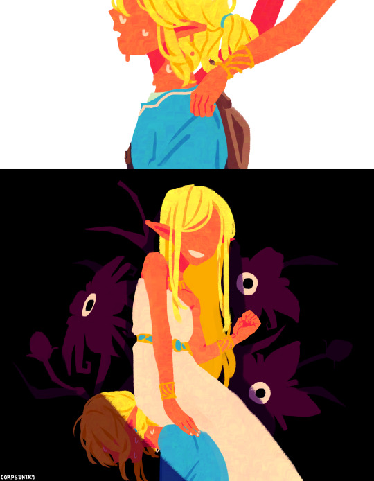
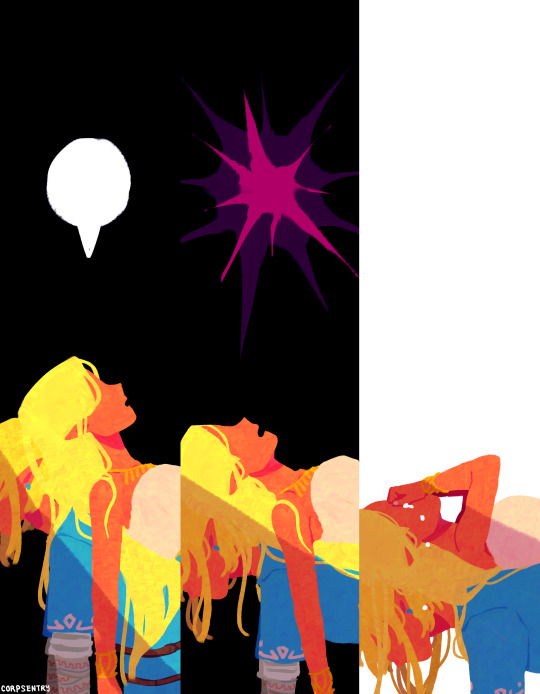
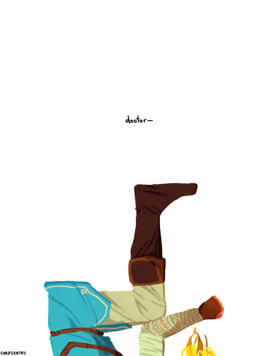
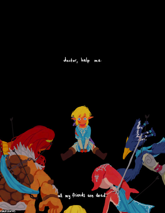
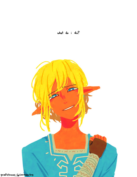
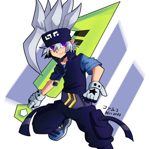
#THIS WAS REALLY FUN TO DRAW. I ACCIDENTALLY DREW ALL 5 BACK PAGES IN ONE SITTING YESTERDAY
Text


1000000kg
#ZELDA#BOTW#BREATH OF THE WILD#THE LEGEND OF ZELDA#LEGEND OF ZELDA#TLOZ#LOZ#BOTW LINK#MY ART#MY STUFF#CAN I NOT TAG EVERYTHING. ITS SO MUCH EFFORT#TAP THE LINK IN THE CAPTION TO GET A PRINT OF PAGE 5 WHICH I ACCIDENTALLY RENDERERD#IT LOOKS SUPER OUTT OF PLACE NOW BUT DO I CARE? NO! ITS HOT AND THATS VALID#SOMETIMES YOURE JUST SO SEXY AND FUCKABLE YOU DONT MAKE SENSE. LINK WOULD UNDERSTAND#HES SO SAD............HES MY TUMBLR SADPERSON. I JUST THINK ABOUT HIM FROM TIME TO TIME#I HAVENT DRAWN A ZELDA COMIC IN HALF A YEAR. NOT MUCH HAS CHANGED SINCE THEN EXCEPT THAT I HAVE A GIRLFRIEND#SO I GUESS A LOT HAS CHANGED! IVE ALSO GOTTEN BETTER AT COLORS AND LIGHTING I THINK. HOPEFULLY#THIS WAS REALLY FUN TO DRAW. I ACCIDENTALLY DREW ALL 5 BACK PAGES IN ONE SITTING YESTERDAY#SO MY BONES ARE A LITTLE BROKEN RIGHT NOW BUT THATS SEXY AND FUCKABLE TOO#THANK YOU FOR YOUR TIME#HAVE A NICE DAY. EAT GOD. AND SO ON
1K notes
·
View notes
Text

[lmfao i realized after posting this that, visually, this accidentally looks like some sort of ad or blazed post on the dashboard. im so sorry hahaha]
I've always wanted to keep a journal.
In high school, I was really into reading journal comics (they're still one of my favorite genres of comic by far), and started drawing one myself. I drew a comic once a day, every day, for all of 10th grade and kept it in a binder to show friends at school.
I did scattered little journal comics after that, just a strip here and there. Then, in college, I had a storyboarding professor who had us draw on an index card on each day of class to mark how we're feeling. Inspired by that, my roommate and I drew a post-it of what we did each day and stuck it on the wall for two semesters. In other words, 1-panel daily journal comics.
I like journaling because it helps put the good days and bad days into wider perspective. Even the deepest pits of anxiety or sadness are eventually faded away and joined by really happy and mundane days.
Since then, I've tried a Hobonichi Planner. I've tried poems on Cohost. I always fall off. I've tried the Daylio App and Notion. I feel too guilty and embarrassed once I've missed too many days.
Then I heard about "5-Year Journals."
Each page is a day, for example "January 5th." No days-of-the-week listed. It's split into 5 sections, for different years. You write in it each day. Then when the year comes around, you keep using the same journal, writing underneath your previous year's entry.
This really appealed to me for two reasons.
It won't be a huge deal if I miss a day, or a week, or a whole month. I won't feel guilty because it doesn't really matter. It's not putting the book to waste, there's no day-of-the-week listed to make the page feel obsolete the year after, and I'll just get those days I missed when I come back around in 2025 or 2026. So even if certain years have gaps, each page will eventually have something.
It'll be fun to read the entries from previous years as I keep going, and see how I've changed.
So far I'm having a good time! I recommend them. Brand-wise I got a Levenger although I'm sure there are cheaper versions. Or just do it in a spiral notebook, who cares? With my handwriting I can fit like 4 or 5 sentences per entry. The fact that I'm not posting them publicly, or drawing anything, will probably help me.
7 notes
·
View notes
Text
Anyone who says drawing is not tough work is wrong.
Yesterday - or actually during the past 2 days, I used about 20 hours for drawing. I literally drew ~20h in a row. I started around 10pm on Monday and I finished both comics on Tuesday, around 6pm.
Now: my neck and back muscles hurt when I move them. My thighs, especially the left one, hurts and my legs are so stiff when I get up and start walking because sitting affect some muscles so much. Now I started writing down something with a pen and my whole right hand, all fingers and everything, are still stiff from all the coloring I did. Plus the skin around the nails on some of my fingers is sensitive to touch now because of excessive coloring.
So based on that, I could say that finelining AND coloring one 1-page (A4) comic takes about 10 hours to do. I would say that doing the sketching of 1 sheet also takes 10 hours or more, depending on how advanced stuff I’m drawing. (Aka if I draw just close-ups of faces or if I need to focus on drawing backgrounds too.)
Drawing a comic happens in several phases:
Planning.
Measuring and drawing the lines for the panels etc.
The 1st and 2nd, sometimes 3rd sketch.
Finelining.
Coloring.
Finising details, making sure everything looks fine and I haven’t accidentally e.g. left something uncolored.
Adding my signature.
And all this takes maybe... 20-40 hours to do? I’m not entirely sure as I am trying so hard to count the hours but I really suck at maths nowadays. But I did finish the finelining at Monday-Tuesday night and I continued with the colors quite soon after and both comics were ready around 6pm on Tuesday, so that means I used maybe 2-3h/comic for finelining, and 5-6h/comic for coloring, I think. And all those hours are really the same as a very light work week, I just work in 8-12h episodes. Usually one “episode” lasts as long as it takes for me to be finished with a phase so if planning takes less than 1h, then that is one “full day” unless I feel like I’m on the mood for doing some more already and continue to sketching the lines and maybe even the (first) sketch(s) too.
Edit: I forgot to say that all that coloring yesterday made my wrist have some problems with the nerves. It sometimes does that otherwise everything is okay but doing a certain movement like pressing a button on a tv remote just sends this annoying sensation to my hand. It feels the same as hitting an elbow somewhere so that the corner really hits the nerves, so not a fun feeling. And I kept forgetting that my hand tends to do that that after drawing for such a long time that I kept pressing a button or grabbin my phone with my right hand all the time and whole hand feels like it just got electrocuted. (Sometimes similar thing happens when I keep writing on computer for long periods of time in a row, or if I play something where I need to click the mouse often.)
0 notes
Text
My Friend has been Falsely Accused of Tracing So I Will Defend Him
Okay I accidentally deleted the blog I posted this one because I’m a dumbass, so I’ll just repost it here even though I don’t use this blog anymore, but apparently I still have followers. Bless caches because I was able to get this back from google caches so I don’t have to retype everything. I added further evidence and refutes to claims that were not in my original post btw.
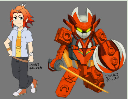
Anyways, I am making this post to help out my good friend @5ru9 aka Falco who has been recently accused of tracing/copy pasting other people’s / official art!
I’ve known Falco for over 3 years, and we’ve grown as artists together. Once in a while we give each other advice on art (thanks for the mech and armor advice and teaching me how you line and color!), but most of the time we just meme each other.
Anyways, a lot of people have pointed out that they’ve seen him livestream before, and he’s already posted some of his block outs and other wips as proof that he does not trace in his post here:
http://5ru9.tumblr.com/post/168277137427/hello-i-have-been-informed-about-a-callout-post
To further prove his claim with solid evidence, I shall present to you!
Times he’s asked for advice on his art, or I randomly decided to mention things I notice in his WIPs!
Exhibit A-1:
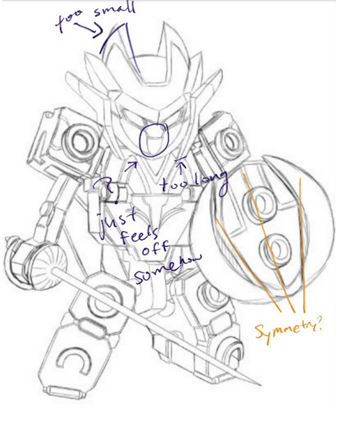
A Tenkai Knight he made up! I pointed out a few things I thought were awkward about the perspective in his WIP.
Exhibit A-2:
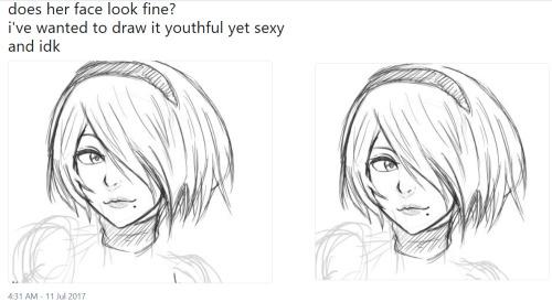
He started working on this way back in July and didn’t finish it until much later because he was working on several other pieces at the same time. I suggested lowering the eyebrows and drawing the eyes a bit narrower to get more of the playful expression he was aiming for. In his final piece here, you can see that Falco continued to refine the piece.
By the way! The reason he sometimes posts a lot of detailed artworks one shortly after the other is because he sometimes works on multiple pieces at once! And then finishes coloring them around the same time.
Exhibit A-3
Falco and I spent good time trying to figure out why he felt like something was wrong with his sketch! I thought maybe it was the trapezius and I decided to red line (or blue line i guess) it so it’d be easier for him to see approximately where i thought the line should go to fix it.
Exhibit A-4:
The gif-ing process turned white bg into blue… anyways!
Falco showed me an early version of his Tenkai Knights OC that he eventually used in an April Fool’s joke to pass off as a new character in the series. He mastered the tenkai style enough that at first glance, people really did believe it was official! Like you had to get a good look to realize Shiyu was not really a real new character! Btw I had to go into my old twitter acc to find this….
(Edit: the gif wasn’t working bc it was too big so i had to make it smaller… and choppier and stuff to fit the mb max)
Well now that brings us into!!!
Exhibit B
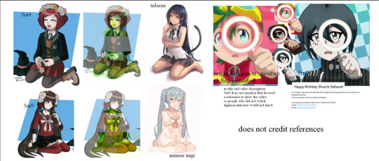
Some of his old art!! (I’m so sorry falco i’ll be exposing your ancient art to ppl now)
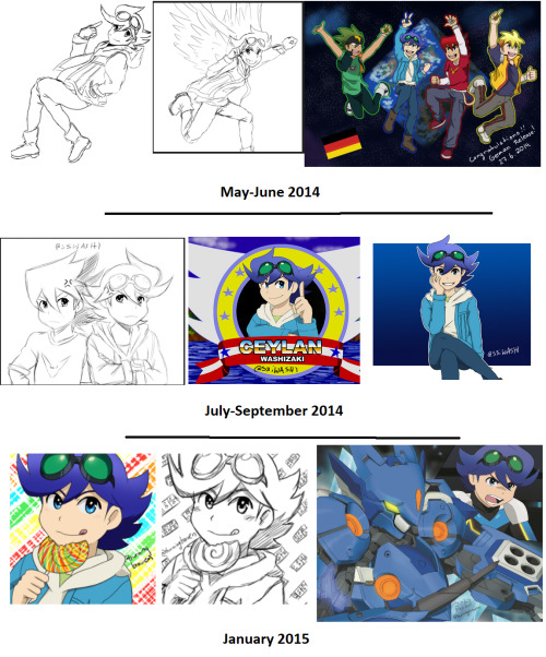
Here you can see his progress from 2014 Tenkai fan art to early 2015! It starts looking more and more like the official art, which is what he was going for.
For reference, here’s what the character Ceylan Jones/Washizaki looks like:
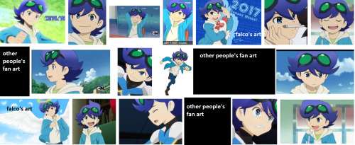
I blocked out fan art by everyone except falco (which i marked) that shows up in this google search. Everything else is official art.
The two fan arts by falco you see here are more recent, the angel one being from 2016 and the chicken one from 2017 (i think he also made a version with sonic instead of the chicken? lol). They’re both on his dA accounts btw! The 2017 one really looks like official art, doesn’t it? But it’s his artwork! He practiced a LOT to reach that point, and I hope the earlier arts I showed above this one are enough to convince you in his art progression!
Side note: i only used images w/ceylan because 1. i’m biased because ceylan is my favorite character and 2. he drew ceylan a lot because ceylan is his favorite character
Also you can see his handle change from s3iwashi to burningbraven. 5ru9 is is a pretty recent handle.
ANYONE WHO HAS BEEN IN THE TENKAI FANDOM FOR A WHILE CAN VOUCH FOR HIM!!!!!
And now for the last one,
Exhibit C
WHAT? WHO IS THIS???
This is my favorite character from a Chinese series called AOTU World! His name is Grey, or 格瑞。I commissioned Falco to draw Grey for me, and let me tell you it would be IMPOSSIBLE for him to have copied any of this. Why? Because the donghua is 3D and the manhua’s art is very inconsistent!
Let me show you the reference pictures I gave him to work with!
They’re all in my gdrive folder here:
https://drive.google.com/open?id=1CqwH5KS-pHX0ZqLHQpoIZBi6W-gsU_Tz
This is all official art from the manhua, except the 3D model is from the donghua. Look at how inconsistent the references are! There’s no way he could have copy and pasted or traced this! Grey doesn’t even do this particular pose anywhere. lol. I told Falco “give him a cool sword pose”. (I’m sorry for being so vague, Falco! But it turned out great!!) The style he ended up drawing in was a mixture of all of them.
Btw!! here’s the blockout and the sketch he sent me before I sent my payment for the commission!! You can see his construction in the block out!! The arm construction and leg construction is light, but it’s there. You can also see the block out below the sketch. Notice he actually fixed the leg length from block out -> sketch?
ARGUMENTS AGAINST SPECIFIC ACCUSATIONS
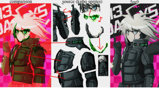
LOOK, thte actual drawing doesn’t even match the sprites that closely. Pay attention to the collar especially. The whole frankensteining the image and then painting over it thing is just way more effort than drawing it himself. They don’t even match that well in the overlays. Like wow it’s such a crime to try and stay on model.
WHO WOULD EVEN NEED TO TRACE A MOUTH LIKE THAT? IT’S SO EASY TO DRAW. I CAN DRAW IT PERFECTLY JUST BY LOOKING AT IT. (well i AM an animator so I also do style mimicking)
Doesn’t the fact that you have to edit the sprites to match his artwork prove that you’re just a tryhard in making up fake evidence and not a tryhard enough at art since you think it’s so impossible for people to draw characters on model?
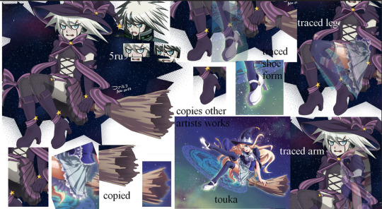
Yes he referenced the broom and possibly the heels from this image, but your overlays for the leg and arms are disingenuous and you know it. The leg positions are different, and the overlay doesn’t even match up. Face tracing also makes no sense. You literally stretched the mouth to try and make it fit but it still doesn’t fit. Do you really think it’s that hard to draw mouths and eyes in the DR style? DR faces are really simple to emulate. Also you fool, if you follow Falco’s artwork enough, you’d realize the way he draws bodies is actually rather consistent even as he does different styles. Especially when it comes to hands. His way of drawing hands is how I recognize his art and know right away it’s his art and not official art or a trace (also his coloring style). The heels he drew are also reminiscient of how he typically draws shoes/feet. he draws them bulkier. The other art has dainty heels. At most he referenced how backside works because he’s used to drawing sneakers.
Also come on, if all you referenced from an image was a broom because you liked the style (his is also clearly drawn by himself since you can’t overlay it on the other one. like i said he mostly used the style as a reference for how-to-broom) and you referenced pieces from many other images, are you going to list every single thing you referenced? While yeah it’d be nice to, it’s a little ridiculous to expect all 5-20 references whenever they post the image. It’s a thing where, if someone asks, you’d tell them, but it’s too much to list all of it. This isn’t a 20 page thesis.
If it’s such a crime, then holy shit sue all those people who parody other people’s comics and sue everyone who dares!!! to ever draw something remotely similar to someone else. Dang.
Art doesn’t live in a vacuum.
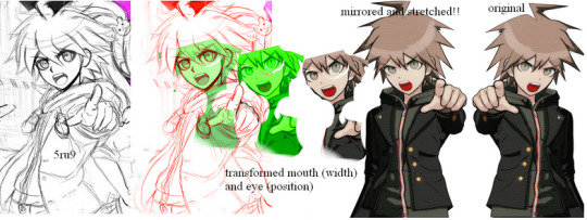
Okay, this one is just plain stupid. You distorted the sprite to match it up with his, but what would be the point for him to distort it just to trace? Also if he traced, can you explain the rest of the fingers that are drawn nicely but clearly different from the sprite? Also the thumbs don’t even match up. His faces more downward while the sprite is facing more forward. Also explain the turned body in Falco’s sketch, then!! And the hair! OH WAIT YOU CAN’T EXPLAIN IT BY ANY OTHER WAY THAN HE DREW IT HIMSELF!!! BECAUSE NO SPRITES MATCH IT AND YOU CAN’T FIND ANY SPRITES TO DISTORT ENOUGH TO EVEN GET CLOSE TO MAKING FAKE EVIDENCE FOR IT.
By the way, the style he drew it in is closer to the drv3 than this sprite. while it’s pretty much the same style as the older games, drv3′s art is more refined than the older games. Falco’s art is also more refined as you can see. (wow not only did falco’s art improved from back when we first met; even professional artists improve. shocker. /s)
Dude what the hell? The overlays don’t even match up even ifi you tried to frankenstein them. And these are really common poses at really common angles, and once again, must every single thing we reference from be listed in the description of every place we post an image? Let me just list all 30 videos and 50 images i used as reference for one of my prints. jfc.
As for the saihara animation based on the digimon opening animation? It was pretty clear to everyone that it’s some kind of parody. Many people when making parody animations don’t mention the original video either?? It’s a fun thing for fans of the franchise to recognize the reference themselves. Yes he could have said it was the digimon opening on the description, but at least he didn’t say he thought of the idea himself? And if you talk to him about the animation, he will openly tell you it’s from digimon. And the fact that you think it’s a trace despite how much the overlays do NOT work out is practically proof that you’re just doing this maliciously and hoping that saying he traces enough with shoddy evidence will make people believe you.
ALSO PEOPLE LITERALLY TRACE ANIMATIONS TO MAKE PARODIES OF, DOWN THE STYLE WHERE ALL THEY CHANGE IS THE HAIR AND OUTFIT, AND YET SOMETHING WITH DIFFERENCES EVEN DOWN TO THE STYLE LIKE THIS IS SOMETHING YOU THINK IS A TRACE? Do you need a new pair of glasses?
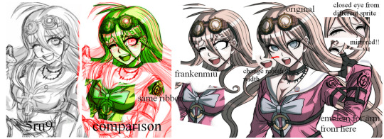
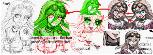
I was gonna ignore this one because it was the same as a lot of the others, but you literally erased Falco’s face line so it would match the sprite, and you covered the bigger boobs Falco gave her, and totally ignored that the angle doesn’t even match properly. Like you covered parts of his sketch in your overlay just to make it look more like it matches, but if you actually fucking overlayed it correctly, even with squashing it, it won’t fit. (Also sorry to point this out Falco, but the circles on your goggle lenses are too small compared to the sprite; Maybe if you actually traced like this person claims you’re doing, they’d be perfectly like the sprite. OH BUT WAIT YOU DREW IT YOURSELF SO OF COURSE THERE’S SOME DIFFERENCES. JUST LIKE HOW EVEN THOUGH ALL YOUR OTHER WORKS ARE REALLY CLOSE TO THE STYLE AND PRETTY MUCH ON MODEL, THEY’RE NOT EXACTLY THE SAME WITH THE SPRITES! SHOCKER...!)
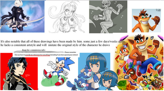
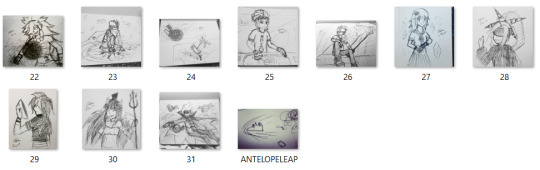
HOLY FUCK. I already pointed out and gave evidence that Falco started on the Nier Automata drawing waaaaaaay before he posted the actual picture. The 2 sketches are sketches! They don’t take a super long time. I busted out 10 inktobers in 1 day. (thumbnails of my artwork below)
Look I even even lined and colored 5 fairly detailed chibis in 1 day (i did the sketches earlier though. btw i hand drew the plaid on ray. it was annoying)
At the moment I have 5 wips. They’ll likely all be done around the same time. I know Falco often has multiple wips as well, and sometimes he also finishes some of them close to each other. Some artists (like my friend Fish) can pump out extremely detailed paintings in less than a day. WOW some artists can draw at a fairly fast rate. WHO KNEW? (manga artists in weekly magazines pump out 15-20 pages of manga in a week)
He’s still developing a style; he’s mostly doing style mimics of series he likes in the mean time.
At the moment he’s mostly experimenting with the drv3 style, but he was practicing p5 earlier. By the way, he DESIGNED a phantom outfit for mishima. Who the heck would he copy that from? He made it up because he loved mishima and wanted to make him part of the gang in some AU fan art. Mishima doesn’t have artwork like this for him to trace, so it should be obvious it’s his own work.
And the pokemon and crash bandicoot ones are actually not that close. The pokemon one looks like a good attempt at imitating the pokemon style, but since he hasn’t practiced it enough, you can tell it’s a little off model because, well, he drew it himself and doesn’t practice the pokemon style a lot. Same with the crash one. Had it been a trace, with his level of control over his lines (which you can’t refute), it would have been much closer.
And you act like it’s a crime to imitate others’ art style. It’s really not. What is wrong with you? Do you want to slow down animation production by only letting the character designer draw everything? Or do you want animation where the art has 0 semblance of consistency because all the artists draw in vastly different styles? lol. What do you have against artists that try to stay on model?
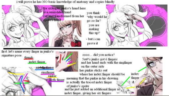
LOL THIS IS ONE IS SO STUPID WHERE DO I EVEN START?
Oh, I KNOW. Why don’t I do that same pose with my own hands?
IT’S A MIDDLE FINGER, YOU IDIOT.
Just because YOU don’t know basic anatomy and can’t tell a middle finger from a pinky, doesn’t mean everyone else is as incompetent as you. He wasn’t doing the rock-on hand pose (sry idk if that pose actually has a name lol), and he’s drawn the rock-on hand pose properly before.
Closing statement
I believe I covered a lot of things and provided a lot of evidence here that Falco and his other friends did not cover in his defense against the false accusations.
I even added more counter arguments in this repost because apparently my original post wasn’t enough to convince people.
Perhaps the person calling him out meant well (no, I doubt it because they made a new side blog just to diss him because they knew if they did it on their actual blog, they’d be called out for being a jerk), but they did not do enough digging to find out if their claims were true or not (and they probably know well enough that they MADE UP THEIR EVIDENCE).
If you’re going to make a call out post, please make triple sure sure of everything before you accuse people. Talk to them first. Talk to those who know them too.
Many jobs require you to be able to draw characters exactly in the style given. Animators for example! There are multiple animators working on one series, and they all need the skill to draw consistently! Some games also have teams that need to be able to draw in the same style so they don’t have to leave everything up to one person. Comic artists often have assistants that help them draw background characters, but those background characters can’t be too different from the main style either.
As for the people who believed the call out post before, it’s perfectly understandable. I am also guilty of falling for similar posts in the past. Due to that, I decided it was best to double check before retweeting (i say retweet because i use twitter far more than tumblr these days. heck i almost never post anything on this blog) things, and if i wasn’t sure, I would just leave it be.
I hope my post was able to convince you on Falco’s innocence and all his hard work. And if you already believed him but checked out this post anyways… Thanks! ObligatoryPleaseWatchAotuWorld.
And again:
Art does NOT exist in a vacuum. All artists are influenced by each other and MANY artists, especially professionals, use a lot of references, whether it be from photographers, their own pictures, others’ artwork, life, or whatever. We all use many different resources. If you’re going to say that’s wrong, you just dismissed millions of artists in the world.
51 notes
·
View notes
Text
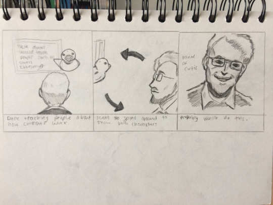
Plastic Infographic Project: Storyboards
13.02.19
I wanted to do some rough storyboards so that I can plan out what I need to do in terms of making assets and animating. I actually made these first two pages a week ago, but unfortunately, I accidentally deleted the post where I talked about them... It’s alright, I’ll just talk about them briefly here, since I’ve made better ones since (last three pages in this post).
First of all, the scene will start with the cargo ship; ‘Ever Laurel’ sailing the seas. Then “January 1992″ will fade onto the screen (maybe) and fade back out. Next, the screen will darken and the waves will get rough—a thunderstorm. A bolt of lightning will shock the boat causing it to tilt and then a crate will slide off into the water, with a splash effect. Next will cut to the ducks where they will be showcased from the side, the bottom, and the back, this is all to show that they have no apertures (holes) so they cannot let water in, so they just float endlessly. Then, a map of the world with points where the ducks have shown up. At this point I was considering doing this, and I wanted to have a point coming from Hong Kong (where the ducks came from) and a line that moves to each country using trim paths. I was planning on using an actual map for this, as making a 100% accurate map myself would take way too long. Next will cut to the ducks again where they will be showcased surviving many different hardships, like being shocked by lightning, being under blistering heat, and being frozen for years and thawing out. The next panel shows what I decided to do after scrapping the idea about the map—I thought I would just have Hong Kong, and then a line using trim paths move toward Japan, UK, US, and Australia, and when the line hits, a little speech bubble pops up with the flag of the respective country.

On the last few panels on the last page, I decided I wanted to give Curtis Ebbesmeyer some spotlight, and had a back shot of his while a duck was pointing to a chalkboard. This was to try and convey how the ducks taught oceanographers a lot about how currents in the ocean work. The next panel shows both the duck and Curtis from the side, as I planned on having them kind of rotate around the screen, to ultimately end with a shot of Curtis. It’s kind of ambitious as an idea, but then again, as are some of the things I’ve drawn in the newer storyboard.
So, below is the new storyboard set. It’s more fleshed out at parts and more detailed. The scene starts with the cargo ship, ‘Ever Laurel’, exactly the same as how I did it in the original, but the boat drawing is much more detailed and actually looks like a cargo ship. It’s actually based off of the real Ever Laurel cargo ship too, which I think is a nice reference. There’re some clouds above, which I’ll have moving. I’ll make it so that there are two or more layers of clouds, some in the background, which will move slow, and then some closer to the screen, which will move faster. The waves I plan on making move up and down, on three layers: one in the foreground, which will go over the top of the boat, then the other two layers, which will be behind the boat. Essentially, they will act as puppet’s mouths, though I won’t be using the puppet tool in After Effects... The music will most likely be upbeat and happy, as there is nothing going wrong right now, although perhaps I could make it slightly eerie, to foreshadow the next scene.
Speaking of, the next scene arrives, and the boat is shown tipped (it definitely won’t be this tipped in the final animation, as I drew it way too exaggerated). The cargo is flying off the boat into the ocean because of a thunderbolt from the sky—it’s a storm. The sky will be dark colours, maybe just shades of grey (not 50, of course), and the lightning will be a bright white. The waves will be chaotic and moving up and down really fast, like a really fast ventriloquist, moving his puppet’s mouth. The wave returns with a vengeance and will be creating a huge splash once the crate hits the water. I will most likely be using the opacity effects to do this. It will also be a more zoomed-in shot of the boat to showcase the effects and stuff that I want to do. The music should definitely be much more chaotic and treacherous compared to the first scene. I don’t exactly know tracks I’ll be using yet, probably more video game soundtracks, since they often work very well. I thought about having a single aggressive piano note play as soon as this scene starts that kind of transitions the two scenes.
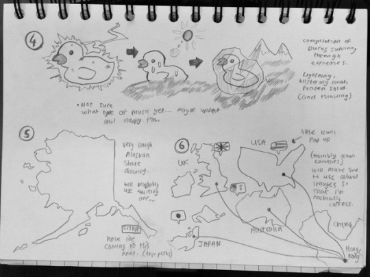
The next scene may be my favourite so far, and it involves the ducks. I talked about them in the original storyboards, but essentially, my idea is to have about 5 models of a duck—one from the side, the first one, one that is facing forward with its back to the screen, the middle one, and then a last one that is showing its undercarriage to the screen. In the middles of these three models that I’ll be making in Illustrator, there will be in-between frames if you will, that will be transitioning into the next model, so for example, the first in-between frame will show the duck moving from facing sideways to facing backwards. Then the last in-between will be of the duck... at a kind of awkward angle—I can’t quite get it to look right, but you can kind of work out what I was going for. This is all to show that there’s no apertures in the ducks, so they cannot let water in, therefore, they will not sink. The final animation will hopefully look like some kind of turntable kind of thing. It will be difficult to pull off I’m sure but will be very rewarding if I succeed. I actually have an idea of what kind of music I want for this scene—some kind of elevator-type music, and I have an idea of an exact theme I could use.

The next page continues on with the ducks—this time they’re surviving through harsh weather conditions, like being shocked by lightning, which I know is incredibly improbable, but whatever, it’s supposed to be a fun animation. The next duck will be shown under blistering heat, with the sun in the background. The duck will have some sweat drops on it, or maybe melting drops, but maybe that will contradict my statement about them being immortal. The final duck will be shown frozen in ice, (for many years. Perhaps I will have a timer or something that’s going really fast to symbolise that it’s trapped for a long time). Then it will ultimately thaw out, I’m not sure how I would go about this, maybe I would have shards of ice flying off the duck once it thaws out. These scenes won’t be too detailed, perhaps no detail at all in the backgrounds, since I want the focus to be just on the ducks. Not sure what I want for the music yet, possibly the same as the scene before, and I can just have it carry on from it, since there isn’t really a big shift in atmosphere.
The last scene is kind of a new one. I drew Alaska very roughly, since this is the first place any of the ducks ended up (Sitka, precisely). I will maybe have some text to accompany this, saying that the first of the ducks appeared here, as I don’t want to reveal my trim paths strategy, that I’ll be using much more effectively in the following scene. Speaking of, for this next scene, I will have single countries of where the ducks ended up. These are: UK, USA, Japan, and Australia, of course, that’s not every country they’ve visited, but I just chose some of the more prominent ones. I will also include China complete with Hong Kong which is where the point will start. There will be lines coming from this point and ending at certain points located on the other countries (in no particular place). To do this I will use trim paths as I mentioned. Once the line reaches the point, there will be a little speech bubble popping up containing the respective flag. Also, I know that these countries are horribly drawn, I plan on using existing vectors if I can find any so to make sure I am 100% factually correct. It is an infographic after all. Not too sure what music I will have playing here, but probably something neutral.
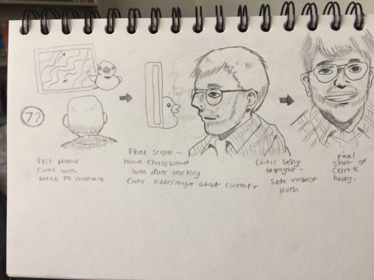
Finally, the last page. These panels are virtually the same as the original storyboard, but this time, the chalkboard at the beginning will have drawings of currents, showing that the ducks taught oceanographers about how currents work in the ocean. Curtis himself will probably be a challenge to create in Illustrator, as even these rough sketches don’t really look anything like him, but I will try my best.
That is everything that I’ve done in terms of storyboarding. I hope to stick to these as closely as I can, but may stray away from certain ideas if I come up with anything better, which I will detail.
Some websites that I used to help with determine where certain scenes fit:
Seanmungercom. 2015. SeanMungercom. [Online]. [13 February 2019]. Available from: https://seanmunger.com/2015/03/27/flotsam-and-jetsam-part-iii-the-amazing-odyssey-of-the-friendly-floatees/
Staywildswimcom. 2019. Staywildswimcom. [Online]. [13 February 2019]. Available from: https://staywildswim.com/the-blog-1/friendly-floatees
0 notes
Text
The Tools I Use · Jeffrey Phillips, Illustrator
The Tools I Use · Jeffrey Phillips, Illustrator
The Tools I Use
by Sally Tabart
Photo – Amelia Stanwix. Styling – Ashley Simonetto.
Photo – Amelia Stanwix. Styling – Ashley Simonetto.
Photo – Amelia Stanwix. Styling – Ashley Simonetto.
Jeffrey Phillips (aka Jeff the Peff) in his Collingwood studio. Photo – Amelia Stanwix. Styling – Ashley Simonetto.
Photo – Amelia Stanwix. Styling – Ashley Simonetto.
Jeffrey Phillips (aka Jeff the Peff) entered the professional illustration game in his mid-20s, although he’s been drawing ever since his family relocated from India to Australia when he was a young teenager. Back then, he drew to observe the new sites he found himself surrounded by.
It was only in his 20s that Jeff enrolled in a Design and Multimedia course. Now a full-time freelancer, Jeff’s clients include organisations like Aesop, Facebook Australia, Ernst & Young, MYOB Australia, Studio Round and yes, even The Design Files. We asked Jeff to take us through his go-to tools.
The tools i use · Jeffrey Phillips
1. Noodler’s Bulletproof Black Fountain Pen Ink
This is a handcrafted black ink that is archival, fade resistant and water resistant when dry. It is pretty rare to have a waterproof fountain pen ink, so these are quite highly prized and can occasionally become sold out. I keep a bit of a stash to last me through dry times.
I think it’s good to be consistent with the type of ink, especially when you are combining different pens. Different inks fade in different ways. Some fade to a bluish black, others go a bit brown. So if you aren’t consistent, the drawings can start to look a bit funky as they age.
Find it here.
2. Pentel Water Brush
There are loads of brands and styles out there, with different sized tips and so on. Both of mine are filled with water, but the grey one also has a few drops of black fountain pen ink for a nice grey wash.
Find it here.
3. Daler-Rowney Ivory Sketchbooks
These tick every box for me. The hard-cover is great for support, the pages are perforated for easy removal, they have a lovely ivory colour and work really well with my pens and inks. I often try other sketchbooks but these are my mainstay. Unfortunately completely unavailable in Australia, but you can find them on eBay.
Find it here.
4. Namiki Fountain Pen
This one has a 14k gold nib (fancy!) which has a nice amount of flex for creating variable line widths. Gold nibs are great. They give your lines a wonderful wobbly character! Also means you can swap five pens of different widths for a single one.
The Namiki Falcon is a very delicate pen and so probably not recommended for beginners or if you don’t use fountain pens regularly. An ill-timed bump or wrong move will probably permanently ruin the tip. So it can be stressful to use but the lines are AMAZING and worth it. Here it is in action.
Find it here.
5. Lamy Fountain Pen with an EF Nib
This is my main drawing pen. It’s a no bullshit, reliable and versatile pen that has given me years of great drawings. It’s much easier and safer to use than the Namiki Falcon. A great beginner pen actually. I originally meant to get the yellow one and accidentally bought the neon-yellow – but what are you gonna do? I had a second one as a backup but lost it on the NYC Subway. I wonder what it’s up to now. It’s funny when you lose the backup and not the thing you wanted to back up. Here it is in action.
Find it here.
6. Pentel Pocket Brush Pen
This pen must be one of the worlds most popular black ink brush pens. Every illustrator I see on Instagram seems to have one. Even though the black ink cartridges it comes with are great, I have replaced the ink in them with my standard Noodler’s black for consistency. Here it is in action.
Find it here.
7. iPad
I have the 12.9inch iPad Pro second gen. The second-gen version has a slightly higher screen refresh rate than the first gen. If that makes a difference to you. I don’t know if I can tell! It also has 256gb of Memory – I heard that the higher memory allows you to run larger files without impacting performance.
I use it with the Apple Pencil which is great – except the lightning port you charge it from is the same one that the iPad also uses. So god help you if both are flat.
Find it here.
Photo – Amelia Stanwix. Styling – Ashley Simonetto.
Jeff’s TOP shops, Apps and Tips
Favourite apps related to your practice?
AstroPad Studio – an app that effectively turns your iPad Pro into a Wacom-Style Cintiq tablet, allowing you to draw in Adobe Photoshop on the iPad. At $117AUD per year, it’s not the cheapest app but in terms of the time it saves me it’s worth it.
Best place to shop for gear?
Jetpens for pens and inks. They have almost anything pen-related you can imagine, including great reviews and handy guides.
Most visited websites?
Dropbox, because good backups are life. About a year ago I decided to sync all my working files and folders with Dropbox. It took a couple of weeks to finish uploading but it’s been the best thing I ever did – it syncs everything across multiple locations and keeps previous versions of all files, too. I can generate a link to any file at any time from any device. I also have an external HDD backup just in case.
Xero has changed my life. Having an easy and intuitive accounting system has freed me up to focus on the fun stuff. If I wasn’t using something like Xero, I’d be mentioning Microsoft Excel instead and not in a positive way.
Reddit – fun to browse, but the worst when you have deadlines.
Ozbargain Forums, where people find and share bargains basically – pricing errors, specials, voucher codes etc. and they get voted up/down depending on whether it’s a good deal. It’s really handy to check when you’re shopping around for something. And when you are procrastinating…
Inspiring reference books?
The Personal MBA by Josh Kaufman is hands down the best book I have read about running any kind of practice. It’s very agnostic in terms of what ‘business’ means to the reader, so you bring your own agenda to it and come away with loads of good stuff.
What do you listen to when you work?
Spotify is always on. Otherwise I’m listening to podcasts. I enjoy streaming WNYC, Radio Melbourne, The Economist, or Design Matters with Debbie Millman.
What’s something you wish you’d known before you learnt it the hard way?
Your environment shapes your behaviour in mysterious yet significant ways. Having known the 9-5 grind before starting out as an illustrator, I thought working from home would be the Shang-ri-la of working lifestyles… Hell no!
Even though I had a separate room set up as my work space, I would find myself keeping extremely odd hours, seemingly always in PJ’s, not leaving the house for days, and always feeling guilty that I wasn’t doing enough work.
Now I have a hired a studio space, so I’m required to get up, get dressed and leave the house. It means I get physical activity, social interaction and a dedicated space for work. When I leave that space, it’s play time!
I think this delineation is very important for people who do something for work that they also find fun or pleasurable. The conventional boundaries are blurred, so you need to work out where the line is. Inevitably, it will be different for each person and situation.
Catch Jeff on Instagram, and check out his personal and professional illustration work via his website.
0 notes
Last Seen Blogs

speak-now-taylorsversion
speak-now-taylorsversion
shyboyricky
Geek is Sheek
chocoberry8
Em Daqneesh

nebraskaccess
The Nebraska Library Commission

perssonpower03
The Life of Bak 639