#Overpainted Photographs
Text
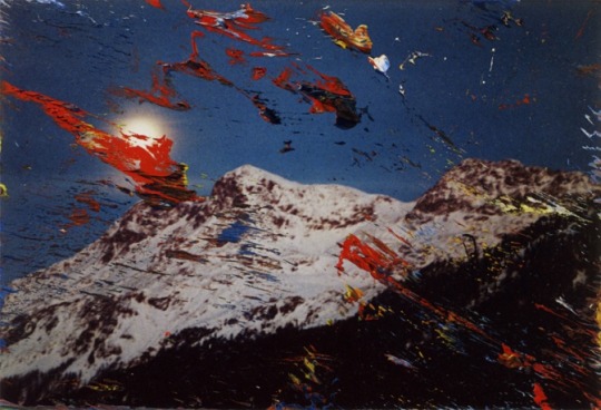
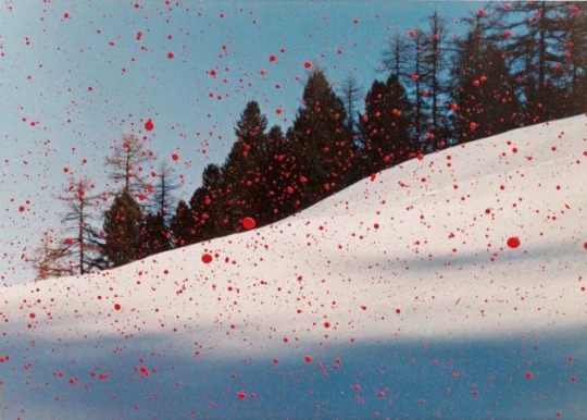

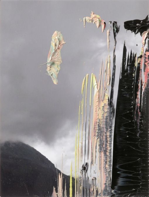
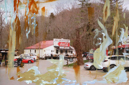
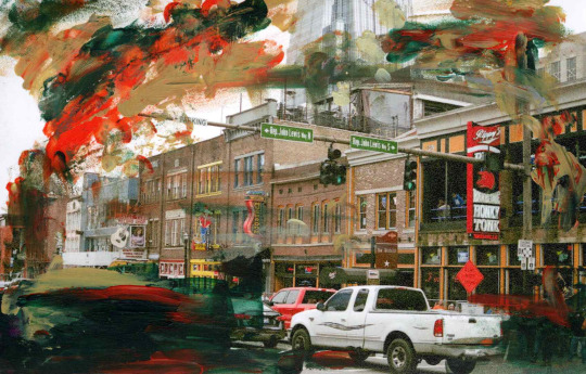
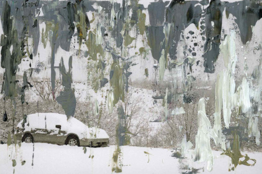
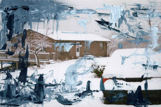
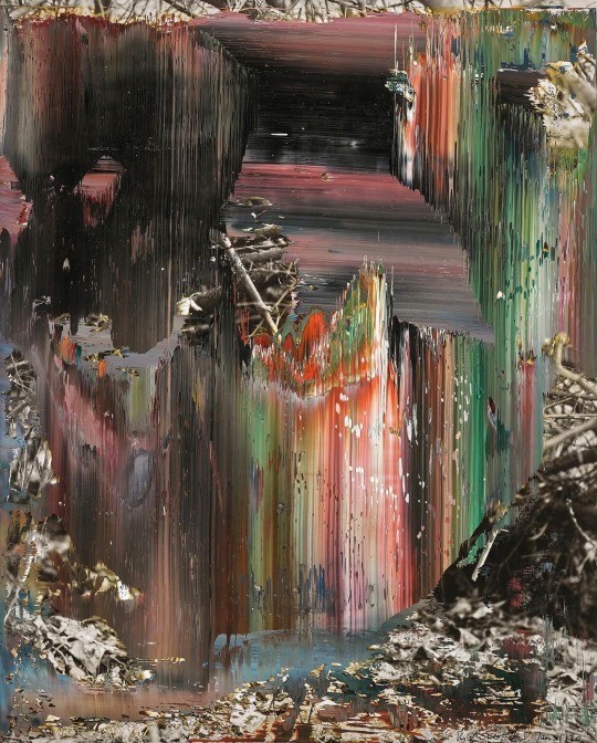
Overpainted Photographs by Gerhard Richter, Winter Series
3.5.89 (Corvatsch) | 3.2.92 | 14. März 92 | 29.01.08
2 notes
·
View notes
Text
Gerhard Richter's Overpainted Photos

View On WordPress
#abstract#Dresden#Gerhard Richter#Overpainted Photographs#painting#the Albertinum at the Staatliche Kunstsammlungen
0 notes
Text
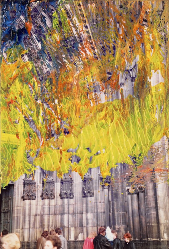
With a couple of exceptions Gerhard Richter really began making his overpainted photographs in 1989. He developed various gestures, pressing the 4x6 in. prints against his messy squeegee, into each other, and sometimes splattering them with paint. Then he'd give them away. This one, of Cologne Cathedral with an aurora borealis of squeegee paint, is dated 1.8.1989 [which is August 1, btw, not January 8], and is selling at Phillips in Nov. 2023.
#gerhard richter#overpainted photograph#cologne cathedral#phillips#wait is this tiny gift lot really the cover image of the afternoon sale?
23 notes
·
View notes
Text
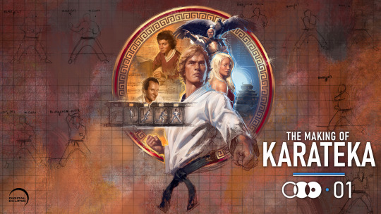


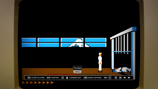
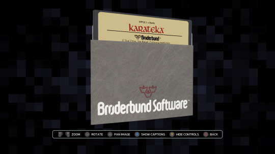
I never played Karateka in the 80s, but as a big fan of Prince of Persia and Jordan Mechner's journals, I was stoked to hear that an interactive documentary about Jordan's prototypical cinematic platformer was in the works by Digital Eclipse.
Released this week, The Making of Karateka on the surface looks like any other game you buy through Steam ($20, Windows-only), GOG, or whichever favorite store or console you prefer (available also for Xbox, PS4/5, Switch). Once the thing loads though, you really get 3 things: a documentary, the original Karateka, and a new remaster.
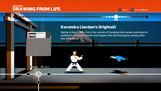
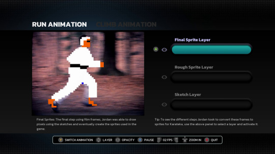
The documentary part is an audio-visual slideshow retelling Jordan's development story starting with his teenage years pitching his earlier title Deathbounce to the publishing house Brøderbund. It's an interesting look into the iterative process, seen through correspondence letters, journal entries, and many playable builds at various stages of completion. After we reach the eventual rejection of that title, Jordan comes back with a prototype of a visual-narrative experience unseen on home computers. We get to follow Karateka's full life cycle from pre- to post-production, ending with the conception of its sequel (which eventually turned into Prince of Persia). It's a real treasure trove! Fellow pixel artists will appreciate the many graph-paper sketches and interactive overlays of final game sprites compared to rotoscoped outlines and filmed footage. There are also video segments, from a comprehensive breakdown of the music to interviews with other developers reflecting on the impact Jordan's games had on their careers. You'll even encounter a fan letter signed by the one and only "John Romero, Disciple of the Great Jordan and worshipper of the Magnificent Mechner!" (I kid you not, you can't make this stuff up).
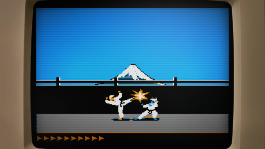
Perhaps just as crucial for an interactive documentary like this, you can launch any of the floppy disks in the emulator, trying out various iterations and ports of Karateka.
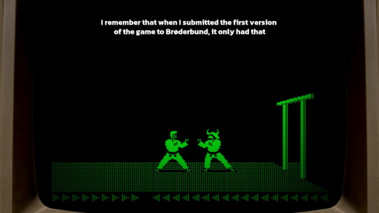
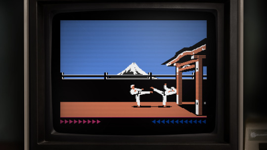
The emulation is fantastic and lets you fiddle with display settings (monochrome or color display, scanlines, pixel perfect or zoomed) as well as enhance the frame rate. You can even rewind the many deaths you will face if you've never played the game before (like me). If you spend some more time obsessing over the weird artifacts of the Apple II hi-res graphics, you might even go down the rabbit hole of realizing that on the Apple II you didn't really paint colors as much as you used different monochrome dithering patterns that the graphics display would then turn into 4 different hues. A fascinating learning experience if you include some of your own research online!
youtube
Add to this the Commodore 64 and the Atari 8-bit versions to compare how the graphics got adapted across the earlier ports and you have a nice way to relieve the mid-80s with a bit of help from modern emulation (I did beat the C64 version without rewinding though!). I'd love to see more art from the other remakes, especially the 16-bit Atari ST port, but I understand their decision to omit playable versions of those due to the lower quality on the gameplay side of the translations.
This brings us to the final part of the package, the modern remaster. Unlike the 2012 complete reimagining of the game (with 3D graphics and all), Digital Eclipse approached the remake as the ultimate port of the original to an imaginary system along the lines of a 90s VGA PC.

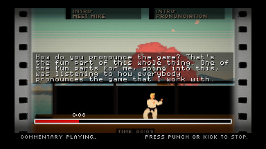
It's well done. Some of the fully-redrawn scenes are a bit overpainted for my taste (I'd prefer a pixel art rendition of the castle than a blurry photographic collage, although there were many games in the 90s that did take this approach), but the in-game graphics are really in style, including the smooth animations that are like one would imagine granted a beefier CPU. It's also a sort of director's cut with previously unseen scenes added, in particular, the battle with the leopard as a clever action-puzzle in the middle. The AI is unfortunately even less challenging than Jordan's implementation. As great as the 6-move fighting system could have been, you yet again resort to simply kicking away opponents as they tirelessly crawl into your range. There isn't even the nuance from the original where you were the one who had to approach some enemies with skilled timing. On the other hand, you now have optional goals and achievements that make the repetitive/easy combat work in your favor (stringing various combos, beating opponents or the level under a time limit …). As the Digital Eclipse president Mike Mika admits at the end of the welcome commentary mode, they didn't manage to achieve their perfect port, but they did come close.
In conclusion, I thoroughly enjoyed playing both the original as well as the remake and while the combat system lacks any sort of depth beneath its stunning animations, Karateka is instead a monumental experience for its presentation. Big characters with personality and realistic motion are displayed through cinematic camera cuts and story vignettes (3 years before Ron Gilbert came up with the word "cutscene"). There are details like animating the unfortunate falling off the cliff at the start of the game, or respectfully bowing to the first guard as they bow in return. Jordan's creative work is precious and worth the attention this release gifts it.
I highly recommend The Making of Karateka to all retro gamers and/or game developers for its immersive documentation which provides an experience that goes beyond the usual video documentaries. It's interactive—just like the subject it's talking about—something I want to see more in the future. And if the $20 by any chance seems high to you, consider that the original retailed at $35 (and that was in 1984 dollars).
youtube
77 notes
·
View notes
Text
My thoughts on this painting
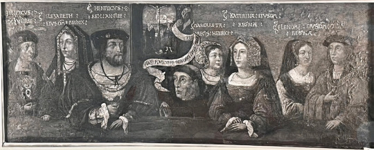
I found it on twitter account called Tudor Extra, and they say it has been recently discovered by Dr Emma Cahill Marrón(on twitter as EmmaLCahill) in London.(link is at end of post)
Honestly in closeup it looks in really poor state.
On left are obviously Henry's parents and correctly identified so.
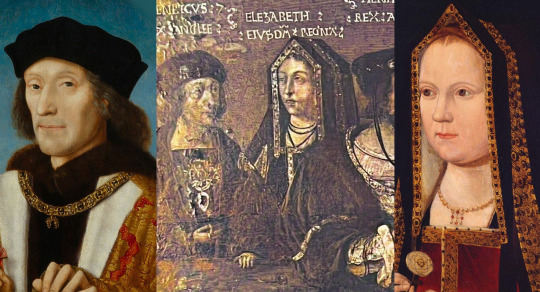
But i am not so sure about rest of figures being correctly identified. Or rather I am sure they aren't!
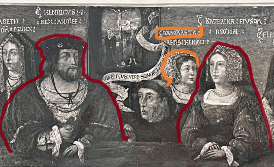
Yes, the figures lined in red are Henry VIII and Catherine of Aragon.
But the orange I lined in orange is supposed to be Margaret Tudor. Henry VIII's sister. Fashion-wise it's possible.
Catherine's gable hood has both veils down, frontlets up. So at earliest it could be somewhere in 2nd half of 1510s, at latest late 1520s. The lack of ends of paste would point to c.1520(however if this was a copy...painters tend to not include them, or not give them justice...) So I am not 100% trusting it.
Margaret left England in 1517(read up on her life, if you want to know more), so in theory she could have been included here. But why is she by Catherine's side? Or rather behind that. Odd isn't it?
Such possition would much better fit Mary I. The sizes can be deceiving here...because in reality Catherine is supposed to be way smaller than Henry...
Hence this figure doesn't necessarily have to be a child(Mary I), but could be. And Mary was wearing same cap in Vyne chapel(where is commonly mistaken for her mother.)
(If there was Margaret, why wouldn't there also be Mary Rose? (Henry's other sister). ...Wouldn't that be even more odd than his daughter being included.)
But...I am really buffled by two figures entirely on right side.
Allegedly on left is Eleanor of Austria and on right her husband Manuel I of Portugal, whom she married in 1518:

...Nobody thinks it weird? ...Just me?
Well, in my opinion. They are misidentified. Both of them.
The man wears order of golden fleece-but that wasn't limited to just Habsburgs, plenty of foreign royalty were honourary members. Including Manuel of Portugal and Ferdinand II of Aragon.
One would be normally considering if the entire portrait is not done to commemorate Charles V visit to England...with figure beside him being widowed Germaine of Foix(who was there!).
But why would Henry's parents be included in such portrait?...Makes no sense!
Unless...we're looking at dynastic portrait!!!
...Where Henry's parents are on left, Henry, Catherine and their daughter Mary in middle, and Catherine's parents on right!
This could certainly be Ferdinand:
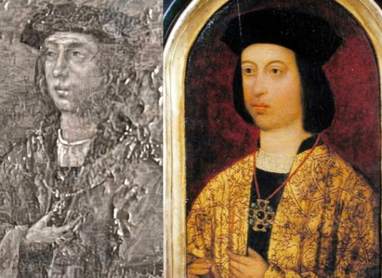
Ferdinand died in 1516, but Henry's parents were long dead too...
But...what about the woman? You cannot tell firmly the shape of gown and jewelry(mind could easily play tricks upon you.)

But why would Isabella wear french hood?
...And i considered that perhaps somebody confused portrait of Germaine of Foix or even real Eleanor and Joanna(netherlandish type of frenhc hood) with Isabella...
But then I noticed shape within the french hood's veil...
And it looks suspiciously like cofia de tranzado... the cap and 'braid', just where they are supposed to be.The headwear is overpainted!
Hence it could be based upon some portrait of Queen Isabella!
Unfortunately this is just card/print from Ancaster Collection, Grimstorpe castle labelled slightly wrong as family of Henry VII(instead of Henry VIII):
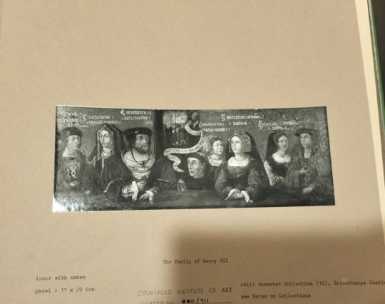
I hope we can all agree. It deserves way more love and attention.
This might be the first Tudor dynastic portrait!
Equivalent of Whitehall Mural or The family portrait from 1542/3.
...And if there is black and white card of it...is it drawing, engraving, printm or photograph? ...It could be out there...
PS: In it...Elizabeth of York is taller than Henry VII. Not that I'd trust the proportions entirely...but it'd be funny if true.
#historical portraits#tudor history#catherine of aragon#mary i of england#henry vii of england#elizabeth of york#mistaken identity
26 notes
·
View notes
Text
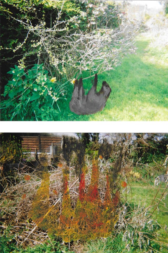
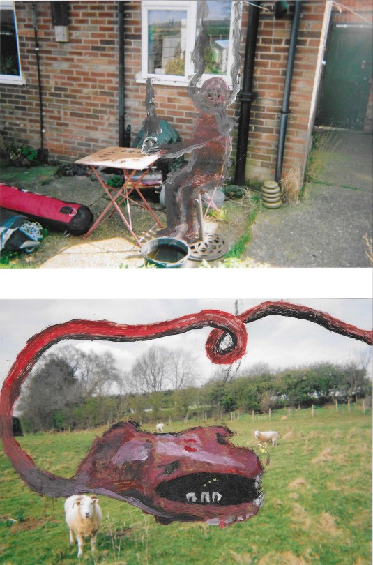

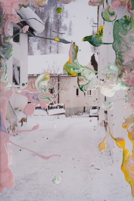
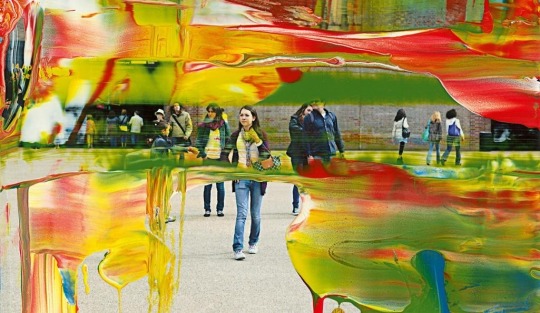
OVERPAINTED PHOTOGRAPHS PART I
by salem woods
may 2024
#art#salem woods#artists on tumblr#illustration#design#drawing#pen#art for sale#photography#painting
9 notes
·
View notes
Text
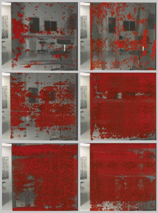
August 4, 2023 Restoration work on the Battleship Texas
"I am 'declassifying' Hunter Miertschin's 'Top Secret' picture from a few weeks ago.
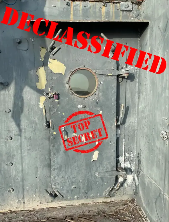
Atlantic Theater Map Declassified
On behalf of our crew, our colleagues at Texas Parks and Wildlife Department's (TPWD) Cultural Resources branch, and OnAim Conservation, I am pleased to announce that the stabilization, conservation, and partial restoration of the Atlantic Theater Map in the Captain's Cabin is complete!
This map of the WWII Atlantic Theater was painted on a bulkhead in the Captain's Cabin after September 1944 (based on references in the map). It shows the ports of call Texas made during WWII (white dots with anchors in them), where she performed shore bombardment (noted by little explosions), national capitals (yellow triangles), and a few surprise discoveries as the map was conserved.
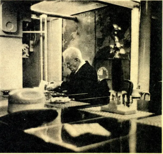
The 1966 newspaper photo of Chief McKeown, with the map in the background. This is the only known photograph of the map prior to it being painted over.
Sometime after 1966 (which is when the only known historic photo of the map was taken), the map along with the rest of the Captain's Cabin was painted white. That act was not great, but not terrible either. What was truly terrible is a window was cut into the bulkhead right in the middle of the map sometime in the late 1970s, after the map and compartment were painted white. We believe that because the map had been painted over and the loss of institutional knowledge of the map, those who made that decision did not know it was there.
Fast forward to around 2000 when the map beings to reveal itself as the white paint begins to flake off and the map is rediscovered during the planning for the Captain's Cabin restoration. When the Captain's Cabin was restored, the window was welded up and the map was partially uncovered exposing the Mediterranean and most of Europe. In 2009, I discovered the 1966 picture of Chief McKeown with the map in the background, which spurred a lot of excitement about what possibly survived. However, due to budgetary constraints we were not able to perform any real conservation treatments to the map.

This is the map in 2002. You can see Italy, Southern France, and the Mediterranean emerging. At left you can see the frame of the infamous window.
The map sat partially uncovered and untouched until last summer. In partnership with TPWD Cultural Resources we hired OnAim Conservation to stabilize the remaining paint on the bulkhead, just prior to the tow to Galveston. This initial step preserved what remained and protected it from any vibrations from the tow and/or shipyard work. It also set the stage for uncovering the rest of the map and recreating the missing sections.
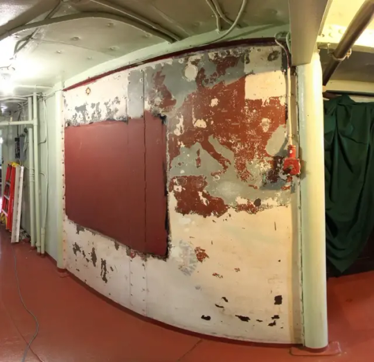
This is the map in 2011. During the 2002-2003 Captain's Cabin restoration, it was partially uncovered. But work stopped out of fear of damaging the map further.
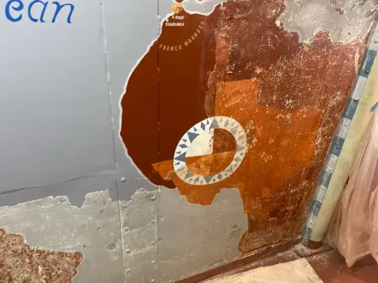
All through July 2023, the incredibly talented husband and wife team of Zak Miano and Ariane Roesch (who own OnAim Conservation), with the expertise and hard work of artist and conservator Bob Pringle, performed the tedious work of uncovering the map by removing the remaining white paint, revealing that much more of the map survived than anyone thought. They also discovered that whoever painted the map, had painted the State of Texas in Africa in burnt orange!

This is the map as it appears today. The gloss is from Damar varnish that was used by OnAim to protect the paint and bad lighting.

Europe afte the remaining remnants of white overpaint was removed and the the destroyed sections of Spain and North Africa were recreated. You can see the explosions where the ship did shore bombardment at N. Africa, Normandy, and Southern France.

We made the decision to use French Morocco as Morocco was a 'protectorate' of France and French Morroco showed on a lot of 1940s maps.
Once the map was uncovered, OnAim added Kati Ozanic-Lemberger to the team to recreate the destroyed section and features of the map. In consultation with TPWD Cultural Resources, it was a unanimous decision to touch up the paint of the surviving sections of the map, fill in and blend in missing areas within surviving sections, and recreate the large missing sections. We made this decision for two main reasons, 1) it would preserve the existing map longer 2) it would allow us to tell the story of what happened to this map. The artistry of OnAim is phenomenal in how they blended the recreated areas of the map with the original, infilled and blended missing patches, and emphasized the surviving features that were being last. The map blew me away, but the skill of these folks was just as impressive.
The big surprise: TEXAS!

The Eastern seaboard of N. America, with all of Texas's Dec 7, 1941 to September 1944 ports of call. Another discovery OnAim made was the remnants of 'North'. THis do not show in the 1966 photo, Referencing period maps, we opted to infill the missing sections of 'North' and create 'North Atlantic Ocean'. As that seemed the most logical as to what was there -there was no 'South'. Because this was largely on the destroyed section we would not be harming the original map.
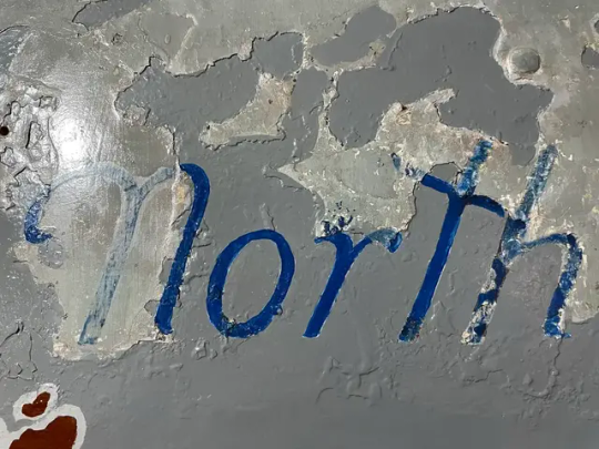
The faded areas are what survived of 'North'. The more solid and brighter blue is what was infilled. Same with the gray for the oceans.
I also want to add that Ariane, Kati, Bob, and Zach were working directly under the work going on the Signal Bridge. They performed their magic while having to deal with the sounds of needle guns, grinders, hammers, et al, right above their heads and occasionally getting smoked out from welding and cutting smoke that would get sucked into Captain's Cabin. How they kept steady hands and focus amid the normal cacophony of a shipyard environment is astounding.

Custom matching and blending colors
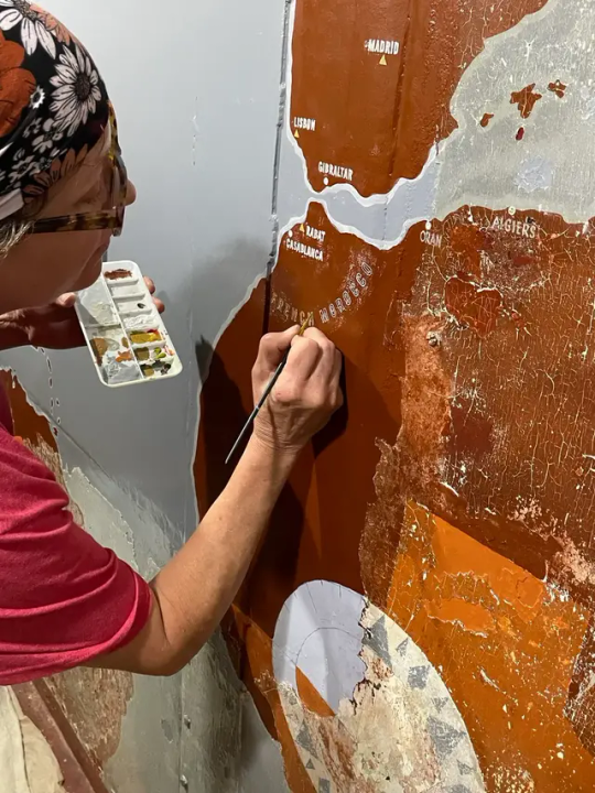
The detail work....

Bob and Katie recreating the destroyed section of the map.

The on OnAm team: Kati, Ariane, Zak, and Bob
As to the future of the map, we plan to have it on exhibit in the Captain's Cabin shortly after we reopen and are planning to incorporate it into an AR experience."
Posted by Travis Davis on the Battleship Texas Foundation Group Facebook page: link
#Battleship Texas#Battleship Texas Foundation#Update#USS Texas (BB-35)#USS Texas#New York Class#Dreadnought#Battleship#Warship#Ship#Texas#Repairs#Restoration
31 notes
·
View notes
Text
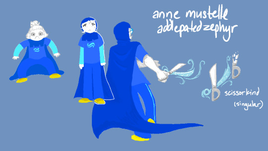

decided to try my hand at some homestuck ocs, classic
(the trolls' poses are mostly overpainted from some fashion photos/photographs which i have included below)
i have links to some of these if you want the original sources, pinterest always makes finding sources a bit difficult though
#this is actually the bare bones of an mspfa but like#sure wolfe yeah youll get there mhm#still#i like them kids#hi if you still follow this blog ur the best im so sorry#fantroll#homestuck oc#homestuck
9 notes
·
View notes
Text
Gerhard Richter https://gerhard-richter.com/en/art/overpainted-photographs/rural-landscapes-75/8-juni-16-7-18536/?categoryid=75&p=10&sp=32
46 notes
·
View notes
Note
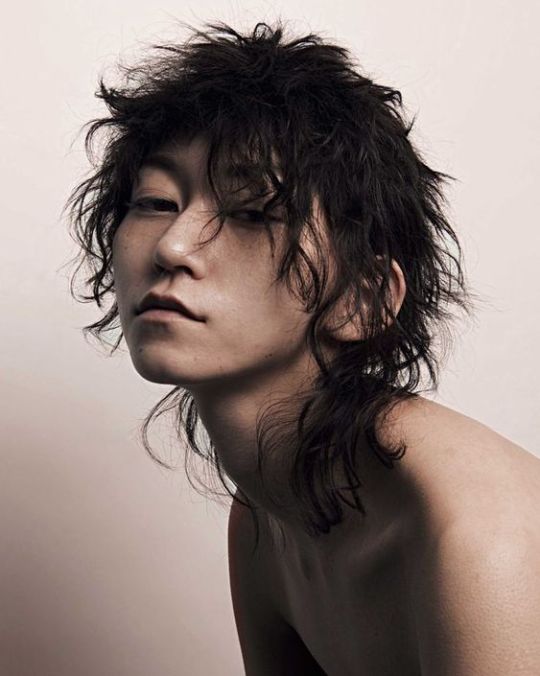
Genuine question, how can you tell if someone just uses a filter or is really good?
There is no easy identifyer you can just point to and go "HAHA! FILTER!"
There are certain things you will pick up on if you have done a lot of photo editing and if you're a realism artist yourself. You get a 'feel' for when there's a lack of artistic choice and with some filters, there is a specific look to edges that is ... very telling. Lacking that, however, one of the best ways to do it is to play an extreme game of spot the difference if you can find the original photo.
Let me give you an example (from my own shit, I'm not gonna take someone else's).
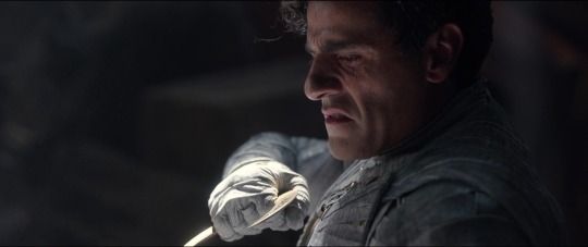
This is the original screencap from the series. No extensive editing, except for some brightness and maybe some sharpness.
Then here's my painting I did:
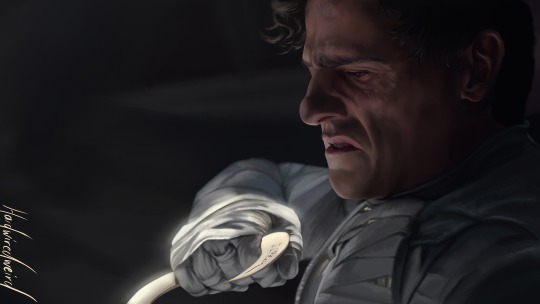
It's pretty accurate, if I do say so myself, but if you really look at the details, you see there's some significant difference. Feel free to take these two and overlay them in something like GIMP or photopea.com (great photoshop alternative, btw, entirely free and works in any browser, even on mobile, in fact, I did the filtered version below in photopea!)
Now, here's the filter:
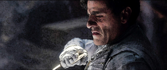
Different style from how I paint, but a 'style' you see often in filtered photos that are pawned off as 'paintings'. If you overlay this with the original, you will see that every single minute detail, down to the fine texture in his glove and suit overlaps perfectly. That edit took me maybe five minutes and that is because photopea is slow on my tablet.
The painting took nearly 15 HOURS!
A good draftsperson can get some ridiculous accuracy, but things like textures/patterns, clothing folds and hair are super-duper telling. It is absolutely impossible for a human to get a drawing 100% correct, down to every single strand of hair and wrinkle in the clothing. If you overlay an 'artwork' with the original and see a 1:1 match in those tiny details, then it is at the very least a painstaking overpaint or, much more likely, a filtered photo.
Now, here's a disclaimer: I AM a professional photographer and editor. I make my income with photo editing. It is very much an art form in itself, but the amount of work and skill that goes into realistic painting is in an entirely different cosmos from editing. If someone tags an edit as fanart, painting, 'my art' or something along those lines, that is disingenuous. It rides on the fact that most people can't tell the difference to rake in the likes and, at the very worst, make money off of people.
22 notes
·
View notes
Text
overpainted photographs
35mm film prints & acrylic paint
1 note
·
View note
Text
https://gerhard-richter.com/en/art/overpainted-photographs/other-73/5-jan-1990-17596
2 notes
·
View notes
Text
Gerhard Richter
Gerhard Richter was born in Dresden on 9th February 1932, the first child of Horst and Hildegard Richter. A daughter, Gisela, followed four years later.
Since the mid 1980s, Gerhard Richter has created more than 2,000 Overpainted Photographs – with new artworks continually being produced. This large body of work illustrates Richter’s wide range of creative achievements in this medium.
I researched into gerhard as I was drawn to his overpainted series and the textures combined, I especially loved this piece of his studio. As the series goes on, the paint becomes more overpowering and intense.
self portrait standing, three times, 1991
2 notes
·
View notes
Text
Artist Research 7/11/23
Gerhard Richter
Since the mid 1980s Gerhard Richter has created more than 2,000 Overpainted Photographs – with new artworks continually being produced. This large body of work illustrates Richter’s wide range of creative achievement in this medium.
He over printed all different types of photography in different categories such as family,people, self portraits etc. I found his work was a lot similar to my idea of disrupting a memory by capturing it in a photo and disrupting and covering with different materials such a paint and using different patterns and colours etc .
Here is a link to his work divided into different categories and information to go along with it that i found interesting in my research.
https://gerhard-richter.com/en/art/overpainted-photographs
4 notes
·
View notes
Text
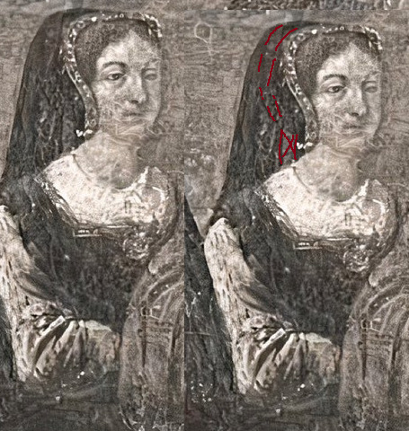
I can't believe it. Overgilding on Elizabeth of York's portrait is modern.
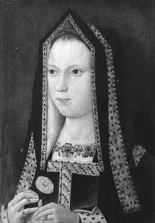
Look how pretty that painting looked probably in 1st half of 20th century! Ok bit of overpaint at back, but the now overgilded parts were intact! The pattern was visible! On frontlets, on dress, the rings also were intact! The overgilding is modern screw up!
By the way black and white photo is from here:
And it refers to paintings's history prior to 1946. Likely this painting escaped WW2 intact...and then somebody decided to screw it over!
Unbelievable!
Anyway, I hope the old photography will help anybody who wishes to recreate her english gable hood.
Though I have to warn you- the bonnet is already painted out in the photograph. So don't trust how the back of gable hood looks in the portrait...Also part of frontlet(left down corner) either blends in in poor quality photo with the background or it was overpainted back then, and the cuff maybe as well, but you can see them on other side too.
3 notes
·
View notes
Text
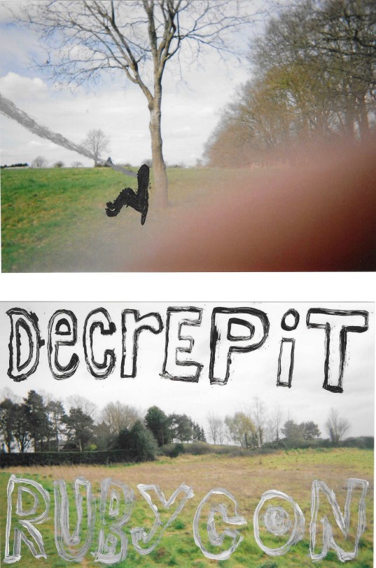
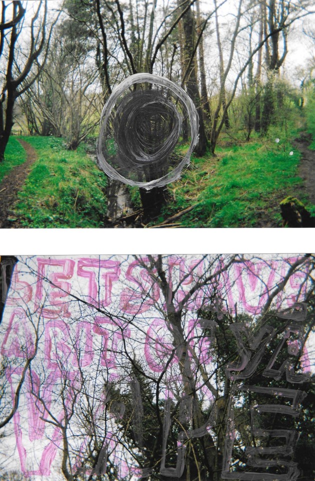
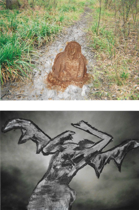
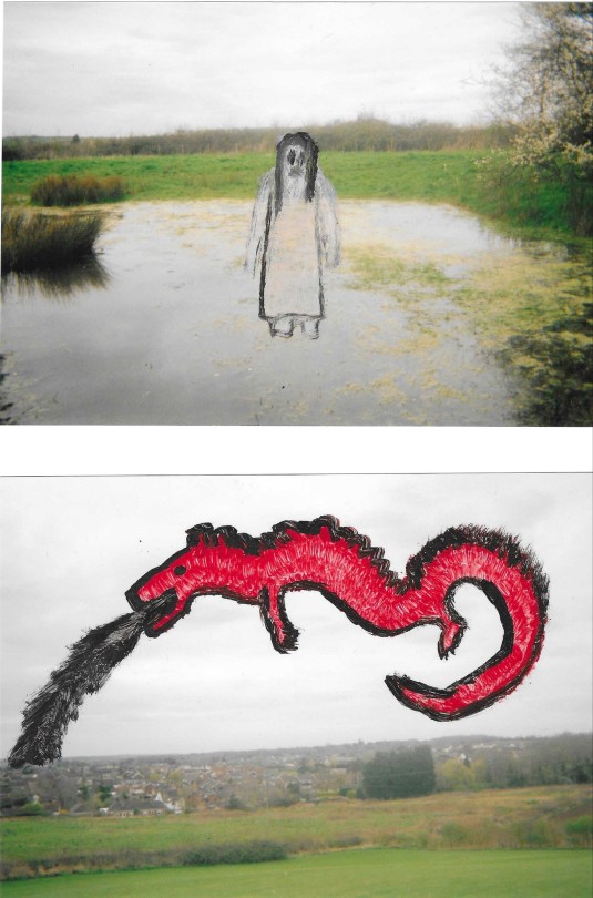
OVERPAINTED PHOTOGRAPHS PART II
by salem woods
may 2024
2 notes
·
View notes
Last Seen Blogs
diltondoileys
"Eat eclairs, brain boy!"

kawaii-av
too KAWAII

spookystudentflower
tease 😈

vungocminh1206
Vũ Ngọc Minh

231happy
231