#I love their consistent aesthetics through time and their contrasting silhouettes they are very fun to draw
Text
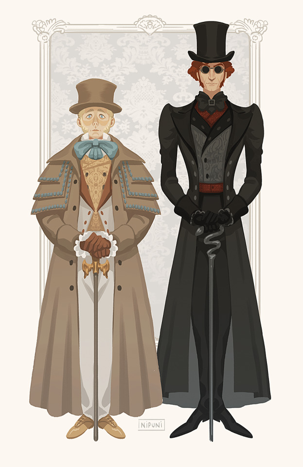
So I watched Good Omens 😊 It is very cute, I really enjoyed the character design!
#good omens#good omens 2#aziraphale#crowley#I love their consistent aesthetics through time and their contrasting silhouettes they are very fun to draw#I haven't watched any modern series in years I'm trying to catch up with the times!! it was a very wholesome short story#I'm looking forward to their happily ever after 😊#my art
7K notes
·
View notes
Text
Design Choices
Since people were asking, I’ll just add it on here. Keeps the posts clean and less annoying to scroll through
On the topic of yandere simulator, can we talk about how god awful they are. I’m not even talking about the sailor uniform, those are temporary and will be replaced, but the direction yandere dev is heading with the uniforms is utterly appalling ( Link ). Everytime he puts it on a video, I have to cringe because it looks like the uniform for an anime about the US Postal Service. So I decided to make my own uniform. I’m gonna explain all my design choices and such below.
Part 1 Part 2
Because Akademi is supposed to be a prestigious school, I made two versions of the school uniform: One for summer (right) and one for winter (left). I took inspiration with what Yandere Dev has wanted for his uniforms (a highwaisted skirt with overalls) and applied it to the summer design for the female students. I put the school’s insignia on the front of the skirt and on the tie for the male student. The female uniform also comes with a petticoat underneath partially for warmth and partially cause I think it looks nice and adds more customization . I also made a version of the gym uniform, because the official game should come with a newly designed one and not the booty shorts and T-shirt we have. Plus it would be nice if the sports club constantly wore the gym sweater instead of the school’s blazer since it’s more comfortable and it would be easy to identify from afar (and wouldn’t be the goggles which I don’t understand the purpose of in a sports club aside from swimming, which those goggles are really uncomfortable to have on but nvm).
Another cosmetic thing I distaste about the game, the club accessories. They are... really ugly. Having a game pad or bass clef glued to your head is just awful looking. So I took it upon myself to redesign all of them. At first I was just trying to add accessories to Ayano, but that became really boring and I ended up right where I started, the accessories looking plastered on and unnatural. That’s when I started changing up her hair to better reflect the club she is in. Ayano is supposed to be a cunning killer, someone who blends in as a normal school girl. Hair is one of the places where you can really express yourself. So why not blend the two ideas together, just like with the personas in the Drama Club. In different clubs, Ayano should slightly change her appearance to better fit in with the club’s aesthetic. I mean it’s hard to believe a normal looking person would join the occult club when they all look like this. It’s a stark difference, and it just looks off. So with each club, I made an effort to better integrate Ayano.
No Club: Yandere Dev has stated that Ayano’s haircut needs to be slightly changed before the game comes out in order to not use storebought assets, so I just have her a higher shorter ponytail with an easy to recognize silhouette. Ayano’s updo will follow into the rest of her club designs to distinguish her.
Cooking Club: The cooking club’s bonus is to help raise reputation. Following with Amai’s sweet nature, I thought Ayano would’s design would be more rounded and friendly so I gave her a bun. and made her hair curved inwards.
Drama Club: Yandere Dev explained in “The Curious Case of Kokona Haruka”, the Drama Club will probably have a hierarchy of curled hair. Because Ayano joins the Drama Club, she should abide by this hierarchy and curl her hair too. Plus roses for the extra effect.
Sports Club: I didn’t have lots of ideas for this one, but I gave Ayano a braid so her hair because less of a hindrance when she participates in activities. But I certainly hate the goggles you get when you join the sports club, so I gave her shades instead. It makes more sense to wear so the sun doesn’t get in your eyes, rather than you might jump in the pool at any second. Plus the sweatbands can relate to Asu Rito when she arrives.
Occult Club: All the occult club members cover one eye in one way or another, and a good portion have messy hair, why not make Ayano do the same thing.
Gardening Club: The random flower sorta bothered me. Not that it’s inherently bad, it just weird looking and contrasts Ayano’s design in my opinion. So I put her hair down to better reflect the calm and relaxed demeanor in the club.
Light Music Club: Since Miyuji has a punk rock aesthetic in her club, why not show that in Ayano. It’s certainly better than glueing a Bass Cleff to your head.
Martial Arts Club: A braid is easier to have when you’re constantly moving and sweating. Plus it can serve as a reference to an anime I’ve never even watched.
Photography Club: I really wanted to make another scooby doo reference and have Ayano’s hair reflect one of the hex girls, but having her hair down didn’t match the rest of the Ayano’s design for the rest of the clubs unfortunately. So I just have her a chill bun and ponytail to make her look fun-loving and cool.
Art club: It’s unfortunate that the art club doesn’t have a set look other than Geiju cause I didn’t really know what to do. But I gave her cat buns in order to show that she is a creative and unique person, who would probably fit right into the art club. Also the beret is sorta a weird addition, cause no artist would ever wear that, so I just put a pencil and brush behind her ear instead cause at least that makes sense. I actually like Geiju with a beret though, don’t take that away from me. If he’s the only one wearing one, it would just be funny because maybe he’s trying to get into the mindset of the old masters by wearing one. I love that boy.
Gaming Club: This one was sorta hard. I hate the game pad, and I’ve heard of others suggesting headphones instead, which is a much better idea. So I gave her headphones. Because the gaming club is sorta a childish club, I gave her pigtails with berets resembling the buttons on a ps4 controller. For the rest of the gaming club though, instead of the blazer, I would give them a hoodie and headphones to better sell the “I spend all my time playing video games” idea in addition to it being more comfortable, which I think they would appreciate.
Science Club: It’s sorta ridiculous that all the science club wears the DBZ eyepiece, but that’s sorta the point and charm of them, so I wouldn’t change that. The idea that either they all love DMZ, or that Kaga loves DBZ so much that he forced the other members to wear an eyepiece too is amazing. I just gave her a neat bun, straight on her head to give her an unsettling, artificial look. (By making it symmetrical you know?)
-
It’s important not only cosmetically, but to the gameplay to have good silhouettes for important people. You need to know who’s around you as quickly as possible. There shouldn’t be idle time trying to figure out if there’s a bully, regular student, delinquent, or student council member down that hallway when Osana is ripe for the killing. Rivals should also have unique silhouettes and clothes to distinguish them from regular students.
For Bullies, I know that they modify their skirts to be shorter than they’re supposed to be. So I turned that idea up to eleven to make a super short skirt with a tutu like petticoat underneath. The bullies put a large amount of frills under their skirts because they want to look unique and flashy. I also know that they are inspired by gyarus so I put some of what I found with the leopard print, and furry legwarmers. Also gave them those large earrings to really sell how much they care about their appearance. For each bully, they could also have either a different undershirt or different color leopard print. They also have a summer and winter version .
For Delinquents: I didn’t have much to comment on with their deigns. My version wouldn’t be much different, just instead giving them my blazer instead of the one present in the game. Maybe for the summer uniform they could have one strap off to show that they are really bad to the bone.
For Student Council: I thought they should have a military themed uniform. What they wear should be very distinguishable from regular students because as yandere dev explained, you shouldn’t be walking around, commit a crime then get mad because a student was around that you didn’t know was part of the student council and you get an instant game over. But their uniform should also not be very modified because they stick to the rules. They should not have a summer and winter version because you shouldn’t have to relearn what the student council looks like. They are a very important group in the game, and as such should be consistent. The student council uniform in the game isn’t bad (it’s grown on me) but it’s still not very good. It serves it’s purpose, which is all it needs right now, but has no relevance to the rest of the school. I gave them something to put over their school assigned skirt. This gives them a clear silhouette by shear contrast, while also reaffirming the military theme I wanted.
For Rivals: I really wanted to make a summer and winter version of the uniforms, cause that’s how schools function. So by doing this, the first five rivals have summer uniforms, to introduce the game as more lively and “it’s summer, everything is great and nothing can go wrong. The prime time for romance” but as the game progresses it gets colder as the atmosphere drops. The game gets harder, and it’s reflected in the weather. By the time Megami shows up, it’s the dead of winter. It’s good symbolism.
Osana: I know alot of people draw her with an orange sweater, and since I am unoriginal and I like the idea I drew her with it too. It’s cute and offsets her mean outer shell and shows she is really a soft sweet person on the inside. Can you imagine senpai teasing her for wearing a sweater in the middle of summer, and she just responds with “Shut up, I need it for my cold heart”.
Amai: I don’t think Amai is the type to really change her uniform all that much. No one really gets dressed to cook, and I think giving her a sweater would limit her in the kitchen. So instead I just made her design more round because round = nice and friendly in design. She might alter her sleeves just to be cute though. If I had to, maybe outside of the kitchen I would give her a shawl.
Kizana: I agree with the idea that Kizana should change her hair every day of the week. Her differing silhouette would make her harder to identify and a harder rival to eliminate. I feel like she would change her uniform as much as possible without breaking the dress code, and would even be the type to look out for loopholes in the dress code itself to use it to her advantage (seriously she should be a later rival, at least 5th because I feel like she is way smarter than Oka and Asu). She hitches up the side of her dress and pins it up to reveal her petticoat for a dramatic, stylish look. On top of wearing the cravat assigned to the drama club and a red lace blazer to sell how refined she is and red being a passionate color. Her skirt is also bell shaped to exaggerate her hips, which makes her look more sassy. (Please Yandev don’t cake my queen’s face with makeup in the final game)
Oka: I feel like she would want to cover up as much as possible. Instead of giving her a big jacket though, I wanted to make her more sleek as a bulky oufit does not reflect her personality. Oka is really petite and feels small and shy, so that should be reflected in her outfit. So I made her skirt thinner, longer and narrow towards the bottom. I also gave her gothic elements with the corset, lace and skirt opening at the bottom, as well as a grayer petticoat underneath, because she is into all those sorta things. The sleeves she’s wearing is not just random sleeves, it’s part of a jacket that’s longer in the back.
Asu: I didn’t have much ideas here. I think Asu Rito has a fine design just like all the rivals, and since she is much more casual I doubt she’s wear a jacket over her school clothes. I think the school would allow her to wear a T-shirt with Kyoshi’s insistence. She wouldn’t wear a petticoat because there’s no point, she doesn’t get cold and doesn’t need it for any kind of fashion She’s all utility baby. It would differentiate her more easily though if the rest of the sports club wore their gym uniforms, whereas she tied the jacket around her waist.
(I didn’t bother with Mina and Muja cause it has nothing to do with uniforms and they are a whole can of worms on their own. Muja is the first rival of the winter season though, and starting off the season with an adult is very telling about the difficulty spike)
Osoro: She needed to look grungy and beat up. So I tore up her skirt and petticoat (she needs it for the warmth). She opens up her jacket and undoes her bow. Still always sporting the male rival school uniform. If I wanted to put more thought, now that I think about it I may have changed the rival school’s male uniform to male it look more brash and threatening on Osoro, as well as rolling up her sleeves. It would be kinda cool if her ribbon was replaced with something more durable that the school wouldn’t notice (just reinforced in some way) so that she could use it as a versatile weapon.
Hanako: I didn’t have much to say here, but it’s terrible how the winter and summer uniforms were cemented in my head once I saw this outfit and knew I wanted Hanako to wear it. It doesn’t make any sense for Hanako to wear Akademi’s uniform so even in the final game yandere dev would need a new middle school uniform to give her (unless the player chooses the sailor outfit for everyone). But since dev has already stated Hanako could come to school during a school festival, it would be nice if she wore something cute and festive for winter. Especially if she’s just at school to have fun with her brother. Also I know it’s not official but giving Hanako bunny stockings would be really adorable.
Megami: Megami should wear the student council uniform. But it was hard to alter an alter. So Megami’s skirt is slightly longer than the usual uniform skirt. I’m not sure about the scarf, I just thought she would be more threatening with it on and it reinforces the cold weather motif.
Overall there are small details you can add like rings and stuff but my drawings were really simple so I didn’t add any in, just overall if I was designing their uniforms, this is how I would make them look.
2 notes
·
View notes
Text
Character Design - Silhouette Designs
Since I’m not the most amazing drawer and tend to spend way too much time on the smallest of things, Jon suggested I should look into creating my character designs/sketches in Photoshop through the use of silhouette design. Instead of drawing the character fully out, all that I would be doing is adding props to an already existing mesh and creating character ideas and ketches this way. Having mention before I wasn’t the best at drawing, i was very willing to try this method out and give it a go to see if the process stuck with me.
Firstly, I had to find some pre-made meshes for me to draw and place images on top of. From casually browsing on the internet, I found this really great turnaround online of the same mesh that’s in an ‘A-pose’. I found this to be just what I was looking for as I could cover all aspects of deign with this mesh at different angles. In addition to finding the perfect mesh for the silhouette ‘drawing’, I also made a library of different objects that I could use to build my character up from scratch weather that be using one object as the basis of a design or used as an extra detail. The images i’ve chosen are influenced from the mood boards I’ve previously made in the past for the character design project.
Mesh Turnaround
Images that i placed on top of the pre-existing mesh

Once my image library had been completed and the meshes ready, i then started to combine the props and human mesh together to create my weird and wacky character designs. To achieve a true silhouette image for some of these designs, I applied a black and white filter to them which I decreased the saturation creating a fully model which was very hand for me if i wanted a deign added on very quickly to the mdoel.
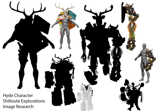
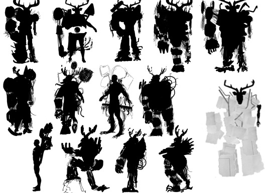
But enough of how i got myself ready to do the designs of the characters, the actual drawing and placement of these props was actually really fun to do as it was a very simple but really effective process if i wanted to get ideas out as quick as possible. Looking at the first shilloute sheet I made, it focused on the character Hyde due to him being the character I would love to model for hand in. Using the shilloute technique, his deer skull was an essential piece to his design being made up from natural debris and junk from my story as this posed as the menacing piece of his design. This si why he has items and materials like bottles, signage and general junk scattered across forming a beast like no other.
Through this process I noticed I wanted the skull to be a lot more hidden and cramped into the design of the character giving off the vibe this is a humongous character approaching you. in a lot of these designs I made on the first sheet, I had what each character was comprised of shape wise and how they were used to create a unique-looking character. Taking influence from Doomfist’s gauntlet form ‘Overwatch’ for one of my Hyde designs was a really good idea as it expressed who I might want to model a particular element for the character (like the fist and wires) as well as giving a vague representation of what it should look like. Knowing this fact, I began to be a lot looser in my design process because of it.
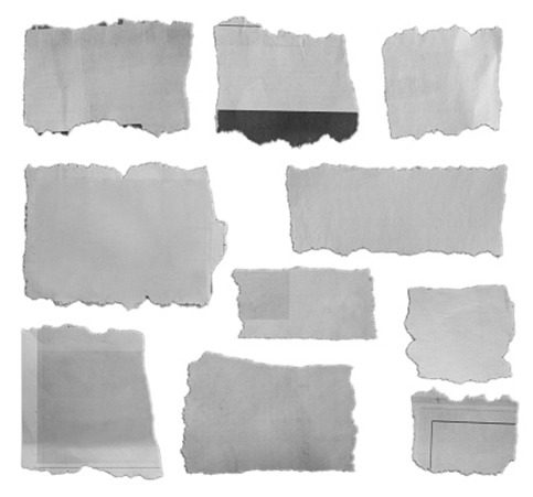
To further expand on my Hyde character’s design, I looked up paper scraps online to see a section of them clustered together. I thought because my Hyde character is very janky and uneven in appearance, these ripped up pieces of paper could emulate how the character will look if it was metal plates attached to him instead. Whilst the process was very tedious to do, I was really happy with the entire process as it really did capture what kind of character Hyde would look like if I was to sketch his silhouette out. Details like Jekyll’s arm being still show reminded me a lot of the Charger's character design (Left for Dead - Game) which is what influenced me to retain some of the Jekyll’s character into the design of him. In addition to the paper scrap method it influenced me to have his big mechanical arm separate fro, his body with only wiring connecting it. Although whilst I really liked this idea, I had to make sure it was a conventional design too as my Jekyll character as to fit inside him sorta snug and not detaching his limbs in the process. All these ideas felt like I needed to expand this particular character design.
Charger Character (Left for Dead - Game)
One slight issue I had when making any of the designs as soon as I got into the groove with it all, Photoshop kept on crashing on me or at least be really slow in placing my props onto the mesh meaning the process turned from really enjoyable to really tedious and tiring to make as across all three silhouette sheets I made, it took me quite the couple of days to make due to how badly my laptop runs Photoshop. Never the less, I still had to keep pushing on as the shilloute drawing is slowly starting to grow on me.
First experimentation sheet on the Hyde character
Ripped up pieces of paper to assemble the rough character designing of the Hyde character
Working from the paper based shilloute, I used the pre-made meshes that I found at the beginning and made 5 versions of them each specifically the front, side profile and the 3/4 angle meshes. This was to allow me to have a wide range of different ideas covering different angles of the character as they weren’t made to be consistent to all form one design all together. Because I found placing objects on top of the models to be really slow and tiresome for my computer, I thought I would create sketches using very loose sketches on my graphics tablet.
Starting off with the front facing first row of experimental sketches, one common theme I had here was to establish what the final design was going to be. Whilst this may seem really early tor try and find, it was because I could dedicate the rest of the angles to much more experimental sketches playing around the from and accessories that the Hyde character is attached too. One design aspect that you could probably already see in the sketches in the first row is with the feet as one foot is larger than the other. The way I’ve been able to communicate this I really like as it express the incompleteness that the chracter has in the world as one of my sub-themes for the story is that my Hyde character wants to be apart of human society but can’t due to his looks and always scary the city folk away.
Going back to the character design process, I like how I’ve played around with the different sizes of the leg shapes specifically with the fourth model as I love how beedy the left leg looks in comparison tot he right one which you can definitely also see in the first design I did for the Hyde character. Another aspect of the design I really like was the right arm itself as I already knew that the left arm was going to be Jekyll's own arm. So for contrast, I wanted his arm to be this huge ginormous figure that overshadows the tiny arm to emphaise the deadlier side of him.
With the second and third row of designs as previously mentioned before, these were a lot more experimental sketches to play around with poses or aesthetics that I want to add onto the already final design. I think the only takeaways from the second and third row of designs were the use of signage as I want a combination of pipes and signage to cover the back of the character as he patrols around the world fully expressing the mess he becomes off of Jekyll’s hatred in my story.
Second Shilloute Drawing Sheet
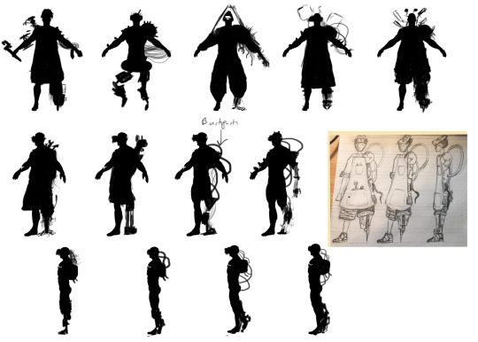
In addition to looking at Hyde, I thought I would look at using the same silhouette process in my Jekyll character working from my turnaround that I made before Christmas. Thinking about how I wanted to exapnd the character, it was mainly looking at how I could make the back look better as that was my only gripe with the turnaround for my Jekyll character due to not being too impressed with it. Through the sketches I made here, I really liked the idea for having either a portable spotlight that can emerge from the back of his back that can be used like a surgeon's light in a operation but for a mechanic. The other idea was to have a leathery school backpack to keep all his tools and spotlights in depending on the work he has to do. I think personally, I’m leaning more into the backpack design as it’s the most simplest and the easiest on the eyes for the turnaround if I was to end up modelling the character fully.
Third Shilloute Drawing sheet - Jekyll Character
Overall despite the process of shillouting these experimental character designs took far longer than expected as Photoshop really couldn't handle the process at all. I think it went rather successfully in terms of developing my ideas and coming up with new ones so quickly. I think if ti wasn’t for my computer acting up the way it has been since the start of January, I would proabley keep working in silhouette deign especially for the final sheets as they would look a lot nicer and prettier to understand.
0 notes
Text
Why Craig McCracken is a Genius
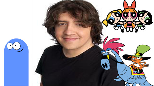
Anybody who follows my work as well as my most frequent postings and discussions knows that I LOVE animation. I sincerely and confidently say it is the greatest art form in the world, simply because in one way or another it’s every art form combined. It’s drawing, painting, acting, film making, special effects, literature and music all at the same time, and while cartoons get the unfortunate shove as being nothing more then non-intellectual “kid’s stuff”, the field has produced some of the finest achievements in art of the 20th century as well as the 21st so far. But much like any art form, the field is only as great as it’s artists and what they bring to the table. There are many great animators and animation directors that any enthusiast can point to for inspiration like Rebecca Sugar, Lauren Faust, Genndy Tartakovsky, Don Bluth, Tex Avery, Chuck Jones, Hayao Miyazaki, Sitoshi Kun, and of course the most obvious answer Walt Disney. While I have great admiration and nothing but respect for the artists above, I’d like to take a moment to appreciate the genius of the man behind the shows I bring with me throughout my childhood and even adult life. The creator of such shows as Powerpuff Girls (which incidentally he collaborated with Faust and Tartakovsky on), Foster’s Home for Imaginary Friends and Wander Over Yonder, Craig McCracken.
Make no mistake; there is a reason this man is so heavily respected and regarded in the current landscape of western animation, and you know a McCracken cartoon when you see them. But what exactly makes his work stand out? What is it about the cartoons McCracken has produced and directed that makes it so accessible to such a wide audience of kids and to an extent adults? How is it that whenever I put on an episode of Fosters or Wander Over Yonder I’m immediately put in a good mood and am enthusiastic about life? Well, after watching and studying his work I think I can boil it down to a few elements which, incidentally I’ve mentioned in previous blog posts before.
1. Beautifully Simple Character Design
Aesthetically speaking, what do the Powerpuff Girls, Bloo from Fosters Home and Wander all have in common? The answer of course is that they are deceptively simple designs that all take a very minimalist approach. So many household names from cartoons are memorable but their designs can often be so complex that if one were to try and draw them from memory, even as a skilled cartoonist, they’d have just enough trouble that they may forget a few key aspects of the design. With McCracken’s designs you can draw them likely in less then 2 minutes, especially ol’ Bloo from Fosters Home. You just draw a little pac man ghost with little flipper arms, circular eyes, a grin and a straight line at the bottom and you’re done. One might think these designs are very limited because of how minimalist they are with how you can express them, and if you’re feeling particularly like a snobby Jackass you might call it lazy. But in truth these design choices are the most practical you can get as they give you all the essentials of the character with nothing superfluous. First, because of how quickly you can draw them by that very nature they are also SEVERAL times easier to animate, and with the added aid of glorious modern day technology (when it’s not crashing that is) producing high quality entertainment quickly has never been easier. Second, all the essential parts of the character are there. Each character in a show is a distinctive shape not replicated by any other character, meaning that if you were to put them in a silhouette you could easily recognize who is who. Also, the whole art of animation is expressing character and personality through motion, which is where the acting part of the field comes in. Just by mannerisms, typical distinctive poses and even the very nature of their walk cycles we know exactly what kind of person each character from these shows is. We know the Powerpuff Girls are only innocent on the surface level and in truth are actually quite violent and gruesome (unless you’re watching the new horrendous show that completely misses the point of what makes the original so great), we know Bloo from Foster’s Home is a mischievous egotistical little trickster who is always causing trouble and we know Wander is a happy go lucky optimist who only seeks to bring happiness to all. Sometimes the best way to go is to not think too hard about it and let the main points of the character come through with no additions holding them down or distracting from the point.
2. Creative Yet Broad Show Premises
*This is my new favorite Gif*
I have to imagine each one of these shows had beautifully smooth pitches to get them funded (except maybe Powerpuff Girls because of the violence) because they have such imaginative and original premises that can be summed up so quickly to anyone who wants to watch and they leave themselves open to so many different types of stories.
*A boy visits his Imaginary Friend at a Foster Home where he and many other Imaginary Friends go on all sorts of hijinx or adventures, along the way saying goodbye to imaginary friends who find a new home*
or
*a superhero parody where a bunch of seemingly innocent and adorable little girls are actually quite violent and aggressive, and the show plays off of superhero stereotypes while also challenging typical gender roles*
Done. Great simple premise with unique concept not explored before. Take my money.
I’ve said before that it’s important for a show to have an easy to grasp premise, especially for children, because the easier it is to understand the more accessible it is to a larger audience. Plus because of the broad nature of the summary you can tell any kind of story you want between episodes. Premises like these have story ideas that just write themselves; it’s why the family sitcom of middle class family with idiot father and hot overcompensating wife exist, because everyone can relate to having a family and the dichotomy of a couple where one is the straight man putting up with the ceaseless antics of the other. Wander Over Yonder is a particularly good example of this because quite honestly all you need to know is “A couple of do-gooders wander the galaxy making new friends and incidentally run into an incompetent arch enemy a lot”. It’s basically just Road Runner but it takes place on a new planet every episode.
3. Color!!!!
Craig McCracken KNOWS how to use color. It gives all of his shows such a warm inviting feeling because it’s all so bright and either blends nicely or makes decent contrast. This may seem like a minor point, but You’d be amazed how quickly a bad color palette can ruin a show for an audience. the color choices of these shows immediately attract the attention of the viewer with it’s positive vibes and satisfying placement. Plus each character has a color scheme appropriate to their personality (or more accurately they contrast, appropriating a common theme in McCracken’s work; polar opposites hanging out with each other). The goodhearted reasonable and well behaved Mac is red, but his mischievous trouble making fun loving imaginary friend Bloo is, well . . . . blue. The happy-go-lucky Wander is orange, but his logical and pragmatic best friend and steed Sylvia is blue. The leader Blossom is pink, the innocent Bubbles is baby blue and the tough tomboy Buttercup is green. They remain consistent with these choices and much like the contrast of these characters physical appearance it makes it all the more apparent that the characters themselves contrast too.I don’t know what else to say about it, but just TELL me you don’t watch the intro to Fosters Home and get all hyped up in the process!
https://www.youtube.com/watch?v=GZiB_S9VpiU
4. Surrealist Humor
One thing you’ll notice about these shows is that they aren’t afraid to be weird, Fosters especially. They take every chance they can get to have something surreal happen only to play it off moments later like it never happened. I think that’s always been a great strength of McCracken’s shows. A huge part of comedy is playing with expectations: nobody ever gets a laugh out of something predictable. But another great and common aspect of comedy is stark, jarring contrast. I once read a WONDERFUL book called The Humor Code by Joel Warner and Peter McGraw, that was all about studying what makes people laugh, and they brought up a theory in the book that comedy is all about violation + benign. Something is jarring to our senses but we quickly find out it’s actually nothing to be afraid of. Hence why being tickled by someone we love makes us laugh: it’s a violation of our personal space, but we know our loved one wouldn’t actually hurt us. But it wouldn’t be funny if we tickled ourselves because it’s not a violation, and it isn’t funny with someone you don’t trust tickles you because the violation isn’t benign. This can also happen in reverse: something that initially lowers our defences turns out to actually be harmful or annoying or bother us in some way. I’m not necessarily saying this is the be all and end all of comedy as it’s only a theory, but I think you could apply it to McCracken’s work. His cartoons are littered with moments where a character does something strange or random or out of the ordinary and nobody bats an eye, or maybe it’ll shift in perspective about how large the situation at hand is. An immediate example that comes to my mind is the episode of Wander where a planet is attacked on a huge scale by a destroyer of planets called “Buster” . . .which actually when you zoom out it turns out it’s an adorable little puppy just playing with a ball. Humor is largely subjective, but if you ask me . . that shit is funny.
https://www.youtube.com/watch?v=LZ5QRrAosQo
Conclusion
McCracken
has been making numerous contributions to the field of animation throughout his career and has gained notoriety for the shows under his belt . . and rightfully so. He understands pure and simple what cartoons are all about: simple, down to earth, easy to access entertainment that’s fun and leaves you in a good mood. Some television can be considered junk food like reality tv shows (cheap to produce, quick to make, advertised well but loaded with garbage), and others can be considered fruits and veggies like Breaking Bad or The Simpsons (they make you a better person and challenge your sensibilities), but sometimes all you really need is a light simple snack. One that’s colorful, sweet, and maybe even a little nutritious. McCracken delivers in his work with original premises, accessible characters, bright inviting colors and a delightfully weird sense of humor. God bless ya, Mr. McCracken!
#animation#Cartoon network#Disney#Cartoons#craig mccracken#powerpuff girls#fosters home for imaginary friends#wander over yonder#genius#animators#animators on tumblr#art#cartoon
210 notes
·
View notes
Text
Best photo editor for PC to print series of pictures
Additional reading about improve an image and photo copy and paste with the best photo editor for PC free download or easy best photo editor for PC for amateurs for simple invert an image and simple photo color correction. Soften an image is easy with the powerful modern photo editor for PC. Download photo editor for experts or edit image software to saturate photos and print photo album.
It is hard to locate a great smartphone photo that was shoot with a flash. All the time, people take a picture appearance dark, negatively changing shades and making items appear rinsed. Even the cellular phone zoom is reported to get a few defects. Capitalize on the resources of all-natural lightning you can locate, even at night time. That provides you an opportunity to have fun with shadows, just like in the photo on the left, or develop a silhouette with various other ambient resources of lightning, such as traffic and outlying buildings. When you have actually taken the photograph, have fun with the direct exposure device in your favored picture editing program to made the photo a little shinier. Best photo editor for PC carries out possess some of the features is popular for, which happens very useful when you've made a decision you've like to try your give on something more high-end than print a photo as well as dynamic blending.
Best photo editor for PC can furthermore import freeze frames from video clip, alongside varied files. As well as when you are actually experiencing a little bit careless or it is merely plain unaware regarding exactly how to use a few of the resources, a wizard may assistance you to change the basics just like illumination, focus, color, and turning of graphics. For them that love their images in wide scale versions, the software application aids you effortlessly constructed photographs to make a beautiful photo.
And also when it's a chance to reveal off your photography capabilities, you can easily choice one of the graphic package deal layout themes to instantly publish all of them in a particular measurement. Get your download for the best photo editor for PC or easy photo editor for amateurs for easy blur images or easy merging photos. Improve a picture is simple with the ideal brand-new best photo editor for PC for Computer. Get this best photo editor for PC for prompt and simple sharpen an image.
Best photo editor for PC download and edit a photo software to brighten a picture or photo printing
Top best photo editor for PC to blur photos or professional merging photos
This best photo editor for PC is actually most ideal for anxious learners along with a lot of time in their hands to determine the as well technological functionalities that will frighten extremely very first time picture tweaking consumers. It additionally happen equipped along with a 360 degrees scenery plan. Likely the glossiest jewel in the package would certainly be actually the attractive skin layer result, which evens and does away with bright spots out the skin tone.
While there is actually no automatic color repair work choice fairly important to fixing the substandard lighting up very most electronic video cams drawback, there are actually still the regular attributes of automatic corrections. One of the most misconstrued components of digital photography is what occurs once you take the photograph as a matter of fact modifying your picture. That's the time where you edit the images you have actually taken, to develop the end product. Modifying your images is the matching of the darkroom from the time long period of time ago. We are going to be discuss some concepts for modifying your pictures, from the fundamentals like insert people into photo and also color adjustments, through much more complex actions. The cut out technique permits you to transform the dimension of your photo, and also to transform the element proportion. For instance, you can cut out a picture from a rectangular form to a triangle form. There are many factors you would certainly wish to cut out, consisting of for publishing in various styles and facet relations. Compared to the initial, I have chopped the photo with photo editor to remove the shining part of the right side of the image as well as reassembled making use of the rule of fourths. It makes the darkness screw much more the emphasis of photograph. You might question why I did not simply compose appropriately when making the picture. Well, in this case, I was creating a very long exposure photo shooting without needing a cam stand, so had actually the electronic camera balanced on the edge of the street for security. That extremely much restricted my capability to flawlessly frame the minute, so I just shot wider, recognizing I had the ability to chop the shot suitably shortly after the fact. In the two cases, cutting out is extremely basic and it is just involves you choosing the cut out technique and also then selecting the location you wish to maintain with your PC mouse. You use the modifications and your new chopped photo is ready to go.
New best photo editor for PC
Just one of my individual casual aggravations in photography is when the perspective contour in a picture is certainly not degree. Occasionally when we are actually caught up in the moment, this simple rule is failed to remember yet fortunately is that editing your shots with the best photo editor for PC to make them grade is likewise really manageable.
Balancing the camera within the corner of the boat dock implied that the photo was not degree that is especially recognizable to the sight anytime the image has a clearly described horizon line, just like the ocean.
This degree tool belongs to the crop tool, as well as you can just turn the image to fit. A grate will turn out to allow you become the arrangement proper while you utilize the best photo editor for PC. Regularize an image is a really basic task in which will get just a number of ticking, causing a far more aesthetically pleasing photograph. Sometimes when we take a photo, components of the image may wind up being actually shadier than we like. We describe the shady spots of the picture as shadows, and also the intense parts of the picture as highlights.
Contrast has to do with emphasizing the contrast between the light and dark areas of the photo. Increasing the comparison of a picture can dramatically boost the graphical effect in which has, by making the limits between those light as well as dark areas clearer. Shade adjustment is an additional essential part related to the best photo editor for PC. We are able to readjust photo color or texture in each sort of ways, starting with altering the overall heat of the photo just like exactly how yellow or blue it shows up, to independently altering the tone and also concentration of certain shades within a picture.
We simply wish to talk about a few extremely helpful color scheme changes anyone can utilize to create your photos simply a little bit a lot more aesthetically effective. The simplest technique in order to change the color or texture related to a photograph is definitely with the saturation tool of the photo editor. This alters the appeal of every single color within a photo to make it essentially saturated. Similar to several edits, the solution is to find an excellent balance too much saturating the pictures often tends to seem instead not naturally made. Hue pictures can be truly helpful, as well as certainly white and also dark is an amazing decision for almost all kind of scenarios, specifically, construction, as well as some surroundings views.
Scale a picture is helpful with the best photo editor for PC
Resize photos and scaling a photo is excellent with the best photo editor for PC and editing photo software download
Occasionally there may be a little something within an image that you absolutely do just not intend to be there, like a troublesome dark spot on anyone's forehead. This is quick to remove in every the leading best photo editor for PC.
It is normally simple to clear away any sort of items out of a photo however the photo editor works most ideal on distinctive, small items that are usually closed in by uniform color schemes. This is because the heal tool has to change the location you desire to get rid of with something else, as well as this works ideal when it has an area close by that looks comparable. For example, red point on a face is bordered by a great deal of likewise tinted skin, so the heal device can easily compute what to replace the white spot based on the surrounding location.
This specific is since the photo editor needs to change out the sector you desire to remove along with another thing, and this works best whenever it gets a field nearby that looks comparable. Best photo editor for PC has come to be really complicated as well as effective and it is actually feasible to adjust images and so they turn into totally different out of the original. There actually are lots of photo editor and also multitudes of techniques of having the exact same or very much the same end results. The intent most when it comes to the majority of images I publish procedure is generally to make them appear as normal as actually possible. I strongly believe this is an optimal spot to make a beginning, even when you intend to continue on as well as develop much more unique appearing pictures.
Tone array at an image is among the main problems. You have the ability to generally see a wider variety of coloration than your cam most likely make.
The meaning of image editing and enhancing is the process of reshaping a picture, basically. Still that is oversimplifying an issue that is extremely complicated.
You can usually carry out simple image editing and enhancing techniques such as photo brightness rather quickly and swiftly however intricate methods and also electronic modifying may require photo editor as well as even more experience. Best photo editor for PC is a helper that you can work with to manipulate as well as boost photos. Due to the fact that pictures include an enhancing number of uses, numerous services are experiencing methods to reutilize photos and use them on lots of channels. Helpful hints to flip photos with the photo editor download or smart photo editor for PC for professionals to professional enhance a photo and uncomplicated perspective control. Best photo editor for PC and software to edit a photo to cut images or warp photo. Download for free this photo editor for fast and intelligent improve an image.
0 notes
Text
First Drive: 2019 Aston Martin V8 Vantage
PORTIMAO, Portugal — The shade of lime green splashed across the Algarve International Circuit’s paddock is not what Aston Martin apologists, or average blokes for that matter, would call beautiful. The hue is a peculiar mix of highlighter-yellow and acid green, a visual shock clearly intended to provoke—not unlike the sharply creased silhouette of the new V8 Vantage that represents Aston’s second salvo at modern reinvention.
For a company that’s only seen two years of profitability in its 105-year history, the time is nigh for the seasoned marque to find a new voice. Though the DB11, introduced in 2016, was kissed with a touch of contemporary design language in the form of aerodynamic curlicues and a subtly pointed tail, it also kept a foot planted in the grand touring vernacular intended to satisfy the tweedy old world set. So far the efforts have paid off for Aston, with the DB11 fueling a meteoric turnaround in revenue last year. But now is a critical time to expand the repertoire and engage a younger, more daring demographic. Now is the time for the V8 Vantage.
Playing the role of the DB11’s mischievous little brother who just might have been sired by the randy milkman, the V8 Vantage is out to crash the Porsche/Bentley/Mercedes-AMG rager and hopefully not end up in the corner wearing a lampshade hat. It’s a car Aston aims squarely at the mighty Porsche 911—one of the most enduring, incalculably honed sports car stalwarts in automotive history. No big deal, right?
Externally, the Vantage’s form is guided by function, not pretense. There are no lavish overhangs or gratuitous French curves. Rather, sheetmetal seems to hug, stretch, and bulge over its underpinnings and wheel edges with purposefulness: think Frank Gehry, not Frank Lloyd Wright. Up front, Aston’s traditional “hill-climb” aperture has been traded for a more minimal maw. “Shock, horror, it doesn’t have an Aston Martin grille,” taunts head designer Marek Reichman. “Why would we put 15 or 20 kilos of weight on the furthest point forward in a sports car? The mouth is about servicing and breathing the engine, and cooling the brakes.”
Fair enough. There are other points of aesthetic contention as well, among them the tiny LED headlamps dotting the sloping nose—which, for what it’s worth, would not look out of place on a vehicle that hails from the Far East. “This is about function,” Reichman insists. “It’s got incredibly small lights because there’s an incredibly small package space. The dynamic turning envelope of the [20-inch] wheel and tire leaves you with very little space.” Moving along to the middle section, extractors—provocatively accented in a contrasting color and texture—draw high-pressure airflow away from the wheel wells and engine compartment. At the rear, a massive diffuser creates 169 pounds of downforce at the claimed vMax of 195 mph. Why not a nice round double century? “Everybody would love a 200 mph car,” says Aston senior vehicle engineering manager Craig Jamieson, “but this is a sports car with a short final drive, not a supercar.” The rear axle ratio of 2.93, versus the DB11’s statelier 2.7, works with the same ZF sourced 8-speed automatic transmission to dispatch a 0 to 60 mph time of 3.5 seconds. Not bad, Aston, not bad.
Though the Vantage shares suspension architecture like the front double wishbone/rear multilink setup with the DB11, the new car is tuned with a considerably more aggressive setup. Similarly, the Mercedes-AMG sourced 4.0-liter twin-turbo V-8 produces the same 503 horsepower output as the DB11 V8, though its intake, exhaust, and mapping yields a punchier 505 lb-ft of torque (versus 498) delivered with a sharper ramp up, plateauing between 2,000 and 5,000 rpm. Its extruded aluminum chassis, also derived from the DB11, claims 70 percent new parts.
The rain is slow and steady at Portimão’s Algarve International Circuit, and it’s finally time to slide behind the wheel and spread the pretty beads of moisture across the Vantage’s Lime Essence paint. The cabin, for those already steeped in Aston Martin convention, departs from protocol by utilizing a decidedly less precious, more masculine design. Rather than a waterfall dashboard delicately adorned in veneer, the center stack features an unapologetic array of a fixed 8-inch LCD screen, HVAC controls, and a cluster of buttons. The individual PRND transmission buttons are now in a chevron, not a row. A small, stitched leather patch occupies an area where a future manual transmission will reside, much to the presumable delight of Luddite diehards.
The first laps in the wet are run with the drivetrain in Sport (the least aggressive throttle/exhaust setting), and stability control in default mode. Discretion being the better part of valor, the conservative configuration almost immediately provides more intervention than it’s worth, with the torquey engine easily breaking the rear tires loose and the stability control violently yanking them back. Trying Sport+ and Track mode during the next session yields a considerably smoother, more intuitive dynamic. Moderation is still the order of the day, especially with decent amounts of water accumulating on this 2.9 miles of rising and falling tarmac. But the Vantage now plays far more nicely with the itchy right foot, allowing decent amounts of yaw angle before it overloads on sliding and the car’s axis is tugged back on track.
The watery conditions are unfortunate on any track, but particularly so with the Vantage because its tuning seems focused on handling, with a strong side order of torque. Regardless, my kinesthetic feedback loop corroborates the Aston’s measured 50/50 weight distribution; barring dumb moves like excessive turn-in during relatively slow corners (been there, plowed that), the Vantage turns in easily and tracks responsively mid-corner, conveying a sense of willingness to rotate when provided appropriately thoughtful inputs. Part of this comes from the relatively low polar moment of inertia thanks to the engine being shoved against the firewall. Lift the bonnet, and it seems there could be enough space to house a keg in there, if not for the big ol’ airboxes.
Speaking of airboxes, the optional quad exhaust system sampled at the track extracts some pleasingly sonorous sounds from the V-8. The tuning here is a tad raspier and focused on mid-frequency notes than in the AMG application, which is bit more guttural and, well, German sounding. The turbocharged setup differs greatly though from the naturally aspirated song of the old Vantage’s 4.7-liter V-8, which came alive with an incomparable level of musicality (second only, of course, to the now-defunct naturally aspirated V-12). Regardless, the new mill’s optional pipes make solid use of the venerable V-8 configuration, offering a pleasantly raw edge that complements the Vantage’s aggressive visual style.
The 8-speed auto performs consistently well with the powerful engine, delivering appropriately aggressive shifts and downshifts when summoned via the large, stationary polished aluminum paddles. Track composure is also aided by Aston’s first use of an electronic differential, which can apply up to 2,500 newton meters (1,843 lb-ft) of clamping force to help stabilize the car. The feature is a welcome addition when approaching the end of Portimão’s lengthy straight, where I repeatedly saw an indicated 150 mph before slamming the carbon ceramic stoppers, whisking away speed just in time for the hard right-hander. Though there’s still some lightness and a bit of tail wiggle when summoning these immense slowdowns, the proceedings still feel commendably in control considering the levels of deceleration and the slick surfaces beneath. Stopping power sometimes seemed to wane when scrubbing off nearly 100 mph of speed, only to be salvaged by what felt like a brake booster effect that sank the pedal deeper into its travel. Only slight fade was perceptible after several hard laps around the circuit.
You can only glean so much subjective data on a car’s track capabilities when you’re stuck in the wet, but thankfully Aston arranged a second day of street driving which shed more light on the Vantage’s terrestrial qualities. On the pastoral B-roads of the surrounding region, the Vantage feels remarkably more modern and extreme than it does on the circuit’s concrete superstructures. The seats are appropriately supportive and sporty, positioned about a quarter inch lower so you sit closer to earth, amplifying the sensation of speed. With relatively high doorsills, you feel you’re within, not on, the car’s interior, further differentiating the Vantage from its more grand touring-focused stablemate. The automatic transmission earns praise for smoothness when lolling about public roads. Shifts can be appropriately imperceptible when you’re not driving in anger, and the variability feels particularly impressive compared to its crisp behavior on the track. A day spent meandering through backroads conveys an overall impression biased toward purposefulness, not plushness, though the three-mode Bilstein dampers offer a noticeably more forgiving ride in their softer settings.
So where does the V8 Vantage fit in the galaxy of outstandingly capable competitors? Well, at least in the context of its Porsche 911 archenemy, it’s easy to argue that while the rear-engine German delivers on its tried-and-true mission of finely tuned driving dynamics, the Brit brings a singular sense of style to the table. Yes, the P-car’s even-keeled Teutonic-ness tickles our fancy, but there’s also some fun to be had in the Aston’s fanciful details like leather brogue edging and tailored suit stitching. And while we’ll require a head-to-head battle on dry pavement to pass final judgment on the finer points of their driving dynamics, impressions from two days of wet weather slinging suggest the Aston team has done a mighty fine job of imbuing the Vantage with a sense of athleticism and personality.
If the grand touring-oriented DB11 was the company’s initial attempt at redefinition, the V8 Vantage serves as one hell of a launch for Aston Martin’s driver-focused second act. There are still miles to go before Team Aston can sleep, with a steady cadence of upcoming models promising a full-circle rebuilding of the marque. But when Reichman leans in and not-so-subtlety hints at future product by asking, “What would you think of this car with 80 more horsepower and 150 fewer pounds?” these enterprising British underdogs have a way of making the skies ahead seem especially blue.
2019 Aston Martin V8 Vantage Specifications
ON SALE Summer 2018 PRICE $152,820 (base) (est) ENGINE 4.0L twin-turbo DOHC 32-valve V-8/503 hp @ 6,000 rpm, 505 lb-ft @ 2,000-5,000 rpm TRANSMISSION 8-speed automatic LAYOUT 2-door, 2-passenger, front-engine, RWD coupe EPA MILEAGE 18/22 city/hwy (est) L x W x H 175.8 x 84.8 x 50.1 in WHEELBASE 106.5 in WEIGHT 3,373 lb (est) 0-60 MPH 3.5 sec TOP SPEED 195 mph
IFTTT
0 notes
Last Seen Blogs

danhausenad
Very 𝙉𝙞𝙘𝙚, Very 𝙀𝙫𝙞𝙡
monta-02
Falling into the void

samu1080p
desenhos aleatórios

valianteggnickelsalad
Corinadimartinoofficial

iamwallpaperz
i make wallpapers