#拷問
Text
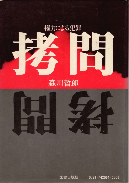
拷問-権力による犯罪 森川哲郎
図書出版
装幀=鈴木礼男
6 notes
·
View notes
Text
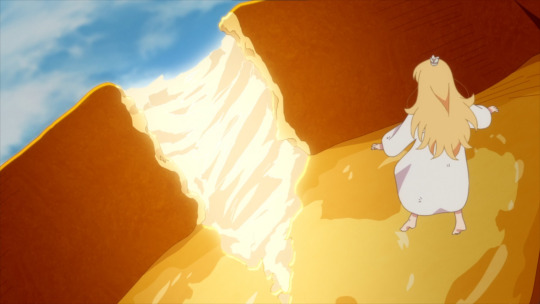
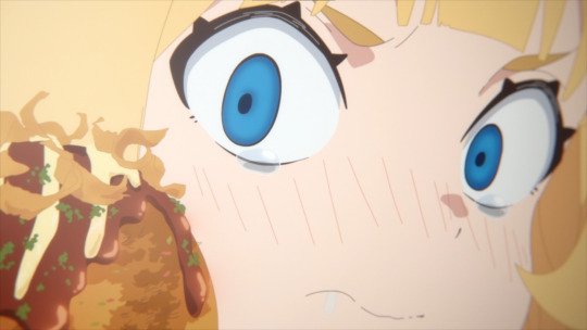
#tis time for torture princess#hime-sama goumon no jikan desu#姫様“拷問”の時間です#fyanimegifs#my gif#1k#3k#5k
6K notes
·
View notes
Text
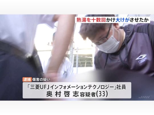
【悲報】大学院の先輩に熱湯を2時間かけ続けた男を逮捕…被害男性は全身やけどで全治3ヶ月
元スレ≫ 【悲報】大学院の先輩に熱湯を2時間かけ続けた男を逮捕…被害男性は全身やけどで全治3ヶ月
1 :moccosnoon…
View On WordPress
0 notes
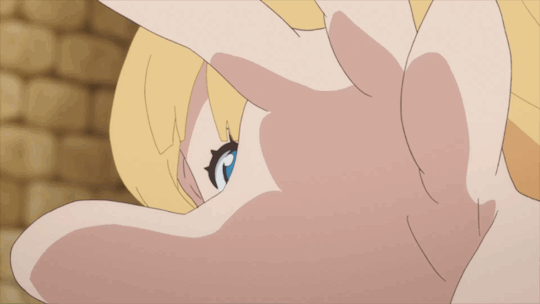
Text
トーチャーいろいろ
169 notes
·
View notes
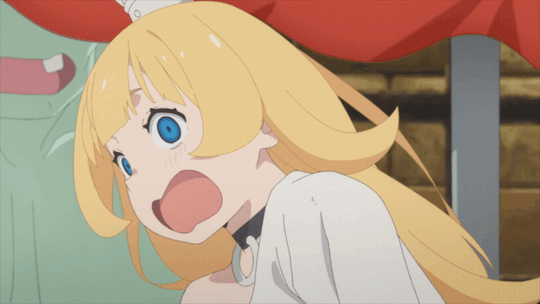
Text
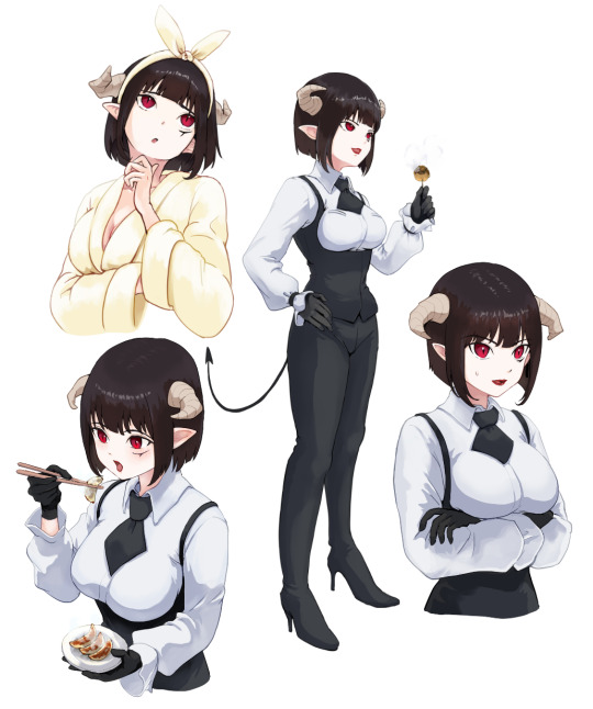
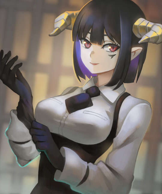
アニメ「姫様“拷問”の時間です」よりトーチャーさん。
クールそうな外見とは裏腹に、そこかしこに可愛いもの好きっぽさが見え隠れるのが良いですよね。可愛いグッズを置いてるお店には入れなくても、家具屋に置いてるぬいぐるみとかはしっかり堪能してそうなイメージあります。
21 notes
·
View notes

Text

26 notes
·
View notes
Text
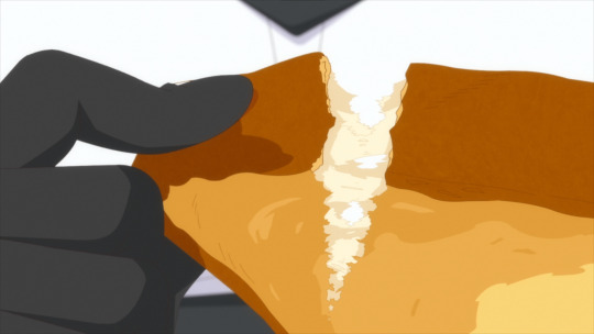
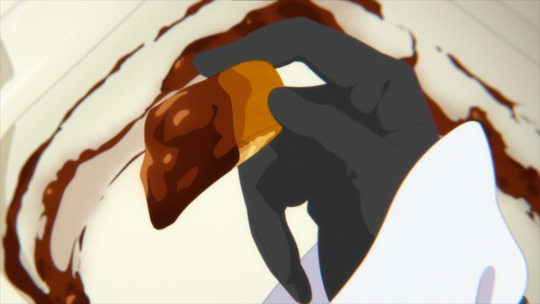
'Tis Time For Torture, Princess Episode 1: You Need To Be Watching This
Do you like food? Do you like shenanigans and humor? What about great animation and direction? I'm sure most would say "that sounds like Delicious In Dungeon", and you wouldn't be that wrong. However, and this is a potentially really hot take, I think that the first episode of 'Tis Time For Torture, Princess is considerably better than Delicious In Dungeon's, and I'll explain why.
Let's lay some groundwork though. The staff on this series is surprisingly fresh. The lead director, Youko Kanamori, is a first timer in the position. Similarly, Hasegawa Mami is also brand new to being the director of photography for an entire series. There's also staff like Narumi Konno who are somewhat fresh in terms of their experience with color design. Then there's the 4 character designers and 2 cuisine designers, plus the rest of what you'd expect.
There's a lot of new talent on this series, and they're hungry to prove themselves. I really really love seeing new staff members, especially women (because of the nature of the industry), get a shot at big roles like this. And I mean, they're proving why they should be here.
Narumi's color design is very striking and full, always finding the right balance for each scene.
You'll get traditionally colored (yet still satisfying) scenes like this, but then you'll get a wonderfully novel approach to coloring in a dank and dark prison.

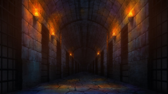
I love the coloring on the floor, it reminds of what oil spills end up looking like, and that idea of it being "dirty" and the ground and walls being covered in that layer of grime adds a lot of fun color to the episode.
Narumi just has a lot of range, though their second ever series being The Vampire Dies In No Time certainly helps with that. However, it's a pretty clear difference in color design between the two. Where The Vampire Dies In No Time leans heavily into its fantasy and simplicity, 'Tis Time For Torture, Princess makes a case for a more believable fantasy style- idealized, even. It's far less noisy of a color palette, but it has such intense range. I really really love it.
I also really really love Hasegawa's composition. The vast majority of the time you don't really notice it there, but when the humor or situation calls for it, Hasegawa breaks out some incredible composition work which wonderfully highlight the characters involved.

Also, they choose a slightly different style for the color shifts in their images. You can't really tell in the above so here's some better examples.


Rather than the more typical Magenta-Green shift you tend to see, Hasegawa opted for the less common/likely Blue-Red shift for their chromatic aberration. Of course, you can still pick out some greens and magentas in the more glaring aberrations, but it just shows Hasegawa's attention to detail, which I really love.
I mean, they're pulling out composition work that looks like it came from a high budget Gacha Game trailer.

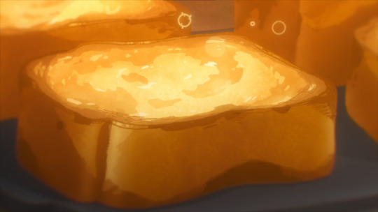
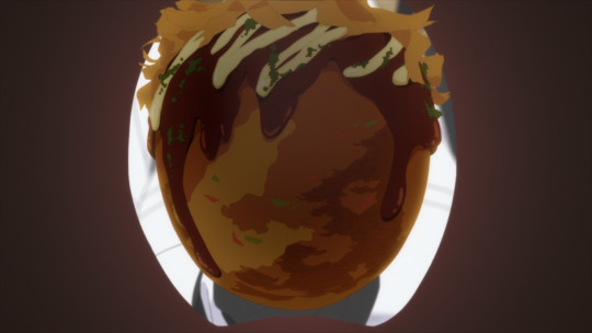
And the praise doesn't stop there, just look at the food. Makes complete sense why they'd have cuisine designers on board, this food looks irresistibly delicious.


And then there's the incredible character acting.


I think it's arguably the most interesting aspect of the episode, truthfully. Largely because there's a total of 4 character designers (two main and two sub) in charge of the designs, and there was a total of 8 animation directors on the episode (1 chief, 7 regular, 1 food). Of course, 3 of those animation directors comprise half of the character and cuisine designers.
And that's interesting for two reasons. It's likely that the designers are rotating episodes. That is, 3 on episode one and then the other 3 on the next episode. And secondly, 7 animation directors is a surprising amount considering how "inconsistent" the Princess' model is (just look at all the different images in this one post). However, I strongly believe that it's 100% intentional. The designs look too good to be the product of simple off model issues, and their appearances too well timed with the events of the episode.
So we arrive at the conclusion that the animation direction and designers for this show are pulling some seriously cool stuff.
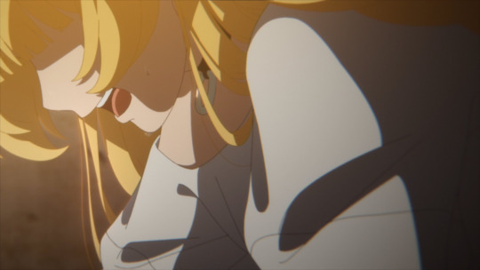
Finally, we can do storyboards. Gosh, it took long enough haha. I'll make it quick, Kanamori really prefers the super close ups to mask facial expressions and leave a lot of interpretation up to the viewer, and that sort of close up work pairs effortlessly with the obsessive focus on food.

But that's hardly the half of it. Kanamori also loves strong perspective in her layouts, and she makes that very evident when playing into the humor or intensity of a moment.


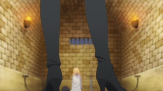
That of course also means that she imparts a fair amount of first person perspective to the episode as well. It's really amazing, Kanamori, much like many of the other high level staff members, is perfectly aware at how fluid Torture Princess is, and she expresses that wonderfully with all the different ideas employed with her boards.
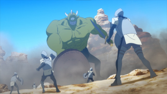
And just one last little piece. The big troll/monster fight at the start? It absolutely lives and breaths Kanamori's experience in storyboarding for Ousama Ranking. You feel their incredible awareness of scale and size and it creates the feeling of a monster of unbelievable size that the Kingdom is forced to fight against.


Anyways, this is all to say that 'Tis Time For Torture, Princess has an all around incredible first episode that promises viewers that the series desperately wants to be one of the best of the season. And I wholeheartedly believe that.
#tis time for torture princess#hime-sama goumon no jikan desu#姫様“拷問”の時間です#anime#anime and manga#anime review#anime recommendation#anime reccs#delicious in dungeon#dungeon meshi#food anime#food manga
24 notes
·
View notes
Text

397 notes
·
View notes
Text

田井中と陽鬼ちゃんってちょっと似てる、描いてみた
#けいおん#k-on#ritsu tainaka#田井中律#けいおん!#k-on anime#姫様拷問の時間です#Tis Time for "Torture#tis time for torture princess
11 notes
·
View notes
Text

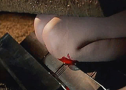
Female Inquisitor, Gômon kifujin, Rusted Body: Guts of a Virgin III, 拷問貴婦人 by Kazuo Komizu.
#movies#movie#movie caps#movie cap#film#films#film stills#film screenshots#film screencaps#film still#kazuo komizo#Female Inquisitor#Gômon kifujin#Rusted Body: Guts of a Virgin III#拷問貴婦人
15 notes
·
View notes
Text

#アニメ-カフェテリア#ランダムダンボール#姫様“拷問”の時間です#Himesama “Goumon” no Jikan desu#'Tis Time for “Torture” Princess#Official Art
4 notes
·
View notes
Quote
ロシア憲法 第21条 何人も、拷問及び暴力その他残酷な、又は品位を落とす扱い又は刑罰を受けない。No one shall be subjected to torture, violence or other severe or degrading treatment or punishment http://archive.government.ru/eng/gov/base/54.html#sel=90:1,92:16
[B! ロシア] モスクワ公演会場テロ犯が出廷…耳を切られて拷問を受ける映像公開される(中央日報日本語版) - Yahoo!ニュース
3 notes
·
View notes
Last Seen Blogs

casualhand
Untitled
piny1234
พิณนี่จัง

valthudershockheeler
Val Thundershock Heeler

fleurubi
⪩ 𔘓 ⪨
mabi-angel
Mabinogi