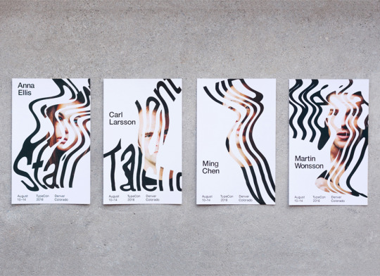
Photo
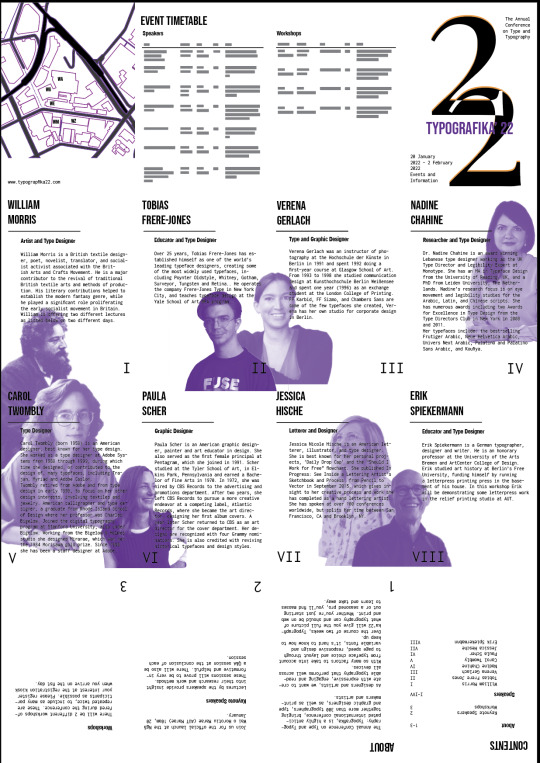


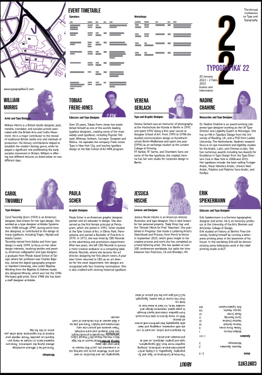
These are some different layouts that I tried out. I liked the idea of the first layout with the people enlarged and at different scales. In the end this didn’t work because I couldn’t scale them to look quite right or make the type stand out clearly. The typeface is one I tried out and did not like. I also took out the page numbers as I guess it was more of an aesthetic look when I had it placed with my black and white design earlier. Also changed the 22 because they ended up looking more like the number 3. It also had a different typeface to what I was using.
0 notes
Photo


Ways of designing the number two
https://www.behance.net/gallery/92146959/Poster-Collection-Flowers?tracking_source=curated_galleries_graphic-design
0 notes
Photo

This whole poster and the arrangment of type, photos and lines looks visually pleasing to me.
https://www.behance.net/gallery/61656967/SKYTREE-TOWERPOSTER-DESIGN
0 notes
Photo


Love the idea of turning a map into a more interesting design and poster cover. This would have been a cool idea for this assignment
https://www.behance.net/gallery/56319221/Steamblood-Map-Pamphlet-design?tracking_source=search%7Cmap
0 notes
Photo

Colours, curves, gradients and contrasts.
https://bizarrebizarrestudio.tumblr.com/post/186860794509
0 notes
Photo
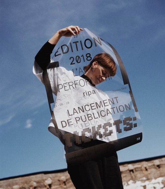
Neat idea to have a transparent background. Makes for interesting looking photographs.
https://www.behance.net/gallery/87291237/Ripa
0 notes
Photo


Another cool design by Fundamental with lovely colours. Quite a lot going on but it all fits together well. Fun to look at all the details within this
https://www.instagram.com/p/BzqLXpuArCY/
0 notes
Photo

Accidentally made this and thought it looked kind of cool, although it didn’t fit with with poster designs
0 notes
Photo

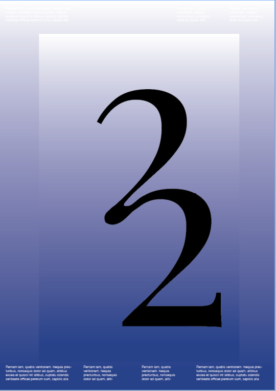
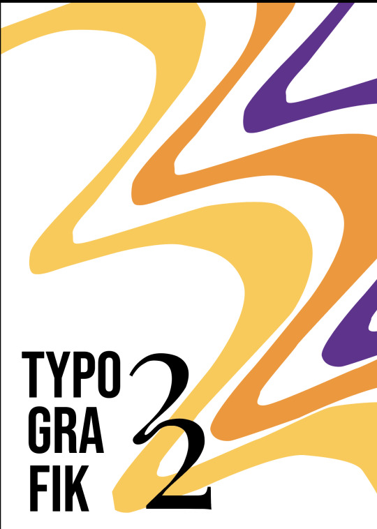
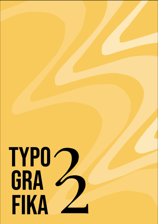

Some Poster Ideas that im working on.
Still expermenting with colour, typefaces and design. Still needs much work
0 notes
Photo
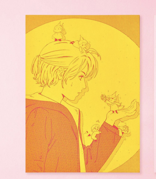

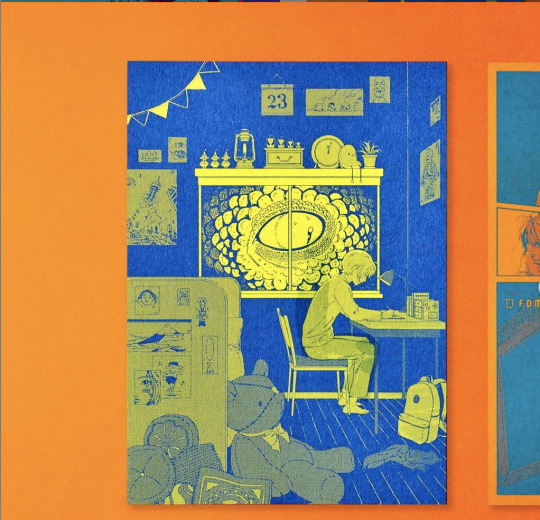
Posting these three more for the colour although I do really like the illustrations. Very neat bright colours.
https://www.instagram.com/fundamental_hk/
0 notes
Photo

Beautiful colours, light and shadows contrast, everything stands out very clearly. A nice almost grainy texture?
https://bestawards.co.nz/graphic/design-craft/studio-south/aalto-brand-imagery/
0 notes
Photo
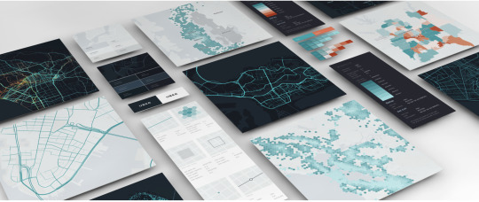
I haven't started on my map yet and came across this design. Its not the the style or look i’m going for with my posters but thought they looked cool and are good for inspiration.
https://medium.com/uber-design/crafting-data-driven-maps-b0835b620554
0 notes
Photo
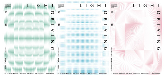
https://www.behance.net/gallery/81495311/-Light-Driving?tracking_source=search_projects_recommended%7Clight%20reflection
0 notes
Photo


I dont know why but I really love this poster, it just attractive to my eyes. Really nice bright colours which work well together. The patterns look relatively simple but it still looks like a lot is going on in a good way.
Type stands out well on top of this.
https://www.instagram.com/p/B4j-BiAiEl9/
0 notes
Photo

I really like the whole look to this poster. It’s a cool abstract way of designing chains. From a distance the colours blend together and have a nice smooth effect, almost blurry in a good way. They also use purple and orange which are colors I often find hard to make look good, this could be fun for me to try. The black is also tinged orange it seems? I also just noticed the writing around the edges is a light grey which stands out well.
https://www.instagram.com/p/B7UKW2rB63o/
0 notes
Photo
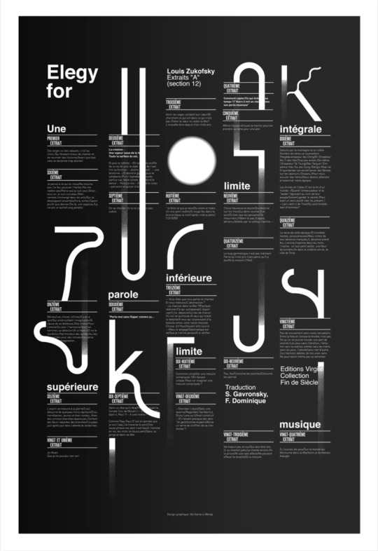
https://www.behance.net/gallery/18581505/Elegy-for-Zukofsky-Ficciones-Typografika?tracking_source=search_projects_recommended%7Ctypografika
Use of layout, type and gradient letters
0 notes
