
Last Seen Blogs
moviesiwillneverforget
Movies I will never forget
pastel--dreams
City Of Dreams

shoppining
ShopPining
hope-to-hell
Sweetness Follows
yemu
SMILE*SUPREME
Photo


Commission - ‘Steampunk TARDIS’ Portrait - Developments & Final
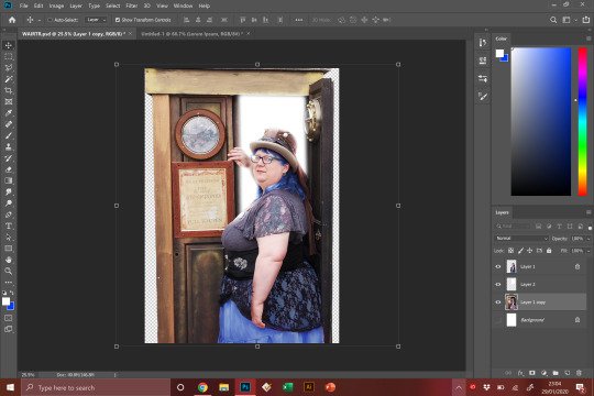
I started creating the clients portrait, painting their face and body first; doing this first allows me to use it a basis on where lighting and shading can go and work in terms of foreground and background elements.
I went on to change the colour of the clients hair and skirt which proved to be, frankly, a nightmare. The hair was difficult to isolate and I ended up having to paint it on free hand more than I was expecting to. The skirt was difficult, but the solution easier than I expected. I duplicated the imaged, changed the hue entirely to blue, and then removed the black lacing of the top over the skirt. So, technically when it came to the layers on Photoshop, the under skirt was actually on top of the lacing.
I then painted the body in full, and added in the steampunk TARDIS, which I edited by removing the wooden inside and replacing it with a bright light and alternative interior, which meant I had to adapt the lighting on the figure to make it look as if they were entering a room with bright lighting. I also added in a new background, and colour corrected the TARDIS and the figure to fit in the surroundings.
The client was very happy with the final piece, not wanted any changes whatsoever. They specified they wanted a cartoon style in the original commission, I was worried as I have never seen my style of illustration as ‘cartoon’-y. So, I went about the piece how I would any other and painted it digitally, in the hope the client would like it, which they did.
Again, I chose this commission because it was both something I felt comfortable doing whilst also being out of my comfort zone and not exactly the usual thing I create. I think I did a great job, and again, it has opened me up to new possibilities for commissions, which is always exciting and something I am looking for.
You can see the final piece below:

0 notes
Photo


Commission - ‘Steampunk TARDIS’ Portrait
The second commission I took via social media to go towards my client studies was that from a client who was looking for a portrait of themselves done. They specified liking my take on the Joker and Mary Poppins, from my online portfolio, are sources of inspiration. It’s curious because these are two very different style pieces, so I wasn’t entirely sure where to take this. In hindsight it may have been better to ask for some further instructions on what the client wanted, but instead I just went ahead with the piece.
The client was gracious enough to send forth a bunch of photos that they would have liked drawn. We both agreed the final photo they sent, which depicted them in steampunk attire entering a steampunk-esque TARDIS from Doctor Who was the best option when it came to both composition and ability to create something out of it.
As I began to work on the piece, I realised I could make more out of this; rather than it being a by the book portrait which was a basic representation of the original photo, what is I edited the TARDIS and surroundings to look more lively, as if it was a promotional shot from the original show. I asked the client if they were interested in this, and they agreed it would be a great idea. They also asked if I would edit their hair and skirt to be a bright blue rather than red and pink - I was more than happy to do this, because I am always willing to go the extra mile to please the client, but this would later go on to prove some difficulty.
0 notes
Photo


Commission - ‘Waitress’ Portraits - Developments & Final
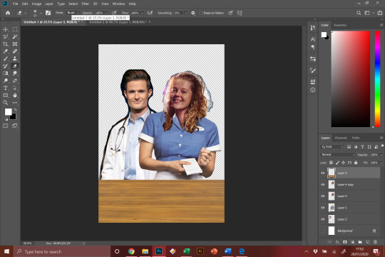
The client let me get to work, as we both had a pretty clear understanding of what was wanted from the piece. I got started by creating a base layer for the characters, using reference shots from the original show, and then manipulated the heads of the client and their friend onto the bodies. This took some time, but I have been doing this for years now and have learnt how to do it to the best of my ability.
I added some lighting, shading and colouring to both the heads and the bodies in an attempt to match them up more accurately, which I believe paid off quite well. I then went on to start digitally painting them both. This is the process that takes the longest time and, especially when it gets to the clothing, is the most tedious part - but it’s what really ties the piece together and makes it more than just a quick, rough Photoshop job.
I sent the rough to the client, who loved it, saying it was “Honestly, better than anything (they) could have imagined”, which was wonderful to hear. They said that they liked it as it was and did not need any changes to be made, which is always a plus side to any commission. However, they did have a request that I include a lyric from the show into the piece, either ‘sugar, butter, flour’ or ‘it only takes a taste’.
I had the idea to incorporate this lyric into the piece via the steam coming off of the pie on the table in front of the two characters. I added the type on, and then warped it, blurred it and lowered the opacity of it to make it seem as part of the steam. I am not entirely a fan of this inclusion, however I do like how I have executed it, after all it is up to the client to decide what does and does not go into a piece.


The client was exceptionally happy with the work done, not wanting any further changes or additions made. It’s always good when you and a client end up on the same pathway mentally when it comes to a piece, it makes it easy to create something that they will truly enjoy.
The client chose the ‘it only takes a taste’ variant of the piece, but I sent them all three version; the two quotes and a textless version, as a gesture of goodwill in case they have a change of heart.
I really, really enjoyed doing this piece for the client, they were insanely grateful for the work that I did and the fact we both had a clear and similar precise view on what we wanted to get out of this commission made for a great experience. It has also opened me up to the idea of doing similar in the future; maybe I could offer the service of editing clients to look like their favourite characters? It seems like there could be a market for it, and I did enjoy the challenge.
Below you can see the final piece:

0 notes
Photo

Commission - ‘Waitress’ Portraits
For my next step in the client studies module, I took to my Twitter and offered two pieces of free artwork to the first two people to send me a detailed commission/brief.
This is what lead me to this client, who wanted a portrait of their friend and themselves as characters from the musical ‘Waitress’. This is the sort of brief I was hoping would come up, as this is the sort of artwork I tend to make anyway, albeit not usually with clients likenesses. I was really excited to start this piece as I already had quite a clear idea in my mind on how I would go about making and designing this piece, and luckily the client and I seemed to be on the same page.
0 notes
Photo


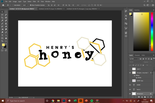
Live Brief - Henry’s Honey - Developments & Finals
The brief for Henry’s Honey explained they wanted a modern design for the logo, so I wanted to incorporate two sides of modern design; one side being sleek and straight lined, and the other being slightly more relaxed and sketched out. I think this worked because I related this idea to the bee; when working they are fast and quick paced and to the point, but they fly around quite quickly and haphazardly.
I liked the, rather obvious, imagery of the honeycomb and utilised this idea and the black and yellow colour scheme to also create this robust bee design which I thought was quite neat and worked well for a modern branding of the honey.
Looking back I realise now that I might have rushed when creating the shapes and aligning them all, and it looks slightly off-centre in some places. Also, I should have tried different colour schemes. While the yellow and black work, and are probably ultimately the best option, it is also highly predictable. I knew what I wanted to create and therefor I just ran with it, when I should attempted some alternate takes.
Below are the final logo designs as well as some sample packaging:


0 notes
Photo


Live Brief - Henry’s Honey
Using BriefBox I was able to find a sample live brief to use for my client studies placement. As a freelance designer and illustrator I thought it best to work on a few, smaller briefs and commissions to go towards this module as it is the sort of work I would like and intend on doing after I finish my studies.
I picked the Henry’s Honey logo and label design brief as I felt it suited me quite well, yet was also slightly out of my comfort zone. With my background in Graphic Design, logo design is somewhat an area I specialise in, but have not had much chance to work with in recent months.
I assumed this would be a bit of a struggle for me, and I wanted to test myself. Not only was it something I hadn’t done in a while, but I also was not used to working under the context of a product label, for such things as honey; another reason why I chose this brief. I wanted to see if I could create something out of my comfort zone.
0 notes
Text
Portal Exhibition - Part VI
Ultimately, the Portal exhibition was, well, far more frustrating than it should have been. The amount of issues we were given thanks to other peoples ignorance, laziness or plain selfishness was insane. It was tiring, unfair and a mess to organise. Working in multiple groups as such a large class really did not do us any favours.
In hindsight, it would have been better to have a certain handful of willing people who wanted to help set-up and organise the event work together, because there were frankly far too many people in the class who just refused to pull their weight and actually work on something.
It was also really an eye-opener to see how many people were unable to stick to a simple deadline and even hand their work in on time on AN EXTENDED DEADLINE. We ended up extending the deadline twice, and even then people were incapable of handing in on time.
It has been a really eye-opening experience and what I will mainly take from this is that you often have to go out of your way to get work done and not rely on others to help when they won’t. Also, if we were to be part of the curation team again, maybe take more precedent on deadlines and make it clear that people cannot just change things when they want, as that is not how things work in the real world. We were far too lenient with the class, and that will not happen again.
All that said, the exhibition was received well by guests and visitors alike and it was nice to see, especially on the opening night, people enjoy themselves and our work on display. That part of the experience was really rewarding.
0 notes
Text
Portal Exhibition - Part V

The time came for us to set up and decorate the exhibition space. We did this on the day before and the morning of the event. The Curation team, those who wanted to turn up and help that is, went along and we started to put up all the work we could. We found out at this time that the size of the prints we had decided on, which had already been changed from A4 to A3 was STILL too small to fill the space at Jacob’s Market. This was rectified though thanks to Bett who had taken the initiative to print all the art A2 sized. This saved us, thankfully, otherwise the space would have looked relatively empty.
We also found out on this day that some people had not bothered to include the AR to their piece, or had not uploaded a file in a decent size so their pieces were not able to be seen properly. It wasn’t fair on us, who had asked people multiple times to upload high quality images and to make sure their AR was working, so we made the executive decision to NOT show their work at all, as it would have decreased the level of quality on a whole.
We also found that the magnets someone ordered were far too small to hang up mounted work, so all the pieces had to go up on the wall unmounted. This left them looking slightly bubbly and flimsy on the walls. We made this work as best as we could but ultimately I feel the magnets were a poor decision. That said, maybe had the correct magnets have been bought, and at an earlier time, we could have had a really nice display on our hands.

It should also be noted that though people from our group came along to help us set up, they weren’t doing much to actually, well, help. Once again, as had been clear throughout this entire project - no one really cared enough. It was Robyn who really took charge and initiative to make sure everything was put up nicely and correctly. I helped her to the best of my ability, but it was really her who put up the entire exhibition. Some people in our group simply did not do anything much at all and it really is a shame that they got credit for work they did not put in. Putting up some candle lights and messing around while haphazardly and unevenly putting up artwork, does not count as putting up the exhibition. At all, and it was Robyn and I who really corrected their mistakes because they didn’t take it seriously.

In each persons work there was at least one of three pop colours used, so we decided to display the art in three groups, designated by colour. To separate these areas we used colour appropriate LED lighting, which was a great choice as when, in the evening of the opening event, when the lights were on down low it really was atmospheric looks very Portal-esque.
Another thing I did to create atmosphere was create a playlist of 80s, sci-fi and atmospheric music to really tie it all together. This was something I took my time to make and made sure each piece of music was suitable for the event. I think this really helped set the mood.
Ultimately, the event went well - but it really is a shame that so many people in our group managed to get by without doing much at all and get credit for it. However, the work looked nice on the night of the event and that’s all that matters; our job was done and we did it well, even if it was a struggle.
0 notes
Text
Portal Exhibition - Part IV
My main role within the Curation team was to keep track of who had and had not handed in their work, and to collect information off everyone for their info cards to go next to their piece at the event. This turned out to be far harder than it ever should have been.
Not only were more than 20 people late with their submissions, most people were reluctant to give me the information I needed. I had to ask multiple times for people to send the information by a certain date, and they still did not do so. It was getting incredibly frustrating at this point, because not only were people in our group not pulling their weight at all, but it seemed almost as if it was just Robyn and I who were keeping up with what was actually going on with the event.
As you can see from the Excel sheet below, I was keeping tabs on everyone’s info and you can see how many people not only did not give me the information I asked for, but you can see how many people handed in late too. How people thought we would be able to get all the work printed in time when they would not send it to us, I do not know. We had most submissions on the morning of the final day before Bett got the pieces sent off to the printers. It was a nightmare.

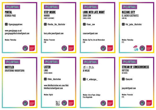
However, from this spread sheet I was able to create 26 personalised info cards for the event, which would be mounted and put up next to each piece. I made a few mistakes with spelling on these, because I had so much to write, but it was easily fixable. Technically, this should probably have been done by the design team, given that they were in control of all logos and art for the event - but seeing as none of them offered to do it, I figured I would do it myself, and I am glad that I did as I am happy with how they turned out, and they added a real flare of professionalism to the event while also allowing guests to learn about the artists.
0 notes
Text
Portal Exhibition - Part III
26

As our team leader, Robyn was in control of writing the brief, which I assisted in where I could. Nobody else in our group offered to help, it was here when we realised that maybe it would not be as easy to work as a group as we first perceived. There were not necessarily any arguments, but a certain lack of mutual work being done.
As a group we decided on using colour schemes and pop colours in our work as a class in order to make all the pieces coherent despite the fact we all have such unique and different styles. We came up with multiple different colour schemes, and had a vote, within the class, to decide which of these colour schemes everyone preferred. We also decided that it would be good if everyone created a piece of work that was the same size as each other. At the time we decided on A4, as we were not sure how large the space in the exhibition would be. We later learnt that the pieces would have to be much larger to fit the showroom we booked within Jacob’s Market. We also learnt that some members of the class were not reading the brief correctly, if at all, and decided to do their own thing, creating pieces that were too large, or not using the right colour schemes. This was a massive pain and the people involved showed little to no remorse about how this would affect others work and the work we were doing to keep the event looking cohesive and together.
The date we chose for the hand-in for everyone’s work was originally the 17th, this would have allowed us as the Curation team time to get everyone’s work printed, mounted and sorted before the day of the event. A large amount of people in the class, however, decided we were not giving them enough time - which at this point was ludicrous, as they had already been given the theme weeks in advance, and should have started working on their pieces already. The date was eventually pushed back, making it harder work for the Curation team - but this was completely redundant in the end, as no more than 7 people in our class of 26 actually handed the work in on time.
0 notes
Text
Portal Exhibition - Part II
It was at this point that everyone else in the class got to work on their own group sections; designing the logo for the event and finding a location, but we still did not have much work we could do despite working on the brief, and planning on what decorations we could attempt to get for the show.
We started to look at different ways of mounting as well. It was suggested that we frame the pieces, but we were unsure if the AR would work with this, and how much it would cost to provide that many frames. Other ideas that were suggested were hanging them up with clips, which could have worked well, but it was decided that we would buy magnets and stick the work up on the wall using these. We wanted to mount each piece on mount board, and then stick them on the walls with two magnets, one on each side making for a clean and non-sticky answer to our predicament. This would end up to leading to more issues later down the line.
We also decided that the best way to decorate a Portal-themed event would be with sci-fi-esque lighting and colours. This was an excellent idea at the time, and we set off, giving each member certain items to get in preparation for the event, this too would turn out to be a bad idea later on.

0 notes
Text
Portal Exhibition - Part I
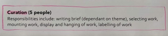

The theme for the pop-up exhibition chosen was ‘Portal’. Robyn, Harry, Charley, Jess, Rhiannon and myself were assigned to the group ‘Curation’ - meaning we were in charge of creating the brief, and presenting the aesthetic choices for the exhibition as well as collecting and mounting all artwork for the show. At the time I was not very happy about this decision, with my background being in Graphic Design, I would have much better suited a role in the design team, but I was absent on the day of assigning the groups, so it is my own fault.
Early on, as a class, we came to the understanding that we wanted to use Augmented Reality within our show to bring every piece to life. This meant making sure everyone was creating work that could have an AR side to it, which we would later come to find is not as easy as it would seem.
It was evident from the start, however, that our roles were really not going to come into play until much later into the process, as we had to wait for people to create their work before we could even think about how to present it. We discussed different ideas, specifically about what size each piece of artwork should be, and how we could make each piece look coherent as a group. However, it wouldn’t be until later that our real work would begin.
1 note
·
View note