spatialtypecarona
Spatial Type
Connecting communities in times of isolation
44 posts
Don't wanna be here? Send us removal request.
Last Seen Blogs

hiromipanda
Hiromi Panda

coviello-arte
mr. nicole

author-confessions
fanfic author confessional

creation-is-rebellion
Isaac

skurfer
Untitled


Photo


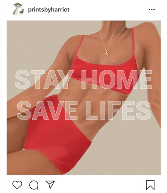
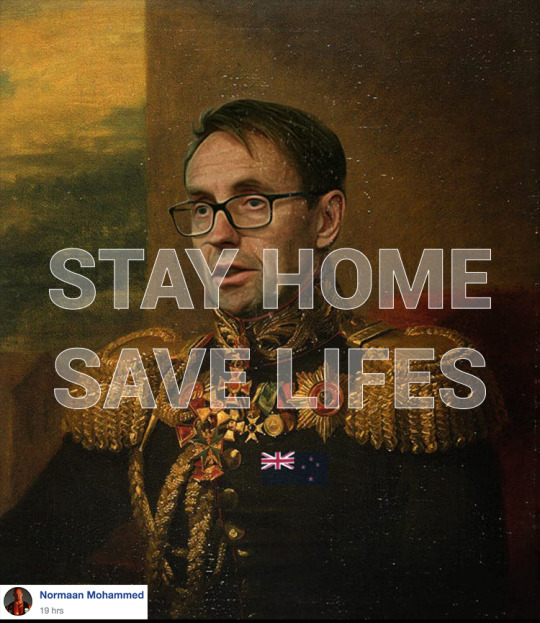
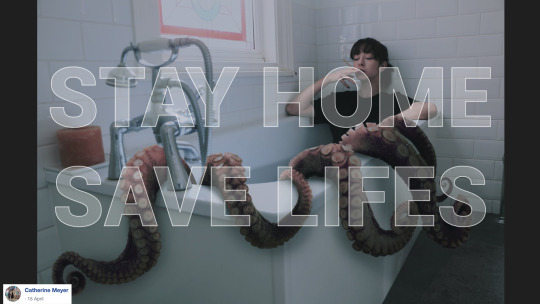
Black and white vs coloured version of the homepage image to invite visitors to look at our project.
0 notes
Photo
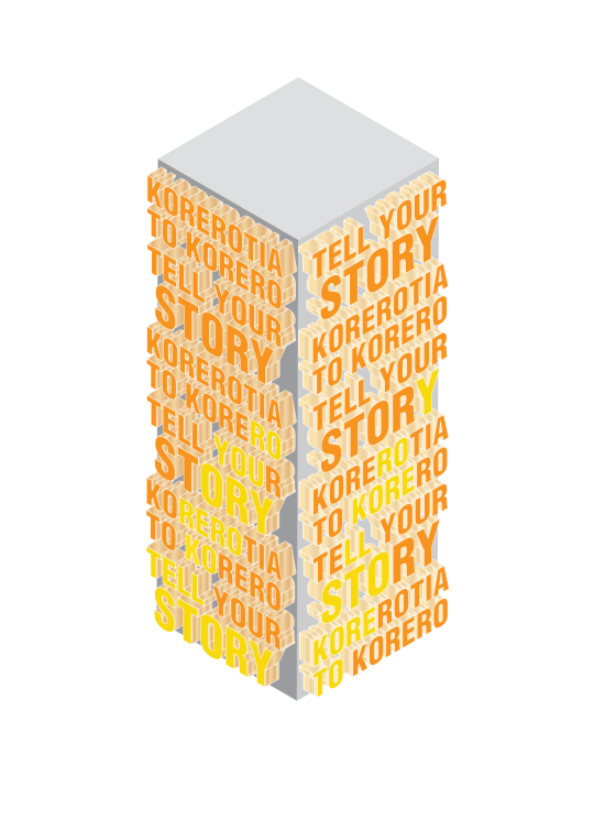
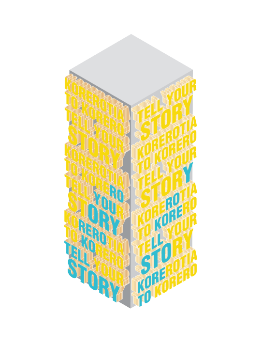


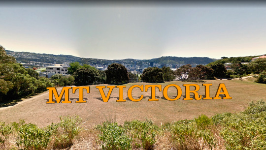
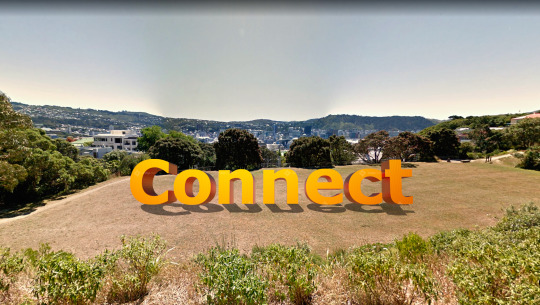
Our new brighter colour scheme. As a group we found that to be more inclusive we should have the Te Reo translation of ‘Tell Your Story included one the stand. There was also the decision of having the letterforms be made out of plywood and only the front facing surface painted in the designated colours. The idea was that the colour climbing the stand was the main colour of the following stand, encouraging users to seek out the next stand.
0 notes
Photo


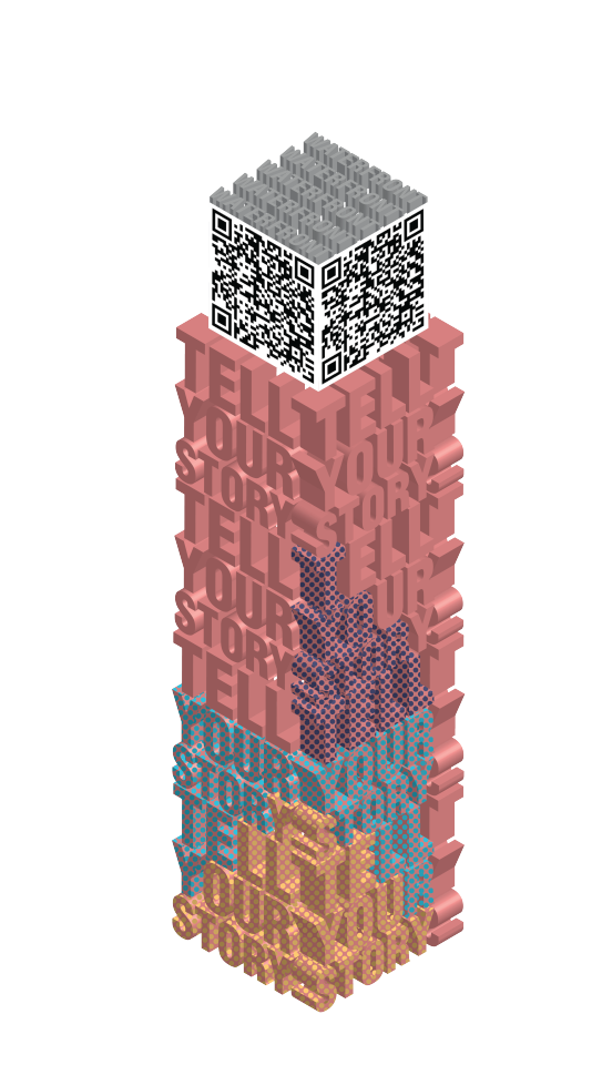

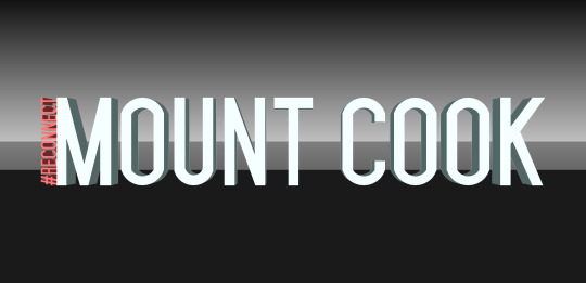
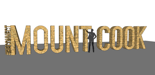
Dotted pattern climbing up stand, all colour combinations. Decided to ditch the dotted pattern as it made the letterforms harder to read. We also changed the colour scheme as this one didn't feel that exciting for our theme.
0 notes
Video
0 notes
Video
Compilation of AR filters in the order we intend people to find them.
0 notes
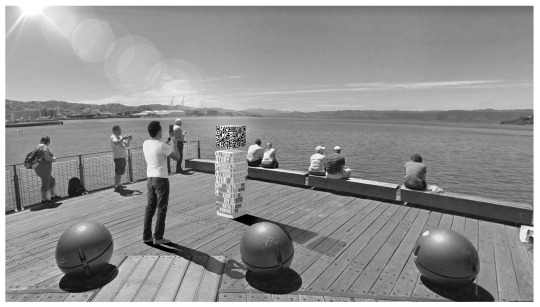
Photo

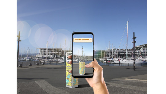
QR codes linking to instagram filters with previews of effects
0 notes