Last Seen Blogs


certainly-treatment-couple
Untitled
cptjamesbhook
cptjamesbhook
battlingbritney
Untitled

turtletravellingwiththedoctor
This Side of Tumblr
Photo


Reflection:
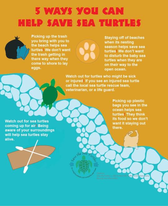
This design campaign was by far the most difficult thing I’ve ever done. There were times I had to re-do things or start completely over with a brand-new plan but I did it. My poster along with the merchandise advocates for sea turtles. Sea turtles aren’t getting all the attention their supposed to anymore by the press, so I decided to help them out. The poster and brochure can be understood by anyone even if they don’t speak English. I used graphics such as a sea turtle, boat, eggs, and trash. These are a few of the many issues the sea turtles are facing. Next to each graphic is a small paragraph explaining why or how the graphic is an issue. The title is bright red and in each body of text there is an exclamation point that is bright red. This connects the body to the title, so people know what it is explaining.
My original poster idea was all over the place, along with my original logo/design. I feel as though I grew a lot during this campaign which helped me realize very helpful tricks. After I fixed a lot of my work, I was really happy with the end results. The poster looks more informative but not so much so that its busy. The brochure is more unified and is easier to read than it was before. My original logo had everything to do with pollution but not the turtles. I decided to add a turtle as my logo since pollution is just one of the many issues that se turtles face. I became more direct and less broad during this campaign which I’m very happy with. I believe I advocated for the sea turtles with my poster and other materials successfully.
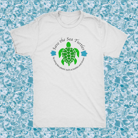
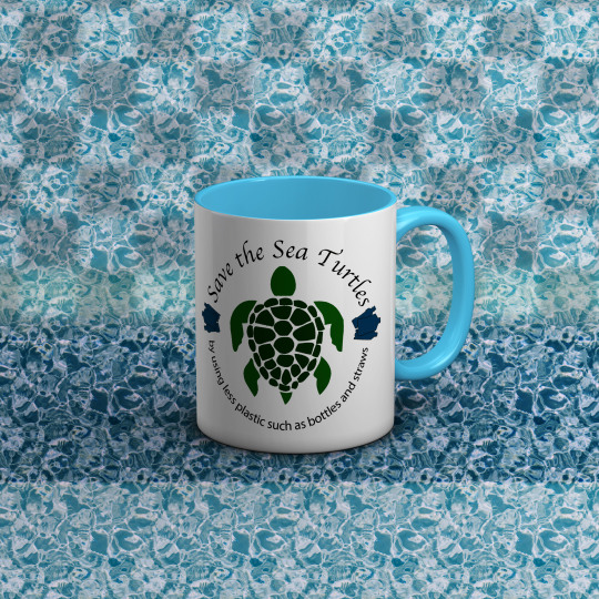
The brochure goes into more detail about the issues, why its happening, and how we can stop hurting the sea turtles and their home. I connected the brochure with the poster, mug, t-shirt, and tote bag with a logo that is seen on each item. People can get more involved with the sea turtles by scanning the QR code on the back of the brochure. The QR code sends them to a legitimate website that has other ways of helping and donating to the cause. Visually, QR codes attract the eye and are very easy to scan and get the information you need. If someone grabs my brochure and doesn’t read it but scans the QR code, it is just as effective.
When I was given feedback for my first drafts or sketches it helped me a ton. I was able to get perspectives from other and see my design flaws through other people’s eyes. This allowed me to grow as a creator and learn how some things worked better than others. For example, not everything has to be center aligned. Center aligned poster are more seen with theater but with my advocacy poster it just doesn’t work. I also learned about dropping the opacity on shapes and how it helps sometimes but not others. If you have a complex background and want letters to show up on it than a rectangle with low opacity might help. Other times its best to keep the opacity at 100% rather than dropping it. I learned that keeping things simple is more than trying to make it super busy with information. You want things to flow and not have your readers eyes all over the information. Right align became my best friend in making my work look more professional and less sloppy.
I also was able to connect things more efficiently thana before. I can connect graphics and meanings even without using words. Icons go a long way since we live in a world that is being more diverse. Not everyone understands English, so using icons helps other to understand a little bit of what you’re trying to say as the creator. Making my poster easy for everyone to read also helps my campaign to help bring awareness to the sea turtles.
Going past the t shirt, mug, and tote bag this campaign can grow into something much bigger. Targeting certain people on the coast such as small businesses, could help tremendously. Starting at the coast and working our way inland can grow the campaign and get more people actively involved. Although small now, if done right, this could really help us as humans and the sea turtles. They make up so much more than we know and without them in the ecosystem a lot of fish and marine life would fall out of balance.
0 notes
Photo
Design Rational:
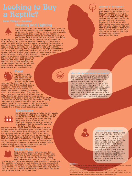
My final poster successfully advocates for all reptiles in the way that they should be cared for by all owners. I included all information that is necessary for their survival and care in captivity. My poster includes all reptiles, not just snakes. Each reptile has key parts in which one has to research about in order to care for them properly and while through not universal, my poster does cover a lot of the key research points.
The huge graphic of the snake will bring attention to the text of the poster and directly correlates with the title and body of texts. The title is a light blue along with the headings of each category of care for these animals. The icons are also the same color as the snake to create a relationship between the two. This is also true for the blue title and headings. The information text is black so it is clearly seen on the light orange background. The text is Arial so it is easier to read on the background. All the information text are the same so they also form a relationship and the reader knows that it is information pertaining to the overall theme of the poster. Advocacy for these animals.
My poster has a lot of information so anyone that comes to read it will be interested in the topic enough to sit and read all my key points or at least the first sentence under each heading. A lot of what I included is the information I believe to be most important for each reptile. Most owners are not aware of this information and that is why I decided to advocate for them, they are misunderstood and can be loved just as much as any other animal.
The process in which I went about researching and designing this poster made me realize just how much I consider these animals in what I do every day for them. I make sure they have water, the right humidity, the right heating temperatures, and that they are fed correctly. The process of design was a bit difficult, snakes have such a free-flowing body and trying to fit text around that was hard. Figuring out where the snake should go on the poster wasn’t easy as well, I had other ideas but considering the size of this poster they weren’t going to fit correctly.
My process of research was also a bit hard, figuring out what as absolutely necessary and had to be on the poster was key to organization. There is so much more that goes into caring for these animals than what is on my poster. I had to condense some of my topics under one heading because if I didn’t, I wouldn’t have any room for other important information. Each reptile is different but the general information you need to research is the same.
During critique I learned a lot about alignment in my poster and how the text should flow around my snake. I learned a lot about dropping the opacity on text bubbles as the text on top is a bit clearer rather than leaving it on a darker color.
0 notes
Photo
Hashanah Cejas
Typography
11/05/2021
Research: Caring for your Reptile
· Enclosure size
o One of the most common mistakes is that people buy enclosures that are too small. While the enclosure may fit the animal at the time of purchase, reptiles grow, often reaching adult size within a year or two. It is cruel and inhumane to house an animal in an enclosure that is too small. It not only causes severe stress which leads to illness and behavioral problems – it also makes taming and working with territorial species that much more difficult. Such animals spend most of their time trying to break out of their enclosure, often injuring themselves severely enough to require veterinary care. For some reptiles, such as iguanas and large pythons and boas, there are no commercially made enclosures big enough for these animals, and much of what is available is not the right shape for them. This means that you must build, or have built, an enclosure that may ultimately take up a good portion of your living space. Buying the right size enclosure is very important and can become costly. Getting large snakes or lizards will put you into a tough position, especially if you don’t have the money for a $700 custom enclosure.
· Substrate
o There are many different substrates for reptiles such as
§ Wood
§ Recycled paper bedding
§ Coconut fiber
§ Alfalfa meal
§ Paper towels
§ Newspapers
§ Reptile carpets
§ Vermiculite
§ Moss
§ Walnut shells
§ Tile
§ Sand
o Depending on the type of reptile, one of these substrates would be perfect. I DO NOT RECOMMEND SAND! Although most reptiles can live on sand and that is what most people tend to get, sand causes impaction! Impaction is the buildup of sand in the digestive tract that can kill a reptile. Most sand is calcium sand and calcium is important in a retile diet but eating it in the sand can cause impaction. I recommend play sand or safe to digest sand for reptiles if you buy them sand for a substrate.
· Food
o How often is your reptile eating? How much money does it cost to feed your animal? Can you breed your own? These are questions to consider when thinking about getting a reptile. There are several food options such as dubia roaches, silk worms, meal worms, crickets, horn worms, mice, rats, and vegetables. Some reptiles can be kept on a powered diet without bugs as well. Insects can become expensive and so can rats/mice. Being able to give your pet the right stuff is important to the well-being of the animal. Feeding them regularly differs from each reptile as well, snakes can be fed once a week or only once a month. Bearded dragons need veggies everyday but only need insects 2 or 3 times a week depending on age.
· Terrestrial or Arboreal
o Terrestrial enclosures must have a surrounding that provides the animals adequate width and depth to live, grow, and provide adequate thermoregulation. Reptiles that call this environment home, still make use of various irregularities in their surroundings, irregularities often being different microclimates.
o Arboreal reptiles like anoles, water dragons, iguanas, as well as a variety of agamas, geckos, boas and pythons spend the majority of their time in trees. Therefore, enclosures for arboreal reptiles should be tall and have a required breadth according to their size. Reptile enclosure must be created with solid branches that are harmless to give them a natural reptile habitat. If you have a larger reptile, it is suggested to provide shelves for basking and roosting.
· Other pets
o Cats are born hunters, and even your lazy Garfield clone might turn into a killer when stimulated by the scurrying of a new gecko or other reptile. Geckos are easy prey, being small and enticing. Your old kitty might find a tasty morsel like a baby crested gecko completely irresistible. Most reptile enclosures are not designed to keep a determined predator out, and that’s exactly what Fluffy represents to our scaly friends.
o The best solution is to keep the species completely separate! Have a separate room, with a door, for your vulnerable reptiles as well as fish, amphibians and birds. This is the best option if you have a large collection of herps (a collective term for reptiles, amphibians, and invertebrates) as long as you remember to shut the door. If you have a solid, not screen, lid for your enclosure you should be able to keep the kitty out, just be aware that she might be constantly plotting and waiting for the chance to get to the critters at just the right moment when your back is turned!
· Heating
o Being cold-blooded, a captive reptile doesn’t have the luxury of maintaining its body temperature within the range that it needs. It has to rely on you to provide an environment that allows it to stay healthy. A temperature gradient should be provided to allow your herp to move from place to place as it needs to warm up by basking, or cool down. It’s also important to invest in a good thermometer and proper lighting. Depending on the species, you may also need to purchase specialized heating equipment like nocturnal heat lamps, basking lights, under-tank heaters, radiant terrarium heaters, etc. Having the correct temperatures during the day and at night are extremely important. Not having these things can cause issues with your pet’s
· Lighting
o One of the top issue’s reptiles have in captivity is lack of appropriate UVB Lighting. While it’s not necessary for all reptiles, it is highly recommended and for many it is imperative. Animals such as turtles, tortoises, iguanas, bearded dragons, and chameleons cannot live without access to proper levels of UVB. Without it, they are unable to synthesize vitamin D3 and metabolize the calcium in their diet. Calcium is important for proper bone growth in reptiles, but is also necessary for nervous system function. Without UVB, these animals can become deformed, paralyzed, and will eventually die. UVB and UVA are good for all reptiles. While some species may not need it to survive, many studies show improved immune systems, increased activity, better eating habits, better breeding habits, and a better circadian rhythm, all building up to a healthier and happier pet. Does your animal need UVA and UVB? Without one or the other your pet could develop serious health conditions which cost a lot of money to fix.
· Enclosure
o There are several types of reptile enclosure commonly used in today’s reptile industry:
o
o Racks
o Tubs
o Aquariums (aka Tanks)
o Terrariums
o Glass
o Wood
o PVC
o Grow Tents
o Screen Cages
o Tortoise Tables
o Furniture Conversions
o Each one has their own pros and cons. Do you want and enclosure to look pretty or are you breeding animals and just need a space for them to live comfortably? Glass tanks aren’t the best because they don’t hold heat or humidity well without modification, transparent walls can stress the occupant, accessible via the top only, which can make occupants more defensive, and it can shatter into sharp shards if damaged. Having other animals like a cat or dog can stress your pet out if your other animals have access to them.
· Humidity
o Reptiles in the wild are accustomed to locations with fairly stable humidity. Depending on the animal’s needs, you will need to provide a means to regulate the humidity in your pet’s home. You may need to install misting equipment, drippers, or foggers. And, of course, if your pet is sensitive to humidity, a good humidity alert device is an absolute requirement. Some reptiles need more humidity than others. Making sure they have the right amount is important so they don’t have raspatory issues and or sheading problems.
· Size
o How big will the animal grow, and what will you do when it reaches that size? That beautiful 20-inch Burmese python may seem like fun now, but within 5 months, it’s likely to reach 5 feet, and it has the potential to grow to 18 feet at maturity. Each reptile has a min and a max growth, knowing this beforehand will allow you to buy the right size enclosure for the current size and or upgrade later on down the line. How much are you feeding this reptile? If you are feeding to correctly you should see steady growth and sheading, paying attention to that will also tell you when to upgrade the tank size. Doing research on how big the reptile can grow lets you know if you are comfortable handling and feeding this animal.
Works Cited
· Amy, Spiral. “Reptiles and Cats: Keeping Geckos and Small Reptiles Safe | Moonvalleyreptiles.com.” Moon Valley Reptiles, 2012, www.moonvalleyreptiles.com/education/reptiles-cats.
· Complete, Critter. “Enclosure Size Guide.” Complete Critter, 2020, www.completecritter.com/how-big-should-it-be.html.
· Dragonhaus, LLC. “Terrestrial vs. Arboreal Reptile Enclosures.” Dragonhaus, LLC, 2020, thedragonhaus.com/blogs/scale-talk/terrestrial-vs-arboreal-reptile-enclosures. Accessed 10 Nov. 2021.
· Kruzer, Adrienne. “These Are the Bedding and Substrate Options for Your Pet Reptiles.” The Spruce Pets, 2019, www.thesprucepets.com/bedding-and-substrate-options-for-pet-reptiles-1239410.
· Mariah. “SHOWDOWN! What’s the BEST Type of Enclosure for Your Reptile?” ReptiFiles®, LLC, 18 Jan. 2020, reptifiles.com/best-type-of-reptile-enclosure/. Accessed 10 Nov. 2021.
· Merker, Walter. “What Foods to Feed Your Reptiles.” Reptiles Magazine, 5 June 2014, reptilesmagazine.com/what-foods-to-feed-your-reptiles/. Accessed 10 Nov. 2021.
· That Fish, Place. “Reptile UVA & UVB Lighting Guide.” Www.thatpetplace.com, 2020, www.thatpetplace.com/articles/uva-uvb-article. Accessed 10 Nov. 2021.
· Tavares Animal, Hospital. “Things to Consider before Buying a Reptile.” Tavares Animal Hospital, 30 Jan. 2017, www.tavaresanimalhospital.com/things-consider-buying-reptile/. Accessed 8 Nov. 2021.
· Zilla. “Reptile Products & Care Information | Zilla.” Www.zillarules.com, 2021, www.zillarules.com.
· https://www.tavaresanimalhospital.com/things-consider-buying-reptile/
· https://www.zillarules.com/articles/top-amphibian-reptile-mistakes-to-avoid
· https://www.thesprucepets.com/bedding-and-substrate-options-for-pet-reptiles-1239410
· https://www.thatpetplace.com/articles/uva-uvb-article
· https://reptilesmagazine.com/what-foods-to-feed-your-reptiles/
· https://www.completecritter.com/how-big-should-it-be.html
· https://reptifiles.com/best-type-of-reptile-enclosure/
· https://thedragonhaus.com/blogs/scale-talk/terrestrial-vs-arboreal-reptile-enclosures
· http://www.moonvalleyreptiles.com/education/reptiles-cats
Hashanah Cejas
Typography
11/13/2021
Design Brief
Reptiles are awesome pets and like any other animal, we want to treat them with care. Unfortunately, reptiles aren’t treated the best because of how high maintenance they can be depending on the reptile. Each reptile has several categories to consider such as enclosure/size, food, heating, and so much more. Although these pets are awesome, doing your research will benefit you and your pet. My design and main focus for this project is to advocate for these reptiles so they aren’t mistreated anymore.
My target audience for this project are 12- to 30-year-olds. Typically, children get a reptile at the age of 12 or older and the adults are usually between 25 or 30 years old. I’m targeting the children but also the adults, it’s important for the children to know this key information but also the adults. If adults know the information then they can decide if their child is ready to own a reptile. In most cases the kid will ask the parent repeatedly and the parent will just say yes if the child has done their research. Nine times out of ten the child did little research and decided that the animal was just “cool to have”. This lack of knowledge leads to hefty vet bills and or the death of the reptile.
This topic is important because reptiles are pets just like dogs and cats. I feel as though reptiles don’t get as much attention as dogs or cats because they aren’t “as important”. What I’m trying to say is that dogs and cats get more attention when they are being mistreated than reptiles or other smaller animals. Reptiles deserve the same amount of attention as a dog or cat. Animal cruelty is no joke and can even cause other people to get involved. By voicing facts about these animals, I hope to change parents minds about allowing their young child to own such beautiful creatures.
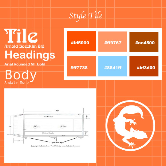
Throughout my campaign I plan on sharing knowledge about reptiles and showing people that it is extremely important to treat these animals correctly. Not having the right enclosure, heating, humidity, or food will make the reptiles life miserable. My poster will be set up with icons that represent how someone should care for the reptile correctly. These icons will be centered around a huge snake that will be brown or a dark orange color. Most reptiles are from the desert or rocky areas, so I decided to go with four variations of orange ranging from light to dark along with one brown and a blue. My hexadecimal numbers are #ac4500, #88d1ff, and ff7738 to name a few. My color wheel will consist of 6 colors or less. The light blue will be the color of the text, I’ve noticed that it stands out on top of the darker colors nicely. The background will be a light orange, allowing the blue text to pop out on top. The dark brown snake will have great contrast when next to the light orange and blue text. The icons will also be aligned with my color pallet, having each icon a different color would make the poster too busy. Making the icons all one color will help with unity. My type faces are Arnold Boecklin Std for the title, Arial Rounded MT Bold for the headings, and Andale Mono for the body of the text. The title type face reminds me of a snake and will draw attention to the poster. The heading and body type faces are legible and the graphics that accompany them will allow people who don’t speak English to understand the main idea of the poster.
Each category will be an icon with text under it that surround the main graphic of the snake. Within the snake will be some health concerns that come along with buying reptiles as a pet, not only are snakes in danger of this health concern but all reptiles can be impacted by impaction in their lives. The icons will consist of a heating lamp, water drop, enclosure/tank, size of the reptile and more. These icons will have text under them explaining how to use the knowledge to help the reptile. For instance, the heating icon will have information concerning what kind of heat that reptile needs. Should the reptile have a heating mat under the enclosure or a heat lamp? Should they have both? This information will be listed under each icon and represented by that icons picture.
0 notes
Photo

Hashanah Cejas
Graphic Design
11/05/2021
Research: How to save the turtles
· Topic Information Relevant to present
o “SEE Turtles was launched in 2008 as the world's first effort to protect these species through ecotourism by conservationists Dr. Wallace J. Nichols and Brad Nahill. Originally begun as an Ocean Conservancy project, SEE Turtles was later fiscally-sponsored by the Ocean Foundation and most recently Oceanic Society. In 2016, SEE Turtles became an independent 501c3 non-profit based in Portland, Oregon. In recognition of our work to protect sea turtles around the world, the organization was awarded the prestigious Changemakers Award from the World Travel & Tourism Council, as well as the Skal Sustainable Travel Award.”
These issues have been around for a while now and even in the present day remain a threat to the turtles and humans. Turtles are such a huge part of the eco system and if they were to go extinct it would affect way more than just the ocean. Oil spills, plastic, harvesting, and lack of preservation for these animals have caused them to be endangered and will damage the ecosystem.
· Who is impacted by your topic?
o The ocean: “Sea turtles are a fundamental link in marine ecosystems. They help maintain the health of seagrass beds and coral reefs that benefit commercially valuable species such as shrimp, lobster, and tuna.”
o “Without sea grass beds, many marine species humans harvest would be lost, as would the lower levels of the food chain. The reactions could result in many more marine species being lost and eventually impacting humans. So, if sea turtles go extinct, there would be a serious decline in sea grass beds and a decline in all the other species dependent upon the grass beds for survival. All parts of an ecosystem are important, if you lose one, the rest will eventually follow.”
o “Sea turtles are part of two ecosystems, the beach/dune system and the marine system. If sea turtles went extinct, both the marine and beach/dune ecosystems would be negatively affected. And since humans utilize the marine ecosystem as a natural resource for food and since humans utilize the beach/dune system for a wide variety of activities, a negative impact to these ecosystems would negatively affect humans.”
· WHERE is your topic relevant?
o Beaches
o Brackish: lagoons
o Nearshore: seagrasses
o Coral reefs
o Open ocean
o Coastal habitats
· What actions need to be taken?
Reduce marine debris that may entangle or be accidentally eaten by sea turtles.
Participate in coastal clean-ups and reduce plastic use to keep our beaches and ocean clean. Trash in the ocean can harm sea turtles and other creatures that live there.
Carry reusable water bottles and shopping bags. Refrain from releasing balloons, they'll likely end up in the ocean where sea turtles can mistake them for prey and consume them.
Keep nesting beaches dark and safe for sea turtles. Turn off, shield, or redirect lights visible from the beach. Lights disorient hatchling sea turtles and discourage nesting females from coming onto the beach to lay their eggs.
Do not disturb nesting turtles, nests, or hatchlings. Attend organized sea turtle watches that know how to safely observe nesting sea turtles.
Remove recreational beach equipment like chairs, umbrellas, boats at night so sea turtles are not turned away.
Fill in holes and knock down sandcastles before you leave the beach. They can become obstacles for nesting turtles or emerging hatchlings.
· How can people help? Who can help?
o Donating
o Shopping turtle friendly stores who give profits to organizations that help turtles
o Facebook and other forms of social media sharing
o Being more considerate about the ocean and realizing that we share it with the sea turtles and millions of other species
o Pulling back on how much humans invade the ocean space, the beaches, open ocean, and how if effects the wild life
o Reducing plastic/finding alternatives to using plastic
Works Cited
· American, Chemistry Council. “Recover, Recycle, Reuse Plastic | Making Sustainable Change.” Www.plasticmakers.org, 2021, www.plasticmakers.org/.
· ---. “Recover, Recycle, Reuse Plastic | Making Sustainable Change.” Www.plasticmakers.org, 2021, www.plasticmakers.org/.
· EarthEasy. “The Best Eco-Friendly Alternatives for the Plastic in Your Life.” Eartheasy Guides & Articles, 2019, learn.eartheasy.com/guides/the-best-eco-friendly-alternatives-for-the-plastic-in-your-life/.
· ---. “The Best Eco-Friendly Alternatives for the Plastic in Your Life.” Eartheasy Guides & Articles, 2019, learn.eartheasy.com/guides/the-best-eco-friendly-alternatives-for-the-plastic-in-your-life/.
· Houck, Brenna. “How Banning Plastic Straws Became 2018’S Biggest Cause.” Eater, Eater, 12 July 2018, www.eater.com/2018/7/12/17555880/plastic-straws-environment-pollution-banned-alternatives-ocean-sea-turtle-viral-video.
· ---. “How Banning Plastic Straws Became 2018’S Biggest Cause.” Eater, Eater, 12 July 2018, www.eater.com/2018/7/12/17555880/plastic-straws-environment-pollution-banned-alternatives-ocean-sea-turtle-viral-video.
· Nahill, Brad. “Save the Turtles — SEE Turtles.” SEE Turtles, 2020, www.seeturtles.org/save-the-turtles.
· ---. “Save the Turtles — SEE Turtles.” SEE Turtles, 2020, www.seeturtles.org/save-the-turtles.
· NOAA Fisheries. “What Can You Do to Save Sea Turtles? | NOAA Fisheries.” Noaa.gov, 2000, www.fisheries.noaa.gov/feature-story/what-can-you-do-save-sea-turtles.
· ---. “What Can You Do to Save Sea Turtles? | NOAA Fisheries.” Noaa.gov, 2000, www.fisheries.noaa.gov/feature-story/what-can-you-do-save-sea-turtles.
· R. Dodge, Geraldine. “About STC: Organizational Background – Sea Turtle Conservancy.” Conserveturtles.org, 2019, conserveturtles.org/about-stc-organizational-background/.
· ---. “About STC: Organizational Background – Sea Turtle Conservancy.” Conserveturtles.org, 2019, conserveturtles.org/about-stc-organizational-background/.
· Save The, Turtles. “Home.” Save the Turtles, 2020, saveturtles.org.
· ---. “Home.” Save the Turtles, 2020, saveturtles.org.
· Swot, Team. “How You Can Help.” The State of the World’s Sea Turtles | SWOT, 2021, www.seaturtlestatus.org/how-you-can-help.
· ---. “How You Can Help.” The State of the World’s Sea Turtles | SWOT, 2021, www.seaturtlestatus.org/how-you-can-help.
· Wildlife, Collections. “Sea Turtle Jewelry | Save the Turtles with Fahlo.” Fahlo, 2021, myfahlo.com/collections/save-the-turtles?gclid=Cj0KCQjwrJOMBhCZARIsAGEd4VEkrJKtAo4XKFia5JiKQteED0s3XhHWf14pS36J4F47_ceE6SCNLMgaAmctEALw_wcB.
· ---. “Sea Turtle Jewelry | Save the Turtles with Fahlo.” Fahlo, 2021, myfahlo.com/collections/save-the-turtles?gclid=Cj0KCQjwrJOMBhCZARIsAGEd4VEkrJKtAo4XKFia5JiKQteED0s3XhHWf14pS36J4F47_ceE6SCNLMgaAmctEALw_wcB.
· WWF. “Sea Turtle | Species | WWF.” World Wildlife Fund, 2000, www.worldwildlife.org/species/sea-turtle.
· ---. “Sea Turtle | Species | WWF.” World Wildlife Fund, 2000, www.worldwildlife.org/species/sea-turtle.
· https://www.seeturtles.org/save-the-turtles
· https://saveturtles.org
· https://www.fisheries.noaa.gov/feature-story/what-can-you-do-save-sea-turtles
· https://www.eater.com/2018/7/12/17555880/plastic-straws-environment-pollution-banned-alternatives-ocean-sea-turtle-viral-video
· https://conserveturtles.org/about-stc-organizational-background/
· https://www.seaturtlestatus.org/how-you-can-help
· https://www.plasticmakers.org/news/putting-plastic-in-its-place/?utm_term=plastic%20in%20the%20sea&utm_campaign=G_SRCH_Ocean+Plastics_NB&utm_source=adwords&utm_medium=ppc&hsa_acc=4927187168&hsa_cam=14380871988&hsa_grp=127166080518&hsa_ad=540805421883&hsa_src=g&hsa_tgt=kwd-317645685332&hsa_kw=plastic%20in%20the%20sea&hsa_mt=p&hsa_net=adwords&hsa_ver=3&gclid=Cj0KCQjwrJOMBhCZARIsAGEd4VFuqncPdkAgw8WGvO81luDHDUitl8O_9NjuDhyZ9i1of0TQLqy_6gQaAq6qEALw_wcB
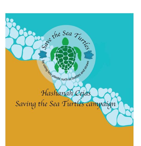
Hashanah Cejas
Graphic Design
11/15/2021
Saving Sea Turtles
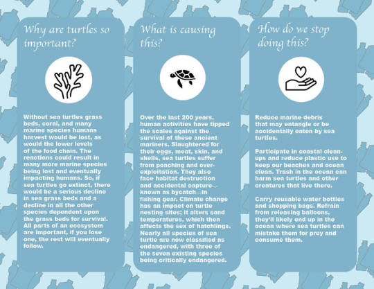
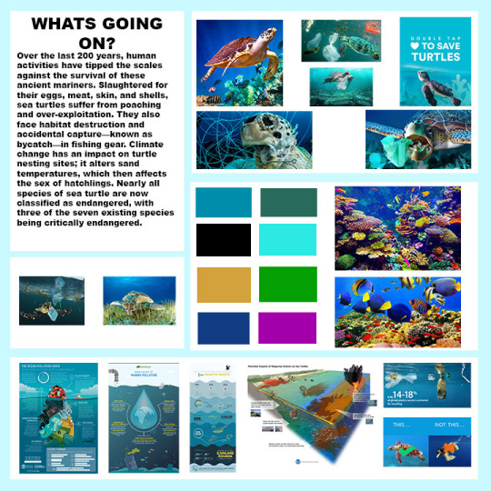
I am advocating for the safety of sea turtles along with everything that they do in our oceans to keep them clean. This is not a new issue but I fear it was lost the light of the public eye since 2017. It is now 2021 and I’ve noticed that the media has stopped showing the effects we have on these animals and has not received as much attention as it once did. Turtles are still a huge part of the ocean ecosystem, and by protecting them we also ensure our future as humans. “Over the last 200 years, human activities have tipped the scales against the survival of these ancient mariners. Slaughtered for their eggs, meat, skin, and shells, sea turtles suffer from poaching and over-exploitation. They also face habitat destruction and accidental capture—known as bycatch—in fishing gear.”. This is an issue because our actions affect more than just the sea turtles, it affects humans, other marine life, and the marine plant life that we use as food for humans. It affects the beaches that we love to lay on in the summer and if we continue down this path the beaches will be unclean.
We can do several things to change this such as reducing plastic usage, participating in coastal clean-up of beaches, stop using nesting beaches that sea turtles use for laying eggs/keeping them safe, keeping beaches clean after we use them/taking our trash with us when were done, and so many other actions we can take to stop the extinction of this animals. “If sea turtles went extinct, dune vegetation would lose a major source of nutrients and would not be as healthy and would not be strong enough to maintain the dunes, resulting in increased erosion. ... If sea turtles went extinct, both the marine and beach/dune ecosystems would be negatively affected.”
By people knowing this information, they can actively take the right steps to prevent the death of sea turtles along with the hundreds of other marine lives they keep alive. Through my campaign I will make a poster, brochure, mug, tote bag, and a T-shirt to spread the word about this issue. The colors will range from several different blues and some bright coral colors. The logo will be an oil drum and trash with a ban sign on it. The oil drum and trash are some of the issues that cause sea turtles to die. By making this the main logo, people all over will understand that this is what needs to stop, the pollution in our ocean. I would also add a credible link being “https://www.seeturtles.org/save-the-turtles” to a website advocating for the lives of sea turtles along with their other contact info. This website will allow people to take the first step in changing the problem. At the very least this website will inform people with even more information about the problem. I plan on having the poster ocean themed, so the design style matches the information being told. There will be a turtle swimming with plastic bottle rings around its neck and fishing line on its limbs. There will be an oil drum floating in the water leaking oil as well. Fish and coral will also be added to help explain the other ocean life that humans pose a threat to. Surrounding the graphics will be the information explaining how humans are damaging the ocean and sea turtles. The ocean will be a darker blue and the sky will be a lighter blue allowing the title to be clearer. In my sketches I have listed nine colors, but I only plan on using four or five colors that consist of blues, yellow, black, and purple. The text will most likely be white seeing how the rest of my poster are dark blues, having a white text will make it more readable on top of the darker backgrounds/graphics. The typefaces I will be using are Apple Chancery for the main title/subtitles and Arial for the body and captions. The title is a bit more cursive which reminds me of flowing waves and water. The body and caption type face are simple and cut allowing it to be more legible.
To restate, my advocacy campaign will bring the attention of the public eye back to the issues of sea turtle life and some of the issues that arise when we ignore how our actions affect them. The poster, brochure, T-shirt, tote bag and mug will effectively show the design of a turtle which conveys the information/issue I’m advocating for. The colors and text will flow nicely so the reader is guided throughout my poster and brochure.
0 notes
Photo

Design rationale
My human rights poster brings awareness to the mistreatment of gay people in Uganda. “The object of this Bill is to establish a comprehensive consolidated legislation to protect the traditional family by prohibiting (i) any form of sexual relations between persons of the same sex; and (ii) the promotion or recognition of such sexual relations”.
I decided to use half of the state on the left side of the poster and the information on the right side. With this design people can see the state’s outline along with the colors of the flag for Uganda. The information is snaped right and aligned with a ruler mark I made in the program. The text is easy to read and straight forward with the bill at the top and the article that it violates at the bottom. The title is bold and brings attention to the title more than the other information under it. Even without reading the other information, the reader can see that the poster is about the law and the state in the graphic.
I believe that the graphic and text information complement one another well because of the color contrast. From a distance people will see the bright red and yellow before they see the tile and information, I did this on purpose. The colors that represent the flag and the state are eye grabbing. During my first sketches and critique, many people said the same thing I did. That the colors all over the poster were too much. Originally, I wanted to incorporate all the colors of the state into the poster, this made the poster look very busy. Isolating the colors to the state outline allows the poster to flow instead of dragging the eyes of the reader all over the place.
I wanted the reader to be attracted to the poster but not overwhelmed. To fix this, I sapped the graphic to the left and the text to the right. This separates the colors and allows there to be a nice flow from top to bottom without the distraction of yellows and reds.
In the beginning, I knew I wanted the state to be included in my poster but I didn’t know how. At first, I put it in the middle and made in all black. The state was huge and the title was as well. The text had yellow boxes around them so you could see them better and the background color was red. This was crazy. After this I did some research and the critique with my class also helped me out. After the sketch critique I knew I was going to do this idea because my other ideas were more detailed. I felt as through this idea was simple and not confusing. This idea allowed me to make the poster readable, not busy, and simple. Even through there isn’t a ton of detail, I was still able to get my point across.
Image of state outline: https://www.cleanpng.com/png-flag-of-uganda-map-national-flag-uganda-knuckles-4859632/download-png.html
Info:
https://www.vox.com/2018/7/11/17562412/ugandas-anti-gay-legislation-explained
0 notes
Photo


During this project I felt a lot better about it compared to the reproduction. This project was a lot more lax in means of raw reconstruction and research. I really liked how it came out compared to my original sketches, I think it flows better this way. After we had our group discussions about what we had so far I realized that some things were a bit off. I decided to have just the one quote so everyone could read it better and took away the white box around the address. The talk also helped me understand how the hierarchy of words effects how the final project would look. How the length, leading, and scale of the letters effects so many other little things. I did make some mistakes but I fixed them. I enjoyed working with the pen tool again which allowed me to make the circle arcs. Realizing that you can't just slap some knowledge on a canvas and expect it to look good, there's more to it than that. I played around with several other pictures for the front before picking the final picture.
0 notes
Photo

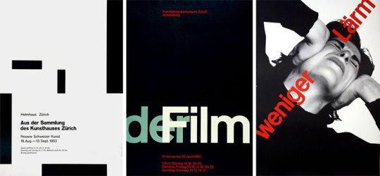
When this project was first introduced another student had this poster and I thought “Yikes! I feel sorry for whoever has to recreate that poster. Look at how many gradients there are, ever never used that....” Then I looked at the assigned artist posters and guess what. THIS ONE WAS MINE! This was extremely difficult at first because I had no idea where to start, the background? the triangles? How would I even...?
Well with any art piece you need a background so I decided to start there. I suppose the hardest thing was definitely the gradients. How far to pull or how little to pull in order to get the perfect transition of black to gray to white.
Although this isn't perfect, I believe it got close. The artist originally used the technique of overlaying lithography. Using multiple layers on top of one another in order to recreate his poster. Since I used photoshop and digital art, it wasn't as difficult as it was for him. None the less I understand his struggle of working with overlapping layers.
I actually ended up learning more about photoshop through this project even though it was a struggle. I am the official “Gradient Master” (I’m going to out that on a shirt). I enjoyed finding new and better was to use the tools, I even found a way to make seamless lines which was important for this poster. I’m really happy with the end result. I poured a lot of my time into this poster so I can't say that I wish for more or that I didn't have enough time. I was able to be in the studio Fridays and Saturdays to work on this and honestly, I'm happy with it and feel like I did my all.
0 notes
Photo

When constructing this project, I found that it was very hard to scale what needed to be a certain size.
This isn’t a keyboard where everything is perfect where it should be, these are things that are not supposed to be letters. I found myself moving certain letters making it bigger or making it smaller. I figured out that you can’t use such a huge bowl when trying to construct the letter O and certain materials were harder than others to form into a letter.
The materials I used were every day materials of the kitchen, more importantly breakfast materials. I pulled out a lot of different foods and utensils even though I didn’t use all of them. I decided to use my dining room table as the background because that’s typically where you would eat breakfast, I snapped the photograph by standing on the dining room chair trying to make it as straight down as possible, and I used the light from my kitchen which wasn’t that great but considering the sun wasn’t out and it was raining all day it was the best I had to work with.
While constructing this project I had issues with making certain foods certain letters. For instants the coffee grounds were very easy to manipulate versus the blackberries which are typically a circle shape and stiff. I believe that most of the materials are used were a mixture of very easy to manipulate and kind of tough to manipulate. My concept was creating those words “early bird gets the worm” with breakfast foods since it’s the first meal of the day.
Considering the materials, I use weren’t all that cursive friendly, I wanted to go for more of a simple type face that was sort of bold and easy to read. Like I said before not all of my materials were easy to manipulate so instead of trying to make some materials cursive and others not, I wanted it to flow and match. I know that when looking at the project some letters seem bolder than others but that’s only because of the materials being used. It was very difficult to get them all the same size without using too much of the dining room table. I was very frustrated because not everything looked perfect but quickly learned that it’s OK if they don’t all match in size or style.
0 notes
Photo
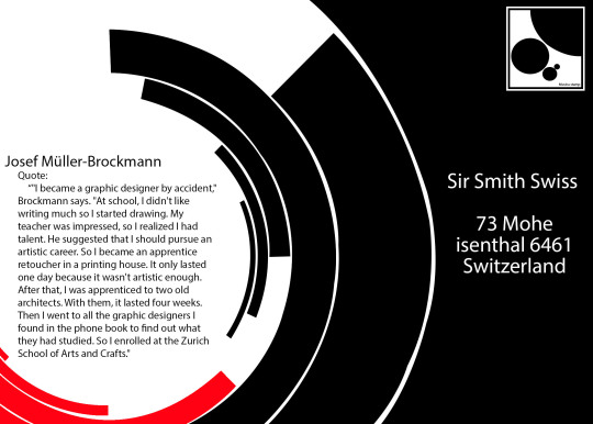
Josef Muller-Brockmann was born in Switzerland, 1914. When he grew up, he attended Zurich School of Arts and crafts to study graphic design, architect, and art. He started off with his own studio which focused on graphics, photography, and exhibition design in 1939 and became an apprentice to Walter Diggleman. During the apprenticeship, Diggleman taught Muller about how to design and advertise his work which allowed him to kick start his career. Muller loved order and simplicity in his works, he removes subjectivity, straight to the point, cut throat even. He often used grids and was trade marked “rigid grids”.
“"In my poster, advertising, brochure and exhibition creations, subjectivity is removed in favor of a geometric grid that determines the arrangement of words and images. The grid is an organizational system that makes the message easier to read, this allows you to get an effective result at a minimum cost. With an arbitrary organization, the problem is solved more easily, faster and better. It also allows uniformity that goes beyond national borders (hence the international style!), a boon for advertising that IBM, for example, has benefited from. Information presented as objectively as possible is communicated without superlatives, without emotional subjectivity."
During his time, he was very influenced by the art movement constructivism, De stijl, suprematism, and Bauhaus. He was a part of the swiss international; style of art and these movements influenced not just him but many other swiss artist. Muller was very drawn to readable, straight, and perfect type faces and believed that letters should be readable instead of illegible. He enjoyed sans-serif type faces and like his teacher, Helvetica.
“"Some have set themselves the task of making typography unreadable, of making a puzzle out of it. Illegibility seems to become an artistic project. I don't want to read things like that. The same rational criterion applies to wobbly shapes and fuzzy contours: Can I read these messages faster? No! No! Fonts designed for Neville Brody are not suitable for advertisements and posters. They are exceptions and individual cases should not be the basis for teaching graphics. These alphabets are confused, unattractive and simply bad."
Although Muller has passed, he left behind his posters and legacy of his work. He left behind the importance of readable text, simplicity, grid design, and several books in which he wrote about graphic design. He impacted other artist and creators with his books and teachering which impacted the swiss movement of design.
Works cited
Designers, Famous Graphic. “Josef Müller-Brockmann | Biography, Designs and Facts.” Famous Graphic Designers, 2018, www.famousgraphicdesigners.org/josef-muller-brockmann. Accessed 24 Sept. 2021.
Flask, Dominic. “Joseph Müller-Brockmann : Design Is History.” Designishistory.com, 2019, www.designishistory.com/1940/joseph-mueller-brockmann/. Accessed 24 Sept. 2021.
Rabiot Mathias. “Josef Müller-Brockmann "Swiss...” Graphéine - Agence de Communication Paris Lyon, Graphéine - Agence de communication, 12 Mar. 2013, www.grapheine.com/en/history-of-graphic-design/graphic-designer-muller-brockmann-swiss-style. Accessed 24 Sept. 2021.
1 note
·
View note
Text

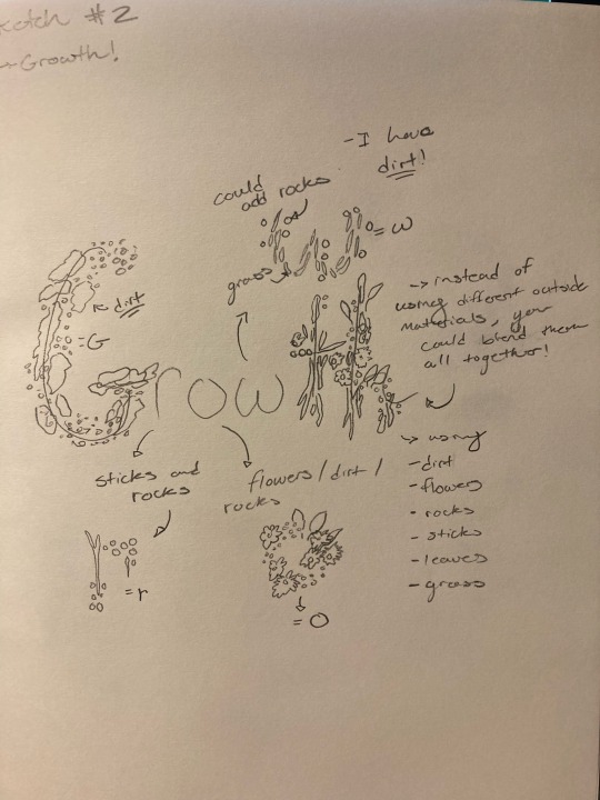
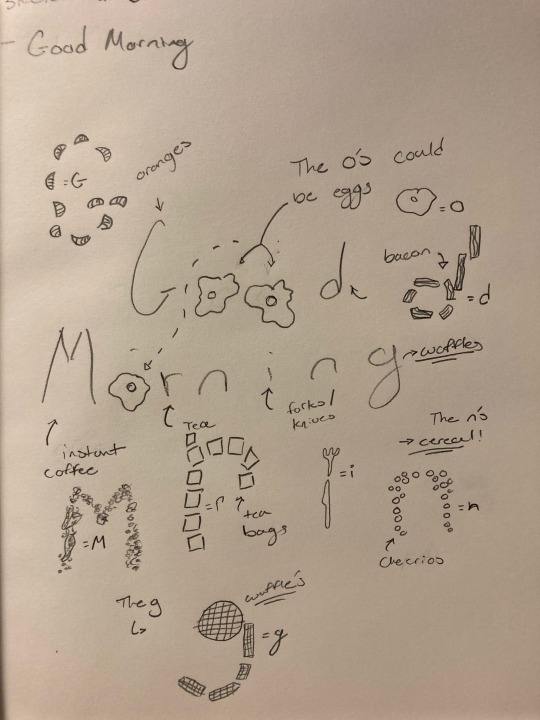
This project is about found objects. Creating words out of objects that aren't usually seen as anything more than what they are used for. For this project I choose video games, plants, and breakfast foods. To me these were things that were only seen to me at least for the one propose, but what if they could create something more, like a word. It was a bit difficult to figure out what I wanted to use for which letters, whether it was that I had too many materials to use like the break foods one or it was video games when I didn't have a bunch of choices. As I was sketching I realized that each idea had more to it. For example, the breakfast foods, at first all I could think was food but there's more to it than that. There are forks and knives, as well as cereal boxes. This also happened with the word growth, although it happened at the end I started thinking about more than the plants themselves, such as pots, food for plants, water, and so many other things that involve growing a plant. Figuring out how to shape the letters with objects that aren't so bendable or finding out what objects should be switch letter was also a bit hard. Although these are just sketches, I had to make draw it as if I was making it in real life, not all objects can be an R or O.
0 notes
Photo
Works cited:
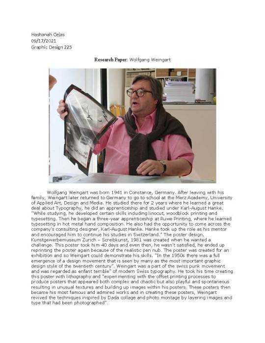
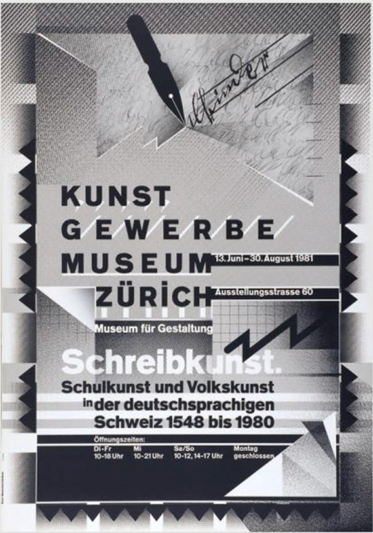
Wolfgang, Weingart. “WOLFGANG WEINGART.” WOLFGANG WEINGART | TYPOGRAPHER | SWISS PUNK, 2002, chriskeno.github.io/wolfgang-weingart-essay/wolfgang-weingart-essay.html. 18 September 2021.
Graphic Designers, Famous. “Wolfgang Weingart: Biography, Designs and Facts.” Famous Graphic Designers, 2019, www.famousgraphicdesigners.org/wolfgang-weingart. 18 September 2021.
0 notes
Photo


Part One: The reason I choose this letter is because it is the first letter of my nick name, Shana. I didn't really think about letters are more than things we use to communicate. Pulling them up, expanding them, thinking them, only seeing one part of them and not even realizing that it's a letter anymore was really interesting. I also like the letter S because it reminds me of Slytherin house, my house.
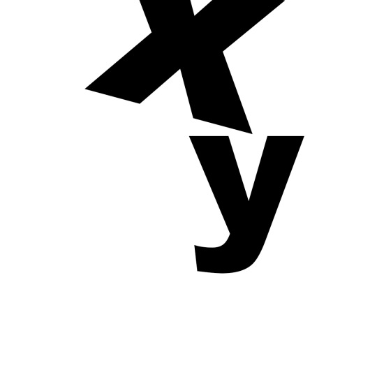
Part Two: I suppose these are my favorite letters to sign in ASL which is a class I'm taking this semester. Y is also the sign for yellow which is my favorite color. I put them close together to make them look as if they were falling together since they are together at the end of the alphabet. Almost touching but leaving just a bit of space between them. This project has allowed me to become for familiar with art boards and type figuration.
Part Three: I absolutely enjoyed this section of the project because it shows who I am as a person, allowing me to express that without some sad backstory, just letters figured in neat ways. I am a very jittery person, especially if I am sitting for a while, I’ll start to bounce my legs or stretch a lot or even start t fall asleep In my chair (Sorry professors). I decided to choose jittery for this reason, I didn't leave even spacing because when I'm jittery I'm all over the place. I wanted to give it the illusion of movement so I added layers of the word in fading shades of gray. when looking at the word, my eyes go all over the place just like me sometimes.
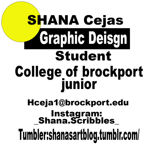
Part Four: Here, you have my sample business card or info, I decided to do three different shapes but keep the same black rectangle/color. In each section I used Ariel black so they would all match and the viewers eyes wouldn't be all over the collage trying to read a million different typefaces. In these info cards my name is the biggest so that is what people see first, then my college and major is a size smaller than that but not by too much, and then where you can contact me in an even smaller size, this creates the hierarchy. Since I found this information to be important, I made the shapes yellow and put them around my name, drawing attention to it. Even spacing throughout the info board.
0 notes
Photo
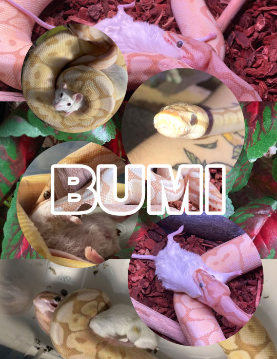
Hello! This is my ball python Bumi, in my graphic design class we were doing photoshop exercises and I choose to do him. During this project I learned more about the tools and neat little things that photo shop comes with. The most helpful process was definitely rasterizing the image and making it a smart object. This turns the layers into pixels. A tool that helped me a lot was clipping mask which allowed me to put a photo in the name. I also really enjoyed putting a stroke around the name and figuring out exactly how to do that. The inverse and marquee tools work great together as well, allowing me to select the circle or everything around the circle. I suppose the biggest issue I might have with photo shop is remembering the layers and how they work, where they go, what exactly you can do with each one in the layers panel, and perfecting how to use the tools. I can definitely say that these exercises will help me get over these issues. I learned how to work with the layers through this project because I used a lot of layers and was able to play around with them. Although there is more I can do in the layers panel I did learn somethings within the panel that helped me so far. I plan on learning more and exploring everything in photoshop.
2 notes
·
View notes
Text

Hello! My name is Shana. Welcome to my art blog, I’m starting this in my junior year of college. A bit late I know but better late than never. This is a picture of me in the redwood forest, I went to CA with my family. This blog will have my art and art process, what I make, how I think, and all things creative✨
1 note
·
View note