saskiafelthamdesign1
Saskia Feltham
UX/UI Design AUT
34 posts
Don't wanna be here? Send us removal request.
Last Seen Blogs

uselessboxexpert
This is where I talk about fandom stuff

bippot
¿Bippot?

imaginingpixels
ImaginingPixels

fckimsadd
(`_´)ゞ

pauldominic
A Rooster Among Cocks
Text
Video and Reflective Statement
Final Video
vimeo
https://vimeo.com/220943763
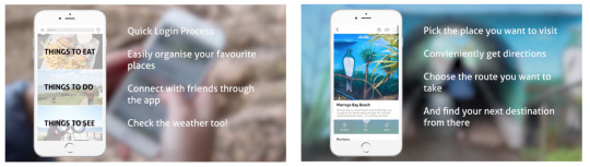
Final App icon displayed in context.

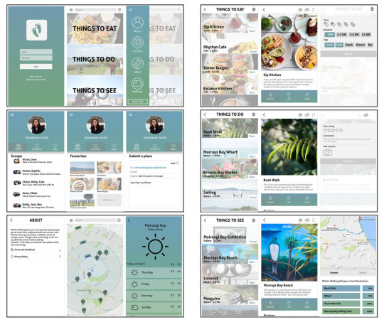
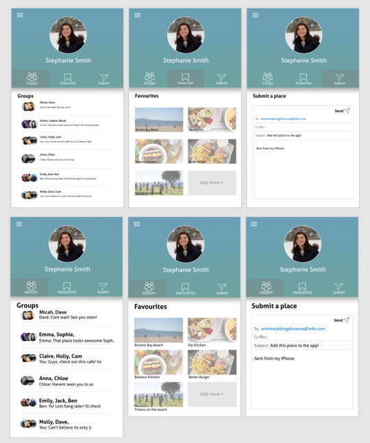
Screen Designs
Below is a selection of some of our screen designs, showing the login, home, sidebar options and our categories on the right.
You can find all our screen designs in a clickable prototype here: https://xd.adobe.com/view/5ac648d5-c3c8-4cba-ad20-d51f3fa20654/
Reflective Statement
When we first started brainstorming for this project we looked into many different forms of transportations, including bus, car, plane, train and walking. We initially had the idea to design a bus app, as we both take the bus to and from uni and felt the whole experience could be improved. This meant that we began the brainstorming phase with a very heavy emphasis on bussing, as this was our first idea. Once we started brainstorming we realised what a crucial stage this was for us. It really opened our thinking and we began letting other ideas in and decided to shift our focus onto walking as our chosen form of transportation. We felt there was a lack of apps available to us which celebrated walking.
We based our idea around exploring new places in your neighbourhood and sharing them with friends. Whether you have lived in your neighbourhood your whole life, or have recently moved in, there are still new places to discover. We decided to focus our app around discovering and sharing local destinations with friends and the community all within walking distance. This opens our app to anyone who doesn’t have their licence or just wants to improve their fitness. After doing some research into existing apps we wanted to make sure that ours offered something different. We noticed there was an abundance of apps related to discovering local eateries but nothing that offered information on a range of activities including ‘things to do’ and ‘places to see’. We decided on the name ‘Within Walking Distance’ which immediately lets the user know that our app is focussed on walking. We balanced our app over three categories; Things to eat, Things to do and Things to see, which would cater to a large audience.
This was a very new experience for both Kathy and I so it took us some time to understand and research the different processes involved with making an app. We used a mix of designing on paper and the computer which felt comfortable to us and allowed us to communicate our ideas to each other well. We both had ideas that we wanted to include in the app so we made sure to refine and combine a mix of each to create one cohesive design. The decisions we needed to make in terms of the visual interface of the app came easy as we both had a similar aesthetic in mind. We did however, face some challenges initially with our information architecture. We took some time researching and testing different layouts as this would dictate the success of our app. I think the final structure of our app flows well and provides the user with an enjoyable experience.
We used Adobe Experience Design (Xd) to prototype our app. We were faced with some problems along the way but were quickly able to over come these and use the program to create a fully functioning prototype. As only one person could work on the application at a time I began linking up our designs onto Xd, we made the most of our time we were together by making important decisions around the design and the way it functions. We were faced with some miscommunication around the sizing of text and positioning of some buttons, which was picked up on in our first presentation. This was easy to fix and improved our communication on small details for the rest of the project.
We made sure to test our app on our family and friends throughout the prototyping process, which was an effective way of understanding how people interact with our app. Most importantly for us it was a way of finding out what was working and what we needed to change.
Although working in a pair had some challenges along the way I'm really happy with how Kathy and I worked together and I am proud of what we made. We achieved what we set out to do which was create a walking app that encourages people to interact with their neighbourhood letting them discover new places and share them with their friends.
0 notes
Text
Making the video
As the main focus of our app is walking we wanted to show this clearly in our video. We used transition shots of us walking to the next destination, which tied the video together and also remained relevant to the idea of our app.

We visited a location from each of the three categories of our app (Things to eat, Things to do and Things do see), to show how they can all link up together. In one shot we show the transition between things to see and things to do where we select the bush walk on the screen click through and then arrive at the bush walk in the next shot.

We kept the video in the background of the shots blurring it out and placing the text over the top. We kept the background simple so to not distract from the app click through. This added interest to the video, showing it being in use in context opposed to a plain background. We also visited the same places that are showed in the app (see the image on the right) such as the Murrays Bay mural, which added a nice connection between the app and the video.
We decided to use Adobe Premiere Pro to make our video. I had previously used this programme and found it really easy to work with, so it was an obvious choice to use for our final app video. We browsed the YouTube audio Library for licence free music and decided on ‘Italian Afternoon by Twin Musicom’. It had the happy upbeat sound we wanted and fit really well with the qualities of our app.

0 notes
Text
Planning for our video

When it came time to make our video we had a few locations in mind that we wanted to film. These were all places in our app so it made sense to visit them in the video. We made a small bank of possible locations. We narrowed this down the 5 as we wanted to show a sequence but not overwhelm the video, after all the video is there to focus on the app features and use so this defiantly needed to be our main focus. The locations that we decided on were Mairangi bay, the Underpass before the beach, Murrays Bay, the Bush walk and then finish off at Sip Kitchen. This sequence made the most sense to us and best showed off our app. We wanted to show our app in use at each location but also use it as a way to transition between them as this is an important feature in our app. Showing that each location leads on to the next. We briefly wrote down some ideas and different shots that we could do at each location, but also left this quite vague as we knew that new ideas would flow when we actually got to each place and started filming.
0 notes
Text
Final Improvements
Kathy and I spent some time deciding what improvements we were going to make, by looking over our feedback and bettering our design.
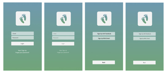
Firstly, we made slight adjustments to the typeface weight of our login page. Previously it had been in ‘Aller Light’ which didn’t fit with the rest of our app which was all either in ‘Aller regular’ or Aller Bold’. This small change was quite important as it set the tone for our app and gave it more consistency.

Secondly, we reviewed our side bar. The design of this was initially very light and when we tested it on a phone was barely readable. It also didn’t really fit the line weight used in the rest of our app. We changed the line weight of both the icons and made our text bigger and it looked so much better. We also included the addition of a weather feature. This not only better filled up the side bar but it also gave our app a crucial feature that it didn’t previously have.
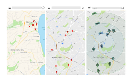
Thirdly, we developed our map. Kathy and I initially had some miscommunication with the source of our maps, with Kathy using Google maps and myself using Apple maps. Our map lacked crucial information such as distance and relevance of location pins. After our talk with Nick we decided to add a radial distance gage to help people understand how far away each location pin is from their current location. We also added our app colours into it to give it for continuity. The icons for each location pin let people know if the maps showing a place to eat, a place to see or something to do, with food, binoculars and walking icons.

Next, we reviewed the readability of our home page. This was a concern of ours from the start, with text over image. we initially put a white overlay over our images to try and wash them out slightly and make the black text stand out however the image still appears busy and distracting behind the text. We decided to swap out two of our images for things to do and things to see. We also added a more intense white overlay which helped the black text to stand out. It was important for us to keep the photos as it immediately gives the user a feel for what each category might include. It also adds interest to the design.
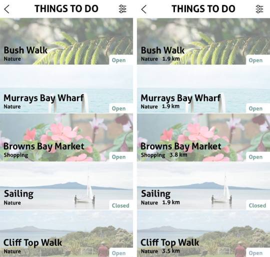
We also added in the distance you would need to walk to reach the displayed location. This was an important addition as the user can now quickly identify how far away each place is without having to click into the page.

Lastly, we got some feedback on a very simple yet crucial detail to the fluidity of our app. We had our option and filter pages where people could give feedback or customise their searches, yet no confirmation button for once they had selected their options. The photos on the left show our original design, then the photos on the right show our improved designs with “submit” and “apply” buttons. This was such a small detail that we just overlooked until it was brought to our attention by our peers.
0 notes
Text
Week 11 process work
After receiving feedback from Nick we sat down and analysed our app, looking both at the pages we had completed and what we still needed to design, such as the settings, about and map page. Our main focus was making sure that our app had a nice flow to it and could be understood by anyone who uses it. We really liked the use of photos in our app in making them the main focus as this helped with linking the pages together and making a visually pleasing design.
To make the pages flow together we also included in our map page a way to link and jump between pages without ‘going back’ or disrupting the flow. This was in the map page of each location, where you can scroll down and go straight to the next location.
Things to see ---> Things to do

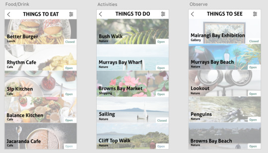
Below are some of our screen designs, we tried to keep them consistent with a large focus on it being image based.


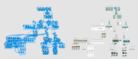
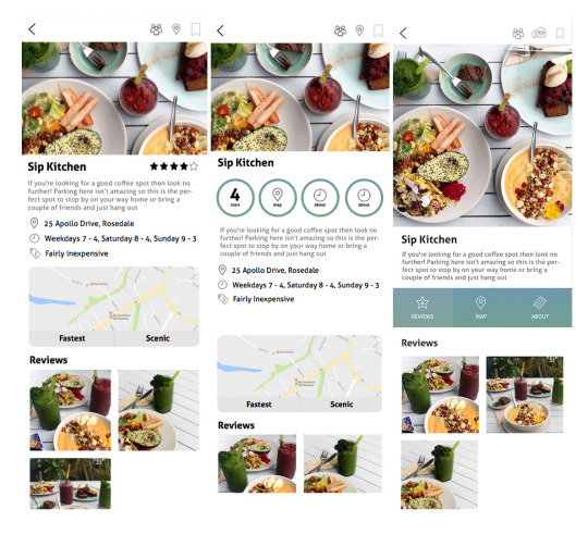
This week we also really focussed on getting our app completely linked up. Below is a photo of our linked prototype and prototype design. It took a long time to understand the linking process and make sure each page not only flowed onto the next but also had a way to go back. So far we have created one destination for each of our categories of ‘things to eat’, ‘things to do’ and ‘things to see’. With a more detailed look into the sip kitchen which is under ‘things to eat’.
0 notes
Text
Week 11 Presentation
This week we had our presentation in front of the class and Gee. We had all our screen designs done so we clicked through all the screens to show how our app is used and our thinking behind it. We were pretty happy with our app at this point but really wanted to get some feedback on how others thought it flowed and looked.
Feedback
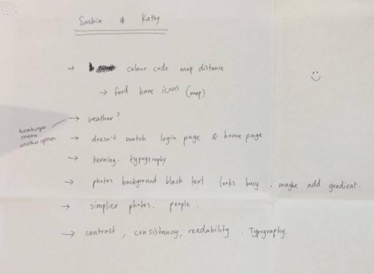
We got some really good feedback from the class and Gee which we need to review and incorporate into our design as necessary. Some key points were
Including a weather section. As we have a walking app it is important for people to be able to check the weather wherever they’re going.
Improve the readability of our map
Consistency in text size and line weight
Re-look at photo choice to improve contrast between text and image
Consistency between pages
0 notes
Text
Research into sizing
Sizing of our buttons was something that we initially didn’t pay a huge amount of attention to in the early stages of our design. Yes we thought about not including miniature buttons that we small and difficult to tap but not to a huge extent. After watching people use our own app and evaluating the presentations we noticed that people were sometimes miss clicking or having to tap multiple times on a button before it actually working. We decided to do some research into the ‘correct’ sizing of buttons and found a study which says that “A touch target that’s 45 – 57 pixels wide allows the user’s finger to fit snugly inside the target.”
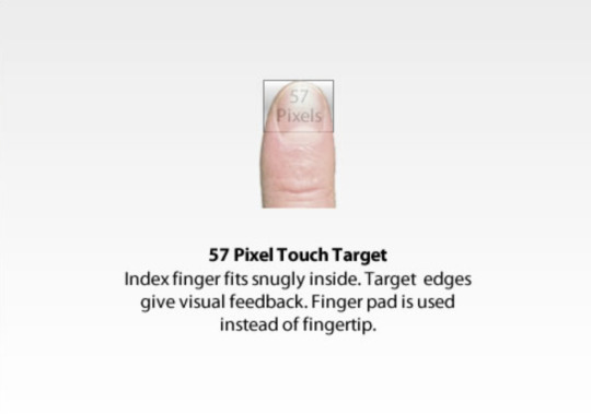
As the study says this finger sizing is ideal but not always practical. We took this information into consideration and made our app as user friendly as possible.
https://www.smashingmagazine.com/2012/02/finger-friendly-design-ideal-mobile-touchscreen-target-sizes/
0 notes
Video
We designed all our screens in Illustrator which we then brought into Xd to prototype. There are still some aspects that need to be changed and finalised, such as the sizing of text and the development of our map.
0 notes
Text
Travel App more detail
When it came time for making out first app prototype we decided to use as much real content as possible following the quote by Jeffery Zeldman “Design in the absence of content is not design, it’s decoration”. This really helped us to get an overall feel for our app, with colours and as many real images as we could put in at this stage.

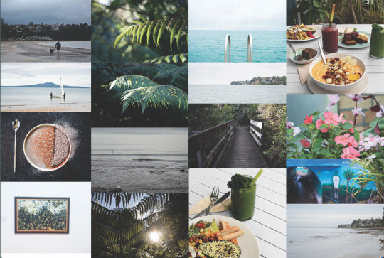
We knew we wanted to make our our predominantly picture based as this is really what is going to sell each location in our app to the user. It is also the best way to recognise the place and get a feel for what to expect once you arrive.
We kept asking the opinions of Nick and our classmates throughout the process to get different perspectives.
0 notes
Text
Week 10 Presentation
This week we presented our app for the class and Nick. It was really good to get some feedback on our app at this stage in the project as we had most of our final screens and links working. This allowed people to get a feel for the usability of our app and the final aesthetic.
We decided to do our presentation on Prezi as we could both work on it at the same time. Below you will see the link of our Prezi presentation.
Prezi Presentation- https://prezi.com/view/ZhYFjBeLqhPSJ8IDNIx7/

Above you can see screenshots from our presentation. We talked about the problem that we are trying to solve with our app design, our target audience, the decisions behind the branding of our product, our design process and the challenges we faced.
Problem
The idea behind our app is to help people discover/rediscover their neighbourhood or nearby locations. The app focusses on new places to eat, see and things to do all within walking distance that you may have never seen or heard of before. Trying to help people to not be a stranger in their own neighbourhood.
Target Audience
To use our app you need a smart phone to be able to access the app wherever you are so our target audience ranges between early teens to adults. Early teens may use it as a way of meeting up with their friends, as they don't have their licence yet. We decided to initially to focus our app in the suburban area that Kathy and I live in. There are so many places to see and things to do in our neighbourhood that not everyone knows about, and are rarely shared on any form of social platform. We wanted to create a way of sharing these places, which is how the idea of ‘Within Walking Distance’ was formed.
Our Product
The name “Within Walking Distance” came about while Kathy and I were discussing the values of our app. We knew that we wanted it to be walking based to encourage walking to places nearby opposed to always getting in the car and driving. The words ‘within walking distance’ began to be a reoccurring phrase, they were catchy and immediately gave a base understanding about our app so we stuck with it.
The blue, green gradient which runs through our app was an obvious choice for us as it closely resembles nature and the outdoors which is a key value of our app. Our logo is simple yet immediately conveys to the user that our app has something to do with walking and nature.
Process
We used our personal experience of our area to help with the design decisions in our app as we chose to focus on the area which we live. This helped with gathering and using our own photos in our app. We made sure to get peer feedback throughout the design process, which helped us to move forward with our designs and create a user friendly app. Some design decisions that we gathered along the way was that we wanted to make sure that we limited the number of screens that the user had to click through before reaching the final page.
Challenges
Our biggest challenge was designing our information architecture. We learnt that refining our ideas was more important than trying to fit them all in so we spent some time cutting back on some pages that we felt would be unnecessary and not add anything to the overall user experience.
0 notes
Text
Typeface
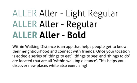
Kathy and I knew we wanted a sans-serif typeface for our app as we wanted a soft welcoming look. We went through a few different typefaces and decided on ‘Aller’. This typeface has a nice curve to it while still giving it a professional look to portray the information in our app well. There are many different weights to this font which we will use throughout the app. The bold Aller typeface is perfect for the headings and the regular will work for the body text.
0 notes
Text
Developing Ideas
One thing that we learned throughout the design process was the importance of checking how our design reads on a phone. Through Xd we were able to open our prototype design onto a phone to see what the typeface looked like, how big the text was and how it reads overall. One common mistake was that we were making the text too small to be read on a small screen (as it looked so much bigger on our laptops). Specifically on our profile page the text was way too small. We also Added writing beneath our icons for the user to understand each icon quicker and more efficiently use the app.
We spent a lot of time designing the base of each page to make sure that we were happy with the layout before moving forward and designing the secondary pages. We tried a few different layouts, while also researching into user experience. We looked at ‘Mobile App UX Principles’ by Stephen Grittiths which provided us with plenty of useful information into the success on an app for the present day user.
Some key points that I learnt from this were
- your home screen navigation should be clear, task-oriented, logical
- Only primary navigation and content should be visible by default, with secondary content hidden
- The tab bar should be located at the top of the screen
Our first out the three designs shown below appeared too cluttered with too much information shown in one place, overwhelming the user. We took this into consideration and designed the next design with circular tabs which gave a more organised look but we still felt this was a little overwhelming. Our final design gives the user three options; Reviews, Map and About which the user can click between.
0 notes
Text
Photos
Kathy and I wanted our app to be very photo based as this is mostly how people will be guided by through our app. The photos will show the user what the location is like and what they are to expect. We want large photos with text that only displays essential information. We have chosen one location from each category to go into further detail with more photos;
Things to eat, we chose Sip Kitchen
Things to do, we chose the Murrays Bay bush walk
Things to see, we chose Murrays Bay beach
It was important to us that we owned all the photos we used. We didn’t want to use any photos from the internet as this wouldn’t accurately depict our neighbourhood. All photos we have in our app are either taken by Kathy or I, or from our friend with their permission.
0 notes
Text
Colour
When we were looking for colours we knew that we wanted to use cool colours closely related to nature so that the user immediately got the feeling that it was an outdoor app. We visited https://coolors.co where we got a feel for different shades and tones of potential colours.
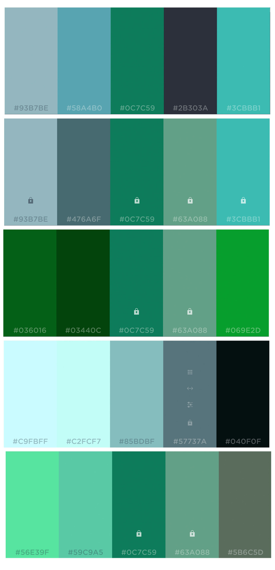
The main colours we chose for our app are blue and green with a grey tone to give them more of an earthy look. We decided to use both these cool colours are they are closely associated with nature and the outdoors, which are two of the main qualities of our app.
Final app colours
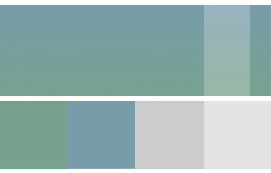
We decided to us a gradient throughout our app as it gave a nice flow and calming element. The soft gradient flows from blue to green. We decided to use white overlays over our screens for drop down menus to reduce the number of screens we have and give it a clean look.
0 notes
Video
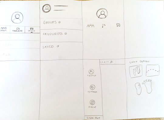
Travel App Wireframe
This is the basic wireframe for our app design. This helped us to roughly plan out the different screens within our app and how they are all going to flow together.
0 notes
Text
Travel App
Existing Product Research
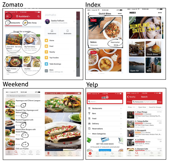
We initially looked into existing apps that had a similar idea or style to ours. We looked for aspects in the app that worked well but also any problems that we thought it had to make sure we improved this in our own app design. Some of the apps we looked into were Zomato, Index, Weekend and Yelp.
Zomato helped us to figure out a successful way of organising our ideas into the app, we really liked the side slide out menu in the top left hand corner. It felt clean and easy to navigate. Aspects of the Index app design that we liked was that it was predominantly photo based which made the user experience much more enjoyable.
0 notes
Text
Travel App
Kathy and I found it really helpful to set aside some time each lesson to sketch, model and communicate our ideas between each other away from our laptops. Ideas could be quickly scribbled down on paper, which often sparked a new idea. If theres one thing we learnt from this activity it is to not let any idea go to waste, often our final ideas stemmed from a side thought in the middle of another idea.

0 notes