sandwichpress
Bachelor of Creative Technologies Blog
Ramblings, experiments and whatever else I'm doing in BCT
89 posts
Don't wanna be here? Send us removal request.
Last Seen Blogs

thinly-veileddreams
Thoughts of Thin

lattoel-blog
Dream factory of Lattoel
jealousoftheirjudgment
Jealous of Their Judgment
kelleyelizabeth98
Lizzy

jaca-rein-369
JJ-Rein-369
Text
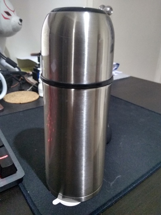
3 Things
3 of the most important things I use daily are
- My vaccum flask. Hydration is key and this bad boy let’s me have any type of drink (hot or cold) wherever I want; at home or when I’m out and about.
-My phone. It’s almost always within arm’s reach and I use it to listen to music, make calls and texts, etc.
- I use my laptop everywhere; in bed, on a desk, on the bus, etc. Used for everything ranging from games, to writing emails and working on finals.
1 note
·
View note
Text
Paper prototyping and doing a thing
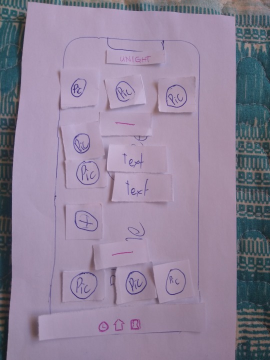
Over the weekend I did some user testing using the paper prototype of our app’s UI, as a way to judge how potential users would feel when the are opening up the app for the first time as well as general usability.
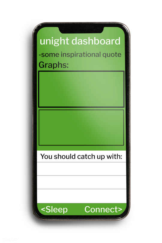
The first screen of the app I asked them to evaluate was the dashboard, the easiest and most straightforward page of the whole app.
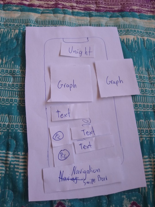
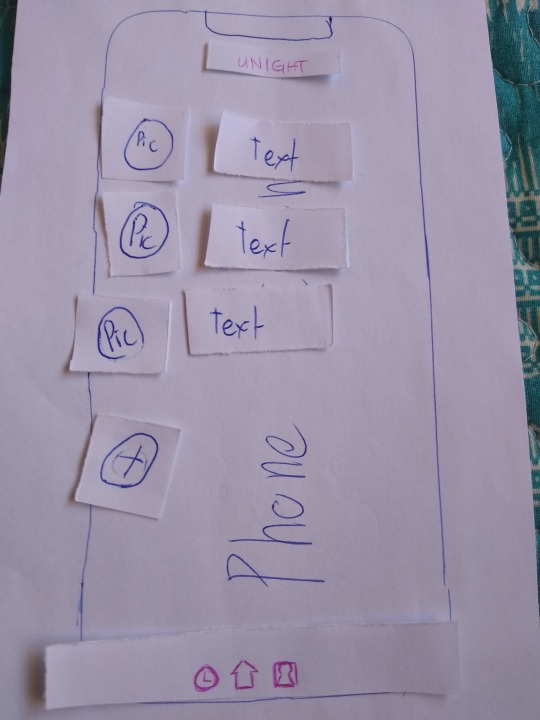
This was the original plan for the dashboard, it consists of sleep schedule graphs and a basic overview of the contacts page.
After asking what the testers thought about it, the unight logo was made smaller, as well as the navigation bar. The nav-bar also got icons to help identify which direction to swipe to get to the right page, as well as being able to simply tap on the icons instead of swiping. The smaller universal UI elements allow for more room for larger graphs, while still being readable and usable according to testers.
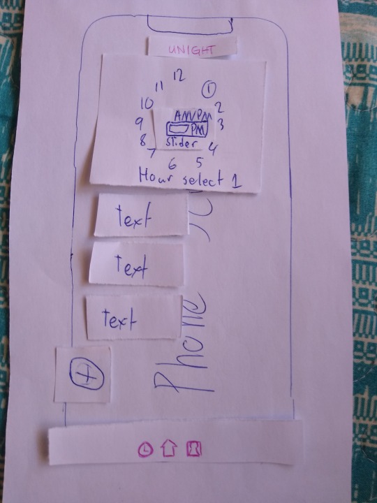
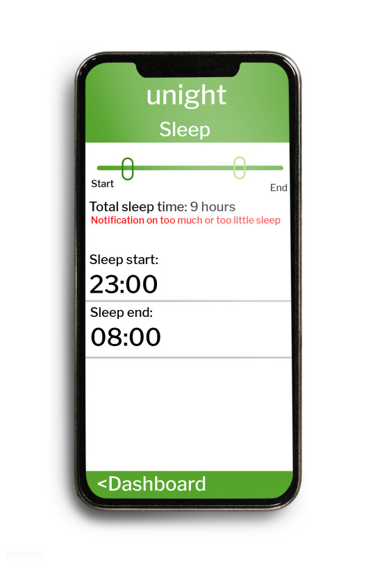
The next page that was tested was the sleep schedule page, another fairly straightforward page. There were multiple variations however if the initial layout.
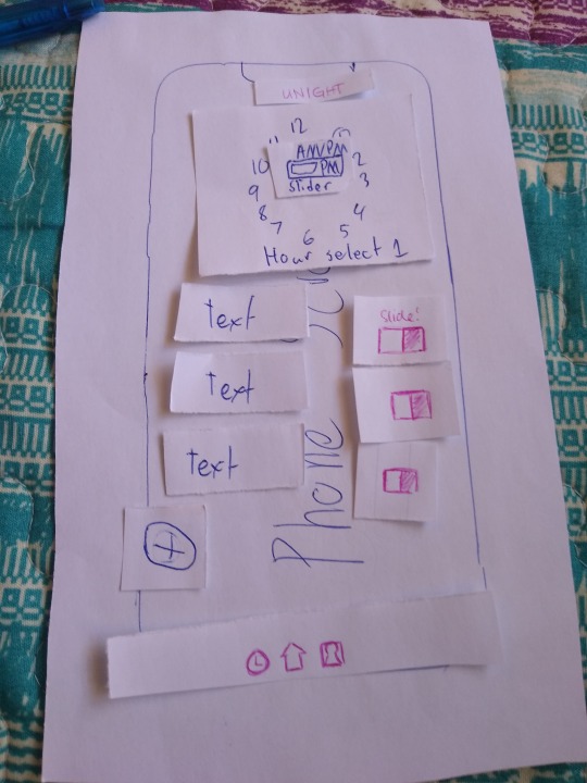
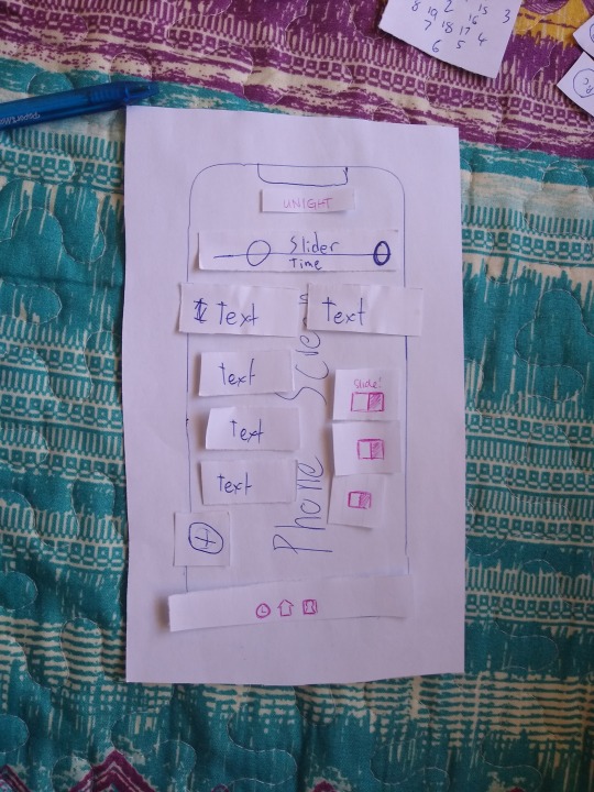
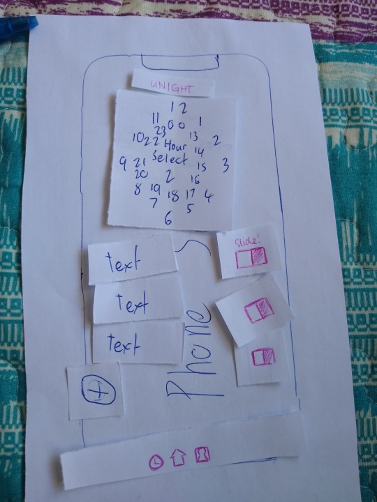
during the testing, I kept the changes in the general UI as they would have made the same changes to the navbar and app name in every page. On the sleep scheduler page there would essentially be a way to set the start and end periods of sleep, as well as a way to enable/disable said alarms if you need them to be slightly different from each other. The use of the hour hand to set times was inspired by my own phone’s clock app, as I thought it was a smart feature.
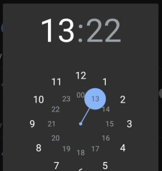
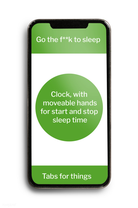
However, this design was confusing according to my testers as it is not entirely clear how you are supposed to set the time. The overall consensus was that the slider was the most intuitive to use, but it was also the most finnicky in their opinion. Instead they thought the first photo, a 12 hour clock with an AM/PM slider in the center. They also suggested that adding sliders to toggle the alarms would be a good idea,
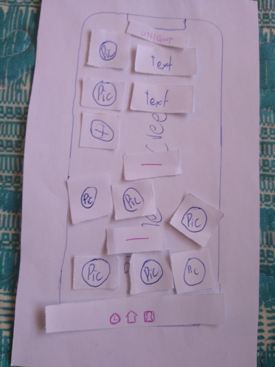
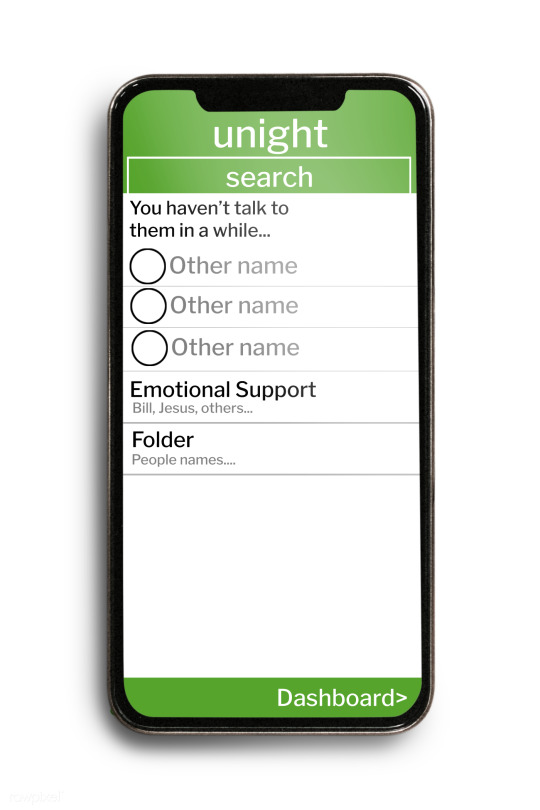
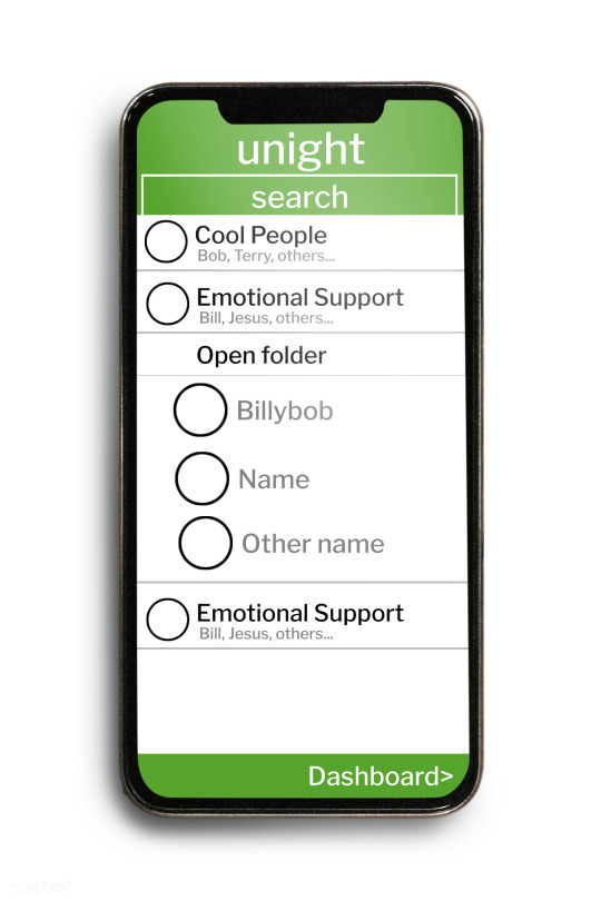
The final page that I tested was the contacts page, with 2 configurations. A list view that is fairly standard for most contacts pages; and a web view that was suggested by Milo. It was an interesting idea as it would allow users to see at a glance who were their most and least contacted people.
The standard list view.
Milo’s original sketch for the web view, and the paper prototype version I presented to testers. While the testers were rather fine with the list view, it was something that they were familiar with and is something that they could easily work with. This was fine as this view was something we planned the main view of the contacts page.
They had problems with the web view however, finding it to be confusing and hard to read on a relatively small phone screen. They also found it to be a bit redundant, as the main screen could offer the same features that the web view offers (being able to see your most and least contacted people, as well as seeing potential groups of mutual contacts). Doing with would render the web view redundant in their mind, and would reduce the amount of pages to go through.
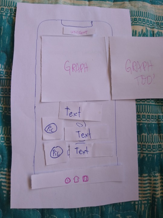
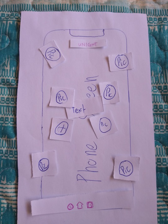
Two examples of what my testers came up with to add the web view’s features in the list view. However, the final idea they ended up was to place both the most and least in the dashboard, as it would allow them to see it at a glance the moment the app boots up.
Since I forgot to take a photo of this, I will describe it. It is essentially the same as the modified dashboard screen from before, however instead of simple contacts with text at the bottom, it would be pictures of the contacts that are divided into groups of most and least contacted. Using photos would allow as much space as possible to be allocated to the overview graphs, while still being able to see at a glance who is who and where.
This user test has shown how someone who is not familiar with our app and its development would potentially interact with the app and allows us to validate whether or not our design decisions are valid. It also allows us to see how we need to consider the medium when designing something, as what would work well in a desktop web format may not work as well in a mobile app format. An example of this is the web view for the contacts page, which they though was an excellent idea but would be difficult to implement cleanly on a mobile phone’s screen, but would be pretty good if it was used for a website or something similar.
While getting some user testing is nice, a large problem with this test is sample size. A house of 3 people (Thanks to lockdown restrictions), was as large a group I could test. And while the demographic is relatively large (2 working adults and 1 student) there isn’t a lot to work with. Still, it is something to give us an idea of what users will think and making the most of the situation.
1 note
·
View note
Text
Clearing up the smaller details and keeping it just in mind.
As I’ve pointed out in my last blog post, we had to get together again fix up the finer details regarding our projects, and this is what we’ve ended up with.
Project concept:
With the current global situation, quarantine and isolation has reminded us about the importance of staying connected with friends and having a good routine for one’s good mental health. We want to encourage people to stay connected and to have a regular sleep schedule, while being in a situation where seeing others may not be actually feasible.
Project goals: Because of the background of our project, we decided to create an app. This would allow users to keep track of their contacts as well as their sleep schedule.
Users: We have decided to keep our targeted users pretty broad, this would make designing for everyone a lot more difficult but it would allow us achieve our goal of encouraging as many people as possible to sleep well, and stay connected. As such, our users will be defined as “people who want to to connect and keep a sleep schedule, whether it be under isolation conditions or otherwise”.
Another thing we clarified in this group meeting, were the various pieces of software we are planning on using for this project. One piece of software in particular is very interesting to my role as the UX/UI designer of this project, and that is the Just In Mind Prototyping Software.
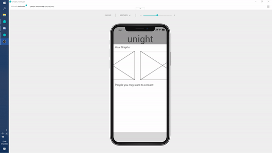
It’s a way for us to get a general idea of how the app might look or feel without actually having to code and make the app itself. There’s a little bit of a learning curve, and the gif above is what I bashed together in about an hour or two. I am worried about the learning curve however, due to the limited amount of time that we have to complete this project.
Before fleshing it out even more though, we are planning on creating a general layout of the app. For now, we are pretty set on only having 3 pages to ease navigation, however the actual layout is still up in the air. The plan is for us to come up with that layout and then do user testing with people in each of our personal bubbles.
We’re planning on replicating the layout the group agreed on on pieces of paper, and letting our testers judge it by rearranging and moving said pieces around. We’ll take this and somehow incorporate all of them into what is hopefully, a layout that most people will find comfortable and easy to navigate.
1 note
·
View note
Text
UX? UI? What this? How do?
Looking back at the designs I quickly bashed together yesterday; they definitely have to be worked on a lot more. The problem is, where do I start? Definitions could help.
All UI is a part of UX design, but not the other way around. I feel that that is a succinct way of summarizing the differences between the two, as they are related but deal with different areas of the user’s interaction; User experience looks at everything the user will interact with, directly or indirectly, Norman & Nielsen (1998). On the other hand, UI relates to the actual interface that the user will interact with, whether that be through images on a screen, audio, etc. And is part of the many aspects of UX. Interaction Design Foundation (n.d.) Another way of looking at it is that UX is how the product ends up “feeling” while the UI would be how the product ends up “looking”.
Both are important aspects of a product’s interactivity and affect how much the user will like and use the product. They can directly affect each other; hindering or elevating aspects of both. An example I would like to use is the difference between the User Interfaces of Pokemon Emerald and Pokemon Pearl, and each of them affected my opinion on each game.
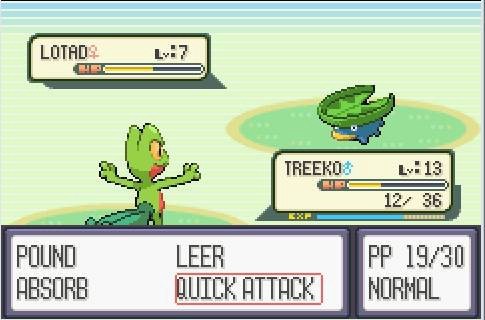
Pokemon Emerald’s Battle UI | Carly Karas
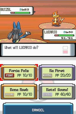
Pokemon Pearl’s Battle UI | Carly Karas
The topmost image is the interface of the older game, being simpler and providing less information compared to Pearl’s interface. The newer game’s UI on the other hand gives the user more information, is more visually pleasing while also adding touch support. The main problem with Pearl’s interface was the delay when using the traditional buttons to navigate it. A delay that wasn’t present when using the touch screen to make a selection nor was it present in the previous games.
Since I was a player of previous games, I didn’t use the new touchscreen features and used the buttons like the older games. The delay caused by this got in the way of one of the main activities in the game, battling. I use this as an example as it demonstrates how an aspect of a user interface may not affect the experience of one set of users, while affecting another set of users negatively at the same time. As such, the types of users expected to be using a product should be heavily considered during both the UI and UX design process.
Other things I looked into were Dieter Rams’ (1976) principles of design that I can keep in mind from a UX/UI point of view. Mainly how a good design:
makes a product useful
makes a product understandable
is unobtrusive
is honest
is thorough to the last detail
While his other principles are also important, I think that these are the ones that will influence my design decisions the most. My goal as the UX/UI designer of this project is to make it so there is little stress added to the user by making the overall experience as easy and as painless as possible. One of the ways this can be achieved is by avoiding the pitfalls highlighted by Gray et al. (2018), which can infuriate and get in the way of the user.
These pitfalls; categorized as “Nagging, obstruction, sneaking, interface interference and forced action” are ways UI is used to control the actions of a user and generally leads to an overall poor user experience. This is something that we as a group should consider very carefully. For example “Nagging” is the repeated insistence that the user perform a potentially undesirable action, which may be difficult to stop. This section concerns one of our app’s planned features, a reminder that encourages people to call contacts that they haven’t interacted with in a while in order to help fight the feeling of isolation and loneliness. This could potentially become more damaging than helpful, as the user may have good reasons for not contacting that person and would introduce stress and anxiety instead.
A potential solution to this would be to allow the user to exclude certain contacts from this reminder feature. This could be exploited and made so the app doesn’t remind the user at all, which we would want to discourage. “Obstruction” is the term used by Grey et al. (2018), and is when the designers intentionally make it difficult for the user to access certain UI elements to perform an action. This again, adds frustration to the user and while we want the user to act a certain way it should not be through bullying the user into submission. This is where paying attention to Dieter Rams’ principles will become useful, as it will be a constant reminder of what we want the product to do and how we should achieve that. By paying careful attention to the overall experience and through user testing, these UX pitfalls can be avoided.
Of course all of this is fine in writing, however it becomes much more difficult if no clear user has been identified. The next time our group meets, this will probably be the most pressing topic. So far our audience is simply “people in quarantine/ self isolation”, which is practically everyone at this point. We should all look at this and decide who we are trying to cater to while also making up our minds on how exactly we want the app to perform its functions.
References:
Interaction Design Foundation (n.d.) User Interface (UI). Design https://www.interaction-design.org/literature/topics/ui-design
Interaction Design Foundation (n.d.) User Experience (UX). Design https://www.interaction-design.org/literature/topics/ux-design
Norman, D., Nielsen, J. (1998) The Definition of User Experience (UX). https://www.nngroup.com/articles/definition-user-experience/
Pokemon Emerald’s Battle UI & Pokemon Pearl’s Battle UI by Carly Karas Retrieved from https://medium.com/@carly.karas/pokemon-evolution-battle-ui-52def00c1ced
Rams, D. (1976) Design by Vitsoe [Speech in New York] Retrieved from: https://www.vitsoe.com/files/assets/1000/17/VITSOE_Dieter_Rams_speech.pdf
Gray, C. M., Kou, Y., Battles, B., Hoggatt, J., & Toombs, A. L. (2018, April). The dark (patterns) side of UX design. In Proceedings of the 2018 CHI Conference on Human Factors in Computing Systems (pp. 1-14).
1 note
·
View note
Text
So I guess I’m doing this again
Well these past 5 weeks or so of lockdown have been something. The uncertainty it brought has been kind of dispelled by the return of uni, but that also means there’s work to do! Since most of our coursework has moved online, I thought of blogging again so that I can have a digital record of everything I’ve done, as well as being able to easily go back to my notes!
So... What are we doing now?
As a bit of a catchup, my group (Milo, Kent, Thomas and I) were working on the idea of creating a wearable that would help people control their anger. Sadly, that is no longer feasible due to the fact that we don’t have access to the studios and that collaborating together on a physical object will be a bit more than difficult with the current situation.
So instead we’ve decided to change gears a little bit, while (hopefully) keeping the previous research work we’ve done relevant. Now we’re planning on making what is essentially a reminders app to help deal with the lockdown and isolation. This is still in line with our original goal of creating an aid to help deal with mental issues and stress, but reimagined in a way that we are able to achieve and to be more relevant to the current situation.
Our temporary name for the app is Unight, a pun with the function of the app. With it we’re hoping to help people by reminding them to keep in touch with their contacts by accessing phonebooks, facebook, etc. As well as addressing a problem a lot of people complained about when uni started back up again; sleep.
For now, each member’s assigned role is this:
Patrick: UX/UI
Kent: Graphics/Audio Design
Thomas: Xcode
Milo: Additional Research (on the effects of sleep for example) and looking at web design
During our first meeting back we discussed a couple of things and I hammered out a few quick mock ups of how the app might be laid out.
Obviously it’s not perfect and there’s a lot of work to do, but learning about UI/UX was one of the skills I wanted to improve on during this semester so this is a great opportunity to do just that! However, I definitely need to do some basic research on at least the basic tenets of UX design!
1 note
·
View note
Text
Gumball’s Process Journey
Project Name: Gumball the Recycling Bin Lid.
List of Project Members:
Patrick Pabustan
Summer Nanai-Solomon
Elilvannan Thurairajah
Project Contextual Statement:
Our project "Gumball" the recyling bin looks at encouraging recycling and reusing through simple gamification of the recycling process (Aguiar Castillo, Torres, Petra, Perez-Jimenez, 2018) and a system of rewards to encourage users (Luyben & Bailey, 1979).
The main reason for wanting to encourage recycling and reusing behaviour in AUT is the relatively recent rise in the amount of waste generated by the average household in nz. (Organisation for Economic Co-Operation and Development, 2017)
A list of all my blogs posts on the project:
Post 1
Post 2
Post 3
Post 4
Post 5
Post 6
Post 7
Post 8
References:
Aguiar Castillo, Lidia & Torres, Julio & Petra, De & Pérez-JIménez, Rafael. (2018). How to Encourage Recycling Behaviour? The Case of WasteApp: A Gamified Mobile Application. Sustainability. 10. 1544. 10.3390/su10051544.
Luyben, P. D., & Bailey, J. S. (1979). Newspaper recycling: The effects of rewards and proximity of containers. Environment and behavior, 11(4), 539-557.
Organisation for Economic Co-operation and Development (2017) Municipal Waste. Retrieved from https://data.oecd.org/waste/municipal-waste.htm
0 notes
Text
It’s Done
10/24/19
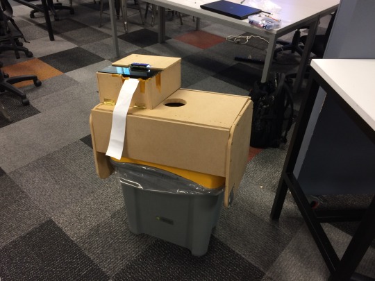
We’ve completed the prototype of our bin cover, deciding to call it “Gumball” after the original concept. It’s still kind of unfinished, mostly due to us underestimating how much work would go in to some of the features we wanted to implement (namely the printer and load cell). It does work however, and it behaves pretty closely to what we wanted.
We also technically had our first play test when Elil invited his friends to have a look at Gumball. In out excitement we forgot to film it, however there were still some observations to be made. Starting off with aspects that I noticed negatively affected their experience.
1. The LCD display was kind of confusing to read. This was partly because of the fact that part of the display was referring to a weight measurement that wasn’t being taken since the load cell was removed. Partly because it is a pretty small display. I think the fixes for this are obvious, remove the text that refers to the load cell and a newer iteration should have a larger LCD.
2. The motor takes a long time to actually spit something out. This resulted in multiple occasions where we thought that it had broken and was not doing anything. A quick fix would be have the LCD say that the coupon is being printed, mainly because the stepper motor we’re using is already going as fast as it can go. A proper one is to actually have a receipt printer handle all of the coupons. It’s something I want to do if we continue working on this, especially because we ended up not getting our thermal printer this time around.
One thing that was encouraging to see though is the enthusiasm shown by Elil’s friends when they first tried it out. After disposing one of their cans, they immediately looked around the room to find something else to put in the bin. Of course this is only one test, and this enthusiasm can be attributed to the fact that Gumball is something strange and looks like it shouldn’t be on top of a bin. A real world test would be the way we find out if we achieved our goals.
0 notes
Text
Moving on with the prototype
This was on old post that I had lost the draft to, I have been able to get a little bit of it back but it is kind of incomplete.
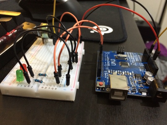
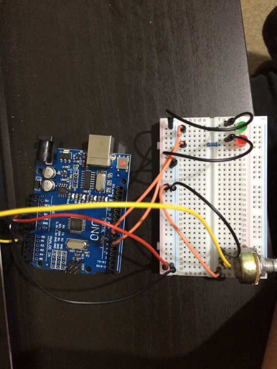
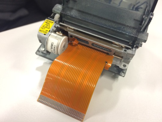
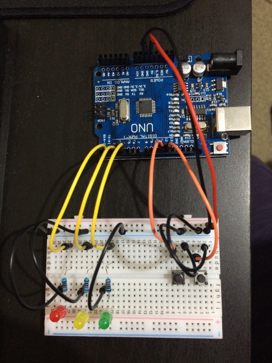
So we have started creating our prototype. Summer and Elil are handling the woodworking/creating the enclosure for all of the arduino stuff that is going inside this. I on the other hand am working on the setting up and coding the arduino, and have already encountered a couple of problems. Even with Elil’s help, I was not able to get the thermal printer working with arduino. The major problem was that soldering connections from the arduino to the printer’s ribbon cable was incredibly difficult, and due to my inexperience with soldering have resulted in the destruction of said cable.
For now we have agreed to just “fake” the effect of printing out the coupons through the use of a stepper motor attached to the paper dispenser. It should have a similar if not the same visual effect, however it would have given us the flexibility that we wanted. A printer would have allowed us to give different rewards based on the amount recycled, a motor does not.
(insert pics of the motor and printer here)
0 notes
Text
Physical Computing
Assignment 2
youtube
0 notes
Text
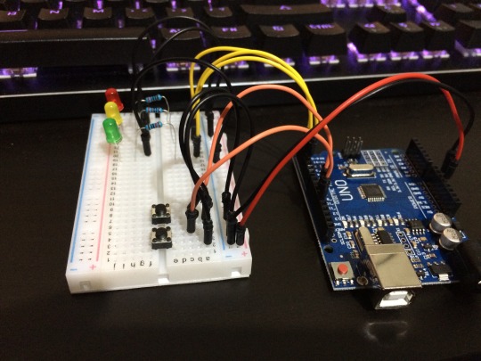
Hooray Soldering!
Elil was able to find an old eftpos machine with a thermal printer. We tore it apart and are now finding a way to connect it to the arduino. We chose to go this route as a part of our group’s goals, which was to make whatever we’re making with reused and found materials, to encourage people not only to recycle but to also reuse what they have got.
The reasoning for finding and using a thermal printer is because they don’t require any ink and are very compact. This should allow us to move and mount the printer as we continue to iterate on our design.
The way we have decided to solder on wires to the pins of the printer as we have no other easy way to do it. It’s a very time consuming process as the pins and wires are small and care has to be taken that they don’t short circuit. After 2 hours I have manage to solder on 7 of the 29 pins, it’s slow progress and it may not work.
For now we’re sticking with the printer as it should allow us to easily change what kind of coupon, or whatever that could be given out. However we do have a back up plan just in case we can’t get the printer to work on time. In that case we plan to have a simple roll of paper with the coupons already printed on them and it would dispensed as needed. The problem with the backup plan is that it is pretty wasteful, especially if print too much.
0 notes
Text
Oops I forgot to blog
So over the past few weeks we have decided on our target audience, what prizes to give them and have created some rough concept designs.
Our project’s target audience are AUT students. Over the break we sent out another survey with some expanded questions and the money option removed as it was kind of clear that people would be biased towards a monetary prize and the fact that we would not be able to provide the prizes with as much ease as we want. The prize we have chosen instead as a result of the survey are discount coupons, as they are still somewhat related to money and would be something students would want. It also kind of aligns with our original idea of giving some sort of food item as the coupons could be for places to eat, among other things. In a sort of roundabout way.
We have also created rough concept designs:
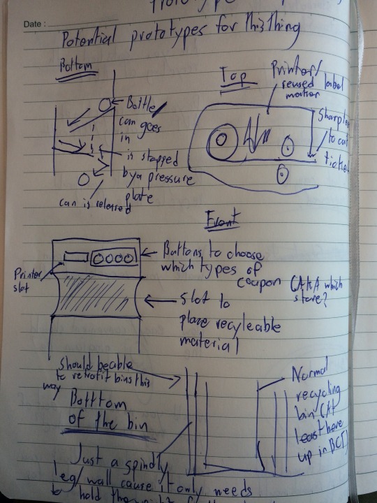
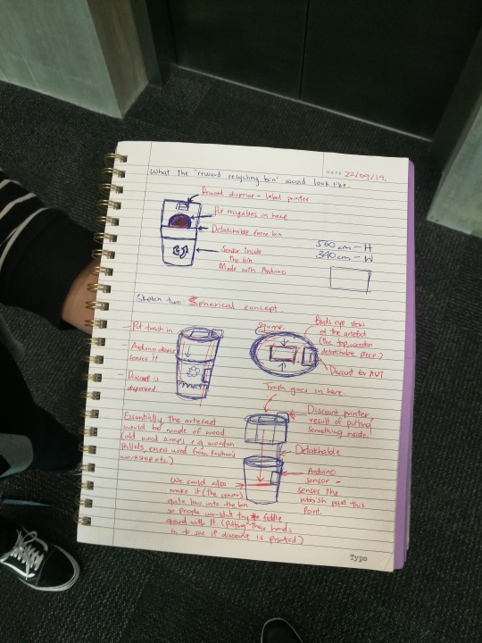
The second batch of designs were drawn by Summer, and we have decided to go with a design similar to one there. We have decided that we will just make something that could be retrofitted into an existing recycling bin. Using the recycling bin we have in our classroom as a model; taking measurements, we adapted the design of the existing bins. We have also opted for not having any buttons in order to reduce the amount of interaction the user has with the bin. The would just throw their bottles/ cans in and the machine should automatically spit out the coupon. We are still deciding whether or not to have the printer as a separate module as well, in order for a user from touching any part of the bin entirely. (We’ll probably go with this, depending on how we can get the printer connected).
0 notes
Text
Physical Computing
Assignment 1
youtube
0 notes
Text
The Rewards of Recycling
Our survey to find out about how people recycle: https://www.surveymonkey.com/r/H7TT223f
There are many reasons we chose a gumball machine as the initial inspiration for our project. The first of which is to reward the positive behavior of recycling. The results of a study where children were given prizes in exchange for newspaper to recycle, Luyben & Bailey (1979) showed an increase in recycling, sometimes dramatically when a prize was offered in exchange for recyclable material. A more recent example can be found in a report by the London Assembly’s Environment Committee (2011), where they outlined the increases to the amount of material recycled by communities that participated in Recyclebank’s loyalty rewards scheme.
We also hope to encourage the action of recycling through rewards by creating this Gumball machine, where the act of recycling would be reward by a gumball presented by the machine. As pointed our by Charles however, people who don’t like gumballs probably would not use a gumball machine recycling bin. In order to find out how to increase the appeal of using the recycling bin we have created a survey that be found above. What will most likely happen is that the project will evolve into a more general vending machine recycling bin, in order to encourage different types of people to recycle.
One problem with rewards schemes that both papers covered is the price of maintaining such a scheme. We are already aware of this potential problem with our idea, as a gumball machine recycling bin would have to be emptied of waste and restocked with gumballs. We hoped that the low prices of gumballs would offset this problem a little, but it will have to be something we keep an eye out for if we are to change the reward we are offering.
The second reason for choosing such a machine as our inspiration is its perceived ease of use. Gumball machines, and by extension vending machines generally release their contents shortly after the transaction is made. This convenience is a factor we want to include in our design as making the reward process as painless as possible for the end user would also encourage them to recycle as well. As Vining & Ebero (1990) state in their article “... the incentive of receiving payment for recycled materials may not outweigh the trouble of preparing, saving and transporting recyclables.” We hope that the near instant collection of rewards would help encourage recycling, especially compared to traditional rewards programs where one might have to wait before the reward is given to them.
Keeping the object simple to operate is also critical as convenience in the actual act of recycling is also affects people’s desire to recycle as shown by the conclusion drawn by Philippsen (2015). This is why we’re using the concept of a gumball/vending machine as the way to give our rewards, as they are objects most people have encountered/ know how to operate.
References:
Luyben, P. D., & Bailey, J. S. (1979). Newspaper recycling: The effects of rewards and proximity of containers. Environment and behavior, 11(4), 539-557.
London Assembly Environment Committee (2011). Carrots and Sticks : A review of waste financial reward and compulsory recycling schemes.
Vining, J., & Ebreo, A. (1990). What Makes a Recycler?: A Comparison of Recyclers and Nonrecyclers. Environment and Behavior, 22(1), 55–73. https://doi.org/10.1177/0013916590221003
Philippsen, Y. (2015). Factors influencing students' intention to recycle (Master's thesis, University of Twente).
0 notes
Text
Switching many... many gears
We’ve decided to ditch our idea of doing something related to war. It’s a pretty sensitive topic and we weren’t sure if any of our ideas were appropriate. We were also not very keen on any of our ideas after we thought about them a bit more.
From there, we tried to think up of something that we could do. The first idea we worked with was something Summer came up with. She did some research on the global issue of deforestation and came up with the idea of creating a soundscape of a rain forest where users would be able to hear sounds of fauna present around them.
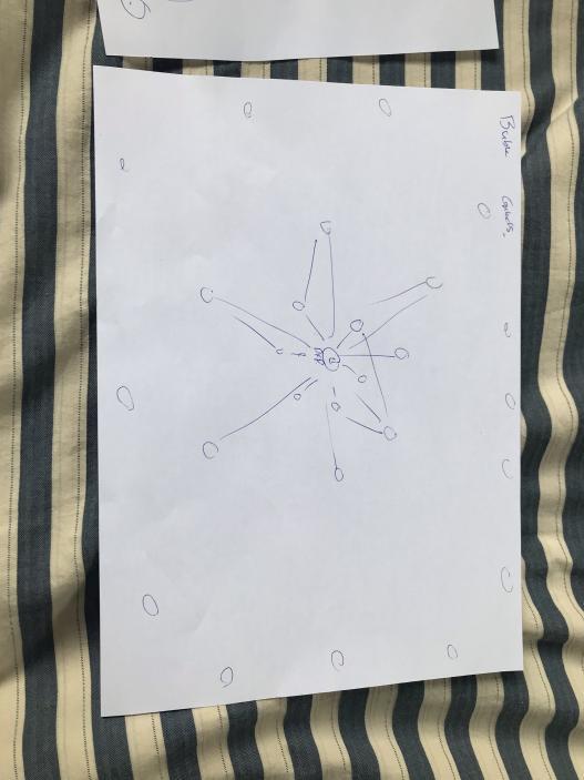
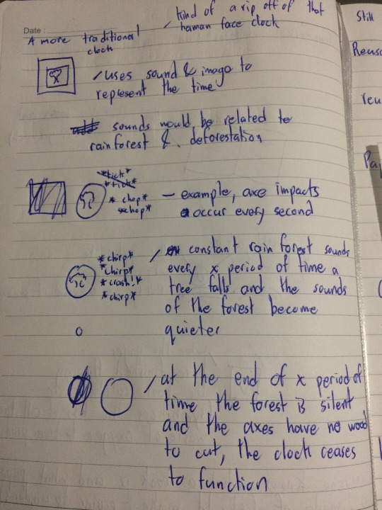
This transformed into the idea that we called the “Deforestation Clock”, kind of inspired by the Bulletin of the Atomic Scientist’s Doomsday Clock. This clock took 2 forms, the first of which was a soundscape which it took the sounds of the rainforest and played them in a clock-like fashion. We would use statistics related to deforestation around the world in order to alter the way in which the “clock” worked. The image below was a diagram I drew to sort of visualize how it would have worked.
The second form of this clock idea was a book. It was more of a symbolic thing more than anything as it would not have really functioned as a clock anymore. The book would have contained information and data on deforestation, most likely from onetreeplanted.org as that was where we were getting most of our statistics from. As the user got closer and closer to the end of the book, grimmer and grimmer facts would be presented. And as they finish flipping through the book the book would destroy itself.
We originally liked the book idea as it was something easy to identify with deforestation. Paper is a product of trees, and a contributor to deforestation. The fact that the user had to flip through the book themselves was something we intentionally thought of, originally I thought we could rig a machine that would flip through the pages for them. The intention of this user interaction was so the user would be involved in the whole process / story of deforestation, warning them as they go through the book and yet they would allow it to continue. The book destroying itself was to symbolize the point of no return, where the user would realize their mistake and the book would be wasted, where no one would be able to read it again. If they don’t reach the end of the book, either through accident or because they paid attention to its warnings and the book would be available to be read again, yet still vulnerable to the same fate.
This was supposed to mirror how people can have a hand in helping to mitigate deforestation, because if they don’t the consequences would would affect future generations (future readers) and if they did mitigate the disaster their successors may still go down the road towards the destruction of rain forests.
Everyone in the group liked this idea, however we had a problem of thinking up of a way to make the book destroy itself safely while keeping the mechanism that does so relatively well hidden. (Kind of to show that while things may look normal, we there might be unknown disaster ahead). Fire was out of the question as it would be a hazard especially if people are holding the book, though it would probably the simplest to implement. Damaging the book with water would be difficult as a tank of water would be easy to spot. And any highly reactive chemicals would be dangerous to handle as well as potentially being difficult to get a hold of. So we ditched this idea as well.
From this point on however, we did come up with a goal for the group. That is to “create something that would encourage people to reuse and recycle”
We then thought up of creating pamphlets that erased themselves in order to be reused at a later date. This stemmed from one of the things we considered in order to destroy the book, which was thermochromic ink. We thought of making pamphlets out of a recycled paper that would inform readers of deforestation, and when they were done reading they could heat up the ink and have a blank piece of paper that they could again, reuse.
We looked at the cost of thermochromic pigment and decided that it was too pricey for us to use, as well as difficult to prototype with. This alongside the fact that the ink cannot be used with printer and would have to be press printed was another thing we had to consider. We ended up ditching the idea as we also thought that most people’s first reaction would be to throw away the pamphlets anyway.
So now we’ve decided on making a gumball machine recycling bin. Where we plan on creating a recycling bin that rewards users with a gumball.
References:
https://thebulletin.org/doomsday-clock/past-statements/
https://onetreeplanted.org/pages/tree-facts
2 notes
·
View notes
Text
What to do?
7/25/19
In all honesty we’re not really sure what we want to work on. So instead we looked into how we could make these ideas a reality.
We searched for projects that are similar to 3 of our ideas and also got some feedback from Charles.
Starting with the our “mined” carpet idea, we found a similar exhibit inside the United Nations Headquarters that demonstrates mines exploding and people are startled.
https://www.youtube.com/watch?v=ovuvcZ0nNKk&feature=youtu.be
Our project, while similar is more physical and and random. Based more on trying to emulate the experience first, and educating people a close second. Instead of it being a sort of augment reality experience, our idea was to create a carpeted floor with hidden switches that were randomized. We saw this as an easier way to emulate the experience of walking on a minefield, as well as increasing the “surprise” factor of it, as most victims in these cases don’t expect to step on a mine as they have usually been hidden and lost for a couple of years.
Charles however voiced concerns over the ethics of this potential exhibit as this is a fairly sensitive topic, and how we need to be able to “do it justice”. This was not something we thought about and was one of the reasons we decided to start thinking on the “why” of our project first.
On a side note; Eli suggested that we create prototypes in Minecraft as this would be pretty easy to do and it would give us an idea of what the experience could potentially be thanks to the game’s first person perspective.
Charles liked the tactility of our phone idea as it forced the person observing it to interact with the installation, however he also asked us what made it different from other similar installations, another question that we really couldn’t answer. Again, this is the reason we’re going back to ask the “why” of our project and give us a little bit of a guiding light so to speak.
0 notes
Text
Back at it Again
https://en.wikipedia.org/wiki/Zone_Rouge07/18/19
The semester has started and I have to propose an idea... AAAAAAAAAAAAAAAAAAAAAAAAAHHHHHHHHHHHHHHHHHHH
Calming down however, I did think up of something to propose.
During the holidays I did some light reading on the Zone Rouge and the “Iron Harvest” that occurs in that area of France & Belgium. According to the Commonwealth War Graves Commission around 200 tons of unexploded ordnance is found by farmers every year. Finding out that a war that ended 100 years ago still directly affect the lives of people today.
To me it is reminiscent of situations we have today in places like Afghanistan or Iraq where people or livestock step on unmarked explosives left over from past wars. And despite the fact that any explosives found in the Zone Rouge can be disposed of by experts, they can still injure anyone that finds them and serve as a reminder that the effects of a conflict that ended long ago could still be felt even a century after.
It’s a pretty light inspiration, but it’s something I guess. It’s definitely something to think about and expand upon. I’m not quite sure if I could actually do anything with this, I would need to think about to to expand upon it.
I have also formed a group with Eli and Summer, though we are pretty short of other ideas for now.
Links to sites that I have taken a look at related to the remnants of war. (WW1 and unexploded ordnance in the middle east)
https://en.wikipedia.org/wiki/Zone_Rouge
https://en.wikipedia.org/wiki/Iron_harvest
https://www.irishtimes.com/opinion/grim-reaping-an-irishman-s-diary-about-the-iron-harvest-of-france-and-belgium-1.2555813
https://www.atlasobscura.com/places/zone-rouge
https://www.nationalgeographic.org/news/red-zone/
https://www.cwgc.org/learn/news-and-events/news/2017/11/28/16/47/the-iron-harvest-a-warning-from-history
https://www.messynessychic.com/2015/05/26/the-real-no-go-zone-of-france-a-forbidden-no-mans-land-poisoned-by-war/
https://www.unicef.org/media/media_81398.html
https://www.halotrust.org/where-we-work/middle-east/syria/
https://www.middleeastmonitor.com/20161201-why-the-landmine-quagmire-is-far-from-over-in-the-middle-east/
07/19/19
Eli and I (Summer couldn’t make it) met up to discuss what ideas we could come up with.
"Mine” Carpet - Meaning to imitate the randomness and misfortune of stepping on a landmine. People who step on the randomly selected switch or pressure plate activating unpleasant noises and lights.
War Phone - A phone that brings up various sound clips from the first world war.
Soundscapes of abandoned buildings
0 notes
Text
Signal Devblog
Name: Pipe Dreams
A list of project members:
Patrick Pabustan
Zhe Deng
Qiyue Deng
Astarlii Taokia
A list of all my blogs on this project:
Day 1
Day 2
Day 3
Day 4
Day 5
Day 6
Day 7
Day 8
Day 9
Day 10
Day 11
Day 12
Day 13
Day 14
Day 16
Day 17
Day 18
Day 21
Day 22
0 notes