
Last Seen Blogs

service-treadmill-bandung
Service Treadmill Bandung

mohamed67520
Untitled

northernexposureonly
NORTHERN EXPOSURE

cabbage-in-a-cottage
Cabbage

batialite
I make a lot of nerdy art
Text
SPECTACULARLY DULLISH
Nimbly loading the 110mm film into my slim line compact camera, I was now ready to capture and record what was to me of significant importance and interest. Having only 24 exposures, I knew that care, rigorous selection and aesthetic quality would be crucial in ensuring that each image would suffice my intentions. Perusing my surroundings I planned my agenda, firstly there were dads slippers strewn on the living room floor, dishevelled in appearance with an uneven wearing to the right sole. Next the cat, unfortunately far to fast for my agile skills and so I settled for her occiput as she darted from view. Long before I even understood still life, my interest had now fallen towards the half used bottle of toxic green washing up liquid perched upon the kitchen sill, its sides a sticky collection of residue and finger prints. Being only 7, my approach to the art of photography could be likened to that of a machine gun wielding revolutionary, peppering the contents of the barrel in every direction possible, without care or concern.
Those 24 exposures were an eclectic collection of the mundanity and normality of 70’s childhood, toys always a keen favourite, wooden handled kitchen utensils, wilting garden plants and of course unsuspecting members of the family. Awarding each image a distinct unequivocal connection to the era was the orange hue, slight blurriness and an exposure which, permanently rested at both ends of the spectrum, very rarely falling into the area of correctness. There was no pause for thought, the roll, once inserted was just as quickly used, the finger never leaving the trigger, everything that passed my peripheral became a subject, nothing could evade the stretch of the plastic lens.
Film exhausted it would be carefully sealed along with the £1.79 developing cost inside the FOTOPOST envelope, the back of which required you to choose the desired print size, which always posed a dilemma in whether what was on the film was worthy of enlargement. Once transferred to the charge of the Royal Mail, all I could do was wait, hopeful that what came back exceeded expectations. True to 70’s efficiency, within a few weeks a brightly coloured envelope adorned with flattering image of Wendy Craig claiming that FOTOPOST was her product of choice would fall through the door, without doubt this was the heaviest and brightest of letters, anchoring itself to the bristles as it thudded to the mat. The heavy din became an invitation to invade privacy, as the majority of fallen sleeves were more often than not brown with red overdue stamps, boldly positioned for all to see, yet now this infrequent thump gave birth to an unwritten rule, that whoever saw first gained rightful honour to front seat premier. This was unfortunate as it enabled an editing process of undesirable portraits to be deleted from the stack before my own inspection.
Leafing through the quantity of highly glossed images there was always a disappointment in my efforts, when recalling the scene intended in comparison to the actual evidence in hand. Unbeknown to me the little 110 always failed to see what I saw, however despondency to one side I now had in my possession a collection of artefacts, relics of yesterday, never to be repeated, which once gazed upon would be relegated to the shoebox under the bed. Blatantly ignoring my own mistakes I would quickly reload with the free film included with my prints and commence the whole routine once again…same pictures…different day.
I still have most of those prints, buried deep in the attics labyrinthine of stored memories and keepsakes, and thinking back I often question why I took those images, scenes of everything and anything, what was it that forced me to press the button in such a hurried amount of time. Obviously there is no real mystery, firstly age would have been paramount in that this piece of technology was as magical as the golden fleece. To be able to see and then embellish onto paper was nothing to be sniffed at, and at an young age there was no real reason in my commitment. Then of course it was the 70’s, photography was the hobby of masters, of which only the individual bestowed with the title of “Dad” could ever understand, something so complicated and delicate could never be entrusted to women or children. However when we acquired our new Kodak 110mm, its simplicity and sturdy slender brick design seemed ergonomically suited to smaller hands…..and brains.
Today my approach and interest to photography has altered greatly, I very rarely carry a camera outside of work (albeit the phone) and don’t feel the urge to capture what I have viewed time and time before. This isn’t to say that I don’t take random snaps, because I do, its just you never really see them, as with their predecessors they end up in the shoebox, although now its digital. Maybe it’s age or laziness, but I sometimes struggle to understand why people feel the need to record certain occasions, and the point in interest is fireworks! This week the veins of social media have been forcefully injected with an overdose of blurring incandescent light trails, explosions and streaks, set against thickly smoked skies, all gently falling back to earth from whence they came. Having November 5th fall on the weekend, gave right of passage for three whole nights of wartime blitzing, back garden jaunts, organised events and or course youth fuelled duels with Roman candles, so inevitably someone, somewhere would take out the camera. For me the hands stayed safely buried inside the thermal lining of my jacket, watching and recording the screeching dazzling lights mentally, I could if needed describe the spectacular images verbally, but at no point did I feel the need to record, reproduce digitally and share. Surely I’m not the only one who see’s this weeks firework displays and unconsciously replaces last years arresting memory with this years fresh vision of dazzling awe. The images administered in heavy doses I feel fall into two distinct categories, those of occasions and those of just light and sky and its the latter portion which puzzles me. Images void of people, buildings, perspective or attachment, ambiguous evanescent memories that over time fade, just as quickly as the burning cinders floating elegantly and sorrowfully back down to the loam.
I’ve never seen the appeal in photographing fireworks. When there is nothing else within the image over time you are unable to specify a year or recall the events that preceded or followed, the image becomes just another firework, all lights no fizz. Photography is such a plenteous and generous medium , capturing what you saw and if given the opportunity so much more. The images shot with the 110mm, clearly show unvarying tediousness in all its glory, however it’s everything else captured within the frame and outside which has grown and become far more important than the initial topic intended for capture forty years ago. Those images over time have now blossomed into a treasured memory of childhood, acting to fill in the forgotten blanks, painting vivid recollections of youth. The bottle of soap is still there, but now what protrudes more prominently are the cracked red tiles of the sill, the mildew infested fissures of the window frame and the chink in the pane allowing access to the elements. Grubby tide marks creeping up the tulle drapes developed over years of mopping up suds from behind the taps, the parched thirsty plant pot and its struggling foliage and even more exciting the hazy view to the outside. Through the window you can see the neglected swing, of which my brother and I discovered is only made for one, a silhouette of a long forgotten pet dog and the garden shed where many an invention was created. All this from a simple photo of a bottle of suds.
Even the image of the cats hind shares more than intended, the torn linoleum flooring caused through years of gouging canine talons, mop residue against the grubby kick-boards and the left foot of my brother, shoed in green flash. Forty years later the images work to trigger memory, leading the thought process in various directions of recall, structuring a clear untarnished memory image of home , as if it were yesterday. As mundane and pointless I presumed these images were, they now have been dusted and brought back to prominence through time, ageing and memory, And this is where I struggle with imagery that sits in the firework domain, what will the image of the black night and spray of gunpowder deliver in 40 years? Will these images unlock suppressed memories from that night, in my opinion I don’t think they will, their glory will be a profile picture, a handful of likes from friends and wannabe’s and then deletion…not even into a shoebox.
Photography is extremely magnanimous towards its keeper, an ambiguous image of normality can over time deliver layer upon layer of memory, guide and open thoughts to moments long forgotten. Photography is simply a way of recording memories, hence why every notable occasion is captured, and even in old images of family gatherings, around the initial protagonist a strata of stories and answers can be found. We don’t have to save the camera for the spectacular, the whirring lights and falling ash, but capture whats in front of us, what we take for granted, I for one would be more interested in seeing the faces of the spectators than the actual subject they are spectating. Photography will successfully capture a moment, but what we all may be guilty of is wasting that moment on a scene which serves no purpose other than to amuse briefly. Quite simply photography I feel has become a perpetual stoning of impermanent scenes, which with pause into where you direct the lens, could once again serve to yield layers of preserved reminiscent echoes for many years to come.
#Fairy Liquid#110mm Film#Photohgraphy#Fireworks#The 70's#November 5th#Food photography#Commercial Photography
1 note
·
View note
Text
MUSTARD GREY
Dulverton Avenue 1977, post silver jubilee celebrations and the gloriously shaded nicotine orange net curtains twitched with envy as our neighbour pulled gingerly up to the curb, purposely and proudly sitting there, exploring the many gadgets on offer, in his newly acquired, hot off the line, Rover 2200. Sleek contours glistened and chrome dazzled, juxtaposed against the mustard yellow paintwork. The neighbour was a big man, and once he’d finished raising awareness of his presence through thunderous pulsating revolutions of the engine, cumbersomely he pulled his huge frame from the drivers position, taking up the pose of a Jack Lord wannabe, one arm resting on the roof, one foot on the sill, removing his beige leather driving gloves digit by digit, whilst maintaining a surveillance type gaze up and down the street. Driving attire removed and placed on the dash, his wife now joined him, scampering down the path in excited animation, to peer inside at the plush velour interior. The two of them pondered for nearly an hour, opening every ingress as if to spread bare this feat of Leyland design for all to see, constantly but discreetly checking for covetous interest from residents.
My dad never had a new car, never could afford one, but never once showed resentment towards this paragon of engineering excellence. Instead he would proudly spend many a weekend, head under the bonnet, hands oiled to the pores, maintaining his own roaring mechanical chariot. His was a Ford Zodiac MKIII, a good ten years old, slight perforations around the arches and underside, but other than that fairly sound. This car was a beast, sitting outside the front of the house, a sleeping giant waiting to be disturbed. Considerably louder than the Rover, drawing attention for all the wrong reasons. Even the shadows cast by the two vehicles parked head to nose seemed to compete, one a graceful flowing silhouette the other an incommodious eclipse. Its battleship grey exterior had over the years become ravaged by the sun, a powdery matt and even the chrome frontage exhibited a peppering of oxidising decay. The interior also not fairing well, its red leather bench resembling a waterless wasteland, a never ending maze of cracks and ruptures, spoiling its once lavish upholstery. The parallel speedometer paused at 50, the fuel gauge worked in reverse and the 8 track only played through one speaker. Where ever this tonnage of steel was placed it marked its territory, like a tom cat, a staining of black gold upon the asphalt. No matter its condition or temperament, my dad still persevered in ensuring its reliability, would stand ear pressed against the head gasket, following the amorous sounds of the tappets like a surgeon listening to a heartbeat. This was what we could afford, but never the less it delivered the same end result of transport, albeit noisier and a little slower.
I always envied the Rover, wished we could have a car which sounded like angels singing instead of a chesty cough, could relax deep into the faux velvet like kings, but it was never to be. They were both essentially the same, vehicles to transport, family cars, although, one was in reality just a better specification. So instead the summer trips to Weston Super-mare were noisy, hot and slow and on occasion often abandoned, when mechanical failure occurred, but still, all is remembered fondly.
It’s only now, wiser and a little older do I realise how although my father possibly wished and hoped to have a new car, that he’d accepted what was within reach. As a kid I cannot recall ever going to a car showroom, furniture or even electrical store. Most contents of our home, extending to the drive were second hand or rented, the sofa bought from a friend who had afforded a new one, the TV with its huge 50 pence usage meter fixed to the side, was on rental from Rumbelows, even clothes and shoes were the rewards of endless queuing in the rain outside community and church halls, in readiness to root through the piles of jumble. This was the 70’s and most families were in the same predicament, but as a family you survived and coped, and although I hated wearing flared 3 button fastening trousers along with tread bitten daps, I can honestly say, there wasn't any resentment towards friends who were lucky enough to have bouncing soles or a classic Harrington. My dad never once went into a dealership and requested the rover for the price of the Zodiac, neither did mum ask for a pair of St Michael school trousers for the price of the jumble flares, they realised what was within their price range and worked to that, they wanted more but played within their limits.
Within photography there are Rovers and Zodiacs, each charge not just for the photograph, but for the equipment used, their knowledge, studio space, time etc. Both deliver a service and both produce work of quality, but placed side by side there are differences, one is cracked leather while the other is plush velour and you may ask what benefit this offers to the final product if the end result in reality is the same. Yet this is where I feel certain clients fail to fully appreciate and understand, I am not about criticising any photographer who works to make a living, but there are some who approach their work differently, there are some who work to a brief and others who can interpret your thoughts and create a brief which delivers. You are not just paying for an image but investing in someones thought process, in how your requirements and ideas are construed into a visual message. An image of an apple is always going to be an apple, but skill comes into play when you want to add a context, location, meaning, metaphor or a connotation of something more. Both photographers will create a similar image, yet neither will be the same, this is where added value is evident.
When approaching photographers its not just about price but understanding what you as a client require, if you simply want the apple then realise this, if this suits your budget and expectations, then success. If however you want the apple, situated on a farmhouse table, at midday, with clues towards this becoming a pie, then there will be an additional cost, You are asking for more than an apple, more than an image, although on first impressions it may appear to be, still, just an apple, as a client you are requesting that someone invest time and thought into creating a bigger picture, you are now paying for more than just a runaround but for something that will be noticed even if unconsciously. The reason I say unconsciously is because this again is another reason why imagery is often misunderstood and its true value unappreciated. Within advertising imagery the message is instant, you glance for a mere second and still this image resonates long after its viewing, it may appear to be a simple image, something that anybody could reproduce but in reality this image has taken a great deal of time, thought and skill in order to create and work on a level of unconscious understanding.
As my dad understood the differences in value and what car he could afford, its wrong to place all photographers on the same shelf, some have turned a natural skill into a living, whilst others have invested time into understanding and exploring further than the camera, not just producing images, but work imbued with thought. In todays saturated market of photography it may be worth noting, that producing an image is not all filters and clicks, but a formulation of thought, technical skills and light, all permeated with a photographers ideas.
So when considering which photographer best suits your requirements, ask yourself do you want the Rover or the Zodiac and more importantly understand that velour comes at a cost.
1 note
·
View note
Text
THE GREAT MANGO ROBBERY
As a small boy the trip to Gateway food store with mum was a lifeless chore of dolour, Cavendish Square Swindon 1976 wasn’t the greatest of shopping experiences, but unfortunately, back before caring, it was all we had. Amongst its sparse but rich selection was Dewhurst, spilling the sweet sickly stench of death, permeated into the sawdust footprints of its patrons. Devon Savouries, where in summertime I would stand mesmerised, watching the freightage of industrious ants, transferring sugary debris back and fourth from the lavish display and of course a cycle repair shop, where gleaming wrought iron grifters sat ready to be purchased. There were the usual splattering of newsagents, hair salons and public houses around its many alcoves, one in particular the Cock Robin pub, where kids would have their heads ruthlessly shaved for the price of a pint, as their fathers watched on whilst enjoying a pale ale…or two.
Central to this Utopia of consumer habits, stood, proud as brass, the Gateway supermarket. Nothing in comparison to the labyrinth style supermarkets of today, the Gateway boasted three isles, two checkouts and half a dozen trolleys. The entrance was grand, well it was to me, huge double glass doors, one pane boarded up, due to the previous evenings drunken debauchery. Above these aluminium framed doors proudly hung the sign, a motif, a symbol of power and safety, a sturdy green image of two towers, a portcullis and the words Gateway in bold Helvetica. The first time I walked beneath this daunting symbol my aspirations of what lay in wait were somewhat shattered, no knights in shining armour, jousting or jesters, what greeted every customer was a rusty trolley dragged from the brook, and a frumpy looking employee, cigarette in mouth named ‘Iris’, carefully stacking tins of a certain product, claiming to contain no lumps of fat or gristle……GUARANTEED!!
Shopping for food when I was a kid seemed a painful exercise with no rewards, the shelves a palate of dull pastel colours, all shouting false claims of exotic luxury and adventure. I’d watch as mum piled in the smash, dried vesta curry for dad and of course the 3 lit container of vegetable oil, an essential ingredient needed to top up the aways warm chip pan. The oil selection of today with its Pantone of glorious golds and greens, virgin press and blends, are a far cry from the wall of ‘crisp n dry’ we had back then. The chilled section, with its tantalising ‘Ski’ yoghurt range, which was in fact a special treat and of course ‘Spam’ and ‘Brains’ faggots, which, alternated their way into most mealtimes. I didn’t know any better, the food on offer for my social demographic, was to me, all there was, and on the rare occasions when a ‘Fray Bentos’ was served, I literally had died and gone to heaven. Unfortunately my taste buds and interest in food had all but dried up or to be true never really started, following years of over salted and dull miserable looking concoctions, all served on translucent pyrex plates, but all this was about to change
At fifteen I took a position at the Wiltshire Hotel Swindon as banqueting waiter, hours and pay of no concern, in fact I never turned down a shift or questioned my earnings. Once a week I joined the queue along with the rest of the waiters, chefs, doormen, housekeepers, outside the accounts office, in order to receive my small brown envelope, stuffed with a few greens a blue and some coppers, this weekly task had become my new ‘Fray Bentos’. Following the end of a function, it was my responsibility to carefully salvage any gateaux’s, trifle and butter, reassemble pieces and portions, in order to form a whole new serving ready for the next day. I would often sneak a spoonful of the thick birds custard and dessert topping, but this came at a risk, as being caught by the chef, would result, not only in public humiliation but a thump or two, so the indulgence was very rare. However it was the fridge which changed my knowledge of food, experience and appreciation.
One evening when placing the newly rejuvenated desserts back into the walk-in fridge, I noticed a strange looking box. It wasn’t like the other fruit crates of slatted wood, but an artistic version, brightly coloured, alluring and more importantly closed. This pandora’s box had limited wording on the side “Mangoes” and a country of origin, of where, the location I couldn’t even begin to imagine was. Each time I returned to the fridge my bravery took me closer and closer to peer inside. I’d heard of mangoes, in fact seen them, but never actually tried one. As my shift ended I through caution to the wind, and with the stealth of a ninja opened the box to reveal the plump orangery green fruits lying inside, like strange jewels. At this point I heard the chef calling, followed by the sound of his wooden clogs. In panic, I grabbed a fruit, tucked it into my jacket and ran for the door, bidding farewell to my comrades.
The walk home was a few miles, dark and often wet. I dreaded this passage, as its path took me through some unsavoury areas, however on this occasion, I had lost all fear, for within my grasp safety stowed away was the stolen mango. I walked with added spring that night, eager to leave behind the hotel so as to find somewhere quiet and alone in order to inspect my wares. I don’t for one minute condone this behaviour, as I had stolen, for which I felt terrible, but at the same time I couldn’t wait to sample this exotic treasure. Once I considered my position to be one of safety, I reached in and pulled out the plump fruit, which was now not only stolen, but like my brow, dripping with condensation, having been so abruptly transferred from fridge to pocket in this daring robbery. Lifting to my nose Idrew in the aroma, it was unlike any other scent I had experienced, even better than a cherry ski. I had no training or previous knowledge into how this fruit should be approached, and so with confidence and excitement, bit straight into it’s flesh skin and all. Juice flooded my mouth, the sweet juicy perfumed flesh tasted delicious, although I felt the skin maybe not as easy to digest. Working around the skin, discovering the odd shaped stone inside, my journey home had become an adventure, I was a young boy experiencing something new, exploring the world through a fruit, stolen from a fridge in Swindon, Gateway was now a distant memory.
My exploration didn’t end there, each shift became a new experience, I had become a professional thief, stealing to feed my first for new tastes. The Kiwi was next, which again taught me that sometimes skins are best removed, the papaya with its black bitter seeds, different oranges, olives, asparagus stems, which are actually quite good raw and fresh cooked beetroot, of which to date I had only tasted pickled, sat upon a pile of hot steaming smash. Before I had exhausted the fridge, the final fruit to fall into my possession was the avocado with its rich glossy emerald jacket. I had delayed my theft of this item due to it’s boringness. I had tried pears many a time and wasn’t a great fan. My youth only ever saw one type, bruised over ripe and at times sour. The flesh was grainy and once down to the core never held its shape, unlike an apple which leaves you with the perfect cartoon core. What could be any different from the pears I knew and the avocado I didn’t? That night the same stealth ridden theft took place, I then headed for home. Had I learned nothing??? Taking my bite through the skin I waited for the sweet grainy pear flesh but instead was greeted with an almost tasteless milky paste finished and a slice of what seemed like a conker, I thought I’d been duped, was this real, was it off, was it ripe?? I didn’t have a clue. The remains of the avocado and the mouthful I’d taken ended up over someones garden wall, I had tried this stolen fruit, offered it a fair hearing, but in the end decided and for many years after that the humble Persea Americana was not for me.
My adventures with food were short lived, slowly as time passed the excitement in taste tapered to a point where it became very rare to find a fruit or flavour of which I hadn’t already experienced. Now at 47 I feel I have exhausted all but a few items, and of those which are left, serve no real interest. Don’t misunderstand, there are cooked dishes of which I enjoy discovering, but it’s the fascination of those raw ingredients which are missed, the child like exploration and excitement of awakening taste buds for the first time, have given way to bitter black caffeine and the thick smog of Philip Morris.
As a father my voyage of discovery is now shared, albeit as more of a spectator. I envy my son, I once had his wide eyes and impatient fixity to explore further than he can reach. I delight in watching his senses mature, revel as he discovers that chocolate, is not the only nectar(Although hard to beat), those fruits I stole at risk of being beaten are now staple ingredients, readily available. They may have lost their shine to most, but introducing these fruits at a steady pace without fear of reprimand to a yet untarnished palette is as exciting now as it was back then.
It wasn’t until I took up photography that something did reignite my own guileless interest towards these basic and often overlooked ingredients. When looking through a camera what you see is yours to frame, to determine the angle and at what point the composition is aesthetically pleasing to your own eye. The German Philosopher Walter Benjamin wrote about the optical unconscious, stating that the camera and cinema have the ability to record aspects of reality that do not fit into the natural optics, namely because they are too quick, small or disperse. We see these details but do not perceive them as information. When taking photographs of what I considered as fairly mundane vegetables and fruits, brought this notion of the unseen to life. The more you stare through the lens at subjects the more you see, the apple with its blemishes, beautifully shaded exterior and perfectly formed stalk reaching from its core to the sky, the fissures naturally occurring between each cabbage leaf, made even more alluring by the rippled fleshy leaves. As I stare I often recall the great mango theft, the fervour now of my experiences are explored through the lens, not dissimilar from the stolen tastings all those years ago, the only difference, it is now the eyes that are rewarded. All of a sudden the normality of food has once again taken centre stage, I see so much more, appreciate the absolute genius in that something so simple, has grown from nothing.
With the supermarkets offering so much choice I feel we have become numb and oblivious to what not so long ago was classed as exotic, it drives me insane to see vest clad men rummaging through the sprouts at Christmas, tossing to one side rejects which have failed to make their grade… Sometimes we should all stop, hold the object in our hands and explore, examine its form, admire its colour and imperfections. I have realised with the help of a lens, that there is still so much more to see and explore, objects all to familiar do in fact have so much more to offer, hidden beyond our initial perception, further than what we first see, a return to childhood, a chance to regain an inquisitive nature…If only we look harder.
1 note
·
View note
Text
WAS IT A WASTE OF INK??
Whenever looking for inspiration, I find my self trawling the internet, gazing longingly at the food images, watching hours of videos before compiling my own list of ideas to create back at the studio. I rely heavily on the internet, would be lost without google images and the huge 27" backlit screen to view them on...how things have changed!!
Recently, I pulled a pile of magazines from the gloomy depths of the garage in a vain attempt to discard unwanted hoardings. admittedly I struggle to throw anything, everything has a degree of sentiment, my conscience repeats "may be useful one day" and so the idea of just throwing, fades as quickly as it appeared. Faced with a pile of the 'Gourmet Traveller' magazines from over ten years ago, I found my self leafing through the pages, gazing at the Donna Haye food images, reminiscing over recipes, admiring the lighting and print quality of each publication.
There is something long forgotten and quite magical about the printed picture. In the same way I think that people have returned to the allure of the dusty vinyl, and surely not for the sound quality, but to actually hold within your fingers a physical object, to explore the text, admire the imagery and feel as though you have something of substance. The magazines, I sat quietly perusing, for me delivered the same enjoyment. Its been a long time since my chef days, when every month without fail, I would acquire a new book, subscribe to a thick overpriced food magazine, religiously devouring the contents, until placing with pride onto the bookshelf. In all honesty, I think once read they attracted more dust than interest, but never the less they were mine, trophies of my trade, collectable pieces of art, of which, held as much importance as the vinyls on the shelf below.
The vinyl's went first, finding solace inside a heavy-duty box, into the cold dusty darkness of the attic they travelled, pushed behind the baubles and Christmas tree. The cd's, I refused to except as a replacement, had won, brainwashed me into a life of effortless disco, into realising that I could jump through tracks at the flick of a switch ... the stylus and two penny piece had now gone forever.
Over the years, the magazines, I fear knew their fate, they slowly became the elephant in the room, watching over me as I replaced the gloss of paper for the glow of screen. There was no need to sit with a damp finger leafing through pages any more, now, I could sit with a cup of tea, biscuit and a keyboard, copying, pasting and reaching further afield than the any of the books could ever offer.
After a few hours, and a now, wrinkled finger tip, I piled the magazines and their thicker hard back siblings, back into their makeshift graves and loaded them into the car. Rather than discard, I offered the artefacts of days gone by to Barnsley catering college, explaining that although they were a cumbersome instrument of the past, the students may find use for them. The senior lecturer welcomed my contribution with open arms, and I left feeling as though I had fostered out a whole clan of children to a more rewarding and hopefully appreciative family, those pages would be flicked once again with fresh eyes.
So after this painful adoption process, I accepted that I no longer needed these objects, but alas, I actually enjoyed my final foray, I realised that possibly I could engage people through my own printed work. I decided to create a magazine (of pamphlet thickness) highlighting my own work and skill sets. I'd forgotten how enjoyable the process of creating pages, adjusting the layout, adding text and colour management could actually be. During my studies I had created quite a few books using Indesign and Blurb, and once I began the knowledge came flowing back. To be fair the process is fairly easy, as long as your organised, the hardest part was profiling to CMYK, and then proofing to ensure colour match.
One thing I have noticed over the years, is that every image to an extent looks good on the screen, bright and appealing, but when setting up for print your perspective changes. Its all too easy nowadays to fill a website or social platform with every image taken, to question why photographers charge, when in fact, photography is relatively easy, and pretty much fool proof (An argument for another day). Yet this process challenged me. It challenged me to reassess my work, look again at composition, colour and exposure, the process saw me discard quite a few from the pile, accepting now that they may not be as good as first thought. Yet on a more positive note, I've pulled images from the backup drive, images of which, had given up the ghost, images that had found their own dusty attic, albeit a digital one.
So finally the pamphlet thickness magazine is finished, the initial proof copies have been approved and the order has been placed for a neat stack. My intention is, to send these out to existing clients, potential and contacts, I'm hoping that the receipt of a physical website, a printed page, of which you can hold, admire and use a long forgotten damp fingertip to flick through, will strike new interest towards my work. It has for me, opened my eyes, filled me with some long overdue refreshed insight into where my work is, and what needs to be revisited, or discarded, in order to move forward. The printed copies may well find themselves lining the bottom of a rusty basket or simply become a coaster, big enough for six coffee rims. Yet, whatever the outcome, the ink was worth it, this has become more than a marketing tool, more than a flashy business card. The process had turned into a reflective process, which has refreshed and relit the the fuse of creativity.
Subscribe Below For Future Posts
#Food#Food photography#Food Photographer#Commercial Photography#Product Photography#Marketing Photography#Commercial Photographer#Commercial Photographer South Yorkshire#South Yorkshire#Branding#Branding Photography#Interiors#Interior photography#Restaurant Photography#Restaurants#Art#Commissions#Bespoke Photography#Lifestyle#Portraits#Business Portraits#Social Content#Moving Images#Video#Gifs#Cinemagraphs
1 note
·
View note
Text
Ambiguity of Meaning Within the Photographic Image
Within the specificity of photography personal interpretation and perceived significance of a photographic image is dependent upon several disparate methods of understanding. Structured semiotics, predominantly within advertising provides direct intentional meaning through linguistic, denotative and connotative signs, of which an individual’s intellect and cultural knowledge determines the level of interpretation acquired. However as Roland Barthes (1915-1980) identifies within his essay ‘Rhetoric of the Image’ (Barthes, 1977:32) the depicted message is merely the start, as coexisting within there can be found relational and personal meanings, which interact with both the conscious and unconscious mind.
The photographic image undeniable as evidence to an event supplements its self with the consternation of discontinuity, a reality to the factual detail of what is seen and will never occur again, yet as a memento the image offers solace, a sense of proximity to the occasion. Meaning becomes powerfully emotional, our connection an indexical link joining both photograph and viewer of which Barthes calls ‘the umbilical cord of light’ (Barthes1981: 81) unable to detach itself from the residuum of a discontinued instant, the reminder and prophecy of death.
Photography as a medium of remembrance acts as a form of reconnection, the attraction toward a particular image is often unexpected, never prepared for what connects or causes us to gaze longer than predicted the images allure continuing subsequent to the actual viewing. Attachments proceed to multiply, stimulating not only conscious thoughts but coax to the surface repressed memories not directly associated to the original image, reinvigorated memories superseding the initial signified.
How then do photographs install a sense of meaning, what is the structural feature or enchantment, which serves to entice our interest and deliberation, provokes contemplation towards an association? What does the photograph show us, how should it be read, decoded and analysed? For it is realised images are not illusions, nor are the objects signified actually present, yet we all see, albeit individually, non-conformist to each other an element that personalises our experience, attracts and connects.
Through a process of mediation on photography within ‘Camera Lucida’ (Barthes, 1981) Barthes explores the photographs of the family archives searching for an image of his mother, not so much as an act of remembrance but more so to reveal the mimetic power of the photograph. Painstakingly his futile examination of the many photographs fail to produce in totality a clear and concise representation, dismissing images that show a direct physical resemblance, simple recognition of the person he knew was not enough, what he sought was his mothers essence ‘Photography authenticates the existence of a certain being, I want to discover that being in the photograph completely’ (Barthes.1981: 107). Finally Barthes discovers his objective within the ‘Winter garden’ an image that precedes his own life, the physiognomy and characteristics of his mother as a child that revealed for him the ‘air’ an ‘exorbitant thing which induces from body to soul- [animula]’ (Barthes.1981: 107)
Barthes had, for him, found his Mother, not just a representation but within an image that to him revealed her true being, a totality of all that makes the person, yet this image was never shared, never printed within ‘Camera Lucida’, Barthes declared that we as the viewer would feel no connection ‘for you it would nothing but an indifferent picture’ (Barthes.1981: 73). Subsequent images have been made available, images of his mother as a young woman of which Barthes appears ambivalent towards attachment yet the reason we are permitted to view some and not others is precisely that, his indifference of opinion, the ‘winter garden’ for him contains an aggregate of his mother, becomes cherished, crucial not only as a form of remembrance but as a way of reconnecting to the person he loved, her completeness within the image completes him, thus remains private, just for him.
Although not directly similar there can be seen within the work of Japanese photographer Seiichi Furuya (b:1950) certain correlations between Barthes writings in ‘Camera Lucida’. Barthes motivation was to seek his mother through the mediation of photography whereas Furuya uses the medium as a form of remembrance and reconnection. From the moment of meeting his future wife in 1978 Furuya began taking photographs unremittingly in an almost fanatical manner up until her unfortunate suicide in 1985, not due to preconceptions in regards to her illness but more so that she became his focus, muse so to say. Having no comprehension of what the future held in regards to her death the images have transpired into a major act of retrospection, a journey of discovery both emotional and investigative.
In his book ‘Last Trip to Venice’ (Self Published: 2002) Furuya included a number of images (see fig.1) of which the film he used had apparently already been exposed. The resulting images became double exposures; two separate moments of time unified within an unbreakable discontinuity. The duality of scenes reveal very different messages their connection ambiguous, one of family intimacy the other a travellers snap yet it is this combination that allows the viewer access. The iconic denotative messages within an image Barthes suggests ‘naturalises’ the symbolic elements within bringing a form of innocence to the connotative thus allowing the primal meaning of the image signifiers to portray a sense of awareness, a natural representation of ‘having been there’ dis-intellectualising the scene as now it is recognised within the everyday. To summarise the connotations of death, are somewhat cushioned as we recognise associations within our own lives through the familiar signified objects for example ‘building, streets’.
Through the amassed images Fuyura has published (see fig.2) we begin to see or sense a connection, the symbolic character familiar enough to allow assimilation into a narrative of remembering. Fuyura’s work reveals nakedness into his personal life and that of his wife; through his images we are witness to a developing illness at times within an uncomfortable intrusive proximity. The viewer is unknowing as to what they are seeking within the image, yet there is a level of expectation and curiosity in that the scene may reveal some personal intricacy from the artist’s life ‘a tiny spark of contingency’ providing some form of clue toward the unfortunate outcome.
Where as Barthes image produces totality for him within a single frame, Fuyura’s work presents his wife’s ‘essence’ through ‘relay’ a term Barthes presents within ‘Rhetoric of the Image’ (Barthes, 1977). Images vary from composed portraits to candid family snaps, technicality towards production not consistent yet within their abundance contained within the pages of a book seem to function as a form of metonymy, guiding the viewer toward a wider view of the subjects life. It could be suggested however that to reiterate a subject continually dilutes to an extent the intended meaning soothing its impact toward our own interpretation, yet equally for Fuyura this process persists in maintaining a connection through an indexical relationship to the outside world by placing within the public eye.
Focus within my own practice explores the process of grief and the human desire to seek a trace of continued existence outside of the intelligible. The composite image (see fig.3) presents us once again a duplicate of time and space, although albeit intentionality of the author is acknowledged due to its preciseness. In contrast to the Fuyura image the viewer is supplied with less information in regards to text as to actual meaning and relevance within the body of work, insufficient in ‘anchoring’ a specific interpretation thus rendering the image ambiguous. Predominantly the subject matter is again remembrance and searching, comparative to both Barthes and Fuyuras’s quest, the deceased as child is brought into the future fused into a state of anomalous conflict within an opposing time spatial. Separation of time specifics is evident within the frames, one being a faded ‘polaroid’ indicating a discontinuity between the two events pictured, causing an element of discourse.
The ‘air’ or ‘essence’ to which Barthes refers displays a similitude towards Walter Benjamin’s (1892-1940) notion of ‘aura’ of which he describes is an anomalous amalgamation of both time and space, not so much a continuity of the past but more a ‘ghostly apparition project[ing] into the present which wounds’ (Stevens DD). Fuyaru’s composition purely accidental, my own intentional and Barthes psychological yet within all three a search for an apparent apparition of character is evident. Within both Fuyara’s image and my own the key signifier separating the echelons of time is further accentuated through the images ordering, in that one appears to be behind the other. This illusion correlates to Benjamin’s notion of ‘aura’; the faded almost transparent image of the supposed past seems to seep into the future through the superficial image layered above, thus suggesting the apparition of character can be both a psychological experience whilst also visually identifiable. Although Benjamin argues that the aura consists of originality and authenticity, not to found within the photographic image due to the mechanical intervention removing these qualities, it could be suggested that within the ‘winter garden’ image the originality and authenticity was present, not through the medium but through Barthes imaginative investment.
An emotional attachment toward an image does not always rely on association towards an individual depicted. Images void of relations to a living subject may still serve to stimulate interconnection through inanimate objects, scenes or colour, the viewer reading the image by process of signifiers represented by the signified objects photographed, an analogical naturalist representation of a literal image. The constituent of this reading consists of external references, knowledge fettered to perception, ‘what it shows invokes what is not shown’ (Berger 1967:20), what defines this meaning is that the relationship between the signifier and signified are virtually one of the same, the image of an apple is by all accounts an apple non dependent on culture or experience yet beyond this literal object reliant on an individuals investment of memory correlations to experience can surface.
Triggering towards this attachment is diametrically conditional to the viewer, polar to the generalised feeling of aesthetic appeal or inconsequential taste felt vis-à-vis an image, appearing through the unintentional content, of which the authors intended meaning may permeate. Barthes begins to locate this detail within his essay ‘The Third Meaning’ (Barthes, 1977)) in which he examines a number of ‘Sergei Eisenstein’ (1898-1948) film stills (see fig.4). As the title implies he professes that these images contain three elements of communication, the first two inherited from structured linguistics where as a further level of meaning described as ‘evident, erratic and obstinate’ (Barthes 1977:52), unable to be identified or named supplements his attachment. Barthes proposes to call this third meaning the ‘obtuse’, a detail protruding from the image, rising above the narrative, a ‘pejorative connotation’ (Barthes 1977:55) extending further than referential motif forcing an interrogative understanding.
To explain further the profundity of Barthes suggestions, within ‘Camera Lucida’ we see an elucidation, distinguishing two factors in understanding a photograph, the ‘studium’ and ‘punctum ’. The first relates to the indifferent, an attraction essentially rudimentary in which the author’s intentions usually appear, the determining factor toward an individuals resolve of ‘like’ and ‘dislike’. However ‘punctum’ emerges through the ‘average effect’, similar to the‘obtuse’ in penetrating the gaze, an unexplainable detail subjective and private. If within the ‘winter garden’ image what Barthes sought was the ‘essence’ then ‘punctum’ was essentially the vehicle, allowing him to discover it.
In an attempt to identify that, which is seen only by the individual, we shall return again to the subject of loss. Remembrance within photography often presents itself to the viewer masked by an unbreakable façade of ambiguity; intentions emotionally placed by the author remain intimate and undisclosed, the viewer unable to interpret or discover the existential relationship or indexical trace. However at this juncture the reading of the image becomes purely individual, the viewer albeit unconsciously generates a connection, one of either general acceptance ‘studium’ or deeper implication ‘punctum’. Paul Hill’s (b: 1941) body of work ‘Corridor of Uncertainty’ (Hill, 2010) created following the death of his wife, reveal personal visual references towards quietus, despair and pain, ambiguous metaphors undoubtedly significant to him yet possibly obscure to the viewer (fig.5). The mien of an image it is suggested embraces a prophetic quality its meaning extending further than the direct signified object, more gratuitous in offering an intelligible reading yet still insufficient as it remains dependable on the individuals want for answers, a prophet may communicate to the masses yet each takes their own interpretation away.
What Hill’s image is essentially producing is a ‘coherence of signs ’ the viewer reading absorbs all of the signifiers depicted arranging connection, which instigates ideas towards new personal meaning. My (Fig.6) own image resonates a very emotional response unique only to me yet within its ambiguity the various signifiers work to produce as in Hill’s image assonances to each other of which remain individual to each reader. However the meaning one allocates to an image may not correlate an alliance to the actual photographic content, connection being triggered through subconscious thoughts and memories, which are only brought into consciousness through an images stimulus of connotations. Barthes identifies within a ‘James Van Der Zee’ (1886-1983) (see fig. 7) image a significant detail of which produces the ‘punctum’ appears for him located within a girls shoes, however once the image has been removed from sight he revisits from memory, professing to alter his opinion toward an alternative detail of a gold necklace of which triggered thoughts relating to one seen worn by a relation. Interestingly Barthes description was erroneous, the gold necklace in fact pearls baring no resemblance to the original image, Margret Olin (DD) argues the detail was in fact ‘transposed from one of his own family pictures’ (Olin.M. cited Hirsch 123), suggesting that the image had awoken the subconscious mind reconnecting memories of past.
The association toward an extraneous event containing no actual historical evidence of involvement has provoked a great deal of discourse within the studies of neuroscience and psychoanalysis. Research within these fields has identified instances where a subjects remembrance of actual and illusory experiences became entwined, leaving a memory trace of the imagined event now perceived as reality. Sigmund Freud (1856-1939) in his lecture regarding ‘latent dream thought’ comments;
‘The dream that is remembered is not the real one, but a distorted substitute, which is to help us approach the real dream by awakening other substitute formations and by making the unconscious in the dream conscious’ (Freud 1916:93)
Freud’s idea was that the ‘latent’ (symbolic) content of a dream would transpose into the ‘manifest’ (actual) content through a process of ‘dream-work’, bringing the unconscious into the conscious in a form of unity.
Within photography an image showing dissociated events could therefore be argued stimulates memories tenuous in relation to the viewer, producing acts of remembrance towards non-empirical experiences. Is it possible that Barthes awareness of his mother within the “winter garden’ image was informed by memory not the unintelligible; as he writes ‘for once photography gave me a sentiment as certain as remembrance’ (Barthes 1981: 67). Annette Kuhn’s (DD) argues that the unconscious mind is not stimulated through systematic logic but visually, bringing to the conscious mind a sense of familiarity toward an un-witnessed event, suggesting that remembrance requires no actual presence or connection to the scene. (Kuhn: 128). Similarly within the area of ‘post memory’ later generations of survivors who experienced traumatic events during the “Holocaust” have been known to inherit memories through intergenerational testimony, appearing so vivid that at times the memories can replace their own.
Freud identified that disturbing or traumatic memories are unconsciously (repressed) and consciously (suppressed) placed into the subconscious as a means to forget. Within repression the individual does not know the source of the memory ‘there are mental things in a man which he knows without knowing that he knows’ (Freud 1935: 93) Simon Boag (2010,pp) argues that influenced with prompts the unconscious can be developed into the conscious mind, which implies that unrelated images to an individual could stimulate meaning and connection previously unknown.
David Bate (DD) posits a notable simile between notions of “voluntary’ and ‘involuntary’ memory proposed by Marcel Proust (1871-1922) in his famed work ‘In Search of Lost Time’. Repression as we’ve already noted is an unconscious or in Proustian terms ‘involuntary’ reaction, whereas suppression is seen as conscious ‘voluntary’. In referring back to Barthes claim of what actually attracts his attention toward an image, ‘punctum’ is in fact ‘involuntary’ an unknown reaction whereas ‘studium’ is seen as ‘voluntary’ connection easily associated. Bate’s suggest that in following this path from image to memory we may succeed in stimulating awareness towards both suppressed and repressed memories, which further strengthens the idea that Barthes connection to the ‘winter garden’ was in fact one of supposed memory, suggesting a photographed scene doesn’t always necessarily reveal the literal content or meaning but effects us unconsciously triggering memories both suppressed and repressed creating a relational connection.
The lack of direct connection or frugality of content can also be seen within the area of ‘transcendental’ film. French Director Robert Bresson (1901-1999) in describing the sense of realism incorporated throughout his work suggests an act of ‘Privation’ a suppression of actual plot offering only the obvious. In this approach Bresson can to a degree manipulate the viewer towards investment of his or her own emotion within the film, as the diegesis is fully understood from the outset, placing the creation of drama into the mind. Photography can perform in a similar manner within images void of any actual plot or in cases where the topic is communicated to the viewer in its totality. Images that depict death or bereavement offer beyond the literal, access to a more prominent meaning albeit incidental to the individual.
Within my own work the emphasis is toward reducing content that may act to direct the viewer’s interpretation, leaving only the obvious and literal, a sense of ‘privation’ of what actually should be present. Within the image(see fig.8) death is the obvious meaning, yet within its context we are denied any further associations towards identity or family, the narrative is left entirely to the viewer to devise through their own personal experiences, which could allow repressed thoughts of a similar occasion personal to them to surface, placing them at the scene psychologically. The actual intended meaning is ambiguous, becoming unnecessary in that“The referent hides the true meaning of an image”(as cited in Bate 2009:17). Suggesting that the depicted object or scene is in fact a facade of an additional meaning, paradoxically the image has depth, only accessed through an individual’s own investment.
John Berger (b: 1926) states that ‘when we find a photograph meaningful we are lending it a past and a future’ (Berger 1967:64), both past and future are as one within the image (see fig.8) yet only visible through imaginative investment, whereas similarly when the viewer is presented with an image that clearly defines these boundaries of time an equal amount of investiture toward the image is required in order to acquire meaning.
Richard Avedon’s (1923-2004) imagery although depicting an actual subject (see fig.9, fig.10) distinctly shows life and death, a literal meaning seen within the figure. Yet there remains a suppression of information joining the two images, although past and present are reflected in both images the viewer is unaware of the physical journey leading one to the other, this ‘privation’ works again unconsciously to entice investment towards the missing piece. Association toward an image it could then be suggested is predominantly achieved by what is missing as opposed to what is actually there.
Conclusion
Barthes states “in order to see a photograph well, it’s best to look away or close your eyes’ (Barthes, 1981: 53). Although we may be fully aware of the photographs status as a representation, an appearance of an object or person, the psychological and emotional effects experienced remain unexpected and profound.
Within the familial confines the photographic image of a deceased family member offers solace, bringing a sense of reconnection thus allowing memories to remain active. In these circumstances the photographic evidence of past events can offer a form of retrospection allowing an insight into the cause and effect assisting in the grieving process.
The image whether of a singular object or relational event can bring about as a consequence through its initial denotative meaning a flow of memories taking prominence over what is visually seen. Through investment the photograph possess the capacity to stimulate latent thoughts, memories brought to consciousness forming an association of meaning, personal yet often unrelated to what is actually seen. Even once the photograph has been removed, it seems the persuasive allure continues to occupy the conscious and unconscious mind, proceeding to develop attachment through past experiences and knowledge.
Although within many images the intention of meaning is pre-determined by the author, through the research explored it is of my opinion that within photography specifically the ambiguous and everyday family image, the depicted content is largely irrelevant. The individual can locate a connection dependent on their state of mind, drawing an association through past memories, the photograph acting as a blank page, allowing the viewer to fill the void with his or her own interpretation of meaning. Although impossible to gauge the personal response one feels towards an image or the level of meaning or association attached, it remains evident that when an emotional connection is created the attachment far exceeds the actual image itself.
Bibliography
Barthes, Roland (1981) Camera Lucida. (25). Great Britain: Vintage.
Barthes, R (1977) ‘Rhetoric of the Image’ In: Heath, S. Image, Music, Text. Great Britain: Fontana Press: pp. 32-52
Barthes, R (1977) ‘The Third Meaning’ In: Heath, S. Image, Music, Text. Great Britain: Fontana Press: pp. 52-69
Bate, D (2010) ‘The Memory of Photography’ In: Photographies Vol.3, No. 2 [Online] At: http://www.tandfonline.com/doi/abs/10.1080/17540763.2010.499609# (Accessed on: 20.04.15)
Bate,D (2009) The Key Concepts of Photography. (3rd). London: Bloomsbury Academic.
Benjamin, W. (1999) ‘Little History of Photography’ In: Totuusradio.fi Vol.2. 1927-1934 [online] At: http://www.totuusradio.fi/wordpress/wp-content/uploads/2010/09/benjamin-little-history-of-photography.pdf (Accessed on 01.02.15)
Benjamin,W (1932) Selected Writings, In:totuusradio.fi Vol. 2, 1927-1934[Online] At: http://www.totuusradio.fi/wordpress/wp-content/uploads/2010/09/benjamin-little-history-of-photography.pdf. (Accessed on: 27.02.15)
Berger, J (1967) Understanding a Photograph. (08). Great Britain: Penguin.
Boag, S (2010) Repression, Suppression, And Conscious Awareness. In: Psychoanalytic Psychology Vol.27. No. 2 164-181 [Online]At: https://www.academia.edu/1526503/Repression_suppression_and_conscious_awareness (Accessed on: 18.03.15)
Brynie, F (2013) ‘Remember Something That Never Happened’ In: Psychology Today.com [Online] At: https://www.psychologytoday.com/blog/brain-sense/201307/remembering-something-never-happened (Accessed on:10.4.15)
Ebner, F (1999) Photography’s Other Latency. At:http://www.furuya.at/reviews/31999Bulletin_e_d.pdf. (Accessed on: 26.03.15)
Freud, S (1987) A General Introduction to Psychoanalysis. Great Britain: Wordsworth Editions Ltd
Gibbons, J (2007) Images of Art Recollection and Remembrance.(01). United States: I.B Tauris & Co ltd
Hirsch, M (2008)’ The Generation Post Memory’ In: Poetics Today 29(1)[online] At: http://www.fsf.ane.ru/attachments/article/157/mar.pdf : (Accessed on: 21.03.15)
Hirsch, M. (1997) ‘Mourning and Post Memory’ In: Family Frames. 2nd ed. Great Britain: Harvard University Press. Pp. 17-40
Kuhn, A (1995) ‘Family Secrets-Acts of memory and imagination’ (2nd) Great Britain: Verso
Metz, Christian (1985) ‘Photography and Fetish’ In: Jstor.org Vol. 34 [online] At: http://faculty.georgetown.edu/irvinem/visualarts/Metz-Photography-and-Fetish-October-1985.pdf (Accessed on 27.10.14)
McLeod, S (2013) ‘Sigmund Freud’ In: Simple Psychology.org [Online] At: http://www.simplypsychology.org/Sigmund-Freud.html (Accessed on:12.04.15)
Pettersson,M (2011)’Depictive Traces: On the Phenomenology of Photography’ In: Academia.edu 69(2)[online] At: https://www.academia.edu/245627/Depictive_Traces_On_the_Phenomenology_of_Photography: (Accessed on : 14.03.15)
Sontag, S (1978) On Photography. (08). Great Britain: Penguin.
Stephens, R (Unknown) ‘On the Reception of Photography: Between Roland Barthes and Walter Benjamin’In: The Conversant [Online] At: http://theconversant.org/?p=8017 (Accessed 02.04.15)
Illustrations
Figure 1. Fuyura. S (1985) Memoires.1984-1987. Graz/East Berlin 1985 [Analogue Photograph] At: https://wolkinger.wordpress.com/2010/10/13/seiichi-furuya-die-grenzen-des-erinnerns/ (Accessed on 15.04.15)
Figure 2. Fuyura. S(1985) Memoires.1984-1987. [Analogue Photograph] At: http://hyunminlee.egloos.com/m/808355 (Accessed on 15.04.15)
Figure 3. Ferrier, S (2015) Greylag [Digital Photography] In possession of: Ferrier, S : Barnsley.
Figure 4. Eisenstein, S (1944) Ivan The Terrible: [Film Still] In: Image, Music, Text. Plate 7. Great Britain Fontana Press:
Figure 5.Hill, P (2010) Corridors of Uncertainty [Digital Photography] In: Corridors of Uncertainty Plate No: 40.Dewi Lewis Publishing
Figure 6. Ferrier, S (2015) Greylag [Digital Photography] In possession of: Ferrier, S : Barnsley.
Figure 7. Van Der Zee, J (1926) Family Portrait [Analogue Photography]At: https://www.pinterest.com/pin/39125090488231864/ (Accessed on: 14.04.15)
Figure 8. Ferrier, S (2015) Greylag [Digital Photography] In possession of: Ferrier, S : Barnsley.
Figure 9, Avedon, R (1973) Jacob Israel Avedon [Negative Print] At: http://www.americansuburbx.com/2011/04/richard-avedon-jacob-israel-avedon-1974.html (Accessed 09.3.15).
Figure 10, Avedon, R (1973) Jacob Israel Avedon [Negative Print] At: http://www.americansuburbx.com/2011/04/richard-avedon-jacob-israel-avedon-1974.html (Accessed 09.3.15).
0 notes
Text
25th January 2014
At last the day is in view for the exhibition and this week saw the prints come off the press ready for framing. Brochures have been distributed and flyers created ready to send. Invitation list is almost complete and the Author Millie Johnson has been booked to present the Auction on the opening night.
This journey has been exhausting and extremely demanding in regards to time and strength. The images printed to their display size is by far the most exciting and the moment I see them hanging from the walls will be a very proud and rewarding occasion.
On top of all this there is still the rest of the work to produce. This week saw Onken visit the cold North to produce 12 recipe shots ready for retail and social sites, not complete as next week I have 22 lifestyle shots to create over three days. Keeps me in leather shoes though!!


The next series called grief is planned and locations all booked. I have secured a theatre, bus, disused building, stately home and waste ground area. Models are proving a difficulty but hopefully in time all will run smooth.
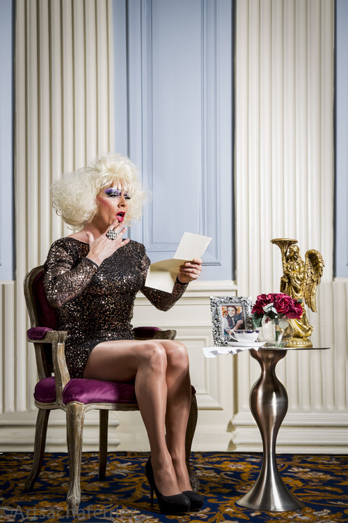
The portrait series is coming together also and I have produced one of the drag queen but plan to reshoot within a different context.
I have so much to complete and very little time! Not to moan though as I wouldn't have it any other way.
0 notes
Text
4th December 2013
Printers
Only three months until the exhibition and so this week the serious task of discussing requirements with the printers was the task in hand. The company I have decided to work with is "The whole Picture Company" Harrogate. http://www.thewholepicturecompany.co.uk. The company is run and owned by Steve who over the phone I have had numerous conversations and his knowledge has consumed my measly contribution to the art of prints!
The first meeting was to deliver copies of the images in readiness for the printing which is to begin in January 2014. All images were resized and embedded with the Pro-Adobe RGB colour space, placed onto drive and taken along. Once there the images were brought up onto screen which on Steve's part was a mistake because once in view I can't help but ramble on for hours about the whole story behind them. Forced to take breath with the offer of a serious cup of yorkshire tea Steve explains the process used within their company. Using a RIP program they are able to produce the images on fine art 100% rag paper, which from examples viewed delivers a stunning reconstruction of shadows and highlights within pristine colours. The monitors used are Eizo colour edge and deliver a perfectly balanced image which to my credit did look pretty spot on in comparison to what I had viewed on my own monitor. Agreed that the images all looked fine, and sizes achievable all thats left to do is determine the bleed required by the framers and then we are all set. I have arranged to go back after Christmas to watch the first print come off the printer, like the birth of a new born!
This week also saw me produce advertising post card for the show which I will send out and distribute all over, a pice in the Yorkshire post referencing the exhibition and the new brochure launched from the gallery.
All in all there is no turning back now !!!!
0 notes
Text
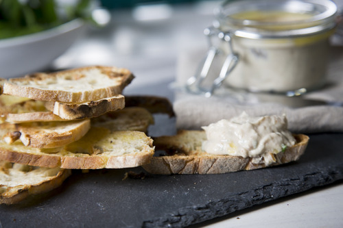
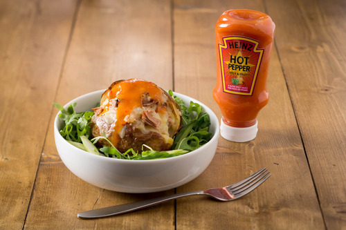
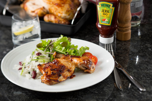
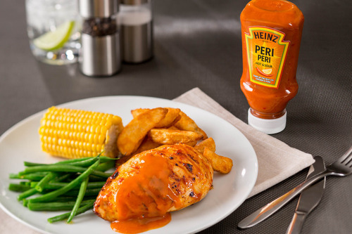
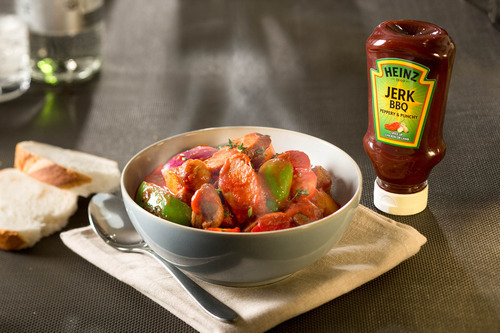
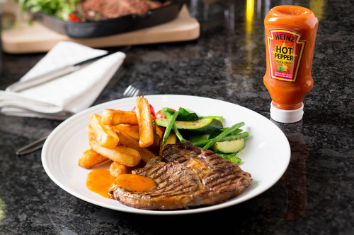
27th November 2013
Heinz
Have had an extremely busy few weeks. Heinz returned with a request for images but this time for the retail sector. The images needed were to promote a new line of sauces, which are to be launched in March 2014. They needed simple clutter free shots of the sauce set next to an appropriate dish. The brief came through along with the recipes and a date set for shooting.
Firstly I needed to set the stage. They required all images to represent an everyday kitchen. As these were retail they had to be within reach of the consumer so settings had to be realistic and seem achievable to most. I looked at worktops and kitchen show rooms to understand the trends and styles at the moment, which came back as being quite modern, contemporary in style. There were a lot of coloured surfaces but as well more premium surfaces like granite and marble. The location I used to shoot has a working kitchen within the cookery school, which is blessed with the most delicious black granite worktops with hobs inset. I toyed with the idea that these could be used and so took some sample images and sent to Heinz, they replied happy that these would be suitable but wanted the addition of a wooden top to break up the images. Luckily I have a wooden hand made top, which I use for food work, and so with this I had my stage set.
For props they wanted to keep the images fairly clutter free and minimalistic. With this in mind and the style of dished I sourced white plates, and the odd utensil to fade off to the back. Knowing that the worktops were to be black I felt that stainless steel would be better suited to give a contrast in the colour.
Location booked, stage set the next task was to source the ingredients. The dishes needed were
Steak and chips
Fish cakes
Jerk chicken
Potato wedges
Jacket potato
Cassoulet
Piri Piri chicken
Chicken and chips
Breakfast Hash
Meatball sub
Roast Vegetables
In the past I would buy all ingredients and make from scratch but I have learnt that you can reduce labour by buying premade items like the fish cakes and meatballs. Don’t get me wrong these are used as is but if you remove the crumb already applied to a fish cake and re crumb you can create a tidier dish without the hassle of cooking fish etc. To ensure that there would be visible pieces of fish I purchased a piece of salmon, poached and flaked up to add to the image where needed.
So far costs were £70 props, £160 ingredients and £700 location, additionally to this I would need to add the £400 staff costs, £150 budget for entertaining Heinz and also travel. The shoot would be over two days and I would travel back each morning rather than stay down there.
With the car full of ingredients, props and camera equipment I set off for the first days shoot. Setting up was fairly quick and the chef I had hired from a local restaurant was excellent in prepping and getting all items ready to present. On the first test shot it was decided that they wanted the bottle set slightly back in focus and the dish in focus however all else needed to be faded. What this meant was that I needed to change the 22-105mm lens I had started with to the 90mm Tilt shift lens in order to change the plane of focus to enable me to focus on the areas needed. Re-set and the day continued to plan and on time. The next day again all went well and the final image was completed by 3pm.
These images are to be used for retail promotion; in magazines, recipes cards etc and so for me is an achievement in moving away from the foodservice side. Response back from the images has been extremely positive and they have passed my details to other departments in the promise of securing more work in the New Year.


0 notes
Text
15th November 2013
Paris Photo
Swinging my newly purchased umbrella jet black with carved wooden handle, coat tails continually flapping in the gust, like a vessels victory flag sailing away from battle, I must have appeared like a pompous dandy. Disposition exaggerated slightly more due to the fact that the spring in my stride was causing me to walk pigeon-chested, shoulders back with chin stern. My excuse for all of this was my location and more excitedly my destination. My route the “Avenue des Champs-Elysees” is enough to make even the flat footed of men dance and in the distance over the rain drenched shimmering roofs of cars, above the hundreds upon hundreds of heads that jounced as they hurriedly made their way this way and that I could see the prize. The Grand Palais des Champs-Elysees.”
I was making haste to attend the “Paris Photo Exhibition 2013” situated inside and as my head was full of excitement in perusing the hundreds of artworks on display my stomach was equally filled with feverishness at the thought of seeing the building for the first time. The down pours of earlier had left their mark on the roads surfaces and so as the sun squeezed an arm out to clean up the mess, glare and piecing rays caused temporary blindness which turned the route ahead into a path of gold. As I drew closer the huge stone pillars in classical form stood guard like, sanctifying the building. Beaux Art architecture reaching out from the beautifully ornate stone facade proudly holding the bronze quadriga’s on its biceps like tattoos, and above all this peaking over the solid form I could just make out the Art Nouveau iron work, web like as its expanse grasped the entire building together.
Construction began 1897 the aim was to create a building to house exhibitions of various kinds in a location that would benefit while at the same time create pride. The job of design was tendered out and unlike asking for quotes from the first handful within the yellow pages and ending up with unskilled villains who spend their days avoiding Melinda Messenger and her sidekick, they had the pick of the crop. Albert Louvet, Albert Thomas, Henri Deglane and Charles Girault were awarded the task all given specific areas to design, which brought a perfectly balanced structure blending effortlessly into the landscape. Inspired by Crystal Palace, which was genius in being able to accommodate large gatherings before the age of electricity this was to be one of the last transparent structures of its kind.
The front of the building grew and grew as I approached and so did the allegorical carvings by sculptors such as Gasq and Boucher, but the most formidable and alluring statements were the quadriga’s. Designed by “Georges Recipon” these monumental works of art strand proud above each wing as if waiting to launch into the crowds below. To the right you see a depiction of Immortality prevailing over Time and to the left Harmony triumphing over Discord, both stunningly presented, beautifully weathered and equally breathtaking.
Architecture, sculptors and designers now rammed deep into mind I was reminded of my initial mission and not by a flyer but by the huge “Raymond Depardon” image hanging from the stone columns. This image was metres in size and an “amuse bouche” (although to say bite size would be an insult to Depardon) to the full banquet that lay inside waiting to be gorged and ripped apart frame by frame. Entrance fairly pain free apart from the security guard insisting I left my parasol with the smartly dressed attendant minding the cloakroom, as I hesitantly released grip I fell into the Grand Palaise to once again be inspired by awe at the sheer magnificence of this work of art which circumscribed me. The stomach of this building was as impressive as the façade with its winding grand staircase and riot of ironwork combining Classical and Art Nouveau styles in a delicious concoction that causes the neck to strain and eyes to water while gazing around.
Eyes down, tears wiped I set about the task at hand, which was to explore the web of avenues upon avenues, each housing galleries of photography from every genre, style and medium, highlighting some of the most renowned and emerging artistic photographers of all time. The journey began with a turn left and although I’d decided that I would follow the formality of the floor plan like performing a weekly shop I was pulled from pillar to post as my eyes and curiosity forced me off piste. The images we peruse regularly in magazines and on line impress and inspire yet there is a magical moment when whilst parading around these events you recognise a piece of art your au courant with. Gregory Crewdsen, Lorca di Corsa, Ansel Adams, Diane Arbus were all forced into socket within the first few yards and to see these images in the so called flesh was an honour as well as an opportunity to get up close and examine in detail the style, format and finish.
There was however a barrel full of newness waiting to be rummaged through and the first of these was “Nicolas Dhervillers.” These digital prints caught my eye at first due to their similarities to Crewdsen of whom I am a huge admirer. On closer inspection it was evident that Dhervillers lacked the funds to perform the scale of set ups that Crewdsen used but nether the less there was evident a scale and delicacy in the lighting that gave these images the same quiet, serene atmosphere. The three I was particularly drawn to, were his homage’s to Millet, Leblanc Stewart and Bastian Lepage, Each image was a mass of texture and interest yet situated probably smaller than we all would dare to venture were his characters. Beautifully presented in keeping with the original inspiration yet the surroundings chosen and arranged to create a completely unique feel. The use of light within these images was skilful to say the least as pools gently spill into the scene guiding the eye to the exact point of interest while at the same time allowing you to freely explore the rest of the image. Colours were quiet and gave mood to the image controlling the exact amount of emotion that he had intended the viewer to feel.
Moving around the galleries there were interest in every corner but it’s the ones that draw you in that remain emblazoned on the mind and the second was an artist/commercial photographer called Guido Mocafico. These images hugely presented were based on the 16th -17th century still life classics of vanitas, of which is an area I am very attached to. Standing back to admire these four-presented pieces they could easily have been mistaken for actual paintings, with their soft lighting, gloriously constructed shadows and symbolic meanings. The simplicity of the items and positioning against textures that would compliment and create the correct shadow and depth needed was stunning and an absolute joy to see and stare at even if for slightly too long.
Like an opium filled vein I was overwhelmed with the quality, not only of the images on display but of the presentation of the pieces, Framing was perfect and not one seemed rushed or from stock material, the backgrounds lighting and layout made the whole event enjoyable and a delight to explore. With so many fantastic photographers it would be rude not to mention a few more if only for you to explore at your own leisure, Holly Andres whose scenes, compositionally perfect create questions. Nobuyoshi Araki with distressing and uneasy scenes, which leave you with an untold story and feeling a sense of concern and care for the subjects. Julie Blackmon with her almost life-size still life set ups, hiding minute clues like a where’s Wally of photography, well constructed, thought out and executed.
Towards the back of the “Palais” to the edge of the barrel shaped roof the book section sits with the noise of peoples fingers leafing through the pages sounding like swarms of butterflies, books again from all genres, collectables and rarities. With a pocket full of coins you would without fail be enticed into purchasing at least one and of my guilty sin was “7 Rooms” by Rafal Milach. A winsome small black book crammed with images, which force you to relook over and over.
The time had finally arrived for my exit from the “Grand Palais” and like a blinkered horse I galloped straight for the door knowing that if my glanced strayed I would be forced to stop and quite possibly miss my connection. Umbrella collected and intact I gave the dazzling and lavish building a final farewell and danced off back down the Avenue yet this time with a little more spring.


0 notes
Text
14th November 2013
The Louvre
Thick heavy cloud slowly descends down releasing its belly of downpour onto unsuspecting heads; quickly they dart into every available archway, doorway or ledge that provides some temporary protection against the heavens. For me the monumental and epic towering form of the Louvre was to be my saviour.
On entrance security swiftly scan bags and person to ensure no doubt that they have not another “Vincenzo Peruggia” within their grasp. Once through you are guided unaccompanied down the escalator to the underground foyer where the whole expanse and size suddenly becomes reality.
To each corner ticket booths managed by smiling attendants patrol the crowds snaking back and forth between the thick swooping red guiding ropes, all vivaciously tipped with gleaming chrome. Unfortunately, supermarket tactics of monitoring each line to eagerly anticipate the most promiscuous fail to deliver any solution to the task of waiting patiently in formation.
This quiet time actually is an ample opportunity to gaze in wonder at the surroundings greedily absorbing the refreshing breathtaking architecture, design and beauty to which you are momentarily part of. Above you the light reaches down through the glass pyramids like the hand of God, casting shadows that playfully dance only interrupted by the crowds flocking the mezzanine level and its sandwiching neighbours. Polished marble floors reflect, mirror and sparkle as the now wet prisms dry in the gift of sunlight. All this before even entering the gallery!
Ticket obtained and you’re now faced with four directions, each inviting you to explore a labyrinth of history art and knowledge. Opting for the most ventured route I follow the signs enticing me towards the main gallery and the reward of meeting the lady herself LaGioconda. Leaving the admission level, an escalator carries excited revellers to the mezzanine to begin their journey. Pass a second security check and you fall into a huge hallway, its stone arches reach overhead as if to embrace and protect, lit not by direct sunlight but by streams of light entering at either end, bounced against every polished surface in a game of perpetual motion. The end of the hallway and a grand staircase devours you pulling you upward toward the warm glowing light that reaches down. Each step abraded from the millions of soles that have dragged their feet creating a sense of unbalance as you add your own addition to the eroding.
Finally the entrance journey is complete and you’re led into yet another formidable room containing Classic Greek Art from the Hellenistic period. The one legged statue of a male torso, peppered with age presents itself, originally found at Miletus and donated by Rothschild, this chiselled masterpiece is undersold in images. The beauty, craftsmanship and sharpness of the contours are brought to life by the backlit towering arched windows, which add definition and texture waking it from its slumber. Each exhibit is shadowed by the next, the visual feast overwhelming as your mind pulls one way, the eyes another and feet the opposite.
The winged “Victory of Samothrace” looms down braving the full force of a tempest; even with her badly reconstructed right wing she deserves the fame of this position. Dated from 190BC she would have been used to ward off shipwrecks or to commemorate a naval victor, invoked as her drapery clings to her figure.
Passing the many forms of Aphrodite in her snowy milky marble form I was drawn to “The Warrior”. A two meter high marble statue known as the Borghese Gladiator. Acquired in 1808 and signed on the trunk by Agasias of Ephesus this brave and daunting figure was discovered in the 17th Century at Antium in Italy and was immediately added to the collection at the Louvre. With its virile anatomy steeped in the lessons of Lysippus of Sykyonthis dramatic Baroque style valiant figure would be remembered centuries later by Francoise Rude sculptor of La Marseillaise.
Time is a must for this tour and unfortunately time is what I lacked. With only thirty minutes left before group resurrection amongst the elements, I needed to speed up my route so as to fill my empty cheeks with a little more but specifically of what my diet craved which were brush strokes of greats.
I apologise ahead of time for rushing past Bellini’s “Christ Blessing” and Mantegna’s “Saint Sebastian” body quick stepped leaving behind my glance and a disrespectful sad feeling that I had not given these people my attention. Never the less, I did pause for Messina “Il Condottierre” his stalwart imperious glance and simple composition showing restrained palette all traits of his style. Admiration given I carried on until “Saint John the Baptist” again forced me to halt. The raised finger rising from the darkness as if to direct you to the heavens is a prime example of the chiaroscuro style of which Leonardo Da Vinci was a pioneer. This image said to be his last is a beautifully constructed composition of graduated light intended to give an illusion of relief.
Through High Renaissance, the Venetians and Mannerism my resting place was to be the 16th Century and Caravaggio’s “Death of the Virgin". With her slightly plump stomach, swollen ankles and appearance of a workingwomen this image was turned down by the clergy who commissioned it, shocked by Caravaggio’s portrayal of such a sacred theme. The powerful, spiritual, traumatic and haunting scene is brought to life and conveyed through his style and mastery of using harsh contrasting light and shade of which he prepared the way for countless others.
The visit for me had ended too soon, rushing back to liaise with the rest of the party I grabbed snippets with my eyes like a trolley dash around a well-stocked store, gorging and feasting in every direction. This short but rewarding whistle stop was an addition to the main agenda of visiting Paris but has left me with an empty feeling of regret like ending up with the orange viscount. I will return, and return with a vengeance, wide eyes and plenty of time.
The Louvre has an abundance to offer, fields of knowledge, masses of culture, art and delight and will be on my Christmas list for many years to come.
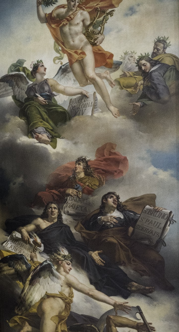

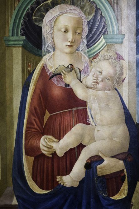
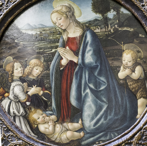


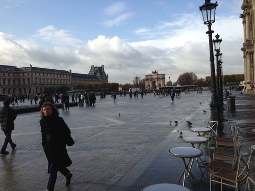
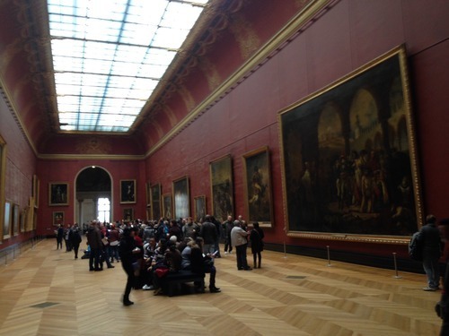
0 notes
Text
8th November 2013
It has been a massively busy few weeks and its only today that I feel the grasp that has securely held my throat has decided to release a little tension to allow breath to once again flow freely along the windpipes.
Firstly the project that began way back in the dusty months of June finally left my side. As I gingerly handed it over to Mr Alan the guardian of the stores I felt a tear of pride desperately try to force its way out of the duct in an attempt to show emotion………….get back in there!!
Gallery event have been moving faster and faster by the day. The brochure for the next season’s events is to be released within the next couple of weeks and it’s with imperious bravado I can announce that a double page spread has been awarded to yours truly.
Image printing has been confirmed and following the less than professional original avenue I have successfully secured an excellent price with equally excellent printing capabilities from The Whole Picture Company Harrogate.
http://www.thewholepicturecompany.co.uk
Initially following a telephone conversation they were sent three prints, one dark, one light and a final full of red, they were very specific in format size etc which gave me confidence in their knowledge. The returned sample prints were excellent, exact on colour and shades. In comparison to another I approached the prints came back with a hue across the blacks that made it look a little plum in colour. The recent task of producing a document on colour management has certainly earned a big fat biscuit because it’s with this new knowledge that I could confidently hold a conversation with the Director of the printing company around the art and not feel out of depth. It has highlighted yet again the crucial and invaluable importance while at the same time excruciating pain educing, puss filled callus of a chore colour management is to a photographer.
Prints are to be arranged for next month following a visit to the company to discuss finish etc. Problem we have is the size and the overall weight of the pictures if framed and glazed. The choice was to go with unglazed but the framers are concerned that damage may occur due to the fine art paper being used. The paper is a fine art 100% cotton rag that on closer microscopic inspection resembles a carpet of fibre. The pigment inks set them selves above this and work differently to dye based which soak deep into the paper. As with suede if you brush your hand across the surface you change the direction of the fibres, which causes a change in tone. The paper which, although not suede would still react in a similar way, dark rich blacks if disturbed by finger or brushing would alter the direction of the fibre which in turn would create a lighter shade resembling a smudge. So we have to review the options, review the weight when glazed and decide upon the best solution to preserve and present at their very best.
This week saw the return of Heinz who asked me to produce four images basic, no props or dressing which were to be used as a image base for the designers to add logo’s and text. Last Monday things changed slightly and all of a sudden the plain shots turned into location shoots. They now wanted a 50’s diner, Pizza express style venue, outside hotdog van and a pub. This was a problem in terms of venue as within the allotted time I couldn’t arrange all these venues and so had to create the scenes. Rummaging through my garage, friends garage and every garage I came across I sourced materials that would be suitable. Amazon was swarmed with orders for tacky 50’s paraphernalia and my weekend spent looking at similar venues in order to understand the style, colours, crockery etc.
Eventually armed with an arsenal of ideas, bits and bobs and rolls of fablon I set about creating the scenes. With a conference call booked for the Monday morning I needed to create some simple images in order to show the Heinz team what I had in mind. The design team who originally were going to come along had decided that they would now work remotely and during the shoot I would need to keep them connected in order to see images. These were the main drivers behind the set ups as they needed to create the correct final design which Heinz had requested. Firstly the conference call came and my images were reviewed. Overall they were very impressed with the set ups. I had used old doors, floor tiles, and planks of wood and granite work surface tiles. The extras I had sourced also fitted well and the shoot was confirmed to continue to go ahead Wednesday.
Wednesday arrived and following a day also of sourcing ingredients, searching for the perfect burger bun and hot dog roll the 5.30am start was difficult in terms of dragging my now weakened sack from the bed! Up and away the hour and a half drive gave me time to contemplate and plan my day. On arrival with my two newly recruited helpers “Sally and Jack” we set up the first shot. Planning was essential in order to time the optimum time to prepare ingredients, the first two hours was spent photographing the plain plate so that lighting, camera angle and shadows were suitable. Now the most exciting part of this whole shoot was the opportunity to use my newly acquired Profoto heads. Having used a pretty substandard set of lights for the past few years I was more than impressed with the performance of these. Balance of colour, reaction to changes, continuity between heads and durability has all received top marks and now in hindsight one of the most sensible purchases I have made to date.
The day worked well and once one shot was complete the set was stripped down and re-laid ready for the next. 8am start at the venue and 8pm and car reloaded ready to drive back home. Twelve hours non-stop! This sort of job needs to be planned down to the last detail, the reason Heinz have worked with me is the fact they can sit back and relax in the knowledge that I will arrange all. When students moan or don’t apply them selves to research they fail to see the connection to preparation. This shoot was only made possible by researching other restaurants, taking notes, looking on the web, sourcing and drawing sketches. Once the shoot was over I had to arrange another call with the agency to discuss file format, send images to Heinz for review and edit all by the weekend!!!
The rewarding aspect is that from this I have secured another two days work with Heinz at the end of the month so at least we can put the turkey back on order!
I have a meeting next week with an art historian to discuss the potential of a joint project, which to date is all the information I actually know? I also feel that in regards to the essay requested by Mark Beechal this contact may well be worth meeting.

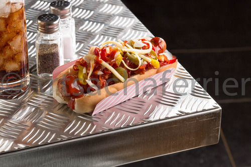

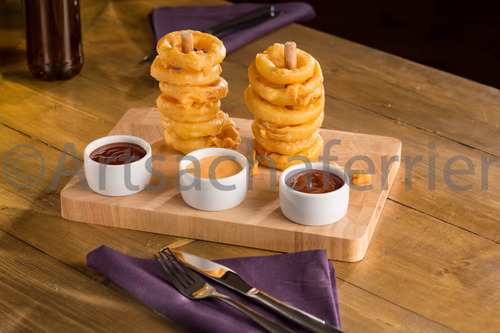
0 notes
Text
28th October 2013
Friday saw me venture off to the Picture Foundry once again to spend some time at the studio assisting and asking questions around business and ethics.
On arrival I was greeted and met their clients for the day, who were having a mother and baby session in the studio with Timm’s Wife Sam. The first thing I noticed was how rather then rush their client into the studio and push for time they were actually sat drinking tea and enjoying Timm’s homemade cookies.
They talked and spun a huge length of yarn before even venturing down the route of photography. This approach and welcoming approach places the client at ease, relaxes the infant in the environment and in the end creates better images.
The day to be fair wasn’t spent in the studio as Timm’s wife was on a mission so I took the opportunity to ask Timm more about his business and how he prices jobs etc, He explained that he works to a day rate of £550 but obviously extras like fuel, overheads would be added on. The day rate was flexible in time and there wouldn’t be down tools at five but he would finish when he had fulfilled his agreement. After explaining what I proposed to Heinz for the next job he said that he wouldn’t commit to anymore than two commercial shots in a day so although his price was relatively lower then what I ask he would take longer and therefore price is higher.
His studio prices range and include different amounts of time but as he composes his sets in the grounds of his house he again approaches with a very laid back and welcoming attitude. The family’s come with picnics and spent time in the grounds so the children explore, the parents relax and he achieves the best images possible.
His whole ethos is refreshing and approach professional yet not Venture in the hard sell approach. He uses props and furniture from around his own home and asks clients to bring personal items along with them also to make the whole experience as natural as possible.
I have another meeting booked in the next few weeks to discuss legal issues etc but to date I have learnt a great deal in running a balanced, friendly and professional practice which, spreads by word of mouth.
I’ve also purchased one of those bags also, the one, which I was so envious of at the zombie shoot!
Have sent some sample images and enquired about a feature in a new magazine published from Manchester. http://www.oftheafternoon.com.
"Since 2011, Of The Afternoon has published photography both online and in print to an international audience. What started as a blog evolved into our first print issue in 2011 and later, an exhibition in London in February of 2012. As interest has grown in the print magazine Of The Afternoon’s online presence has expanded through social media sites such as Facebook and Twitter. These daily updates on social media help to keep our readership informed on everything regarding contemporary international photography."
Had a couple of missed calls today so hopefully they are interested? Also heard back from Aesthetica magazine in regards to another competition entered, no news as yet merely acknowledgment that they have downloaded and images are in front of the judges, Shortlist announced December!
Received two jobs with Heinz today also, one fro a day and the other fro two, both wanting images which will used for advertising and marketing purposes. My worry was that when they sold to an American company I would lose any contacts or work but thankfully they still seem interested in my product, so next step is to impress them enough to carry on the relationship.
0 notes
Text
23rd October 2013
The Book has finally arrived, although to add a little salt to the seeping wound of tiredness one of the pages was stuck together. Yes stuck! What with heaven knows but it was steadfast and no amount of gingerly teasing with my nail file could release it.
Instantly an email was dashing its way through the murky dark of Internet space to Blurb, who in their defence replied within the hour with the confirmation of a reprint. I actually sent the stressed packed email twice by pure accident and received two confirmations, so I am now sipping tea, nibbling my rich tea and hoping that the big burley UPS man returns with two books! It does look good though………..like a proper book with pages and all!
The photographer I worked with last week has invited me to work in the studio with him this Friday on a Mother and Baby Shoot! The mere thought of photographing dribbling babies and doting mums fills me with dread but I feel that this is essential to build a good rapport with Timm and also see how they deal with clients and work with them.
The Zombie Run images we took last week he has placed up into an online gallery for people to purchase and has kindly placed mine in there to.
The gallery exhibition next year looms and shadows closer, but not with the dread of exposure but with the excitement on seeing the images mounted. I did have a printer arranged but unfortunately I feel his motivation, commitment and interest didn’t actually match mine so the task of finding alternatives has begun. I have two already working on test prints and will search and involve a few more before making a decision. The problem is that the original printer gave such a good price that I worry that we may have to increase the budget slightly to achieve the prints. However you get what you pay for.
This week saw the renewal of photography insurance and public liability insurance, which at over £300 is not a easy departure of money. I don’t understand why they cannot provide a student or part time workers cover that you can activate when working. I pay for this cover as it’s needed but really at the moment I don’t perform enough paid jobs to cover it.
Last night saw me return a favour following an introduction by photographing a swimming pool. A fairly wealthy couple has built a pool in their back garden (Yes there is wealth in Barnsley) the task was to create a few images highlighting the structure and design, which was fairly straight forward. As they returned back to the house and left me to it I was tempted to whip off the shirt and perform a little water dancing but as always work comes first!!
They also have a daughter who is marrying next year. Huge military wedding set at an equally large venue. She wants day and night, shots of the officers etc in full garb and the whole day from various locations covered. She has also asked for video footage to be arranged! Hopefully this could prove to be a great portfolio builder and also make me a little money! Next steps are to meet the daughter Christmas to run through their plans.
Heinz Job still booked in for next week and with all the fine art food photography around I have to take a picture of a Hotdog, Burger, Onion rings and a pizza! Not even any garnish! Well it pays and keeps me in their Christmas card list. Location wise I have asked Northern College whether its something they would be interested in renting a room for? Failing this I will approach the cookery school in Tideswell, which I have used previously.
0 notes
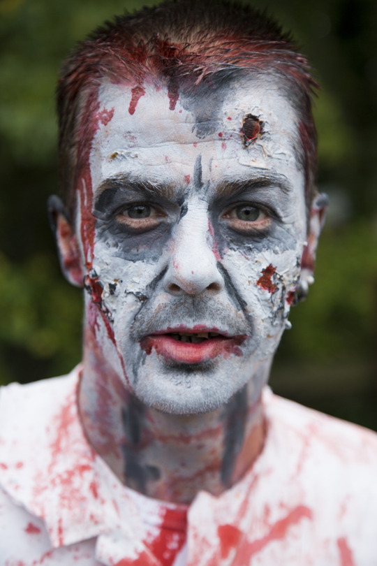

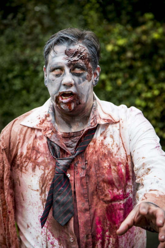
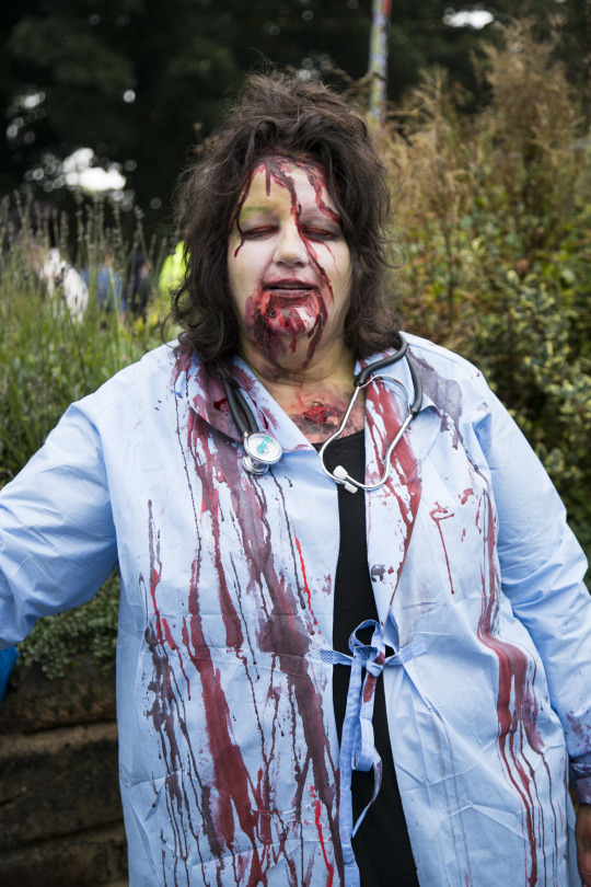
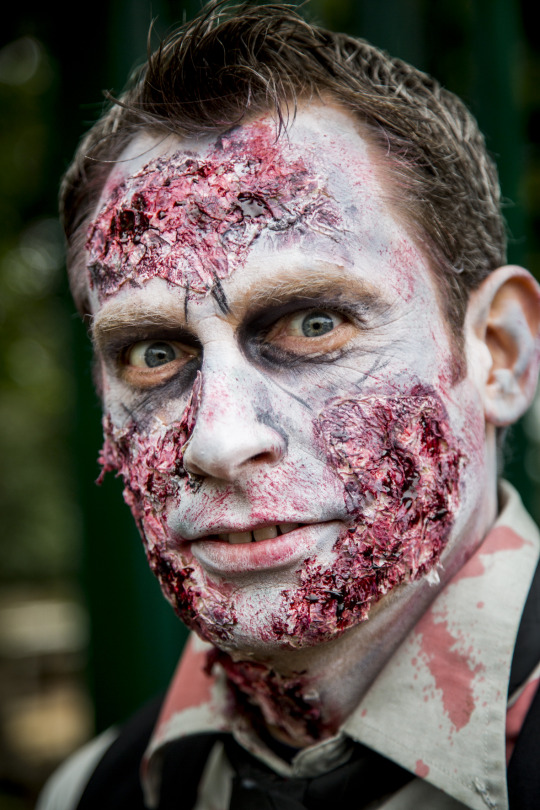
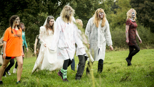
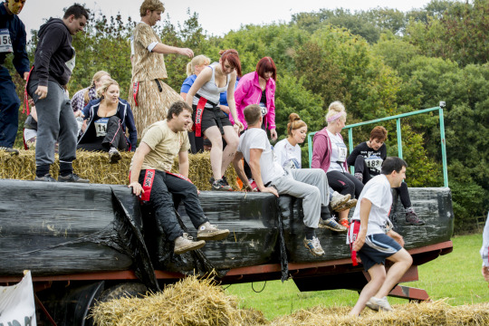
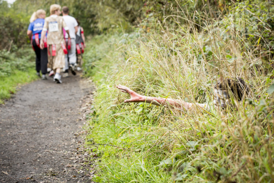
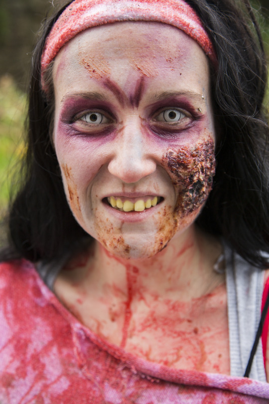
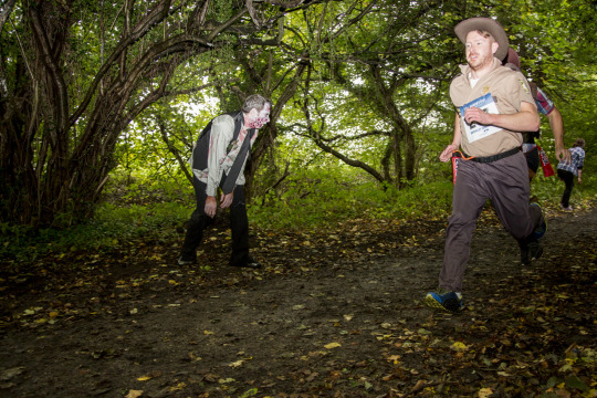
Text
20th October 2013
As part of the industry study I recently met up with Timm Cleaseby, a photographer from Sheffield. Saturday 19th saw me venture down to Worsborough Mill Barnsley to tag along with him whilst he covered a charity Zombie fun run.
The evening before saw heavy rains fall as usual across the bleak skies of the North and as I sat polishing my beloved Canon lens I apologised to them at the possibility of them being exposed to the elements for the first time is their working life.
Darning my Italian Chelsea’s and a tweed jacket I set off to meet him early morning, He arrives a few hours before in order to walk the course and monitor the best areas to obtain shots. This stroll also gave me time to ask more questions on how he operates and works. As I struggled through the silky sludge like a new schoolboy in ill-fitting shoes with my camera bag reliable secured across shoulder I was over come by a slight envy at Timms carry bag. Water proof, organised and with easy accessibility, mine was more like an old woman’s handbag, zip not functioning and with a fluid shape so that all contents fell to one central point at the bottom. Trying to locate individual items I felt like James Herriot foraging up the rear end of some unfortunate animal.
Once the trek was complete and reached the start point Timm positioned himself and I in various locations and then the race started. Manically I tried to dodge the walking dead, anxious runners and the hundreds of cowpats beautifully softened by the previous nights downpour, which were randomly scattered around the fields. On a few occasions I confess I had to perform what seemed like a moonwalk as I desperately hurried to remove the bovine residue from foot!
On a 5Km course its not far if attired in the correct athletic gear but running around, laden with equipment trying to keep one step ahead of the runners was slightly tiresome, as a forty something who enjoys copulas amounts of coffee and the occasional woodbine before the sun even rises, the slightest increase in momentum does activate the anti exercise alarms within my legs!
I have never covered an event like this and in reality I found it very enjoyable and pretty laid back. In regards to a wedding I always feel under pressure and worry right up until the point of delivery as to whether the bride and groom are going to leave my company fulfilled and happy with the images I have provided them. The event was just as manic, just as much running around but seemed to be less demanding in terms of expectations. I’m not confessing to preferring to do less than adequate images compared to a wedding but with this atmosphere I feel it helps you relax and thus creates some more controlled and less frantic images.
This event was a charity occasion; sponsored by Timm in regards to photography so there’s a little marketing and networking in return for his services. It was also sponsored by numerous other companies and attended by the Mayor and local press, which for me was a learning curve in that these local events although some of which may be judging some sour smelling old woman’s attempt at a Victoria sponge are in fact a very good means of networking with others, local businesses and media. It’s all about getting your name splashed around and if you sit back it never happens but if you act like a promiscuous old hag and force it every where they just simple can’t ignore.
So what did I learn?
Sensible shoes, Italian leather is not the norm for trudging over wet dewy grass
Sensible bag, as equipment needs to be accessed quickly and easily
Networking, by any means even if it means working for nothing
And finally smoke less woodbines!
0 notes
Text
17th October 2013
Met with a web designer today to discuss potential improvements and design to existing website.
Originally I started off with a commercial website called Chester Morris which to be fair contained a collection of images mainly food to promote that side of the business. When statistics are viewed this site hasn't really pulled much business in mo doubt due to my lack of marketing and also the amount of competition within the market.
The majority of my work load has come from word of mouth and past contacts who already know of me. The situation now has changed in that I now would like to promote the recent work and expand my skill sets to a different market within art as opposed to just food.
Chester Morris has been running for two years and along side that but not linked a Facebook page which on examination has been to personal and not as professional as it should have been. The approach this time is different.
I have the twitter account which has been managed in a strategic manner. Firstly I've only followed people relevant to the profession, people who are influential and people who are connected to the art industry. The return followers have increased to 230 in only two weeks and next week I have planned to review the list I follow and delete the ones who have not replied or have accounts that are not active. This will reduce the % of followers verses followed substantially and make correspondence more managebale.
The twitter account works under the heading "Artsachaferrier" and from this I have also set up another Facebook page which is purely business. I have set this so that replies and messages cannot be seen until I have vetted them. The reason for this is to keep from view the personal material from friends and family so that the page maintains its professional only profile.
In the week this has been running the page has received 50+ likes which in terms of % is far greater than the Chester Morris page has received in the two years of running. Originally the page was started and linked to twitter but I have stopped this so that rather than twitter followers just peek at the page and receive updates via twitter they have to actually enter the site and like in order to keep abreast of the activity.
The next steps of the plan are Flickr and linking this again to twitter and face book. The website is the most tasking of the applications as the work between the commercial and aspect and the art side is so different. The appearance needs to reflect the content and this will not work with the current design. Also naming as with the art works I have used my own name as with the commercial it remains Chester Morris.
The plan is to have two websites which are linked together so that visitors to either site can move effortlessly between the two. Each will have a separate identity and maintain the current names. The themes will be completely different on both and links to Facebook and twitter available on both.
The contact page will be split into two and filter through to separate email addresses so that specific requests can be seen clearly and actioned.
This was the first meeting of no doubt a few more and he is currently drafting a template and cost. This may be the decision maker as cost needs to be kept low. If the price seems to high then plan B is to create websites personally from templates but implementing the same plan as mentioned.
0 notes