sabrina-ann-luckman
All Things Graphic
Sabrina Luckman. Year 2 Ext Graphics Diploma.
152 posts
Don't wanna be here? Send us removal request.
Last Seen Blogs
ofmiscreants
tempted fate
characteroulette
Cardboard Box Syndrome
hamjiro-dot
hamjiro
featherdusterbelphie
くコ:彡
fsmuggler5
Mio_Hana🪅
Photo
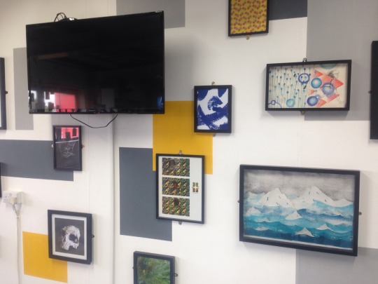
Exhibition layout After doing research into exhibition spaces I was inspired to exhibit one of my paper cuts to accompany the animation. I had seen this done before with an exhibition of an animation and thought it worked well to engage the audience and allowing them to see one of the processes which is involved in animation will help them gain an understanding of how the animation is created. I think this makes the audience feel more interested in the animation and they can gain an understanding of what it is consisted of, it also gives me the chance to showcase other parts of my work. The paper cuts aren't shown to their full capability in the animation because they are only in the form of the animal, this way I get to display the layering technique and show the strong composition in the piece. I would have liked to display all of the paper cuts along side the animation but there wasn't enough room for this, I still think that having one helps to enhance the animation by making people more aware of the different processes involved.
0 notes
Photo
The final animation in my sequence is the WWF logo. After all of the effort i went through for the rest of the animation i wanted the logo to have something special about it too, even if it was the only thing they remember it would be one of the most important. And animating this helps to keep it in people’s minds.
I did consider the option of screening over a background and then moving it like my other animations but thought this would just look bland. I wanted the actual logo to have movement, and i think using this add/subtract technique works well in revealing the cause. I think it adds a slight suspense to end of the animation by making the audience wonder, and then a pleased reaction when they notice the well known charity.
i chose to use paint for the frames instead of simple line drawings or paper cuts (which would have taken time i didn't have) because i knew there wasn't going to be a layer behind it so thought the texture of the paint would work well in giving the animation a bit more life. I was pleased to find out the paint texture also helps with emphasising the movement as well as adding character to it once it is animated. Although these changes may be small i still feel like they will have a sustained effect on my audience, making something a little more detailed than it usually is can change the way the audience sees and feels about it.
0 notes
Photo

Marion Deuchaurs campaign for WWF.
This is a recent poster created for WWF by designer Marion Deuchaurs and i found it interesting to see how throughout this project the awareness for environmental issues and WWF has risen. I like how her playful and childish style aids the message theyre trying to send and how it keeps a heavy subject light. They arent forcing you to do this or that theyre advising you on small things that you can do the help save the environment.
This poster provokes a different emotion to the ones by my animation but i think that a cause which has such a large impact on people can have a large impact on one person and it can raise a whole bag full of emotions, it still has an impact whether it makes you happy or sad.
0 notes
Photo
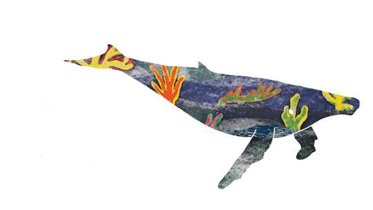
Whale swim with background This is a sneak peak of one of the final animations, I'm so pleased in this result. The movements are smooth and the lines are crisp, and I feel as though it has been executed to a professional standard. The background works so well with the shape, I was a bit worried about it because not all of it had vibrant colours and compared to the rest it looked dull but the positioning and scale of the background with the whale shape aided well in highlighting the best characteristics of the paper cut. The textures and colours work well with the natural colours of the whale and the environment and I think this contrast between dark blues and bright colours gives the animation more significance, considering he doesn't actually move a lot. I mentioned in earlier blog posts that I wanted to film how light and shadow change on the backgrounds and then combine that with the animation but after assessing how much time I have and the resources I would need I decided it might not be worth it. I am still adamant about having the background move as well as the figure because I think it advances the animation, it adds to the movement of the piece and shows direction.
0 notes
Photo

Tiger to whale morph
This morph was one of the least difficult ones and the fastest to create. This was aided by being able to rotascope a tiger jumping and then it was just the getting into the water that I had to draw myself. With the first attempt I thought it looked a bit strange so I asked my peers about what they thought and a few said it was too stiff, it looked as though it was just disappearing and not falling into the water. I then went back and re-assessed how the frames looked and my tutor pointed out that it might be the legs, they extend when the tiger is in the air. To make sure I understood the form of the tiger I researched a few videos of tigers jumping and looked at how the shape, angle and scale changes as it jumps.
Adding in the whale was simple and effective, I already had the whale swim frames so I drew a rough path in which it should follow and slowly added more of the whale form each time. The last frame then sits slightly different from the beginning frame of the whale swim so it just slots in nicely. Although some of these morphs may be difficult I believe that it’s most definitely the better option than separate animations. They wouldn’t have the same effect on an audience because they would see them as separates. I want to create an impact on my audience and the best way to do this is to engage the audience in the experience - keeping it flowing all the way through keeps them engrossed and is able to trigger more emotions.
Although I said I didn't want these morphs to be too flamboyant I think that I was wrong, I hope that people are going to be astounded by the transformation and it will excite them. This will then help keep the animation (or at least parts) of it in their heads, having a lasting effect on them and hopefully inspiring people to make a difference for this cause .
1 note
·
View note
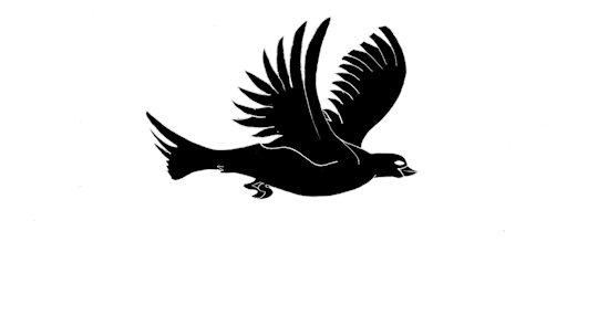
Photo

Goose Flight Animation
To resolve my earlier issue about the bird being too small for the whale i’ve decided to keep a bird species and gone with a goose, i think because it is generally a big bird people wont think the sizing is off or strange.
This animation has been one of the most challenging of them all because as you can see, one is a flying loop and one is a taking flight. The goose morphs after the whale in the animation sequence and i decided on making him sit because a bird flying out of water (especially a goose) would have looked strange, no matter how well it was done.
The flying animation was as simple enough of a task as the other animations and was created by rota-scoping over goose flight frames. The problems came when these frames had to be drawn, i had nothing to rota-scope from so it all had to be hand drawn with clips of a video for reference. It was a tedious task and i wish i had planned better so i could have used the time more efficiently but i got there in the end - i used some of the flight animation frames to trace and make the wings match. It was important that the two figures didn’t look dissimilar, jumping from one form to another (even slightly different) could confuse the audience into thinking its another animal in the sequence, and of course it wouldn’t look professional. I solved this problem by replacing the original goose head with the hand drawn one and making it fit with the width and height. I was concerned about the head looking too stiff but the change in size and shape adds creates chattering which then makes the head look as if it is moving with no help from me. This replacement then ties the two animations together and can be smoothly added to the sequence.
Just as a last note, flight is an oddly satisfying movement and the frames in this animation just give it the energy it needs - it involves the excitement of taking off. I hope that the audience will be delighted to see the goose take flight after emerging from the water and seeing a larger (than the Starling) figure glide across the sky.
0 notes
Photo

Final Outcome Paper Cuts
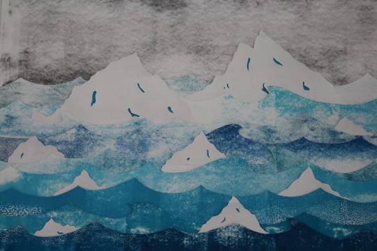
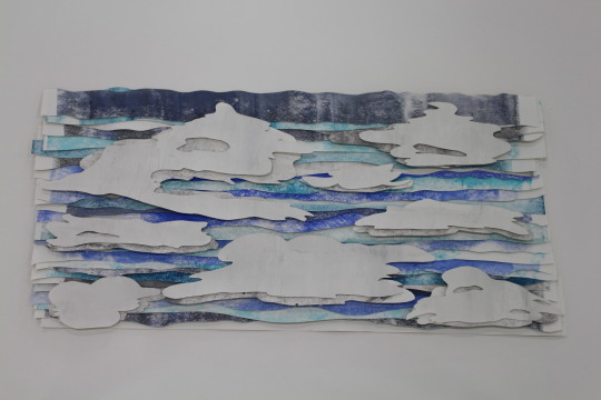
Here are three of the final paper cuts i have made for my animation (completed the forest scene a few weeks ago). They include an iceberg scene which will be matched with the polar bear, an underwater scene to partner the whale and the sky will accompany the bird. I’ve decided to create a similar layering relief look to these as the forest scene to keep a theme running and i think this style works well with all of these scenic compositions.
The process was simple, enjoyable and time effective. This time i planned each paper cut by doing a small sketch with colours and basic composition and this aided me in maximising my time. For the underwater and iceberg scene i went with a similar layout because i found this to be the most effective in capturing a scene, and it fitting well with the animal overlay. A similar colour scheme runs throughout these three paper cuts because it allowed me to experiment with different tones and hues and pair which would be most effective. Each paper cut has a selective colour palette which represents as close to reality as possible and a selection of blues helps bring them more energy, each colour complimenting the other. This works particularly well with the icebergs, the dark blues help to make the lighter ones more vibrant and this then makes the white look cleaner and brighter. I went with darker blues and some blacks with underwater to demonstrate the scene better and to also help give the coral plants more emphasis.
Because these scenes involve elements in the foreground, and background, i had to create the illusion of this by playing with height and scale - and a vanishing point. This worked well to a degree, its difficult with paper cuts because you cant artificially add in shadow and tiny detailing to help fool the audience. This is why i have created a relief look, so that natural light and shadow can help the audience feel more involved in the piece.
When it came to the final paper cut, the sky, i wanted to do something slightly different to show that it was separate from the others, it wasn’t land,but i also had to show that i was portraying air too. I went with a more feathered layered look because i didn't want the audience to get confused with it being like the others - the sky also involves a large array of colours and tones. I am very proud with how this came out, to start i added too many dark's and greys and it looked nothing like sky so i added more blues (in worries it would start to look water like) and took out some of the most dark and it worked well, the height in the layers makes the overall composition tighter and more refined. With the cloud laid over the top it really comes to life - and the dramatic height in the clouds gives them a strong natural shadow and gives the illusion that they're floating.
I chose these environments because, for one they match the animals, and because they are a representation of more than just that one scene - they represent the areas which are most at danger; forests, the icecaps, oceans and the sky (air). I am confident in the effectiveness of these paper cuts with my animals for an animation and feel as if they will help to send a strong message and to help raise awareness for WWF - i’m hoping people will be amazed and will have never seen anything like this before.
0 notes
Photo
Bird flight animation
The last animal in my animation sequence is a bird, i think it best to end it with the most visually satisfying one - there’s something about flight which makes it more exciting than walking or swimming. I like the movement in this animation, how the wings curve and have a smooth natural effect - it will aid me in drawing attention and engaging an audience to my work, which will then help to spread the message and raise awareness.
I created this by rota-scoping over single frames of each movement and then just scanned them in and drop into Photoshop. You may notice in this animation that the figure is solid black and not a line drawing (like previous) and this is because for the paper cut background to be applied it must be screened over in photoshop and this process involves covering anything black with the above layer. This has actually become an advantage of mine because some of the features and lines look a little scruffy but then once the frames are inverted they become unnoticeable.
The background for this animation will be a sky, the birds natural environment or atleast the one that their associated with the most. It will be of a similar style to the forest and have tonal changes of colour as well as a strong sense of depth created by, a lot, of foam pads. I think that having the bird flying with the sky moving in the background will create a really peaceful atmosphere and strong connections between the two elements.
I want to include all ranges of animals and environments into my animations which is why i chose a bird, but i have come across a problem as to when it comes to the whale breaching and morphing into the bird - its far too out of proportion. This bird looks like a Starling or Black Bird and that compared to the size of a whale... I’m worried is going to turn out wrong and look like a giant bird from Jurassic Park. To solve this i may have to rethink what animal i have and how he morphs from the whale (or the tiger, or polar bear) and how i can create this without it looking strange.
My next step is to create my other paper cuts along with thinking about changing the bird or the may it morphs.
0 notes
Photo
Polar morph into tiger
To create this animation i had to practise drawing frames and creating quick animations in imovie, I've never in my life morphed one animal into another and every time I've seen it happen its using all fancy computer graphics. Getting the hang of it didn't take long though and after i had figured out the best way to do it it was straight forward - using both images i started drawing ‘inbetweens from a single frame of each animal (making sure the legs were in the same spot).
Using trial and error i pieced together the frames in Photoshop to make as smooth as a transition as possible, you don’t realise how different these animals are until you draw them! Getting the head size down along with elongating the body was the most difficult part and i will admit that some of the frames do look like something from a horror movie but lets not dwell on that. I didn’t want to jump from one animal to another which no connection between them, i want my animation to be a line with no cuts, everything runs smoothly from start to finish and it helps the audience to feel a stronger connection to it and it draws their attention with nothing to combat it.
I didn’t want the morph to be a special or big thing though, the animals and their environments are the star of the show, so i made this transition as fast as i could without it being too jumpy (at no delay it changed too dramatically) and of course i want people to notice the transformation but it isn’t tied too closely with what my animation is trying to say. I think it works in a way that keeps the animation light-hearted and pleases some people, his face and body become a bit strange in the middle but i don’t mind because its just another emotion to make my audience feel and in my opinion, the most emotions i can trigger the stronger impact i will have.
0 notes
Photo

Animated Seahorse Print
After the success with my seahorse block print and the results showing potential i created a looping animation from the 5 prints. I am very pleased with the result, how even though they are all the same still image it has movement to it. Of course the chattering is causing most of the action but the change in boldness gives this animation mobility in the form of light - it looks as though a light is coming across the figure and this adds direction and therefore movement. The fade also makes each element become less defined and this then makes them change in size slightly, this aided the chattering (or might be the full reason for it) and really gives it energy.
From this ive learnt that shades and fading can be used to portray light, and then used to create movement. And how chattering isn’t always a bad thing and sometimes, it could even work to your advantage. I will now apply this knowledge to my works in the hope that it engages my audience.
0 notes
Photo


Marnie Karger
These paper cuts are created in response to lakes and rivers, using card stock and a scalpel. I loved the tone and hue change with the various layers and how such a simple process can create something so beautiful. The layering reminded me of Vantours paper cuts in how he changed between depth and height with the amount of layers and how Karger does the same here. Both artists have a similar style and process but use different colour palettes - Vantours uses a wide range of colours because of the image he creates are a wide range but Karger uses a selective colour palette because she also needs to keep in theme with the scenes she wants to create. If she started using brighter colours and ones that weren't so natural I don't think you would be able to defer what the image was, or what it was trying to demonstrate. This has made me realise that I might have this problem when it comes to creating my paper cuts, all the ones I have left have a blue colour palette because they involve the sea and the sky. The problem I'm concerned about is that the audience won't make out the difference between sky and sea, the paper cuts have similar lines and forms and this could becoming confusing. To solve this problem I think I will create even selective colour palette of blues for each paper cut and possibly add shades of white and grey into the sky paper cut so it differs from the others.
“In a nutshell, I hope to create items that appeal to a diverse group of people who share one common trait: the appreciation of handmade works. While I had grand intentions to offer pieces made of different media, paper is my first and true love and I haven’t looked back.”
This is something which I also agree with, Kargers work is immensely popular on Etsy, and people love her work - because it's hand crafted. This is something which I'm also attempting to achieve with my paper cuts and target audience, people enjoy art because they someone went through the time and effort to create it and along with my work being a mixture of animation and paper cut (both of which people know are very long processes) I think they will appreciate how time consuming it was and the craft.
0 notes
Photo

Screening backgrounds over frames. This is an image I've taken from the tiger walk animation, it shows how I am going to incorporate both my paper cuts and the animations together. The background image is one from experiments I did with lighting my paper cuts and creating depth with shadow - I plan on doing this will all of my paper cuts to get the same desired effect. I like how the form of the tiger is still strong and his features are still bold, this will be useful when it comes to exhibiting my work because people will be viewing my work from a distance and this means that the form must be sharp and defined so not to blur people's views. My tutor has advised that I add some sort of effect to the background and I think this is a valuable point. At the moment I think that the background stands out too much, or it looks to much like a photograph. The two elements don't quite stick together yet, the composition is good but I think they need to fade into one another or I could soften the edges to blend them together. I could do a similar look like the robin wood campaign posters and eradicate the top of the animal and have the back ground slowly fade out and have nothing bounding the top, but then issues come with morphing and movement. My next step is to carry on creating my paper cuts and experimenting with how I can screen them over e frames and what effects I can get.
1 note
·
View note
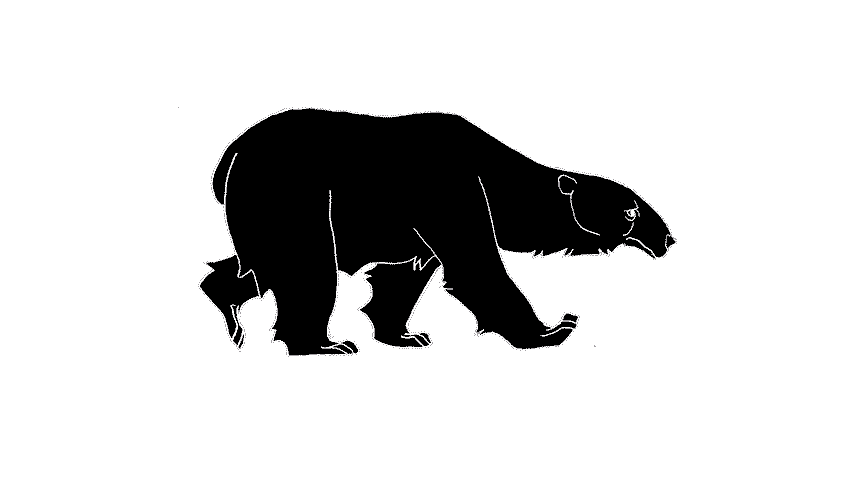
Photo

New polar walk animation I've decided to create another polar bear walking because I didn't feel as if my previous attempts have been strong enough. Because of the use of rotoscoping over live images the textures and features of the bear are poor, in this animation there is added accents of line for fur and the expression and facial features give the bear more character. Another problem that I had with the previous animations was that they didn't loop well, and the video that I took the frames from had the bear walking at different rates and angles meaning that if I was to loop it, it wouldn't look as natural as this one. And also this method was faster for me to create and loop because there are only 8 frames; the others had up to 15 and it still didn't reach the starting point again. Many of my peers have mentioned about the expression on this bears face and that it looks sad and I agree with them that it does, but it isn't a bad thing. Because of my context behind the work I think that having this sort of expression will remind people that it isn't all happy faces and that this bear is sad about his habitat being destroyed. I found this animation as a gif and exported is at frames so that I could trace it. Although it doesn't look as life like as the previous and has cartoonish features I think that my audience will prefer this, and with the overlay of a paper cut as the form it won't look as graphic as it does now. For this to work I will have to invert the image and then screen over the paper cut, so the lines will be white and not as defined as they are here. For this animation the frame rate is 0 per second, which I think is a bit too fast. From the previous animations and research I have done I have noticed that polar bears walk at a slower rate than the other animals I've looked at, they sort of stroll along - here he looks like he's rushing to get somewhere. I will experiment with how fast each frame should be, but I have to be careful because if it is too slow it won't look as smooth and to a professional standard. My next step will be to change the frame rate and start making my paper cut to screen over the top, I have previously made an ice berg paper cut but it was early on in my experiments and it doesn't have the same sort of look as my forest paper cut because I used different media. I want all of my paper cuts to look like a collection so I want to use a similar media and materials, so it carries the theme throughout my animation.
0 notes
Video
vimeo
Live animation test
Using the water layered paper cut as a set and fish of a similar style i have explored how live animation varies from stop motion and others.
We know how i created the water and the fish were a similar process but with different media and materials. I applied acrylic paint with sponges and scourers to create a complimentary texture to the water, so that it has a fluid composition. It becomes more difficult to create a strong composition with animation because elements are always moving from one place to another so i have found that creating similar textures, colours or shapes gives it more relations and then things don’t look off. I decided to layer the fish like the water because i thought that this would be more visually pleasing than just a solid shape and it does look effective but it did cause some problems when it came to the movement of them.
Live animation is a process which usually involves many more people than just myself, i knew this from the beginning so i created at least 8 fish - not too much and not too little. I had been worrying about having enough fish when what i should have been doing was worrying how many people i could get to help me. We’re smack bang in the middle of the project and everyone is doing something important, i managed to find two peers who were free for a few minutes but due to there being 8 fish and 6 spare hands, it didnt go as to plan. I havent been put off by this though because the animation looks wonderful, all i needed was one more person to move the other fish.
I think this process is very effective in the sense that it is fast and simple and i like the aesthetic you get from fluid movement. The continuous movement of a hand is a hundred times more natural than stop motion, there are things you can do live that you cant do other ways. But then the problems with live animation is the mistakes, if it is made then (if it really is live) then you cant go back and even if its filmed it slightly ruins the film, you can still crop that bit out but its never gonna look as smooth as is should. The other thing about live animation is the wire, im not sure if i like seeing it. When there is this much going on the wires dont really aid anything they just make it more cluttered, but there are ways in which this can be solved. Depending on the set, the wires can be hidden behind layers and used basically like a puppet- I wouldn’t mind seeing a small amount but in this its coming from so many different angles.
I would like to experiment with how my other paper cuts could work as sets for live animation and whether i will be able to incorporate some in my final animation - even if its just like the shadows as a live animation.
0 notes
Video
vimeo
Testing Light and Shadows
these are two layered paper cuts which i had recently created and, due to the depth and relief effect, i was inspired to experiment with light and see what sort of effect i could get.
The rainforest paper cut worked fantastically, the length and depth of shadow works so well to give it more of a natural look and give it a strong 3D effect. Ive tried different angles to see which is strongest, and which is most natural - positioning it above gives the impression of the sun and a more natural shadow but then if i position it slightly lower it pushes the shadow up the background and i think this larger effect makes it pop more. I experimented with how a moving light could work and think all of the results are very strong, each of them creating different intensities of shadow and darkness but i think the one that works best is just moving up and down slowly. It looks more natural and some of the others weren’t very strong, along the bottom looks cool but does it really happen like that? and you can’t really see that much of the paper cut. The one which is angled straight down doesn’t work because of the medium ive used, this acrylic printing paint gives a reflective surface - the acrylic meaning plastic is basically plastic paint, and plastic reflects light. This creates horrible glare and even looks too plastic and fake.
The water hole paper cut didnt work as well, the height between paper isnt as muh as the rainforest and the light wasn’t able to peak through them as easily. I got some good shadow effects by angling it but they werent as strong as i had expected or hoped. I like the way what the slight is stronger on some layers than others and would like to carry this look to my other paper cuts - because they all feature a tonal change it would make these stronger by having a light density change.
I found that filming the light moving is such a good way of animating the scene without having to add anything extra or move any elements. It also saves a hell of a lot of time and i think it would aid in the effect my animation has - as the animal moves so does the light and it gives it a strong direction. People respond best to a moving image and if i have the chance to make two moving images i will. If i had still images it would still work well because of the layering and natural light creating shadow, this would be defined enough on the moving image for it too look strong but if this happens i might try photograph the paper cuts under different light conditions and see if that helps.
0 notes
Photo

More graphics made by using the double exposure effect on photoshop. These are a little closer to what im looking to create with a natural scene incorporated with the animal form. I still think this is a strong message and raises awareness about animals and the environments; plus i think the play in visuals is something which will please an audience. I also like how the animal form frames the environment, but in a way that makes framing more exciting - along with the use of negative space giving it more volume.
i look forward to experimenting with how this will look and what effect it has on an audience, my next step will be to get paper cuts and animation frames planned and drawn.
0 notes
Photo


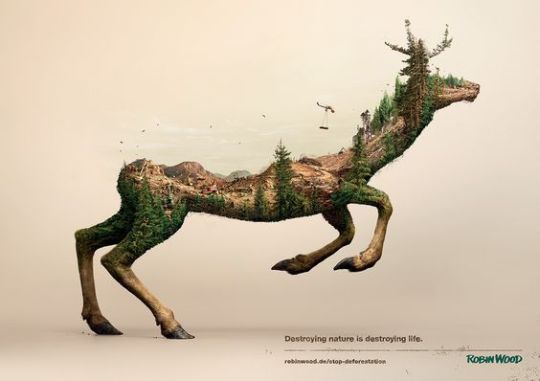
Robin Wood Deforestation Campaign
These three illustrations were created for Robin Wood, the environmental activists, and aim to raise public awareness by showing the ongoing destruction of animals’ natural habitats.
They are created from clay (3D rendered) models, of the animals, with digitally illustrated layouts of the environments cut shape then through the magic of CGI they are made into these.

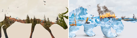
I admire how powerful of a message they send, with something which doesn’t even seem that complex. How the figures start to fade as the environments within them are destroyed shows life degrading, as it slowly starts to vanish so do the species which rely on it. The juxtaposition of the environment within the animal, instead of it being vice versa, really captures the strong link between and the idea that that environment really is that animals life.
These illustrations were created by a series of designs and agencies but what based on the original creative concept of Grabarz & Partner’s. To create something to this degree would be near impossible for me, even if i knew what i was doing, but i dont see why i cant interpret the process into something. I feel inspired by the two different elements to this, i could use the animal form as a sort of frame - like i have with previous work - and develop, or maybe just use, the existing paper cuts i have. I have wanted to peruse this idea of combining animals and their environments for a while but couldn't figure out how to do this besides the typical animal being in its environment. I think using paper cuts for the environments is going to work well because the depth to them and how the relief gives a 3D effect, like these but less precise.
There is a problem with the scene of the background, to do something to this much detail and at such a professional standard is something i cant yet achieve, and would be near on impossible with paper cuts anyway (less they were to a much larger scale). I think that using a less intricate scene will still work effectively because the materials which is is created by and it still conveys the idea of the environment being the animals life. Although this is a powerful and succeeding campaign i wouldnt want to copy it, i want to interpret it for myself - using a similar design with a similar message doesnt feel right for me, if its my work i want it to feel original.
Since im still a bit unsure on whether i can develop this and how best to interpret it im going to consult with my tutor about possible actions.
0 notes