
Last Seen Blogs

emisimblr
Emisimblr
srkizer
kizer
medicallymercury
Mercury’s Casualty Sideblog!

joeyisourranger
not a rangers fan
blacknailsandheartbreak
Just here
Text
REFLECTIVE STATEMENT
After completing this unit have gained new knowledge of both the historical and practical elements of design, which is what I hoped to gain from the start. I was introduced to many movements within the design and art world, in particular I enjoyed the lectures on early printmaking as well as the later lectures on modernism and design ethics. To me the historical aspect of the course reflected how far design has evolved and how ancient methods are still used today in a contemporary manor, “the new media absorbs a lot of the old media” as said in one of the lectures. In terms of practical skills I really enjoyed the collage workshop we did and learnt a lot through the process of our zine assignment in terms of layout and the physical making of it. Overall I feel like the course helped me look at objects, images, space or pretty much anything from a different perspective as we explored letterforms in everyday life.

2 notes
·
View notes
Photo


Recently I have been looking back and having a read of some of our old lecture topics and looking through the readers. One of the most interesting things I found was that Bruno Munari was able to essentially define what a designer is in a singular sentence “He is a planner with aesthetic sense”. I found this engaging because remembering back to one of the first lectures we were asked the same question, although I believe no one came up with this solution and we all had very very different answers.
4 notes
·
View notes
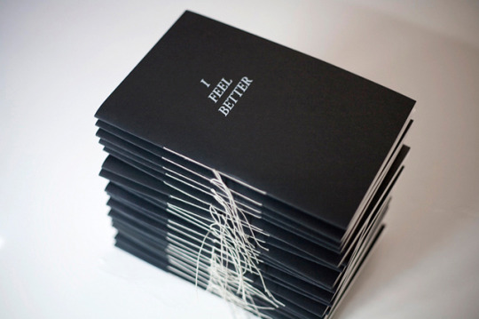
Photo

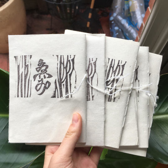
zines are done!!!
this was a really nice learning experience as I previously had never made a zine before or had any idea how to make one. I like how each zine I made came out slightly individual based on the folding or binding. It was also just nice to create something tangible and not on the computer, as part of the process included cutting up and glueing the cover to fit the rest of the zine and the sewing element too.
I’m excited to see what everyone else has made on friday!
1 note
·
View note
Photo

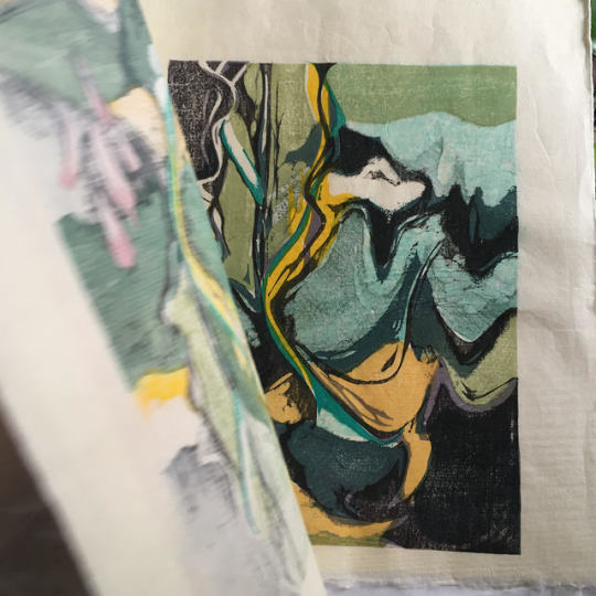
zine progress 4 - in the package that emi my creative sent with the cover print she made, she included old test prints which she no longer needs for me to incorporate into the zines. This is very exciting and nice of her. She explained to me how a photograph sometimes doesn’t do a print justice and it's nice for people to see the true effect of the print colours and texture.
1 note
·
View note
Photo


zine binding research and inspo
Going to use thread to bind the pages of my zine as I think it’ll work well with the washi paper which the cover has been printed on.
From the thread bound zines which I’ve seen I like the idea of the excess thread not being removed like the two images above.

tried out different thread to see what matched the paper of the cover best. thinking of going with the white thicker wool thread:)
2 notes
·
View notes
Photo

week eleven + twelve
in week 11 we made rough plans for the composition of our zines, and now in week 12 I’ve done my first test print to see how the colours and text translate onto paper. I found that the colour behind the text is way too dark to be able to read the text and that the paragraphing style that i choose doesn't quite work in some areas. Having the physical copy of the layout that I’ve made is really helpful in seeing what could be improved in comparison to just looking at my inDesign file.
2 notes
·
View notes
Photo
zine progress 1
thinking about questions and the front cover design. my creative kindly offered to print the cover for me so I came up with some designs, going to choose one of the more simple ones.
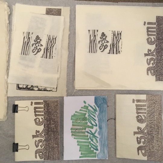
zine progress 2
the printed covers arrived! super happy with them and on the back she printed her signature. Need to find a paper which would suit the washi paper of the cover. Thinking of a paper which is more natural and has visible fibres.
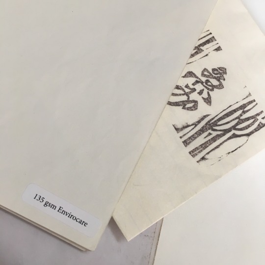
zine progress 3 - went with a paper called Envirocare as it was the most natural and fibery paper I could find. I ended up test printing many times as the print out version of the imposition made me realise flaws in the layout or how the colour had been printed . This helped me understand how printing and seeing the physical copy is really important in comparison to looking at an inDesign file. Reminded me of how a painter steps back to look at their work from a distance to see the whole image.

1 note
·
View note
Photo

week ten - my first zine!
Such a helpful workshop this week as I was previously unsure how I would go about making the zine. Made a few mistakes with the printing such as flipping on long edge, so two of my pages were in the wrong spot and printing on A4 instead of A3, however this helped my decide on wanting to make a A6 16 page zine.
0 notes
Photo
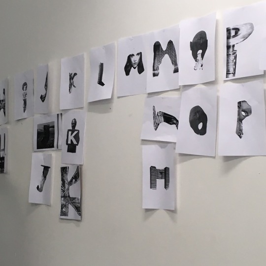

week nine - collaging to create letterforms
the activity challenged me to look beyond the original image and try see and experiment with what it could become. The outcomes reminded me of Dadaist photomontage’s, such as Hannah Hoch’s.

week eleven - found a book called Uniforms by Bettina Hubby at the NGV which reminded me of our week nine workshop
2 notes
·
View notes
Photo


week eight - RMITabc’s - g E A c
“art does not reproduce the visible but rather makes visible”
0 notes
Photo

week seven - mini exhibition
This week we exhibited our first project in small groups. The group I worked with decided to display our print outs underneath the archway of a staircase outside. It was a really nice way to see what everyone had made.
0 notes
Photo

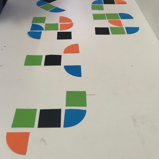
week six - typeface systems
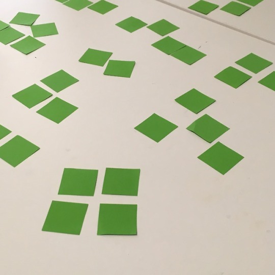
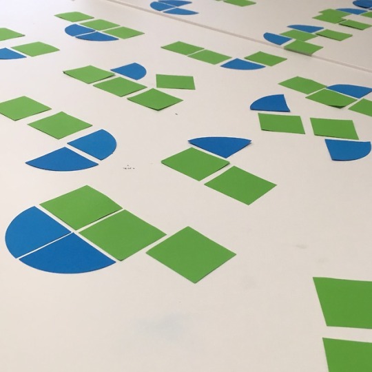
This week we created the alphabet with shapes. Initially we were only given squares, so we created simple forms which required the eye to fill in the gaps as we used a negative space technique for some letter. Next we were given quarter circle shapes which helped depict the curvature of letters which the squares could not achieve. As a final step, two groups combined, providing us with new colours and double the amount of shapes. With a larger group is was more challenging to communicate, however, by incorporating multiple ideas we were able to create a typeface which has a balanced use of colour and form. The final result reminds me of of the “PARCO” logo (a Japanese department store)
1 note
·
View note
Photo


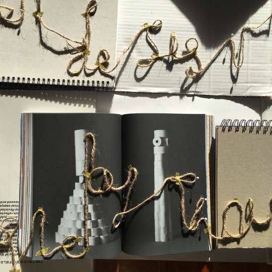
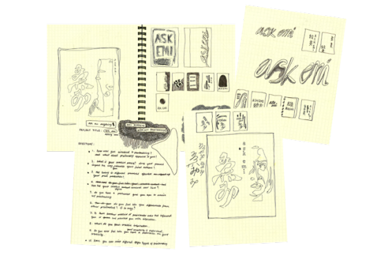
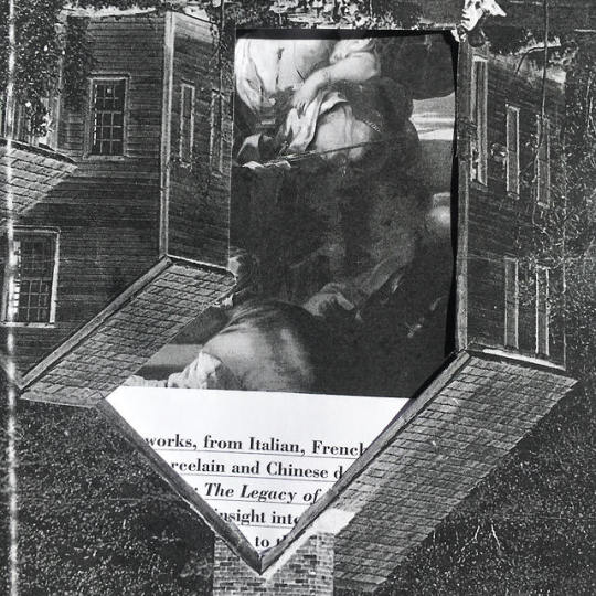
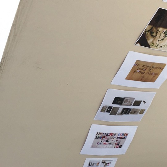
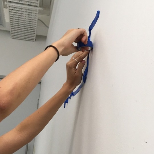
how can design bind people by thought?
I developed my question from an experience which I had with a friend when we were both discussing our thoughts and interpretation of an exhibition. This lead me to think of how designs are able to bind people to a similar thought process through their understanding of a work .
I used books, their bindings, tape and string to represent my questions.
from the feedback of this assignment I have learnt that in the future I could improve by not being so fixed with one idea. I feel like once I physically made the question I didn’t think too much about altering it, especially because I knew what the question was and there by had no trouble reading it. I also feel like I focused on what the question would be and how to create it with materials that I didn’t think too much about the layout of the text and thereby stuck to a tradition composition, next time I could think beyond this.
5 notes
·
View notes
Photo
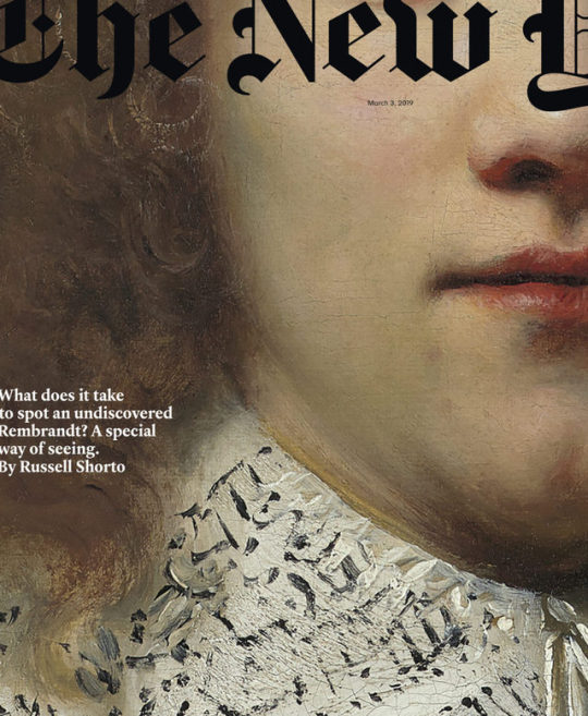
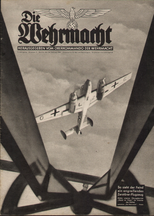
week four - black letter
This weeks lecture highlighted how typefaces carry notions and ideologies which are dependant on their context and use within the design as it is their overall composition that defines them.
The typeface Black Letter has been associated with Nazi Germany due to propaganda posters, yet today used as the known logo of The New York Times Magazine. Whilst both uses of the font carry different ideologies, they share the characteristic of seriousness.
2 notes
·
View notes
Photo

week three - the five boxing wizards jump quickly
The lecture this week provided us with examples of how the development of writing systems are pressured by time and material efficiently. The in-class activity additionally allowed us to experience this as the medium which we worked with defined the letter forms which we created. With the electrical tape, we found that writing smaller and in lower case letters preserved the material, whilst when writing with water on the pavement we were tested with time before it evaporated.
0 notes
Photo
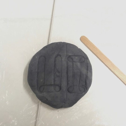
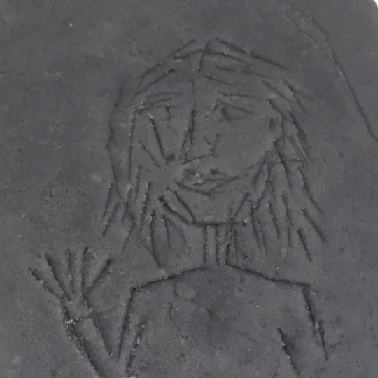
week two - communicating through clay tablets
This weeks activity and lecture provided an insight into how people in the past were able to communicate. The playdough tablets allowed us to explore which methods were most efficient in communicating a message/symbol. I found that imprinting the popsicle stick as well as creating wedge indents were the most effective in comparison to a dragging motion which we would use with a pen. This reflected the significance of medium being clay and mode of the tool. It was overall interesting to see how communication has evolved to the present.
1 note
·
View note
Photo


week one - creating letter forms out of items from our bags
It was interesting to see how an object could be morphed into an abstract form to create words and letters as well as how everyone had different ideas even if they were using the same or similar items. In addition certain objects which couldn’t have their shape distorted were seen from a different perspective beyond their original use, for example the asthma inhaler used as the letter r.
3 notes
·
View notes