
Last Seen Blogs
xumgh-97
kinda in love with xu minghao.

tvguts
IT’S A NEW AGE IN CABLE TELEVISION!

akagaminokairi
Untitled

djrjaybrasil
Dj R-Jay

teltinsurvivor
Fuck off.
Text
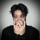
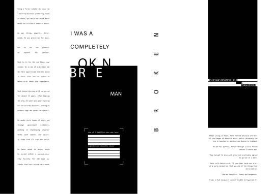
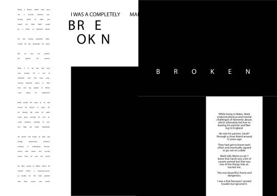
For my final design I wanted to create a visual which told the story of this man who was a solider but has also been broken like the title implies. I decreased the leading of the first body of type to make it more of a block shape and repeated the same concept to the other visuals which created the effect of a number of block structures, this creates the commutation of being structured, stable and secure just like being in the army as a solider but I also overplayed and separated the blocks which better tells this story that this once solid foundation is broken. Some areas of type overlap over the double page spread itself further promoting this concept of a broken past but also makes the reader more engaged in the reading making him feel part of the story by creating movement and drama which is a concept I picked up when listening to the visiting speaker Lucienne Roberts who talked about how political designs use visuals to create emotions. This is a concept which I will implement in later designs why using visual graphics to tell a story which intern creates a more immersive experience and intern create emotional links the the story and spread which will make you remember not just the story the layout style, this aspect is key as a magazines top priority when it come to design consistency which means every magazine spread will have some connection to the reader.
0 notes
Text
BREAKING THE RULES
For this task we had to continue exploring are designs but break the common rules of typography and gridding which been learning and have used in the previous task. We as designers use this task to first learn the importance of the fundamentals as they almost always help in aspects such as readability and clean formatting however as creatives its beneficial to break a few of these rules to help your design stand out.
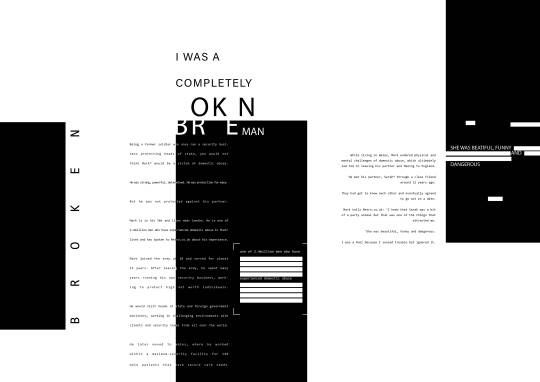
For my first design I took inspiration from the Bauhaus movement which saw a change in the way typography and layouts were formed, designs tended to be rotated to draw the readers eye in to see the text and large areas of negative space both white and block color could also be used to navigate the readers eye around the design and this is a technique I implemented in these designs. I rotated the entire design 45 degrees clockwise giving the text and other visual assets more movement, drawing you constantly to the right which helps an editorial piece especially flow.
Because I had rotated the design certain bodies of type had started to bleed off the page, therefore I reduced the leading to bunch the sentences closer together and also increase the width of the text box to overlay over a black block and converted some of the words to a white hue to keep the readability but to also create create color contrast due to the brightness levels being opposite, which instantly draws the focus in.
In terms of ascetics the breaking the rules designs instantly make me as a consumer for compelled to read the double page spread as they like the name suggest break the norms creators have build and when they are broken designs which are unique heavily standout. For my final design I will focus on breaking the rules more than learning the rules for these design to make the overall look more eye catching and create a a different experience when reading.
0 notes
Photo
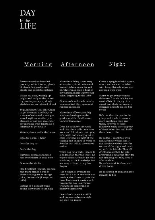
a day in the life task inspired by the teachings of my typography workshop
0 notes
Text
In Design workshop
Today I had my intermediate in design workshop with my group and we focused on the various tools in the properties, character and preference menus to help slightly alter the look and functionality of a paragraph.
I never knew you could create style systems in the paragraph style option which essentially allows me to create pre sets like on photoshop but with tracking and hyphenation settings which will come in such a hand in later project using in design. An issue I've always had is manually modifying a body of type and later forgetting what the setting are when I move onto a completely different paragraph which doesn’t type link, meaning the settings don't pass on, with this addition I can click on on a paragraph and select the right preset and instantly have what I need. This would also be perfect in a real job editorial piece situation as its also a fats way to proof check if all the settings are the same and the type can be detailed so much you can select ligatures and even if upper case punctuation is located in or outside of the text box.
I will definitely use most, if not all of these techniques from the workshop in my final design to make it look as readable as possible and as technically sound. In the brand experience module under the task “a day in the life” I used these simple techniques are saw an instant change in the quality of my typography. I altered the tracking in the body of type to better combine a serif typeface and then dramatically increased the tracking for the sub titles to 200pt which creates a sharp contrast and with the help of underlining the titles helps break up the body of type easily with minimal visual elements, keeping the design sleek simple and eye catching do to the negative space I added to my layout. I am very happy with how this design came out.
0 notes
Text
FINAL LEARN THE RULES DESIGN
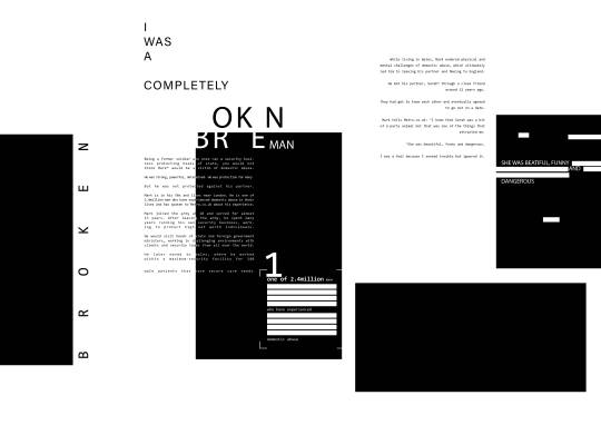
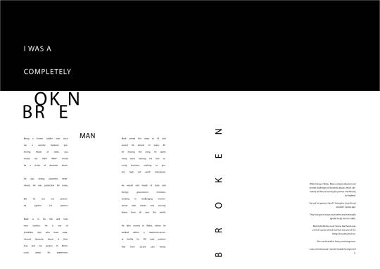
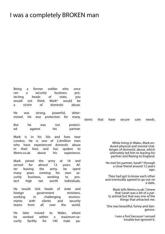
After the development of different double page spreads I came up with this design which I’m very happy with and feel it ties in strongly with the values of the text. I increased the size of the text on the right size to the same of the other text to make it equal in weight and placed a black column overhead to bring better focus to that piece but it also gives the impression that the text has a lot of weight as its weighing down on the body of type.
Another visual aspect I added was small blocks of white inside the black boxes to create breaks in the solid colour, I took inspiration from WW2 documents again as they would block out any information of importance to stop spy's finding out, instead I want to use the blocks to remove all information without importance and help highlight the facts people should know about abuse.
0 notes
Text
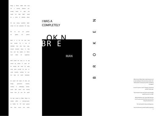
For this alternation I kept a large amount of elements the same and mainly removed the black space and changed the second extract of text as I felt it didn’t compete with the left side of the page which I feel was because I had placed a center alignment on the information and the typeface was too thick which made it jump out but it was only 2 paragraphs of text.
Instead I changed the alignment to right facing and removed the black, I liked the alignment now a lot more as It seemed like the text was looking at the left side which talked about his past and was at the bottom of the page which creates an imaginary diagonal line across the page from top left to bottom right which is how we read making the readability of the layout a lot smoother.
Overall I really like the improvements I made, the overall design looks better with not as much black on the page allows the design to breath and the alignment stops the text from being stale, however I feel the right side is still too weak compared to the left. I've made the right side look too small and by removing the black boxes I've left it on its own which gives the impression its hiding which is the opposite impression I want readers to have. I need to better balance out the layout of text.
0 notes
Text
I knew I wanted to separate out the working into 2 different chuck's, the first talks mainly about his time in the military and the achievements his had then changes to his abuse later on. Because of this and the name being broken I wanted to separate out these extracts and create different type and visual elements which cater to these. I used Consolas as my typeface as it looks like a typewriter which has links to military because of WW2 documents having a similar ascetic, I also dramatically increased the leading to emphasis the negative space which gave the impression of being broken while still being very readable.
I wanted to use a lot of black negative space in these designs to better tell the tone of the story, because the story getting gradually worse I wanted the ratio of negative space to compliment that and for the type to change over time.
0 notes
Text
LEARN THE RULES
For this task we had to create multiple double page spreads all with different ascetics and layouts while keeping within the grid layout and typographical standards we have been taught so far.
I chose to design spreads around the story I was a completely broken man, this is because the story instantly stood out to me when reading and reminded me of a book I’d read again about an ex soldier who had suffered with domestic abuse. In addition the title and the content had multiple different layout inspiration just to the connotation you get from the word broken. Further more the sentences when written were all broken up into short sentences which made changing layouts using my 8x8 grid very easy and fun. This was one of my favorite project of this module as I felt like I made a lot of development from the first to last designs which proved to me how much better work can be when you push on. I’ve also talked to my tutors before and I now know that I'm a creative who benefits and creates the best work when I push through high volumes of designs and break down what's gone wrong and constantly adjust it little by little; I'm not a designer who can draw a few sketch's and create a final design in one go therefore I feel this task suited me quite well.
0 notes
Text
I, ROSEBUSH part 2
The final version I cam up with solved the problems which I had with the previous design which was mainly the banner design at the top not being well balanced in terms of visual focus and legibility. I chose to rotate the rose up right which instantly made it recognizable and also converted the paragraphs into single column shapes followed the same line of movement as the title giving the design overall symmetry, because of this it also has a good amount negative space which helps this sense of direction this is a similar tool to the Bauhaus posters which utilized negative space as a way to funnel the reader into bodies of type. To balance out the design I added a black rectangle around the other page which also acts as negative space, most people believe that negative space is only areas of white space but that isn’t true, its large areas of similarity this can be a single colour or in certain example a certain pattern repeated.
Overall the design draws the eye in well and has techniques which help its legibility stand strong in the main body of type. I didn't need to use images to inform the reader about the extracts topics and themes either. If I was to improve this I would add a few more breakers in the text to give the page some more character which is what I feel this piece is missing.
0 notes