
Last Seen Blogs
toastymuffin66
🕊chrissy🥀
madinah-irshad
Al Madinah al Munawarah
osamot
DON'T PANIC...
ask-cordelia-sakamaki
Cordelia♡
soulsolid-a
♪ ─ SHALL WE SING ?
Photo
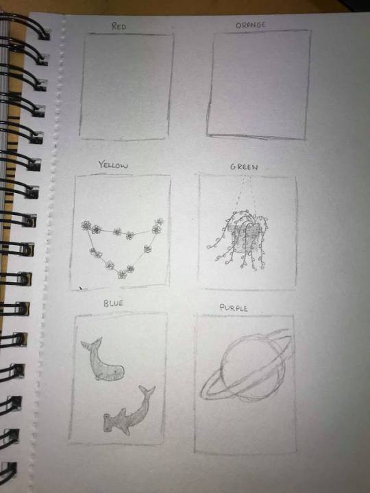

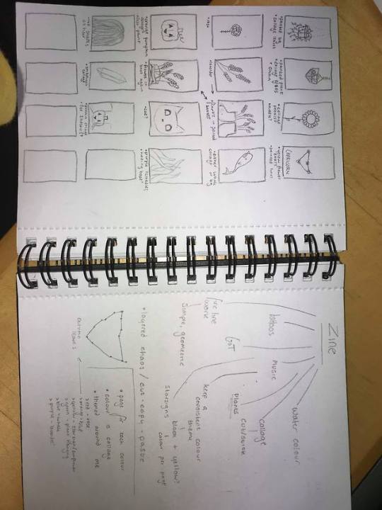
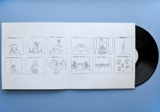
Before creating my zine I did a lot of sketching and mindmaps to decide what I wanted to have on each page. These ideas didn’t necessarily stay throughout the creation process, but they definitely helped to shape my final product.
0 notes
Photo


Evaluation
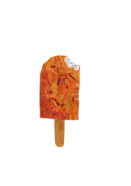
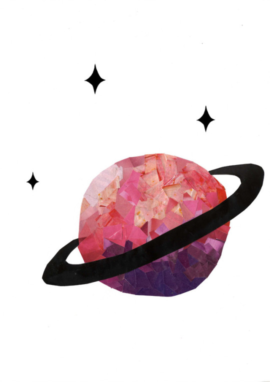
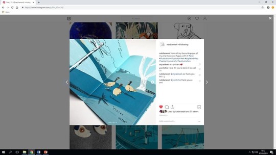
For my zine I knew that I wanted there to be a vague theme throughout so each page linked with another. For this, I made sure each page was created using the same technique - collage - and I also made ‘rainbow’ a theme so each page’s focus was a certain colour. Once I had decided this, I drew up ideas for things i enjoy/are personal to me for each colour. I then decided which of these to use and sketched them out on to some white card. For my colours, I cut out lots of block colours from magazines (clothes, adverts, plants etc) and cut these up in different sizes depending on the image. On a few pages (red and purple) I used one large piece of paper for a section instead of multiple little ones because I felt like it would give a more effective outcome, but for the majority I used pieces around 1cm². I used different shades of each colour to create depth so each image didn’t look overly 2D, and I feel like this has been pretty effective. I edited all my pieces after scanning them in, mostly minor things such as removing unnecessary pencil lines/smudges, but I also added something new to each page. My front and back covers are the same image, just flipped and rotated. I did this because i think it keeps the focus on the inside pages and just acts as a protector/box around the important content, whilst still fitting with the theme.
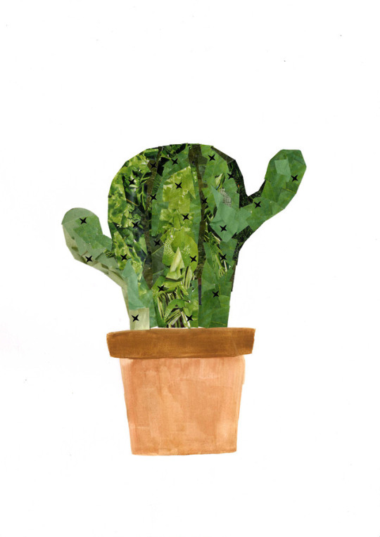
I used ‘cut-copy-paste’ as my theme. I chose this because it seemed to fit in a literal sense with my initial idea to do a collage, as well as with some plans for editing that I had. These include, for example, my green cactus page, as I drew a small cross as a spine on PhotoShop, and copied this several times over the whole piece.
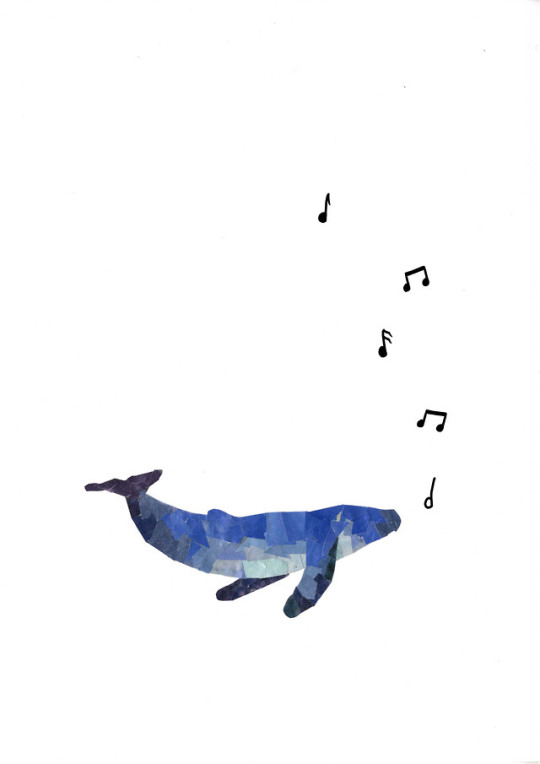
Overall, I’m fairly happy with my zine. I feel like I kept a consistent visual theme throughout, and it looks like each page belongs with the next. Every page looks more or less as I intended, with an exception of the blue page as I was going to have another sea-creature in it (probably a shark), but I couldn’t figure out what angle to do it from as the whale was already from the side so doing it from above wouldn’t make much sense, so I decided to keep it simple and minimal. However I’m still pleased with the end product, especially the small bits I edited on afterwards, such as the musical notes and star-sign, as I feel that this really brings all the pieces together, as well as being a nod to the fact that I’m doing a digital course, and am therefore competent using software such as PhotoShop.
1 note
·
View note
Photo

This is my finished character turnaround sheet. It took me a long time to finish (mostly due to not having the software at home), but now it's complete I’m fairly happy with it. I known it’s simple, but I think I’ve executed it well by adding shading with the dodge and burn tools, and keeping height and scale consistent throughout. I created this on Photoshop twice as the first time I lost the file. In this first version I had a scanned version of my drawing as the back layer and drew over it, which worked well but took a while. the second tie after the loss of my file, I instead used the magic wand tool to highlight and remove the white of my scanned drawing, and then edited the colouring of the image so the black came through much stronger and I had my outline ready made. I then just had to colour behind it and remove any smudges from the original pencil drawing, as well as adding shading and improving the quality of he original lines as some were a little blurry and faded.
2 notes
·
View notes
Text
Roald Dahl Animation
This is my finished animation, based on ‘Georges Marvelous Medicine’ by Roald Dahl. I themed it around the scene where a chicken is given some medicine, and suffers some odd side effects. When making this animation i came across various issues, for example in one scene I was intending to have the chicken do a full somersault (as that’s what the book said), but when it came to it I couldn’t figure out how to do this without making each individual element move, so I just removed that scene. This was the only area where I struggled to stick to my storyboard - the rest is fairly representative.
I made my background in Photoshop using a wacom pen, with a brush that mimics a crayon to make it look childish. I considered having the granny through the roof as an actual elements so when she speaks I could have some movement, but i decided that having it still was a better idea and allowed me to focus more on my chicken. Similarly, I made my elements plain and stroke-less to make them look simple and friendly - although I chose to make these in Illustrator as it was the software I was more familiar with. I deliberately made each element of my chicken on a separate layer so I could animate them independently, as this was something I failed to do with a previous project. However, I think I didn’t necessarily have to do all elements separately, as sometimes they moved then I didn’t want them to and so some frames are stilted and pretty poor.
When it came to adding my sound I initially planned to have a voice-over reading the story, but due to me running out of time I decided to animate the narrative on the screen and have various sound effects instead, for example a splash as it falls into some water and a slide whistle sound while it grows. I gathered these from ‘FreeSounds’ as they provided a large range of high quality, easy to access sounds.
Overall, I’m fairly happy with my animation. As stated earlier, some areas of my animation aren’t as intended as the chicken comes apart and/or moves in a stilted way, however as animation is still fairly new to me I’m proud of what I've achieved as I feel like it fulfills the brief and tells a story with no other explanation.
https://youtu.be/8W8X8eSkBwU
0 notes
Photo
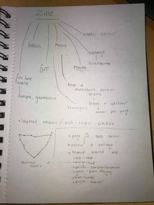


I’ve started planning my zine by making a mind-map about things I enjoy which i could connect to one of the two themes which appealed to me most - ‘layered chaos’ and ‘cut/copy/paste’. I decided i’m going to make a form of collage, I then had to decide what the theme would be to connect each page together. I’ve decided the basic theme will be colours, as each page will have a block colour made from collage. I will use these colours to make things I like, for example green will be a plant, with the rest of the image done in watercolour to keep it dull and allow the colour to be the main focus of the image. I considered having the theme be plants, and having different coloured flowers of each page, but I struggled to think of a blue one. I’m now going to do ocean creatures for blue, sunflowers for yellow and so on.
0 notes
Photo


Annotated Art Styles
- Collage (1,2,3):
I find this ‘cut and stick’ method of art really appealing because it fully allows you to create whatever you want, as long as you can find it somewhere. Each item can be layered in a way that expresses something, whether that be a story or a single image. It’s a fairly childish approach to creating art, but I think it can be adapted in so many ways so create the most abstract environments that it’s actual quite a mature method. I especially like when it’s done in books like a diary as shown above, as it allows for many layers to be explored and expressed.
Images used in collages can be found in magazines, books, posters, newspapers etc or can be printed out by the individual. This second method allows the artist to use the most accurate image for their creation, although some may consider it to be cheating.
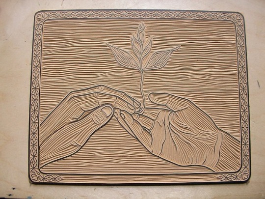
- Woodcutting and printing (4,5,6):
This is the most ‘physical’ art style here. It involves carving intricate shapes and patterns out of wood or a cork like material, covering this in ink and pressing in onto paper to create a print. I think I like this method because it involves high levels of detail which is something I enjoy, but also because it can be repeated over and over to create the same image with only minor differences.
It’s mostly used to create posters and other forms of wall art, but could easily be scanned and used in a digital way as well. I think it’s quite popular because it involves a level of craft, not just being able to draw well as with some styles.
- Abstract/Minimalism (7,8,9,10):
This art style is a favourite of mine due to the use of geometric shapes and patterns. I find these really visually appealing because they’re so simple yet so crisp and clean, and can be used to create repeating patters or other simple shapes - they’re very diverse. Similarly, the line work example I included is very basic, yet extremely effective. It’s used on an album cover that I like (shown above), which I believe influences my appreciation for it. I also think this style makes amazing tattoos, which further increases my interest for it as I have one of the ones above myself, and also I would like to go into a career as a tattooist and this is where I find my main influences for designs.
(The numbers in brackets represent the images which correspond with each graphic style)
1 note
·
View note
Photo


Graphic Design Examples (2/2)
11) Vector Graphics
12) Architectural
13) Conceptual Art
14) Art in Sequences
15) Info-Graphics
16) Children's Books
17) Graphic Novels
18) Book covers
19) Depth (and drama)
20) Mapping
(The order of the images attached corresponds to the numbers in the list).
0 notes
Photo


GRAPHIC DESIGN EXAMPLES (1/2)
1) Modern Retro
2) Geometric Shapes
3) Negative Space
4) Dramatic Typography
5) Abstract/Minimalist
6) Woodcutting (printing)
7) Pencil Illustration
8) Water-colour
9) Collage
10) Pen and Ink
(The order of the images attached corresponds to the numbers in the list).
1 note
·
View note
Photo
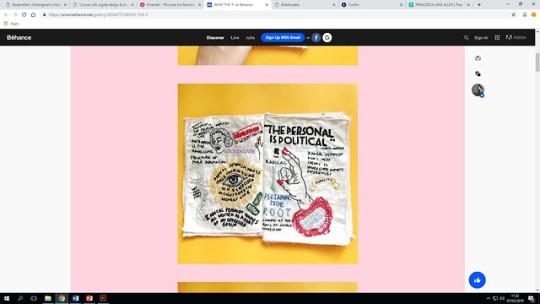
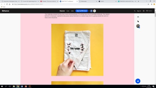
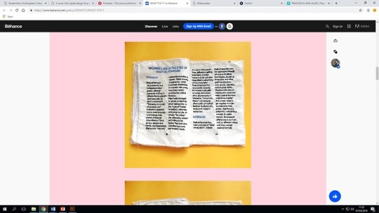
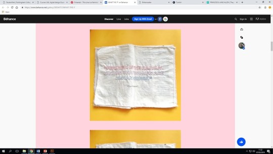

The final zine that I really love is this one: 'Girls Gone Wild’. Firstly I like that it’s embroidered instead of being printed, because not only is this so different but it shows how much work was put into ti. It also helps the theme to stay consistent as it has the be the same material all the way through. Having said this, if the author wanted to they could've made it messy with too many conflicting colours, but they chose not to. it is clean and organised even if the pages appear to be busy and un-planned. As I've said before, I like the lack of narrative so the ‘plot’ has to be decided by the reader, although it does have a strong visual ‘feminist’ theme which can’t really be disputed.
1 note
·
View note
Photo

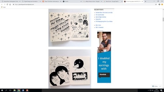
I enjoy this zine a lot because it fits with the image that I have of what a zine should contain. It is primarily images instead of text, so the theme of it has to be interpreted by the reader instead of being given to them in writing. There might not even be a given theme, it may have been left open to the viewer to decide what it’s about. For example, the seemingly random art work could be a type of theme itself. I also like the consistency in the art style as it’s all done with simple plain black ink line work on off-white pages. As with the last one, i can’t see all the pages without purchasing the zine so this may vary, but I believe it to be uniform throughout.
0 notes
Photo
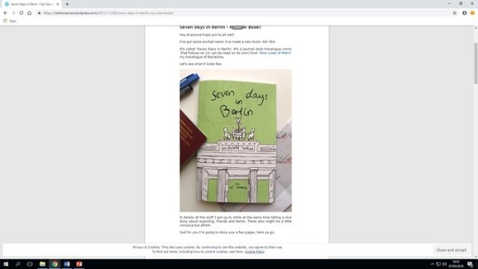

This is another zine which I like the design of. This one is contains more narrative compared to the previous, which I think makes it more of a book/magazine than a ‘zine’, but it’s still self published and artistic so it fits the criteria. I really like the simple ink style of the art both inside and on the front cover, as well as the use of a bright colour on the front cover which may continue at points inside, I’m not able to view much else without paying for it.
0 notes
Photo
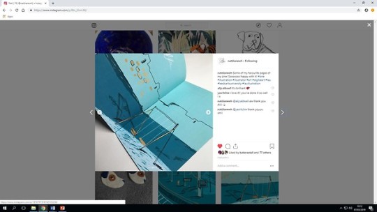


This is the first example of a zine that I like. This was made by somebody I know who studies art at University (credit is included in the images). I really like this because the theme is so consistent throughout, both in terms of the colours and the art style. I believe that all the pages have been created the same way - digitally drawn using something like Photoshop. It’s themed around a trip she took to York, including some scenes such as a coffee on a train seat and some pigeons what she saw. I think this page with just birds on is a really effective as it breaks up the large amount of blue-toned scenes while keeping within the colour scheme. I would love to be able to create something this smooth and visually pleasing.
1 note
·
View note
Text
What is a Zine?
A zine is a small, often self-published magazine. They have a consistent theme throughout and often contain information about art, whether that be music, photography or paintwork. They mostly contain images which can be photographs, hand drawn art or scanned images of physical work. These are chosen depending on their subject and visual aspects as an important comparison between a magazine and a zine is the uniformity between all pages.
0 notes
Photo


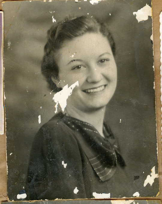
Here is my work using the clone stamp tool in Photoshop. In the first set of images you can see that I have used this to remove most of the chicken pox from this baby’s face and body. This was relatively simple as the body is mostly all the same colour so finding a suitable area to stamp from wasn’t too hard. In the next one we first removed the tree, then copied and added more of it. This was a little harder because of the rolling shape of the flowers. Each row was angled slightly differently so finding one to stamp to fit over any mistakes was tricky, however I still think I did a good job. Finally we used this tool to try top restore old damaged photos. You can tell that I didn’t finish restoring this work as there’s still a large part of her face missing, but I managed to improve most of the body and background. This was definitely the hardest thing to do as it’s quite a detailed image with lots of different shading, although I think it was a good way to practice and improve with the tool, as this is what it’s often used for professionally. I imagine it’s also used for improving photos of models for magazines to remove any blemishes and flaws, similar to the work we did on the first image.
0 notes
Photo


I’ve created an element for my animation as well as the background. I made the chicken in Illustrator using the pen tool as it’s the software that i’m most familiar with. I mean all the different pieces on separate layers so when I come to animate i’ll be able to move them independently from each other. For both these pieces I've gone for a childish look, with bright colours and simple lines. I’ve done the background on Photoshop with a Wacom pen and a brush which looks similar to a crayon. Although I initially used bright primary colours, I placed an opaque shape over the top to dull it slightly so my elements stand out better on top. Now I just need to create a hand and some water droplets, and i’ll be ready to animate. I'm not excited for this as I think it’ll be a long and hard process, but hopefully I can make it look as good as I want to.
I intend to include some text within the animation to highlight key phrases of the story. I will hopefully get the rest of my audio recorded so I can put that over the top of the animation as a narrative. If I don’t manage to achieve this in time then I will add the text onto the screen with some music and maybe sound effects over the top.
Music and sound can both be very effective within animation, as they help to bring the piece to life and make it seem less dry and stilted. Music keeps the whole animation in unison as it flows throughout the entire piece, whereas sound effects can highlight certain elements and make them seem more realistic and stand out more.
0 notes
Photo
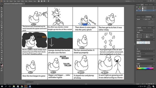

Here are both my digital storyboards for my animation. The first one shows the text which will be voiced whilst the animation plays. The second is my own annotations of whats going to be happening in the actual animation.Both versions show which words are going to be presented visually in the frame of the scene that they will appear.
0 notes
Photo

Turnaround Sheet
I made a mini turnaround sheet for my character before I did my full A3 one because there are different elements to it which I wanted to explain. When my character is underwater the idea is that the leaf which it carries around can float up and wrap around its head, producing oxygen to make a bubble-helmet so it can breathe for a short time. Similarly, the leaf can become a raft/surfboard when on water, and a glider in the air although I haven’t drawn this.
2 notes
·
View notes