
Last Seen Blogs

empress-twilight-blog
Empress Twilight
aanabear2803
Salon Bear Ana/Amaranth At Your Service
aanabear2803
Salon Bear Ana/Amaranth At Your Service

thatoneguy2390
HentaiBeta

spongebobssquarepants
SpongeBob SquarePants
Text
Project 4: Sequence
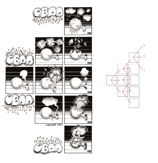
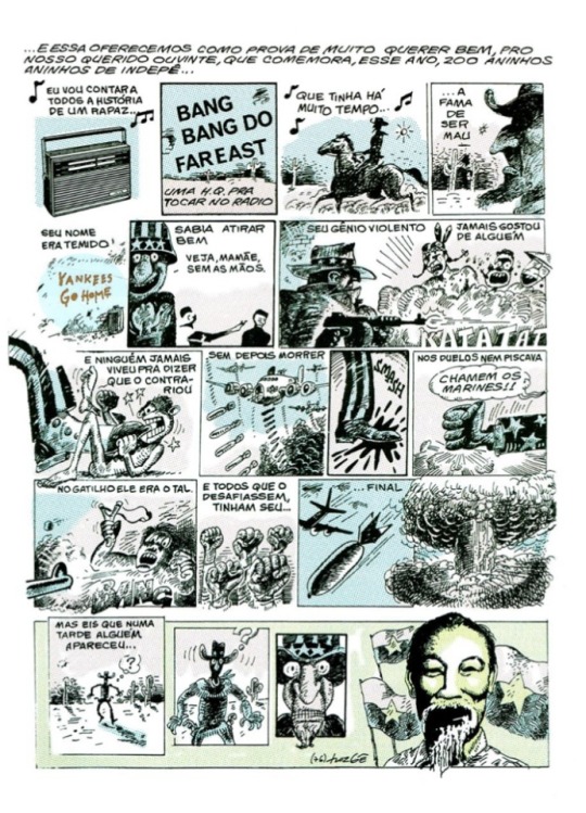
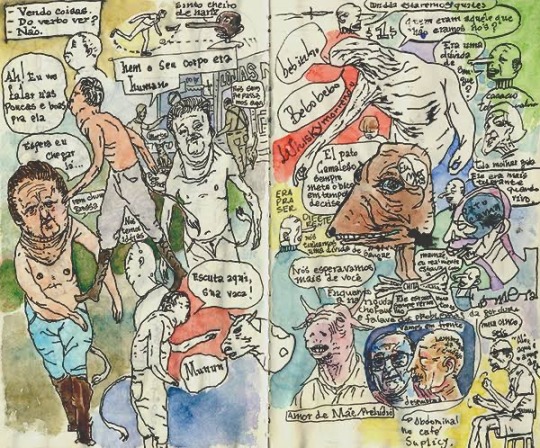
Luiz Gê
Luiz Geraldo Ferrari Martins, known as Luiz Gê, is a Brazilian illustrator, considered one of the greatest exponents of Brazilian comics in the 1980s.
He graduated in architecture at the University of São Paulo in 1977. In 1987 he went to do postgraduate studies at Royal College of Art, in London.
During the 1970s, Luiz Gê consolidated his career as a comic artist, creating the magazine Balão and collaborated with other magazines, Jornal do Brasil and the Pasquim.
The magazine Balão, was seminal for the Brazilian underground comic, a real watershed in which Laerte also participated.
It was in the magazine Balão, created in 1972, that Luiz Gê published an controversial story, but which according to him, records a series of thoughts about the language of the comics. The comic called “Oba Oba”, with only one page, proposed several reading possibilities, it was an open work.
Throughout the 1970s, he developed a series of stories that were popular with the alternative press at the time.
His artist style is loaded with an intense visual culture that makes his work unique.
The angles and perspective that he uses, as well his cinematographic expressionism, like the camera movements of Hitchcock, that he is inspired of, and even the perception and ideas of the Italian filmmaker Fellini.
For most of his life he was inspired by North American and European comics.
Tintin is said to be one of his sources of inspiration for working on the comics. Because of the framing and the feeling of living the adventures together with Tintin.
In addition to Jack Kirby himself, who has co-created several characters alongside Stan Lee. His visual narrative was unique, in addition to being able to create unimaginable characters for the time. Like the X men, and the New Gods of DC comics.
He is the author of the underground comic book; “Avenida Paulista”.
It’s a classic of the Brazilian comics, and over the years, it has become a cult and coveted object among collectors and marked the begging of a long period of departure from the comic books of one of the greatest Brazilian comic book artists.
The comic narrates a hundred years of transformation that took place at the avenue that symbolizes São Paulo’s accelerated and chaotic development like no other.
Currently, Luiz Gê is a professor of comics in the Industrial Design Course at the College of Architecture and Urbanism at Mackenzie, São Paulo.
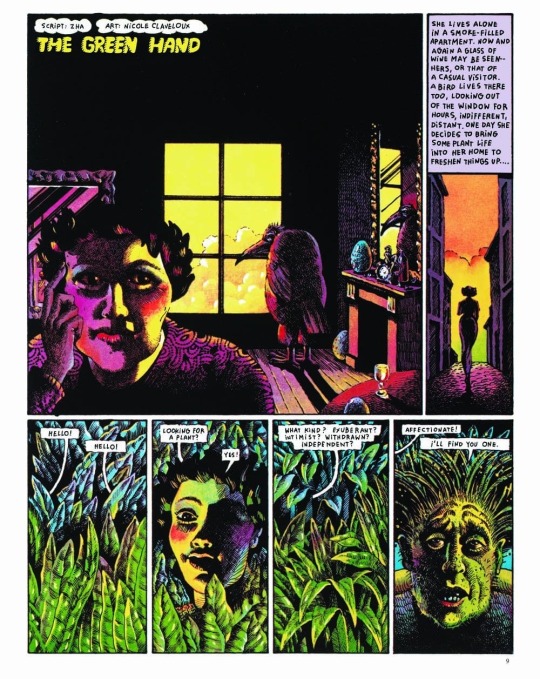
Nicole Claveloux
She is a French surrealist illustrator who has worked on several underground comic books. While there have been several surrealist women, throughout the 20th century, few are remembered on the same level as their famous males counterparts such as Salvador Dali for example.
Mixing the figurative with abstract, the everyday with the manifestations of the mind and psychoanalytic issues, she made her name among the greats of the French comic books in the 1970s, using the aesthetic of her biggest influence, the German painter Max Ernst.
In the 60s the comic artist had enormous influence from psychedelic art.
As well by the drawings of Czech German illustrator Heinz Edelmann, art director of the Beatles animation Yellow Submarine. In addition to the collages of former Monty Python member Terry Gilliam.
For few years, Claveloux contributed short comics to the French magazine Metal Hurlant ( an counterpart of the English marine Hevy Metal), which featured women features exclusively.
During this period working in Metal Hurlant, she made comics very focused on her personal interest. Having a very vivid color palette, besides in many of her comics, she doesn't use dialogue, often focusing on the characters' expressions.
And just like in Heavy Metal, many of his works were counter-cultural. Using violence, sex and drugs as the main theme. The experimentation and styling was something very present in the 70s comics as it was a time of change and revolution, trying to remove the censorship of the comics, and explore other themes.
Something that catches my attention in Nicole’s drawings is the exacerbation of eroticism. In her adorable, multicolored drawings, there is an exploration of erotic and fetishistic imagery. Nicole takes a chance and some times criticized in using a children’s imagination with genitalia, testing our sense of humor.
As the psychedelic movement, had come to an end. New references came to her field. Using the contrast between black and white is highlighted, as well as the presence of hachures and more naturalistic lighting.
Yuichi Yokoyama
Yuichi Yokoyama was born in Miyagi, Japan in 1967.
Always interested in arts, he knew since an early age that he always wanted be a illustrator. He went to the university of fine arts in Nagasaki. But after studying oil painting and other techniques, he thought that drawing manga was the style that suited his form of expression the most.
According to him, he felt “ emptiness in drawing a single picture”. He wanted to draw what would happened after that, instead of just one expression including portraits and sculptures.
He produces works that do not have lines or clear stories, featuring lines and onomatopoeia with a sense of speed, and unique characters using the style called the “Neo Manga”.
It is highly evaluated not only in Japan but also overseas, and the manga is published in Europe and United States. He says he likes to record his conversations with friends and draw while listening to them.
Neo Manga, has been highly acclaimed as a work that redefines the stereotypes of manga, but it is said that if was completely different from the original aim.
He participated in several exhibitions around the world showing his monochromatic works, which showed a different approach to manga. Focusing much more on the movement of characters and their expressions to tell a story, than simply using text, which seems to boring the viewer in his opinion.
Chris Ware
Is a cartoonist and comic book artist, who is acclaimed for presenting narrative illustrations in a form and style very different from traditional comic book.
Franklin Christenson Ware was born in 1967, in Nebraska, USA.
He grows up with the absence of a father figure, his biological father left his family when Chris was one year old and until he had reached adulthood he would not have any contact with him again.
Because his mother worked as a reporter and editor at a newspaper and his grandfather also worked as a sportswriter, Ware was able to get in touch with the world of press. In fact, his grandfather was one of the pioneers in introducing Peanuts strips in newspaper and because of that, he introduced Chris to the comic strips and started reading as much as he could.
He is mainly recognized for his work Jimmy Corrigan: The Smartest Boy on Earth, with which he won the Guardian First Book Award and was selected as one of the 100 best books of the decade by the Times of London in 2009.
Ware’s unique perspective on the language of his works was seen early in his career. The author’s first independent publications, was during his years in the college of arts at the university of Texas, drew attention of Art Spielgelman, author of the classic Maus.
Chris Ware is undoubtedly a fascinating comic book author. It’s because we find ourselves with one of the few authors who managed to bring together comics, illustration and design within a style and a way of doing things that works for him to create his comics.
The influences of Ware, was Windsor McCay with his comic strip Little Nemo in Slumberland, Richard Outcault with his strip The Yellow Kid, and of course Charles Schulz, author of Peanuts.
It was these authors who left a strong imprint on Chris Ware and who showed him that on comic page the text and the image merge and that the composition of the vignettes on the page can be manipulated by the author at will. In order to achieve the desired effect.
Also the countercultural movements in the 1960s was also a big influence on him. Hippie movement, Vietnam war, student protests, experimentation with drugs, influence of oriental philosophy and music.
Most of his characters share similar characteristics, such as the lack of a father figure, discouragement, loneliness, lack of communication, insecurity, and lack of affectivity.
Towards the way that Ware works. He limit himself on only using the computer for coloring and discard it when it comes to the use of fonts. Ware prefers to make his own fonts by hand, thus becoming a great lettering artist.
He prefers to start by drawing with the first vignette and see what paths the process has taken him on when he reaches the last one.
The break with the conventions of the comics in that it is hierarchized by the logical sequence of the vignettes. Instead, Ware in many of its pages diversifies the timelines and events that a character and everyone around him can undergo.
Multiple frames of varying sizes and shapes are packed into each page; among the bold black contours are startling shifts in scale and points of view.
Chris Ware is someone who, despite sticking to traditional techniques when dealing with the blank page, dares to experiment with new technologies in order to find new ways of telling a story.
John Romita jr
John Romita jr. is an American comic book artist, known for his extensive career in Marvel Comics and DC Comics since the 70s to the present day. He is the winner of both the Inkpot Prize, like the Eisner award. He worked with many different characters, like; Spider man, Iron man, Daredevil, Batman, Superman, Kick Ass and many more.
Son of John Romita sr., one the most famous Spider-Man artists since the 1960s, John Romita Jr. he started his career early. At the age of 13, he proposed the creation of a character to Stan Lee, who later was introduced as Prowler in The Amazing Spider-Man #78.
He began drawing sketches for reprint covers, until debuting with six page story in the Amazing Spider-Man #11 in 1977.
During his run at Spider-Man, Romita’s art style resembled many other artists of that time, like his father for example, as well Jack Kirby, who inspired a whole generation of comic book artists.
Romita stayed on Amazing Spider-Man until 1987. Then he started working at a Daredevil run, and Romita’s style began to evolve from that more traditional Marvel style to something different. His style got squarish. It was more angular, more stylistic. He mentioned, that he got that style thanks to Frank Miller’s influence.
Romita Jr, brought that style back to Spider-Man in the mid-90s, where he had a run of 140 issues, becoming the artist who worked the most with the character.
John Romita Jr. was one of my biggest inspirations when I was younger. I've always liked Spider-Man a lot, and I've always collected many of his magazines. John Romita's drawing is very different from a traditional style, and I think that was what caught my attention. Because in the world of superhero comics, the artistic style ends up being repeated a lot. Always exaggeratedly strong and beautiful people. Romita's style seems to me to be more cartoony. And I say this in a good way, because I find his characters extremely expressive and unique. His style doesn't belong to a specific period, like many artists from the 90's who were forgotten because they didn't knew how to adapt themselves on the following decades.
He also knows how to build an action scene like no one else. Always investing in close ups, and showing the specific movement that the character is doing in a very natural way. He always knows what fits into the specific scene, making frame transitions very different.
John Romita has been working since the 70s, and he never stopped. He is always been in some different title in both Marvel and DC.
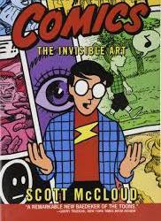
Scott McCloud
Scott McCloud is an American cartoonist and comic theorist. He is best known for his nonfiction comic books: Understanding Comics, Reinventing Comics and Making Comics, all of which also use the comic book medium. And also one of the first artists, to promote Webcomics as different variety of comic, with different possibilities than its the printed.
Born in 1960, in Boston, United States. In 1984 he published his first comic Zot !, And later another comic called Destroy !, a parody of fight scenes from superhero comics; The new adventures of Abraham Lincoln, a comic created with a mixture of digital graphics and traditional drawings; also working at some Superman comics, like: “Superman Adventures” and “Superman Strength”.
But he is best known as a comic theorist after the 1993 publication of his essay Understanding Comics: The Invisible Art.
Originally published in 1993, the theoretical study on the universe of comics in all its context provides a long historical journey (from the foundation that gave rise to comics) to establish and legitimize the means for art production.
McCloud goes back to the dawn of civilization when cavemen first began to develop what he defines as art. Not to mention the full range of what characterizes comic books- from the American ‘comics’ market to the Japanese ‘manga’ passed through the French- Belgian market (like Tintin, Asterix and Lucky Luke). And of course, it goes further, entering in concepts of iconography, structures and forms of visual communication.
I've had this book with me for a while. And he helped me a lot in terms of how to put together a comic.
Last semester I did a very amateur one, which was lacking in a traditional comic book structure.
So I ended up finding this book, and I started to have a theoretical notion, in terms of passing, the use of angles, and trying to make it clearer to the reader what is happening.
The author exposes a multitude of complex arguments with good humor and a fluid structure which is really hard to see as a theoretical book
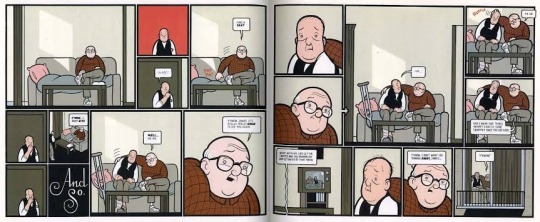
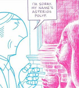
Asterios Polyp
David Mazzucchelli made his career as an illustrator, as is customary in the industry, for both Marvel and DC, working on Frank Miller’s iconic series Batman: Year 1 and Daredevil: Born Again. Later, he stopped working only in illustration and began to publish anthologies with stories of his own. However, it was only in 2009 that the comic artist fully demonstrated what he was capable of, when he published the graphic novel Asterios Polyp.
Asterios Polyp is also the name of the protagonist, a misogynist and acid architect. Asterios projects are highly awarded, but none of this projects were actually built. He lives in the universe of abstract ideas, protected from the reality of human experience behind his own arrogance. But after a Lightning causes a fire that devastates his apartment, Asterios finds himself homeless and aimless.
Asterios wanders around at dawn accompanied by the story’s narrator, his stillborn twin brother, Ignazio. Thus begins the journey of the protagonist who is forced to radically change his life.
Mazzucchelli manages to build a complete character in his aesthetic narrative, which is an interesting thing he did, in that he didn't have to rely entirely on the text.
Unit various types of “styles” of drawing and writing, forms to reveal the universe of the character without losing his style.
One of the biggest influneces for me in terms of style , is a specific moment when Asterios and his girlfriend Hana are having a discussion, and Asterios turns into a blue, perfect geometric character (implying his architectural nature) and Hana turns into a sketchy red character. this sketchy look is very descriptive in that it implies the looseness and passion of Hana's character.
The way it was made, using these hatches in red and even pinky in some moments of the story, was a style that I really liked when building the bottle. Trying to do a red shaded style just like Mazzucchelli did.
In addition to the drawing style itself, the framings themselves, which are made, often focusing the "camera" on important moments, as if it were really close ups from a movie, in addition to the open plans showing the entire environment, often depicting what is going .
A very personal work by Mazzucchelli, which has been planned for a decade, where each frame, each character with a different style has a specific meaning, is a purely visual work, but by no means is the text weak. It's just not Mazzucchelli's focus
2 notes
·
View notes
Text
Project 3: Reportage
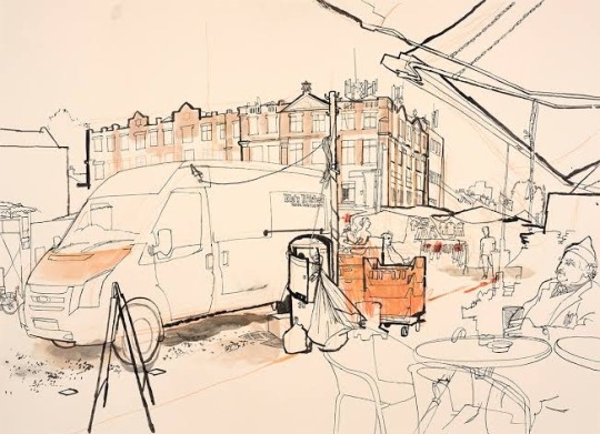
Laura Fitton
Laura Fitton is a reportage artist, educator and performer, who works at London.
As reportage artist, Laura goes to several places to make her drawings, such as; markets, allotments, community centers, football matches, libraries, pubs and cafes.
She documents the every day life in specific location. Fitton created this into a zine named Hartlepool (her hometown) By Hand.
Fitton’s works are amazing, her use of colour also portrays a sense of energy.
Each illustration on the page documents what Fitton has seen.
Focusing on the typography, architecture, people, conversations etc. Portrays there is a lot going on in Hartlepool and a lot to see.
Always with a sketchbook to hand, recording conversations that she hears, documenting time and place whenever she feels like it. This allows her to generate ideas and create successful drawings.
Also she collects a lot of objects from Hartlepool and documents the psychical aspect of the location. To create this sensation that we are at her hometown.
Fitton's style, despite being more minimalist, doesn't mean it's weak. On the contrary, her drawings have a high spirit, the way she represents the people around her doing different activities is very interesting, as she brings great personality to them.
As she is interested in the mundane moments, the absurdness of everyday life. She often uses slogans and signage in her work to create new sarcastic narratives.
Draw in different environments is not exactly my thing. I'm impressed with Laura Fitton, that she has the energy and creativity in creating compositions from everything around her.
I find it interesting because it makes me want to explore the outside world more, instead of always looking for references on the internet.

Lourenço Mutarelli
Multiple artist, he is a writer, actor, playwright and author of comic books.
Mutarelli was born in the city of São Paulo, and was interested in art from an early age. After completing high school, he attended the College of Belas Artes at USP and worked three years at the studios of Mauricio de Sousa. He was fascinated by the quantity of magazines that emerged in the 1980’s, he tried to publish his stories without success, as they were considered too “strange”.
He started his production in comic books through fanzines, distributed by the author himself.
One of the greatest influences of the comics that Mutarelli mentions, is Tintin.
On a interview he told the importance of Tintin in his life.
“ When I met him, I was very young; and whenever I read, I go back to that same frequency. It’s a fictional world, a cool thing, something that totally disconnects e from bad and difficult things.
Perhaps the best moment of my childhood was reading Tintin”.
In addition to Tintin, he also cites Robert Crumb, Will Eisner, and Argentine illustrator Jose Munoz, who he considers the best art finalist of all.
The art in Mutarelli’s drawings is difficult to qualify, something that emerges between Robert Crumb’s comics and Francis Bacon’s paintings.
Mutarelli says all the time that his creating something, is his treatment and that though it he becomes a better person, regardless of the acceptance of the work by other people and even an alleged impossibility of publication.
I've known Mutarelli for a while. His unchildish drawings have always intrigued me. Very heavy in shading using ink, for me it was always intense to look at your comic zines.
In this project I also want to do the final drawings in the concertina in black and white, using ink.
In addition, I had the opportunity to see your sketchbooks.
These collection of sketchbooks bring not only sketches, but texts and images related to literature projects, film scripts, the existential and practical routine of Mutarelli, comic book drawings and a dose of nonsense humor.
Always original, Mutarelli takes the reader to the abyss of conscience, he doesn’t mind tracing the most deplorable profiles of our society. His works stand out for the raw image of the human being, disturbing the reader, but making him reflect on our broken society.


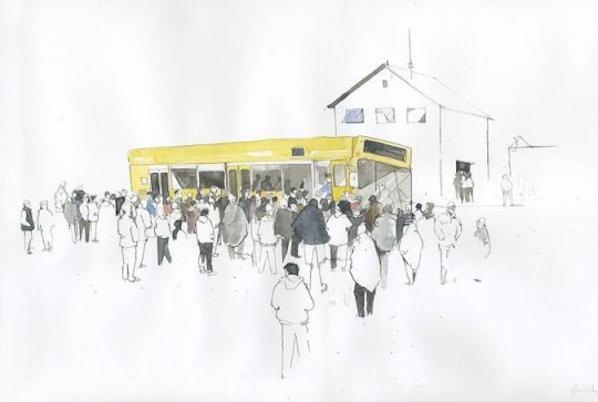
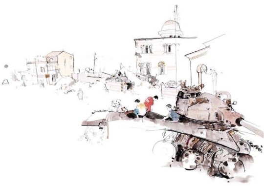
George Butler
George Butler is British award winning, artist and illustrator, who is specialized in reportage drawings, and it mainly addresses conflicts that currently occur, in countries of the Middle East,Africa and Asia especially.
His drawings have been published by The Times (London), New York Times, the Guardian, BBC and CNN.
Butler believes that reportage drawings can offer insight and value, and communicate in ways that photography cannot.
Butler traveled to refugee camps in Syria, Iraq and Afghanistan.
What he always takes with him are some brushes of different sizes, ink , watercolor, leaves and a clipboard.
He had many stories from the refugee camps, like people sitting next to him and asking to show him around, and sometimes just observing him drawing.
He sad that this is the only way that he can get inspiration from,by sitting with someone, and trying to have connections with them.
When he arrived on Afghanistan in 2006 alongside with the British army, Butler had no experience in the War zone, and because of the Afghanistan conflict, he was restricted to draw only in the bases and surrounding areas. He thought that was perfect, because while the photographers were at the action zone, Butler drew British soldiers waiting to fight and interacting with each other.
He enjoyed doing that, because it made him forget about the restrictions of the studio or that all the drawings should turn out well.
In 2012 Butler went to Syria where he documented the conflict, the rebels and their way of life.
Destroyed houses, destroyed buildings and roads where conflicts have taken place, were where Butler went most of the time. Also children playing on abandoned tanks and people walking around on the streets.
I find it interesting how Butler manages to create such beautiful and vivid paintings and illustrations of such terrible moments.
But more than that, the courage to venture out into the world and leave the comfort of your studio is something I would like to dare more.
This last week I was tested to leave the comfort of my drawing table and go out on the streets of São Paulo drawing different things.And how embarrassed I am to draw around people.
The naturalness that Butler has in these places, as if he were in harmony with the environment.
When I see this, I feel that my challenge of drawing on the streets seems very small compared to Butler who had to crouch in mud drawing and risking his life.
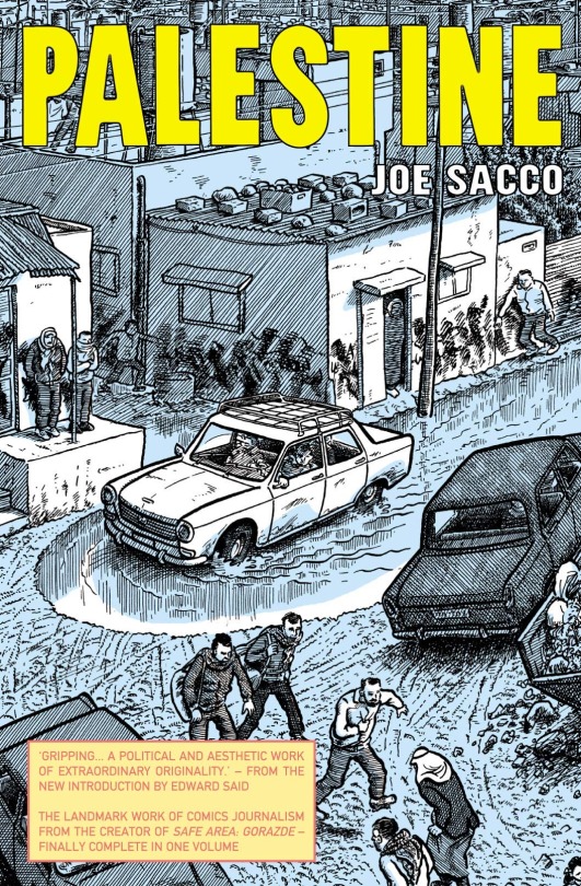
Joe Sacco
Joe Sacco is a reference in comic books, and also in journalism. And he is quite good in mixing those two ideas together. He is also an author of books about the conflicts between Palestinians and Israelis in the Middle East, the war in Bosnia, the arrival of African refugees in Europe and the struggle of Indigenous peoples in Canada.
Born in Malta, a group of islands south of Italy, and based on the United States, the journalist and comic artist has delivered, a career’s worth of first hand reportage from some of the world’s most hostile areas through his comic book aesthetic, portraying life in a war zone, with a beguiling humor that manages to camouflage some of the problems that these people go through.
He wanted to work with comic books since the High School, and he managed to work some years after he graduated. However after a number of dissatisfying stints working at publishing companies and small newspapers, joe’s frustration led him to Palestine in search for a more complete information. In 1991 and 1992 he spent time in the Gaza Strip and West Bank regions, drawing the stories of people he encountered.
And after so long collecting so many informations in the Gaza Strip and the Palestines about their real situation, he published in 2001 his graphic novel "Palestine".
Palestine has been compared to Art Spielgelman Pulitzer Prize winner Maus for having the ability to navigate in social and political subjects matter.
Something that Joe does, and I really like it, is mainly mixing his illustrations with international politics. I've always tried to understand what's going on out there, I'm very interested in other civilizations and cultures, and many of these countries with rich history are been swallowed by violence and corruption.
But what impresses me the most about it all, is Joe Sacco mixing it with the comic book aesthetic, which is very reminiscent of Robert Crumb's style.
Sacco has often been called the first comic book journalist, and he is certainly the best.


Lucinda Rogers
Is a British illustrator and artist, who works on newspapers, like the Times, and she is specialized at reportage illustration.
Rogers is known for drawing cities, particularly London and New York, and as reportage artist, draw directly from life.
She immerses herself in an environment and records straight from eye to paper, which give her drawings a particular spontaneity.
She has a simplicity on the line with a touch of colour to highlight parts of the image.
She also has a very particular taste on drawing people. Where she represents them on their everyday life; at work, shopping, or simply walking on the streets.
In a interview she explains why prefers on drawing outside in streets, rather than her studio.
“ I draw on site because it’s just more interesting to be there on the spot. The response to something directly in my eyes goes straight into the line of the page. The process is partly about recording of a particular time. Things move, things change, and sometimes the picture has to respond to that”
As a newbie to reportage illustration, I'm still learning how to behave in environments like this. How do I get used to drawing standing up many times, in addition to having to deal with the people around me.
I find it interesting that she follows an approach very similar to that of George Butler, in just painting the most important elements of her illustration, in addition to taking hours to sometimes make just one drawing. She says that she prefers to do her work as calmly as possible so that she can be as faithful to the environment that she draws.


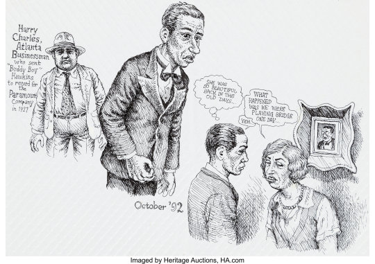
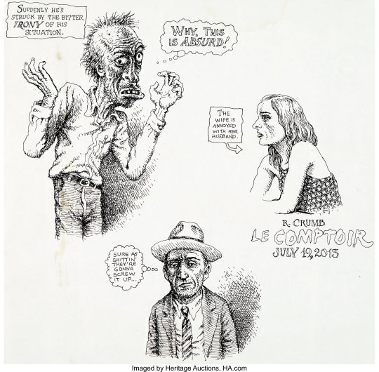
Robert Crumb
Robert Crumb is an American cartoonist, who is considered one of the pioneers in making comics about counterculture, which discussed certain taboos in society. He mainly deals with sex, where in many of his pages he puts out all his sexual desires, and his experiences with women during his life.
Born on August 30, 1943 in Philadelphia, USA, in a Catholic and conservative environment; with a father of violent manners (broke his collarbone when he was five years old) and a fervent mother tortured by guilt, Robert and his brothers had to learn to flee quickly, and for him was the comic books that he loved so much.
In 1958 he discovered Mad magazine, becoming fascinated by people like Harvey Kurtzman, Basil Wolverton and Bill Elder, who inspired Robert and his brother Charles to create their first fanzine, Foo Crumb Brothers Almanac: Satires and Parodies.
At the same time, the fifteen years old Crumb begin to develop on of its most famous characters, Fritz, The Cat.
By devoting all their attention to this fanzines, the Crumb brothers social lives, was reduced solely to teaching their fellow students their work and selling it around the neighborhood.
1962 The entire Crumb family moves to Cleveland where Robert finds work as an illustrator at the American Greeting Card Company, where each employee draws one card after another.
To get rid of similar and tedious routine, he began to make his first paintings in some underground publications, in addition to producing illustrations and weekly strips for the periodical magazines.
Crumb began to contribute artwork to several “alternative” publications, and in 1967 he moved to San Francisco.
He uses the underground style that is characterized by an open language and contestation of the global reality that emerged after World War II. With extremely expressive and surrealist drawings, always addressing social, political and environmental issues to oppose the destructive action of man in modernity.
1968, Crumb would publish the first issue of his fanzine Zap Comix, considered as the birth of the underground comics or comix. During this period, Crumb continued experimenting in the drug world, getting in return some bad experiences with LSD, which led him, on creating on of his most famous characters, Mr Natural.
Crumb discusses the values of contemporary American society in stories that dealt explicitly with such taboo subjects as sex, racism, and drug use.
I've known Crumb's work for some time. His style extremely crosshatched and loaded in nanquin always caught my attention.
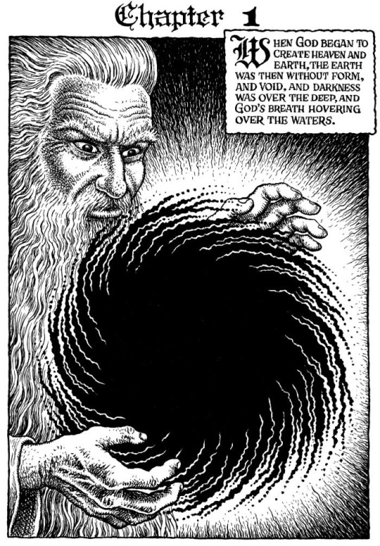
Crumb can do works that can infuriate the reader, showing his perverted side that can’t be to everyone's liking. But also doing very interesting works like Genesis.
Genesis, a work that takes seriously the book that “founded” Western culture, which highlights every passage written, rewritten and edited so many times over the centuries.
Crumb, before starting the comic, explains to the reader how he chose the text to be used in this work, taking into the various existing versions of the Bible, and also emphasizes that he uses it in its entirety, a proof of respect for what he would illustrate.
Crumb continues to write and draw, married to Aline Kominsky, who is also a cartoonist. They both had a daughter called Sophie , who is also comic book artist.
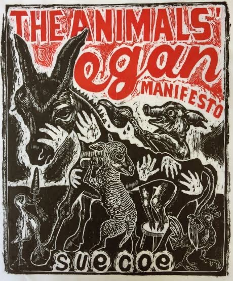
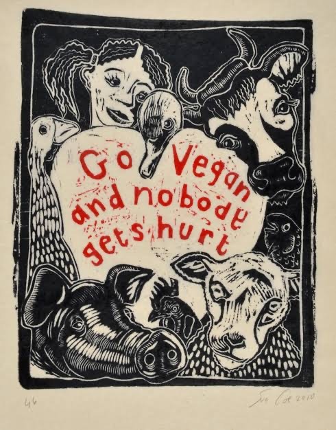
Sue Coe
Is a English artist, that uses politics and activism as it main approach to her works.
Born in Staffordshire, England, she grew up near slaughterhouse, which instilled in her a lifelong passion for animal rights activism.
This political sensibility characterizes Coe’s work, which she often discusses about animal rights and other social issues.
Her commentary on political events and social injustice is published in newspapers, magazines and books.
But Coe’s target in the painting is also the bleak misery wrought by poverty and drug addiction.
Coe’s illustrations, drawings and prints, are often related to the meat industry. The drawings are made in the form of comics.
Her major influences include the works of Chaim Soutine and José Guadalupe Posada, Francisco Goya and Rembrandt.
1995 she published her most important book, called Dead-meat.
She spent years visiting slaughterhouses and meat farms, in the U.S, Canada and England, all the while drawing and writing about what she saw. The result is a fascinating and revealing portrait of the institutions behind the meat we eat.
Coe’s book is political, and she clearly hopes it will make the reader think twice about meat consumption
The book contains haunting charcoal sketches, Sue gives readers a disquieting visual of her her visits to numerous slaughterhouses.
Thorough this book is very hard to get through because of the insane reality of mass slaughter, it is our responsibility to see and understand exactly how we get the food in our fridges and on our dinner plates.
Coe’s images have the urgency of someone trying to save a life, and in a way that is what she is doing - drawing attention to the death and exploration that happens daily all around us.
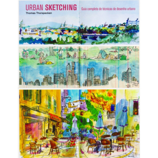
Urban Sketching by Thomas Thorspecken
Thomas Thorspecken is an American illustrator and animator, who attended to the School of visual Arts in New York City. But he also had worked at Walt Disney Studios for 10 years as an lead animator.
But in recent years he has decided to devote himself to passing on his knowledge as an illustrator and animator through book series mainly focused on drawing in many different environments.
In Urban Sketching he teaches people like me how to draw with perspective, without necessarily needing a ruler, but drawing by hand without much perfection in the lines.
I used this book for a while mainly to give me more comfort when drawing in different environments. Because I can't always depend on my desk and my Google references to do my projects.
Thorspecken teaches how a person can make observational drawings in a few minutes, often trying to draw without looking at what he is doing to simply leave the pencil free in his hand and not worry about making a faithful copy of what he is seeing.
He also uses watercolor as the main technique, where he manages to give a lot of life to these drawings, which have, at first, very simple and even imperfect contours and lines.
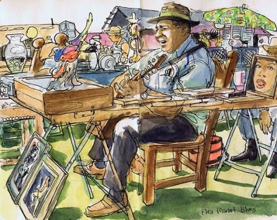
But it also explains how to draw something or someone more calmly.
He shows that you cannot rely many times on looking at the person or object in question, but keep in your memory the details as much as possible of your reference. And trying to get your own interpretation of what you're looking at.
In addition to the book's own drawings, Thorspecken also puts forth dialogues and thoughts he had during the time of drawing, he mainly likes going to fairs and events where he can meet the widest possible variety of people to draw.
He encourages the reader to take more chances, and not be afraid of making mistakes in the drawing process, because everything is a learning experience, and you can't expect to do something amazing the first time. He also suggests using a variety of materials, not only white, but the nanquin itself for example which is also perfect for use in open air environments.
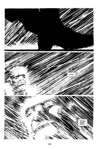
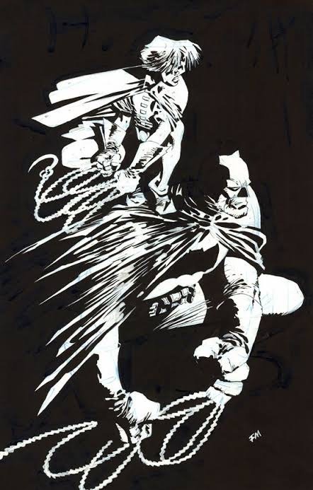
Frank Miller
Is an American comic book artist who is considered one of the pioneers of comics, and has worked with several well-known characters such as Batman, Daredevil, Wolverine and Spider-Man.
With drawings marked by high contrast and a darker language, Frank Miller made room for the maturation of the comics.
From a young age he was a fan of comics, and had a letter published by Marvel in Tigress magazine in 1973. Five years later, he drew the Twilight Zone, based on the TV show. And in the 1980s, Miller’s career took off, with Daredevil stories with a more mature and darker tone, which the character didn't have before. Just as in the '80s he worked with Batman on The Dark Knight Returns, taking a heavier approach that defined the character forever.
Miller during his career possessed a variety of styles, which transitioned from a much more traditional style when working with Daredevil and Wolverine. And then he used a more square style, in which all the characters seemed to be inside a box, due to the lack of flexibility.
It was much criticized by the public, for choosing a style so different and even not very pretty as it was before.
But I tend to prefer Miller's more square style, because I can feel more fluid when making his drawings, where he doesn't really care if his characters are well done or not, but he manages to capture me with his visual narrative. and extremely detailed. Something that in your early work I didn't feel it. Seeming to me like it was something Miller was forced to do, having to follow the most salable style of the day.
But the style loaded with heavy shadows and ink, in black and white, was what influenced me to make the comic.
His work best known for following this noir style was Sin City, published in 1991.
Miller wanted total control, so he wrote, drew, lettered, and didn’t even let the colorist get near to his pages. In addition, the black and white underscored the noir atmosphere he wanted in the stories - even without the slightest shades of gray.
As Sin City is a heavy and violent story, and made to show how bad the atmosphere is, I would like to bring in my comic mainly in sadder and heavier moments in my history, this darker style, using even the same style of shadows.
In addition to the angles that he uses in different perspectives, framing mainly in his characters, something I'm used to doing, and in this work mainly, where I try to make a contrast between the character and the setting.
Miller's career was full of ups and downs. It had its heyday in the 1980s and 1990s, with comics of different styles and approaches.
But during the 2000s, his career went from bad to worse due to certain political positions, which tarnished his name.
An example of this is the comic Holy Terror, where he portrays a racist view of the Arabs as terrorists and barbarians, who just want to see the world burn.
He still makes some commissions for comics, but he doesn't have the same strength like before.
Os Japoneses Célia Sakurai
It’s a book written by the Brazilian Japanese historian and anthropologist Célia Sakurai.
The purpose of this book it’s to take a look at the history, from formation, through the myth of the Japanese miracle, to the WW2, and even the pop Japan today.
The first part of the book talks about Japanese customs, even their relationship with nature, which is very strong.
The begging of the book is written in chronological order, from the Paleolithic period to the end of the 20th century. The last third of the book describes in short chapters topics specific to Japanese culture, such as the role of the women in society; immigrations, mainly to Brazil; language and writing; the life of a samurai warrior; and ending on contemporary Japan and the western influence on the culture.
The book is abundantly illustrated and contains many maps as well as a lot of factual information about the geography and economy of the country.
I think it's an extremely interesting book, because Célia Sakurai describes everything that the culture of her ancestral country has. However, I thought that at first it was a little difficult to read the book. Because she decides to describe the entire Japanese mythology, which is very complex, and difficult to conceive of images about certain situations.
But passing that part, she manages to captivate me in describing all the beauty and history of the great samurai warriors, who lived to serve the emperor. In addition to interesting and absurd facts about Japanese soldiers in World War II, who also lived to serve the emperor.
But she devotes an entire chapter talking about Japanese immigrations around the world, and obviously highlighting Brazil, which is the country with the most Japanese immigrants in the world.
Talking about their arrival in 1908 at the port of Santos, where they were promised several things, but in the end they were deceived.
In addition to the injustices they suffered during the second war, because their compatriots were on the wrong side, and thus suffered at the hands of the Brazilian population and the police itself.
It is a book extremely rich in content, where it has several interesting moments to be discussed, but it is also a bit slow some times.
Book Arigatô
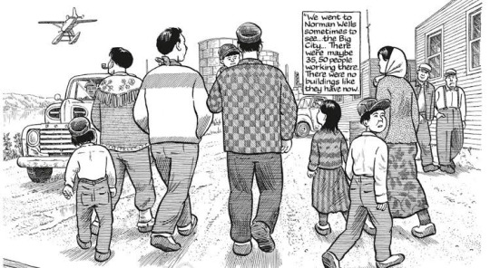
Is a book, that tells the trajectory of Japanese immigrants since the arrival of the first Japanese ship, in the port of Santos, 1908. The hard life in the fields until the consolidation of the Japanese- Brazilian community.
Japanese immigration to Brazil, began on 18th June, 1908, with the arrival of the first Japanese ship, Katsato Maru, in the port of Santos, bringing 781 japaneses. Single people were not allowed, only married people with children.
At the end of the 19th century with the Meiji Revolution (1868), Japan opened up to the world and changed its social organization.
The government began to encourage people, to go to the Americas and sick opportunities to work on the fields.
And with the end of the slave trade, in 1850, the price of an enslaved person increased and planters began to hire Europeans, and later Japaneses immigrant labor to make up for the lack of slaves.
Without speaking the language and without any infrastructure prepared to receive them, the Japanese immigrants realized that they had been deceived.
With patience and determination, the Japanese manage to farm in the countryside or open business in the city and stabilize their lives.
During the 1940s , however the scenario would quickly change.
Brazil supported the United States and England in WW II, while Japan fought alongside Germany and Italy.
In 1942 a series of laws will harm Japanese communities, such as closing of schools, associations, sport clubs and the use of Japanese symbols.
The myth was created that the Japanese were incapable of assimilating the National culture and would end up forming racial cysts within our country.
Furthermore, there were denunciations that Tokyo had secret plan to dominate Brazil. During the 1933 constituent, an intense campaign to ban Japanese immigration was put into practice, with anti Japanese intellectuals seeking to win public opinion.
Even with this dark stain in the history of both countries, the participation of Japanese immigrants was immense for Brazil, which left 20th century being considered one of the countries that developed the most in that century, ceasing to be a nation whose territory was little explored at the beginning of 1900, to an urban and industrial power, in the 2000s.
The Japanese explored regions previously despised by Brazilians, creating cities from the coast to the interior, using their most advanced techniques in the countryside and fishing.
That's all I was able to get out of the book, it was very interesting research to do. As much as it was not really necessary to write a text with everything that happened to the Japanese in Brazil, I would like to expose everything I learned from this book, and also from other sources I used.
1 note
·
View note
Text
Project 2: Editorial Researches
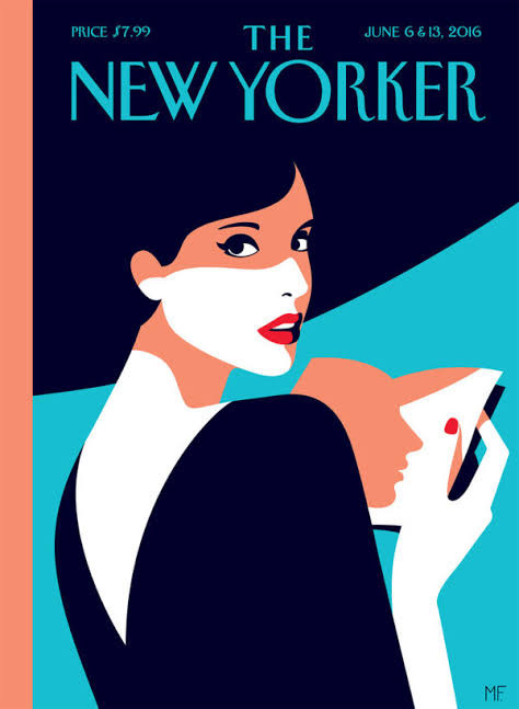
Malika Favre
Malika Favre is a French illustrator and graphic designer who lives in London. She has a very particular art style. With her bold and minimalist style, which is usually described as pop art.
In her work, the use of space and color stands out, in their positive and negative formats; whose beauty has established her as one of the UK’s most sought after graphic artists.
Among with her most outstanding works are the alphabet of the Kamasutra, and numerous covers for American magazine The New Yorker.
A graduate from Paris National Art school, since 2004 she settled in London and attended the Surrey Institute of Art & Design.
In her drawings she has developed a visual language that is characterized by simple structures, the combinations of geometric patterns and the use of color contrasts, in which elegant designs, female bodies, and faces, usually appear.
Malika Favre’s images modify the intellect, sometimes through the minimal forms she creates and the way they flow into each other; while in others evokes optical illusions with repeating lines and patterns.

David Colman
David Colman is a famous illustrator, who was born on 1976 in the United States.
Illustrator, designer, and story board artist known for his work in animation with several major companies including Disney, Sony, Paramount, and Nickelodeon. Often specializing in drawing animal figures. He posts daily on his Instagram, sketches and drawings made with marker pens, oil painting and even with charcoal, of his extremely expressive animals, done with his energetic and rough lines.
He first began working within the animation industry in 2003. After working with several major companies including the Jim Henson Company and Blue Sky Studios, he turned to visual development and fine art. But David started to appear to the public in 2010, when he went to Paris to present all his projects and ideas, and since then he started to work for large animation studios, such as Disney itself, where he made several collaborations.
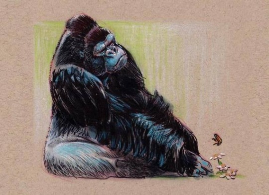
I have been following David Colman's work for some time. What I really like about his drawings is that he makes his animals extremely caricatured. He likes to play with the proportions of animals, always making a gorilla for example, with a very large body but extremely small hands. Or even a tiger with a flat head and a very protruding chin.
His drawings may not be realistic, like several naturalists, who are always keen to do something extremely photographic.
But I don't think that's necessary for Colman, as he's a cartoonist and an animator, and his goal is to exaggerate and make something much more fun and colorful than just a photograph.
He is a big influence for this project. Because I intend to draw animals with the greatest possible dose of humanity and humor. The expressions that David puts on his animals, in a mostly comic way, is something that really catches my attention.
I want to do something that has a good mood, that my animals are very expressive.
David is currently engaged in various animated film projects, and spends a good part of his day drawing in his office or in the woods near his home. He also has a passion for fishing. Who he always go together with his wife and his two daughters.
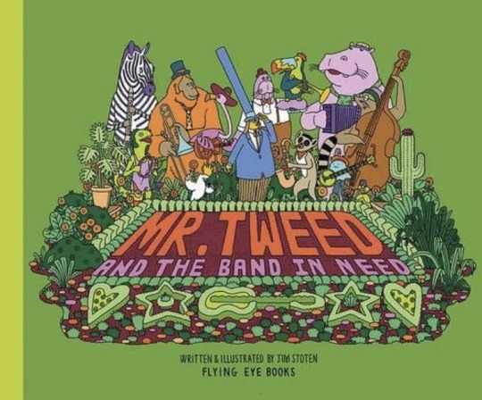
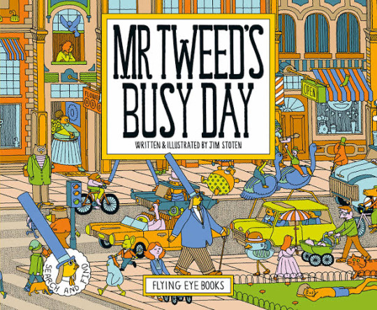
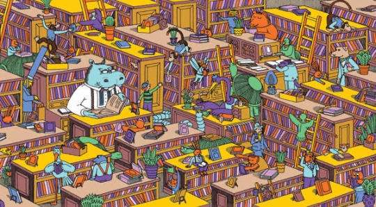
Jim Stoten
Jim Stoten is a British illustrator known for creating extravagant illustrations, with vibrant colors, and lots of bizarre elements present in his drawings.
His illustration world spans to comic books, clothing, music, artwork, printmaking, with his touch of psychedelic influence.
Jim started drawing at a young age. He said that he spent a lot of time in his room when he was 18, drawings his characters and also cutting parts of his favorite songs from the tapes, and playing over and over.
One of his major influences on his drawing style, was the animated movie of The Beatles, “Yellow Submarine”. Which has Jim psychedelic and colorful style that he would use for his entire career.
“ When I watched Yellow Submarine to the first time, I was 20. It was like being allowed to watch dreams that I had in the past. The characters and the landscapes were familiar to me”.
Stoten sad that he had watched the movie only one time, because he felt that this experience of watching Yellow Submarine, will never be repeated, so he keeps the first watch as a great memory. Also he did not want to copy the entire style of the movie.
Also very inspired by music, Jim has always been a lover of vinyl and 80s bands.
One of his best known works in the world of illustration is his character, Mr. Tweed.
A character created in a series of children's books. Where children are encouraged to find band members, who are lost in crowds (in the best Where's Waldo style).
The books show Stoten's style very well, putting all his passion for music and colorful characters.
Always putting a piece of his favorite bands in cartoons, like David Bowe, and a band called Jawbone. A band made up of just one person, who plays different instruments, from guitars to drums.
The reason I chose Jim Stoten was because in this project, I'm looking to put a kind of bizarre or surreal element. Jim manages to create extremely lysergic illustrations,with powerful color use and a very particular style, that looks like it was made in the 60s.
I want to create something that is totally weird, maybe putting humanoid animals, wearing different styles of clothing.
In Mr Tweed's books, he has bipedal animals characters wearing clothes and walking the streets like normal people. This is something very interesting that he put in, because it puts a fantastic tone in his books, even comic.
He currently lives in a flat in London, where he has several projects for children's books, which he will launch soon.
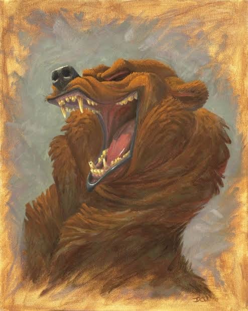
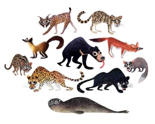
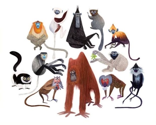
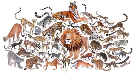
Brendan Wenzel
Brendan Wenzel is an author and illustrator, specially regarding wildlife.
Having an affection for art and animals, he has been drawing since he was child, and was encouraged by his parents to follow the artist career. In 2003, Wenzel graduated from Pratt Institute. His work has appeared internationally in magazines, animations and in several children books.
His first project as both author and illustrator, was in “They All Saw A Cat”, released in 2016.
They All Saw A Cat explores what a cat might look like from the perspective of various animals. This is such a simple, but beautifully illustrated idea and contains numerous lessons, for children.
One interesting characteristic about Wenzel drawing style, is the fact that all his animals have gigantic eyes, and cartoonish expressions, which reminds me of another, illustrator for children’s book called Lauren Child (she created a famous children’s book who turned into a television show called “Charlie and Lola”).
Brendan Wenzel has traveled to jungles, savannas and everything in between in search of fascinating animals and has teamed up with many groups working to preserve wild places and creatures around the world.
Nikolai Senin
Is a Russian illustrator and graphic designer. He is specialized in drawing wildlife, and he is also a experienced editorial illustrator.
Nikolai has been drawing, since the childhood, where he had a deep passion for animals, and he say on interviews, that he trained to draw wildlife, watching documentaries, looking at pictures, and going to the zoo.
For a long time, he has been working as designer, mostly for headers for websites and magazines. But not so long ago, he decided to devote himself to illustration completely. And started working for Illustration X, a international agency.
He’s main tool, is the photoshop. He creates mostly animal compositions, using a very flat color palette. Despite this, his images are powerful for showing the suffering of various animals around the globe.
He makes his illustrations for several wildlife magazines, showing mainly the animal's need for the environment, and the big problem if it got extinct.
Nikolai further increased his repertoire, mainly traveling to several countries, and visiting several national parks, where he met many people who care about animals, and who know a lot about preservation, and they try to popularize ecology around the world, for people to understand the importance of it.
He is one of the most sought after artists when it comes to preserving wildlife. He is always producing, always drawing some animal on his tablet. He has a passion mainly for big cats, where he always donates money to big institutions that rescue tigers and other cats, like The Black Jaguar White Tiger institution in Mexico.
I think it's important for illustrators to pass on messages in their works. After all, the image can be more shocking than the words themselves. And that is. something Nikolai does very well. His illustrations are inventive and shocking. Besides having a unique charm with its vibrant colors.
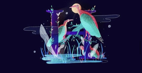
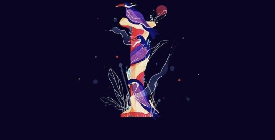
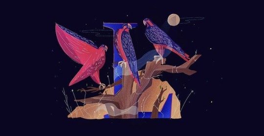
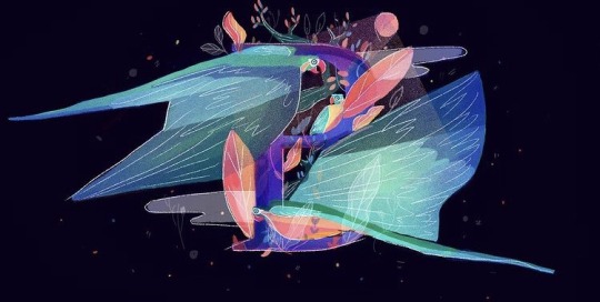
Komal Pahwa
Was born in Udaipur, India and is now based in New Jersey. She is an illustrator and graphic designer.
Her work is elegant, often using vibrant colors that greatly exalt her Indian origins.
Besides also having fun works and with her imagination running wild.
She works mainly in the editorial illustration part, where she has already made posters for several clothing brands, even for food.
She has a style all her own. All shapes and colors together seem like a dream. She herself says that she gets a lot of inspiration from her daily life, trying to mix the energy that her physical activities bring, such as handball and hicking, with her own culture, which is very interesting.
More recently, she has released a series of photoshop illustrations with different birds from around the world that are endangered.
These illustrations are extremely colorful and vibrant, showing birds around the letters of the alphabet.
She says she has a great interest in birds. Always when she was little, her parents took her to the zoo a lot and she says she has always been fascinated by birds. Because they have different shapes, sizes and colors.
Since then, she has been putting these magnificent birds in her illustrations in order to show people which birds are at risk of disappearing.
In addition to the animals themselves, she has a great passion for dancing.
She says she has been dancing since the age of four, and she will never want to stop, as she always leaves her in a state of inner peace.
Komal has an extremely active life and several passions in life.
But this is all the fuel to make your illustrations. She says she can't stay stuck in her office looking for references to her work. She likes to go out into the world and look for her sources of inspiration.

Charlene Chua
Charlene Chua is an illustrator from Singapore who moved to Canada in 2007.
Her illustrations are mainly aimed at the children's audience, where she has worked mainly with books, but she has also worked with magazines, packaging, and advertisements.
She works with several types of tools for her drawings. She uses computer programs like Photoshop, but she also enjoys working with pencil, watercolor and ink.
Her style is very graceful, and sensitive, always making illustrations with themes and messages for the children, often talking about personal situations, about growing up and certain daily experiences.
However a passion that is very great, and is evident in his work, are his charismatic animals.
She has a very hard passion for Canada.
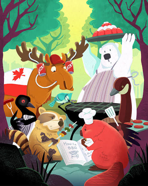
She describes that much of her creative process comes mainly from walking around the woods near her house. There you always find some very remarkable animals of the Canadian fauna, such as beavers, deer and even bears.
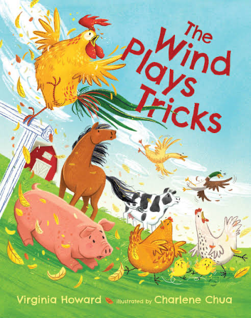
Charlene has always been very fond of animals, and often likes to share her passion in a very humorous way, as in the book "The Wind Play Tricks".
She mainly likes to represent her animals in the most humane way possible. Always making them with very catchy and even funny expressions.
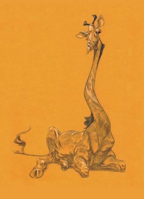
Something I'd like to bring into my work, it's mainly this humor part. Because like this article about giraffes is somewhat comical. So I try to represent the giraffes in the funniest way possible.
Its smooth and soft line shows a lot of delicacy when making her drawings, and it's something I try to do in my
drawings, I would like to make something more colorful and even sweet.
I want to represent animals as sympathetic figures, but also humorous, not leaving them with a totally animalistic or realistic form, because it can lose some of this sympathy.
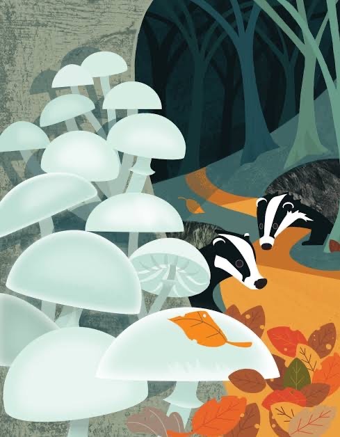
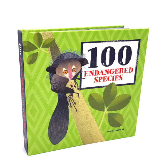
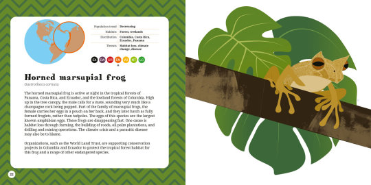
Rachel Hudson
Rachel Hudson is a British illustrator based in the city of Hampshire. She specializes in drawing wild animals, always trying to represent them in a very lively and beautiful way, and the habitat itself is always done in a very colorful and stunning way.
She is an editorial illustrator so she always puts her animals on business cards, packaging, flyers and children's books.
She has a degree in Anthropology of Art, studying specially societies, in addition to helping to harmonize nature and our world.
She worked in nature reserves around England, and visiting neighborhoods that were close to the woods, teaching people not to kill small animals like rabbits and foxes, which are essential for the environment.
She has a very strong connection to nature and she conveys a lot of this in her own work. Creating posters or magazine articles talking about the importance of certain animals to the environment and that they should be left alone.
She creates images which portrays the simplicity and the realism together, as she tries to capture the accuracy of the environment. And the result is totally childlike style, which she reflects with the authenticity while working to a minimalist approach, suggests the style that she wants to use.
She is not interested to work with shape, movement and behavior. She likes the sense of humor on her drawings.
Something that I really like about the way she creates these drawings is creating all this composition between the animal and the environment. Where she seems to granulate the environment more, putting textures on it, and the animals are less detailed, not that it means the animals are simpler, quite the contrary, she manages to create a fidelity to the animals' appearance and looks that is very realistic .
Observational sketches Rachel makes outdoors help her start to determine composition before she returns to her work bench in her studio where printmaking and mark making add texture and depth to the design.
Although I want to bring something more cartoony to my work, I really like the compositions she creates, I would like to explore mainly the digital tools (the artist's main tool included) and create a composition different from what I'm used to, trying to bring a certain charm for my work. Maybe make the animals less textured and make the environment more detailed.
0 notes
Text
Project 1: Record Covers Research
note: Both Klaus Voormann and Jamie Raid, were researches for an initial ideia of mixing illustration with collage. But this have changed during the process of the cover.
Klaus Voormann
The son of a doctor, Voormann was born on April 29, 1938, in Berlin, Germany. He studied classic piano at a young age, but his parents decided that he should study commercial art in the Art college of Berlin.
He moved to Hamburg where he started working as a commercial artist, graphic designer and illustrator before completing his studies.
Klaus Voormann left Germany for London in the early 1960s to work as a commercial artist in advertising agency. He was invited to live with George Harrison and Ringo Starr in they apartment on Green Street, although he later rented an apartamento on his own.
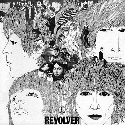
In 1966, Voormann returned to London and John Lennon invited him to design the cover for the Beatles’ new album. He spent a few weeks drawing ideas.
He used pen and black ink to create four large line drawings of the Beatles. He then combined the drawings with a collage of black and white photos taken by Bob Whitaker, who’d shot the infamous “Butcher Cover” for The Beatles. Voormann also included personal photos contributed by the band.
I'm a big fan of The Beatles. I have a great affection for the band, and especially when it comes to their history.
And the cover makes total sense with what the band represented at that time.
They were alternating their style and their lyrics. They were ceasing to be the band of the four boys from Liverpool with songs dedicated only to love. And they were wanting to try something different, something that goes with the 60s.
This is something I plan on doing in my album cover work, because I've always enjoyed working more with illustration. But I don't want to keep reusing the same techniques in another project. So mixing with collage is perfect for making something different. And for me the first album that used this kind of technique is for sure Revolver.
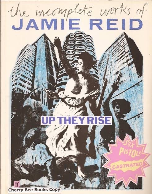
Jamie Reid
Jamie Reid was born in 1947 in the Croydon district of London.
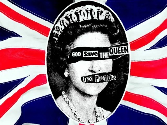
He is best known for making the cover of the Sex Pistols album “ Never Mind the Bollocks”.
He came from a very politically sensitive family. His mother was a firm believer. And his father was a financial editor of newspaper and the whole family were steeped in socialism.
Reid himself was politically active from a young age and got involved in the student protest movement of 1968. He was together with his friends, including Malcom McLaren one of the people responsible for the success of the Sex Pistols, along with his wife Viviane Westwood and Reid himself.
His record designs ushered in a completely new approach to album art; his typography, blustering cut and paste newsprint, mixed with ink illustrations, still
Instant signifier of “Punk”.
He had a particular way of working. He had to first adapt the spirit of the punk movement to the technical possibilities of graphics, promoting the democratization of the self-management process and eliminating the division between expressive and creative ability, and the merely everyday.
One of his most famous works is the artwork for the Sex Pistols’ single God Save the Queen. It was designed in 1977, during the height of the punk music scene and in the year of the Queen’s silver jubilee, making it a very topical and controversial piece.
Chaos, Nazi symbols, desolate images of ruins reminiscent of Hiroshima,iconography drawn directly from popular culture , the urban subculture heir to the youth gangs of the fifties and sixties ( teddy boys and skinheads) showing their most uncivilized aspects in an explicitly apology for violence and nihilism.
The Punk movement is something that has always captivated me, perhaps because they take a slightly different approach. In the sense of trying to do something without necessarily having experience or at least talent. The Sex Pistols and the Ramones are the representatives of this class for me. With a lot of style and attitude, which showed the rebelliousness of the 70s. Reid's style marked an era, and brought a very different approach to album covers.
As I'm testing a lot of different things to make the album cover, making collages with illustrations is something quite different from doing.
I've never done something very chaotic, in the sense of using several different materials on a single sheet and having a totally unpredictable result.
Solange Knowles' album is very different from her sister Beyonce. She has a more alternative tone, calm and at the same time chaotic with the content of her lyrics. So I'm looking for artists that have this counter-culture aspect, so that I can do something out of the box.
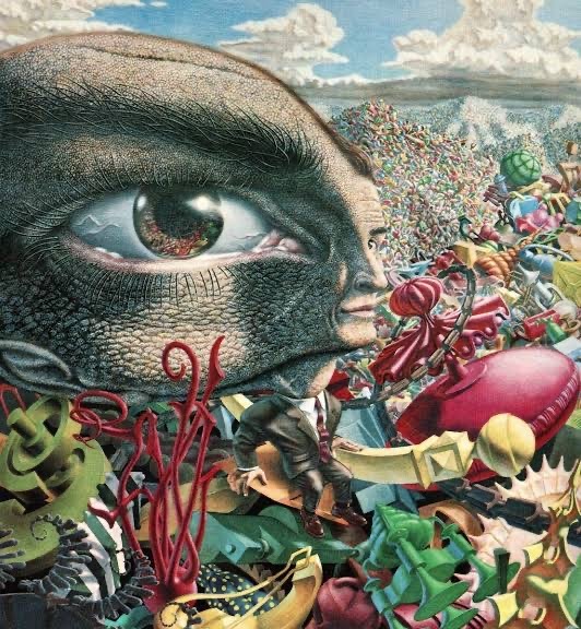
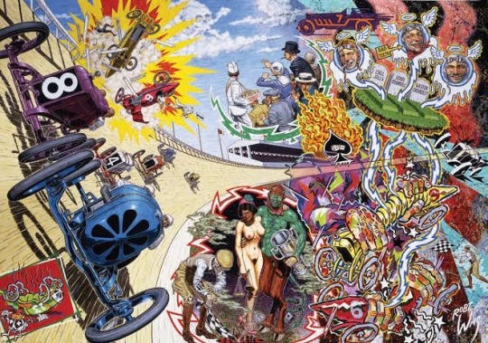
Robert Williams
Robert Williams is an American painter, cartoonist, and founder of the Juxtapoz Art & Culture magazine. Williams was one of the group artists who produced Zap comix, along with other underground cartoonists, such as Robert Crumb, S. Clay Wilson, and Gilbert Shelton.
His mix of California car culture, cinematic apocalypse, and film noir helped to create a new genre of psychedelic imagery.
One of Williams most famous works on record covers, was for the debut album Apetite for Destruction, of the Hard Rock band Guns N’ Roses.
This was 1987, and unknown bands were regularly calling Williams.
“The paintings were highly detailed”, he told once a magazine. “I did them with a magnifying glass- and they all had a certain degree of gratuitous sex and violence. It wasn’t so much the subject matter that was important but the composition of an anxiety going around, an ellipse of violence. “
I wouldn't want to bring such sexual content to the work, but I really admire Williams' style, and his paintings that had a counterculture style.
Maybe do something totally imaginative and colorful. I really like the style of these illustrators from the 60s and 70s, who did the opposite of what many comic book illustrators did at this time.
I would like to create something, that would be in line with the criticisms that Solange's album makes, about the social inequalities that black people suffer in the United States, besides the women themselves.

Genie Espinosa
Genie Espinosa is a Catalan / Spanish illustrator and designer.
Espinosa is one of the Catalan illustrators with the most international projection and an active presence in the world of comics, where she has as a main theme talking about feminism, and thus building strong female characters.
One of the author's best-known comic works is the graphic novel Hoops.
The protagonists of Hoops live in a world where men have disappeared and are not missing, a premise that referes to the feminist science fiction, but which Espinosa uses mainly to focus in female sorority and relationships between friends who fall into a hole and appear in another world transformed into empowered versions of themselves.
Her inspirations range from comics, manga, illustration and animation.
“Music is a big part of my life too, as it helps me with the big lump in my throat”. She explains. “ Plus horror movies, reality shows and everyday life, all mixed with anxiety and coffee is what inspires me”.
I think her style is very particular. Her characters have more exaggerated proportions, with big hands, and a small head. I find it interesting because it's a totally characteristic style, because as soon as I look at these drawings I already know who it is.
Also, I want to understand a little bit about feminist art, because like the music album I'm listening to, it talks about very sensitive issues about women, and other issues in the American society.
I would like to have another vision, to make drawings that are more expansive, with more vigor, and more surrealistic. Maybe doing something more experimental.
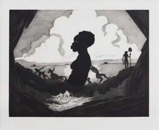
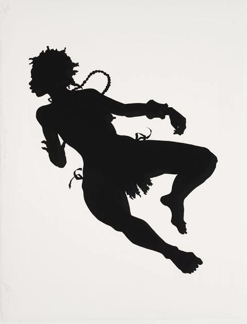
Kara Walker
Is an American artist who works from black silhouette cut to the most intimate drawings, Kara Walker denounces representations of racism and xenophobia.
Subtle cutouts, drawings and watercolors often combined in large wall installations, and shadow projections. Kara walker depends on any medium to relentlessly denounce the violence story: “ So we begin to tell the story of racism, to relive it, we create a monster that devours us”, she said once in a interview.
In 1969, she was living and working in New York. Inseparable from her status as a black artist, her pushes, in every sense of the world, without taboos or false modesty, the most unspeakable forms of racism and sexism in American history. Rape, excision, murder, torture.
Her silhouettes cut out of black paper, shown in her first exhibition at the Drawing Center, in 1994, are distinguished by their size, but also by their setting on the scene directly on the walls or in the form of sculptures. Making parodies of popular scenes of children’s books, that existed before the American Civil War.
I think it's necessary to study and analyze other artists, with different ways to get a message across. In this case, Kara Walker was an artist that I was intrigued, mainly by her style. In putting the silhouettes of black people going through different situations.
I would like to understand a little more about this subject, to maybe be able to understand what Solange's album "A Seat at the Table" really means. One of its main themes is racism.
The delicate silhouettes Kara Walker draws, draw a lot of attention to me, and I even want to use them in my project. Because I feel that in this project I can do something different.
Because, being a theme
or a very different subject, maybe using traditional tools is not an option for this project. Maybe I do silhouettes using nanquin, and mixing with cutouts.
Kara continues to paint, and exhibit her works. She is married to a German jeweler, and they both live in Brooklyn, New York.
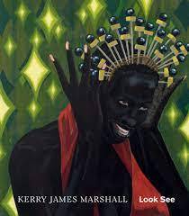
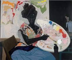
Kerry James Marshall
Is an American painter that translates the strength of black culture into his beautiful paintings.
Born in October 17, 1955 in Alabama, he is a prominent contemporary black American artist. He paved the way for black artists by ascending to the upper echelons of the art world, remaining dedicated to presenting works that explore the black experience in America.
Marshall and his family moved to Los Angeles when he was very young. They lived 12 blocks from the headquarters of Black Panthers activist group. During his childhood, Marshall witnessed many incidents of violence, although those traumatic experiences were scattered between the joyful memories of his family, and happy coexistence at home, as well the impact of art.
As a student, he was greatly influenced by the African American social realist painter Charles White.
Marshall was selected for a summer drawing class at the Otis Art Institute of Los Angeles, where White taught him everything that he knew.
Kerry James Marshall’s paintings range from urban pastorals to the Renaissance- inspired portraits, subtly moving from abstractions to romanticized interiors. However, regardless of style, substance or setting , the works converge on a single element: the image of the blacks, in the American society.
His paintings are represented with personal, social and historical experiences. The questioning about the ideas of representation and the criticism of art history are formulated at the same time that the paintings discuss how black people were represented and treated in social history.
In the construction of the work itself, there is a connection with the social discussion that interest the artist: Marshall uses different shades of black in the construction of the figures, not only as a shadow or background, but as an “active color”.
The formation of Marshall’s work took place in the 70s, in the south of United States, but the artist began to exhibit regularly only in the 80s.
Marshall uses the most diverse resources established throughout the painting tradition to critically review the narratives of art history in relation with the present.
Another frequent subject of Kerry James Marshall’s work is the concept of beauty. The people depicted in Marshall’s paintings are usually very dark skinned, almost entirely black. He explained to interviews that he created the extreme to draw attention specifically to the distinctive appearance of black Americans .
In his own words, it is not all about resolving social discussions in the political field, but rather, based on discussion about the history of painting itself, rethinking the social situation of blacks.
Marshall thus offers us more complex experiences- both in relation to art and social life.
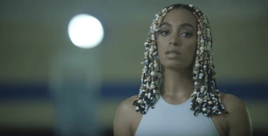
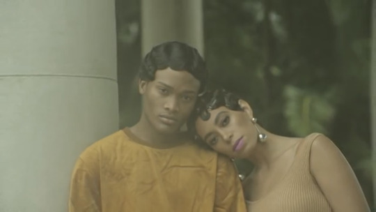
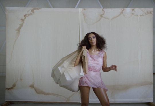
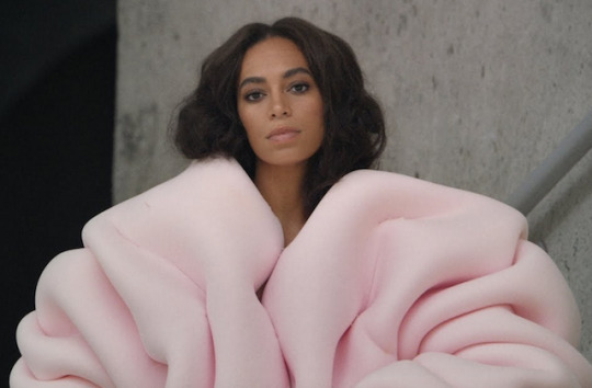
A Seat At The Table Album Visual
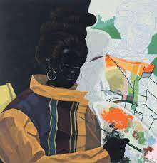
A Seat At The Table is an album that has several meanings, in addition to having a very particular aesthetic.The album talks specially about America’s racist history.She says the album, is a project that goes on topics like: identity, empowerment, independence, grief, and healing. And also talks about themes like race and identity politics, and her relation with her family.She says that she has a lot to thank her parents for, because they were always very connected to the empowerment of black people, valuing their cultural aspects, and they always supported Solange in her choices, especially in the making of this album. In a interview on Vogue she explains what was her intentions regarding the album “ I wanted to express an almost stately look for black men and women, because I feel like historically we haven’t been put in the most regal or majestic context. I wanted to create visually something that could match the ideias of the album.”Visually what inspired her on making the scenarios of the album was the artist Donald Judd, which he had a minimalist style, whose goal was to rid art of the Abstract Expressionism, to create pieces that were free from emotions. She also mention that Matisse’s collages as an inspiration.Shiona Turini was the costume designer who helped Solange bring some iconic looks in the songs “Cranes In the Skies” and “Don’t Touch my Hair”.Every fashion piece was intentional, to reflect the meditative mood of black pride, such as fur coats, du rags, track suits, and choir robes, as well as intricate hairstyles, which she says “That are often mocked, ridiculed, or associated with negative connotations”.The soft pink jacket Solange wears in Cranes in the Sky was made by a designer called Nadine Goepfert. The jacket is part of a project called “The Garments May Vary”, which is associated with how each person changes their clothing through experience. “It goes beyond the definition of a garment and allow a close examination of their essence”, said Goepfert in a interview. Solange chooses her music video looks not only by the aesthetic but also by the intention/inspiration behind the clothing, giving a very personal touch.Most of the costumes in the clip of Cranes in the Sky video are handmade, either by Solange, or Turini, and it features a soft, pastel color palette. Solange is known for using a bright color pallet and color blocking, but for the sake of the album, she embraced muted colors and softness.Analyzing the videos, with their visuals, I could get a much better idea of what was the proposal that Solange wanted to make. Because at first my drawings were very colorful, with clothes that didn't match the general idea of the album. So, analyzing all these materials, I could see how the aesthetics were different, with the intention that was precisely to do something more subtle, even using extremely random clothes, from purple plastic bags, to pink fur coats.
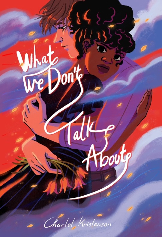
Charlot Kristensen
Charlote Kristensen is a Danish-Zimbabwean illustrator who works mostly with books, pamphlets and occasionally album covers. Her illustrations mainly talk about current issues such as social injustice and the role of black women in society.
Daughter of a Danish man and a Zimbabwean mother, she grew up in a small town in northern Denmark, and says it has always been very difficult to get along with the other people in the city, being one of the few black girls in the region, she describes that there was a lot of loneliness in this period.
One of the major reasons on why Kristensen focuses on empowering of the black people in her art is because she grew up with a whitewashing media, and she always felt very frustrated with this kind of situation, always wanting to do something about it.
She has been drawing since she was nine years old, with a very cartoonish style, that she has been using until today. Influenced much by manga and animes, artists like Katsuhiro Otomo, creator of Akira, and Canadian illustrator Bryan Lee O’Malley, creator of Scott Pilgrim comics.
She is a self taught artist, who learned by observing the works of her favorite artists when she was very young.
She has a great experience by using digital tools, like Photoshop for example, that she has been using since a young age, and learning step by step. As well procreate, that became her main tool now in this days. She said that is a tool quick to learn, with a variety of brushes, and types of textures to use as paper.
Always trying to represent minorities in her drawings, she always draws them with a lot of passion, with a very characteristic style, with vibrant colors, focusing mainly on clothing, hair and facial expressions.
She published in 2014 her first comic “What We Don’t Talk About”, where she makes a story based on her troubled relationship with her father's Danish family, and the difficulty of being accepted in this environment.
Not only does Charlot's art please me, but all the content she creates in her works pleases me. She manages to express her feelings very well on very complicated topics, such as racism itself, where she insists on continuing to speak in her works. So we don’t forget that even in places considered safe and super developed like Denmark and Sweden, they have a big prejudice against other races, because there are not many mixtures of races in Norse countries, and that is one of the reasons why she left Denmark and now at days she lives in Ireland, because of a larger black community, both in the UK and Ireland, with a better acceptance.
1 note
·
View note
Text
Project 1: Book Covers Research
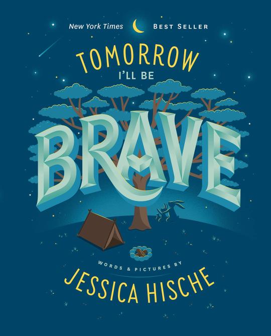
Jessica Hische
Jessica Hische is an American lettering artist, author, illustrator, and type designer who mostly works at book covers, making letters with different shapes and sizes, and using very vibrant colors.
Hische graduated from the Tyler School of Art in South Carolina in 2006, with a degree in Graphic and Interactive Design.
In 2009 started working with her freelance career as a letterer, illustrator and type designer.
One of her big influences on the typefaces is the British type designer Matthew Carter, which she admires for years, and Doyald Young, another type artist, which has a more fancy style for his typefaces.
After that, her career just took off. Working mainly with her stylized letters . She had worked with clients like film director Wes Anderson, Penguin books, The New York Times, American Express, Victoria’s Secret, and many more.
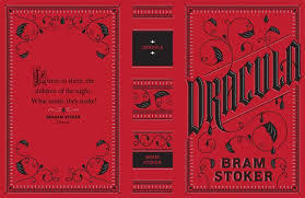
In this work I would like to test my typography skills a little more, because I usually prefer to work with illustration rather than typography. But having chosen a book with a gothic theme, I feel that I can play with the lyrics and do something very different, and I think Jessica Hische is a good choice, because I've seen her work on the cover of the book "Dracula", which too is a work with a Gothic identity, and I would like to do something in the same style with Frankenstein.
In recent years, she started working together with her husband, who is a web designer, in a project called “Don’t Fear the Internet”. A tutorial website that teaches the basics of web designing for beginners.
Kako
Kako is an award winning illustrator and graphic designer from São Paulo who works for clients in the Brazilian and international editorial and advertising areas.
His work has been published in several books such as Communication Arts, Society of Illustrators, SPD, 100 Illustrators, Illustrator now !
But surely his most outstanding work is certainly his covers from the series of historical novels by writer Bernard Cornwell, Saxon Stories.
Where it tells the story of a Saxon who was raised by Danish Vikings in the 10th century.
Something interesting about the book covers in the Brazilian editions is that if you put all the books together, you form a great illustration.
He has received several awards including a Golden lion at Cannes Advertising Festival, and the Grand Prix at El Sol.
He has a very interesting style, using a simpler color palette, valuing the details of the characters much more, besides having a lot of knowledge in Japanese-style illustrations, which he aspires to so much.
I've known Kako's work for some time, I've always liked his style a lot, and especially for the covers of Saxon Stories' books, where I've tried to copy his style many times, because I always found it very flashy, the way he represents the Vikings in your covers.
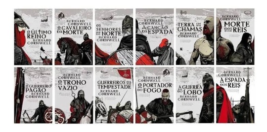
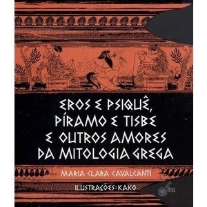
Daniel Clowes
Daniel Clowes is an American cartoonist, illustrator and screen writer.
He is known for creating alternative and stylish comic books, with different thematics.
From an early age, Clowes was fascinated by comic books, and spent years absorbed in the irreverent humor of Mad magazine.
Clowes studied art at the Pratt institute in Brooklyn, New York.
Upon finishing his studies, he tried unsuccessfully to get work as an illustrator in New York.
Between 1985 and 1989 he collaborated with texts and drawings for Cracked magazine, where he mainly developed a section entitled “ The Uggly Family”.
From 1985 onwards, he started to gain more attention in the world of undergronud comics, mainly for having a certain humor and subversion in his works.
His most famous work, that even was adapted to a movie in 2001, was Ghost World. Which features two bored, cynical teenage girls, Enid and Rebecca, who spend their time critiquing the world and the raft of humanity.
Clowes did a many projects in the following years as a writer and as an illustrator. But he also worked as cover artist for books, to honor works that he enjoyed during his years. One of those books, was Mary Shelley’s Frankenstein.
Clowes, chose this book because he recently had an operation on his heart to correct a defect on his valves. Therefore, he felt a great empathy with the character.
The style used to make the cover was very interesting, because it was a big influence for the project, due to the aesthetic, in using a more comic style.
On the cover of the Frankenstein book I would like to do something that dialogues more with my style.
I really like comics, and I can't help not using it in my projects.
When I saw this illustration made by Clowes, I was sure which way I wanted to go with this cover.
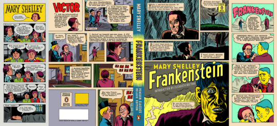
Butcher Billy
Is a Brazilian illustrator and graphic designer, mixing classic elements, games cinema, comics, photography and politics, Bily Marino works under the pseudonym of Butcher Billy.
Billy is also, a creative director in a digital agency. He lived in the UK for a while, and has travelled widely.
His influences are all connected with the pop culture, including; Banksy, David Bowie, Steve Ditko, Shigeru Miyamoto, Malcom McLaren and Andy Warhol.
He always starts his project, by sketching his ideas, then he goes to his Mac to create a clean and clear image. Using basic colours and strong graphical forms for images that really pop. He has a deep passion for the 70s, 80s and 90s. And he is always using, the typography, imagery and creative concepts.
Currently he works, mainly for netflix, in the promotion part. In series like Stranger Things for example, where he has this nostalgia totally focused on the 80s.
The artist’s contact with Netflix started unexpectedly. He published posters on his Twitter that he created for the Black Mirror series, the work caught the attention of the program creator, and the two started a professional partnership.
Something that caught my attention in Butcher Billy's drawings, is mainly the recreations of many series and movies, in book or comic book format. Always using a texture that imitates an 80s pulp magazine. Even books with creased covers, stylized illustrations with the half tone spots, and a grandiose typeface.
I'm doing several tests with the frankenstein cover, and would like to use this more comic aesthetic. With a simpler color palette, and a more pop culture oriented style.
Maybe use textures from different papers on the cover, to make my drawing look less digital. As I will get the chance to revisit this project, I would like to do something totally different from the cover I did recently.
I want to use more, in terms of aesthetics and digital tools and I think Butcher Billy is a good influence.
Dave Mckean
Dave Mckean is a British illustrator, photographer, painter and painter. It has a totally surrealist style, and is also known for having done several collaborations with writer Neil Gaiman.
Dave McKean, was born in Taplow, Berkshire, in 1963. He attended the Berkshire College of Art Design from 1982 to 1986, before beginning his career as an illustrator. Also in 1986, he met Neil Gaiman. Their first collaboration was the book Violent Cases (1987).
In addition, Mckean is responsible for all illustrations and cover designs for the acclaimed Sandman comic book series.
Mckean is considered as having the ability to shape thoughts - he uses traditional influences from childhood, life experiences, thoughts and knowledges about metaphysics - however he is still unique.
Mckean can articulate his imagination into pictures, drawings, illustrations and everything visual.
He has the ability to bring transformation to his photographs using digital tools, and create his unique compositions.
His works usually have a surreal character, according to the illustrator, would be the perspective of life taking into people’s thoughts and how they interpret the world around them. Inspired by Sir Francis Bacon, Bill Sienkwicz, Ralph Steadman, Gustav Klimt and filmmakers, Woody Allen, Andrei Sakharov, and Michel Gondry.
Dave Mckean has made the book cover of a fantasy novel by Cory Doctorow, a writer from Canada. He designed the cover of the book Wizard and Glass from the series of Dark Tower by Stephen King. He also designed the front cover for Neil Gaiman’s books- The graveyard Book and Coraline.
I've known Dave Mckean's work for a long time. I think your style is a great fit for a book cover like Frankenstein. He usually makes covers with a horror character, and I think I could try to do something more daring.
His covers in the comics Sandman, Black Orchid and Hellblazer have always been very eye-catching to me. He makes covers, which are very different from the commercial style, so he is totally characteristic, without having to emulate another illustrator's style, but creating something that could be done by him.
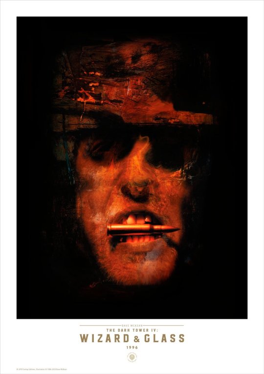
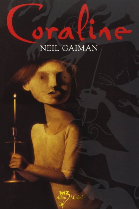
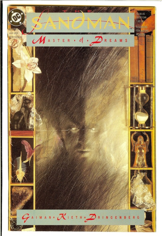
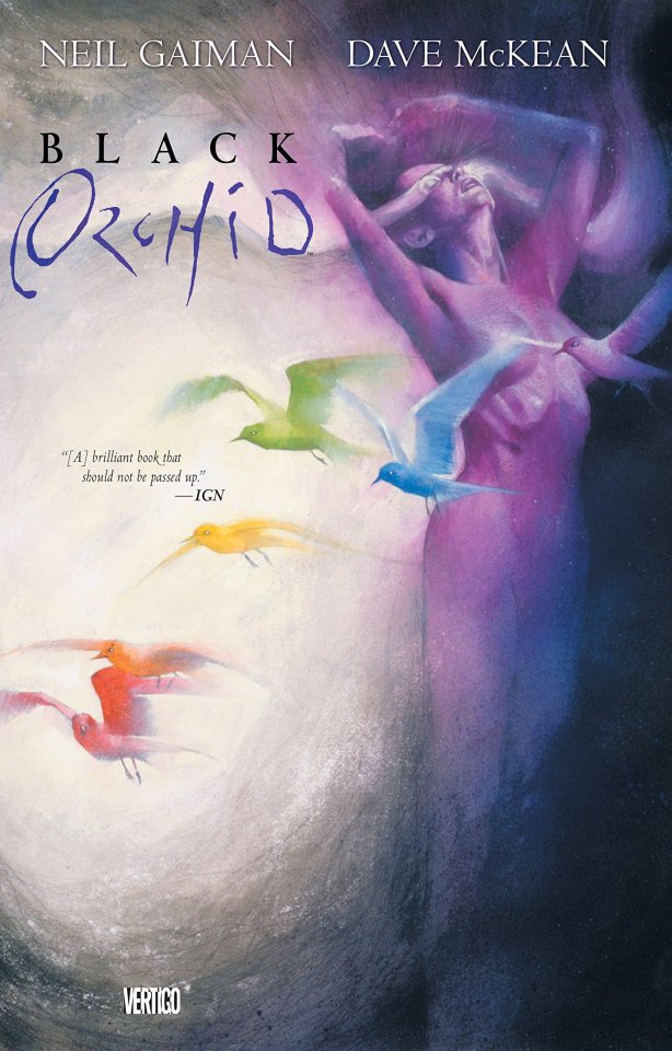
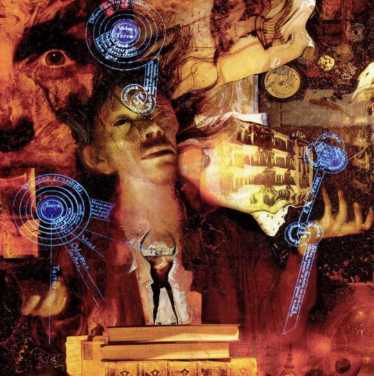

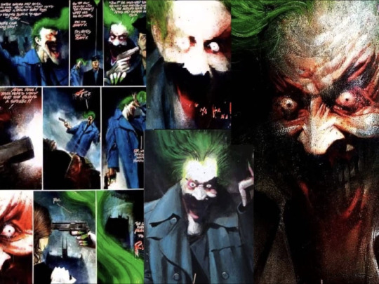
Stephen Bissette
Stephen Bissette is an American artist, editor focusing on the horror genre, titles in particular, like the award winning series of DC Comics Swamp Thing with writer Alan Moore.
He started working at Marvel comics with Jack Kirby and Steve Ditko monster stories, and the DC science fiction/fantasy and war comics.
Also he worked at the underground comic books of ZAP, where he was most influenced by Greg Irons artwork. He also mention cinema as a influence, with Ray Harryhausen’s monsters ( the stop motion animated creatures in Jason and The Argonauts.)
Despite not being an artist as well-known as a Jim Lee or Alex Ross, Bissette is an artist with a handful, he has a very particular style of the 80's, always emphasizing the dark in his characters.
He never felt very comfortable drawing super heroic characters, because he never had a real interest in drawing untouchable and angelic beings like Superman or Wonder Woman.
On the contrary, he was always interested in the occult, the bizarre. No wonder he teamed up with Alan Moore and reworked the Swamp Thing .
Alan Moore started at the 80s what would be called the American Gothic. He had been working with the idea of using classic horror monsters to scare people and heighten belief in the supernatural.
During this period there was a reformulation in the DC universe, where several characters that were not so popular, such as the swamp monster itself, would have their titles discontinued from the universe.
Alan Moore and Stephen Bissette took the character, and kept him the furthest away from the DC superheroes, trying to make something totally unique, as if it belonged in a universe of its own, without super beings.
The Swamp Thing is one of my life comics. I had never even heard of him when I was younger. I knew precisely the saga written by Alan Moore.
The comic has great humanity in the way the monster is represented. Because despite being scary and smelly, he wants to know who he is, he wants to protect the swamp, from those who want to destroy it.
A bit of Franknestein was used in these stories, in the sense that what exists on the outside is ugly, but on the inside isn’t that ugly, in showing both creatures trying to understand who they are, and also seeking love and affection.
Despite being the script that stands out the most, Bissette's art manages to bring these pages to life, as well as scaring me, with certain bizarre monsters and concepts that appear throughout the pages, something I'd like to do on my cover, scare the reader.
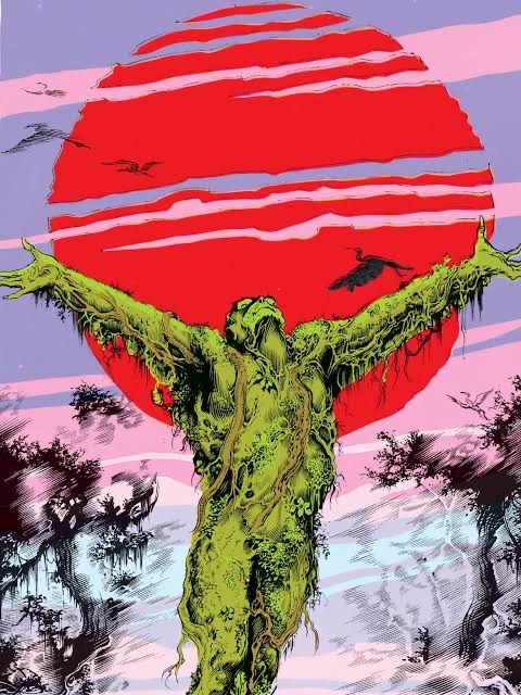
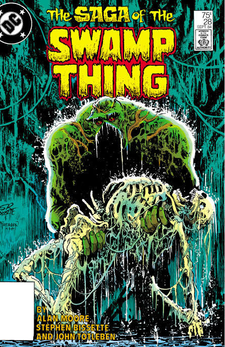
1 note
·
View note