
roadworxx
heckkkkkkk
~~ 22y/o in colorado || they/them || adhd af || bi || 196 refugee ~~ i like old games n stuff
84 posts
Don't wanna be here? Send us removal request.
Last Seen Blogs
smbrickman
W E L C O M E

stifffacility
Untitled

hellocarebears
renjun ♥

verxfrancoeur
agonizer

suyacho
snow / semi hiatus
Text
why have an alarm clock when you can just have a cat swat at your face every morning so you can get up to feed them
9 notes
·
View notes
Text
one day my labia will be the stretchiest in all of sim city
1K notes
·
View notes
Text
we've all heard about the rise of the boomer shooter, but it's about time we moved onto the next stage of first person shooters:
the femboy shooter
277 notes
·
View notes
Text
ok yeah lots of memes about how the shitty new UI is literally a direct carbon copy of twitter and we hate it because of that, yea yea
here’s some actual/extra reasons why the UI itself is shitty beyond the fact that it’s stolen from twitter (in just my personal opinion)
it’s claustrophobic as hell. the old UI felt breathable, felt like you could scroll and actually look at your posts, and now there’s enough shit going on on one page that it actually gives me a headache. (i’ve heard other people say this as well, so maybe it’s not just me that’s overstimulated by all the fucking noise on the dash?)
the ‘dash sorting’ (for you / your tags / what you missed) is way too high up the page now and appears crowded against the top where things like the bookmarks bar are on most browsers. not that anything in this new UI isn’t crowded.
i’ve seen it mentioned plenty already, but there’s quite a lot of unnecessary duplication-- as in, the same buttons that exist in the new left navigation panel show up on the right in blog view, which is just completely annoying and unneeded clutter.
the fact that post interaction options are all on the right side of the posts, but dashboard navigation is now all pushed to the far left of display, is extremely annoying. i’m right-handed, so it’s extra annoying for me to have to constantly go all the way over there. maybe that’s easier for left-handed people, but if the case was supporting diversity, why not just put an option in dashboard preferences to switch the side of ALL the controls? because the post interactions are still on the right.
while we’re on the subject-- tumblr’s original design was actually MUCH more intuitive and easy to navigate. the reason for this is that everything you needed to click was in one small area. you scroll up and down the dash, move slightly up to navigate (home/asks/notifications) and slightly down to the side to interact with a post (reblog/reply). extremely simple, easy to use, even ‘lazy + addicting’, which is what all social media studio exes are supposed to want right now. changing the ui to actually be more work and more frustrating to navigate seems completely opposed to what their obvious business strategy should be.
tumblr’s original design was also much more breathable, with the small icons in the corner looking organized and not taking up much space, and lots of room for the posts themselves to be the main attraction.
there’s the fact that copying someone else’s brand entirely actually just puts you in a bigger, wider pool with much more competition, and makes you much more likely to immediately fall short of that and go bankrupt.
tumblr's original purpose was to be geared toward blogs, and these updates, along with the writing on the wall about blog themes being completely phased out soon, is completely against the original purpose. although sometimes website purposes change for the better, so take that as you will.
and finally the obvious point that you can tell from all the memes: this change is almost universally hated by the core tumblr userbase-- aka the site’s loyal consumers for years and years. driving out their main demographic seems like a very obvious, very quick way to lose a lot of fucking money. they also did this “carbon copy of twitter” update literally just a week after sitewide protest about the idea of this site being anything like twitter, so it feels like a massive Fuck You to literally all of the users. tumblr is rapidly approaching their trust thermocline, and show no sign of slowing down.
these are just my opinions about the ui, and i’m only one person. so feel free to add on other design flaws you think people should be aware of or able to mention! i will probably also be submitting this post as feedback to staff, and will be taking their surveys when i can as well.
679 notes
·
View notes

Text
are you okay, you've reblogged this like 49365364 times
191K notes
·
View notes
Photo
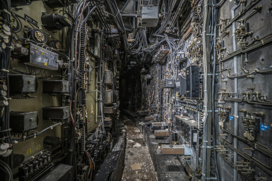
Computer wiring tunnel inside an abandoned coal power plant, photo by Bryan Buckley [1280x854]
53K notes
·
View notes
Text
what, are you telling me that you don't understand what's going on here?

I saw someone run Doom on a 3ds and it was the first time I actually understood what was going on... on screen... on a modern display.
Benefits from the low-res small screen I suppose lol.
7 notes
·
View notes
Text
I have OCD and with that comes quasi-hallucinations, and I grew up watching a ton of horror films so some of the worst of mine are the standard white skin/black hair demon girl type shit.
However, because a lot of them are based on horror film I have found comfort in doing things that “go against” horror films and being like “see? This could never happen.”
(It’s irrational. I know that. But shut up. This is how I cope.)
For example: I started hearing garbled whispering from beneath my table, so I started playing the muppets sound track. Because they would never play Movin’ Right Along when the protagonist is about to get attacked. That won’t happen. Disney, who owns the muppets, wouldn’t give them the rights.
And it fucking worked.
77K notes
·
View notes
Text
Having to join someone's Discord to get help instead of finding the answer on a forum or webpage is like if you asked someone on the street for directions, and they said they'd only tell you if you came over to their house.
36K notes
·
View notes
Text
CRYPTOFUCK. THE FUTURE IS GARGLECOIN. INVEST NOW.
DO IT NOW
NOW
10 notes
·
View notes
Text
So I've done a lot of frankenspriting over the years, and I've posted them to various places, but its hard to remember what and where I've posted when, so I'm just gonna start off by posting a whole bunch here now so that they're in one place, and that you know that I'm the dingus who did them in the first place. You're allowed to use anything I make here so long as you credit me. The doom community was built on sharing after all, and so that's how I want to operate.


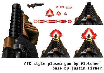
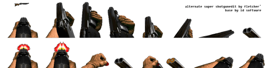

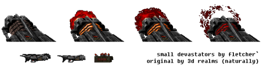

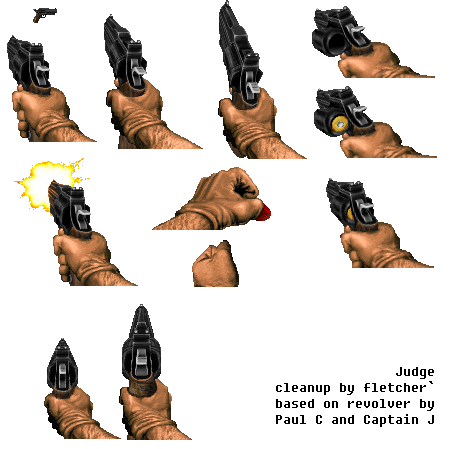


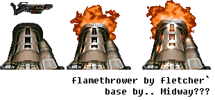


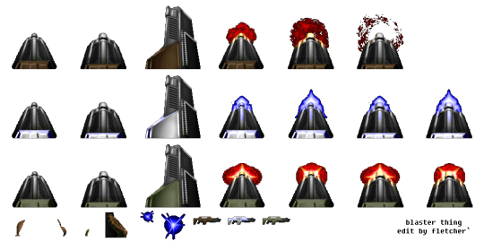


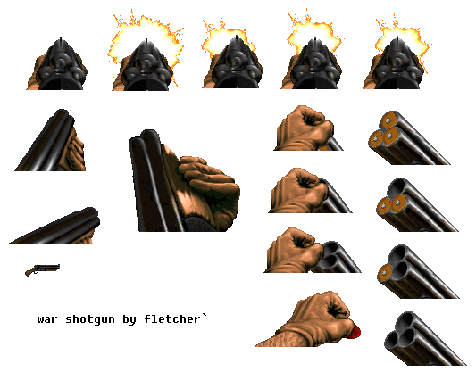

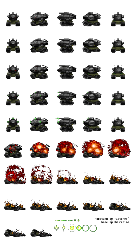


These are in no real order, some are from like 2010, some are from like yesterday.
5 notes
·
View notes
Text
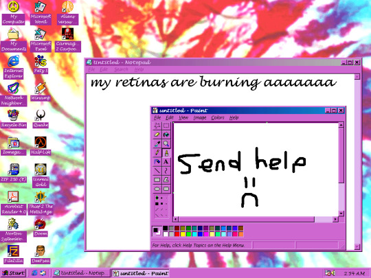
some of the windows 98 themes have to be among the gaudiest things ever conceived. i both love and hate them
i can't feel my eyes anymore
#eyestrain#windows 98#windows 95#microsoft#retro aesthetic#retro computing#vaporwave#webcore#90s#notepad#microsoft paint#ms paint
42 notes
·
View notes
Photo


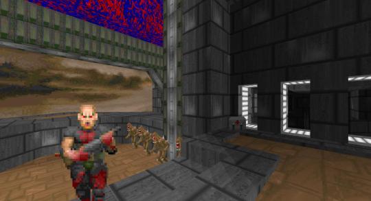
DMAX2021.wad: Doomworld Maximum Project 2021
MAP46 (1212, 2160, 64)
Author: See maplist for authors
Date: 2022-12-14
Description:
Fifty-eight maps made for the Doomworld Maximum Project 2021, as well as three maps to mark the required source ports and a hub for GZDoom. The Doomworld Maximum Project 2021 was organized by Obsidian and sought to provide a community project that anyone could contribute to, regardless of mapping proficiency or source port familiarity.
13 notes
·
View notes
Text
28K notes
·
View notes
Text
There is an open source space trading simulator game based off the 1984 game Elite and its 1993 successor Frontier: Elite II (two of the most ambitious games of all time).

It is a fully functional experience which has been in continuous development since 2008. Coming out of the development of GLFrontier in 2005, a reverse-engineered version of FE2 rewritten to utilize OpenGL for rendering its 3d graphics.

Just like the games it is based on it takes place in an expansive galaxy with hundreds (In FE2's case a near-infinite number) of systems utilizing a what it describes as a realistic, albeit rudimentary, newtonian physics system for space flight and air travel.
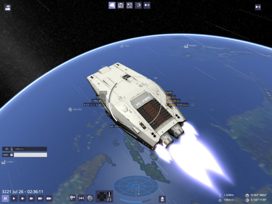
Github
Website
10 notes
·
View notes
Text
i’m not shitting you when i say this. i used to play these wolf3d mods way back when i was a young kid (around 6 or 7) and i didn’t learn until i was a teenager that the man who made them was really an 80 year old ww2 veteran named John Bucksnort. i think he passed away in 2002 but has left an incredible legacy behind of wolfenstein 3d mods and a yahoo page called The Spear of Destiny Fanclub which is defunct now needless to say.
3K notes
·
View notes