Last Seen Blogs
electrikyouthh
The Insomniac's Dreams
desirejackets
Desire Jackets

herbrainakiln
Her brain, a kiln- and other oddities

spence922
Insert witty title here

paintwithnumbersau
Paint with Numbers Australia
Text
Rationale
Rationale The project “Type as a hero” and part 2 the social media typographic. This part of the brief focused on creating a digital animation that helps to promote the typeface.
The typeface that I was given was called Roboto designed by Christian Robertson. Overall, as my job is to create a promotion that promotes my typeface, so I decided to focus on the practical side of my font. By researching the history of the typeface and the industrial usage of the typeface I found out that. Roboto was the main font of android back in 2011, this gave me a clear concept of approaching the animation concept with an app designed to display various aspects of Roboto. The first concept that I chose was the phone app where it types up the word weights. Using. The android keyboard and showing different font weights and the main fundamentals of the font. The app idea was eye-catching and had a playful tone where it is a clever concept to start off my animation. For the second concept, I wanted to continue with the idea that I used for my type specimen book as its main theme is Robotic and mechanical. The Roboto is exceptionally clean and has sharp edges that remind me of it is mechanical, with the inspirations from Pixar, created a little lamp shaped Roboto robot that re acts the opening scene of Pixar. Also using other ideas such as cogwheels and USB sticks from my type specimen book. Overall, the main tone of my animation is playful with using different concepts of illustration and different conventions. Personally, I was not too happy with how I portrayed the Pixar opening scene into the animation using Roboto. I felt like I could have made the animation more active and bounced just like the actual Pixar opening scene. I was lacking in the information was. In word choices where I showcased my font and the why I overused some transitions within my animations.
0 notes
Text
finalised animation of my second concept machinery
instagram layout
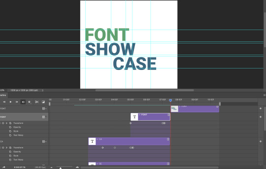
this represent the usage of font also the glyphs that roboto contains
by using robot, mechanical concept i was able to bring different conventions playful
0 notes
Text

removed the pixar idea and used the USB idea
it has more contents but something feels like its missing
0 notes
Text

remade the glyph showcase made the glyphs make bigger
and i made the word roboto in glyphs i bold that comes together in the middle war
0 notes
Text
after reviewing my finalized animations I realized that they looked too empty as content-wise
so I decided to add in more clips that will benefit my work
this is the glyphs showcasing gif that I created using the USB stick from the typeface workbook
0 notes
Text
This is the finalised version of my animation concept 2 displayed within the instagram layout format
I wanted to continue with the old idea of being mechanical and also with the inspiration from pixar's opening scene
I added the spinning as my main key point to this animation to show the machinal concept towards my animation.
0 notes
Text
added more materials and added the cogwheel spinning near the end so it matches the next part of the animation and also to bring out the theme robot and mechanic
0 notes
Text
added more cogwheels to fill in the negative space and work my time frame so the way they spin is linked
0 notes
Text
type showcase transitions using saw tooth that i used previously for the type book
as the saw tooth spins it showcases different words relating to the font roboto
0 notes
Text
this is the pixar idea so far is smooth as it is going but the jumping motion looks bit. Odd
0 notes
Text
tried out the new convention yet i dont really no how im going to showcase the glyphs
0 notes