rachelsudinghitegd-blog
Design for Interaction
Hi there! I'm Rachel Suding, and this is my process blog for the Design For Interaction class I am taking at the University of Louisville Hite Art Institute, instructed by Meena Khalili. Welcome!
3 posts
Don't wanna be here? Send us removal request.
Last Seen Blogs
cartoonsandcheerios
Restaurant billing software india

perfectpeanutauthorcowboy
H E L L O

a-dremurrs-hope-blog
Hope & Asriel

infolabposts-blog
InfoLabPosts

Photo
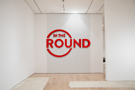
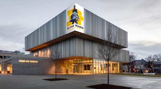
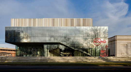
Our last prompt of the semester took us across campus to the Speed Art Museum. A brief and informative field trip led us into the world of exhibition design. Remaining in our same teams from Prompt 2, we took on the task of designing a potential interactive exhibit for the Speed Art Museum that would feature a particular collection of works curated by the museum. Zach, Emily, Kylar, and I were assigned Contemporary Sculpture. The steps involved to design the exhibit were creating a title wall, arranging the works within the gallery space, arranging different collateral and wayfinding materials to promote the exhibit, and fleshing out an interactive app for museum-goers to use in the exhibit.
I was admittedly a little uneasy about this project—I felt a bit unsteady in the world of exhibition design after a project in Letterforms II—but a field trip to Solid Light ended up being really inspiring for me. We got to see a lot of really cool applications of interactivity within exhibits. They showed us some very immersive, awesome experiences that were in the works for a new museum, and I was blown away. They were so warm and friendly, and they happily answered any questions we had about exhibition design.
While researching the works, it was clear that many of them were very abstract and produced with a wide variation of materials and inspiration. The only real common ground across the whole collection was that they were, in fact, sculptures. With this piece of information in mind, we decided to title the exhibit In the Round. Not only is the name a literal description of the type of works found in the exhibit, it also is a play on words—people can walk around the work and see it from all angles. The title wall plays off of the category of works as well; the ITR logo would be a three-dimensional piece suspended in mid-air with floor-to-ceiling cords.
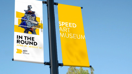
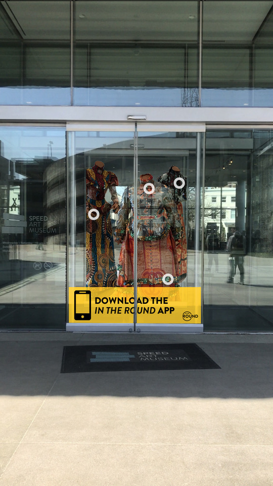
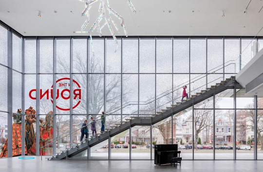
Environmental signage around the Speed promotes the exhibit to people passing the museum on the streets and sidewalks as well as museum-goers entering the building. Patrons are encouraged to download the ITR app in order to experience an augmented reality view of the work displayed on the door signage and throughout the museum, leading from the entrance all the way up the stairs to the exhibit. Once inside the exhibit, patrons are able to select how much time they have to view the works in the exhibit and are presented with an activity tailored to their schedule and desired experience.
Because the works varied so greatly in size, not all of them would have fit within the gallery space. For this reason, AR pedestals were put in place of some of the larger works to view them onscreen instead. Additionally, select works within the exhibit had specific AR hotspots on them that, when highlighted with the app, would provide more information about that particular work.
As a group, our workflow seemed much more organized with this project, and I think that can be attributed to the fact that we had pre-set brand guidelines to work with this time around—we didn’t have to create anything from scratch, and as a result, our final mockups look a lot more cohesive than they did with Prompt 2. Additionally, we got into a better groove as a team, having already known from the previous project where each member would be strongest when it came to executing the design work. I personally really enjoyed getting to work with Zach, Emily, and Kylar again. Our communication was spot-on, and I’m very pleased with the end results of our exhibition ideas.
0 notes
Video
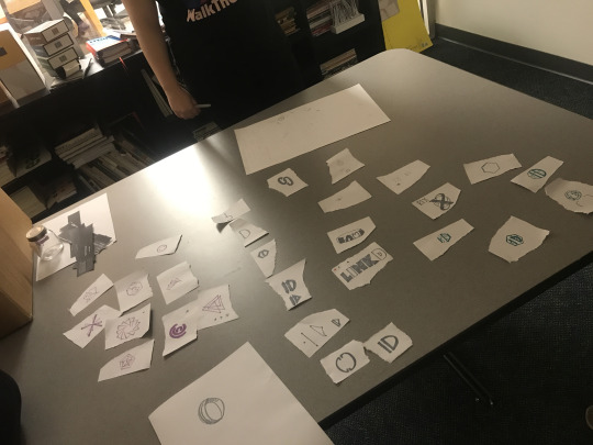
Logo sketches from our studio brainstorming session.
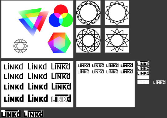
My logo artboards (above) and the final logo variations (below).
Our second prompt threw us a major curveball: develop an inclusive identification system and partnering interface. This identification was meant to take place on a global scale, including all citizens of the Earth. Of course, nothing like this currently exists in our world, so we were thrust into the unfamiliar world of speculative design. Luckily, we didn’t have to navigate this unknown territory alone—we got to work in groups! I worked with Zach Downs, Emily Frink, and Kylar Ware. It was honestly the dream team.
We spent the first week and a half researching identification systems that already exist in countries across the globe, searching for things that worked well for each system and what features overlapped between countries. From there, we began to compile a list of must-haves, should-haves, could-haves, and won’t-haves. The opening stages of this project were the most difficult to tackle. Conceptualizing for something that doesn’t exist takes a lot of brain power, and it was almost exhausting at times. But when we came up with a solution, it was really gratifying.
Our ID system concept was a small, non-intrusive, interchangeable device that could be worn or carried in multiple fashions and would serve as a catch-all for the important information that identifies us on a daily basis. This information included the typical notes one would find on today’s IDs, such as name, birthdate, height, weight, and address, as well as medical, criminal, and travel records. The device itself was a small disc that would measure the biometrics of the user for security and identification purposes, and the accompanying interface held different levels of accessible information for different authority systems. Possible wearable options included a necklace, ring, watch, hospital bracelet, credit card, or phone attachment. The device would only allow access to the user’s information if it was actively measuring their biometric data, whether it was reading their fingerprints, heartbeat, or vein patterns. Upon the verification of the user, more information would become accessible to whoever sought it through the app. Different types information would be provided to different sectors; for example, medical professionals would receive access to medical records, but law enforcement would only be able to look up the user’s criminal records. This would help ensure the user’s privacy. An accompanying scanner would be customized to the different sectors for accessing the information.
After a studio session of brainstorming adjectives and logo sketches, we decided to name this device LiNKd—from one of Emily’s sketches—because it links all of the user’s information together. For this concept, I was tasked with developing the logo and eventually animating it. We started with some abstract shape concepts with different color overlays and eventually moved to some one-color, monoline polygonal shapes. We still needed a wordmark, however, so I started playing around different typefaces, weights, and ways to bring ‘ID’ to the foreground of the word ‘LiNKd.’ We decided as a group to use a heavier weight, and class feedback during our interim critique suggested that the edges needed to be softer to convey more friendliness. In the end, we ended up favoring the wordmark over the abstract shapes.
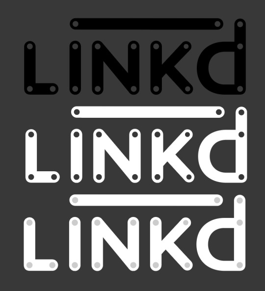
In the final logo, the lowercase ‘i’ and ‘d’ represent the abbreviation ‘ID’ and are linked together by a horizontal bar. The letterforms are based on the typeface Proxima Soft with some minor weight alterations. The dots refer to hex graphs we used to gather and organize different types of ID information in our user interface.
Animating the logo became another fun After Effects challenge. This time around, I learned how to use trim paths! First, I had to recreate the letterforms using weighted strokes and separate them from the dots. This took some time and quite a bit of adjustment, but it was super exciting when I got the strokes to match up with the original outlines almost perfectly. After figuring out how to operate trim paths with those strokes, I played around with scaling the dots into the composition, then added that same effect to the trim paths so that the letterforms didn’t just suddenly appear out of nowhere. They start as growing circles, then eventually expand into their final forms. Lastly, I decided to reverse the effects so that the animation could become loopable. Adjusting the timing took hours upon hours, but I think investing the time in this animation produced a really cool product that could be incorporated as another interactive element in the digital interface.
Unfortunately, I had to miss our last studio day due to travel for the ACC Women’s Basketball Tournament, and therefore missed some of the final development of our interfacing—but our basketball team ended up winning the whole tournament, and I witnessed my first UofL conference championship as a senior, so I have no regrets. I’m grateful for the communication our team shared through Slack, as we were able to keep each other moderately updated with the progress we were making on things. Overall, this project was a lot to take in, but I think we came up with a really great idea. I know that there is no way I would have been able to develop a concept like this on my own. Our collective brain power brought a lot to the table, and I’m very excited that I get to work with this group again for our final project of the semester (and college!!!).
2 notes
·
View notes
Photo
Our first project in Design for Interaction entailed creating either a stop-motion or animated video, 10-30 seconds long, to promote a consumable on social media. My initial thought was that I would use this project to extend my Genesee Brewing Company rebrand from my Identity Systems class in the fall, but then a new idea struck me:
What if I use this project to help out my boss at my internship, and treat him like a real-life client?
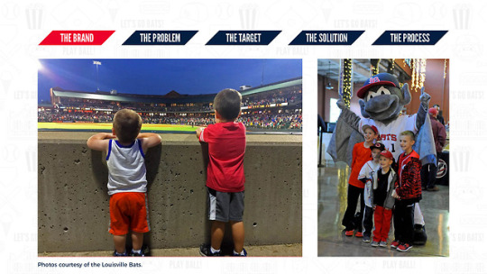
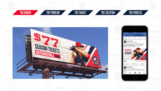
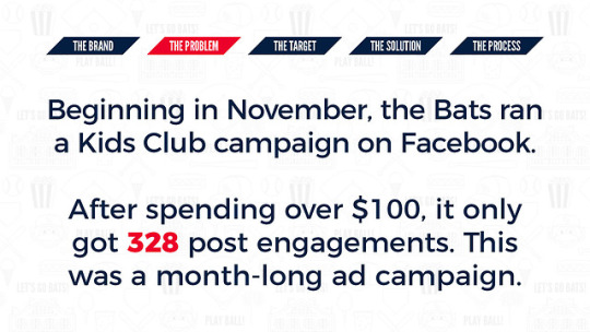
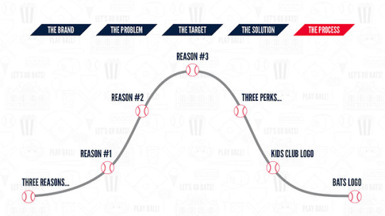
I absolutely love interning for the Louisville Bats Baseball Club, and with the 2018 season on the horizon, marketing campaigns to entice fans are on deck left and right. Needless to say, he was thrilled that I wanted to give him a new promotional piece. As the Director of Digital Marketing and Design, he typically has a lot on his plate and is constantly thinking of different ways to promote different events and consumables that the Bats offer to their fanbase.
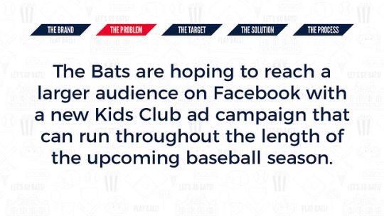
We sat down together and brainstormed things for which we could use a video promotion. Our top three ideas were single-game tickets, Team Store items, and the Kids Club. After a lot of thought, we both agreed that the Kids Club would be best to elevate on social media—after all, our promotions for tickets were about to drown our Facebook timeline.
His own requests for the video were as follows: make it all happen in about 15 seconds, and don’t put any dates in the video so that it can be run as an ongoing campaign from approximately February 1 to June 30. I took this information into consideration and pitched the idea of giving fans three great reasons to join the Kids Club. He loved it!
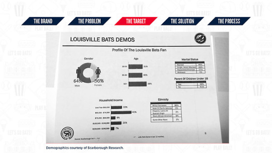
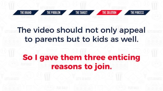
Producing work for a real client also meant that I had access to real research, which was honestly a game-changer. My boss gave me real statistics to sift through, and I realized that my target audience (parents, aged approximately 28–40) did not make up the majority of the general Bats game attendees. The more I thought about it, the more I realized that a lot of our marketing hasn’t always reached out enough to my target audience. It was here where I discovered the problem and how I was going to solve it.
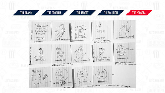
So, I started to storyboard everything. Because there is a slew of perks that come with the Kids Club, I had to narrow it down to just three things. I decided to go with the free jersey, free water bottle, and free tickets to Sunday and Wednesday games. I also wanted to incorporate the diagonal elements and fun pattern we’ve included in our other collateral for the upcoming season.
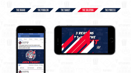
To begin this endeavor, I had to make a new friend: Adobe After Effects. I was thrilled to finally begin learning this program! Prior to this assignment, I had only opened it once just to see what it was all about; upon first glance of the interface, I quickly closed the program in a spell of intimidation.
This time, I watched a 50-minute beginner’s tutorial in its entirety before opening the program again. Intimidation subsequently faded, and then it dissolved completely when Meena gave us a quick rundown of the basics in class the next day. When it came to actually bringing materials into the program, everything went pretty smoothly! The diagonal wipe effect took me four hours to create, but everything else was much easier to maneuver. I definitely spent the most time on (ironically) timing everything—adjusting the speed of the incoming materials and the duration that the text would stay onscreen was the hardest part. In the end, though, I was so proud of what I had created and a little shocked that I had pulled this off in four weeks on top of preparation for Portfolio day, another class, and two full days per week at Slugger Field. Creating this from start to finish was such a rewarding experience, and I surprised myself with what I was capable of accomplishing.
During critique, I received a lot of positive feedback and good tips to take the video a little further. One major point was that I could add sound to the video, whether it’s just instrumental music or ambient noise from a ballgame. I’ll definitely take this into consideration—maybe I can implement sound for an extra pop at Portfolio Day.
I showed my boss the video, and he loved it. He’s going to schedule it to go live sometime in the next week, and I can’t wait to see it in action on Facebook!
3 notes
·
View notes