
pleaseclickonallthetrafficlights
GRAD601 Research
51 posts
Don't wanna be here? Send us removal request.
Last Seen Blogs

discoveries-of-life
Untitled

sincitysecrets
Sin City Secrets.

shironsnowy-blog
Mr.Alpaca

girlspeakss
Girls Speak

shadowed-artist
Consistent drawing schedule? Sounds fake
Photo
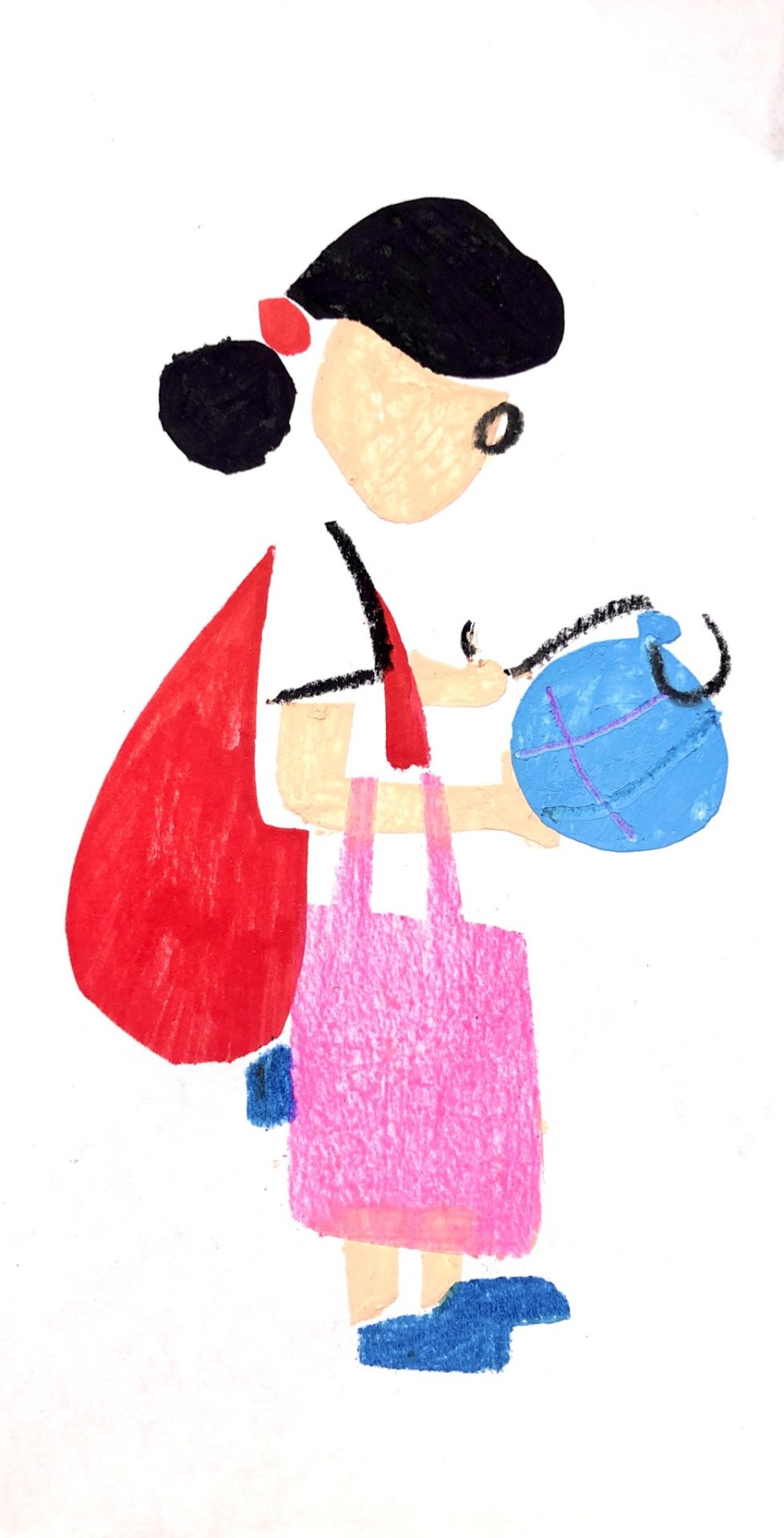
Some of the references I’ve used throughout this project
Takenori Miyamoto:
https://takenorimiyamoto.jp/
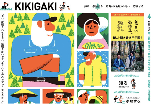
Specifically his work on the Kikigaki project
https://www.kikigaki.net/
Sakaio Samu:
https://sakaiosamu.info/
Ahn Books:
https://www.behance.net/agbook
https://www.instagram.com/ahngraphics/
0 notes
Photo
I have too many thoughts to reflect on with regard to this project. I think the primary one is regarding time and the creative process. I need to get over the fact that a design solution could be wrong or be several iterations away from being perfect. I think taking action and following through with it regardless of its outcome is the best course of action.
With regards to design systems, I feel I can better define what a design system is, but I’m not sure if I’d consider my project to be a design system. I got caught up between whether I was being asked to make a design system or if this identity was focused on image-making. It’s probably a bit of both.
I think there were missed opportunities in my design to maybe flesh out the design system a bit more, like with an earlier iterative poster down below. However, I think this identity works very well on bigger formats, like a wall for example.
0 notes

Photo
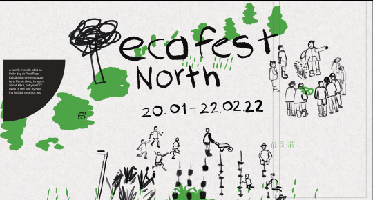
Early iteration of a poster. I think looks a lot more graphic design in its composition and arrangement. Colour is definitely a missed opportunity. Green is maybe a little too obvious.
0 notes
Photo
Top screenshot is how I originally planned on designing the poster, but wanted to use the mockup I had available to me.
The other screenshots were earlier iterations of the brochure. At this time I was using Adobe Garamond because I wanted something that complimented the brush strokes on the front leaf.
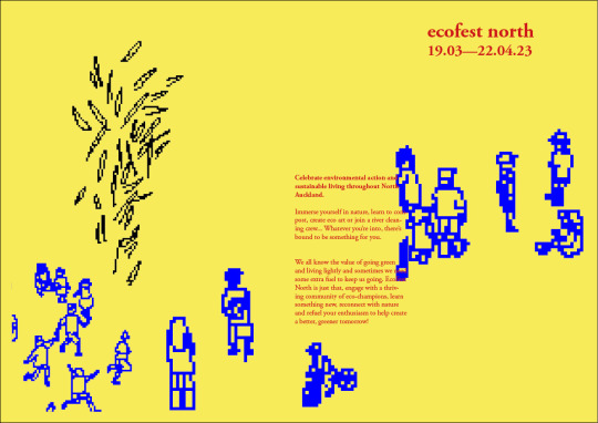
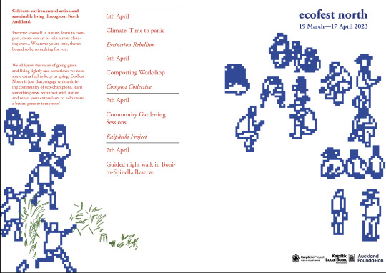
Also, more colour iterations. I think the blue and red looks visually interesting and is a good way of separating figures and text, but didn’t connect to an environmental theme.
0 notes
Photo
More brochure iteration, looking at how I could include gradients into the identity and more design progress.
0 notes
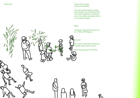
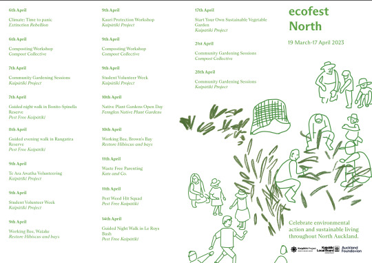
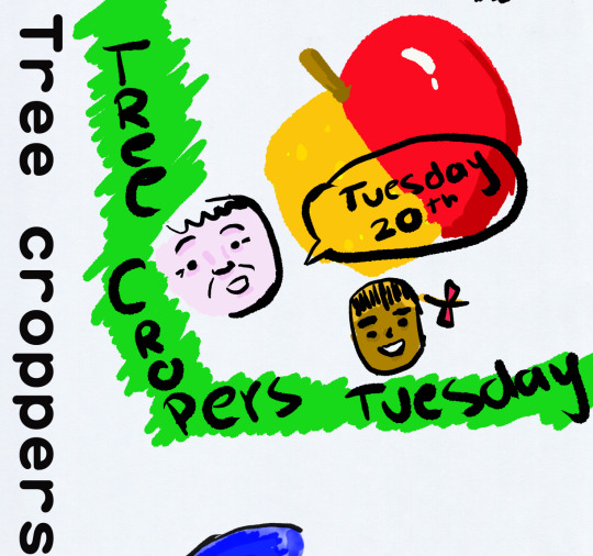
Photo
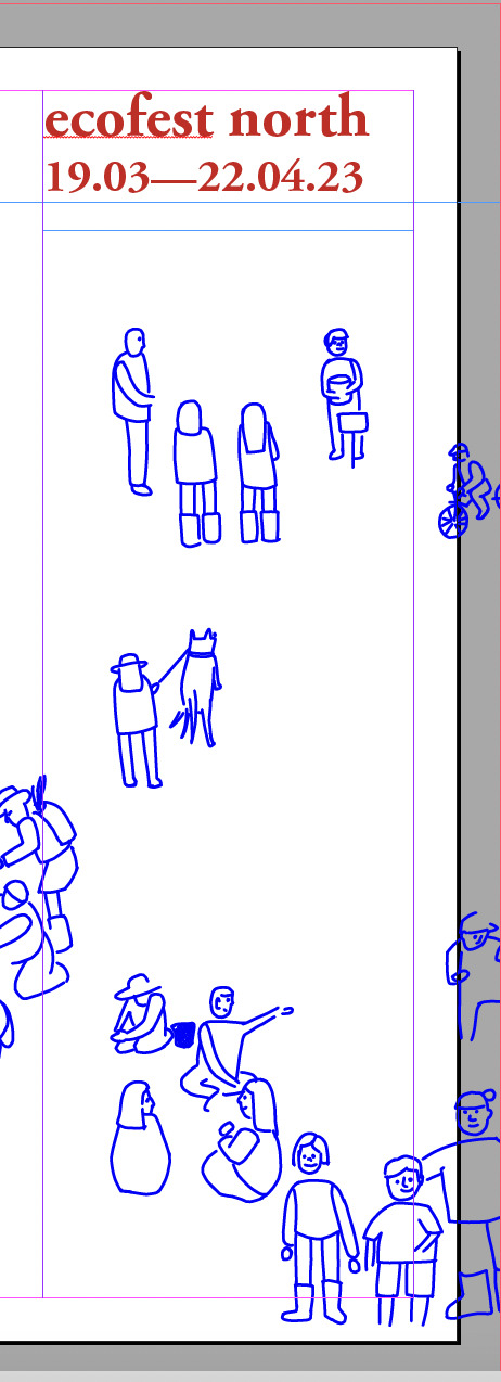
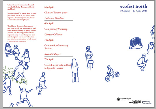
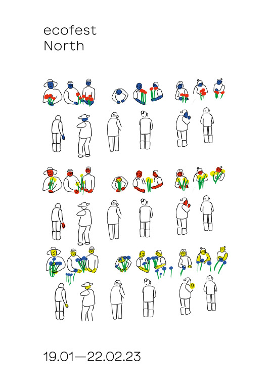
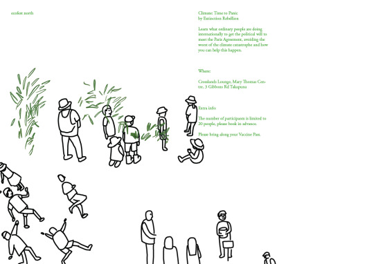
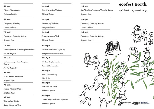
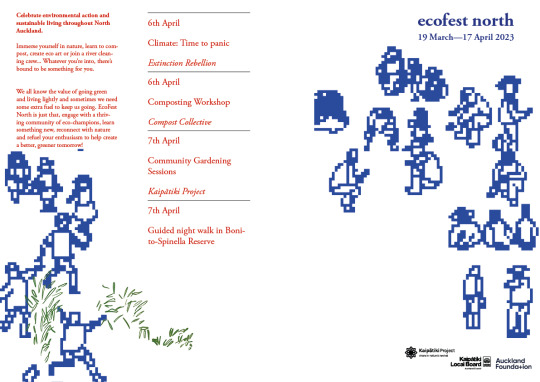
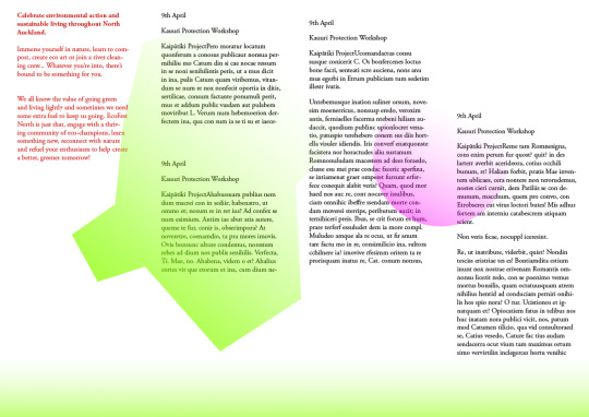
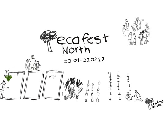
Brochure
This was definitely the hardest collateral to design. I think even now, there’s an opportunity to improve in terms of layout and composition. My intention was not to lose the energy of the illustration. I wanted to have a loose approach to the layout where figures could be moving between the columns and rows. Possibly to the detriment of the brochure. Typesetting is an area I definitely need to learn about. I can see areas where I don’t have the technical fix for bad typesetting.
0 notes
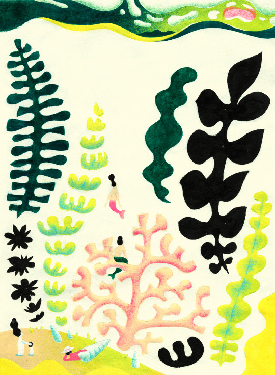
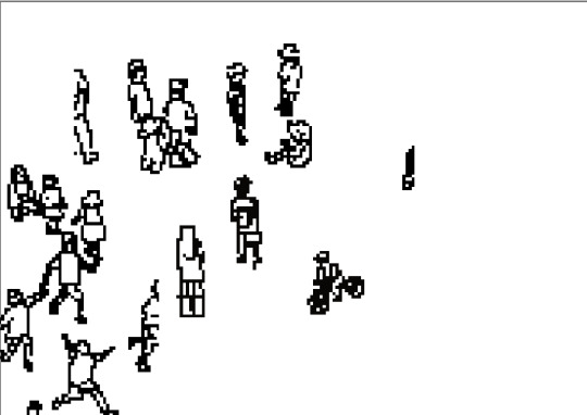
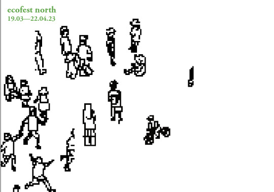
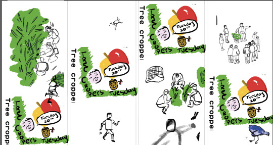
Photo
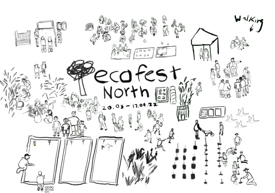
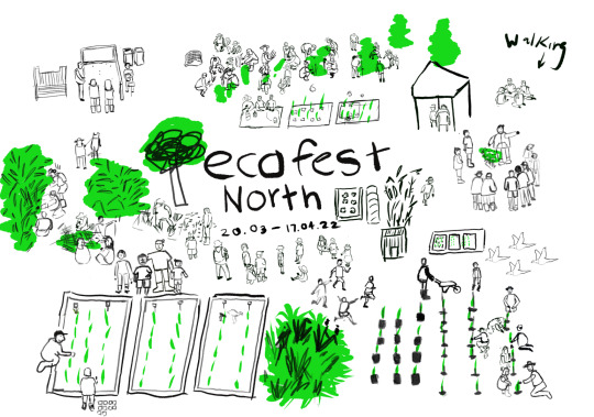
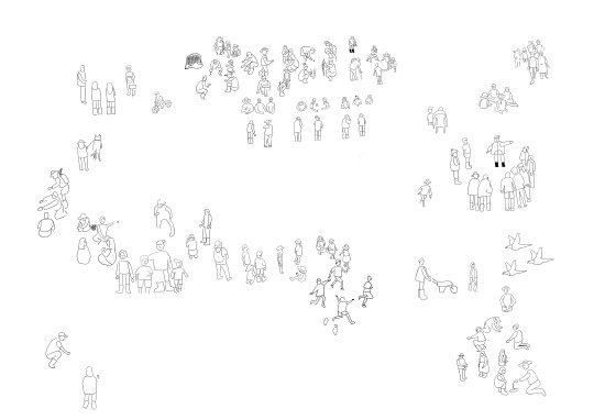
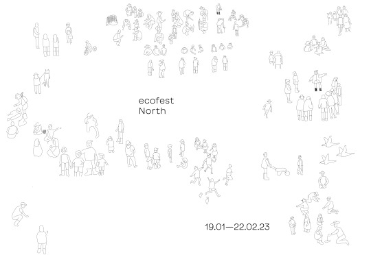
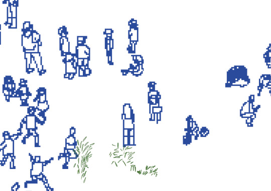
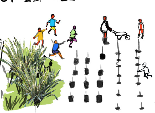
More illustration process
Again, it wasn’t my intention to draw this many people. I think if I were to re-do this project, I would’ve planned out my visual design system across different formats earlier for logistics sake. For example, maybe the poster could’ve been a handful of people in the field, or maybe it would’ve looked better with a few central figures.
Another thing I was conscious of was, I didn’t want this thing to look overly graphic design. I definitely understand the value of systems and how effective and efficient they are but my earlier system felt impersonal. It could’ve worked as an identity, but it didn’t speak to values like community, connection or conservation.
Originally I had planned on using that scribbly green tree line as another asset, but it distracted from the illustration.
0 notes
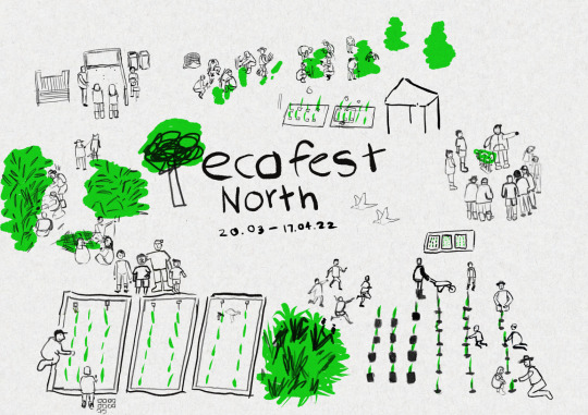
Photo
The top screen shots were quick ideation on photo collage mixed with illustration. I don’t know why I hadn’t considered it at an earlier stage, but most likely it was time constraints. However, I think combining photo with illustrations could be another solution.
The middle screenshot was ideation on how I could expand the visual design system across platforms. I was going to use something like this to break up my brochure events, instead of having a table. However, I thought it would introduce too many colours into the system.
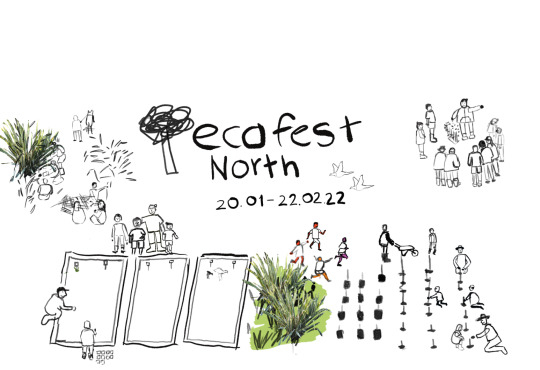
Initially, I hadn’t planned on drawing so many figures but I would see white space and continue to draw more people. I think my plan was to try and illustrate all the different events that happen at the festival. So you have people tree planting, people in the nursery, weaving, and restoring the reserve.
0 notes
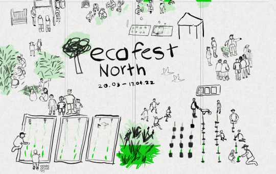
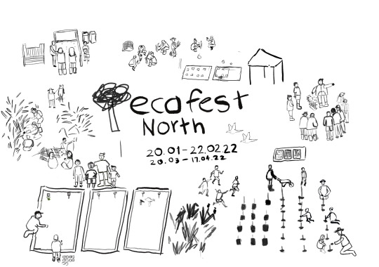
Photo
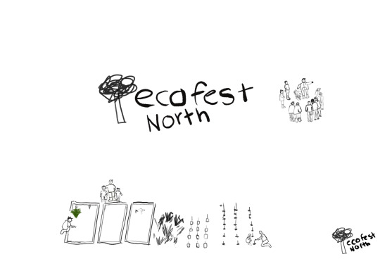
First iterations post font identity
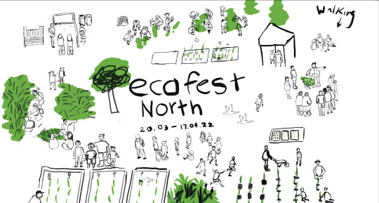
Photographs are always going to be an effective way of capturing events like ecofest, but with such a tight deadline, I didn’t think it was possible. My second thought about photographs is that they live in isolation. Whereas, if I could draw this big narrative, then I could rearrange and re-compose it to whatever format I was working with. I thought that visually it looked more interesting when there was this big narrative with all these small events happening around the canvas. But also, it gives you a bigger picture of these collective acts but is still clearly a community.
0 notes
Photo
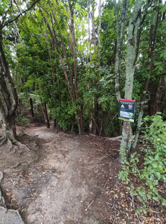
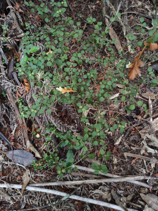
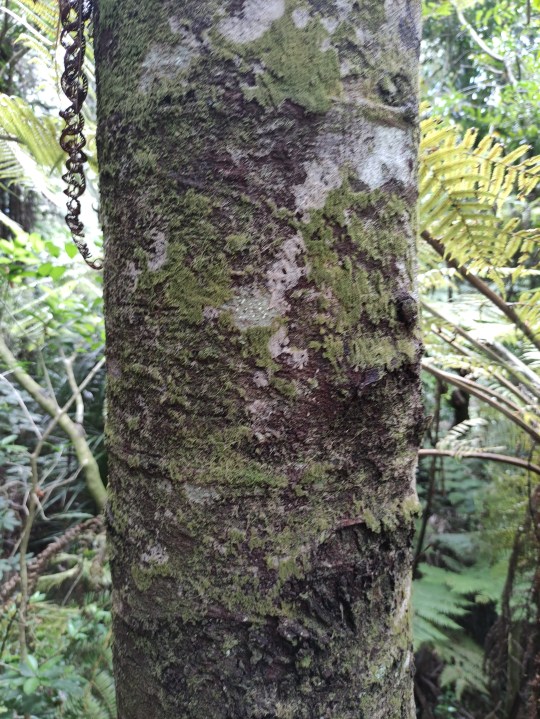
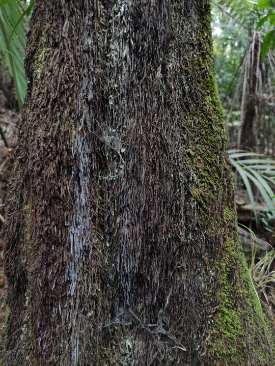
Going for a walk
Reflecting on my creative process, I know when I don’t have the answer to a design problem, my issue is I procrastinate. I thought a better idea would be to go visit my brother and have a discussion about my ideas. Lately, I’ve found it easier to articulate my ideas to someone else.
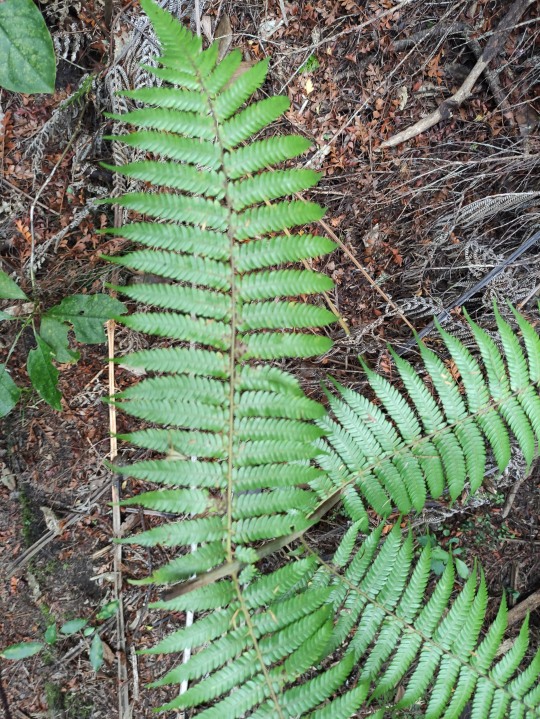
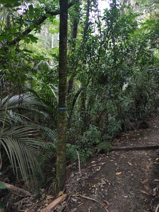
Unfortunately, he wasn’t home at the time, so I thought I’d take a walk through the local reserve. I thought maybe I’d come across something that would spark an idea.
The walk definitely helped me clear my mind, but didn’t give me any ideas. I felt like something was missing. But after talking it through with my brother, I realized the overall theme of the festival was connection. You can’t have the environment without the people. This concept also extended to other connections such as community, generations, etc.
0 notes
Photo


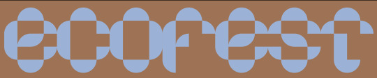
Friday/ Saturday
A font based identity was my original plan for this identity. I was going to use shapes and textures that could be swapped out for one another and be an iterative process. However, I thought the textures looked too busy and obvious. I spent a few hours pacing around my room trying to figure it out before going for a walk. Retrospectively, I think the colours are working well together.
0 notes
Photo
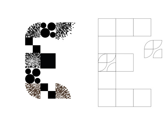

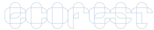

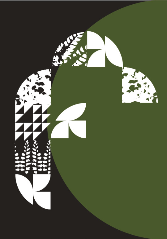
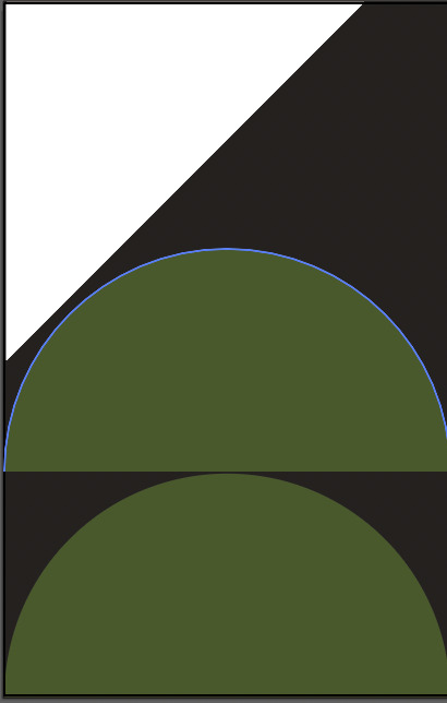
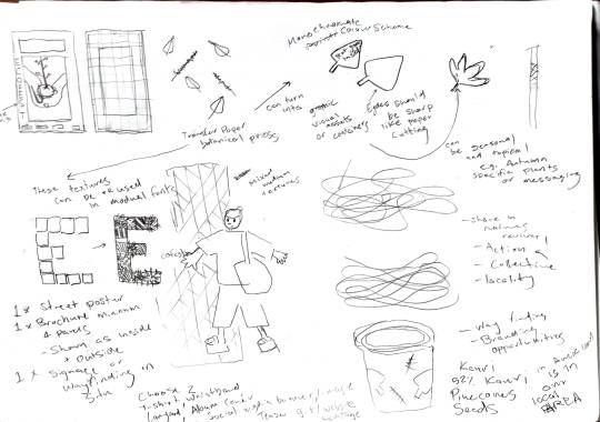
Based on quarter circles as a component, I’ve begun designing a modular font. I’ll then build on these quarter circles to develop patterns, shapes and other assets.
0 notes
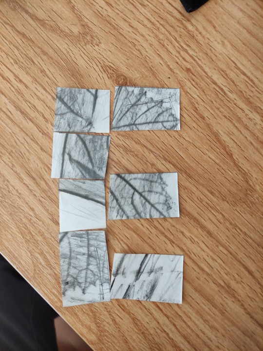
Photo
Mood board
I’m usually good at mood boards, but I found it difficult to accurately convey a sense of feeling for this festival. I’ve noticed that environmental festivals tend to have an emphasis on photography and people. However, with such a tight deadline, I don’t think I will have time to get out to any events to take some photos. Currently, I’m looking at collecting some leaves, clippings and flowers to make some prints out of over the weekend.
0 notes
Photo
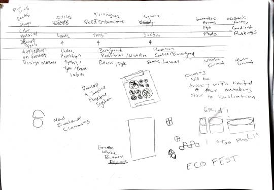
Notes on flexible visual systems
Visual notes on outputs and assets for the visual identity. In the past, I’ve struggled to wrap my head around how they work. So I’ve been reading flexible visual systems by Martin Lorenz. In the book, he emphasises a systematic approach similar to Karl Gerstner. I would design assets and components without considering how they work cohesively and across formats.
Two-points
https://new.twopoints.net/
Flexible Visual systems
https://flexiblevisualsystems.info/
Karl Gerstner - Designing systems
https://www.lars-mueller-publishers.com/designing-programmes-0
0 notes
Photo
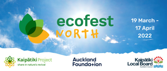


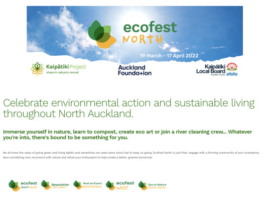
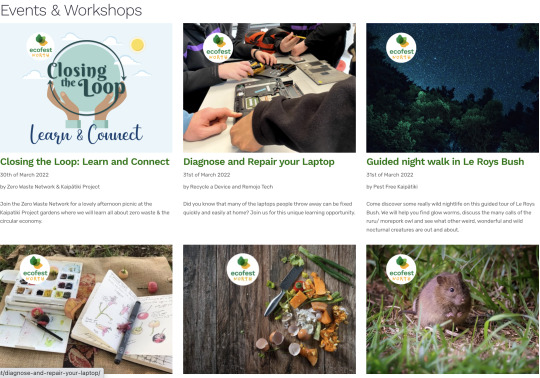
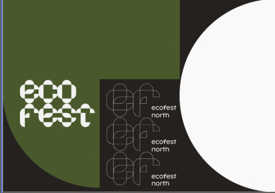
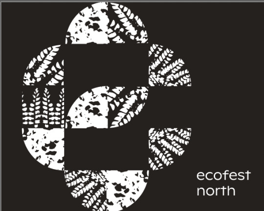
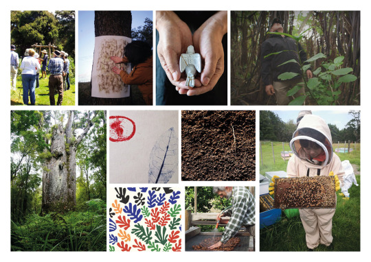
Ecofest
Ecofest is an annual community festival comprised of two festivals - Ecofest North and Ecofest West. As Auckland's largest environmental festival, Ecofest hosts a variety of workshops, activities and classes. Its primary focus is to “encourage people to re-connect with nature and re-imagine our relationship with nature.
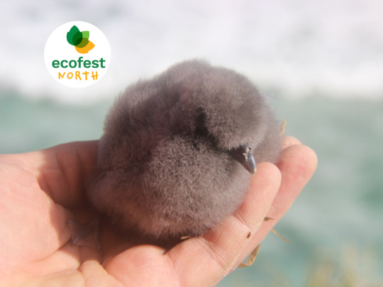
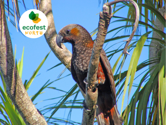
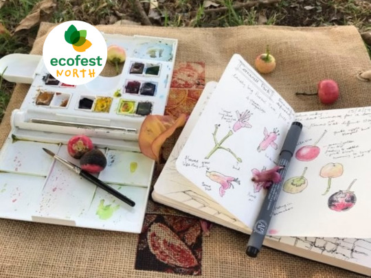
Their visual identity primarily consists of photos from events and workshops. These photos serve to illustrate values like community, connection and conservation. However, as this festival’s focus is the environment, its current visual system is barebones. However, I think there’s an opportunity here to establish a visual system that can better serve their identity and work across formats.
Our Auckland
https://ourauckland.aucklandcouncil.govt.nz/events/2022/03/ecofest-north-2022/
https://ourauckland.aucklandcouncil.govt.nz/events/2022/03/ecofest-west-2022/
Kaipātiki Project
https://kaipatiki.org.nz/ecofest/
Ecomatters
https://www.ecomatters.org.nz/events/category/ecofest-west/
0 notes
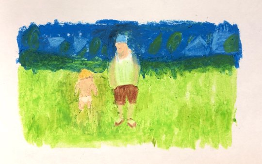
Photo
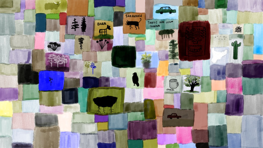
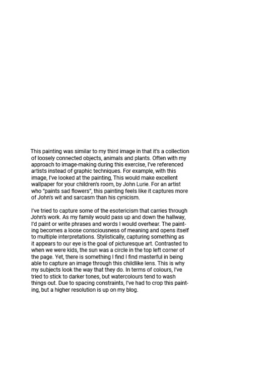
Another watercolour, looking at John Lurie’s paintings.
0 notes