oneroyi
royi
he/they - 19 - still trying to figure out how this works
76 posts
Don't wanna be here? Send us removal request.
Last Seen Blogs

manelocos-blog
Sem título
princeoftheeternalbog
Prince

borngreat-dmoneyevangelist
Born Great _Money Evangelist
pihilippineliterature
Philippine Literature

skincell-advanced-price
Skincell Advanced Reviews: Check Price, Benefits & Customer Feed
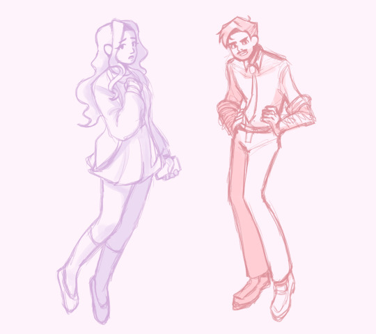
Text
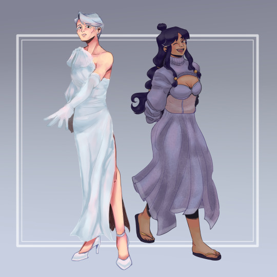
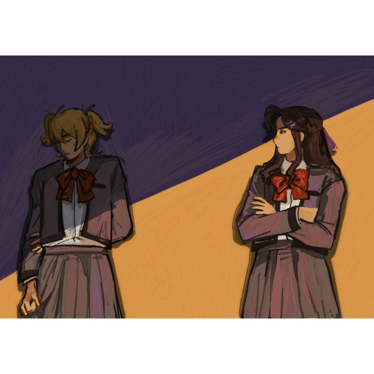
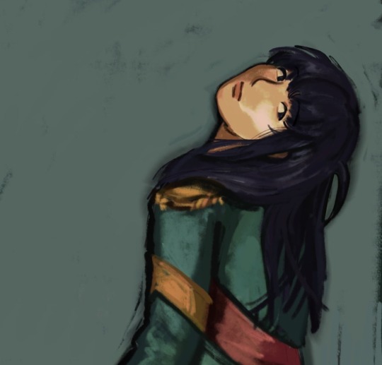
felt in the mood to draw some dresses :)
171 notes
·
View notes

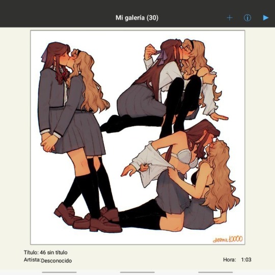
Text
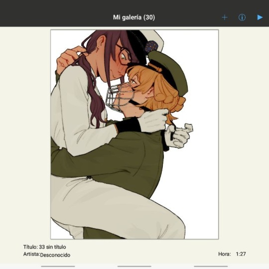
Toxic Yuri fanart
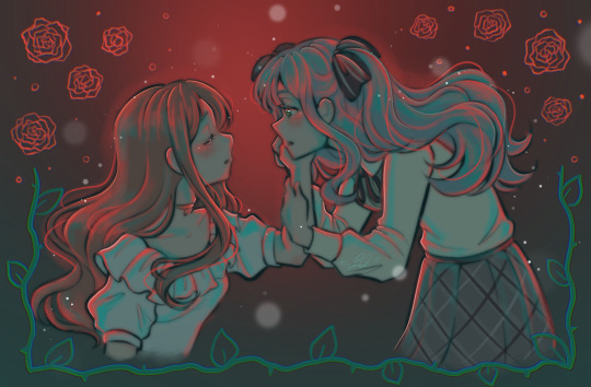
#soyo nagasaki#sakiko togawa#soyosaki#bandori#its mygo#TOXIC YURI NUMERO UNO#this is so good ooouuughgh the colors!!!
307 notes
·
View notes
Text
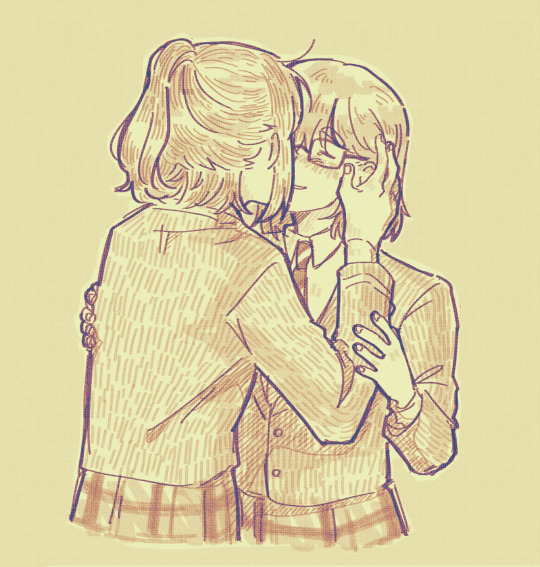

bandoris i doodled this past week....my littles
#bandori#bang dream#kaomaya#yukilisa#i miss kaomaya so much it hurts physically#ykls for my good friend pris#manifesting ykls event w this btw
46 notes
·
View notes
Text
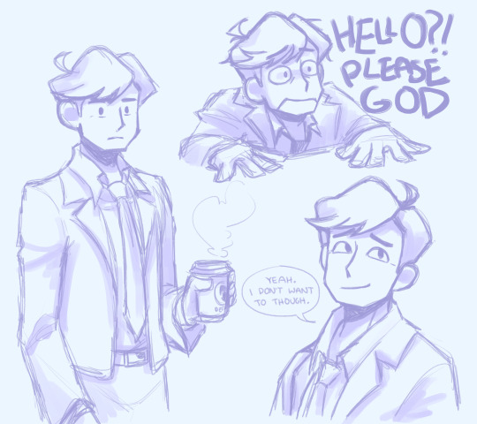
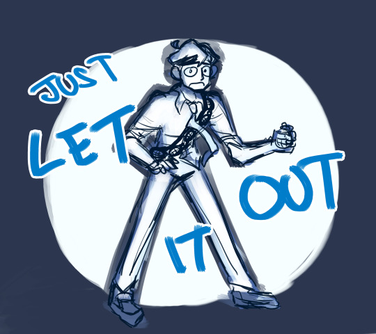
tgwdlm doodles cause ive been thinking about it
#the guy who didn't like musicals#tgwdlm#i dont go here but these are so shaped#every day i fall more in love w your art my dear friend
341 notes
·
View notes
Text

hand delivery service ! open to see what’s in the letter !
128 notes
·
View notes
Text
color practice tomori + little takitomos (i keep forgetting tumblr exists......)
178 notes
·
View notes
Note
How scared would you be if sharp rocks were constantly flying around you?
it depends on how big they are and if they make contact with me or they're just flying around. chilling
5 notes
·
View notes
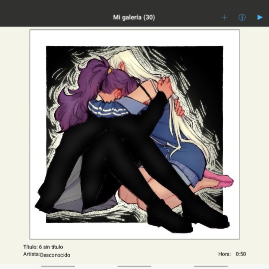
Text
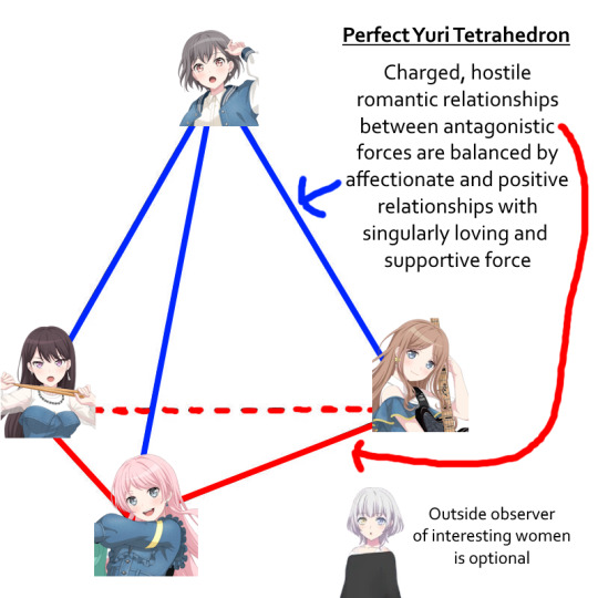

Doing some yuri science
523 notes
·
View notes
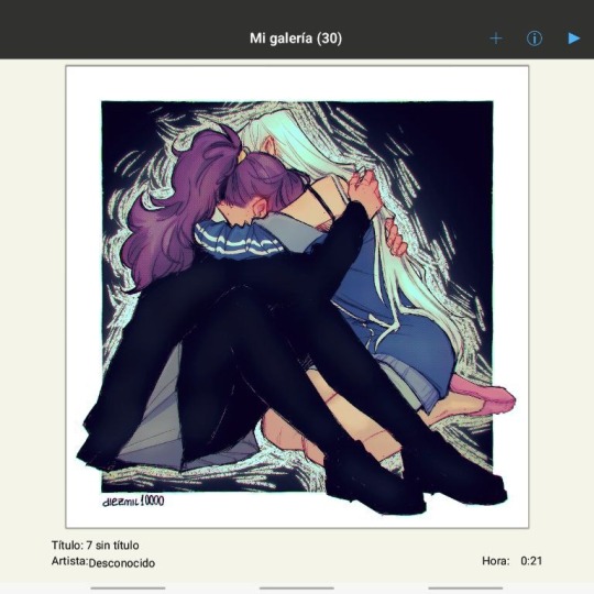
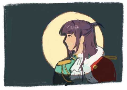
Text
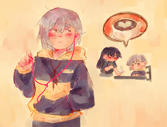
anosoyo doodle
143 notes
·
View notes
Text
Me when tragic siblings:


#MEEEE#specifically about the yumeojis#but any kind of tragic siblings story is so ooohhghhh#good soup
34K notes
·
View notes
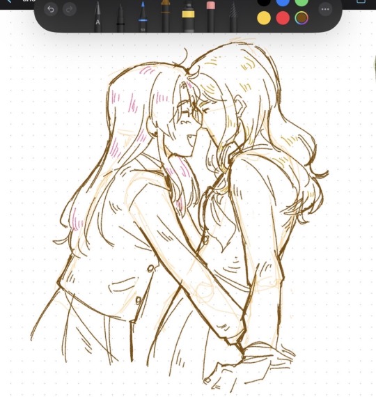
Text
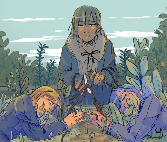
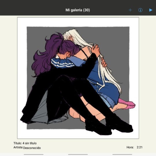
death tending its garden
#bandori#EATING THIS#PRIS NEVER MISSES#LOVE#i keep going back to this on twt and i think everyone on tumblr should see it too#mygo#togawa sakiko#nagasaki soyo#wakaba mutsumi
202 notes
·
View notes
Note
Hi hi, hope you're doing well!!
Wanted to ask if you could explain how you pick colours! They're always so appealing to look at...
(If you could also explain how you pick blush colours it'd be great! I never manage to pick good ones, no matter how hard I try :'))
hi anon, i'm doing fine!! it's summer right now where i live and that's healing all my problems (◡ ω ◡)
i have recorded the process of some of my drawings and everything is posted in my youtube channel (in twitter too), so i'll drop the link here and try my best to explain the coloring part to you. the short answer is that none of the colors you see in my drawings are similar to those i initially picked.
i try to keep my lineart loose but i pay attention to the outlines so i can quickly select the outer parts, invert the selection and fill it with the bucket tool. my base colors are all 100% opaque and i don't use any fancy brushes here.
as to how i pick colors, i never use the color picker tool, i eyeball everything. that's important for me because i tend to make all of them warmer: the greens are dark yellows, the pinks are light reds, and everything that's close to blue is very desaturated. i do this even for drawings that turn out much different later, unless i have a very specific vibe in mind from the beginning. i also never use pure whites for anything, and if something is black i make it part of the lineart.
then i always color my lineart!! there's no trick to that, the layer is in normal mode and i just paint it with a darker color than what's below it. i usually add the shadows and highlights at this stage of the drawing too. you're going to kill me for this but shade with gray set in color burn or linear burn (never multiply). i just don't want to think about color variety at this stage because it makes things more difficult for later. sometimes i add textures and some basic color correction here (curves, color balance, layers set in overlay, etc.) but i mostly leave that for the next part.
as to how i choose blush colors, i usually pick the base color and move it towards the saturated end of the color wheel, and a bit more pink. sometimes i add a multiply layer and airbrush hot red over the base colors at low opacity. coloring the lineart with hot colors surrounding the blush areas helps a lot too :)
i also almost always duplicate the lineart, blur it and set it in linear burn (i paint this layer in a light gray). this adds a lot of depth to the drawing, especially if later combined with the bloom effect.
the key to why the colors in my art pop so much is that i don't enjoy drawing as much as i enjoy postprocessing pictures 😂🤣😅👌✌️👍 once i'm satisfied with the "base" colors i merge everything except the background, open a new canvas and go crazy with filters and textures. that's why i use ibispaint X even if i do the lineart elsewhere (krita), and even if it works a bit wonky with big canvases.
i do something different for each drawing here, so first i'm going to explain my reasoning so that you understand my process: i used to have a problem of using very strong colors that overshadowed my beloved lineart into which i had put a lot of effort, so my goal nowadays is to make everything look less contrasted without losing the visual impact of saturated colors. that way the lineart remains a strong point and not just a way to separate one color from another.
what i usually do is duplicate the new merged layer, set it to exclusion mode, add a gradient map and play with the opacity. then i duplicate that and do the same thing with another gradient or another blending mode. i tend to add like 3-6 layers of bullshit over my drawings, including textures and other filters like "bloom" or "sharpen". i understand everything that's going on there but i don't think too deeply about it, i just pick whatever looks best.
for the final touches i always pull up the saturation and contrast (since a lot of it gets lost in the process), and i usually have to manually change some colors (ibispaint X has a filter to do that) or tweak the curves. then i add chromatic aberration, noise set to overlay and little polka dots set to linear dodge.
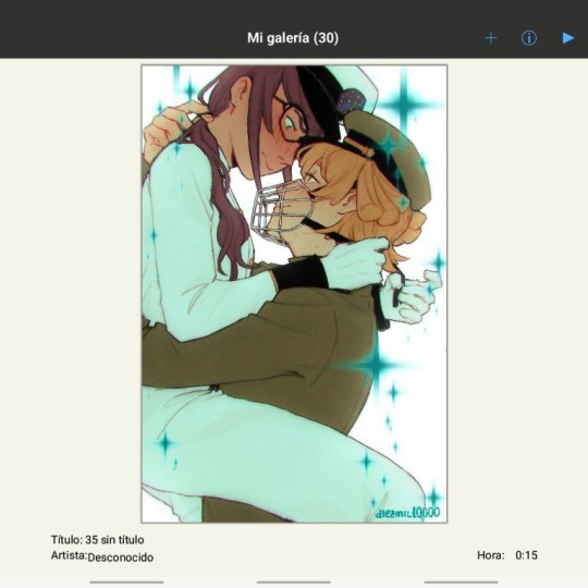
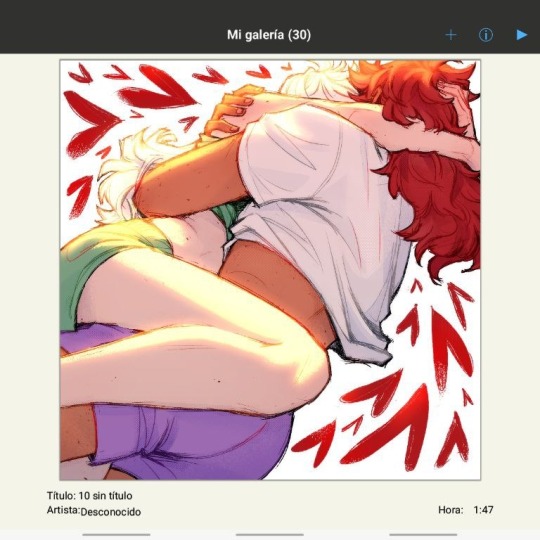
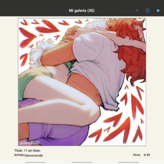
here are some comparisons of the before and after of recent drawings. the 1st one is very subtle, but you can clearly see how much warmth and depth it gains it gets after all the postprocessing. the 2nd one is so different that i understand why you're curious about how i pick colors. i don't think i can replicate that look just from picking nice colors, there's a lot more going on!! the 3rd one personally feels like it had potential lost (i liked the yellow highlights), but the colors were too strong and all over the place, so the finished result looks more intimate and calm and i like it a lot more.

thank you for the interest anon, i'm very happy that you like the way i color things and i hope i have explained myself. good luck with your own journey!!
24 notes
·
View notes
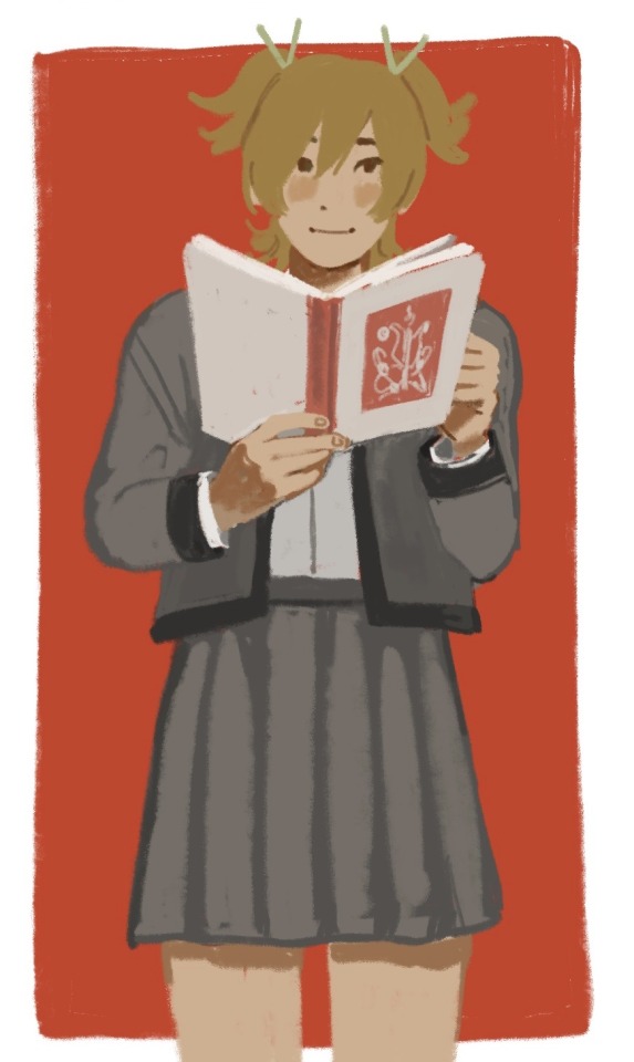
Text

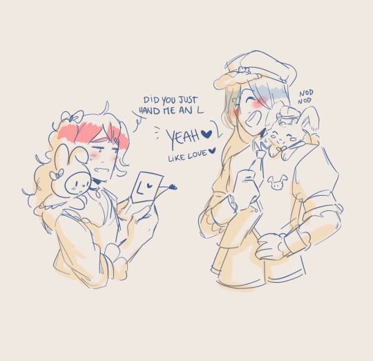
obsessed with mutsumi being umiri's little guy.....we love you little beepo
228 notes
·
View notes
Text

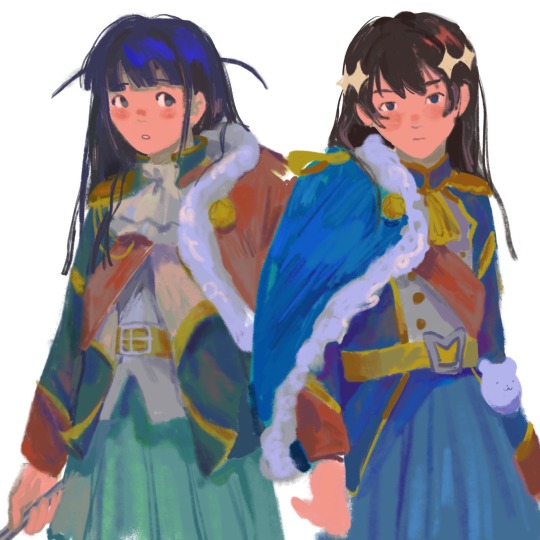


assorted revstars
#revue starlight#revstar#ooohhhhhhhhhhhhhh this is so good#i love the way u use shapes and colors op...#and the textures too#this has to be one of my fav art styles ever#kagura hikari#tsuyuzaki mahiru#daiba nana#tendou maya#hoshimi junna
2K notes
·
View notes
Text
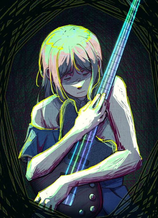
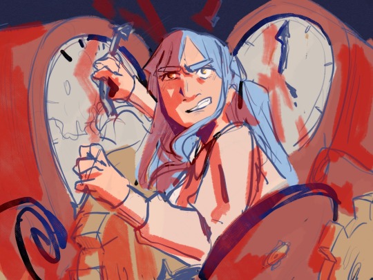
she refuses to change her bass' strings, but that only makes it sound strained and painful
#bandori#bang dream#mygo#soyo nagasaki#the strings' colors are crychic's members' image colors btw :)#normal girl swag!
728 notes
·
View notes