Last Seen Blogs

nordicbananas
𝙱𝙰𝚂𝙾𝚁𝙴𝚇𝙸𝙰!
claiirvoyantjedi
Clairvoyant

yanlei-a
the master of shadows.

fosfood
Untitled

dicasparsluts
dicasprio
Text
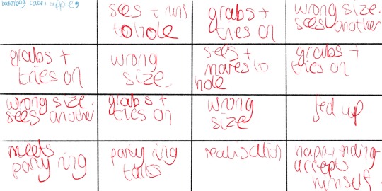
Page Tweaks Part 2
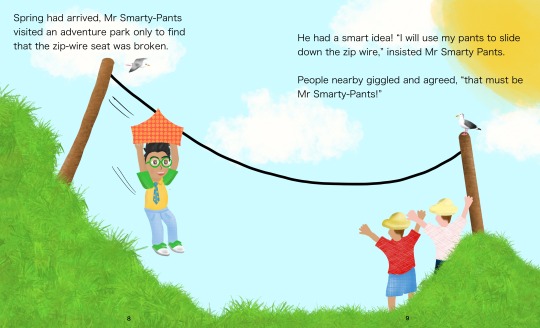
I changed the font for all pages to the one that isn’t bold, not too harsh on the eye and distracting from the imagery. I also added a slight grain on Mr Smarty-Pants cheeks for a slight blush. I drew a seagull to add to the beach page which I added on a few others for more details to be looked at by readers, happy with how it turned out.
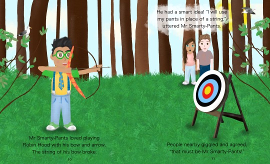
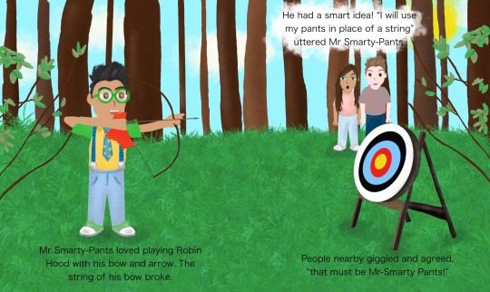
Pants string on arrow looks better with the shape, like it’s archery. Added some birds in the background to give more details to look at in the page.

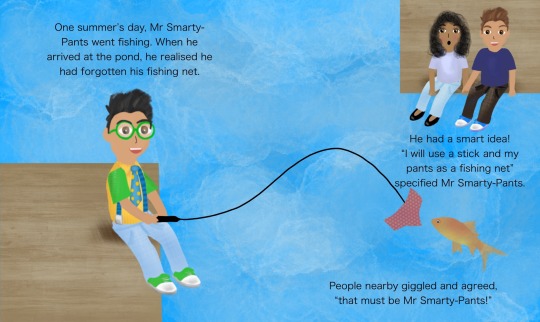
Make the pants look more like a fishing net, looks more like the fish will go inside it, maybe in front of the net? Have some tiles on the planks and have them at an angle for better perspective- not just flat, give a 3D feel. Show the characters feet in the water
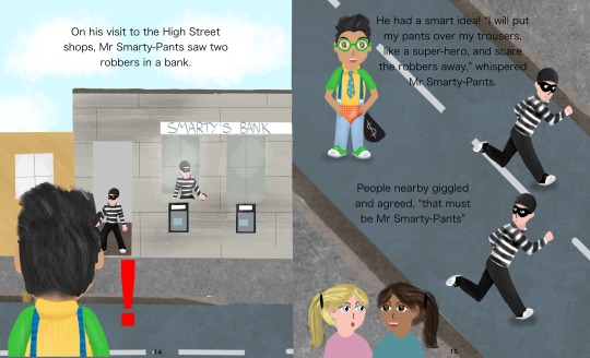
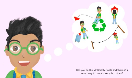
Tutors liked this page
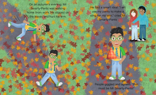
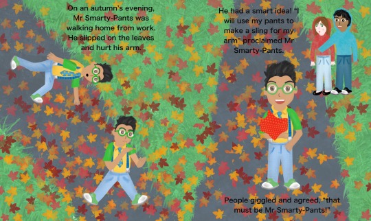
Liked the motion of Mr Smarty Pants falling on the first page, and with the motion lines drawn on. The sling looks much more like a sling, has depth.
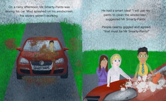
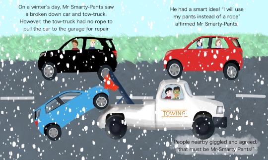
Rain looks a bit dark, not quite like rain? Will play around with this, could remove the background for the right page and have it plain. Anonomaly centre of spread. Blonde characters eyes are quite bright with very pale skin, look into making skin less pale and lighter eyes/less bold? Happy with how the other characters are rendered. Extend the road on the first page to the top, looks like a dead end, give it perspective.
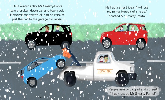
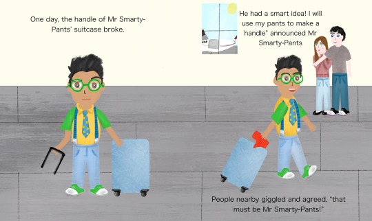
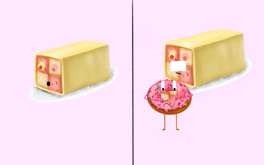
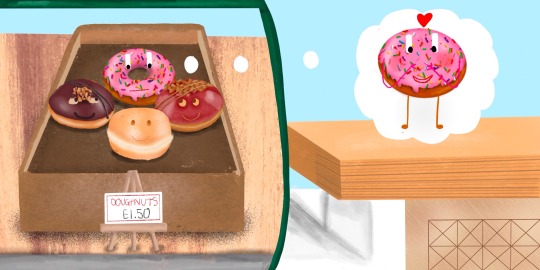
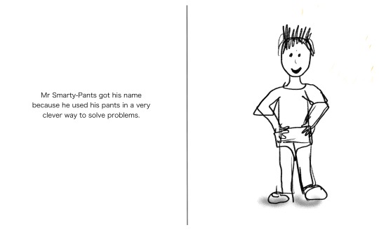
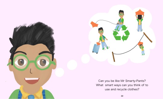
Happy with this page, just need to check the important information (pants) aren’t positioned to be in the gutter once printed.
No change from previous post

0 notes