
miru-craciunbcu
MIRU
20 yo | Graphic Design Student | L5
50 posts
Don't wanna be here? Send us removal request.
Last Seen Blogs


Text
xChange // Ideas
Valentina Tereshkova
Marie Curie
Amelia Earhart
0 notes
Text
ACA// 2. Identify Design Elements When Preparing Images
DIGITAL IMAGE FILES
JPG (print)
continuous-tone raster images
for photographs and digital paintings
million of colors
compressed
they lose information when saved as JPG
GIF
web graphics, logos, and cartoons
256 colors
small file size
are commonly used for short animations
PNG (print)
PNG-8
simple transparency
256 colours
small file
can be smaller than a GIF
PNG-24
millions of colours (RBG, greyscale)
partial transparency
high-quality photographic images
the file is larger than a JPG
PDF (print)
it’s the industry standard format for most commercially printed products
contain both raster and vector information
support embedded fonts, layers, transparency
RGB, CMYK, greyscale and spot colours
support bookmarks, hyperlinks, audio, video, and forms
EPS
include both raster and vector information
does not support transparency
widely supported
RGB, CMYK, greyscale, 1-bit images
PRINT VS. SCREEN
FILE SIZE
web: file size low while maintaining the image quality because you have to download it, and the larger the file, the longer it takes to download
print: file size is not an issue for print files
DISPLAY SIZE
when you create a PS doc, you have to choose a profile: print, art and illustration, web, mobile, film and video
they will set several options for the document, including the pixel dimension and resolution
PRINT DOCUMENTS: have sizes like letter and tabloid, and are measured in points, picas, inches.
WEB PROFILES: have sizes like 1366x768 and 1440x900
FILM AND VIDEO: have sizes like iPad, iPhone, HDTV, and it’s measured in pixels
DPI: dots per inch (print)
PPI: pixels per inch (web)
color modes: screen graphics (RGB) and print graphics (RGB, CMYK, greyscale or spot colours)
DESIGN PRINCIPLES
GRAPHIC COMPOSITION
foreground and background
colour and tone
cropping
aspect ratio (4:3 into 16:9)
rule of thirds
VISUAL HIERARCHY
size
position
alignment
repetition
balance
colour
contrast and emphasis
proximity and grouping
texture
white space
PERSPECTIVE THEORY
vanishing point
perspective grid
one-point perspective
two-point perspective
SCENE OF DEPTH
shading
highlights
drop shadow
3D effects
TYPOGRAPHY
The art of formatting and arranging type in print and/or screen
The actual appearance of type
TYPOGRAPHIC TECHNIQUE
typeface: design of a set of characters (ex. Helvetica)
font: digital file on your computer (ex. Helvetica Light Oblique)
FONT SIZE
legibility is a feature of a typeface design and it’s based on how easy/difficult is to recognize some characters (ex. if you can tell apart a B from an 8)
readibility refers to how easy/hard is to read something based on point size, color, alignment, etc.
line spacing (leading)
letter spacing
word spacing
line length
alignment
type style (bold, italic, condensed, extended, etc)
hyphenation
kerning (auto, manual, optical) - space between two letters
tracking - space between all the characters in a selection of text
COLOUR CORRECTION
COLOUR CORRECTION
the process of adjusting the colours of an image so they more accurately represent the real world colours
when the colours are skewed in a particular way, we say that the image has a colour cast
AUTO TONE, AUTO CONTRAST (doesn’t change colours), AUTO COLOR
HOW TO TELL IF IMG NEEDS COLOUR CORRECTION
go to Color Panel > Panel Menu (3 lines) > HSB Sliders
pick the eyedropper tool and set Sample Size to 5x5 and click in the image
check the H to tell the hue, and S to tell the saturation
Adjustments Panel > Color Balance > Tone > Shadow > modify depending on what you want to turn down
IMAGE GENERATION AND TYPES
IMAGE TYPES
Created Images are the ones that started out on the computer. They can be screenshots, digital paintings, illustrations, diagrams, etc. They can be JPG, PNG, TIFF, GIF and PDF.
Captured images are created by devices with sensors that can ecode light and colors (cameras, phones, scanners). The most common file formats are JPG, TIFF and RAW images.
RAW images are unprocessed data from device sensor
KEY TERMS OF DESIGN AND GRAPHICS
RASTER - refers to the digital images that are composed of a rectangular grid of pixels. These can be digital paintings, photographs or other graphics. Raster images have a resolution. ALL IMAGES from PhotoShop are rasters.
RESOLUTION - is a measure of the density of pixels in a raster image
RASTERIZE - to turn an image into a set of pixels. Raster image formats include JPG, PNG, GIF, TIFF, PSD or Photoshop Files (although these can contain both raster and vector information)
BITMAP - bitmap images or bitmap objects refer to any kind of raster image. Yet, they also refer to more specific things. In Photoshop, there’s an image called bitmap for raster images - refers to how much information is contained in each pixel. These images go back to the earliest days of computer graphics. You should also understand the term 8 bit or 16 bit.
BIT DEPTH - high bit depth images can contain much more detail but come at a cost: bigger file size, longer time to save, etc.
CHANNEL - a channel in a digital image contains information representing light and dark measurements. These are also known as luminance values which range from white to black.
RGB is composed of 3 channels: red, green and blue light
CMYK is composed of 4 channels: cyan, magenta, yellow and black ink
DUOTONE images are composed of a single channel and two inks
HISTOGRAM panel shows you the value of each channel in an image
PATHS - a path is made of one or more straight or curved segment connected by points. Vectors are NOT made by pixels. You can draw vector shapes in PS by using the pen tool, shape tool, etc.
VECTOR - have no appearance. Are objects that describe 2D shapes.
FILL - are colours that fill up the area inside of a path/selection
STROKES - are the colours that are applied to the outline of a path/selection
RENDER - to render an image in computer graphics means to generate an image from a set of instructions.
0 notes
Text
ACA // 1. Setting Project Requirements
PURPOSE OF IMAGES
convey info or data
promote learning and understanding
advertising and packaging
UE design or app/websites
AUDIENCE OF IMAGES
closely tied to the purpose
age, location, gender, ethnicity, etc.
audience guides design choices
context is crucial
CLIENT’S GOALS
attractive design
sales
another specific result
speed and low cost
UNDERSTANDING COPYRIGHT RULES
intellectual property
copyright - the right of authors of creative works
drawings, paintings, photographs, videos, movies, books, etc.
THREE REQUIREMENTS FOR COPYRIGHT
copyrightable subject matter
original work or significant variation
fixed, tangible form
WHO CONTROLS THE COPYRIGHT
the person who created the work
the company who hired the person who created the work
purchaser the copyright
GETTING PERMISSION
a license is an agreement giving the permission to use content
the license contains terms and conditions
license terms vary
infringing is using copyrighted content without permision
PUBLIC DOMAIN
can be used freely
expired copyright
federal government content
works published before 1923
public domain resources from Wikipedia
CREATIVE COMMONS
nonprofit organization
enables the sharing and the use of creative works
DEMONSTRATE PROJECT MANAGEMENT KNOWLEDGE
WHAT IS A PROJECT
a collective effort to achieve a specific goal
creating or changing a product/service
limited time that is defined by a schedule
allocated resources
ROLES
project team
project manager
project sponsor
vendors - someone that is not part of the team but helps with a task
stakeholder - everyone involved with the project (internal/external)
PHASES
initiating
planning
launch
execution
completion
COMMUNICATE DESIGN PLANS
important to communicate early
design plans: concept, goal, scope, details of work
ask a lot of questions
be sure you’re talking to the right people
articulate the goal
understand the problem the design has to solve
be clear to avoid misunderstanding
try to meet in person
the phone is faster than e-mail
peer communication
sketch
use placeholders
0 notes
Text
ACA // PhotoShop
1. SETTING PROJECT REQUIREMENTS
Identify the purpose, audience and audience needs ;
Knowledge in standard copyright rules for images/image use ;
Knowledge of project management tasks and responsibilities.
2. IDENTIFY DESIGN ELEMENTS
Knowledge of image resolution, image size and file format for web, video, and print ;
Knowledge of design principles, elements, and image composition ;
Knowledge of typography;
Knowledge of colour correction using Photoshop ;
Knowledge of image-generating devices, their resulting type images, and how to access resulting images in Photoshop ;
Understand key terminology of digital images.
3. UNDERSTANDING PHOTOSHOP
Identify elements of the PS user interface and demonstrate knowledge of their functions ;
Knowledge of layer and masks ;
Knowledge of importing, exporting, organizing, and saving ;
Knowledge of producing and reusing images ;
Understanding of the features and options in a colour management workflow.
4. MANIPULATE IMAGES
Knowledge of working with selections ;
Use guides and rulers ;
Transform images ;
Adjust or correct the tonal range, colour, or distorsions of an image ;
Knowledge of retouching and blending images ;
Knowledge of drawing and painting ;
Knowledge of filters.
5. PUBLISH DIGITAL IMAGES
Knowledge of preparing images for web, print, and video.
0 notes
Text
Competition Brief // TABLE OF CONTENTS
LEARNING OUTCOME 1 - 1.500 word critical reflection
LECTURES
All Lecture Notes // Scanned Sketchbook
WORKSHOPS
Workshop 1 // Planning & Structuring
Workshop 2 // Selecting Sources & Referencing
Workshop 3 // Using Quotes & Paraphrasing
Workshop 4 // Using Images in Writing
Workshop 5 // Constructing Paragraphs
Workshop 6 // Consolidation/Visual Text
BOOK SUMMARIES & RESEARCH
Library Books Researched
‘DemoGraphics. Packaging: Design Successful Packaging for Specific Customer Groups’ By T. Seddon
‘Illustrative Branding: Smashing Illustrations for Brands’ By Victor Cheung
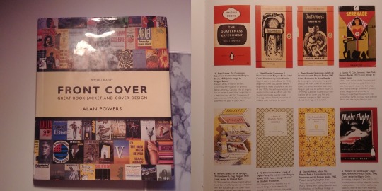
‘Front Cover: Great Book Jackets and Cover Design’ By Alan Powers
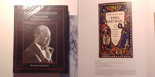
‘The Penguin Years’ by Richard B. Doubleday
DEVELOPMENT
Mind Mapping & Essay Structure
LEARNING OUTCOME 2 - REFLECTIVE BLOG
LEARNING OUTCOME 3 - COMPETITION BRIEF + RVJ
RESEARCH
Competition Brief - Penguin (Why?)
‘Wonder’ Present Covers Analysis
R.J. Palacio // The Author
‘Wonder’ // Book Review
‘Wonder’ // Movie Review
COVER DEVELOPMENT
Cover Concepts
Moodboard
Wonder #1 Cover Development
Title Development // Typography
Wonder #2 Cover Development
Critical Reflection
1 note
·
View note
Text
‘Wonder’ #2 Cover Development
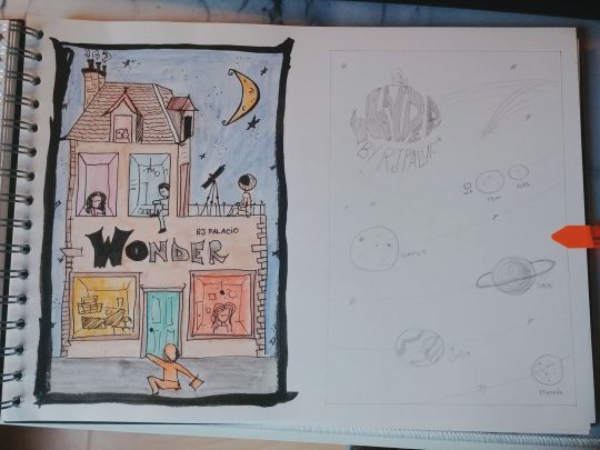
This cover was one of my first concepts (right one) that I’ve drawn in my sketchbook. After reading the book, a part of it stuck in my head: when Via said that from her perspective, Auggie was the Sun, and his family and friends were the planets, all his life orbiting around him.
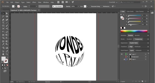
Designing my concept was a lot harder than I anticipated. I had this issue in Illustrator in which I couldn’t get the type to look right. In spite of Googling tutorials on how to fix this, I couldn’t find anything. I posted an Instagram story asking if someone knows how to fix the problem and, luckily, a guy that works in the field helped me.
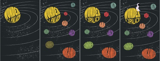
Here is a more detailed view of the development of the cover. As you can see, I first added the planets and then changed the sun. After that, I added more details and finished everything.
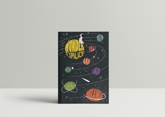
After I was done, I placed the design on a hardcover mockup in order to see what it would look like when printed and to spot any mistakes that I might’ve missed.
0 notes
Text
Mind Mapping & Essay Structure

Ever since I attended the ‘Consumerism’ lecture I knew that I wanted to approach that subject when it came to the 1.500-word essay. I didn’t know the main subject, but I was keen on researching how certain packaging designs influence the consumer into buying it or not.
Yet, after designing the book cover for ‘Wonder’ by R.J. Palacio, I thought it was the perfect opportunity to dig into how book jackets first appeared and how they influenced the world through time, therefore coming up with the title of my essay - “Always Judge a Book by Its Cover”, being a satirical title based on the well-known saying “Never judge a book by its cover”.
After coming up with the title name, I tried to mind-map what subjects I could focus on, the main one being:
evolution of book covers through time ;
the first printed book ;
illustration and its importance ;
importance of colours in design ;
consumerism ;
target audience - kids ;
typography vs. illustration.
ESSAY STRUCTURE
INTRODUCTION - In an increasingly interconnected world, where markets are saturated with a growing number of products, a brand must explore ways of distinguishing themselves. How does this apply when it comes to books? Relate to lecture, consumerism, and books you’ve designed for ‘Wonder’.
1ST PARAGRAPH - Graphic and typographic design was made possible in the third century A.D., with the Chinese invention and development of relief printing from woodblocks. Develop the subject and speak about how it influenced Europe, typography, first book cover.
2ND PARAGRAPH - How book jackets became popular and developed through the 20th century. How the consumers influenced the covers to change, to use colour, and then illustrations. Give examples about Penguin, and then Puffin Picture Books - the relationship between illustration & typography.
3RD PARAGRAPH - The importance of illustration when it comes to a book cover. Visual language and what it transmits. How it influences the target audience when it comes to kids - kidult - adults. How type it’s playful. Relate to your work and the book covers you’ve designed & explain the process.
CONCLUSION - Brands often need to create an identity and visual language that is unique and can create a meaningful connection with consumers. How book covers will change in the future. Digital vs. traditional books. How it relates to you as a graphic designer. How it influences you?
0 notes


Text
‘DemoGraphics: Packaging’ by Seddon, T.
DESIGN FOR KIDS
Marketers have realized the potential of pester power. Given the complex negotiating process that occurs between parent and child at the point of purchase, it’s no surprise that packaging has to tick two boxes: fun for kids and reassuring for parents.
Occasionally, the children’s category morphs into ‘kidult’(p21) territory.
Marketing learning fun is often a key objective of packaging in this sector, so type and illustration balance playfulness with information. Bright cheerful colours are appealing to kids while color coding aids a parent’s purchasing decision.
Fads and crazes in kids toys come and go, but space has long been a perennial pull for kids. Perhaps the key to its attraction lies in the versatility of the space theme: educational-astronomy and learning about the universe; adventurous-action packet space travel; science fiction- Star Trek and all that has followed.
0 notes
Text
‘Illustrative Branding: Smashing Illustrations for Brands’ by Victor Cheung
In an increasingly interconnected world, where markets are saturated with a growing number of products, a brand must explore ways of distinguishing themselves. Brands often need to create an identity and visual language that is unique and can create a meaningful connection with consumers.
Illustration often offers a design the ability to be memorable and desirable.
It is capable of storytelling and showing abstract concepts. It’s more fantastical and not bound to reality in the same way photography is. (p2)
Illustration can lead the consumer to collect visual elements of the brand, the same people collect art.
It has the ability to be flexible.
Bad visual language can lower consumer engagement. If language is confusing or not distinctive, it won't endure in peoples mind. Good graphics language can lead to more sales and a greater loyalty base. A strong visual language can provide a holistic brand experience, engaging consumers in the narrative of what it means to buy into a brand.
0 notes
Text
‘Front Cover: Great Book Jackets and Cover Design’ by Alan Powers
THE EVOLUTION OF THE BOOK JACKET
A book jacket or cover is a selling device, close to advertising in its form and purpose, but also specific to a product that plays a teasing game of hide and seek with commerce(p.6)
Book jackets first appeared in England in the nineteenth century, in a culture that was still discovering the rules of consumerism.
This early evolution came about in fits and starts, constrained by cultural inhibitions that are now difficult to understand.
It is quite a commonplace remark that, so far as certain classes of literature are concerned, “the cover sells the book”.
The first wave of jackets was so relatively fragile that the 1914-18 war was able to set back their further development until the 1920s. During this decade, advertising and the study of salesmanship became both more widespread, largely inspired by the economic buoyancy of the U.S. Branded and packaged goods were a growing feature among foods, medicines and a range of household products from the 1880s onwards. Books could learn from this practice, for not only could a publisher establish a brand image, but he could make different genres of books more easily identifiable for the convenience of the customer.
Consumers, who were growing up in a culture richer in visual images than any before, were experiencing motion-picture films for the first time, were beginning to take visual images subliminally as well as to read text for information. In addition, colour was more readily available for printing.
In most publishing houses, the dummy-prototype of the jacket (nowadays easily mocked up with a computer and laser-printer) has to be approved by the sales team, who have regular contact with retail buyers and claim to have a sixth sense for what will be commercially successful.
Book buyers are willing to be charmed but are not the kind of consumers who take kindly to being treated as fools, so some space is left for real imagination and creativity, and this pays off again and again.
Book designers, nowadays, have a new challenge: jacket legibility in a thumbnail icon on a website is almost as much a requirement as legibility across a crowded shop.
0 notes
Text
‘The Penguin Years’ by Richard B. Doubleday
The Flowering Of The Printed Book
Graphic and typographic design was made possible in the third century A.D., with the Chinese invention and development of relief printing from woodblocks. From the third to the fifteenth century A.D., illustrated, handwritten and illuminated manuscripts - Greek, Roman, early Christian, Celtic, Spanis, Christian, Romanesque, Gothic, Judaic, Islamic, and late mediaeval evolved into an opulent design vocabulary comprising complex, geometric patterns, exquisite page designs, various initial letterforms, and gold leaf applied to book design.
China’s invention of paper and printing dispersed slowly toward the West, arriving in Italy in the fourteenth century.
Because visual language and early writing systems (hieroglyphs, cuneiform and Chinese typography) were difficult to learn, Europeans eventually replaced these pictographs, signs and symbols with the twenty fundamental signs comprising the Greek and Latin alphabet.
The next major printing discovery was movable typographic printing by Johann Gensfleisch zum Gutenberg. The availability of paper, emerging transitional style and bridged the gap of Old Style Roman typographic design and modern typographic design.
England became the centre for development and growth during the Industrial Revolution of the eighteenth and nineteenth centuries.
Later on, a growing need for a more individualized profession of typographer materialized, someone with special talents who studied the history of the design and letterforms and could carefully choose the most suitable font for a specific text or printed material to be set in type.
In 1930, Stanley Morison (1889-1967) designed a series of yellow book jackets for the publishing firm Victor Gollancz. The whimsical cover design utilized a mixture of black and magenta typefaces in various sizes and words combined with design to intrigue and invoke the reader.
Yet, Jan Tschihold was the first designer to separate the profession of graphic designer from production editor. His prudent planning, inflexible control combined with his philosophy knowledge allowed him to create marvellous book designs in order to intrigue the reader into buying them.
OTHER INTERESTING FACTS
In 1949, Tschihold replaces the original dull grey paper cover to a warmer cream colour palette for all of the Penguin series.
The Puffin Picture Books became really popular after the 1917 Soviet Union Revolution. It included descriptive text for children with educational and recreational subject matter for the purpose of education. the books included commissioned full coloured illustrations. In 1947, The Puffin Picture books presented Tschichold with the challenge of striking a delicate balance between text and illustrations which could deliver harmony and balance. In order to give the design consistency, Tschichold maintained a consistent border design, thus giving the book a unique character. In 1948, Tschichold inherited a series of books that used unpleasing typography with no visual connection to the illustrations and lacked unique characteristics corresponding to the book's story. Such example is ‘Through the Looking Glass and What Alice Found There’. Tschichold cleverly adorns the front cover with an illustration drawn by John Tenniel of a young girl stepping through the looking glass, and a similar illustration of the young girl stepping out on the other side onto the back cover. The typography treatment for the back cover was placed backwards and read from right to left, an occurence that happens when reflected into a mirror.
0 notes
Text
Workshop 2 // Selecting Sources & Referencing
ACADEMIC MATERIAL
SUMMON
bcu.summon.serialssolutions.com
A-Z DATABASES
the university’s online library service also has a collection of databases through which you can locate a wealth of full-text academic material ;
libguides.bcu.ac.uk/az.php
GOOGLE SCHOLAR
Google Scholar is Google’s academic search engine ;
scholar.google.co.uk
0 notes
Text
Workshop 1 // Planning & Structuring
mind map ‘a diagram in which information is represented visually, usually with a central idea placed in the middle and associated ideas arranged around it’
WHAT ARE THE ADVANTAGES
they lead to a more structured essay plan
you can sort between relevant/irrelevant ideas
helps with critical thinking
organises your thoughts
it’s easy to add ideas at any times
you can discover connections that you might not normally see
ESSAY STRUCTURE
1500 words in total
introductory paragraph 10%
main body 80% (1600 words)
concluding paragraph 10%
0 notes
Text
Workshop 5 // Constructing Paragraphs
paragraph a distinct section of a piece of writing, usually dealing with a single theme’
we usually use paragraphs as a way of structuring writing and developing arguments through a sequence of distinct points ;
without paragraphs, text becomes overwhelming, off-putting and difficult to read .
HOW LONG?
it is a good idea to aim for around 100-200 words per paragraph ;
each paragraph should contain no more than one main point - however, you can break down a main point into up to three paragraphs dealing with sub-points.
PERSONAL REACTION
academic writing is formal in tone, and is meant to be objective by using cited sources to support an argument or position ;
the focus is not on the author(you), but the writing itself - you can use phrases such as ‘this essay will explore’, etc.
it is crucial to present both sides of an argument - even if you know which direction you want your argument to take - it will give your argument more credibility.
A PARAGRAPH CAN
develop a new idea ;
expand upon an idea which has already been introduced ;
offer a contrasting view.
P.E.E.E.E. PARAGRAPHS
P // POINT - introduce the main point - this should link in some way with the previous paragraph, using connecting phrases ;
E // EXPLAIN - explain a little about the point in order to contextualise it ;
E // EVIDENCE OR EXAMPLES - introduce evidence/examples supporting the point, for example, quotes, paraphrases, images, statistics, studies, etc. but ensure they are cited correctly ;
E // EVALUATION - weigh up what has been said in the paragraph, possibly identifying a topic for discussion in the next paragraph.
SIGNPOSTING
signposting is a way of guiding your reader through the text, explaining the logic of your argument ;
you remind the reader about: what is being said, what has already been covered and what direction the essay is going to take moving forward ;
there should be some aspect of signposting in every paragraph of your essay - often at the start of the paragraph.
examples:
‘In order to understand ... it is useful to apply these theories of ...’
‘Another aspect of ... is...’
‘In contrast...’
‘Building on from the idea that ...’
0 notes
Text
xChange Festival
Submit 2-3 postcards ( 148 x 105 mm)
File name: Surname_Name_Postcard_Brief Name
BRIEF 1. Women in Higher Education
colour red
experiences & issues for women in Higher Education
Pay gay, salary, etc.
BRIEF 2. Seen
1 note
·
View note
Text
Blender
This Christmas break I decided to take upon a new skill - learning a 3D software, Blender. I’ve always wanted to learn such software on the grounds that it is extremely required when applying for jobs and it can boost up your CV.
My goal was to try and learn every day one chapter from Lynda.com. Even though I couldn’t do that daily, fortunately, I managed to complete a lot of chapters and learn a lot of things!

Taking notes while studying has proved to be the most efficient way for me to learn. Therefore, I tried writing down every bit of useful information and revising it at the end of the day in order to memorize it better.
My goal is to learn this software really well by the end of the year and design a couple of concepts I’ve had in mind for a long time now.
1 note
·
View note