
miarttx
Mia McKervill
Blog for all collage work in Year 1
143 posts
Don't wanna be here? Send us removal request.
Last Seen Blogs

itsglitter420
Untitled
ashxjack-blog
Anxious mind, wholesome heart
dancinginashesandshadow
In search of inspiration
hyunjaesteeth
hyunjaesteeth
Text
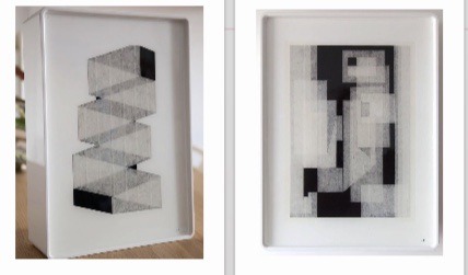
3D Evaluation
1- Visual flow map
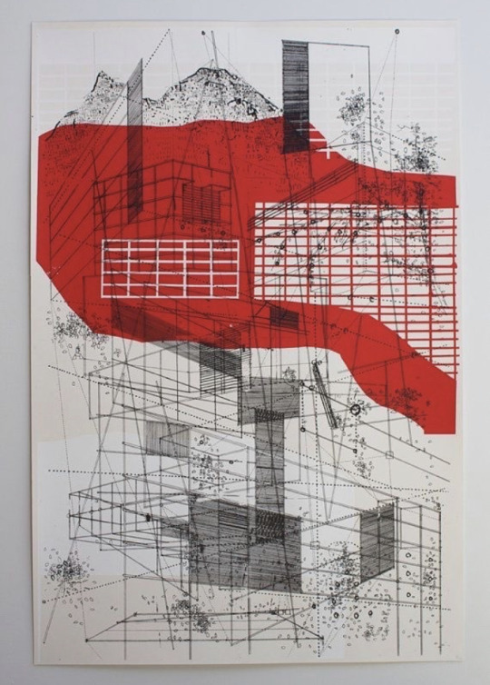
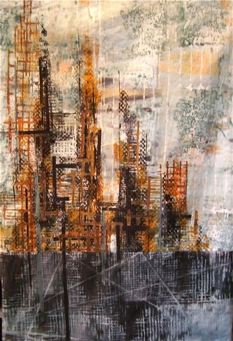
A piece of research that has impacted my work the most:
Composition, perspective, forms.
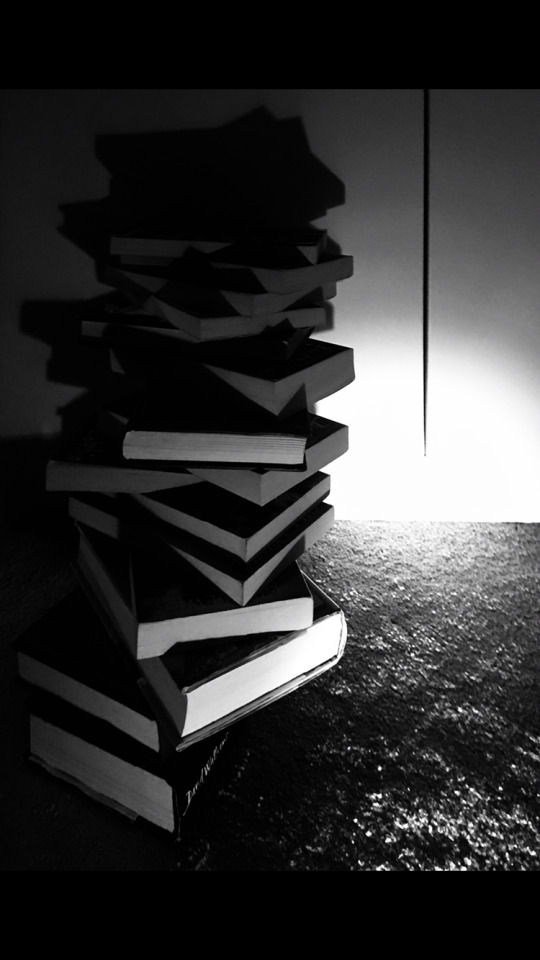
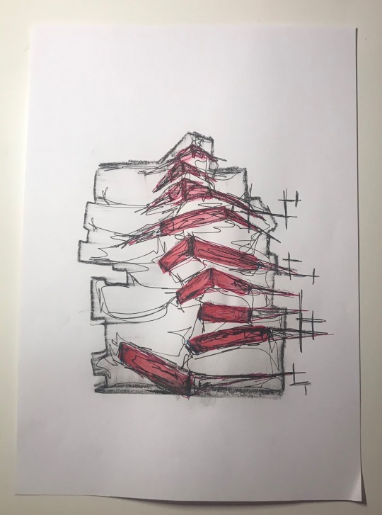
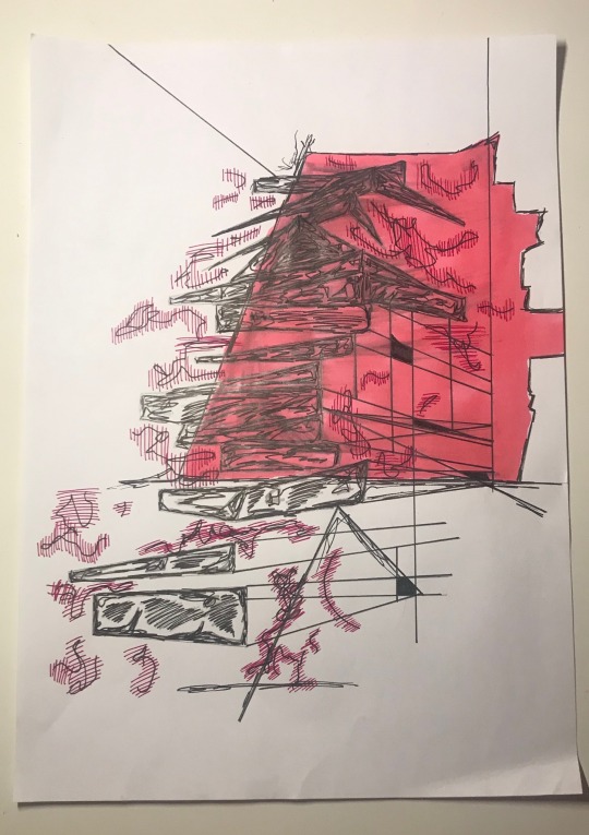
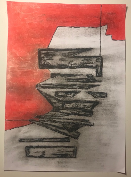
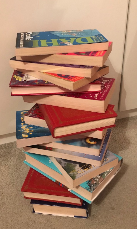
A photo of a tower I have made:
Contrast, tone, scale.
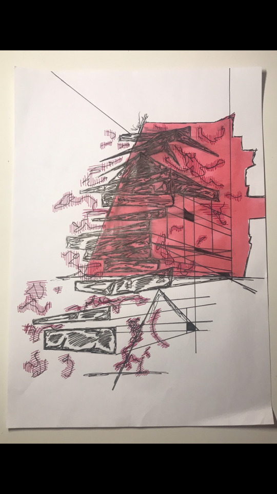
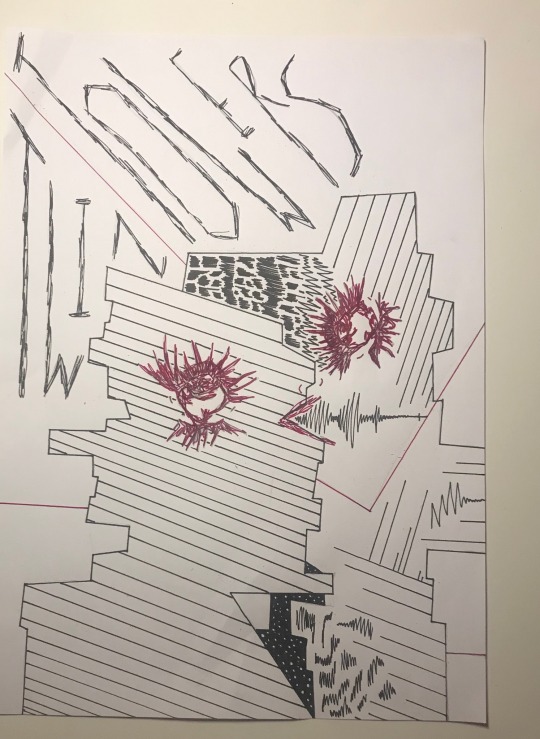
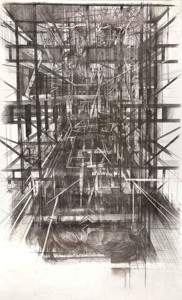
Tower drawing
Sketch, shapes, colour.
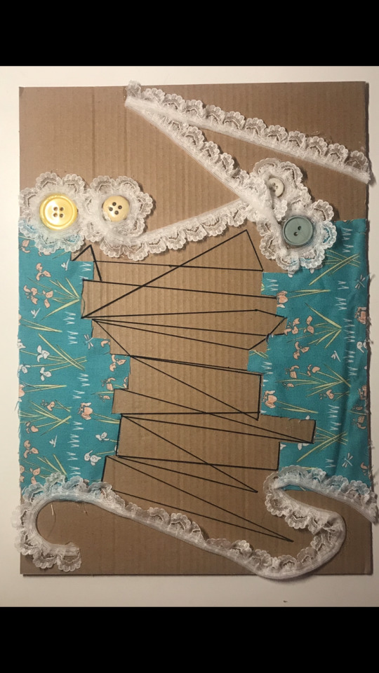
Independent work/development:
Texture, mixed media, creative.
2- Materials and processes I have used:
During this project I have created towers/structures using angles and perspective. I included a lot of mixed media into my artwork such as masking tape, electrical tape, fineliners, pencils, graphite, watercolour and textile materials to creates shapes and structures.
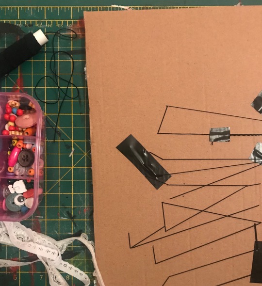
For example I stitched elestric on a piece of art and added other textile components such as fabric, ribbons and buttons. I thought carefully about where I put my materials to make my artwork busy and have good compostition.
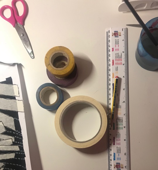
Another process I used was the use of electrical tape and masking tape. These materials allowed me to be able to create nice rectangular shapes represented as my sculpture and background behind taken from the shapes from shadows my sculpture created.
3- Creative and practicial problems I came across:
Drawing in 3D and using perspective in art isn’t my strongest skill but I have used Pinterest and other artists to give me a better ideas on how to create drawings taken from my original book sculpture. From images I found on Pinterest most of them consisted of layering, sketching out shapes, using contrast in colour and mixed media. I discovered adding more colour and mixtures media really impacted on the final outcomes throughout my art.
4- How I pushed my initial independent outcomes:
After creating ten outcomes using general materials I decided to push my skills by using textiles in my art. This included the combination of patterned materials, buttons, ribbons and elastic to create a new type of structure form. I layered these materials nicely together and overall these were the most enjoyable to create.
0 notes
Text
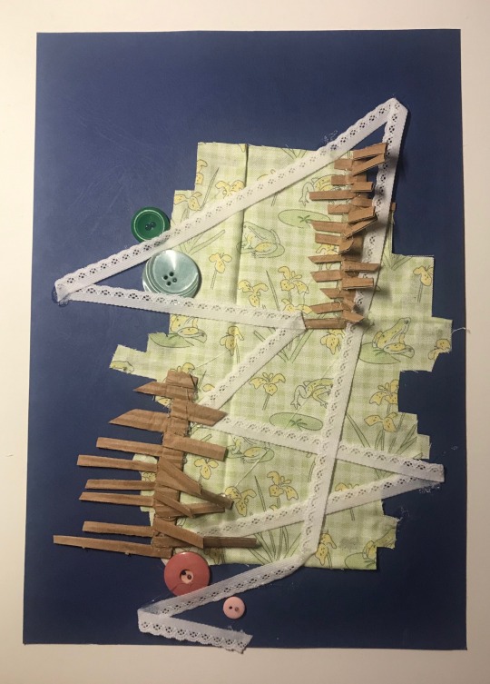
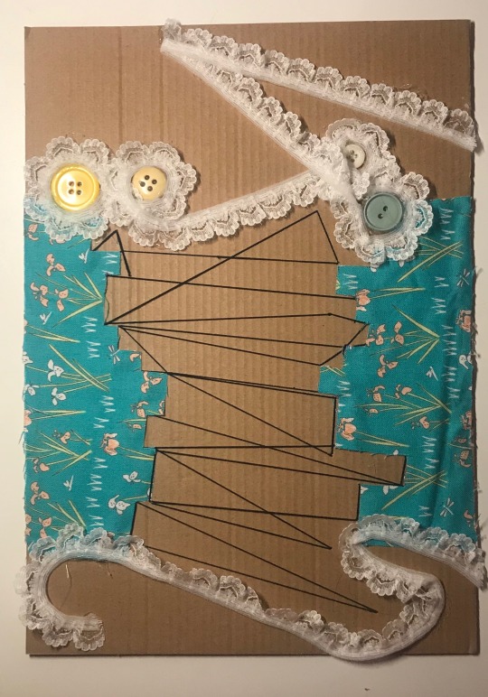
Towers involving textiles
I used art for my background and cut out silhouette shapes using patterned material. From there I used ribbon around and connecting shapes.
To create the original shape of my structure in the first picture I also included cardboard 3D tower shapes which are only partially stuck down. In the second picture I used elastic to make rectanglar shapes.
0 notes
Text
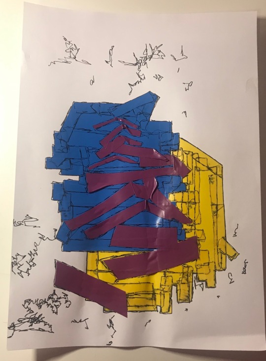
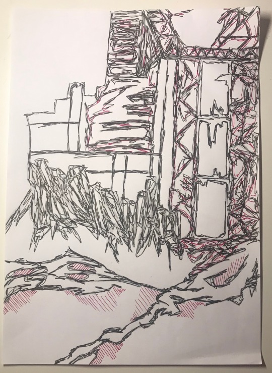
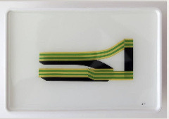
Towers using masking tape and coloured electrical tape
I discovered that tape is very good for creating rectangular shapes, I layered pieces together and thought out the layout. The use of angles and colour really helps them to stick out of the page.
0 notes
Text
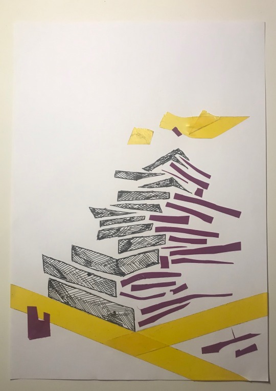
Detailed illustration towers
I enjoy using illustration, so I decided to include my personal illustration style into this project. They include simple outline shapes but with extra included colour and shapes.
0 notes
Text
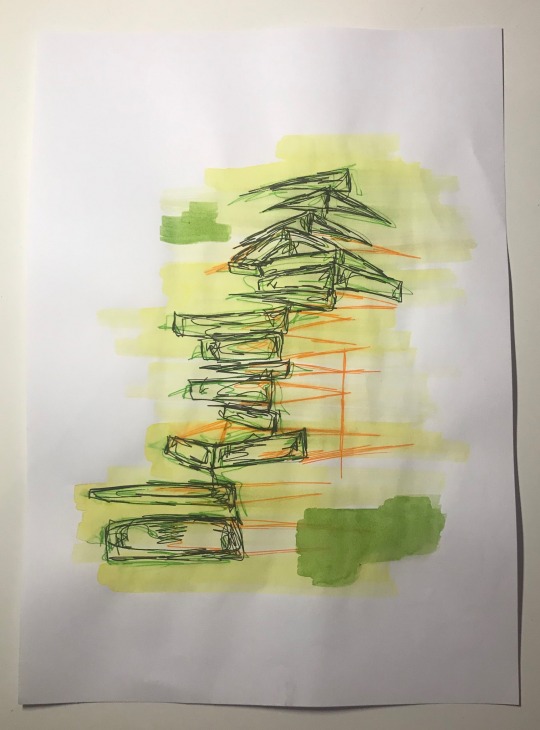
Free hand flowing structures
I used a range of graphite, watercolour, pencils and fineliners to create this rectangular stacks. These are quicker drawings and I focused more about the shapes, shading and layout at first and then added more detail later on using more made of shapes, colour and texture.
0 notes
Text
Jesus Perea
‘Since 2018 I began to feel the need to experience again with the rhythm and development of manual creative processes, and I started to work on paper especially: drawings, paintings, collage and small-scale sculptures.’ ~said Jesus~
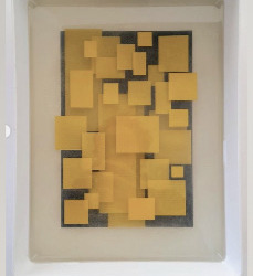
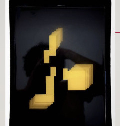
Here are some examples of Jesus’ work, he creates these 3D layered shadows. His use of contrast and colour, for example the black and yello together helps to bring a more bold and floating, hazardous affect.
He also uses a mixture of masking tape and electrical tape, I have tried both of these techniques within my art which have come out nicely.
0 notes
Text
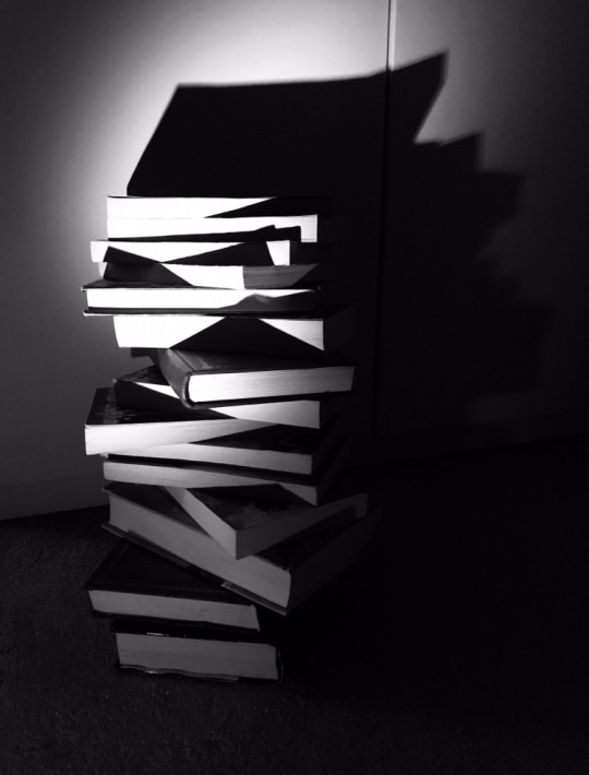
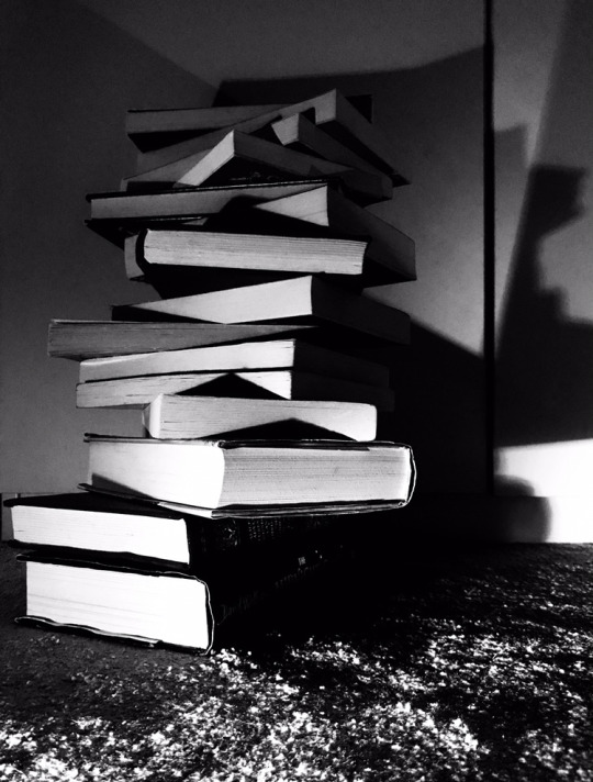
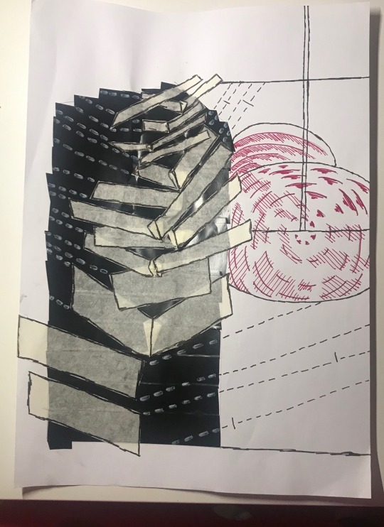
Edited photos of my sculpture
I used the noir filter in my camera and enhanced highlights and contrast to make the shapes more clear.
0 notes
Text
Towers in Lockdown
Liam O’Connor
Layered, built up, stacked, monochrome, detailed.

Williamsburg Bridge (1995)
Perspective, composition, layered, lonely, structure.
By The Phoenix Contemporary Textile Group
Contrast, shapes, abstract, detail, texture.
Landscapes in lines- by Primed4design team
Shapes, floating, layered, contrast, simple.
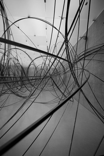
Image from Pinterest (unknown creator)
Forms, waves, different, depression, anxiety.
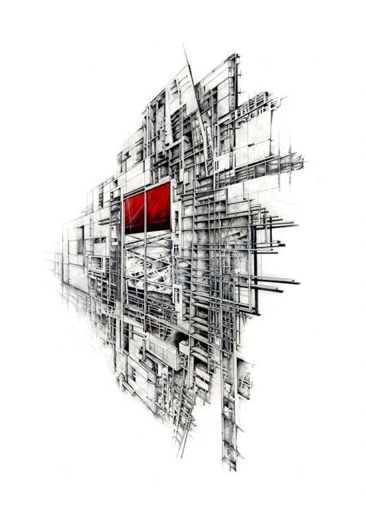
Image from Pinterest (unknown creator)
Complex, 3D, perspective, flat, pops out.
Jason Jackson
Building, formation, levels, height, silent.
0 notes
Text
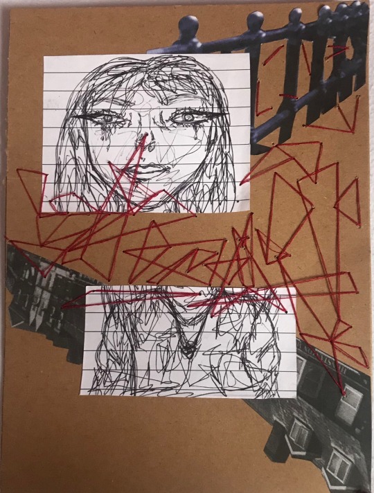
Independent artwork linked to the current project and techniques learnt.
I created another cross and wires piece, using red thread, pictures cut out from my own photography and a sketch I drew all layered together.
0 notes
Text
Researching the Creative Industries
The different sectors within the creative industries
Within the creative industries there are 16 sectors.
These involve:
Advertising, architecture, visual art, fashion/textiles, design, performing arts, music, photography, film/video, computer games, radio/tv, writing/publishing, heritage, cultural education and software/electronic publishing.
Skills I have learnt throughout the course that can help to get a job
There has been a wide range of new skills, techniques and processes that have been very useful to be and great skills that can be used towards a job.
Some examples of these skills are, being able to use photoshop. This term I have been manipulating my own hand based work, taken from my sketchbook and scanning them onto my computer. This allowed me to create new designs with added digital features too. Being confident with using photoshop with art is great for going into the graphics industry.
Another skill I have learnt this term is the process of screen printing. Screen printing can be used on fabric for example on T-shirts or bags, which are part of the fashion industry. Designs are drawn, then made into a stencil and swiped through the screen.
Jobs and vocational roles within the creative industries that interest me
Throughout this term I have learnt a range of new skills that have given me more ideas on job roles.
Tattoo Artist:
To become a Tattoo Artist a degree isn’t necessarily needed, generally a apprenticeship or tattoo course is required. Going to collage or university for fine art or illustration is helpful to develop a style and learning lots of drawing techniques.
Being a Tattoo Artist involves designing and applying tattoos, using specialised needles and ink to leave a lasting image on the client’s body. The tattoos can be completely original designs that are done by scratch if the artist feels confident enough or pre-designed templates can be used too.
The basics of this job:
Consulting with clients to see what design they would like.
Creating original artwork that is based on what the client wants, with options.
Tracing the design on the clients skin using a transfer or by freehand.
Using a tattoo machine/gun to apply the tattoo to the clients skin.
Sterilising all equipment to stop infection.
Independent Artist:
To be an Independent Artist you can simply create your own work and sell it. You could make a website or instagram to show off and sell work there. It’s mainly about being able to promote your art.
Having qualifications in Art and Design can help towards learning different processes and techniques or you can even be a self taught artist. You could create a business to officially advertise and promote your own original artwork.
Promoting yourself to become a successful artist (creating a business):
Create a website/ social media platform for your artwork.
Design a logo.
Make business cards.
Develop information and designs for your website and social media, make it interesting for customers.
Illustrator:
To become an Illustrator a degree in illustration, fine art or graphic design is needed.
An illustrators job is to produce drawing, paintings or diagrams which make products look more attractive and more easier to understand.
These products include- books, cards, packaging, advertisements and diagrams.
The basics of this job:
Discussing requirements with authors, editors or designers.
Concluding prices and timescales.
Choosing the right style for illustrations.
Creating illustrations by hand drawing, painting or digitally.
Speaking to clients and changing designs if needed.
Finishing work within a set deadline.
Screen Printing (designing T-shirts):
To become a screen printer qualifications in art and design are needed, previous work experience as a screen printer and a high level of creative and artist skills.
A screen printer involves creating the printing design pattern, mixing correct ink colours, loading the screen onto the printer, printing the final design and cleaning the machine after every batch is complete.
The basics of this job:
Examining work order to plan printing times, ink and material quantities needed.
Selecting screen size, emulation coatings and degreasing agents.
Loading the screen into the printer.
Installing and repositioning the printer before the batch is printed.
Running prints and making quality checks during the printing process.
Solving problems as they occur.
Drying, folding and packaging completed products.
Virtual tour of a gallery:
The gallery I chose to do a virtual tour of is, Musée d’Orsay in Paris, France.
Musée d’Orsay is a national museum of fine and applied arts, the museum features work mainly from France produced between 1848-1914. There are a range of paintings, sculptures, photography and decorative arts displayed.
Musée d’Orsay is located in the previous Gare d’Orsay, which was a railway station and hotel located to the left of the Seine river. The interior involves a boasted metal construction, passenger elevators and electric rails, however this got outdated due to changes in railway technology.
The building was remodelled and restored in the early 1980s to become the museum. The new interior was designed by Gaetana Aulenti. The ground floor that used to be the buildings train platform and stone structures broke up vase space. These structures created central posts for paintings, sculptures and decorative arts.
Art that has interested me during the virtual tour:

^ The Church in Auvers-sur-Oise (view from the Chenet)
- By Vincent Van Gogh, 1890
I like the use of straight and curvy lines across this design to create a lot of texture. Van Gogh’s work always give me a unknown feeling and the colours are built up to create these textured surreal pieces. I like main focus of the church in the centre and the textured sky and grass goes nicely.
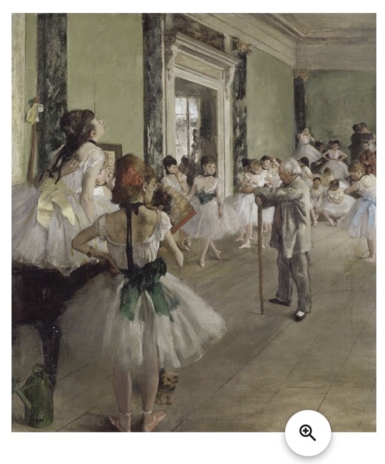
^ The Ballet Class
- By Edgar Degas, 1871-1874
This piece captured my imagination, it brings emotions of preparing and getting ready to perform. I like the use of the composition of the closely scattered ballet dancers at the back of the room and the more sparse dancers are the front to create perspective.
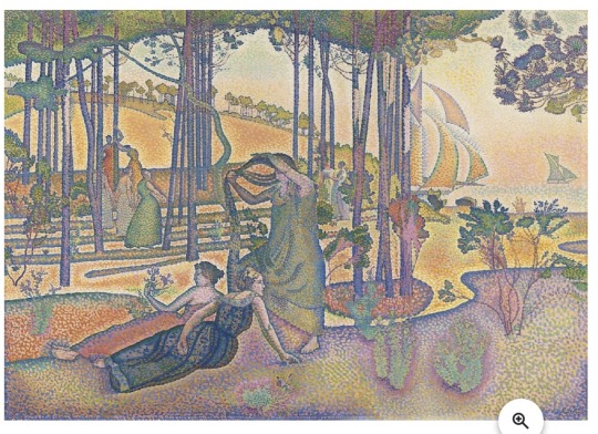
^ The Evening Air
- Henri-Edmond Cross, 1893
This really appealed to me because the bit rant and clashing colours. The colours are dotted and blend in with each other, creating a tone and texture.
Wider World research
For my wider world research I have chosen to investigate environmental issues. Thought out this project I have been recycling materials such as images and text from old magazines and newspapers that have been read, to Crete new designs.
One very big environmental issue in this point of time is too much waste and pollution because of the rapid growth of the world’s population that increases every year. Due to this increase more supplies are needed, resulting in more waste.
Using old materials for art purposes is a great way of recycling materials your own way instead of disposing them.
Non-internet based research

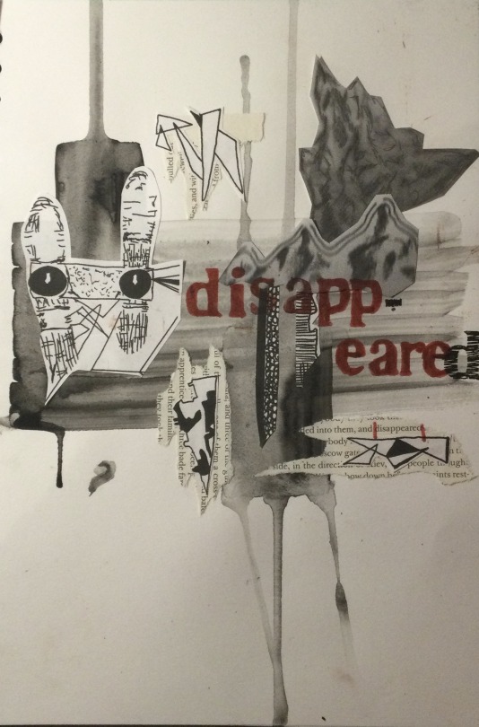
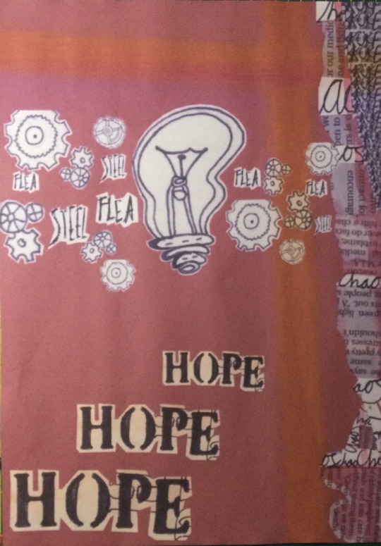
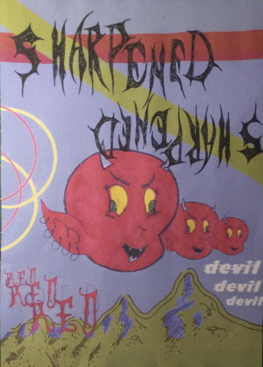
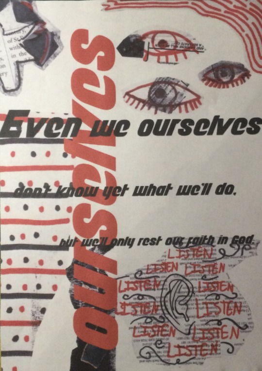
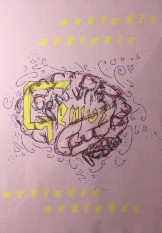
The Steel Flea, Penguin Classic book by Nikolay Leskov:
This term I’ve related all my work toward The Steel Flea. Quotes and words from this book have given me a lot of imagery idea I can create.

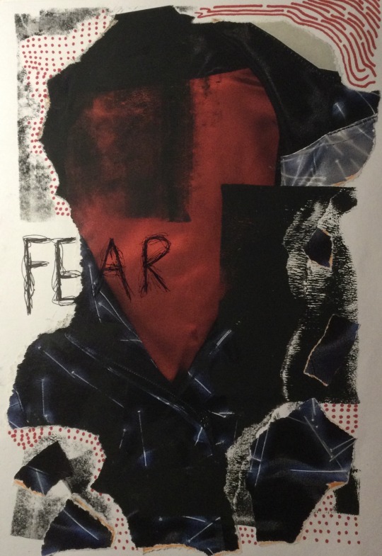
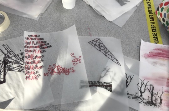
^ Here’s an example of a design I created based on the word ‘fear’ from a quote in the book. I found a red and black cloak figure in a magazine and reminded me of The Grim Reaper, which makes a connection of the fear of death.
Photography research:

^ Here is a picture I took in Hunstanton, the two sections I have circled in green can be traced together to make a new design.

^ Here’s an example of some structure I have traced and layered together.

^ I took this picture in the summertime. Thought out this project I have used images and text that connect together a lot. For example the pink branch could be photocopied and have words connected to the image around it.
0 notes
Text
My 6 final postcards/ final outcomes
Each of my outcomes are mixed media collages. These pieces involve a mix of typography, hand drawn imagery, images taken from magazines and imagery taken from hand drawn art and combined to together. Each postcard involves quotes taken from my Penguin classic book and imagery and text connect that. I worked carefully of composition and intended that each postcard would have a connection. Using texture, shapes and imagery helped me to make these words into more than just works, but into worlds.
0 notes
Text
Evaluation
Artists that have impacted on my ideas
Throughout this topic, three artists that have had a impact on my ideas and artwork is firstly, Rossanna Taormina. Her artwork introduced me into using stitching into my work. I have created a piece of work using geometric shaped stitches on and around images, like Rossanna creates. I will definitely consider adding stitching into my own future artwork too.
Next Peter Bankov’s work inspired me with his layering of text and images from magazines. I have created a lot of art in this layering style throughout this project. It’s enjoyable finding interesting images and combining them together with colour and different fonts of text.
Brooks Salzedel introduces me into producing incredible three - dimensional layered images. The layers give depth and I love how vague and mysterious they can be. Each layer is created by tracing or drawing onto tracing paper, the more layers there are the more depth and mystery is revealed.
The artists I have researched during this project have been very useful to me in many ways, I think it is important to introduce to yourself new ways in which you can create art using different materials and techniques. There are endless ways of creating art.
What materials and techniques I’ve experimented with
I have learnt some very useful new processes, using new materials and techniques to create some designs out of my comft zone. In this project I have mostly enjoyed experimenting with collages that match quotes from my penguin classic book. These collages included layering a range of lettering, repetition, rolled on ink, images and text from newspapers and magazines. I’ve also been experimenting a lot with writing fonts by hand or with stencils, as well as on photoshop. I created a series of designs with my own hand written lettering and images that link to quotes or words in my penguin classic book.
What I’ve learnt in Thursday’s drawing sessions
The Thursdays sessions are very helpful for learning lots of new unique processes. This term I have learnt skills such as creating lost worlds, inspired by Brooks Salzwedel. This included layering imagery drawn on tracing paper. Each layer is then placed on top of each other with creates theses amazing faded scenery.
^ These are some layers I created
Another technique that was very new to me was creating asemic abstract forms. This involved cutting up hand written lettering (using quotes taken from my penguin classic book) in strips and placing them together again, but in different shapes or weaving them.
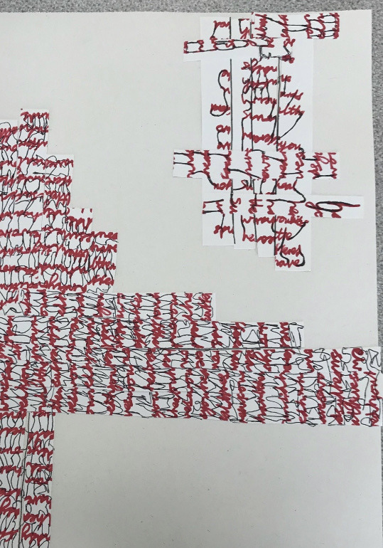
^ Here is a example of the start of the weaving process, by cutting up all the words and beginning to form these words into new layouts and shapes.
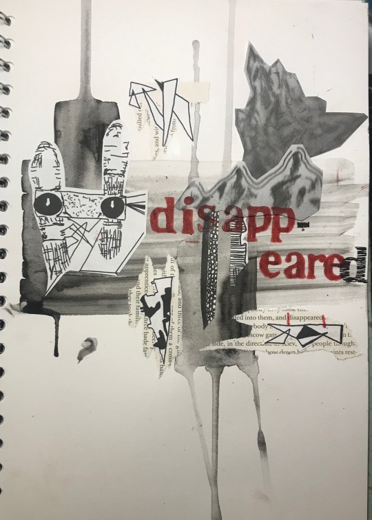
My favourite technique I learnt in the Thursday’s sessions this term was creating ‘crossed wires’ pieces. It is a combination of lettering cut out of my penguin classic book, images found in magazines (that link with a quote) and stitching in geometric shapes. The overall process was very enjoyable and the use of the three media’s layered together are really effective.
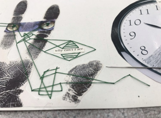
^ Here is an example of my beginning to stitch into my design. I made connections from different points, around and on imagery, making straight lines and geometric shapes as I go.
How long I’ve spend on this project independently (off-weeks)
I’ve spent roughly 30 hours a week towards developing my work independently for this project, trying my very best.
10 words that describe my final outcomes
Layered, combination, busy, collage, colourful, interesting, unique, neat, arranged, contrast.
Problem solving
I haven’t found many problems in this project as this is the typical art I enjoy creating. However I found it hard sometimes to be able to find correct imagery that will support quotes nicely.
Screen printing as been another struggle this term. I created stencils for my screens but found that the stencils got stuck to my screens rather quickly and also made it harder for the ink to past through enough and didnt always create clean shapes
Ideas behind my art
At the start of this project I read all of my penguin classic book, the steel flea. I found a great selection of quotes throughout my book that were suitable and gave me a lot of ideas for designs I could create. I chose to use a quotes or words that connected nicely with techniques I learnt within my collages, imagery and constrasts in colour. I wanted to focus on the layout too and for my designs to be full of imagery, text and mixed media to really show off the meaning of my chosen quotes.
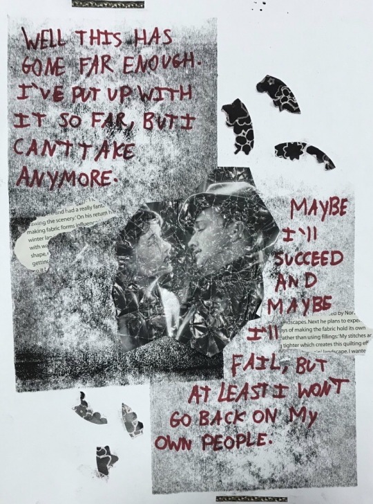
^ For instance I really like the use of black, white and red I used in this design and the layout is outstanding too. The crunched up image used as the centre piece along with the ink and the extra shapes are very simple yet effective. I have enjoyed experimenting with the choice of colour, layout and mixed media and the composition shown here.
Analysing my final outcomes
My final outcomes have definitely evolved nicely from what my initial ideas at the start of this project were. I’m very pleased with the layout of each of my postcards. Four of my postcards are digital, I used photoshop to take texts and parts of drawings or images taken from previous collages and designs that connect to quotes taken from my penguin classic book. The two non digital postcards include written text, mixed media and imagery taken from magazines that are also connected to my penguin classic book.
Part of my initial ideas for my final outcomes was the layout and being able to connect with my chosen quotes nicely. Overall my final six postcards meet my initial ideas well. I focused deeply on the use in contrasting colour, for example using red, black and white together. I layered out designs which had centre points of imagery to show imagery that represented a quote or a more messy layout top that showed a range of links imagery, shapes, typography, texture and composition.
0 notes
Text
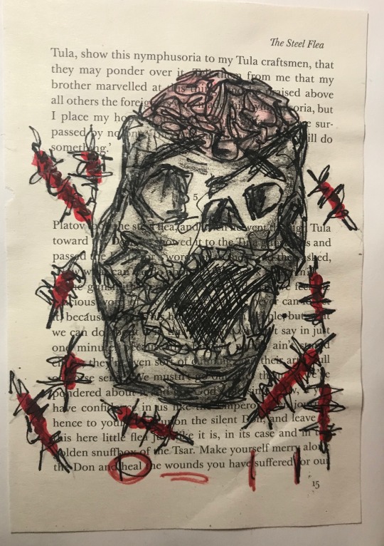
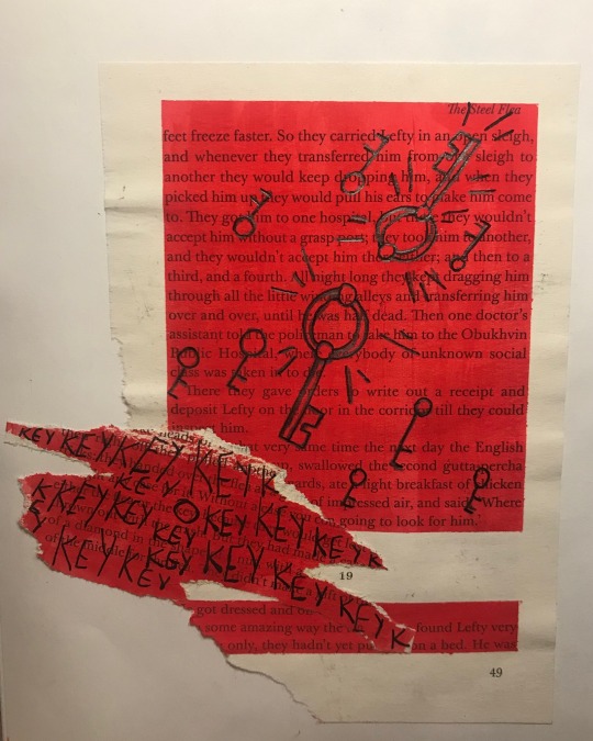
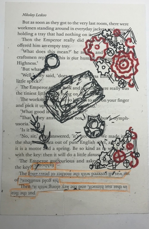
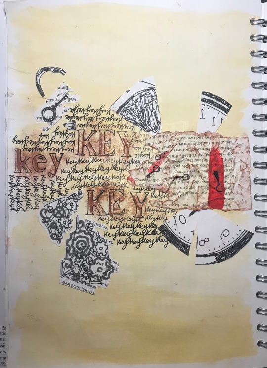
I selected four pages from my penguin classic book and chose quotes and words that I could connect with imagery.
I chose to use the same range of colours, I have really enjoyed using he combination of white, red and black throughout my work lately. I tried to make the layout of these designs very effective to really bring each of my chosen quotes and words to life.
0 notes
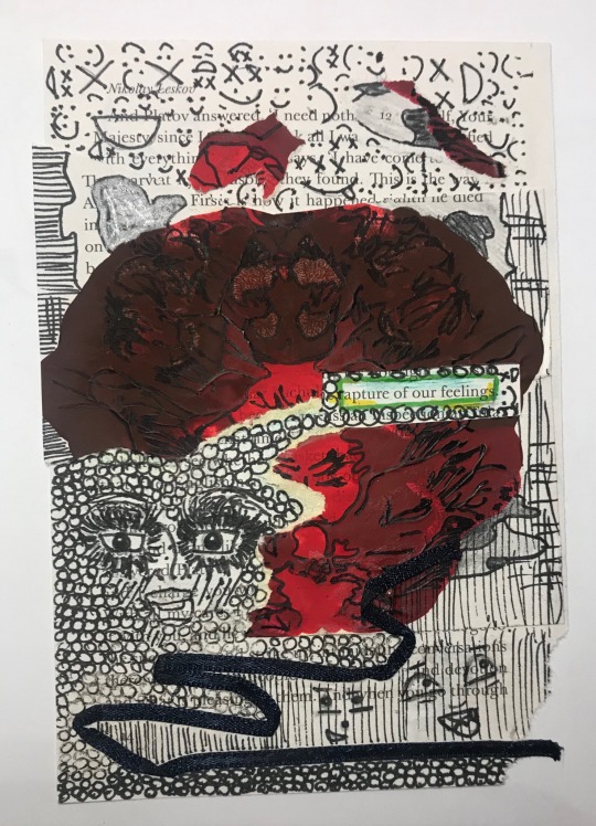
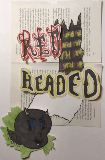
Text
I created these collages from a range of photocopies taken from previous designs and chose quotes that link nicely with the imagery. I focused of the layout and layering everything together. I am very happy with how these came out, I have even chosen one of these designs to be one of my final postcards for this project.
0 notes
Text
My gif stop gap animation
Firstly I took pages from my penguin classic book and ripped parts out. I photocopied imagery and lettering taken from pervious collages and placed everything together nicely. I then repeated this process again so I had two lots of imagery and text. Next I coloured these two parts of the animation so u could tell the difference between the two.
I downloaded a gif app and took a picture of each frame and put them together to create this flash/ changing colour effect.
(I found it hard to get the images to be in the same place for each frame)
How I created my gif
When I first got onto the app I clicked onto photo to GIF which allowed me to take two or more photos and create a gif.
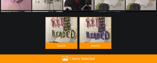
I selected my two desired images.
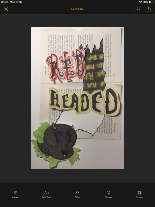
And it automatically created my gif changing from one image to the other.
0 notes
Text
TOM PHILIPS
Tom is a English artist who specialises in painting, print marking and collages.
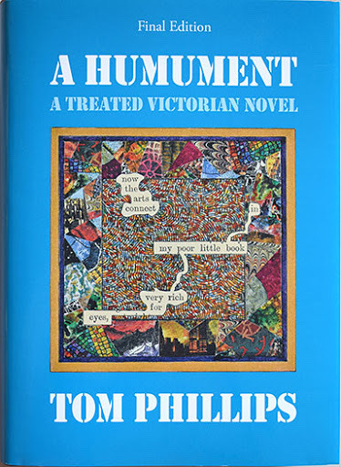
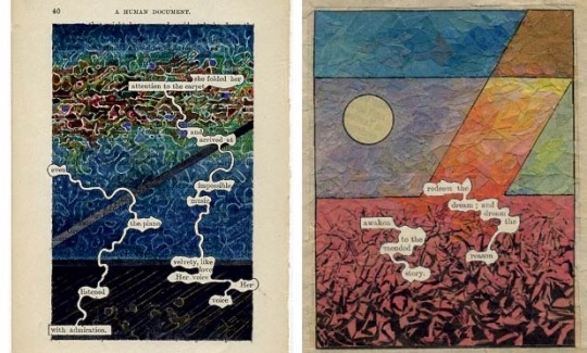
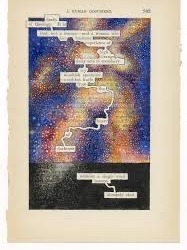
His artwork on ‘A humument is a Victorian novel that Tom has altered with his artwork. He created a range of new meanings on the pages, with artwork that represent quotes across the book and around lettering.
I haven’t experimented with this style of art before and Tom has given me ideas on how I can create artwork using quotes and bringing them to life with imagery.
0 notes