
md-drawz
fighting for my life so much rn
just for school
19 posts
Don't wanna be here? Send us removal request.
Last Seen Blogs
alsangrereal
AL Sangre Real

mqazhe-blog
Lorko

salimouhiba
Salim Ouhiba
salimouhiba
Salim Ouhiba

kapypm
-All Things-
Text
puppet project
This project was actually the bane of my existence. You’ll notice I actually gave up halfway through (maybe not even halfway) because it was making me so miserable and I straight up did not have the energy to try anymore. I’m very sorry about that.
The historical figure I decided to use as inspiration was Adolphe Sax. He’s the creator of the saxophone, as well as a variety of instruments related to the saxophone; he also was a musician; and as a child, he escaped death way more times than the average kid, which I find really fascinating. He’s not technically from my hometown, but he did come from Belgium, the country I grew up in, so I figured that would be close enough. I think he’s cool. I did some sketches of him based on photos I could find of him (and of a statue of him). I also did some studies of saxophones, and was able to do a bit of figure drawing based on a video of a saxophonist performing.
I’ll admit right now that I was really dreading having to design and build a puppet. I had no idea where I wanted to go with my puppet design. My general idea for the animation itself was to have the puppet working on/cleaning a saxophone, sitting at a bench/table in a work shop, then getting up and playing the saxophone for a bit. Simple enough. But I couldn’t decide what I wanted the puppet to look like. I did some sketches the day before our first puppet workshop with Ali (and hated how they came out, honestly).
I did actually carve the head, hands and feet in class. The head makes laugh yet also fills me with pain. I kept flipping between giggling about it and wanting to crush it under my feet. So that’s been fun. I very reluctantly assembled the skeleton using milliput, and that was even more upsetting. Turns out I really hate working in 3D (I already knew this about myself but figured I’d give it another chance. Maybe if I’d been in a better headspace, I might’ve managed more, but I’ve had a rough couple of month, so I’m constantly on the verge of quitting things if they feel like they’re going badly). So I did stop after that.
It’s very unfinished and to be honest, I have no plans of ever completing it. Sorry again.
0 notes
Text
9trees illustration
I think I was kind of excited for this one because I do like illustrating and it was refreshing to have a client giving directions instead of having to determine everything by myself. I chose rat day, I think because I’d recently rewatched ratatouille or something? I don’t remember. But I think rats are neat and get a bad rep and I figured it would be fun to learn how to draw them.
I struggled a lot with trying to find a concrete, positive fact about rats, because most of the info I found - especially regarding rats in the UK - was about how to get rid of rats. I ended up finding facts about seed dispersal (“Small rodents disperse seeds within the habitat in short distances and provide secondary seed dispersal services on the local scale.”) (https://www.sciencedirect.com/science/article/pii/S2351989421005321). From there, I did some digging about which seeds rats might be most inclined to eat, focusing on seeds that were on the list of trees that we were given, and I was able to use hawthorn seeds as an option.
For an art style, I decided that I wanted something eye-catching but still light-hearted and leaning a bit towards a more comedic take. I did that partly because rats do have a bit of a bad reputation, so I thought a more amusing approach might make people stop and look, and partly because in our first meeting with 9trees, they talked about wanting the kind of illustration that we’d stop to look at and share with people, and I enjoy seeing illustrations that have a light-heartedness to them. I was a bit worried that I might’ve gone too cartoony with the style I chose for the wip I submitted, but I got very positive feedback! So that was encouraging.
I did some tweaking around with colours, trying to use the 9trees colour palette as a base and then adjusting colours here and there to make things pop. I used the actual dark blue/teal as my base colour for the rat, then added the purple as the background and the yellow as back lighting. I ended up making the yellow lighter so that the rat would pop more, and I think I adjusted the purple as well, but I didn’t make huge changes so that I’d stay as close to the 9trees palette as possible.
I’m quite happy with the final illustration! I think I did my best to take the feedback into account as I adjusted things between the two submissions - mainly ensuring that the seeds actually read as seeds instead of vague round shapes - and I feel like I was successful in that.
0 notes
Text
experimental animation: pixillation
This was. Challenging.
I feel like we came up with a narrative fairly quickly, just going for something very unserious with Jace as a crazy murderer who goes on a mini-rampage and then experiences regret. From there, though, we ran into some issues trying to figure out the timings for each shot - how many seconds should it last, how many photos do we need to take for it to flow nicely, how much do we need to move between photos, etc. To determine how long each shot would be, we acted the movements out in real time with a stopwatch going, then translated it to 12 photos per second (I think? I believe we were animating on twos). So we had it mapped out theoretically, and then I think we just kinda struggled to make it work in practice. I think some of the movements look awkward because of timing issues. Perhaps that’s the charm of pixillation? I don’t know. All I figured out was that I don’t really like doing stuff like pixillation/stop-motion because it’s SO hard for my brain to compute the shots and unlike digital/2D animation, it’s not very easy to go back and add in-betweens - you have to redo the whole shot. Which I find really frustrating. My only consolation is that I think this video is entertaining and I remember having fun with some of the filming (until I got cold and impatient).
0 notes
Text
experimental animation: animation in the real world
This was a fun one! I enjoy 2D animation so it was a fun challenge to figure out how to incorporate that into a video.
I was feeling pretty bad mentally that week so my first thought was literally just “I want to draw a silly little jester falling down the stairs because I feel like mentally throwing myself down the stairs” and. That’s just. The idea I stuck with.
It’s a pretty simple design (that I did not sketch beforehand): vaguely blobby but also humanoid, a jester hat, and the fun little spiky jester collar. I incorporated squash and stretch into the character’s bounces as it tumbles down the stairs because I pictured it being a squishy little fellow, and figured I’d have some overlapping action with the hat as it follows the movements of the fall.
I was feeling a bit unmotivated when it came to making sure that the proportions stayed consistent as flopnik (the jester) approaches the camera, so it probably isn’t as accurate as it could’ve been if I’d tried a bit harder, so that’s something for me to keep in mind in the future with animations. That being said, I actually really like how this animation turned out (if only because I think it’s funny), so I feel like it was a successful project.
0 notes
Text
experimental animation: collage
I wasn’t actually there for the first week of class, so I did this as a lil catch-up project with Amy. We decided we wanted to do something simple, and since she had paper with fruit patterns on it, we agreed on a pac-man x fruit ninja concept where the fruits fall from the top of the screen and pac-man travels in arcs to catch them.
We struggled a bit with a couple of stuff during the filming process. Part of it was that we were in front of an open window on a windy day (not a smart move! I do not recommend!) so despite using sticky tack, some of our lil paper bits kept getting blown away or shifted around a bit. With pac-man it was also a bit hard because the sticky tack ripped the paper a bit and we had to keep unsticking it to adjust the mouth movements. I also just generally struggle with this kind of animation because it’s hard to get the timing down right, even when we were using the arc guide thing on dragon frame. And unfortunately I don’t really have the patience to go back and re-film sections as much as I should to get it down perfectly, so I think there are a couple of awkward timing issues with pac-man’s movements, but I don’t know if it’s less noticeable than I think it is. Overall, though, we did our best and I think it turned out okay!
0 notes
Text
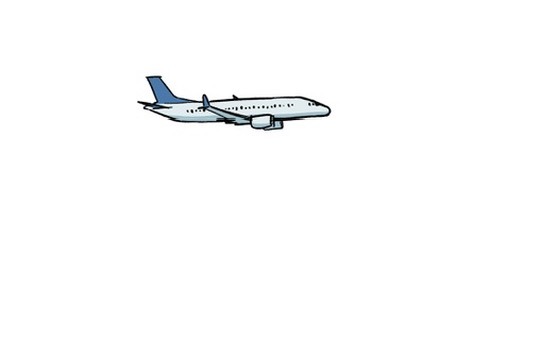
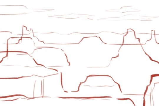
path (after effects)
Using after effects was fun in the sense that I have no object permanence and kept forgetting how to do stuff right after doing it. Anyway.
My original idea for a path animation was to have a plane flying above a mountain range, so I created assets for that. And then I realised I hated them with a burning passion so I scrapped the idea.


I regrouped, did a bit of thinking, and decided it might be fun to explore a rocky canyon-esque landscape. The plan was to have multiple layers of rock ranges that I could zoom into/out of, and then have clouds floating by ahead. So I created those assets next, using some photos of canyon landscapes as inspiration.


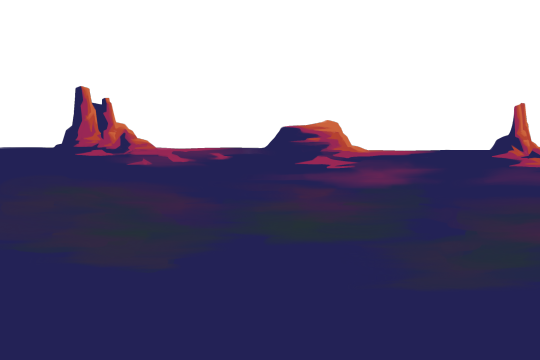

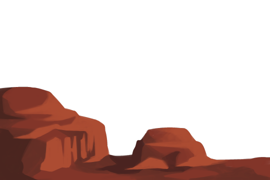

Then it was just a matter of figuring out camera movements! I started with the clouds, having them move along the screen from left to right. Then, I adjusted the assets in 3D view so that the various rock layers were distanced enough from each other that I could have the camera start more zoomed in, then move back through the layers to reveal more of them
0 notes
Text
walk cycle
I was feeling pretty confident about this one because I have done a walk cycle before (it wasn’t complete but I had the motion down with a stick figure).
I chose the following prompts: firefighter (fireman?) and determined.
For the design, I spent a while trying to figure out what firefighters wear because I found a range of options, especially for helmets/headgear. I ended up going with the more traditional(? It feels like what I generally picture at least) helmet that curves down at the back.
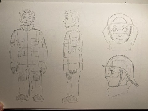
In terms of trying to capture the right emotion with body language, I decided to put more emphasis on tension in his body. Relatively straight back, shoulders raised up a bit, fists and jaw both clenched. It looks a bit stiff but it is very much intentional, and people were able to guess which emotion I was going for during our little class walkthrough, so I like to think I was successful. I probably could’ve pushed it further, though. I wanted to keep it more subtle so that it felt realistic, but it might’ve been fun to exaggerate the movements much more than I actually did, so that’s just a lil note for myself for future walk cycle/general character animation practice.
plan:

rough:

clean:

final:

0 notes
Text
maya
3D modelling… I cannot lie, I did not enjoy this project. I have a bit of experience with 3D modelling programs, because I’ve used Blender in the past, but I struggle a lot with visualising/working with things in 3D, so this was overall really frustrating for me.
I thought I’d go with a bit more of a simple shape for my building, so I chose a lighthouse. I figured it might be easier to work with just adding things to a cylindrical base.
It was in some ways pretty manageable? At least with the basic shapes. I struggled more with the roof, and there are some details I just didn’t include because they would’ve been really small and precise and I didn’t want to push myself into having a mental breakdown. So there’s no railing around the walkway. Health and safety hazard, but luckily this lighthouse isn’t gonna be built anywhere. The rock was fine. Had some fun trying to hold it into a vague rock shape. Does it look organic? Probably not. But it’s fine probably.
And then we got to the texture mapping and everything went downhill. I actually managed okay with the cylindrical parts, because that was easy enough, but oh boy this roof gave me so much trouble. So I gave up on it. I think it was an issue of not really being able to figure out why the texture map looked so weird, which then fucked up any application of actual textures on top. Maybe it’s because I used a cone shape and chopped off the top? Perhaps just a sphere chopped in half would’ve worked better? Unfortunately I did not have the patience to find out. I just wanted to be done with it as soon as possible.
Playing around with the lighting was pretty fun, though!
0 notes
Text
straight ahead and pose-to-pose
[could not find a fun relevant gif </3]
Straight ahead and pose to pose are two different methods of animating.
Animating straight ahead is essentially just animating as you go - drawing the first frame, then the second frame, then the third, etc etc. This method is more beneficial when animating movements that are unpredictable, like flames or explosions, which are much harder to plan out using pose to pose. Straight ahead animation also works better for overlapping actions like hair movement. For example, when I was working on my character head turn, I animated her body using pose to pose, then went back in and animated her ponytail using the straight ahead method, as it was easier to focus on how the hair would move separately from the rest of her body while still follow the action of her head turning.
Animating pose to pose involves drawing keyframes like the beginning and end of a movement, then filling in the frames in between. This method allows more control over the actions, as the keyframes give a pretty good indication of what the final animation will look like. It's easier to determine how an action will end and then work backwards to create smooth movements. It also allows for more consistency when it comes to the scale of objects or characters, as the scale can change easily when animating straight ahead. (That happened to me while I was working on the bouncing ball project)
0 notes
Text
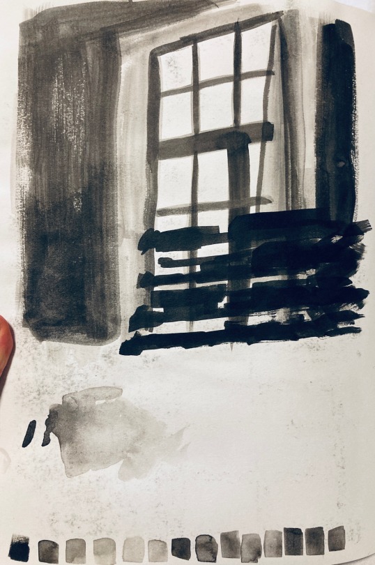
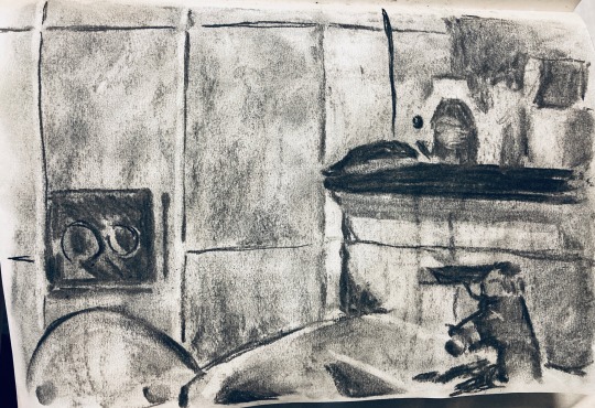
week 3 - tone


in class workshops ^


A4 hw pages ^
tone! i struggled with these <3
I'm not really a fan of collage stuff so I got that one out of the way first in class (and hated the process). Did my charcoal experiment twice because I think I missed the mark the first time around. The ink experiment... looks passable, I think?
For the A4 pages I tried picking scenes where there was one main light source and I think it turned out okayish for the charcoal pages. Ink is where I really struggled with accidentally going too dark too quickly and immediately losing control over what I wanted to do. So note to self: try using ink more?
1 note
·
View note
Text
Norman McLaren
Norman McLaren was a Scottish Canadian animator (1914-1987), director and producer, primarily known for his work for the National Film Board of Canada (NFB). He is remembered for pioneering a number of areas of animation and filmmaking, including hand-drawn animation, drawn-on-film animation, pixilation and his development of groundbreaking techniques for combining and synchronising animation with music/sound.
Since McLaren didn't have access to a camera when he first started animating, his early experimentation was mostly done by scratching and painting on film stock. He then worked for the UK General Post Office (GPO) film unit, where he helped create films. Afterwards, he moved to New York around the beginning of WWII, where a grant from the Solomon Guggenheim Foundation allowed him to work on drawn-on-film animated works. He then moved to Montreal, and was asked to open an animation studio where he could train Canadian animators at the NFB. During his time there, he worked on a variety of projects ranging from animated shorts reminding Canadians to mail their Christmas cards, to maps for Allied war propaganda films.
His most famous piece is the short film Neighbours, which is 8min 6s long and won a variety of awards including an Oscar for Best Documentary. The film has an anti-war message that encourages the audience to love one another rather than to fight each other. McLaren also created the soundtrack for the film by scratching the edge of the film roll. He used this technique to make blobs, lines and triangles which the projector then read as sound.
1 note
·
View note
Text
staging

Staging is the animation principle that involves ensuring that each scene is presented clearly so that the audience can understand it easily. This can be applied to many different aspects of animation, including the acting, timing, setting, and positioning of the camera, in order to guide the audience to each action on screen.
The general idea is that the main action of a scene should be clear and simple. If there's too much happening on-screen around it, that takes the audience's attention away, so any unnecessary detail should be avoided. Camera positioning also plays a role here, as wide shots are more effective for large actions while close-up shots are more effective for showing a character's expressions - if you are trying to show that a character is crying, for example, a wide shot would count as bad staging since the tears wouldn't be visible.
Exaggerating other parts of the scene like the characters' acting or the setting's elements can also help to convey certain ideas. This can be done by pushing character poses/facial expressions so that they become more expressive, and including background/foreground elements that emphasise certain ideas (or excluding background/foreground elements that detract from those ideas).
0 notes
Text
Émile Cohl
Émile Cohl was a French caricaturist, cartoonist and animator, 19th-20th century (1857–1938). He has been dubbed “the Father of the Animated Cartoon” and created over 250 films between 1908-1921.
He started out as an apprentice for André Gill, who was a very famous caricaturist at the time. Cohl completed backgrounds for Gill's work, and simultaneously developed his own caricaturist art style inspired by Gill’s (which was based on Fantoche puppetry) as well as imagery inspired by Guignol puppetry. Afterwards, he joined the Incoherents, an artistic group that based its activities around shocking people through absurdism, nightmares and the drawing style of children. Cohl contributed to their exhibits in 1883 and 1884.
Around the end of the 19th century he drifted away from caricature and more towards comic strips and story-telling, and entered the film world not long after that. He is known for having created Fantasmagorie, which is considered to be the first fully animated film. Fantasmagorie is almost 2 minutes long, with a total of 700 drawings animated on twos. Cohl used straight-ahead animation in a stream of consciousness style. He also filmed black lines on white paper, then reversed the negative to make it look like white chalk on a black chalkboard (the “chalk-line effect”). He then followed up Fantasmagorie with Le Cauchemar du fantoche and Un Drame chez les fantoches the same year, which both stuck to the chalk-line style and included stick figure clowns as their protagonists.
Cohl also created the film Clair de Lune Espagnol (also known as the Man in the Moon), in which he pioneered the use of matte photography. This allowed him to combine live action and animation in the same image by adding drawings to each photo frame.
Cohl is also known for creating the Newlyweds, an adaptation of the popular George McManus comic strip and the first animated cartoon series with a regular cast. He was able to animate 13 Newlyweds cartoons in the span of 13 months by using the bare minimum of actual animation - most of the visuals consisted of static backgrounds with dialog balloons appearing above each character's head, in line with the art style used in McManus' comics. He then used stop-motion to animate cut-out figures for any necessary movements. The success of the Newlyweds resulted in an abundance of animated cartoons based on comic strips.
0 notes
Text
Anticipation


Anticipation is the animation principle in which characters are shown to be preparing for an action. Examples of this include winding up for a punch, crouching for a jump, winding up before bursting into a sprint, etc etc. Depending on the complexity of the action, there can be multiple levels of anticipation.
This principle is used to add some realism to the actions. Going back to the examples I just mentioned, those actions require a burst of energy, which is accumulated through a wind up. A punch animated without using anticipation would look weak, and it would feel extremely unrealistic if the person being punched (the punchee, if you will) then got knocked down from that, whereas a punch animated with anticipation implies that the puncher is actually putting some strength behind that action.
Anticipation is also used to communicate to the audience that an action is about to happen. Back to the examples again, animating a wind-up for each of those actions is basically like saying "hey, audience, this thing is about to happen! Look over here!" Or if something is about to happen on screen, a character might look over to a specific spot to guide the audience's gaze. It functions as a visual cue without which the audience might completely miss the action. In the same vein, it can also be used to trick the audience by getting them to focus on one action, while another more important one happens on a different part of the screen. Very sneaky!
Also, I could be wrong about this because I am just going off the top of my head, but I feel like really exaggerated/drawn-out anticipation is more present in older cartoons, especially the ones with really expressive styles (stuff like Tom & Jerry, Oggy and the cockroaches, etc) and is less present in more recent shows? I recently watched Harley Quinn the animated series and while anticipation is used there, it feels like it's really toned down and just there to keep the human movements look realistic rather than to really exaggerate movements. My memory is really bad so I could be way off but that's a fun bonus thought I had.
0 notes
Text
week 2 - perspective


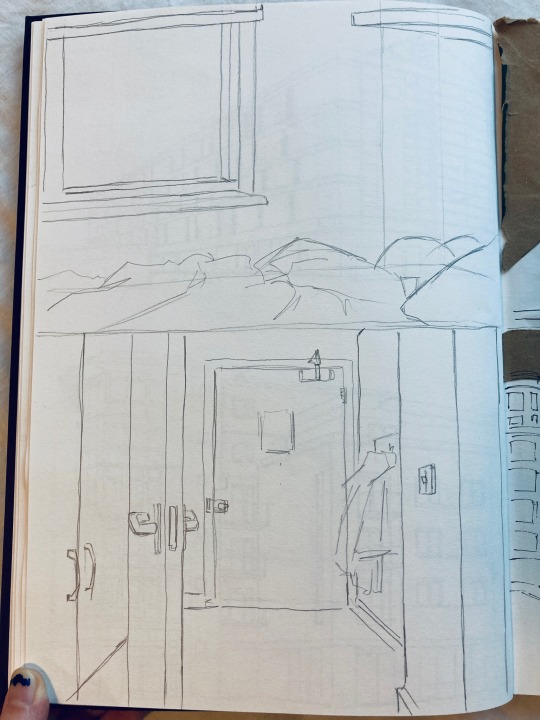
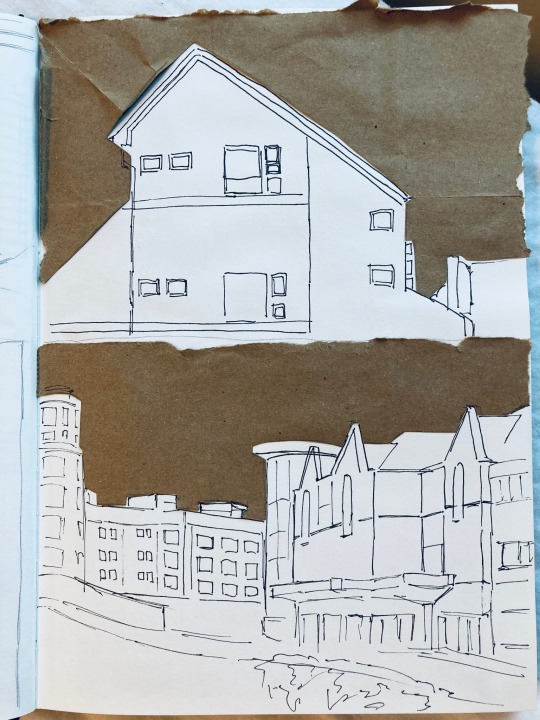
I missed class that day so none of my sketches are actually from around the market place (sorry) but I did go into the center of Cambridge for that first page! Some very pretty buildings to look at there. I also tried diving in straight with fine liners for my second page in an effort to force myself to really be deliberate with the lines I was drawing. I think that worked out for me?
The last two pages were done on a day where I wasn't feeling very patient, though, so I really struggled, especially with the cut-out technique. For both drawings I messed up the shape of the skyline when I was cutting out the paper, so that automatically messed everything else up. Big oopsie there, did not enjoy the process at all
0 notes
Text
week 1 - people in movement/in scenes

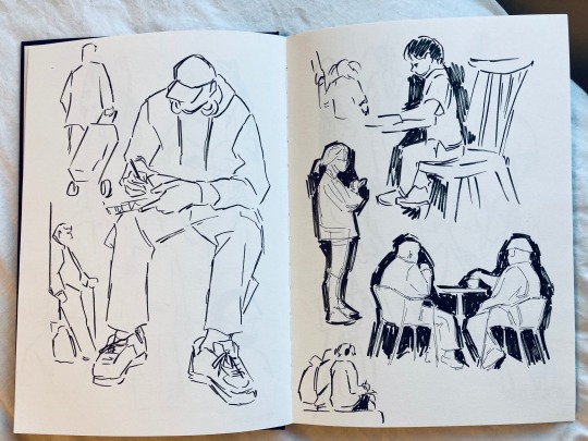
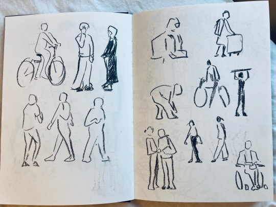

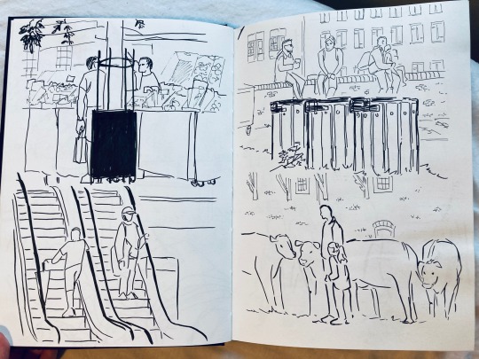

I originally started out the day using fine liners and a small brush pen and kinda struggled with finding a way to simplify shapes without making them look too graphic. I think once I switched to charcoal for my third spread I was able to focus more on capturing the movements in as few lines as possible? Working with charcoal stops me from getting caught up in adding details, since it's harder to control the lines I am making.
For the homework assignment I had a similar issue where I found it easier to draw scenes with the fine liners/brush pen, but easier to draw moving people with charcoal, so my second spread ended up drifting away from larger scenes and into little snippets of people. So I may have missed the mark there. Also I tried drawing cows (for the first time, I think?) and instantly regretted it.
0 notes
Text
Organizational stuff
animation skills (tri 1) (tri 2)
illustration and animation practice (x)
sequential practice (x)
0 notes