Text
Process and Portfolio: Introduction to Portfolios
In this seminar we were introduced to the creation and development of portfolios.
We discussed the different types of portfolios and the importance of having one, alongside how you lay it out.
The purpose of a portfolio is to show potential employers, educational programmes and clients your work and what you do, your skills, samples and education. You can communicate ideas and concepts that you’re interested in and promote your brand. It’s important to show that you’re able to do an array of different things, and are able to adapt to certain requests and topics. The format in which you choose to present your work can also add to the representation of you and your branding.
Types of Portfolios
Edited Sequence
This can be presented as either print or a PDF, such as a showreel or standard portfolio.
It’s vital to consider how someone may read it - think about what is strong and where to place those pieces to complement the other included works. You want a portfolio that has a consistent flow when looking at it.
Archival / Experimental
This can take form as an archival website, or an experimental website.
Websites make it easy to categorise work and upload a lot of images. It also allows you to date the work and order it how you want.
Diarised / Anecdotal
This type includes blogs, Instagram and Tumblr.
A more personal way of laying your work out. You tend to present your own brand and own narration.
Capturing and Presenting Work
The Content
Having the images, perhaps zooming in on details and highlighting certain aspects and ideas.
Optimising the images for display.
The Process
The development, documenting how it was made.
Could be documented as a video, a series of images.
Sketches, roughs, thumbnails.
Materials used, describing materials.
The Context
Images presented in their intended environment.
Interaction with the audience to communicate the purpose / scale.
0 notes
Text
Everyday Connections: Presentation.
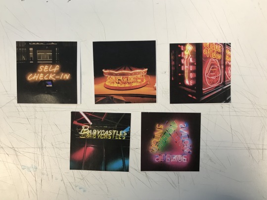
Today was the finale to Everyday Connections. To prepare for the presentation today, we had to select 5 images we felt worked best together and then display them somewhere in River House. Whilst choosing the photos, we had to consider how the photos look next to each other, how they’re being laid out, the effect they create as a whole and how they are likely to be read by a viewer for the first time.
I took a more story-based narrative route.
With my images, I wanted to show a journey, as opposed to something that only just looks aesthetically pleasing together, though that is always something to consider. The images I chose I feel emit a rather sci-fi atmosphere, displaying what could be a robot rehab, maybe a malfunction repair shop, or just a place filled with weird, unexplainable objects. They make me think of something you’d find in Sebastian’s apartment (in the last scene) from Blade Runner, with all the miscellaneous items.
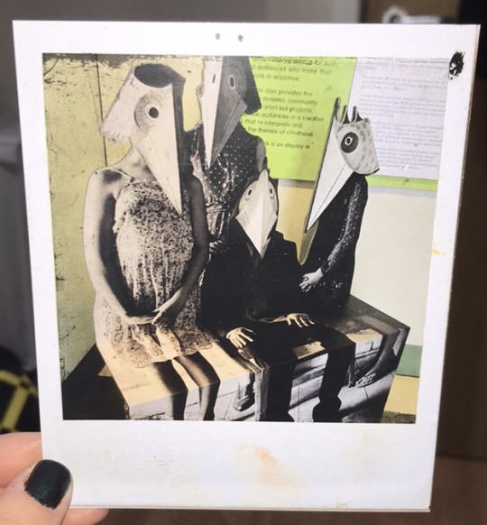
I edited the photos to look like old polaroids, as if they could be randomly found somewhere with no specific context for them individually, but when pieced together, make sense.
I chose to display them by the stairs, to correlate with the self check-in photo, so it’s almost as if you are a person on this journey, walking into this strange facility and checking yourself in.
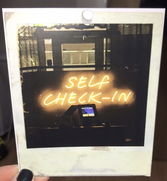
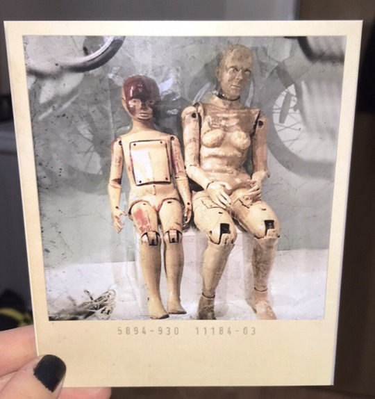
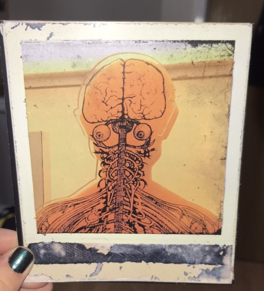
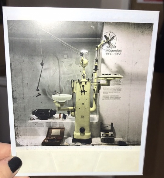

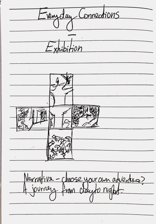
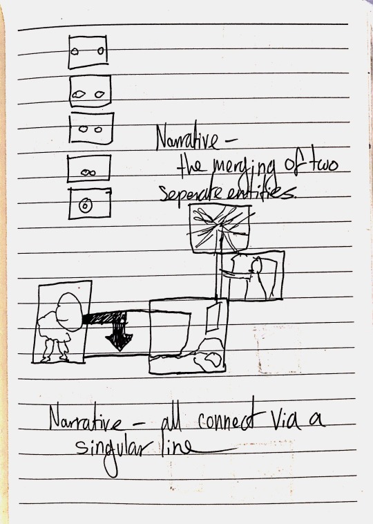
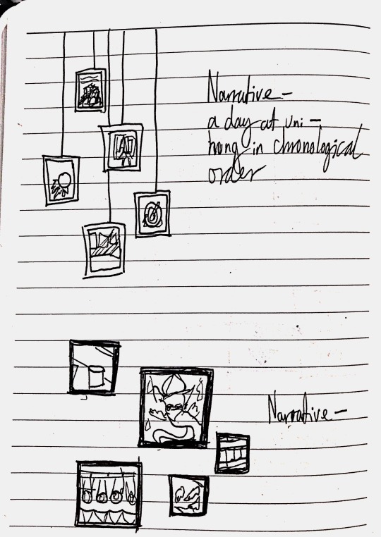
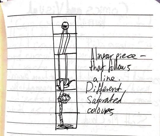
I also made a few notes and a few quick sketches of other peoples selections of images and how they presented them.
0 notes
Text
Everyday Connections: Typology, Chronology & Continuity
In this weeks seminar, we looked at Typology, Chronology & Continuity.
Typology
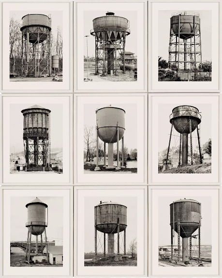
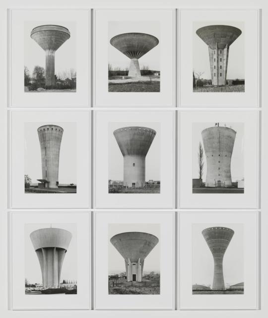
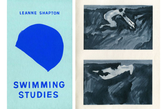
A system used for putting things into groups according to how they are similar and the study of how things can be divided into different types.
Reference
Water Towers by Bernd Becher and Hilla Becher (1972-2009)
Reference
Swimming Studies by Leanne Shapton (2012)
Chronology
The arrangement of events or dates in the order of their occurrence.
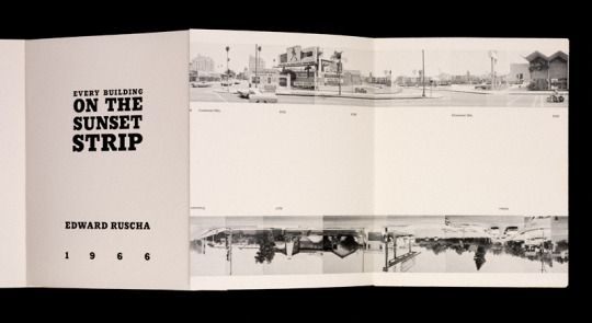

Reference
Every Building on the Sunset Strip by Ed Ruscha (1966)
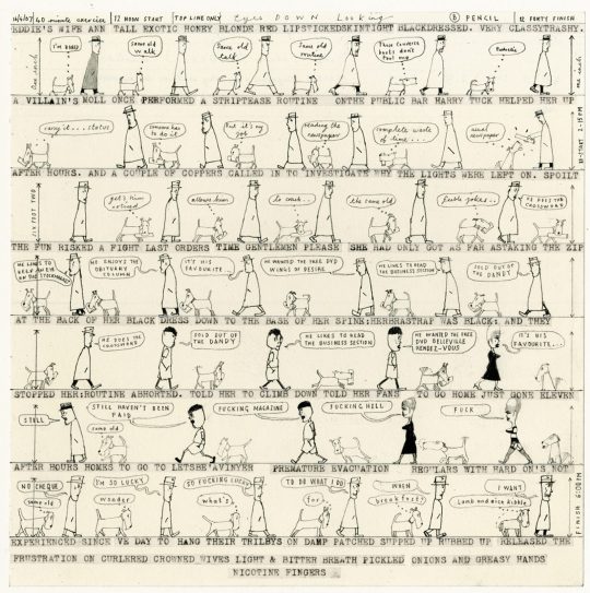
Reference
Walking the Dog by David Hughes (2009)
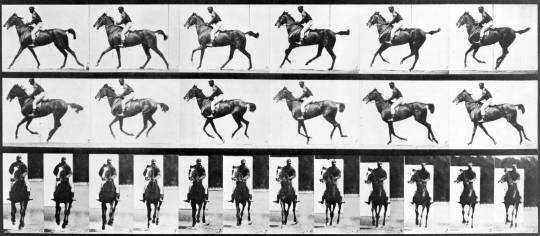
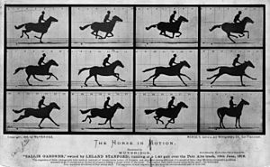
Reference
Study of a Horse at Full Gallop by Eadweard Muybridge (1878)
Continuity
The unbroken and consistent existence or operation of something over a period of time/a distinct break in physical continuity or sequence in time.
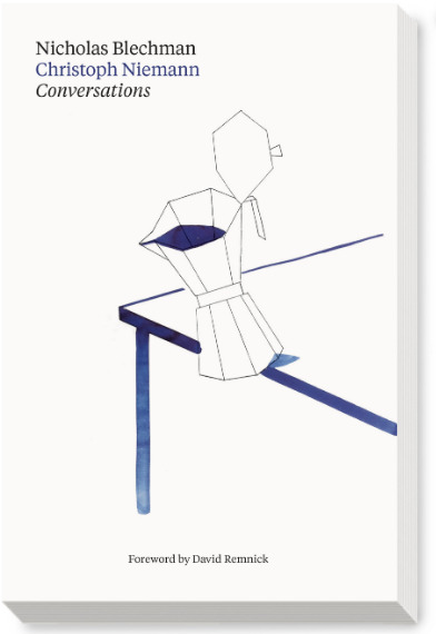
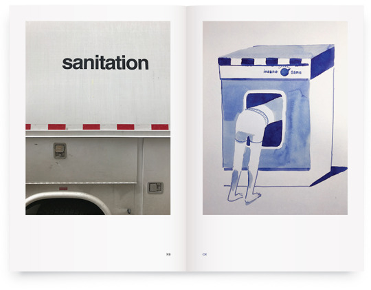
Reference
Conversations by Nicholas Blechman & Christoph Niemann (2017)
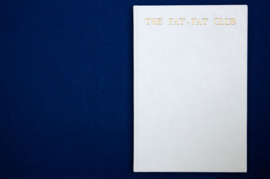
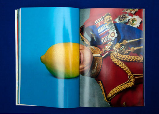
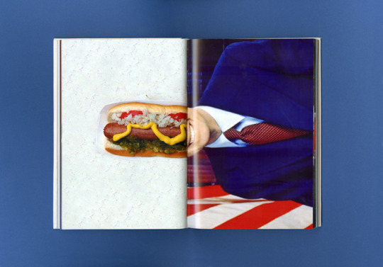
Reference
The Fat Fat Club by Aude Debout & Caroline Lollo (2012)
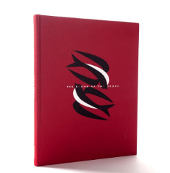
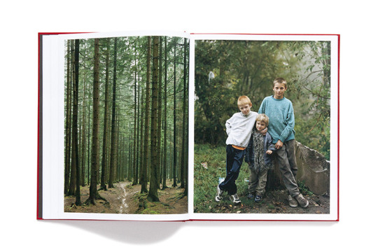
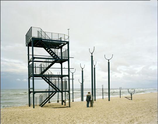
Reference
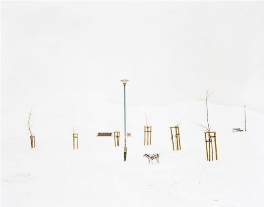
The Sound of Two Songs: Poland, 2004 - 2009 by Mark Power
Reference
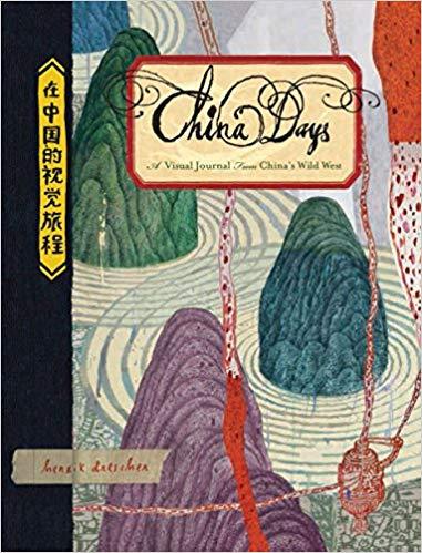
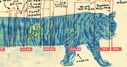
China Days: A Visual Journal from China’s Wild West by Henrik Drescher (2014)
Task
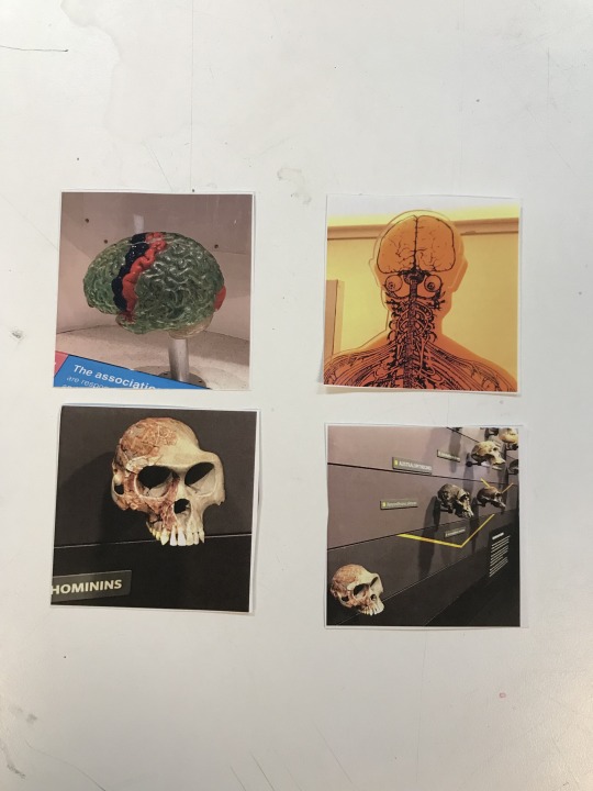
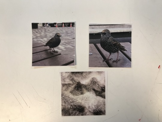
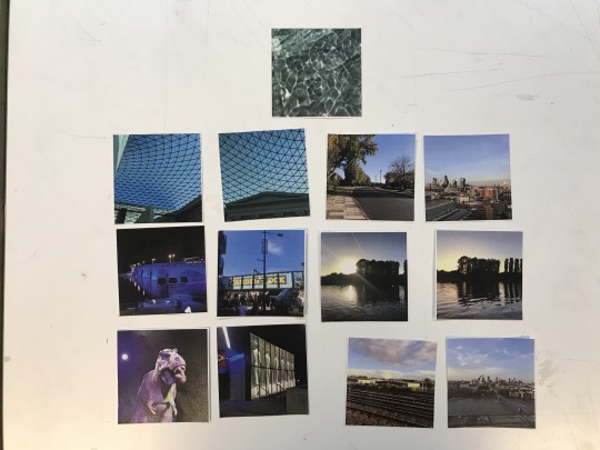
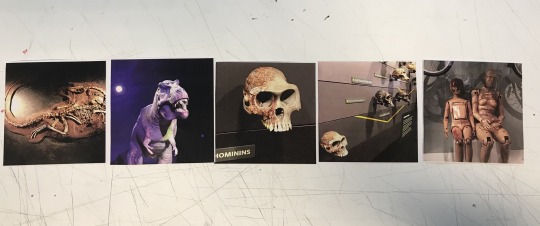
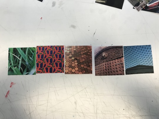
For this weeks seminar, once again we were asked to take at least 50 photos and then bring 25 of those in, plus the photos from last week.
Below are the new additions I brought in.

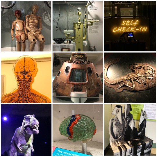
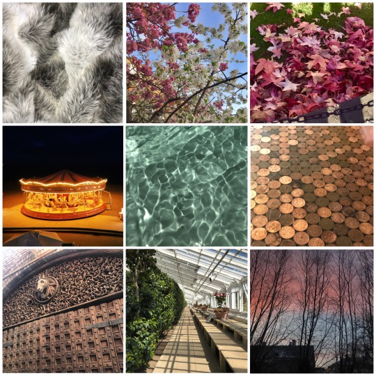
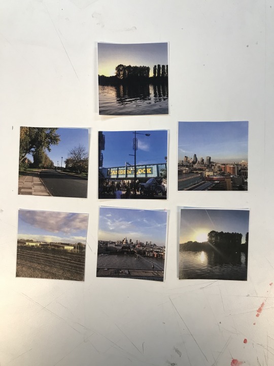
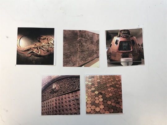
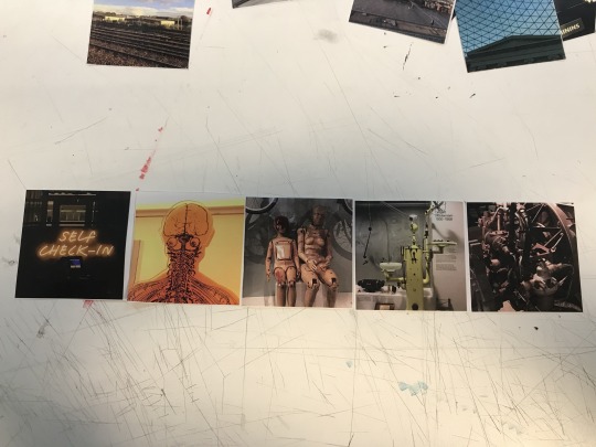
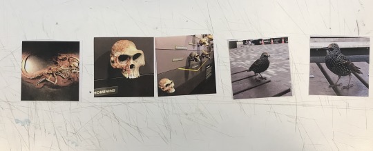
With the addition of the new pictures, we categorised all the images we had into typology, chronology and continuity.
Typology
Chronology
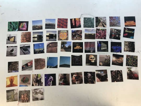
The photos are ordered from the oldest to most recently taken.
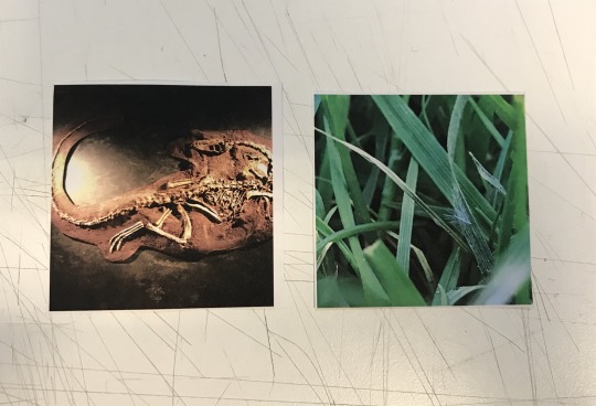
The oldest subject taken vs the youngest subject.
I thought it was a funny observation that in the first photo, the grass was the first image I had taken for the project, yet was the youngest subject I photographed.
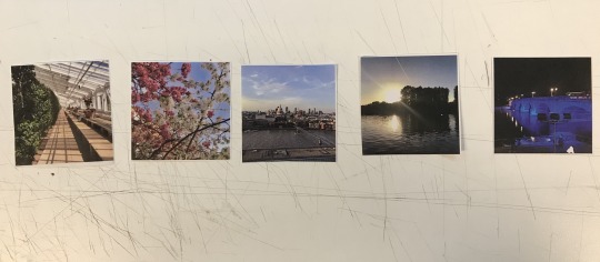
Continuity

0 notes
Text
Everyday Connections - Introduction to Editing: Initial Connections
For this part of Everyday Connections, we looked at the Introduction to Editing: Initial Connections.
What is Editing?
The process of altering an image - adding or subtracting features, altering features (eg. colours, lighting) to make an image more visually appealing.
To go through a selection of photos and choose a selection of images to display and fit your needs.
To prepare (written material) for publication by correcting, condensing or otherwise modifying it.
Reference
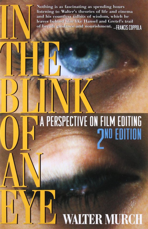
In The Blink Of An Eye by Walter Murch (1992)
‘Every film is like a puzzle really, from an editorial point of view’
One Piece Puzzle
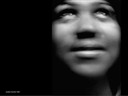
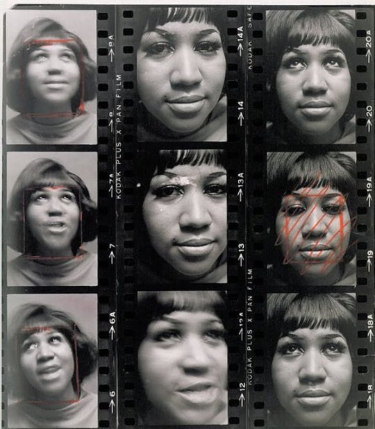
Reference
Art Kane by Aretha Franklin (1967)
Two Piece Puzzle
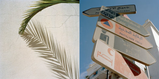
Reference
Gravehopping by Jason Fulford and Tamara Shopsin (2015)
Three Piece Puzzle
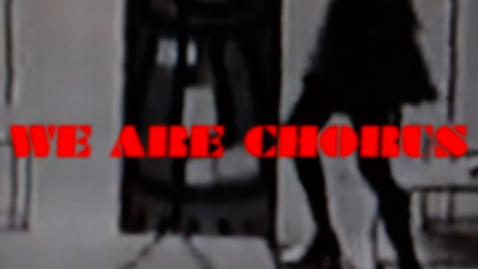
Reference
The Woolworth Choir of 1979 by Elizabeth Price (2012)
https://www.tate.org.uk/art/artworks/price-the-woolworths-choir-of-1979-t14214
Multi Piece Puzzle
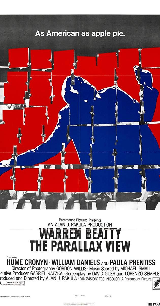
Reference
The Parallax View by Allan J Pakula (1974)
Missing Piece
An audience
Movement of the eye
Bridging connections
Assumption / Experience / Knowledge
Solving The Puzzle
Content
Composition
Colours
Texture
Tone
Shadow
Framing
Task
We were asked to take at least 50 images and print out 25 of the most interesting shots.
Shown below are the images that I took.
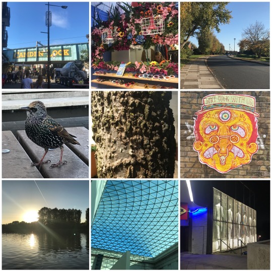
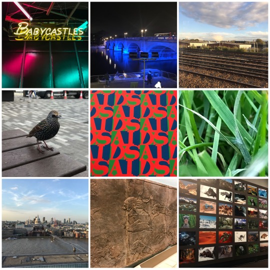
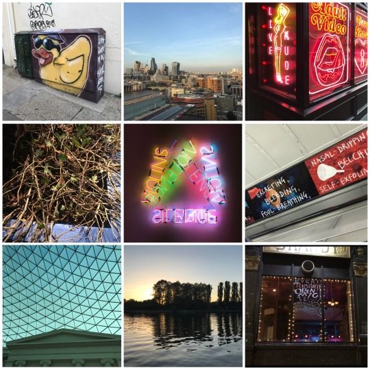
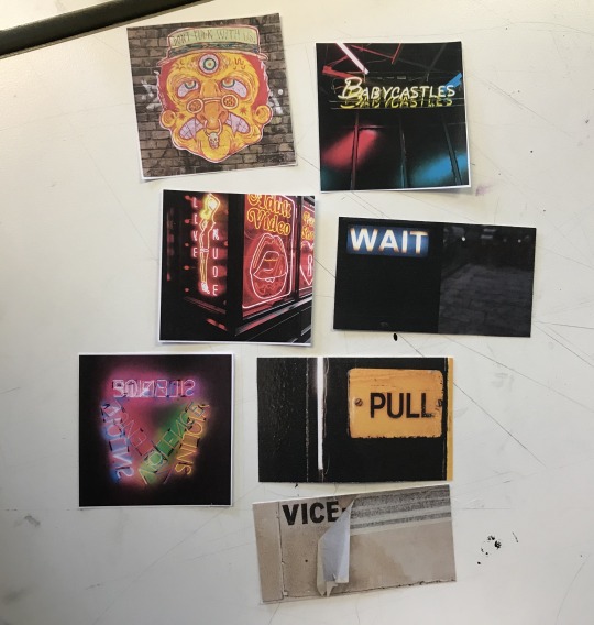
We then took these images and arranged them in groups of two, threes and fives, playing around with the positioning and thinking about them in terms of colour, narrative and common themes.
Below is a small selection of the many combinations I conjured up.
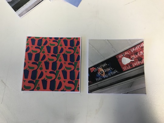
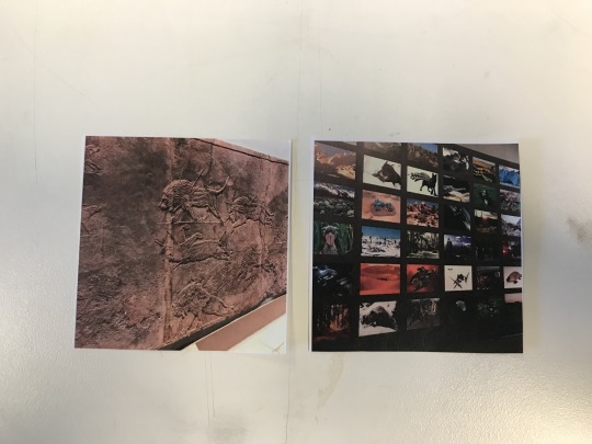
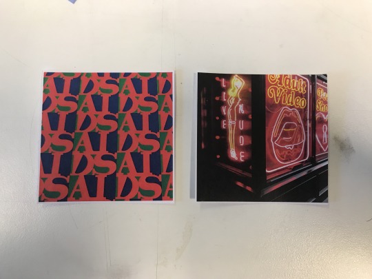
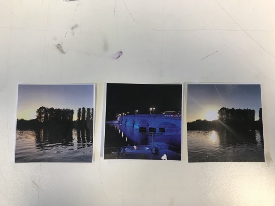
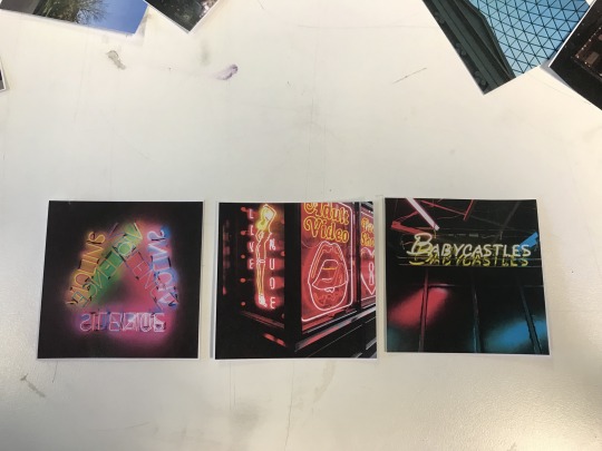
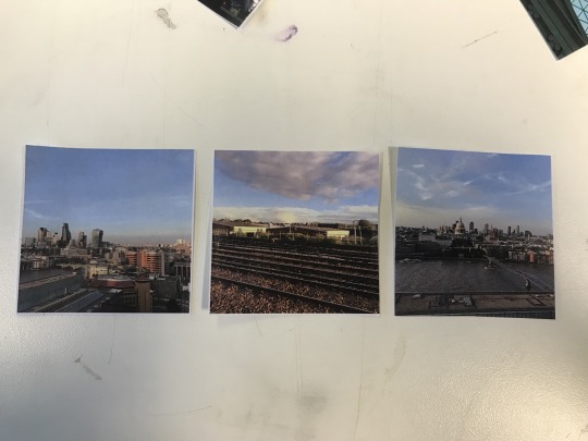
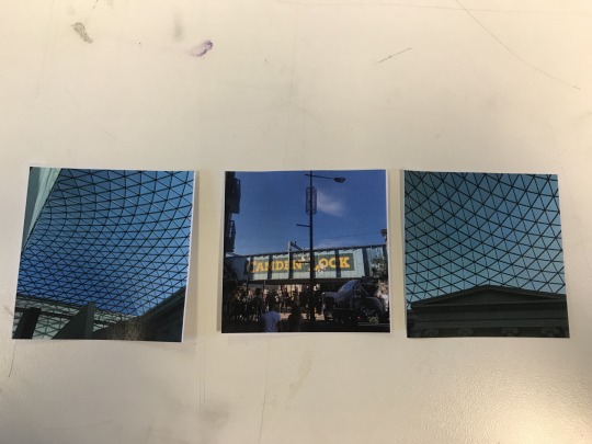
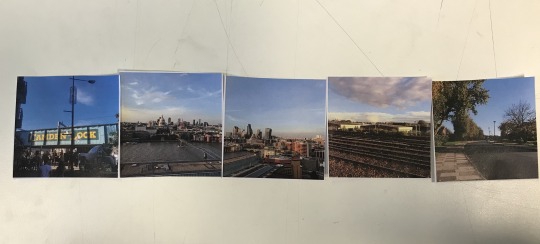
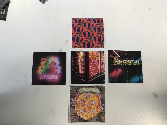
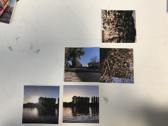
All these photos have a connection to each other in the layouts, whether it's obvious or more hidden. Some are pretty self-explanatory, be it theme, colour or perspective, well as others might have a deeper meaning, perhaps more political or in the form of a story.
We were then asked to swap images with someone and do the same thing with those photos, so we can interpret someone else’s work.
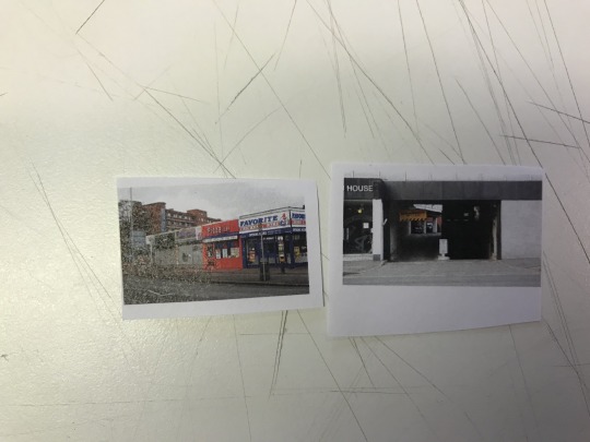
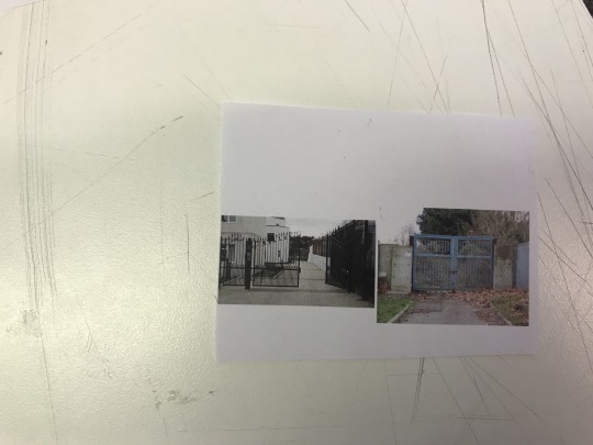
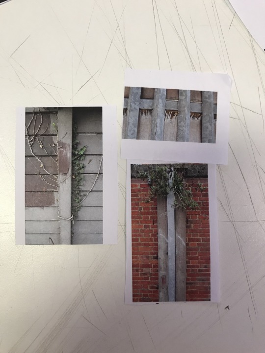
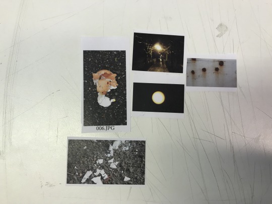
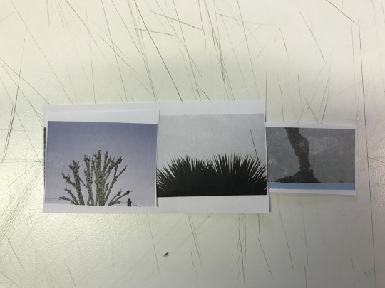
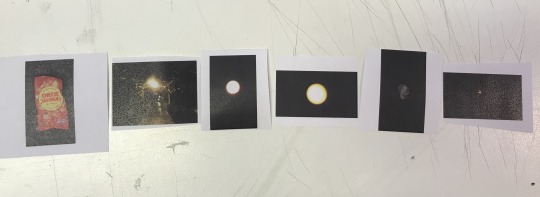
This felt particularly challenging for me as the images I was given were quite different from my own and initially I couldn’t find many things in the images that I felt connected. However, once I played around with them a bit more, I started noticing small things that joint the images together, thus creating a narrative - a journey, common themes, a CONNECTION.
For the final task of the day, once again we swapped photos with someone else - however, this time we worked in pairs and used both our sets of images.
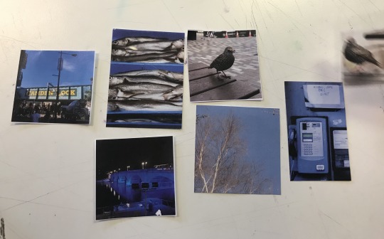
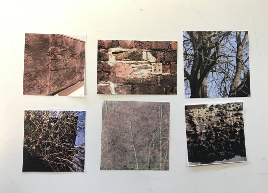
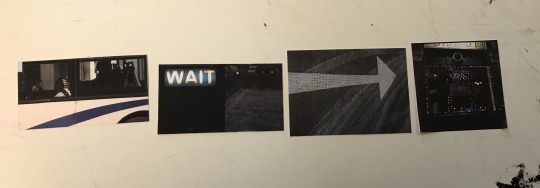

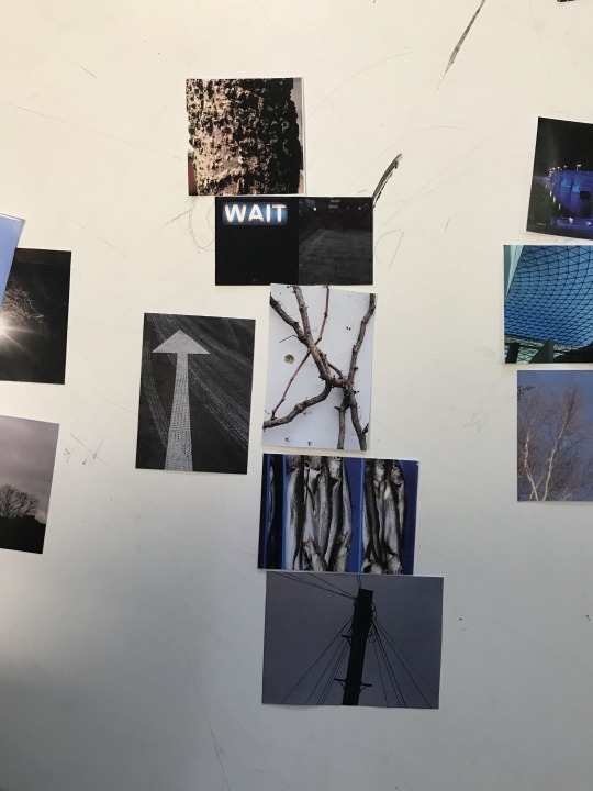
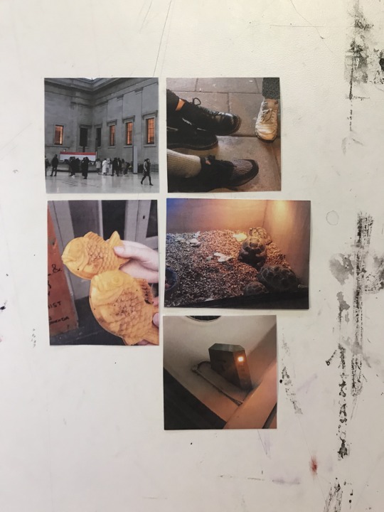
I particularly liked the outcomes of this task - I felt that both our sets of photos complimented each other very well and having two different artists perspectives allowed us to think of combinations that we might not of thought of individually. I especially like the 6th photo - having a first glace at it, you might not understand what the link between the photos are, but upon further inspection, you see that each photo connects with each other using lines - there is one continuous line going through the set of photos.
Doing these tasks has allowed me to open my mind more in regards to analysing and arranging photos, I’ve found links that I normally wouldn’t have chosen in a standard setting. Playing around with these photos was almost like a puzzle, I needed to find the pieces to join them together.
0 notes
Photo

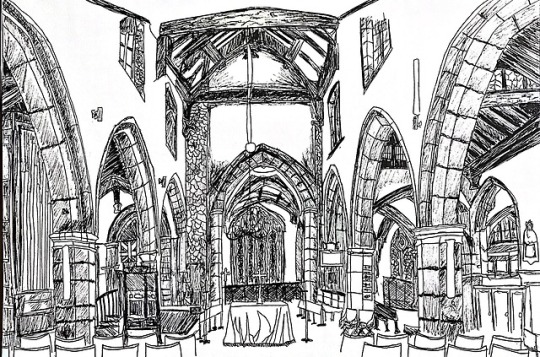
Monday Lecture - Week 1- Documenting Differently - All Saints Church
Group: Maya Browne, Nina Hacker-Thornton, Chloe Victoria Wickham, Ben Sinclair, Sky Burrows.
We went to the All Saints Church in Kingston to document the surroundings and capture the atmosphere that is encapsulated in the church.
We decided in our group that each person would have a different medium to work with, and each draw a different perspective of the church, ultimately creating a panorama of the church. We also decided to have one overview piece of the church, drawn from the entrance, so we would be able to have captured views from almost all sides of the inside of the church.
We chose All Saints Church as our location due to the fact that churches often have an intricate and detailed interior, as well as artistic portrayals of symbolism. You’ll also get a certain demographic of people going there - people of all ages, race and backgrounds collectively meeting for the same reason - their faith and connection with God, their spirituality and rituals. With churches, they often share similarities in the decor - stained glass windows, crosses, arched corridors and pews, yet each church has their own unique way of portraying and displaying these features, especially in regards to denomination.
2 notes
·
View notes
Text
CHS Lecture - Moving Stories Film Festival
This week our CHS Lecture put on their own Film Festival to celebrate animation as an art and to honour the London International Film Festival. We all split into groups and chose a short film or film clip that uses animation to tell a story in a distinctive way to show to the class.
My group consisted of Maya Browne (me), Romy De La Mare, Freyja Crisp, Oliver Whitehead, Sam Glynn, Rina Torshina, Charlie Crome and Jamie Sparrow.
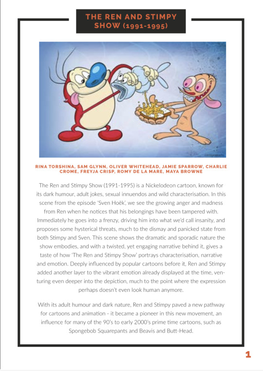
We chose a clip from the 90′s Nickelodeon cartoon ‘The Ren and Stimpy Show’.
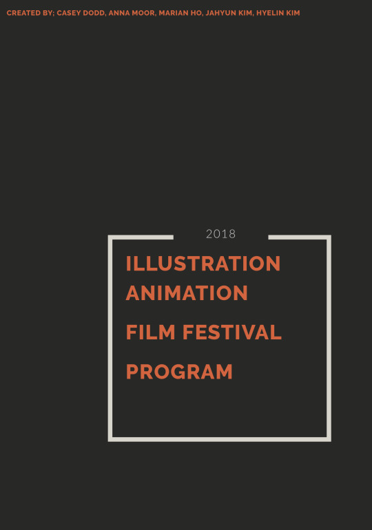
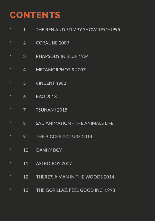
Seen below are the cover and contents page of the festival programme and a description that I wrote for the programme telling why we chose this example and how the animation impacts the scene being shown.
0 notes
Text
CHS Lecture - One Panel Wonders
For our Monday lecture, we were asked to find an example of an album cover that tells a story in a single frame.
I have chosen a selection of album covers which show a narrative.
Sonic Youth - Goo (1990)
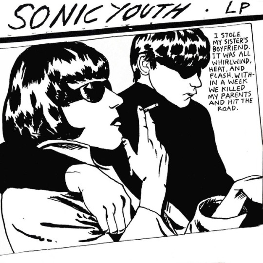
Sonic Youth’s 1990 album Goo features artwork from artist Raymond Pettibon. The inspiration for the artwork comes from a paparazzi photograph taken from the 1966 trial of the infamous Moors Murders, featuring Maureen Hindley and David Smith, sister and brother-in-law to one of the murderers, Myra Hindley. They were there as key witnesses. Since the album cover’s inception, it has been parodied countless amounts of time.
Pink Floyd - Wish You Were Here (1975)
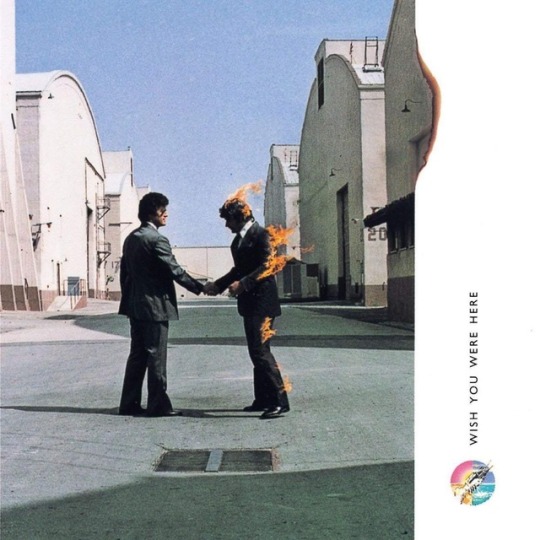
The cover of Wish You Were Here was photographed by Aubrey "Po" Powell. The initial idea behind the image is that that people aren’t always open about their emotions and tend to conceal their true feelings, for the fear of ‘getting burned’. The image displays two businessmen shaking hands, with one man set alight on fire. The phrase ‘getting burned’ was also a phrase commonly used in the music industry, often said by artists denied royalty payments.
The Beatles - Yellow Submarine (1969)
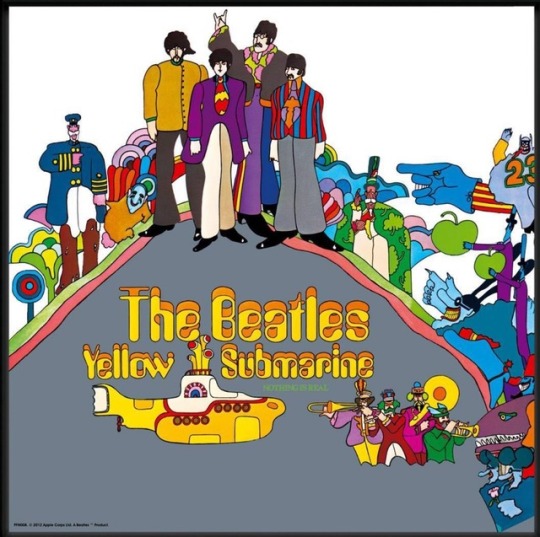
Yellow Submarine is The Beatles’ 10th album, which was created as the soundtrack to accompany the animated film of the same name. The artwork is drawn by Heinz Edelman, in the same style as the film and uses the characters in a way that hints towards the film's story.
1 note
·
View note
Text
Materialise - Presentation
Our group found this project to be a struggle, as we were not exactly sure what our end goal was and what was to be expected from us.
Shown below is our presentation. Each person in our group had a slide, in which we created an illustration for and wrote down either some pros or cons for the process that we had looked at.
The process I looked at was Laser Cutting, for which I wrote the positive factors for. In this presentation, I spoke about how a laser cutter works, talking about the intricate details and processes of how the machinery operates.
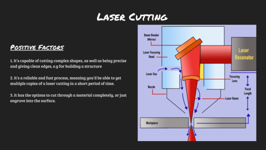
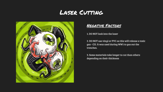
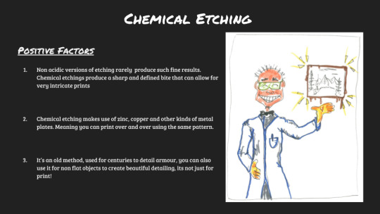
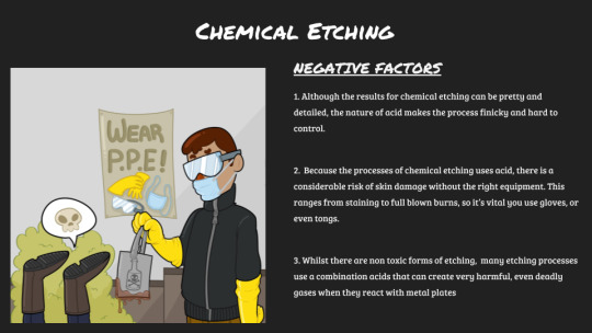
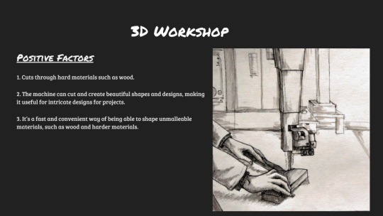
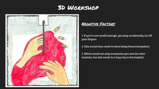
In terms of improvement, I think our group could have made the presentation more interactive, maybe with audience participation, and perhaps focused more on developing a performance within the presentation, rather than just reading out what the different processes did. Had we done so, I feel we would have gained more of a R E A C T I O N from our audience.
We did have a couple of props to emphasise on the points made (this included a balloon painted to look like an eye for showing the dangers of looking directly into a laser cutter, and an inflated glove covered in red paint to further develop the points made about the hazards of the 3D workshop.).
I felt our presentation may have come across rather stiffly, due to us reading information and not engaging so much with our audience on an eye to eye basis - I do think this may be because there was a build up of nerves though. For our presentation, I think we should have incorporated a Q&A, video and perhaps more visual outcomes - we were going to do the cook book idea, which I think would have been a fun piece of visual media to add in, however our time was limited and there was only so much we could fit in.
Nevertheless, this was certainly a learning process for all of us and I think by not only going up in front of everybody and doing this presentation, but also watching other presentations, it showed us what works well and what doesn’t work so well in presenting and what we can learn for next time.
Something that caught my eye with a couple of the other presentations was that when someone wasn’t speaking, they were always adding to it somehow, whether that was them showing actions / acting to add a visual to what was being said, or being dressed up in a costume to further the points being made. I’m sure on their part this made the presentation more comfortable to do, as not all eyes were on them at a singular moment - this truly shows teamwork.
0 notes
Text
Materialise: Final Planning for Our Presentation
On Monday, we met up as a group and ran through some ideas of how we could present our findings. Our initial idea was to create some kind of ‘cookbook’ where we presented our findings as a recipe - an illustration created by the each of us, and presenting the pros, cons and a health and safety list of each process.
We came to figure that this would be overambitious and we had too little time to do this before Friday, since we’d need to not only print a huge amount, but also create the front and back cover, as well as the inside of the book. This unfortunately proved to be too much to do in the time we had, with our current schedule.
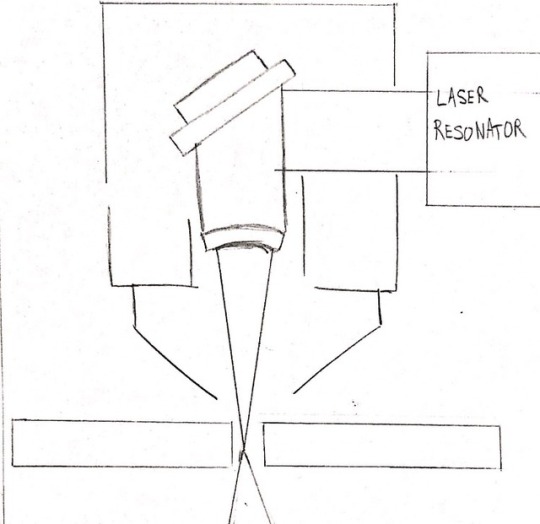
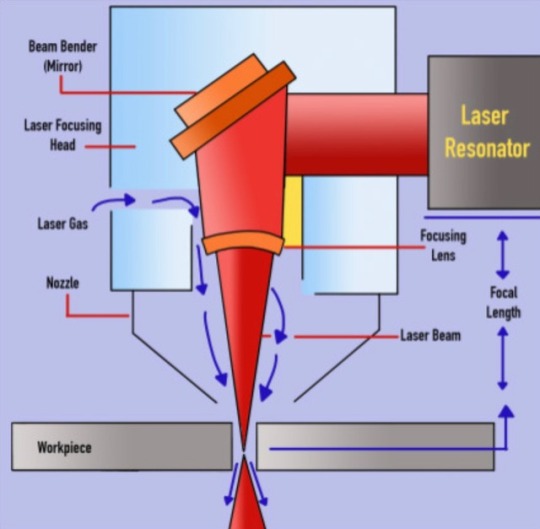
As an alternative, we decided that we’d each create an illustration for our segment of the presentation. My role was to talk about the pros of laser cutting. I would be discussing how a laser cutter operates, the uses for a laser cutter and what kind of materials you can use a laser cutter on. To allow for further understanding, I created a labelled diagram of a laser cutter.
Below is my initial sketch and my completed illustration, which was to be displayed alongside a few key points on a slide.
0 notes
Text
CHS Lecture - Manifesto Performance
For our lecture this week, we had to look at an avant-garde modernist group and create a manifesto to present based on their ideology. The group I was in looked at the Expressionist movement.
Below are a few pictures from our performance and a copy of our manifesto.
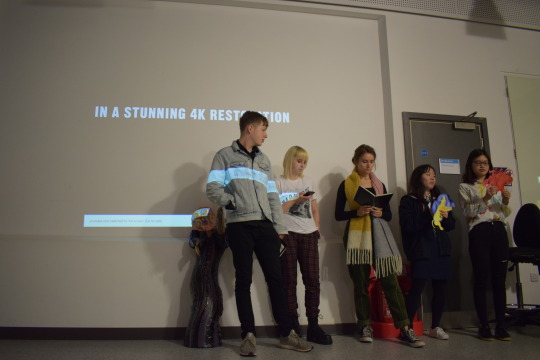
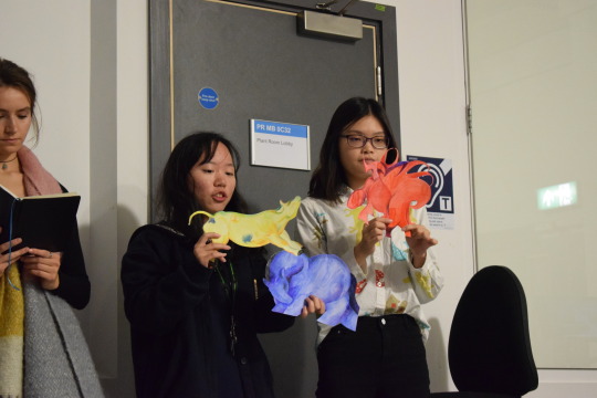
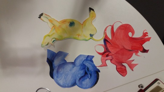
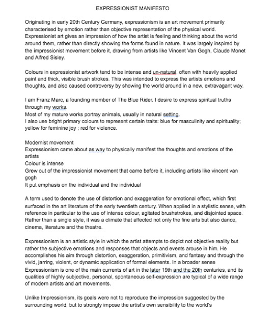
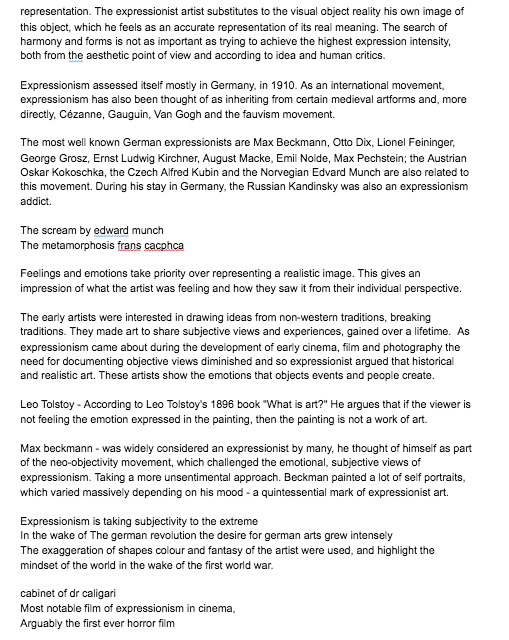
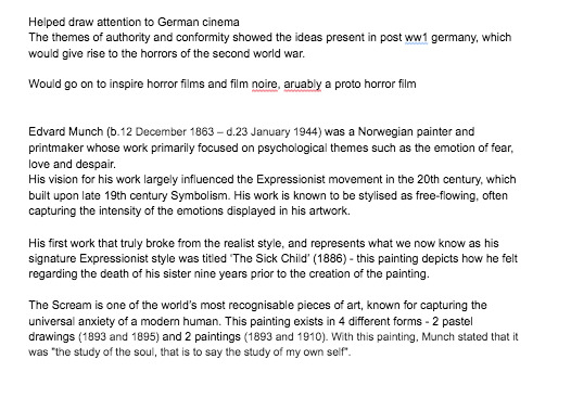
We had difficulty with this project due to the fact that not everybody knew who each other was when we signed up for the group online. Alongside, once we found the majority of our members, we couldn’t find a time to meet that worked for everyone. This meant our communication and ideas weren’t always getting across to each other in its full vicinity and lead to the group being rather split up. As a result, our manifesto was created separately, with each person bringing in their own part to put towards the overall document. This made the manifesto go way beyond the 200 word limit.
Alongside, because we weren’t able to meet in person, we didn’t create a performance as such, leaving us to just read our points out, rather than unveil a show to the audience.
However, we did have a few props that were created, to add some visuals to a part of the speech. I also brought an inflatable version of The Scream, based on Edvard Munch’s classic painting, with me, that I remembered I had somewhere at home, bought about 11 years ago. I’m glad I finally got to use it for something, even if I didn’t have enough time to blow it up fully for the presentation, it still helped visualise the points I made about Edvard Munch and his impact on the Expressionist movement.
If I was to do this project again, I think perhaps I’d research more into performance pieces and try to illustrate certain points of the manifesto through movement. Organising a time to meet is vital and must be attended in order to progress with the development of the project, though of course that is a joint commitment and depends on the other members of the group as well.
0 notes
Text
Presentation Seminar 12/10/18
This seminar focused on presentation in creative / vocational fields.
The two key points in this seminar were:
Form Follows Content - to challenge what you think the outcome should be whilst conducting research/documenting.
The Presentation is the Work
We started the seminar off by sitting with our Materialise groups, and answered the 3 following questions:
Why do we present?
To sell an idea / get ideas across.
Get feedback.
To ensure you have your idea solidified and know what you’re talking about, as well as answer any questions.
To share information resources.
Gain confidence.
Convince others.
As a form of protest.
Who do we present to?
The general public.
Bosses.
Tutors.
Colleagues.
Peers.
Social Media.
Target Market.
Clients.
Collaborators.
Consumers.
To people who will fund projects.
How do we present?
Interview for a job.
Social Media.
Powerpoints.
Visuals.
Interactive material, such as workshops.
Audio.
The way you act and hold yourself during a presentation.
How To Present
Finding appropriate ways to present - the form.
Keeping people captivated - don’t talk at the same rate.
Create costumes and props.
Q&A.
Books.
Walkthroughs.
Films.
Exhibitions.
These questions are all things that I will need to consider and assess before my presentation next week - these are the key to knowing how I will create an informative, yet engaging piece of work, something that will REACT well with the audience.
We need to think about how we can make a presentation so much more than just a powerpoint slide.
0 notes
Text
City Visions - CHS image
For our CHS lecture, we’ve been asked to find an image that represents a dream-like or a nightmarish city. Below are a few examples.
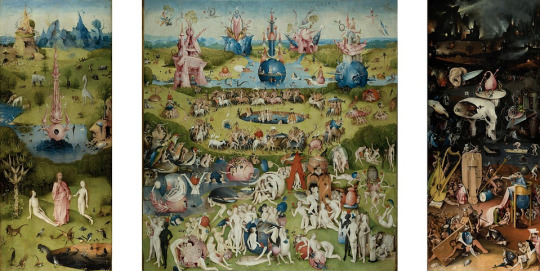
The Garden of Earthly Delights by Hieronymus Bosch.
Hieronymus Bosch (1450 - 1516) was a Dutch painter known for his paintings that were often surreal and had aspects of religious imagery. The Garden of Earthly Delights is a triptych oil painting painted on an oak panel. I chose this piece as I believe it displays a rather dream-like state, a sense of utopia, from a time where artwork that depicts visuals like this weren’t commonly found. I do also think it’s interesting to note that next to this painting that depicts a paradise, the right hand side panel displays Bosch’s interpretation of Hell.

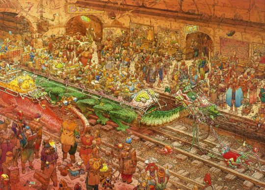
Desert Valley and City of Fire (1984)
I’ve also included a couple of pieces by Jean Giraud, also known as Moebius (1938 - 2012). Moebius was a French artist who worked in the bandes dessinées traditions. He is known for his science fiction and fantasy genre works, contributing illustrations, storyboards and concept designs within the genre. The first piece is titled Desert Valley and the second is City of Fire. These both show overall dream-like states in the fact that they are a totally different world to ours... however, if you look at it from an individual character’s perspective, it’s possible that they themselves find it nightmarish due to their personal situation and their relationship with the surroundings.
0 notes
Text
Materialise - Further Research
Upon conducting individual research for this project and seeing where we could potentially take this work to, I found an online PDF from NYU with a list of different chemical reactions in art and their hazards. I thought this could provide a helpful insight to our project and perhaps initiate some new ideas.
https://steinhardt.nyu.edu/scmsAdmin/media/users/af/Safety/Hazardous_Chemical_Reactions_in_Art.pdf
Going through the list very much reminded me of being back in Chemistry class...! I thought the list might allow us to look further into the materials we had already looked at and also let us explore some workshops / materials we hadn’t experimented with yet! It might also start to provoke some ideas for our final outcome.
0 notes
Video
Materialise: Documentation - More rubbings from the Laser Cutter
0 notes
Video
Materialise Documentation - Rubbings from the Laser Cutter
0 notes
Text
Materialise - Workshops
On Wednesday, having previously discussed our plans for our next steps, we decided to visit the workshops at Knights Park.
With the mantra ‘Thinking Through Making’ continuously running through our minds, as a group, we ventured into the 3D workshop, printmaking studios and Hackspace to gain information on how these processes work. Unfortunately, we were met with disappointment as we weren’t able to get the extensivity of knowledge that we strived for due to inductions taking place. However, we were able to talk to one technician! She went through in thorough detail about the processes of plaster casting, wax and also we were told a huge amount about health and safety in these workshops. As a result of our discussion, we decided as a group that we’d individually research into these techniques before our next lesson on Friday.
The process at which I looked at was marbling. We felt marbling was a good process to look at due to how it reacts with the material it’s printed onto, and how it’s a unique creation each time.
My Research on Marbling
Paper marbling is a method of aqueous surface design, which creates patterns reminiscent of smooth marble and other kinds of stones.
These patterns are created through dropping ink or other kinds of pigments on water or a solution known as ‘size’, which is then transferred to an absorbent surface such as paper or fabric.
This method can be used to create book covers, pages for a book / zine / etc, t-shirts and other similar clothing, and more. It is also often used as a writing surface for calligraphy. One of the main appeals of this design is the fact that every print is unique, and never the same as one another.
The process of marbling is often done with a pan / tray filled with an aqueous liquid and the dropping of inks (often fabric inks) onto the surface of this liquid. You can then alter the liquid how you want, whether that’s leaving it how you’ve placed it, stirring the colours or dragging a skewer through the ink to create certain patterns.
You then gently lay your material down onto the ink and then lift it up to reveal your print!
Photos taken in the printmaking workshop
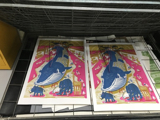
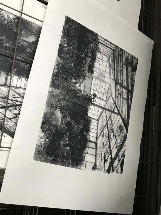
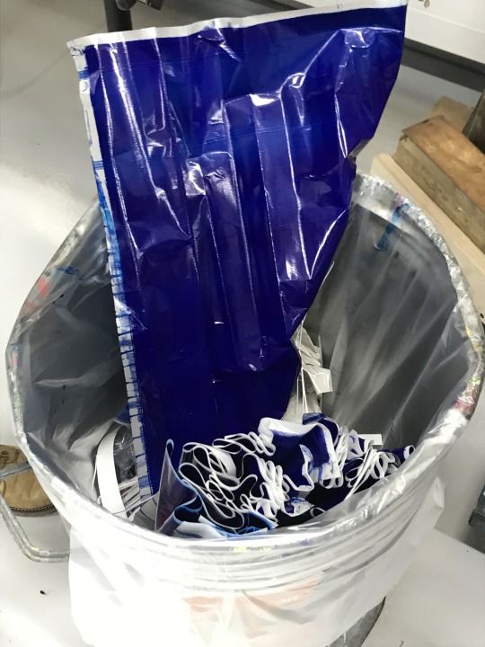
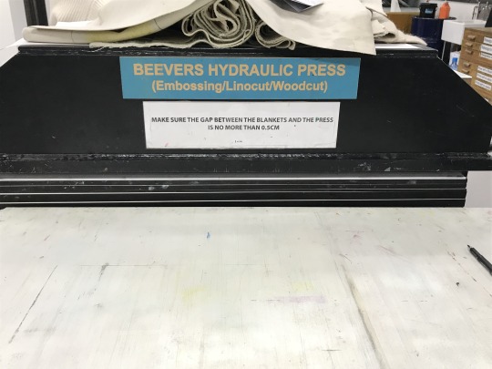
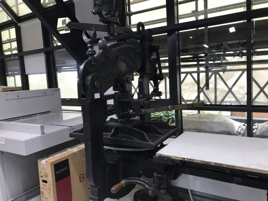
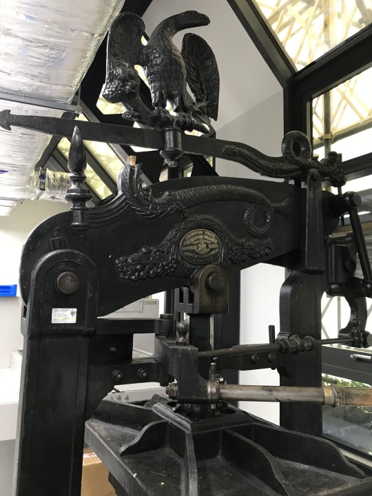
The following week, Mai and I met up to go back to the workshops to gain further knowledge on these processes and see if we could talk to a technician about the printmaking workshop and more on the 3D workshop. Unfortunately, having looked around, there was no one to be seen before and after lunch, which made our task to progress on this project harder.
0 notes