marigoldserenity
Marigold
A yellow aesthetic blog by @chromaticanxiety. Feel free to send submissions, or tag us in your yellow posts. Some posts may include #nudity, but will be tagged.
733 posts
Last active 60 minutes ago
Don't wanna be here? Send us removal request.
Last Seen Blogs

collective-of-eevees
Collective Thoughts

four-bastard-bustle
Hand in unlovable hand

pawzofchaos
Paws draws shit
softrobotcritics
SoftRobotCritics
Text
More than just yellow, this mini-online exhibition curated by @inariporkka invites the audience to make connections between visuals and the viewer's experiences and the curator's thoughts.
The New English Art Club Annual Exhibition 2024 is online right now (link here), so I wanted to go through it and share my picks with you guys.
The online exhibition is set up mainly to sell art, so there is very little information about the works on the website. There are no descriptions or artist's statements, so we are going purely on my vibes here. The selection and arrangement is also mine, so this post is in essence a mini-exhibition curated for you by me. I'm gonna call it:
State of the Art
A Curated Selection from The New English Art Club Annual Exhibition 2024
(Image descriptions in alt-texts.)
We start with my absolute favourite, "Natural History Museum, Oxford" by T. F. Ashley. (Link)
Pro-tip for any aspiring curators: you always lead with the strongest piece. If this was a physical exhibition, this would be on the poster, this would be hanging on the main wall of the space.

I am the kind of person who prioritises drawing over everything else in art. I don't mean drawing as a medium (though that is important to me too), but as an element of art. And this piece - while obviously being made in a drawing medium - also manifests the kind of drawing that I think is important. To me that kind of drawing is almost like thinking with a pencil in hand, making a thought process visual, visible.
This piece also has that elusive quality of looking tactile. I live a very digital life, and I have chased that vibe of "digital image that looks like you are touching it" for a long time - and this image nails it.
I am also drawn to this image for its content, as I work in a museum so the picture is relevant to my professional interests, too.
Rest of it is under the cut, because I am considerate of y'alls dashboards.
Landscapes
First we will have a landscapes section. Landscapes are not usually particularly divisive, so it's a safe choice to lead into an exhibition with them. They also have the power to be familiar: the viewers of the exhibition might know the place depicted in the works. Or, since a lot of places on Earth have similar vibes, a place might remind someone of a different place.
Melissa Scott-Miller: "Waterside Cafe, Little Venice" (Link)

For example this painting reminds me of Coventry, where I used to live, because Coventry has a river running through it, and the river has these kinds of narrow houseboats on it. I never had the opportunity to visit one, so this painting makes me feel some kind of a nostalgic longing or remembering a missed opportunity.
It leads us to the next painting: "Boating Central Park" by Ruth Stage. (Link)

This painting is done in egg tempera, which is not an easy technique, and knowing that appeals to me - I enjoy examples of humans being good at doing difficult things. The image is also beautiful. It doesn't look like anything I have ever seen. Like, I can get vibes of influences, but it doesn't feel like I have seen paintings like this a lot in my life. Also grey is my favourite colour.
Next we will have another unique-looking landscape, "Estate - The End of the Affair" by Andrew Torr. (Link)

The geometric shapes and planes of colour are approaching abstraction without crossing over to it. I also really enjoy mundane things being given the art treatment, because making a painting does elevate its subject, still. The area depicted in the image looks like somewhere people like me might live, in a way that "fancy" places don't, because I'm not rich or fancy.
Taidg O'Malley: "Piazza del Campo Rooftops, Siena" (Link)

Another landscape approaching abstraction, with the additional layer of an unusual point of view. I just really really love this, it is so inventive, and especially when "Siena" is the name of a place but also the word for the colour that is the most prominent in the image. The artist is using the medium of the painting to pass on that insight they have had about the association between the name of the place and the name of the colour, and it feels fantastic to be receiving that insight. For my personal art practice sharing insights and pointing out things I have noticed in the world are central motivations for me, so all sorts of synapses are firing for me right now.
And lets pair another high up view point with the painting above:
John Duffin: "W1A - BBC and All Souls Church, Langham Place" (Link)

This is an etching, which is a kind of print where you scrape the image onto a metal plate with a needle. I love a fine line and you don't get much finer lines than with etching. I also really love all printmaking. The mood in the image is also top notch, very dramatic and powerful, even ominous. The light is almost like a frozen explosion, and the tall buildings make me think of Batman the Animated Series. I also really like the use of the postal code in the title. Not sure why, but it's cool, interesting, I like codes.
We will continue the fine lines and meticulous details idea here, with Neil Pittaway's "Brunel City". (Link)

Something about the colours and the details done in white hark back also to the egg tempera painting of Central Park, but this one is a drawing done with pen, ink, watercolour, and "body colour" (???) The image is delightfully Inception-esque, and I really jive with this way of depicting a city.
We follow it up with "Wiener Jugedstil Palast" by the same artist. (Link)

More of this incredibly enjoyable line work depicting the kind of architecture I (and a bunch of other people here on Tumblr) like.
Portraits
It leads us neatly to our next segment: Portraits. Portraits are also nice and friendly for viewers, because we are humans and we know how to look at pictures of other humans. Of course the depiction of humans does bring in the possibility of viewer (and artist! and curator!) bias, bigotry, and sense of propriety (what if someone is naked? what is appropriate? where do we draw the lines?) so we run a slightly bigger risk by introducing the human element to our exhibition.
We start with Frederick Jones and "Hidden" (Link), as it carries a similar visual language as the above drawing.

This wood engraving might not be a portrait in the strictest sense, considering the person is obscured, but I don't subscribe to the idea that we can be identified only by our faces. Also the Rene Magritte vibe is strong here, and who doesn't like a good Magritte.
Michelle Maddox: "Self Portrait in the Studio" (Link)

Another portrait with an obscured subject, with nice geometric-ish surfaces of colour (check out those circles and semicircles on the twigs in the vase!), which this time add to the Magritte vibes.

Charlotte Sorapure's "The Lepidopterist's Dream" (Link) introduces another layer of surrealist inspiration with the trope of the reflection in a mirror reaching out. The vase with plants connects this one to the previous painting too.
The objects in front of and reflected in the mirror seem normal enough until you hang on a moment exploring the image and begin to notice that some of the butterflies have alighted onto mirrored images of flowers.
Then we use the profusion of flowers and butterflies as our link to the next painting, where the background has a profusion of organic elements.
Julie Held: Self Portrait (Link)

Something about the strangeness of the composition appeals to me. My eyes explore the background, trying to figure out what is going on (is it upside down?) before returning to the awkward, sketch-like figure in the corner.
Next up is Barbara Leidl's "Dominic (and Bird)". (Link) We continue the theme of limited palettes.

I love earth tones, and the bird on the figure's shoulder is absolutely perfect. The use of outline with minimal shading works so wonderfully well here. It's the drawing again.
Paul Gildea: "Boy with Necklace" (Link)

A slightly impressionistic treatment, which is an enduring trend in contemporary painting, but the subject punches it above the mass. It makes me slightly uncomfortable, because the subject seems so beautiful but vulnerable and uncomfortable too. My sense of propriety doesn't quite know what to do with this image.
Maxim Langford: "Arnold" (Link)

The shifts in value, light and line work in this one are incredibly satisfying to see, they scratch some kind of an itch for me. Also I am very partial to profiles, I just think profile portraits are the most interesting and beautiful.
Shadi Vahabzadeh: "The Daughter of the Sun" (Link)

We are once again nearing abstraction, and here I particularly like those pattern fills on the skirt and the vase, and the lighter area in the background. They connect well to the way the shirt and hair of the previous drawing were also only sketched out as shapes.
Shanti Panchal: "The Book of Revelation" (Link)

This one combines together a lot of elements that I find particularly enjoyable: the profile view, the combination of line art and subtle shading, surrealist influences, and even the combination of the yellow sofa and the grey background is right up my alley (because I run an aesthetic blog for the colour grey called @grey-in-color and my friend does one for yellow called @marigoldserenity and one year Pantone chose grey and yellow as the colour combo of the year).
And we close the portrait section with a painting that is only dubiously a portrait (though every foot fetishist worth their salt will tell you that you can recognise a person from their feet).
Sharron Astbury-Petit: "Reclining with Venus". (Link)

It connects to the above painting in several subtle ways: the style of line art and shading is similar, there are nude figures in both; but also the contrast between the flat grey background of "The Book of Revelation" and the profusion of colours and organic shapes in "Reclining with Venus" - which one might expect to find in a painting inspired by Indian miniatures. I also really enjoy the subtle touch of the bird tattoo on the ankle, which matches the busy vibe of the background.
Still Life
The next segment is paintings of objects, still lifes. We'll start with William Pierce's "Trainers" (Link), which carries us nicely over from the previous image of feet.

Here too the vibe is nearing abstraction and sort of impressionistic-ish, but what can I say, a trainer (sneaker, running shoe, tennis shoe, whatever you call it) is such an iconic object that it just always works.
Jason Line's "Bric-a-brac" (Link) also has shoes in it, and a similar sketchy feel.

I also find this perspective kind of strange and interesting, looking at things from above, as if they are laid on the floor. Like logically I reckon that is a table, but to me the feeling is of floor for some reason.
The next painting by the same artist continues the floor vibes: "Still Life with Shell" (Link)

But here more than the weird perspective vibe, I love the colours. Look at all that amazing grey, which is accentuated by the pink shell and the blue bottle (it's called "@grey-in-color" for a reason).
Claire Venables: Recreating the By-Product (Link)

Similar vibe here, with the way the shapes work, and with the colours. This is aesthetic manna for me. Also blue is my wife's favourite colour, so I do pay more attention to it due that. The subject is also fascinating, it is not common to see science as the subject in visual arts, especially in traditional mediums like painting.
Agata Smolska: Arrangement in Yellow (Link)

And here we have grey and yellow meeting again! But I just really find any and all colours in the same image with grey to be really compelling. Everything goes great with grey. The subject is also another great example of elevating the mundane, with paper cups and napkins (and a lemon for some reason? What are they serving?)
Misc
We finish this exhibition with a grab bag of paintings that don't quite fit any of the above categories. Which I think is important, you always need to have space for things (and people!) that don't fit into your neat little labels.
First we have "Not Forgotten" by Aidan Potts (Link) which could be a still life, or a portrait of a flower. That's actually something I have thought about a lot, plant portraiture.

By now you know my thing well enough to see it right away: I am here for the grey and the colours. I also love the challenge of the title, because a plant growing in a crack in the sidewalk is pretty near to being forgotten, despite still fighting. Which reminds me: Free Palestine.
Toby Ward: Bike Repair Station (Link)

Here again appears my beloved line art with lively flat areas of colour, and the elevation of the mundane. But I also love the subject matter, because bicycles have been important to me throughout my life.
And last, "The Bar at The Bull" by the same artist (Link).

We finish with a painting that I can't quite explain what it is I like about it, because it just goes straight into my feelings without passing Go. It reminds me of something that I don't have anymore, even though I never had it. This one for me connects to Harpo Marx and how important he is to my life, but the connection is too convoluted to try to explain. But what is more useful to explain is the fact that this connection exists and is the reason I am drawn to this painting. Because there's no way the artist was making this painting thinking that I would connect to it through some convoluted Harpo Marx connection.
Instead this painting being the finisher in my little online exhibition is an illustration of the fact that we see in art what we bring to it as much as what the artist and the subject bring into it. We mix it all together in our brains and get some sort of experience out of it. And that's pretty much all there is to art. It is a form of communication you cannot achieve with any other form.
-
Thank you for reading/looking, I know that was a lot and I did it mainly for myself, but I'm glad you were here along for the ride.
7 notes
·
View notes

Text

Uprising - Edwina Lucas , 2020.
American , b. 1991 -
Oil on panel , 8 x 8 in.
929 notes
·
View notes

Photo

KATSUDA Yukio(勝田幸男 Japanese, b.1941)
unknown(sunflower) via
302 notes
·
View notes
Text
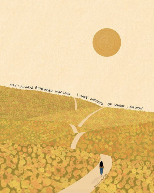
you would not believe the yellows this generous world gives us
7K notes
·
View notes

Video
Deaf Kitty Enjoying The Vibrations From Guitar Strings
(Source)
12K notes
·
View notes

Text
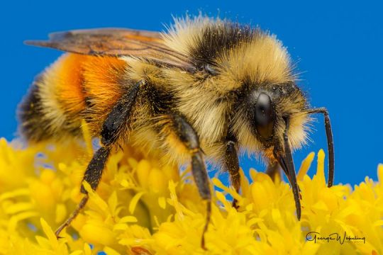
Orange-belted Bumblebee (Bombus ternarius), family Apidae, Montreal, Quebec, Canada
photograph by George Wakeling
312 notes
·
View notes