Text
first workshop excercise

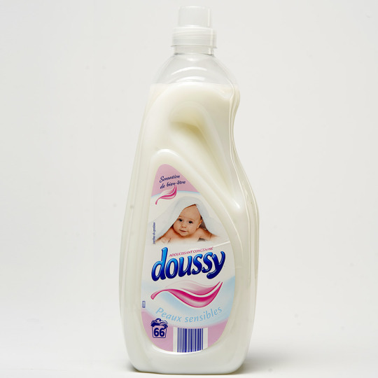
Comfort Pure Concentrated Fabric Conditioner 1.25L.
Retailer: Waitrose and Partners Ltd.
Doussy Premium Fabric Softener
Retailer: Lidl GB Ltd.
0 notes
Text
Feedback on sound collection so far
In my tutorial Jack suggested that I explore some of the 'extremes' of my project, by widening the parameters a bit and see how this could perhaps change my defintion of a market. This lead me to collect more photos from a wider range of potential market environments and I visited East Street market, Camden market, Borough market and Canary Wharf
Whilst reflecting on my collection so far with Mille I felt having a sound-based collection made it a bit difficult to engage with and I decided that I didn't want my audience to be interacting with my sounds through a screen
After the 2nd Friday workshop I became quite conflicted about how I wanted my audience to interact with my piece, and what the implications might be if I were to make my collection primarily sound-based. Although I did consider uploading my files to an mp3 player, I think I ultimately decided that the context in which my work was going to be shown in a busy (probably noisy) room might make it a bit of a sensory overload, and a bit too overwhelming with a large group of people around you. Furthermore, I think since the concept for the exhibition was already something that requires a lot of focus from the viewer- to view a collection of things that we (as a group of designers) are asking our viewer not just to process individually, but as a part of an assortment of images that form an individual collection, and then not just analysing this collection, but the collection in the context of the 15+ other collections is quite mentally demanding.
Looking back now however, I wonder if I had explored more ways to display audio files whether I could have moved past this reservation. I wish I would have spent a bit more time in this early development phase of my research considering and thinking through potential options rather than shutting things down. In particular I wish I had continued to collect the sounds past 4/5 days as I think it would have built a more intimate portrait of a market particular to Peckham, and could have built a greater sense of the psychogeography of Peckham market- what social role in the local community, what type of customers it attracts and how cultural 'resources'/ infrastructure (ie. certain Afro hair products, or Afro-Caribbean hairdressers and barbers) bring together diaspora communities along Rye Lane etc...
0 notes
Text
First ideas for my collection
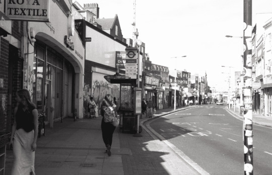
Towards the beginning of my making for the community set brief to start generating some material based on the market I went for on the same walk each weekday up and down Rye Lane recording sounds. I think at the beginning of my project I was thinking about how the market is a very fluid/ dynamic thing with lots of layers of sound happening at the same time (calls/ chants from vendors, passing conversations, bikes, buses, traffic etc.) and I wanted to start to build a portrait of Peckham market so I could develop themes to pick apart in my work. I thought by setting some 'controlled variables' and parameters for my collection eg. distance I was walking, what route I would walk, how often etc. this would help build a more cohesive understanding of the changes in the market day to day.
However at the same time, I was still trying to keep my options open and was thinking about things that interested me the most about the market. In the first activity we did as a class I focused on how the market is a site of reproduction for dupes/ 'knock-offs' and this was the idea I ended up settling on for my collection. Looking back I wish I had gone with the sounds idea as I feel like this was a better way to represent the fluid, unpredictable nature of the market. I think there would have also been more room with this to explore more creative systems of captioning and how this in turn affects a viewer's understanding of a collection and the associations they make.
0 notes
Text
Some community design project tests playing with the idea of 'inauthenticity'
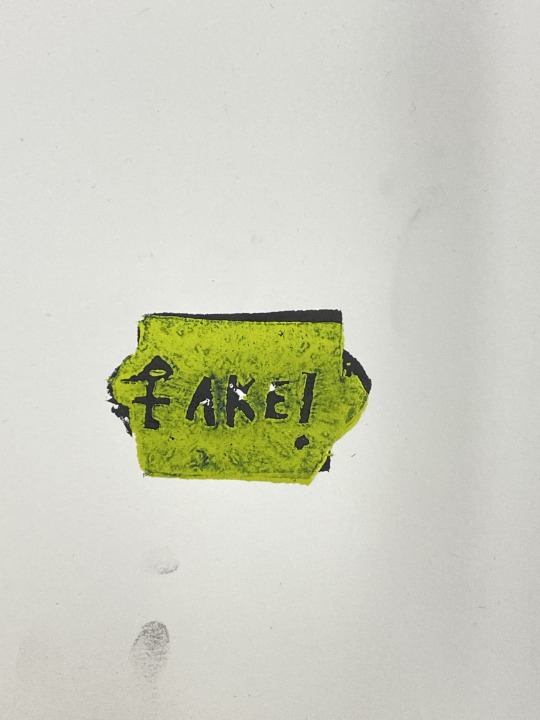
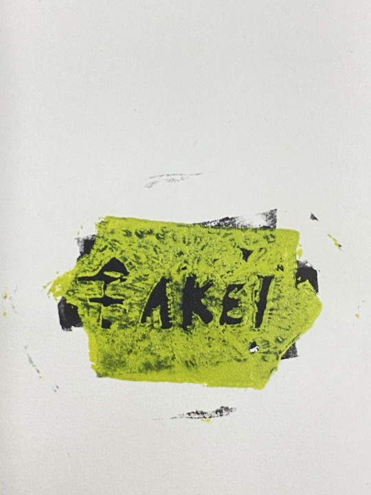

Some potato print tests I did with Charlotte following on with my interest in price tags, authenticity vs inauthentcity and market value
0 notes
Text

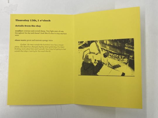
Sounds publication
This was the first version I printed of a basic captioning booklet to accompany my sound files. I went through several ideas for my captions based on a workshop we had had about captioning in the first week. At first I think I found it hard to develop a system for documenting the sounds each day, and I focused my captioning more on things that I had seen over the course of the walk (so I could combine the audio and visual experience of Peckham market each day) but then I decided later I just wanted to focus on audio. I also looked into more systematic approaches into documentation such as my research into the British Library sound collection but decided not to pursue this.
This booklet was designed to accompany the sound files which I had edited down. I tried not to make the text too long or dense since it was intended to be read at the same time to listening to the sounds, but if I were to develop it further I think I could experiment with more unusual formats.
In the first workshop we had for the community set brief we reflected on different ways of captioning (as well as displaying images) and how this affects how a viewer interacts with them. One of the examples of a caption someone had written had included something about their ring scraping a rock and I really enjoyed how this humanized this passing moment in putting the collection together and gave a slight glimpse into the lived experience of the individual. Similarly, I decided to include moments and details from me in the process of collecting these sounds. I created a system whereby each day I wrote down: a description of the weather, the shoes I'd worn that day and one thought I'd had that day to capture some of the changes of my experience of the market with each day. These were details that I felt helped map out an image in the viewer's mind of that day if they were to do the same walk. I think one of the things that worked out about this was that you could see a bit of a story emerge with each day along the market and I think it was interesting to follow this, especially since it was something quite ephemeral, but if I were to make this again, I think I would have tried out more systems for captioning, and would have liked to have a seen a description of some of the sounds contained in the audio files (eg. more abstract longer descriptions of sounds vs. simple ones and whether listening to the audio files in combination with reading the booklet created new thoughts for the viewer- ie. made them re-think what they had assumed certain sounds were, or whether experiencing the market primarily through sound instead of sight changed their perception of the built environment, the daily rhythms of Peckham market and the ways in which communities created through it interact).
0 notes
Text


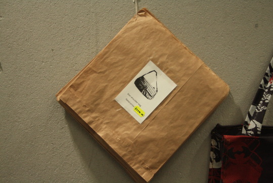
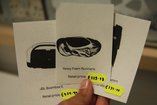
[add image of caption on exhibition catalogue]
Add in final thoughts in terms of my purpose with the collection, whether I felt the work I displayed communicated this effectively.
0 notes
Text
Process of developing making
1st prototype
When putting together my first prototype I tried gluing the pages using a kind of water-based adhesive. As I started to stick my pages I developed certain small adjustments to try to make the glued pages look better, such as leaving a 2-3sm border around the edge of the pages I was gluing to make sure that any excess glue wasn't coming out of the edges of the pages when I smoothed them, or putting each glued 'leaf' through the book press to get a flatter finish. Even though the paper that I was using was quite thick (140gsm) I soon found out that as soon as I started to stick together the pages, they started to curl and wrinkle with the wetness of the glue. I think also tried this with thicker PVA glue which was less watery but still had the same effect with the paper.
In my second prototype, I've tried to solve this issue by using double-sided tape to prevent the curling with the moisture of an adhesive glue. In my last tutorial we also discussed just spiral-binding the publications which I think would give the best finish/ execution to the booklets.


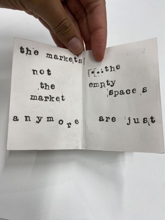


second iterations


Feel like the more playful approach to type layout works better in some places than others. For the most part, I think it works better where the text is more spread out and has more space to breathe. I also think this approach to type layout perhaps works better for certain purposes eg. for comedy, or for more 'playful, 'dynamic conversations than it does for long pieces of text.
0 notes
Text
Design Enquiry research
Poetry
EE Cummings
Bob Cobbing


This publication was particularly relevant to what I was trying to do with my more experimental type layout, however the text actually adapts to the shape and folds of the publication, rather than the text feeling more independent from the form it appears in.
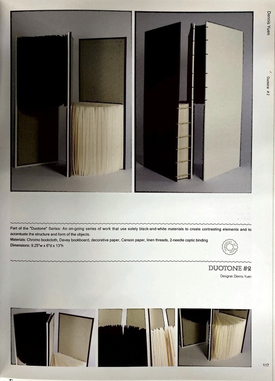
Publication drawing on contrasting elements. Has a fairly sculptural element- hardback cover creates spaces not just for printed pages but also for empty space. Means that the publications fit together as the sum of multiple parts, changing the way the reader both understands and interacts with the publication.


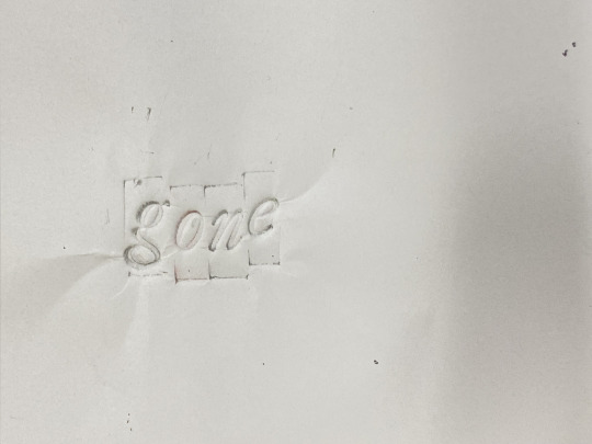
Embossing. Playing with how imprints can introduce 'blank' (uninked) space. In this particular example the extensive embossing across the page really brings out the texture and tactile nature of the photos placed to it.
I'm interested in how embossing could be used to create new shapes, emphasise/ change how the reader reads certain words.
Underneath is an example piece of card that Charlotte embossed using a scalpel as an example, and then an attempt I made at embossing with some letterpress letters. The print didn't exactly come out as I was hoping for (I didn't really want the outline of the lead pieces to embed as they did, and also putting the letters through the bookpress transferred some of the paint still on them which I was trying to avoid!) However I did still really like how the embossed typeface looks. I think I might try to work on this idea a bit more by having this typeface laser-cut and turned into a stencil I can emboss with.

"Because the pages are fabric the viewer has to turn and straighten them with care, making the book a slower read despite the simple text."
Considering 'user experience' of the book as part of the intentional design decisions made in prototype/ outcome development. Really like the idea of a book that pushes the typical expectations of what one looks life. Seems like a very tactile and sensory experience reading through the publication.
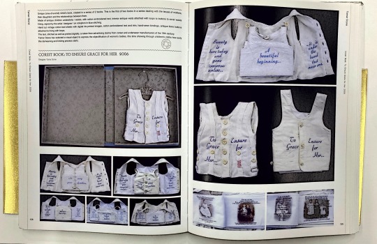
Embroidered text on clothing. As clothing unfolds it reveals more and more text from a poem. Makes for a very engaging and explorative piece- clothing feels like it hold personal stories and struggles.
0 notes
Text
Sewing the bag


One thing I wish I changed about my process is my thinking about constructing the bag. Although I had a very logical process of deconstructing an existing 'market' taurpaulin bag, making a pattern, and using this to cut my fabric, I wish I had taken the time to try passing my fabric through the sewing machine (trying different tension settings, stitch length, the speed I'm sewing at etc.) rather than deciding on hand-sewing so quickly. I think back then I was worried about how little time I had left, and I knew that if I sewed the panels by hand I would at least be able to continue this over the weekend before the exhibition. I remember I had spoken to one of the art shop advisors who had said that they didn't have needles thick enough for my fabric, and that the material would snap the sewing machine needles, but I never tested this out for myself, which meant that I could have potentially saved myself a lot of time sewing and better directed some of my effort towards the design of the accompanying brown paper bag 'publication'
0 notes
Text
Re-writing and re-writing and re-writing the brief

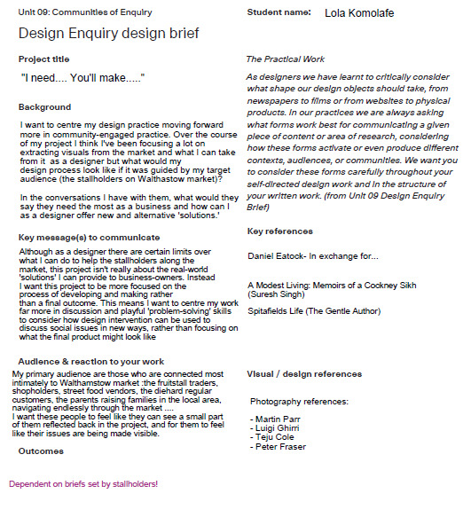
(write up some text about the briefs written so far and why I keep re-writing them)
0 notes
Text
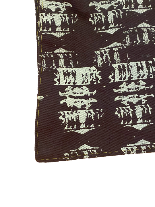
Bag screenprints
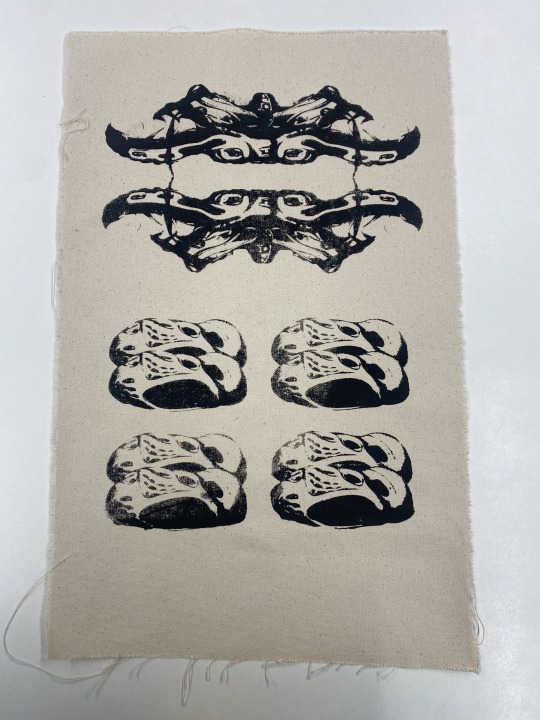
1st image- prototypes/tests on canvas material. This was probably when this more dense print came out the best. Afterwards with the thicker grey fabric the image started to breakdown quite quickly.
2nd image- testing my screenprints on a very thin fabric. The image came out very crisp and I was happy with the level of detail that came through the screen.
4th and 5th image- first full-scale screenprint. As I moved to the thicker fabric it became more important that I perfected my technique- making sure I flooded the screen in one go. Applying the right level of pressure when printing for the full image to transfer completely, lining up print correctly so that one print blends into the next, and doing all of this in as little time as possible to avoid the paint drying out etc. The more I repeated the process the better I got at gauging things eg. the right amount of paint needed to print vs when I needed to add more, how I could use the shadow cast by the image on the screen before it had been flooded to help me adjustment the alignment, how much paint needed to be on the screen in order to fully the flood the mesh etc. I also developed my own methods to achieve crisper prints, such as adding a bit more than a 50:50 ratio of textile medium, or adding water to avoid the paint drying off so fast, using a hairdryer in between layers to make sure paint was fully dry before I added a new layer with a different colour etc etc.
First grey fabric screenprints- Even though I had already tried printing on different fabrics quite a lot I wasn't really prepared for how the paint would react with thicker waxed cotton material. Especially with the fabric being waxed which meant that the paint was never entirely absorbed into the fabric but kind of just sat on the surface.
Later on, as I printed the first full-scale bag design I was trying to repeat-print my image onto textiles and the paint began to dry. I had to wash my screen to tackle this however, in between washes I realised some of the emulsion was rubbing off my screen, making my images far more blurred. I think this was an issue particularly because this image was so dense, so it felt like the print was almost decaying the more I printed onto my fabric.
Later on I found out that I could mitigate this issue by trying to avoid washing the screen as frequently, but I also made my monogram designs a lot larger, which meant that even if the emulsion did come off slightly when the screen was washed, it wouldn't be enough to lose much of the detail in the print.

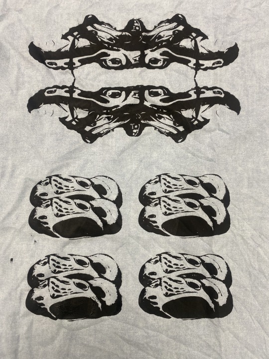
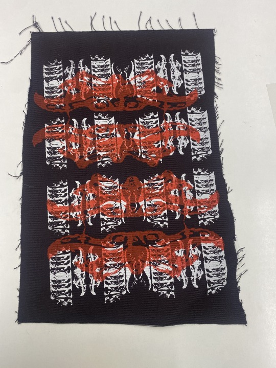

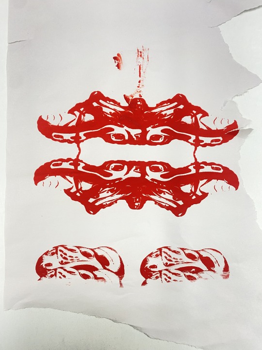
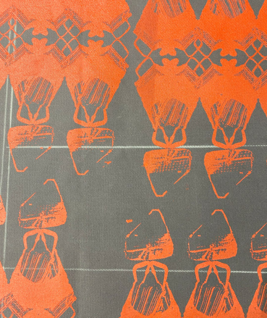
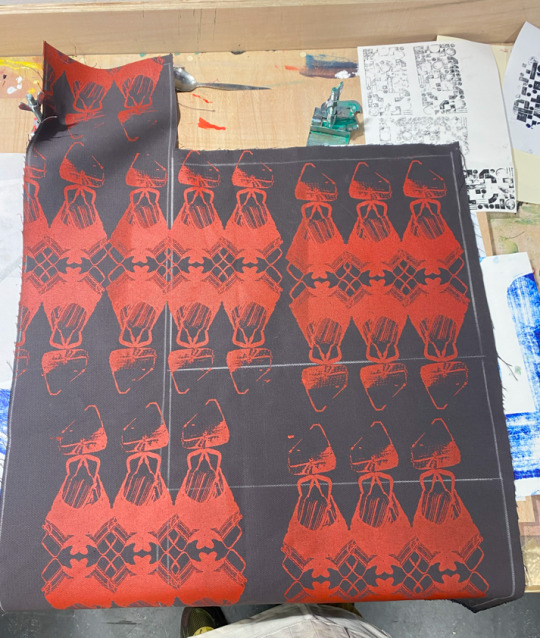


Red large-scale screenprint on grey cotton- my second attempt at printer on a larger scale. This series of prints went far better and I was able to achieve a much greater level of detail. In part this came from what I had learnt about not cleaning the screen too regularly when it does dry, but this was also to do with the fact that the images I exposed on my screens were far larger in size, so the lines in the images came out a lot clearer.
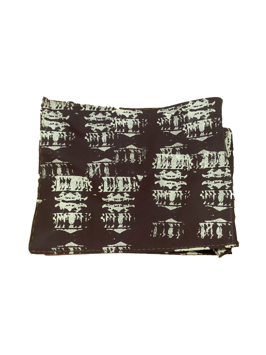
Last image- a third potential bag design I ended up developing. In the end I went with the previous design because I think it was easier to understand that the images used were themselves referencing the market and so the audience gets a bit of a clearer understanding of the self-referentiality of the design.
0 notes
Text
Types of knock-offs I'm collecting
Images I've collected from East Street Market near Elephant and Castle. Out of the stallholders who were happy to let me take photos I was able to collect knock-off shoes, clothing, bags, toys and electronics.


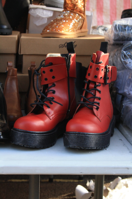

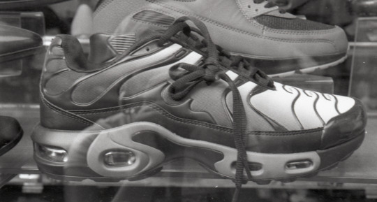
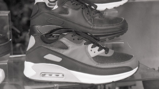

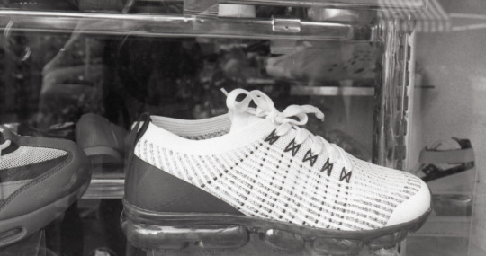
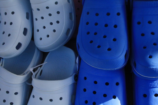
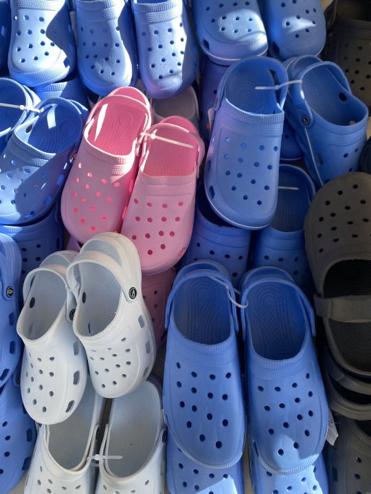

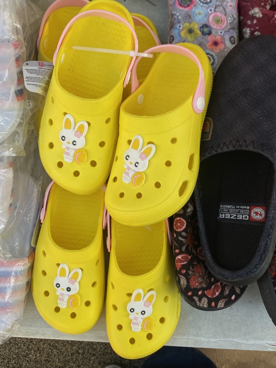
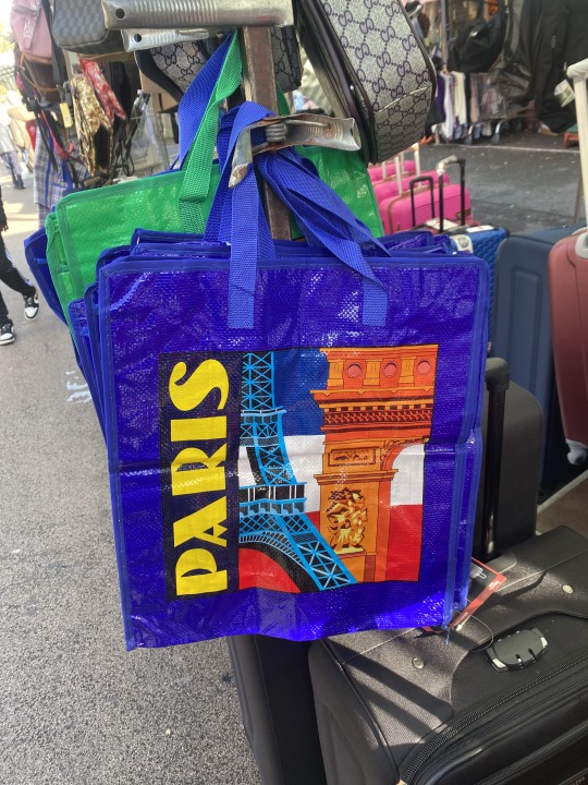

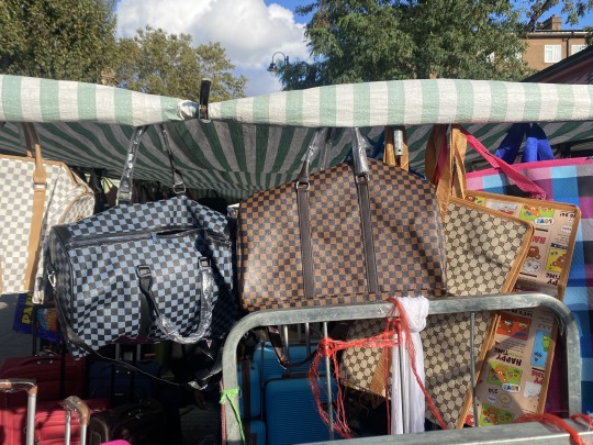


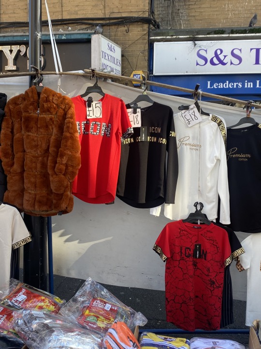
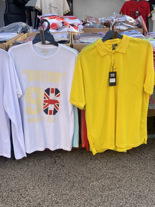
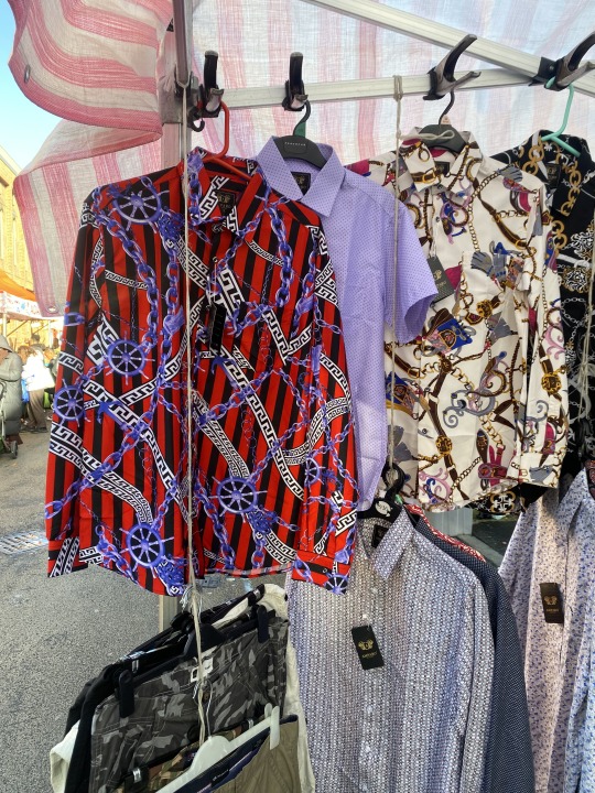
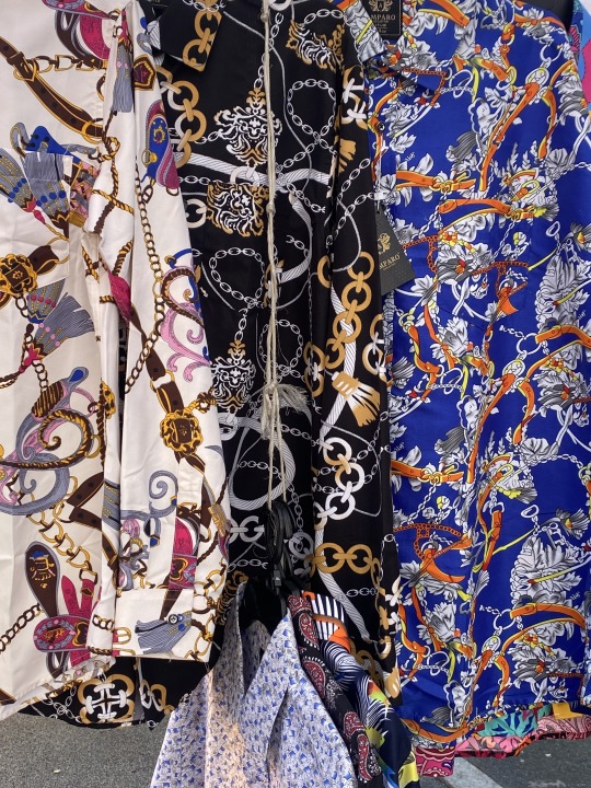

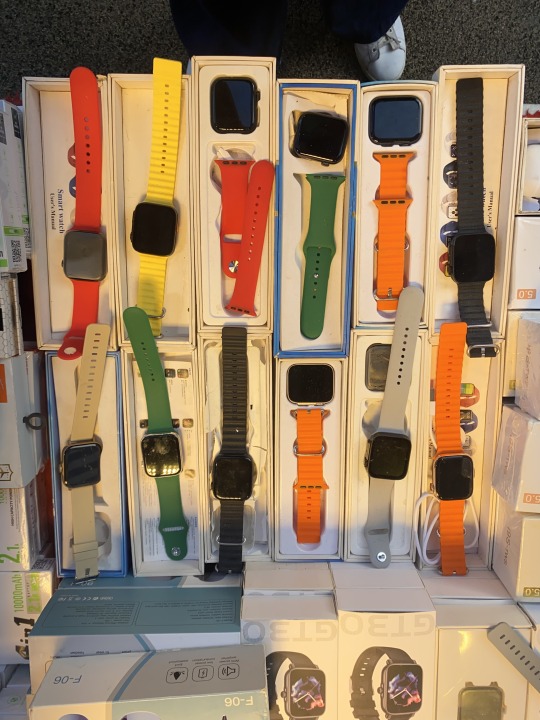


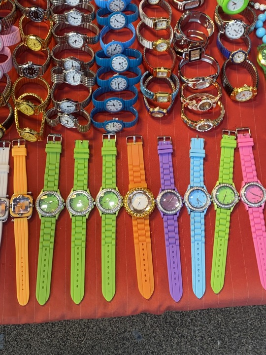
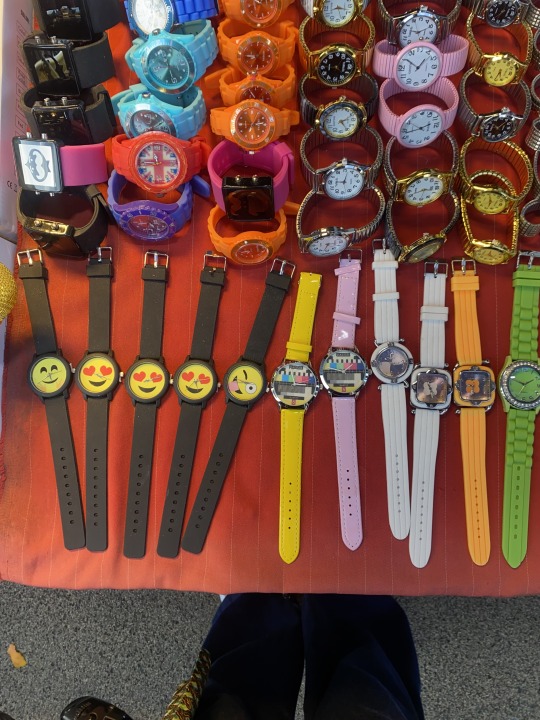
I found it quite difficult to start to form categories in my mind of the types of knock-offs I wanted to collect. In general the types of items I collected I would say are those most typical of London street markets, but I need to find a reason why I'm collecting these items in particular, and also narrowing down the types of items to feel like a more curated, thoughtful collection.
In photographing the items I tried to take as face-on photos as possible as I was thinking I wanted to isolate the items from their environment in Photoshop. I think the visual language of the market is typically very crowded and dense, so isolating these items will help make clearer the connections between one item and another, and create new meaning for the viewer's understanding of the collection as a whole.
0 notes
Text
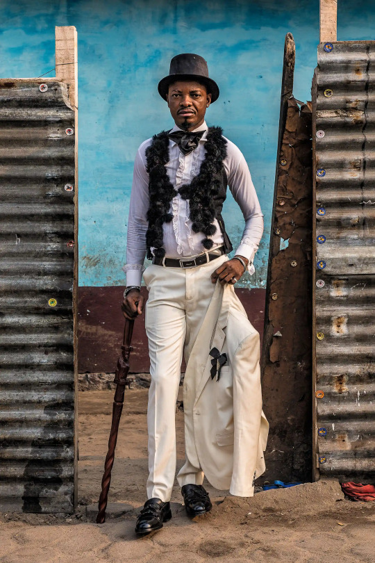
Congolese Dandies/ La Sape
La Sape – an abbreviation of the French translation of Society of Ambience Makers and Elegant People – was born during Congo’s colonial period when the ‘houseboys’ would adopt their master’s clothing as a socio-political statement to show that they too could be just as elegant and smart as them. “La Sape was a way of giving hope to a generation who didn’t have any,” says sapeur Monsieur Robby.
I think I'm realising as I progress through this project that as much as the act of collecting is a form of design in its own right, the act of collecting is also something we naturally all practice to a certain extent as designers. As I looked into Dapper Dan and his reappropriation of designer brands, I've also looked more into the Congolese Dandies as a reference that came from the former. For me it's most interesting when I get to understand how a collection has come to inform a movement/ project/ body of work. Like in the case of the Congolese Dandies you can still to this day see very clear links between illustrations/ archival footage of the European dandies in the outfits worn in Congo today. In a sense, this is like a collection of two halves brought to life, and I think it draws some really interesting points of discussion about what society was like then vs now.




0 notes
Text
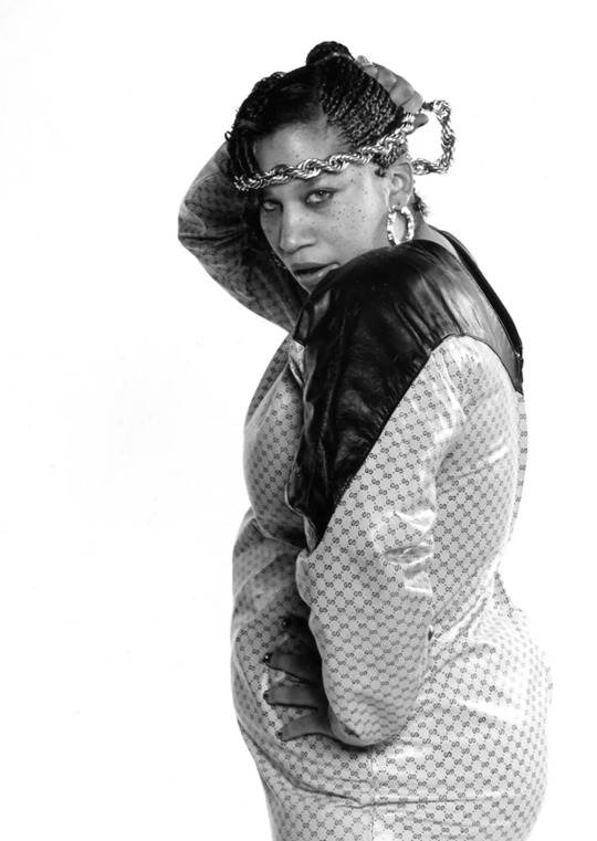
Dapper Dan & Fashion as a Radical Reclamation of Social Rank
Some quotes pulled from a Guardian article about the evolution of Dapper Dan
...At first, the boutique sold furs. But when the girlfriend of a drug dealer came in with a Louis Vuitton purse, and Day saw the faces in the store all turn to look at it, he realised that the power of fashion went beyond aesthetics. He went to his local library to study the origins of the Gucci and Fendi logos and their evolution from mere hallmarks to status symbols. He understood what wearing a designer logo meant to his customers and how it made them feel... “That’s why you saw Cadillacs pulling up to a dilapidated building in Harlem.”
...He cites the cash-poor, snappily dressed sapeurs of Congo, who adopted and adapted the fashion of French colonisers, donning three-piece designer suits and crocodile shoes despite their destitution. “That culture – that’s what happened to me,” Day says..
...Day’s ostentatious creations didn’t emulate, but rather amped up the luxury of existing labels, and he took to referring to them as “knock-ups” as opposed to “knock-offs”, saying he simply “blackenised” the brands.
The way Dapper Dan studied and researched into the psychology of branding: what it means as a status symbol and how brands are able to develop a mythos that takes on a legendary status. Want to explore this further as a theme in my collection and see where I can go with it.
How can something deemed as inauthentic in its nature take on new forms and transform into something new entirely? How do these knockoffs draw on an understanding of the existing genuine brands and imagery and remix these in new and unexpected ways? What type of knockoffs do I need to collect and across how many markets to start to get an understanding of the similarities that the items sold share in common? What can the act of collecting 'fakes' teach me about how commercial worth is created on local scale businesses (ie. market stalls)? What happens when we understand these fakes more as an art piece in their own right- an imitation or reflection of the societies in which they exist?


0 notes
Text
The Serving Library &The Public Domain Review
The Serving Library is a non-profit organization that publishes an online and print journal, maintains a collection of objects, and offers public events and programs.
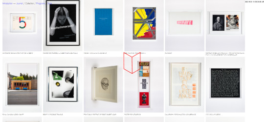
When navigating The Serving Library website your first interaction is mainly guided by the images you choose (despite each of the pdfs inside being written). I think choosing to represent quite lengthy texts through images has worked very effectively as a design tool to create intrigue but also make the viewing experience a lot easier. Since we only see a single image alongside it's title, the viewer starts to draw their own connections between image and text which they can choose to explore further by reading the downloadable archive. Through this format you can view a lot more content at one time (in comparison to the Rapid Response collection etc.)
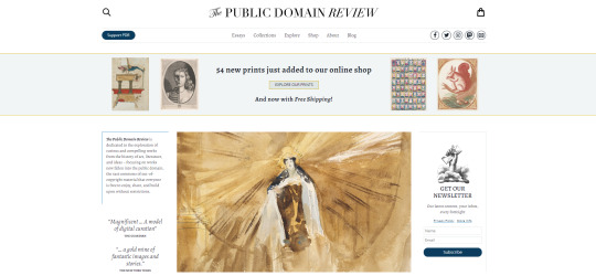
Both The Serving Library and The Public Domain Review a part of a wider 'Open' movement, which is one that advocates for the free flow and exchange of knowledge, unhindered by commercialized paper, journals, content etc. It argues that "when research is held behind a publisher’s paywall, this restricts access to only those who can afford it. " These two digital libraries are both examples of how the act of collecting is never just about acquiring but plays a far larger role in shaping the publics/audiences they attract. In this case both the Serving Library and The Public Domain Review attract new audiences/ publics by promoting education and free knowledge distribution to all. In this way they both embody quite a political function in responding to the world around them- that is that they don't just function as archives but as mechanisms to uphold certain core values that we believe in as a society (justice, free speech etc) in a space beyond the influence of government, political institutions: the digital commons.
An introduction to open access (2019) Jisc. Available at: https://beta.jisc.ac.uk/guides/an-introduction-to-open-access (Accessed: 15 November 2023).
The Public Domain Review
"Online journal and not-for-profit project dedicated to the exploration of curious and compelling works from the history of art, literature, and ideas.
As our name suggests, the focus is on works now fallen into the public domain, that vast commons of out-of-copyright material that everyone is free to enjoy, share, and build upon without restriction. Our aim is to promote and celebrate the public domain in all its abundance and diversity, and help our readers explore its rich terrain – like a small exhibition gallery at the entrance to an immense network of archives and storage rooms that lie beyond."
Extract from the brief about the meaning of the Public Domain:
"The term public domain refers to creative materials that are not protected by intellectual property laws such as copyright, trademark, or patent laws. The public owns these works, not an individual author or artist. Anyone can use a public domain work without obtaining permission, but no one can ever own it."


0 notes
Text
Starter task research appointment with Alessia
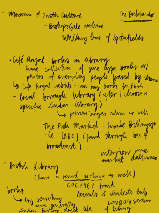
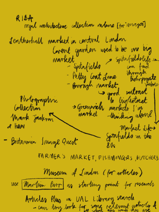
0 notes
Text
V & A Rapid Response collecting research
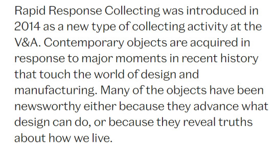
"reveal truths about how we live"- collecting as a methodology for displaying a range of lived experiences. Paradox of items in collections often being collected from individuals but as a means to understand who we are as a collective body. How many items are required to fulfill this task, or is it more an impossible task- gathering a large enough quantity/ a wide enough range to start to piece together the commonalities amongst us?? I think this collection really brings to life an idea we came across in one of our taught studio lessons which was that collecting is hoarding but with a vision for the future.
"each new acquisition raises a different question about economic, political and social change, globalisation, technology and the law"
Rapid Response collecting suggests that the way the world is unfolding in dynamic and unexpected ways, and that this approach has designed been designed in line with this. Rather than collecting being a slow and drawn-out act, this approach is perhaps more reactive,, selecting those items which are most essential. Knowing that these items have been collected as a 'response' to the times (the social, politicial, economic etc. climate) also which gives an added sense of gravity/ significance with which we view each item, which changes our relationshio with the items as viewer (perhaps thinking more closely about what these items might say about us as a society etc.)
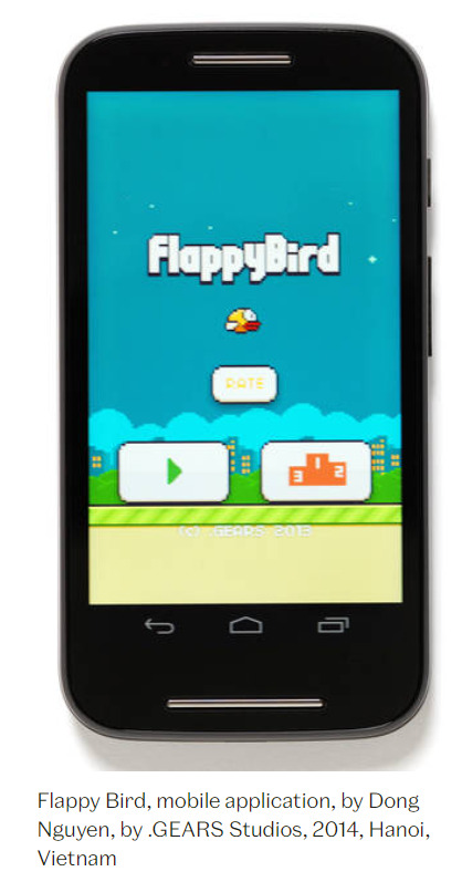


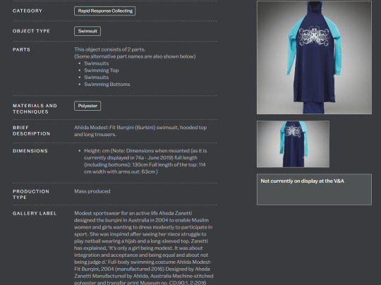
Simple captioning systems lists 1. Name of specific item 2. What type of item it is 3. When it was made 4. Where it was made
Under this section there is a more in depth explanation of the significance of this item, as well as the sub-categories that the item fits under
Online vs. digital collections
Online website allows for casual browsing with the option to find out more about the object. I think the difference between this collection being online vs. how it might look if it were an in-person collection is quite striking here. Online we can't really get a full sense of scale (despite the dimensions being listed) and the final form that the items take online (ie. the difference between seeing an old phone with the Flappy Bird app installed vs. an image on a laptop of a phone displaying Flappy Bird) creates further layers of separation between the viewer and the item which in some cases makes the items more difficult to engage with on an immediate level, but does have teh significant benefit being able to more easily access a wider volume of items.

At the bottom of the website page I found this disclaimer which I thought was interesting. It encourages viewers of the collection/ archive to engage with helping shape the future of the collection by identifying historical language/ ideas present that could cause offense. I think the idea of censorship and redaction is interesting in cases such as these as the level of appropriate use of disclaimers or intervention is far from clear-cut. At best I think it's a good thing that the V&A is appealing to the wider public and encouraging discussion and debate to work through these complex scenarios and help shape understanding for collections to come. The wider the pool of participants in such debates, the greater the range of perspectives brought to the table and therefore the more informed decision-making can become on behalf of large institutions such as the V&A
0 notes