livsunit2fashionportfolio
UNIT2 FASHION PORTFOLIO
My Work and Research for Unit 2: The Eras.
55 posts
Don't wanna be here? Send us removal request.
Last Seen Blogs

k-ameblog
K-ame's Personal Blog
aubree268-blog
인터넷도박중독썰// KON20。COM /

that-gay-firefighter-emt
Untitled
dinatio25
Tio 📖📓
cnthelane
on wisteria lane
Text
Final Collection Portfolio
This is my final collection portfolio, showing my collection mood board, customer profile board, 12-piece, ready-to-wear, collection design boards and press release.
0 notes
Text
Sketchbook Flip Through
This is my complete unit 2 sketchbook, this video shows a flip through of all my pieces of work. I really like the work I have done in my sketchbook for unit 2.
0 notes
Text
‘Reawakening - The Jazz Age’ - Collection Commercial
This is my commercial for my collection “Reawakening - The Jazz Age”, I created my commercial by using the video editing app ‘CapCut’. I used the song ‘Sing Sing Sing’ by the BBC Band, as I believed that it represents the up-beat, lively, free-spirited atmosphere of the 1920s. I also added a film projector sound affect to represent the uprising popularity of silent film in the 20s, as well as the use of the typewriter for the collection name at the beginning of the commercial.
youtube
I have uploaded my commercial to YouTube, this is the link that will take you to my YouTube channel.
0 notes
Text
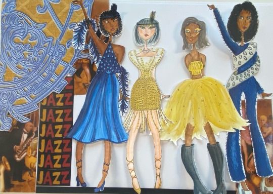
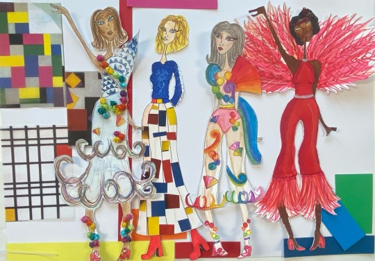
“Reawakening- The Jazz Age” - Final Design Boards


This is my finalised 1920s, Ready-To-Wear, 12 piece collection “Reawakening - The Jazz Age”
For the layout I chose one of my experimental layouts that I had previously done that I believe complimented my collection best, using different images from my original mood boards that show the inspiration behind the pieces on each board and in my collection. Differentiating the images in each one gives them a coordinating look without completely repeating the layout across my design boards and press release.
I believe that my collection represents the era of the 1920s as a whole, as it takes inspiration from each key area of the decade. The colour palette, texture, patterns, beads, sequins, feathers, represents the epitome of the roaring twenties.
With this collection I aimed to completely “Reawaken” the 1920s and I confidently believe that I have done this. Showing the range between the architecture, music, fashion, furniture, art, and entertainment, and I think my collection represents it all in some way or another.
0 notes
Text
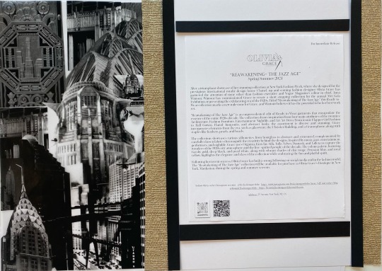
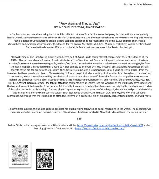
Final Press Release

This is my finalised and decorated press release board, it includes in depth details about and describing my 1920s collection ‘Reawakening - The Jazz Age’.
I had to include the title of my collection, focused details for example; textures, colour palettes, silhouettes and fabrics. As well as, who my collection is designed for and where it will be available to purchase.
0 notes
Text
Commercial Story Board


These are my initial ideas for my commercial, using a storyboard I planned out the order of how it will be layout out and put together. Using descriptive words from my press release draft and mind map as well as aspects of my designs that I focused on.
0 notes
Text
Design Board and Press Release Layout Experimentation

In order to finalise my design and press release boards I had to experiment with different layouts that I could choose between for my final layout.
The first layout I experimented with, I initially really liked this layout, however I soon decided that it was too simple i think and didn’t fully represent the collection itself.
I really liked the second layout I tried, I think the colours of the background that I used ties in with all the colours of each piece and compliments the collection. This is the layout that I chose to finalise my design boards and press release.
The third layout had too much colour on the background which took the focus off of the collection as it clashes too much with the pieces. I decided agains this layout for this reason.
For the final layout experimentation I tried, I liked the gold and the images that I put with the textured paper, however I thought that while it did somewhat compliment the gold pieces in the collection, it didn’t give the same effect for the brighter coloured pieces. This being the reason why I didn’t choose this layout.
0 notes
Text
Final Logo

This is my final logo, in order to finalise it i had to make the background transparent so that it could be overlayed onto my pieces of work easily and change the format to PNG to make this process easier. I like the simple but effective design of this logo, it is also an easy logo to change the colours of if needed.
0 notes
Text
Media Experimentation


These are some of my media experimentation pieces, for this I experimented with two different medias for each of the final 12 designs for my collection. I also had to change the style of the design for example with colours/ patterns. Through this experimentation, I found that I liked using pro-markers and pencil as it gave me a more clean and tidy outcome, however, as I included a lot of feathers I found that to get the most effective outcome using watercolours/inks were the best. I also liked using additional media's like sequins and beads to create more movement in my designs.
This video shows the process of adding media one of my designs where I used watercolour to add a base colour and then went in over the top with pencil crayons to add more detail, with the pencils I added the feather texture to the jumpsuit, using different shades of blue and a white pencil to show the dark and light shadows. As well as that I used the pencils to add shading on the circular wraps around the body to show the 3D shape. Using skin tone pencils I added the light and dark tones to the base to make the skin colour more accurate.
0 notes
Text
Collection Summary Mood Board
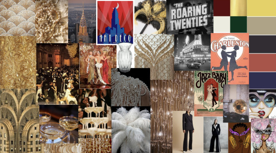
For this mood board I had to find images that summarise my collection to show the inspiration, colour palette, the illustrators and trends that I used. It shows the different themes that I used for my collection; Architecture, Fashion and Furniture, Entertainment and Nightlife, and Art/Art Deco. It also shows the colour palette that I will use for my collection including gold, black, white, red, blue and yellow that I had mentioned in my draft press release.
It shows the trend of tailored suits that I had researched earlier in the project and used in my collection. It also shows the illustrators that I had researched and have chosen to focus on throughout designing my collection.
0 notes
Text
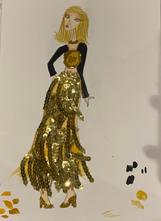
Final 12 Designs For My Collection
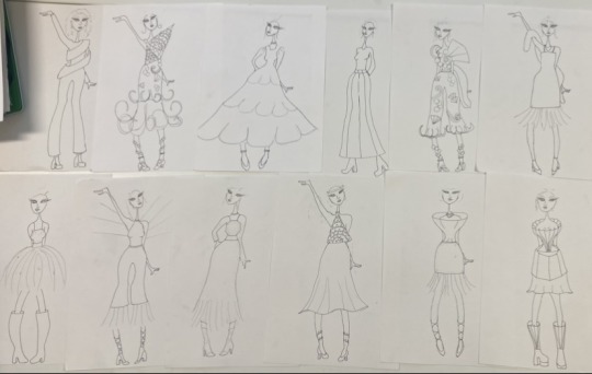
These are my final 12 designs I have chosen for my collection.
The next step is to add and experiment with media for each one.
0 notes
Text
Facial and Hand Development

I decided that I wanted to practice my hands and faces before I drew my final designs for my collection.
For the faces I chose to try and experiment with bigger heads, I liked the outcome of the bigger heads as I was able to add more detail to the faces. I also experimented with head positioning which I think i improved when doing this practice.
For the hands I decided to practice three different hand positions that I use frequently, I think practising these hands I have improved compared to how my hands look on my draft designs.
0 notes
Text
Editing My Collection
This video shows the process I had to go through in order to edit my collection and how I had to reduce my collection from 24 designs to 12 designs.
I had to choose which of my draft designs fit into my collection, choosing 12 of my favourite designs that I thought complimented each other and the design brief to create a successful and flowing collection.
0 notes
Text
Draft Press Release
This is my draft press release, for this I had to construct an article to describe my collection, including who had commissioned me as a designer to design the collection, what season and market level my collection is for, and what the inspiration was for the collection, the colour palette, fabrics, texture and silhouettes I had used and how the collection makes you feel.
I also had to include where my collection could be purchased and where I can be followed and contacted.
0 notes
Text
Mind Map for Drafting My Press Release
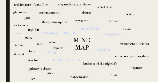
This is a mind map to collect information and ideas that I need to construct my press release. I had to write about each category and list each aspect of my collection: what theme/inspiration I had for my collection, the silhouettes I have used when designing my looks, what textures I have used, the feeling my collection has and gives, what colour palette I have used for my collection, and the fabric I wanted to use for my designs.
0 notes
Text
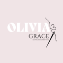
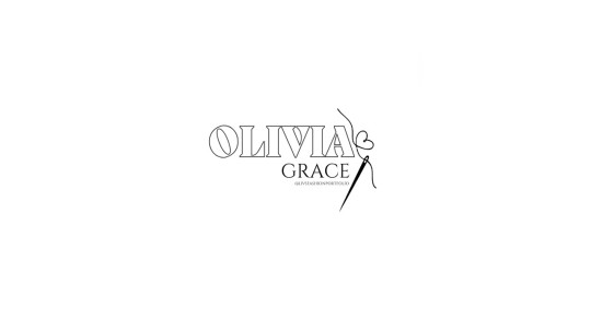
Favourite Logo Design


This is my favourite logo design, this colour way is one that I designed so that I would be able to easily brand my work, however, my favourite logo design had a dusty pink background which I really like. This logo represents me and my branding including my love for pastel colours and sewing.
0 notes
Text
Logo Draft Designs
These are the first two logos that I designed, the first one I wanted to find a font that almost looks like stitching due to the addition of the needle. I like this logo, however, I was 100% certain that I liked the font, the needle illustration was a definite love but I wanted to experiment with other sewing and fashion inspired illustrations.
For the second logo, I wanted a more prominent font, I really like this font and out of the first two designs it is my favourite. The coat hanger to the right of the font is supposed to represent fashion however it doesn't represent my "brand". I think that this logo is a good contender if I changed the illustration to something that better represents me and my brand.
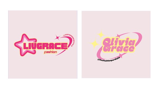
For these logos I wanted to experiment with something more vibrant and "out there", I really like the bright colours and the style of these logos, however, I think that while these are good options they aren't exactly my style.

These logos are more my style, and I really liked the illustration on the first two, the font is really nice and it's different to the others that I experimented with. Because I liked the style of the first one, I experimented and moved the illustration to the side to see how it looked and which positioning I preferred.
For the last draft logo I designed out of the three, I decided to experiment with another illustration, I liked the design of this illustration the thread into a bow as I liked the dainty style of it. The font of this logo is definitely my favourite out of the one I have experimented with.

This logo is my favourite, I combined my two favourite aspects of the last logos (the font and the illustration) and created this logo. I played around with colours and positioning of the writing and illustration, I ultimately decided that my favourite colour combination and illustration positioning is the dusty pink, white and black logo that is in the middle.
However, I also had to experiment with the logo and make it black and white so that it can easily be branded on any piece of work.
0 notes