
Last Seen Blogs

fishtackle1
finn (hehim)


saudis-do-it-better
buy oven online
dokidobe
yellow.dr.monv

cutedaehyun
moondance
Text
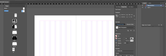
Fundamentals: Software InDesign Final Session 8 21/03/24
to start we discussed minimum and suitable page amount for booklets

opened pages, and control via window in an A5 Document


Added text to the front and back of the booklet. and sized them to fit the square. the back cover we selected the text and narrowed the space between the lines

inserted page number text to the parent booklet to apply it to all pages

we then selected the number in our parent document and set it to current page number as seen above


we then dragged the {none} page to the cover page and back cover page to take away the parent effects


we then went into the parent page and went into margins and column, adjusted top and bottom, added a number of columns and adjusted the gutter.

we then individually centred the page number text to each page, added a column to text box and inserted placement for images.

we then added a text on top of the text wall and selected both and hit text wrap
we then went to the parent page text numbers and dragged them to a new layer

we then created a new parent page by dragging it down to the plus icon

we then centered the text to the respective pages


we then made a vector shape with a background, selected it and then dragged it into the colour swatch options to create a interesting pattern.

we then tested it as a fil for a created shape and then created a diamond shape around the original object to make a fairly interesting pattern.

to reflect i feel this whole lesson has been quite informative and helpful for future endeavors in design of books, pamphlets, and brochures. it was rather cool to see how easy it is to create a repeating pattern out of a few shapes and objects. im excited for what i could create in the future with these skills.
0 notes
Text
Fundamentals 1: Software InDesign Session 8 14/03/24

i then right clicked and hit paste into

i then cmd + shifted the image and enabled text wrap

changed the text wrap to the rounded wrap and increased the spacing

we then moved it to the centre as it gave the page a nice look
in reflection im happy with how everything turned out aside from a sudden crash of the project causing us to lose alot of my progress but i was able to use the previous save of the project and place the photo in again and keep up. i really enjoyed doing this and it fairly reminds me of the web design part of the course i did last year for the certificate. in future i see myself using this for informative stuff about my particular interests and such.
0 notes
Text
InDesign Shortcuts
space : pan
z : zoom
v : select
a : direct select
cmd + click outside of text box: exit text exit mode
w: toggle preview mode (hides outside text)
(with curser in text)shift + arrow key: selects letter
(with curser in text)shift + cmd + arrow key: selects word
shift +return: soft return (breaks text)
shift + cmd: move image around
shift + cmd + dragging on corner: constrain when scaling images
0 notes
Text
Fundamentals 1: Software InDesign
Session 8
14/03/24

We were introduced to InDesign which is based on creation of pamflets, magazines and other similar mediums.

We chose A4 for our Introduction

allows more control

paragraph style brings up a box for style change for paragraphs

created using the text tool and dragging it down

created using window control

we then hit type > fill with place holder text with the columns selected

shown the ways you can realign text

we opened this menu to change the text style like a smart designer. by double clicking the basic paragraph menu

we changed the leading (spacing of the lines) and the size and font with preview enabled

removed hiphenation using the same option box

created headers by hitting return

we selected the header, hit + under our basic paragraph thingy

we made it bold and selected each header and clicked on the new header style

we then went into indents and spacing and changed the spacing of the headings

we then added bullet point text from moodle

created a new paragraph style for bullet points

added some leading for spacing between the bullet points and the paragraphs

made a new character style called bold text and made it bold italic


added phrog into photoshop and indesign and importing from the same file and folder

added a cowboy hat to the phrog and saved out

relinked the file


changed the image around, saved and relinked the image

move around using shift command

text wrap for wrapping text around an image

wrapped text around image ysing the 2nd icon from the left

held down option and dragged the image which duplicated the image then went into the text wrap menu and increased the spacing between the image and text

created circle around image and deleted
0 notes
Text
Fundamentals 1: Software Pūmanawa
A bit more compositing
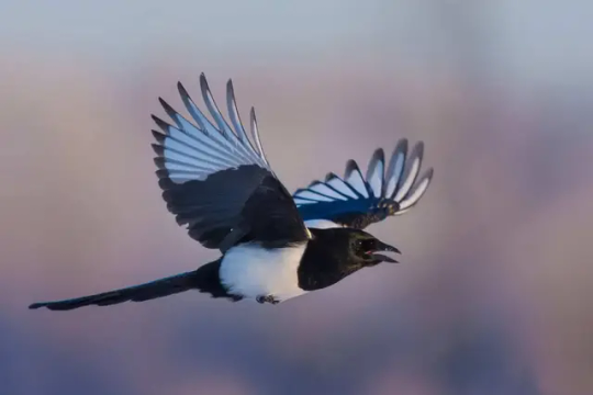
first image of choice to edit into the jumping man Photoshop creation
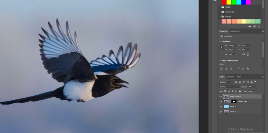
i duplicated the photo, object selected the magpie, then clicked on the mask icon and then added a blank layer between the two. by clicking option/alt + delete/backspace, in the new layer between the bird and background, we created a fill using the foreground swatch colour. i selected then duplicated the background layer and made it an overlay by putting the opacity down to see all the issues needing fixed
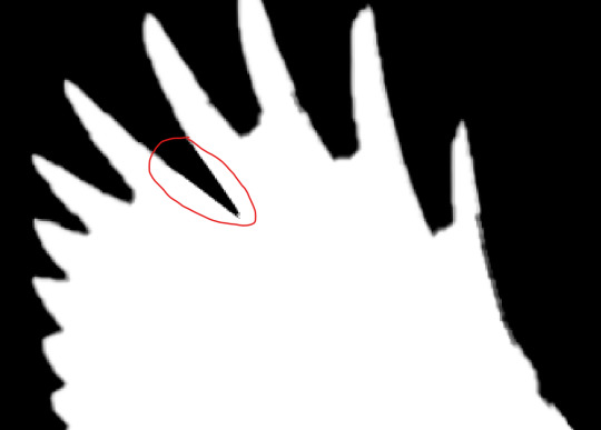
on the mask layer being selected, i created a path around one of the areas that were undesired and needed removal. i turned the path into a selection and then hit delete.
going over a few more areas and using the same technique as shown above has proven success in creating a more seamless cut.
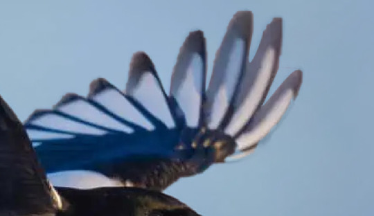
after removing sections we found some areas that were overdone
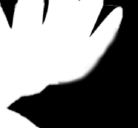
i ran the white brush with maximum softness over the edge of the feathers of the layer mask
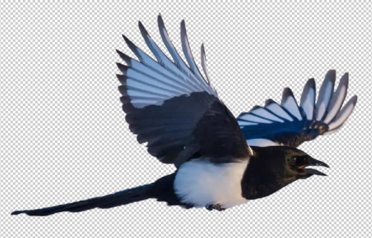
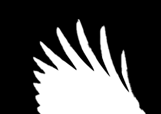
after some touch ups and tweaks i finished separating the background and the magpie
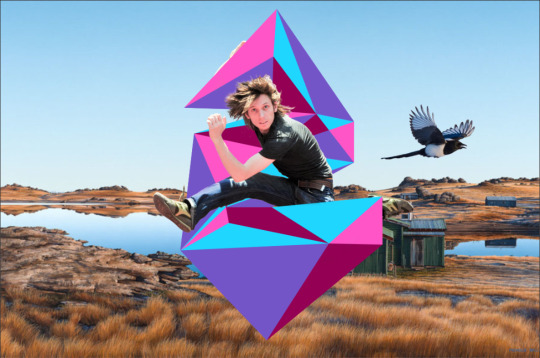
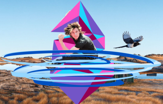
Magpie added to the jumping man composition

this is the 2nd Photoshop image i will edit out of the background.
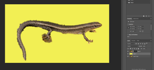
once again i duplicated the photo, object selected the skink, then clicked on the mask icon and then added a blank layer between the two. by clicking option/alt + delete/backspace, in the new layer between the bird and background, i created a fill using the foreground swatch colour.
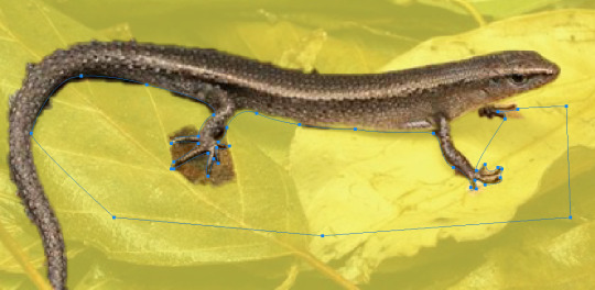
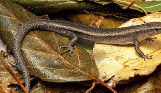
i then created a path around the areas undesired i then made the path into a selection and then deleted the section
i then took the soft white brush around the areas i went a little over
i then added the skink into the background.
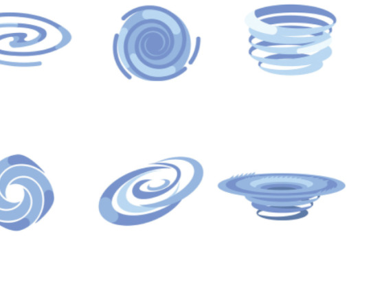
moving on to 2 vectors (one that interacts with the jumping man) i decided on using a whirlpool (the road i grew up on's name means Whirlpool in Maori)
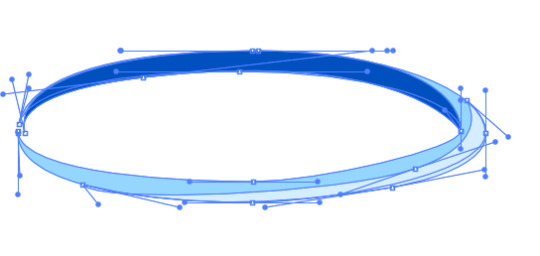
i started with creating one ring of a swirl
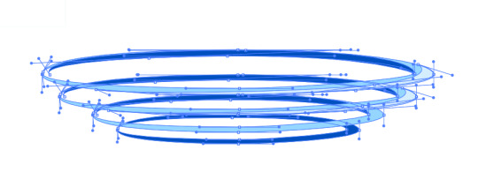
I then duplicated the swirl while removing some parts of the shape ie. the mid colour, highlight and shading

i played around with the shapes and bent some edges to create some uniqueness and natural randomness.
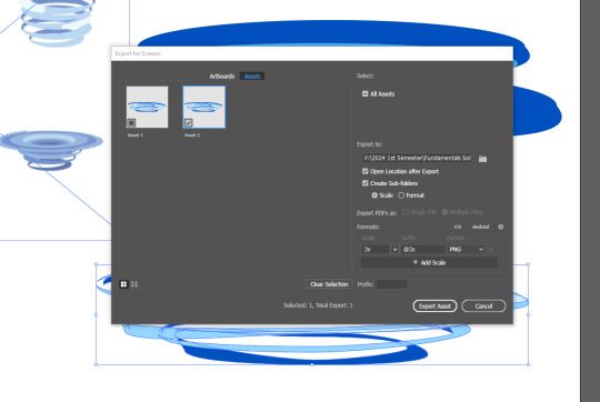
I selected the image and hit export selection, hit 3x scaling and made sure it was in the right folder and then hit export asset.
i then placed it via file > place linked into the jumping man project.
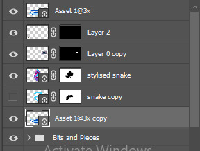
i then duplicated the asset and then moved the duplication below the stylised S.
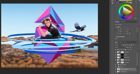
after adding a layer mask to the top duplication of the whirlpool and creating path selections around areas overlapping and parts of the swirls to be put behind, i was able to successfully create an effect similar to the stylised s of the whirlpool going around the jumping man
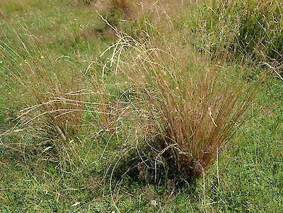
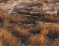
for my final vector, i will be recreating Carex kaloides, commonly named sedge which has been observed in the area of what the background painting was of(The Poolburn Dam) to be declining.
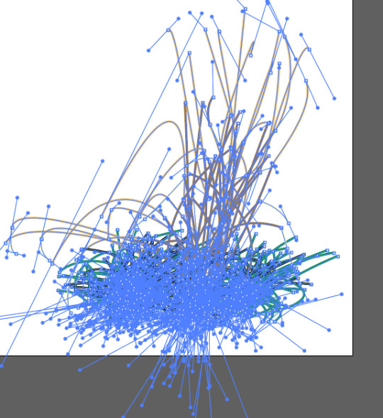
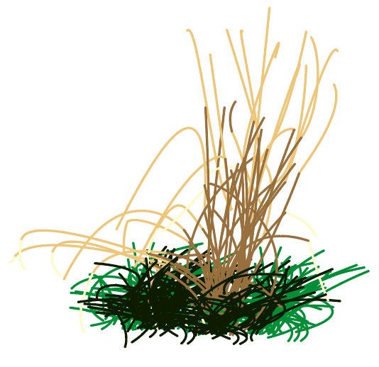
after rigorous play around with stroke shapes, placements and sections of colours this is the end result. i started off with the left down bending straws but realised how drooping i had made it thus far so i gradually had the straw stand up mostly straight as i went on.
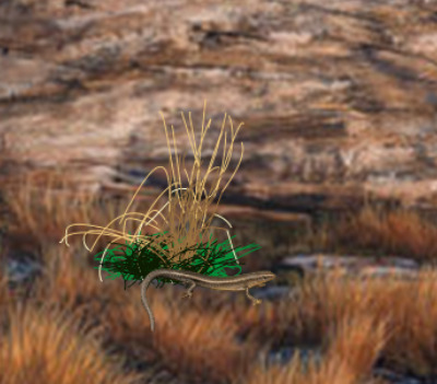
i decided to put the sedge next to the skink cause they looked very lonely :(.
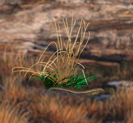
i went over the area with a soft erasor to blend them in better
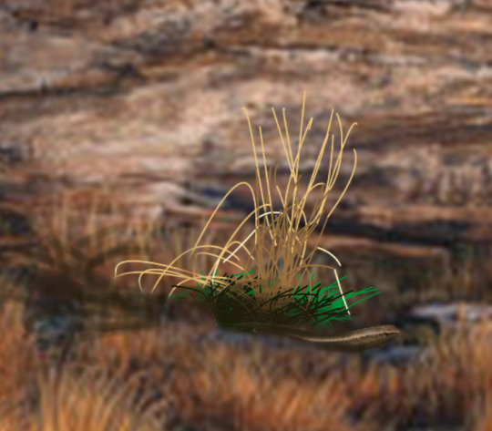
i decided to add some shading to have them work a little better with the scenery
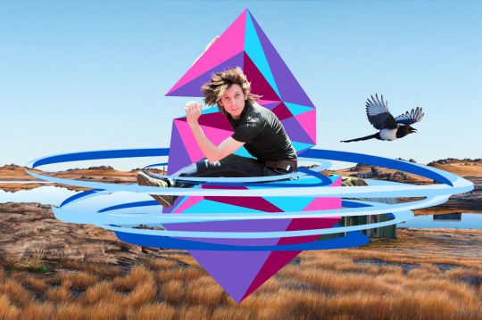
Following all that, we are finished. in reflection this turned out better than I imagined and I'm glad that things fit together well with each other. I'm happy i was able to use images and vectors that well represent the area of the Ida Valley and the Poolburn Dam in an artistic perspective after growing up in that area for many of my young years. the main thing that i would benefit a project similar to this is having more time to brainstorm and go more in depth into the design and creation of the objects. i honestly haven't been able to get around to work on this composition until the day of posting this and the day after. all of these objects and photos are of significance to me. the sound of the Magpies squawking early in the morning among the pine trees opposite to my bedroom window and the poplar trees spread around the farm house. the name of the road i grew up on, Auripo Road, where Auripo is Maori for Swirly Wind or Whirl Pool visualised here with the whirl pool around the jumping man and stylised S. the skinks roaming around up on the hills of my farm that my family has owned for many generations. and the sedge observed all over the place along the Dam and my Family Farm.
0 notes
Text
Fundamentals: Software Pūmanawa
Extra Vector Level Up

This is the vector i have chosen to recreate. i printed it out on A4 and traced over it with a lightbox.

here is the traced drawing of the horse vector above and where i believe the anchor points and direction handles will be placed and look like

this was the process i had made in creating the overall shape of the horse. i felt a little inconfident from the beginning but as i carried on i got better and better with creating broken anchor points and hybrid points.

after readjusting the anchor points and the direction handles length angle and placement

looking at the two side by side i was somewhat accurate with the direction of the handles but underestimated the length that they would be especially at the long curves strokes.

this is the image i will be using for the second graphic (ass there isnt much evidence of shading ill add my own to the illustrastion

Tracing drawing before the anchor points and direction handles are applied (i hate that i didnt just draw this from reference it hurts)

Here is where the direction length and placement the anchor points and direction handles will be

progress made on the outlines shapes and eyes of the character (computer crashed and i had to do this all over again essentially)

i created the eyes by firstly creating a while oval shape, then created another oval with a gradient for the iris, used the same shape and ctrl + c then hit ctrl + shift + v and held down shift and alt to keep the shape in the centre and downsize it to create the pupil then copy pasted the shape twice to create the white shiny bits of the eye

the hair was added through creating the shapes under the stroke layer and using the intersect tool where you select both stroke and objects then ungroup and delete the undesired parts of the shapes that go outside of the lines

i then made certain stroke edges into objects by going Object > Expand and hitting okay allowing me to manipulate the stroke and give it a clean look rather than being a flat end


this is the end result including the layers used


as you can see the lengths and directions of the direction angles are a little more accurate compared to the previous project with some missing anchor points
in relfection after many crashes of my system and having to start over again really tested my limits but i pushed through and got it done. i think in future im just going to have to clean out my cpu fan more often because dust buildup caused overheating which caused feezing up and illustrator was hopeless at recovering my files. i feel the creation of these vectors has greatly increased my confidence in use of broken anchor points and creation of characters such as seen above. i know its tuesday and i shouldve finished by last friday but i needed that weekend to focus on myself and chill out for a second before getting straight into school work.
0 notes
Text
Fundamentals: Software Pūmanawa Photoshop & Illustrator Compostiting Session 6 07/03/24

First we started off with warming up with working on the fruit bowl file once again. where we duplicated the layer, created a selection around an object, created a mask, added an adjustment layer and clicked on the box with the down arrow to apply to the layer with the mask only

we played with some shapes and included how holding shift creates a uniform transformation and option keeping the selection in one place while scaling.

we then created a mask on the square layer, option clicked on the mask layer, drew over the white and then we can see the parts we drew on over the shape created transparency inside the shape to the fruit bowl image

we then made an attempt at removing the man from the background

we then duplicated the photo, object selected the person, then clicked on the mask icon and then added a blank layer between the two

by clicking option + delete, in the new layer between the man and background, we created a fill using the foreground swatch colour we selected.

we then duplicated the background layer and made it an overlay by putting the opacity down to see all the issues needing fixed

we then created a path using the pen tool around a are we want delete, opened the path window (Window > Paths) held cmd and clicked on the layer picture in the window, then hit delete and removed the selected area

removed the rest of the uneeded stuff using the same steps as above

using the same steps as above but this time i went in with white rather than black to bring back a section of the mans bicep that was removed with the object selection

for the hair we had a go at using colour range by firstly duplicating the overlay (and putting the opacity up to 100%), applying a mask, then opening up colour range (window > colour range) then adjusted the feathering and clicked on an area that was in the light parts of the mans hair.


we then tried remove the areas we wanted gone but it just didnt work out so we just ended up using the brush tool and drawing black using the brush over the undisired areas of the hair on the layer mask

this is the result after going in using a small soft brush and putting the brush opacity down

we then opened the saved file into illustrator, clicked the top layer, shift clicked the bottom layer and clicked on the hamburger menu and hit flatten artwork


Then we created a stroke to wrap around him and imported it into illustrator

we then created a duplicate above and below the man

then we created a mask over the top layer and drew with black brush over the left arm and right leg so it looks like the man is being wrapped around

we then created a wireframe in illustrator of the s to make a stylised s to put in our photograph

we then did the exact same thing we did with the simple s snake seen above

I then imported a photograph and moved the man and stylised s towards the middle. the background you can see is a painting of the Poolburn Dam (A Dam that is in the same Valley i was born and grew up in, the Ida Valley.
To reflect on this i can say these skills could greatly help me in creation of album covers as i produce and release music from time to time. my S you can see above took a bit longer time than others causing me to have to stay behind for a wee bit.
0 notes
Text
Fundamentals 1: Software Pūmanawa
Photoshop Tools Part 2

added a background by adding a layer beneath and using option + delete

we then made a path around the wings, made into a selection, option clicked the mask and went in with a black brush around the selection to make the selection more apparent as seen above

copy pasted the bird into a new photo and adjusted areas and levels to blend it in.
To reflect i was quite familiar with the brushes from last years certificate however i was quite intrigued as to how the masks and selection tools were used to create a crisp cut-out of the bird into another photograph. i would see myself using the skills from this session for inserts for album covers and such.
0 notes
Text
Fundamentals 1: Software Pūmanawa
Photoshop Tools Part 1

First started with explaining the difference between the background layer and a transparent layer. when youre drawing on the back ground layer youre drawing on white and when youre drawing on the transparent layer you just have the drawings by themselves

we were also shown the colour picker to use for our brush

here we can see the background layer with the drawing layer on top. if it were all to be on the same and you were to erase, it would reveal the transparency

this menu allows you to change your brush, its hardness and size

shown how you can erase part of the layer when applied a fill to a layer

used multiple colours for some experimenting

what applying 30% opacity to the brush did


new layer added and comparison with the other layer and by itself

can move the layers up and down

showing off of what you can change about the layer

using the elipse tool and using the fill foreground colour and background colour

deleted the selection using del

created a perfect circle using shift

took off a piece by selecting a part and using the move tool and dragging away

doing the same thing but holding option before dragging the shape away

First Image before being worked on for selection exercises

made a selection and hit command j to copy and move the selection to a new layer

went into the mask and make a black brush stroke which make part of the layer transparent

using a soft brush and selecting the mask we brushed away the surrounding water of the copied boat

we then resized it using cmd t and bringing the layer opacity down

new photo to mask

we created a eliptical selection and adjusted as we were creating it by holding space to move the selection, option to add to the selection and option to subtract from the selection while selecting. we then went into the adjustment layer creater to change the hue of the selection being the orange

flattened the image using the hamburger image and duplicating it by dragging the layer down to the plus

we then also created a mask and adjustment layer to adjust the colour also

next image

we started off with addng some blotched to the plant before using the pen tool to make a selection around the section of the plant seen above.

then we created window > path and made the path a selection before making the layer of selection adding colour balance adjustment and changed the colour

Original image

using object selection we were able to make a quick selection around this humming bird but it wasnt perfect.
0 notes
Text
Fundamentals 1: Software Pūmanawa
Simple Image Adjustments Brief

In the difference between the original image and the readjusted image, i started off with adjusting the levels (brought the black closer to the middle to bring it out a little more and brought the middle point closer to the black), then added a hint of saturation to create more vibrancy and then finally added a cooling photo filter to give a more cooling feel as it felt more fitting to the appearance.

For this one i noticed the image wasn't quite so sharp enough so i applied the smart sharpen filter before applying colour balance (brought in more cyan, yellow and green) and then finally moving the levels more left and closer together.


For this photo edit, i started off with adjusting the levels (brought the levels very slightly more left and closer together.) then i increased the contrast to... well... make it more contrasting. i finally decided to add a hint of blue colour gradient to the image.

And finally this photo edit. i started off with once again adjusting the levels (brought the levels very slightly closer together.) then decreased the contrast and slightly decreased the brightness to give it more depth in the darker shades.
to reflect i found surprising amount of difficulty looking for photos that needed readjustment. all the images you can see here are either photos ive taken in the past, or other peoples works i found online through discord photography channels. while adjusting the photos levels i also had a play with a few photos hues and i can see myself in the future creating portraits and experimenting with hues and composition. perhaps even some on the level of Andy Warhol
0 notes
Text
Communication Fundamentals: Software Session 3 01/03/24 Penguin Vector Creation

First, we started by separating a circle created using the Elipse tool

then joined the shapes together once again into a pill shape using cmd + J.


we then took a few anchor points and stretched them out to create some head and butt feathers

we then created a beak by rounding the corners and creating the eyes with a gradient and highlights

we created a penguin foot by creating a half a curve and doing similar to what we did at the beginning

we option + shifted the penguin foot to duplicate it then cmd + j to join them together to create an appearance with depth and 3-dimensional appearance.

we then created legs for the feet to attach to the penguin's body and selected a section of the body applied the rotate tool using R and tilted the body to give the appearance of a frame of a walk cycle.
and also added a flipper

after adding highlights and shadow we were done
to reflect i would say it was all quite straight forward to me however i was caught behind up to the shadows and such due to trying to help the student next to me while toby was going 1000 miles an hour (i know i should be focusing on my own work and keep up but i'd want others to do the same for me when im ever in the same position). the most compelling part of this process of creating the penguin were the feet and their three demensional appearance. i see myself in the future using this same technique for future graphic projects
0 notes
Text
Vector Object Creation Assignment Process


After some Brainstorming of Characters and Style types. I finally decided on a Vector Drawing of MLP:FIM's Twilight Sparkle in a similar art style to the show with a few personal style changes.
(The images above are the references I used for the drawing)

This is the final sketch for the proposed vector drawing

For the vector drawing, I broke down each limb and appendage into individual shapes and into individual layers to allow more in-depth control and readjustments.

this is the point where i finished up the core shapes of the character before creating separate layers for each colour fill of the shapes.


after filling in most of the core shapes I moved on to the important details such as seen above which required some trial and error to have the colour stripes properly pass over the horn while keeping It inside the shape and from going outside of the shape


after all that trial and error and adding the final touches (face, cutie mark and hair detailing) i was able to successfully finish the vector drawing which executed better than I initially imagined
0 notes
Text
Communication Fundamentals: Software Session 4 4/03/24


First we recapped on the types of points including Corner point, Curve Point, Hybrid Point and Broken point where we once again recreated the curves on paper and in illustrator.

We the moved on from illustrator onto photoshop and learning about the basics of the colour wheel. hue meaning the colour, saturation being the level of vibrancy (becoming more vibrant as it becomes more saturated) and muteness (becoming desaturated) and the brightness(more bright being the tint and more dark being a shade)


we began on photoshop learning about how we can use this knowledge to correct the tone, brightness and contrast. we worked with the curve tool allowing us to add remove brightness and increase or decrease contrast. as you can see above and below a before and after of readjusting the colours


after readjusting the photograph apeared far suited to our goal of bringout out the darkness a little better.


we then started working with a different version of the original photograph but this time is was too dark and needed to be lightened


Photograph of Cat we adjusted the saturation and brightness of the image. initially when we saturated the image it appeared too yellow.


Photograph we experimented with the hue and saturation of the image


while adjusting the saturation and brightness of this image we learned about the use of the curves in the curve tool.


a beautiful photograph we adjusted the curves and colour balance of multiple sections of the photo (mid tones, highlights and darker tones)


For this Photograph, we noticed in the original that it overall wasn't great in terms of tone, shade and hue (also the the background past the trees being a singular colour). we also had a go at using Vignette.


finally, in this photograph we made the same adjustments as above however this time we noticed adjustments taking away the nice look of the sky so we applied a gradient mask to darken the bottom area and brighten the top area.
To reflect on this i was decently familiar with the techniques shown in this session but the new learned shortcuts and techniques would further help with future ventures when i indulge more in my occasional hobby of photography
0 notes
Text
Communication Fundamentals: Software Session 2 29/02/24

First we started off with warming up with creating stroke shapes and playing around with the Transformation Tools (Rotate, Scale and Move).


We then, similar to what we did yesterday and emulated stroke shapes Toby put up on the board on A4 paper and in Illustrator.

As you can see, i found most difficulty with the star and zig zag box because it was a challenge matching its proportions/lengths and sizes. it was more difficult on paper as i had used pen rather than pencil so i couldn't exactly readjust or redo like i can in Illustrator. In Illustrator, the most difficult shapes were also the star and the zig zag box for the same proportion reasons. Doing it in illustrator was easier as i was able to readjust through transforming the strokes.

My favourite shape to draw was definitely the dog one because i enjoy drawing animals and dogs are cool

We then started working with single arc curves, where the segments are more rather curved or arcs which allow for more rounded and less angular shapes.

Amogus


My attempt at replicating these single arc curves on Paper and Adobe Illustrator. There wasn't much complication due to them being simple single segment shapes.


My attempt at replicating these multi point arc curves on Paper and Adobe Illustrator. I particularly had a little trouble with the bottom right one in terms of getting the rotation and length of the handle points proportionate.


My attempt at replicating the closed curves shapes. there were a few complications with the top right, bottom left and bottom middle.

The assistant lecturer there advised on increasing the amount of anchor points and to keep the handles of the segments small to allow for more control.

1/03/24
My attempt at replicating the curves and straights by clicking back to the anchor point to create a straight after a curved segment or vice versa.

My attempts with memorizing and recreating a few of the challenging shapes using the skills and knowledge from above.

was unable to memorize the shapes from yesterdays class so in its place i attempted at replicating an eye in the style of MLP (left) and the Better Call Saul logo (right) using the prior knowledge and what i have learned in the past few days with the use of the pen tool.
To reflect on this, these exercised refreshed the work did last year in the design certificate i did last year while also increasing my confidence in use of curves, broken anchor points and bezier curves in general.
0 notes
Text
Communication Fundamentals Group 1
Session 1 Part 2 - Software Fundamentals
Straight Line Shapes


We learned the essential fundamentals to creation of simple Vector Shapes and Stroke Lines using the Pen Tool and Shortcut Keys in Adobe Illustrator


We were tasked with the skills and techniques we were taught in Adobe Illustrator, which were use of the Pen Tool, use of Strokes, Fill Tool, Selection Tool, Direct Selection Tool, Zoom, Deselection Tool, Transforming of Strokes and Gizmos to emulate the Stroke Shapes that the Lecturer had drawn on the Whiteboard to Pen and Paper and then over to illustrator Illustrator as best we could.
In reflection these skills were very familiar to the certificate i did last year (Digital Media & Design Communication) however they were a great refresher and provided more shortcut keys to be quicker and more efficient with my time
0 notes
Text
Shortcuts
Finder
cmd + n = New Finder Template
Illustrator
Z=Zoom
Space = Pan
/ = Clear Fill or Stroke
P = Pen
X = Toggle Fill / Stroke
V = Selection Tool (All)
A = Direct Selection Tool (Part(s)
Click nowhere = Deselect
cmd + click = Deselect
shift + cmd + 4 = Screen Grab -> Desktop
direct select objects: Select > Object > Direction Handles
Anchor Point Tool: Shift + C
cmd + x: cut copies and removes
cmd + c: copies and remains
cmd + v: paste what was copied
shift + cmd + z: redo
shift + cmd + v: paste in place
cmd + J: connects two seperated points together
+ : add point
- : remove point
x : toggle fill/stroke
shift + x: swap fill strokes
space while scaling: moves object
cmd + shift : duplicate
cmd + g: Group
shift + cmd + G: ungroup
s: scale
r: rotate
o: Flip reflect
Photoshop:
x : foreground and background colour swap
shift + cmd + del : fill selection with foreground colour
cmd + d : deselect
b : Brush
e : erasor
option + del : fill selection with foreground colour
cmd + del : fill screen with selected colour with background colour
[] : shrink and enlarge tool (brush and erasor)
cmd + a : select all (if you then hit del it will clear that selection)
1-0 number keys create a transparency with the tool being used (eg 2 being 20%)
option : colour picker
move tool: v
cmd : deselect
holding option and dragging over of a certain part of a selection removes that part of the layer
cmd + t : transfrom gizmo
shift + cmd + i : invert
0 notes
Text
Communication Fundamentals Group 1
Session 1 Part 1- Software Fundamentals (Likely would be using PS & AI)
27/02/24

Graphic Design
-Create Scaleable Shapes (AI)
-Display Typography (AI (Stylised Text)
-Typographic & Image Layout (Laying out pages text and Graphics) (AI)
-Compositing (Bringing everything together and its formation)
-Image Adjustment (Photo editing and Refining)
-Pixel Painting (PS) (Rasterised Art)
Vector
-Mathmatical points that can be resized without losing quality/clarity
-Creating Logos & Graphics
-Typography
-Shapes
-AI, EPS, PDF, SVG
Raster
-Pixelated Imagery
-Photo Editing
-Pixel Painting
-PNG, JPEG, PS,
Bézier curves (Vector Shape Definition)
-Pen Tool (Controversial but an essential to vector creation)
Folder System
Project name - PRJ (Project Folder) IMG (Image Files) DOC (Documents of any format) OUT (Output Folder PDFs draft and final) Create Folder for anymore extra work (eg RDR render AST assets)
0 notes