lilydelaneyhillphotography
_manipulated_image_
54 posts
Don't wanna be here? Send us removal request.
Last Seen Blogs

dilf-batman
#1 dick grayson stan
miracles-and-butterflies
Welcome to the Family Madrigal!

beelifenatural
Bee Life Natural

whiskeykesh
FUNCTIONING WITH DYSFUNCTION

yeayeayeahs
Untitled
Text
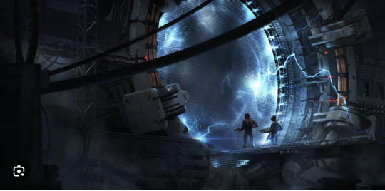
Jati's work was still a strong inspiration for me during this second assignment. His connections to outer space throughout his photo manipulations is really well done and also reflects the connection of outer space and earth which was the same connection I was trying to convey throughout my image series.
Here are a couple of examples that made me want to continue with my idea from assignment one...
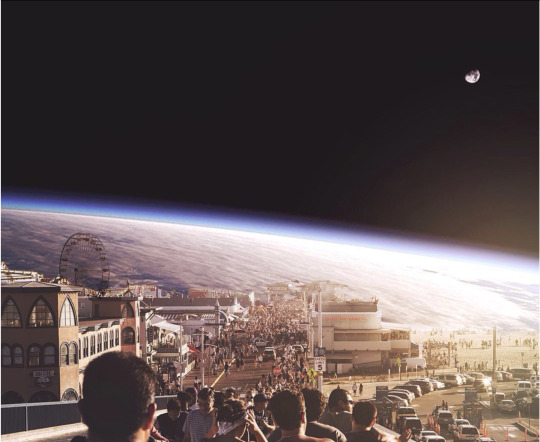
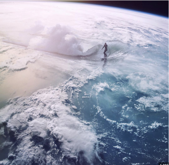
These images allow for the two worlds to collide and I love his playful nature with his photo manipulations where Earth is visually depicted as very small in the grand scheme of things, which it is. The universe is massive and so are one's possibilities and potential and I feel that is strongly conveyed through his work also.
0 notes
Text
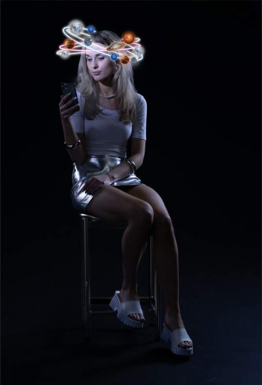
This is going to be the first image of my series. As this is the starting point of my visual story, I need this photo's message and the last photo's message to be the clearest and the middle two to help tie it all together.
After hearing some feedback around my work, I am thinking of making this image smaller and more cropped in. I am starting to think the stool and having my full body isn't necessary and may just crop it from the skirt upward. I also may try putting some stars or some kind of hint at a galaxy/outer space in the background, because there is a lot of black blank space that originally I wanted because I thought it allowed for the planets around my head to stand out. Now I am thinking it looks a bit bland so I will attempt this.
0 notes
Text
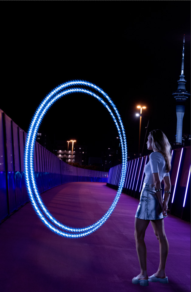
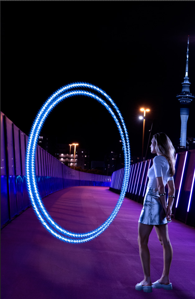
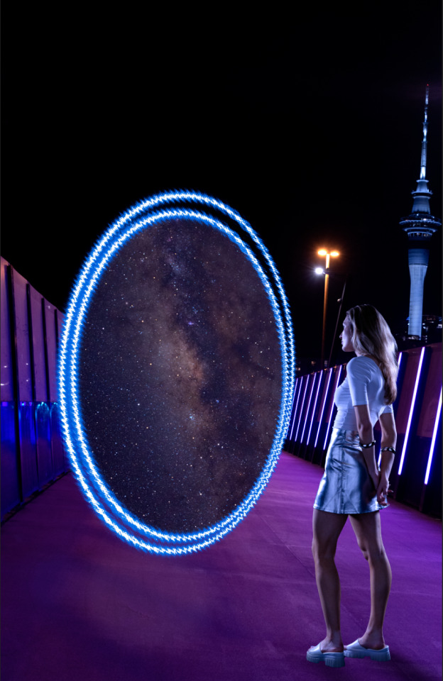
I am really happy with the colour grading of this image more than anything. I feel this is probably the most successfully colour matched image that I have made. After class, a few suggestions were made for me to try. One was to look up a bit about how portals are used in sci-fi films and attempt to create one that looked a less like a mirror and more convincing. For example, things coming in and out of it. I think I will try adding some kind of electric charges like these...
I feel this will be hard to do without making them look out of place, unnecessary or slapped on, but will give them a go.
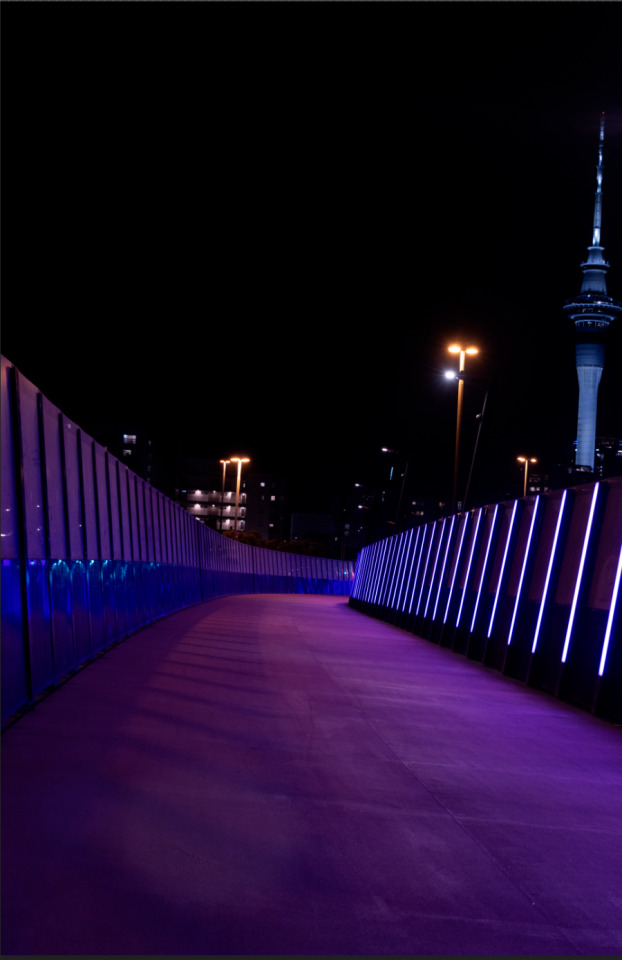
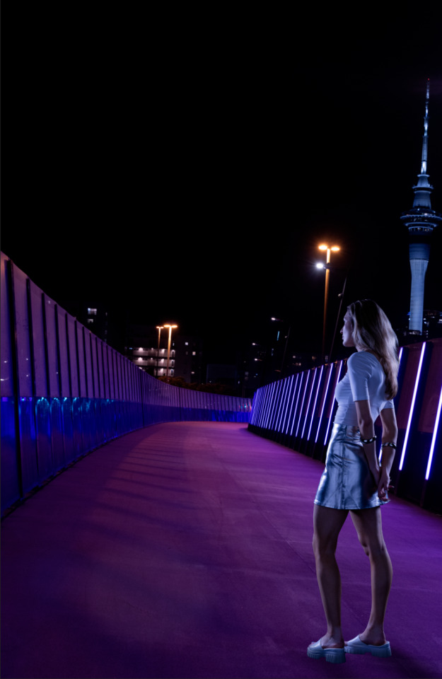
The top image is the background image before I did any editing. The second, is me placed onto the image with the colour matching applied. For the third, the portal is added which i created with the help of a tutorial that told me to use the eclipse tool to make the circle and then add a ripple effect and then go to blending modes to give it a glowing, lit up effect. The fourth image is where I added some extra light on the whole image to give it a stronger effect and make the portal look like it is glowing onto me. The last image was where I placed the image of the galaxy into the portal, using a mask to perfectly shape it to fit inside the circle shape.
Apart from the electric charges, the only other thing I think I will try adding is a little more light projected onto the floor from the bottom of the portal to look more convincing.
0 notes
Text

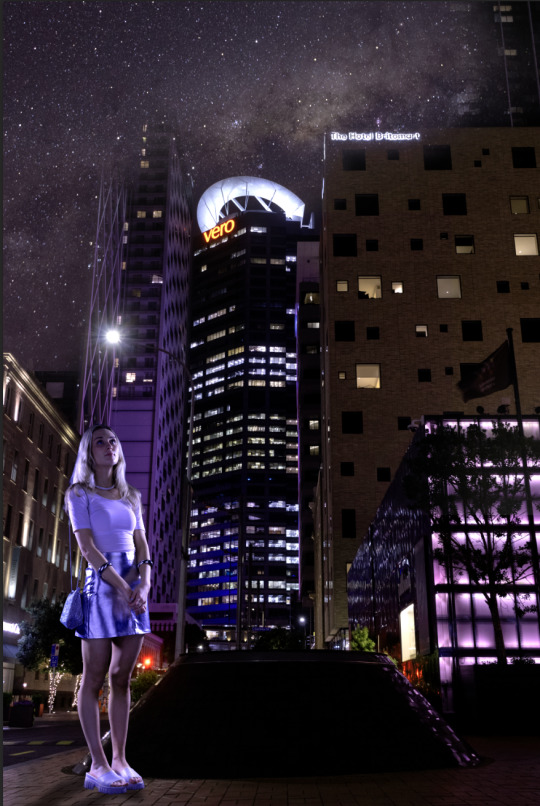
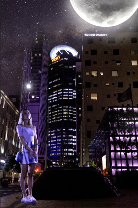
This was one of the manipulated images from my series that I wasn't actually going to include in the end, but after consulting in class yesterday, I was told it was effective and that it would help to make the series stronger so I have decided to include it.
This is the process of how to got to the final outcome, which may still need a small bit of tweaking yet, I haven't fully decided. The top image is the background photo, without any editing, the second one, I placed myself into the photo and did my best to colour match myself to the background which I also edited to look a little more purple, as I like how this looks a lot more. In the third image, I tried to add a shadow by my shoes and blend the shoes into the ground a bit more, as this looked very harsh originally. I also added in the galaxy, using the sky replacement tool which actually did a pretty accurate job. The last image is with the moon added. I felt this improved the image drastically as it gives it more depth and gives me something more spectacular to look up at. I added a glow to the moon as well using the blending options, inner and outer glows and added an extra glowing effect around the moon, by painting it on with the pen tool.
I am thinking of making this image the second one in my series.
0 notes
Text
Week 11 class exercise - writing our initial ideas for our self refection
0 notes
Text
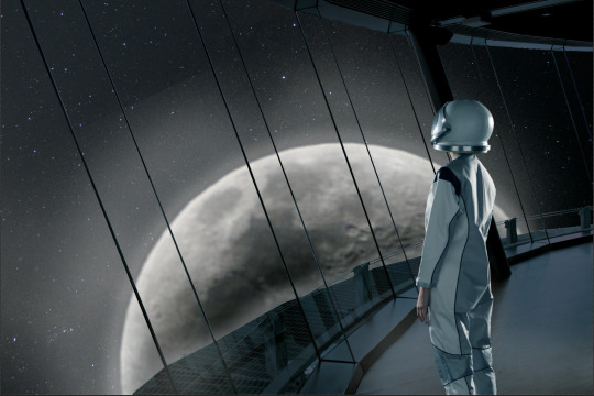
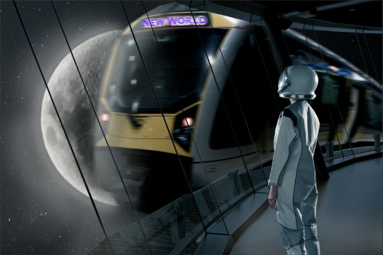
This is where I am at with this image after todays class. I was almost set on this image being finished (the one with the train) however after consulting I am now not sure. Apparently the train isn't really necessary to have and I hadn't thought about it in that light before, as I wanted the train to be in the image as I felt it added visual interest and added to my message. The train was meant to symbolise progression and achieving the shift to a new world. It was meant to symbolise arriving at a new desired destination, but I am now wondering if the top image of me looking out at the moon is more effective. It seems more tranquil, still and what space would really be like which is why I felt adding the train would be more of interest, but maybe it just looks too busy and ends up distracting from what I am trying to say.
0 notes
Text
This reading I found helped inspire me with my chosen idea. "There’s nothing like a photograph of outer space to remind you not to sweat the small stuff." - I really liked this quote from the website, as this is exactly how I have been feeling after researching the capabilities of space and relating these to the art of photography. Also seeing what other photographers have achieved through years of astrophotography is exciting and has allowed for me to see the potential of this style of photography. As one of my themes and ideas behind my photographic series is to communicate the idea that there is so much to life, so dream big, this exhibition resonated with me. The possibilities extend beyond the planet we live on, so I wanted to show that believing something will happen, means that it really can.
0 notes
Text
Here's some of the colour grading that I have been trying in order for the images of myself to match the backgrounds that I am placing myself into. These are just the before and afters to show what the images looked like in the studio and then after I have tried colour matching them to my backdrops. I am pretty happy with the results and feel the lighting set ups we had in the studio have allowed for the images of myself to look convincing in the new backgrounds which is great.
0 notes
Text
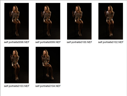
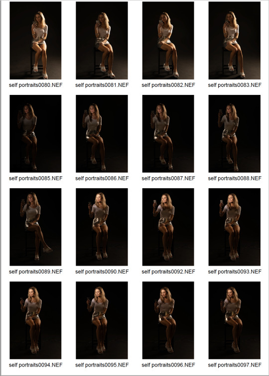
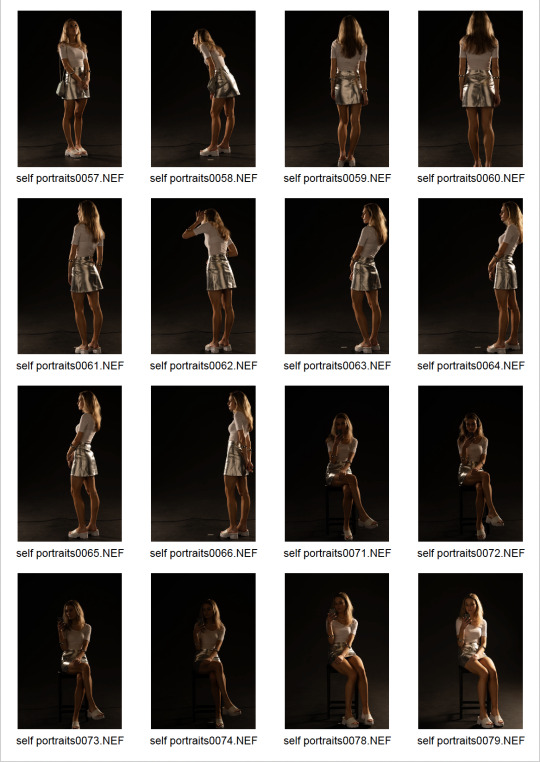
This was the shoot I did in the studio last week. I ended up using basically the same lighting set up that I used for my astronaut shoot. two key lights on each side of me and two polystyrene walls to help bounce the light and allow a little more to reflect onto my face. Cornelius was super helpful during this shoot and advised me to use the black studio, informing me that we then have more control over the lighting which was what I wanted.
I am not used to taking self portraits, especially in a studio environment so this proved to be challenging for many different reasons.
The images of me holding my phone were the most difficult to get right, as I had such a strong idea in my head of how I wanted them to look and wasn't having much luck with achieving the outcome I wanted. Originally I wanted just the phone light to be illuminating my face. I wanted this to be my main and only obvious light source. However, this proved not to be feasible because the images were just coming out way too dark. Cornelius then helped by setting up another light source which shined directly onto my face, creating the same lighting effect that I originally wanted from my phone. Some of the images on my contact sheet of me holding my phone are a lot better lit up than others. These were the ones where we killed the other key lights and just used the light source by my face to create the outcome I wanted.
With more practice I could definitely achieve a better outcome, but also with limited time, I am going to have to stick with these images. This shoot taught me a lot about lighting and many of the challenges faced when shooting self portraits.
0 notes
Text
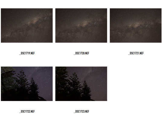
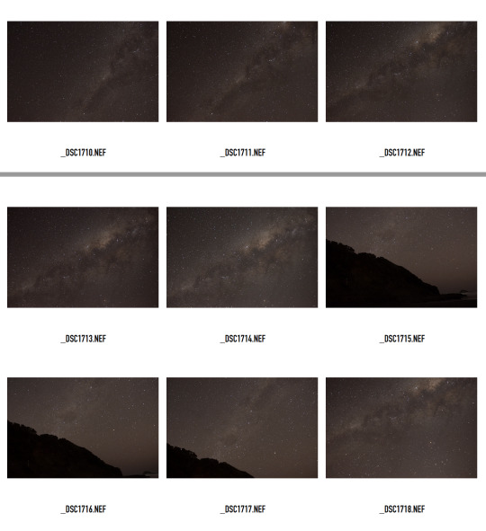
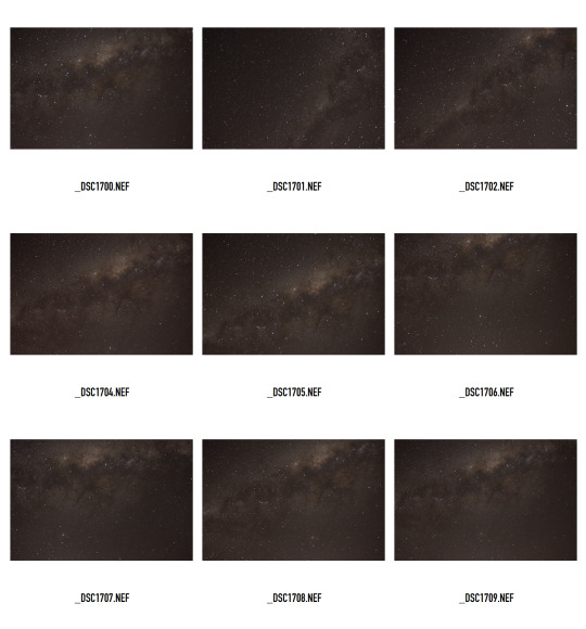
This was my second shoot out at Muriwai that I did on Tuesday. This shoot was much more successful, as the moon was a lot lower down in the sky on this particular night which allowed for me to capture the galaxy how I wanted without light pollution from the moon.
I now need some shots of the moon, but it looks like the next full one is at the end of the month so that's not ideal. I will just get as many shots of the moon as I can in the meantime and try and make do with what the sky provides.
0 notes
Text
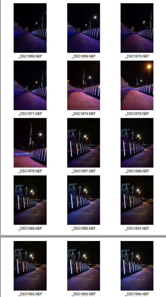
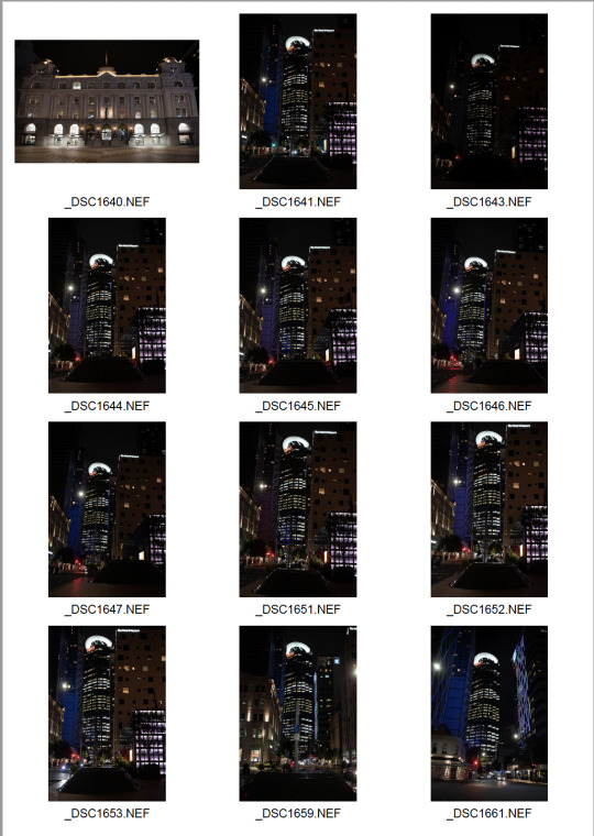
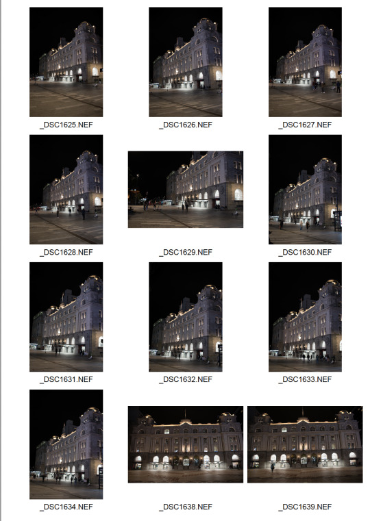
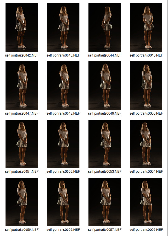
These are the shots I am going to use for my backgrounds. I am going to put myself into these shots, as well as incorporating the galaxy, moon and planets into them. Some other editing effects will be created in post. I will also use these as reference shots for when I am photographing myself in the studio to see where I need to place the lights, where I need to be standing and what angles I need to shoot from. My aim is to just get as many as possible and then just play around with manipulating them.
0 notes
Text
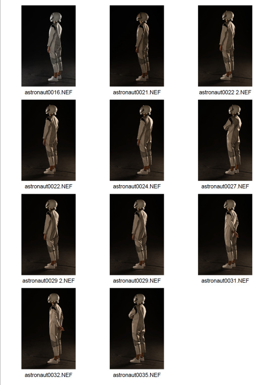
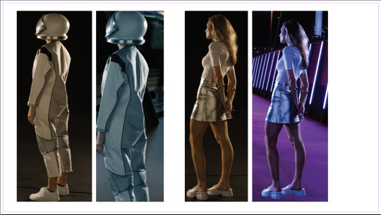
This was a shoot I did in the studio on Wednesday. I hired this astronaut suit, as I was really inspired by the 'Lone Astronaut' series we viewed in class. I found this shoot really challenging, as I had never shot in a black studio before and the lighting responded differently. It was also difficult to set up the lighting in the correct way in order to match my reference background image that I will be cutting myself out to fit onto. I used two key lights, one on each side of me and two reflective polystyrene pieces to bounce a bit more light onto the side of me. I'm not sure why the images came out so yellow looking, the first one is edited by me in the way that I want it to look (a cooler tone).
My plan is to shoot in the studio again today, but this time taking self portraits without the costume that I will use for my other images. These will be taken in the white studio.
0 notes
Text
Current stage and plan:
Recently I have just been trying to finalise my overall message and how the series of images will pan out to gain clarity for when I write my concept, context and content. I have almost taken all my images now that I will be using in the series, I just have to do one more studio self portrait shoot so that I can then start creating the rest of my composites.
I plan to get this shoot done today, as I have booked the studio and then this weekend start putting the rest of the images together.
0 notes
Text
In class feedback
Aiden's feedback... and help...
Aiden's amazing technical knowledge was so helpful to me when working out how to add light to the right areas of this image...
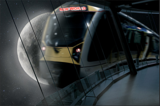
I still have a lot of touching up to do, for example, the edge of the tower against the sky is way too harsh. I also added a bit more of a glow to the outside of the moon, as I felt, once again the contrast was too harsh against the sky so wanted to lighten up the rest of the sky a little bit. I may end up removing this, as I now feel it has blown out the sky a bit much, to the point where the stars are quite obscure.
Aiden suggested I add some motion blur to the train and I thought this was a really cool idea, as it just creates more interest. Subtle, but effective. He also showed me how to do this, as I had no idea. I think I like the level of motion blur that has been applied, I may switch it up, but for now I'm happy with it.
I think the image is coming along and will definitely use it in my series.
0 notes
Text
Connotations and denotations -
Glasses:
Denotative -
Glasses
Eyes
Accessory
Low vision
Fashion
Sight
Connotations -
Clarity
Vision
Expansion
Intelligence
Scientist
Teacher
Cool
Smart
Heart:
Love
Pink
Water colour
Dreamy
Abstract
Contrast
Romantic
Connection
Painted
Soft
Calming
Zen
0 notes
Text
Meaning behind images lectures:
Images are culturally situated and convey different meanings to different viewers based on personal knowledge and perspective - context
A sign is anything that stands for something else, signs are culturally/contextually dependent
Sign VS signification that justifies our interpretation - connotative vs denotative
0 notes
Text
https://maekan.com/story/sticks-and-stones-detroit-as-vuhlandes-sees-it/
youtube
Although Vuhlandes' work is very different to the types of images I will be creating for this particular project, I find his work, his work ethic, mindset, process and everything else so inspirational and helpful. Through studying his work, in terms of photography and film, I have seen the strength of an image series that comes from the heart.
So far through observing his work, I haven't come across any composites so it would appear that his image manipulation lies mostly within the editing process. His images appear honest and true and he even states how much he enjoys capturing natural light and often using that as a main source of light for his images. Although, this is the opposite of what I am doing currently, I have gained a lot from his work in many ways, but in terms of this particular assignment, I have found the his storytelling element and advice to be most useful.
0 notes