Last Seen Blogs

juliussims
Julius

new-found-furry
New Found Furry

configuratorsolutions
Configurator Solutions
oh-lawdy-mama
im free, and dont you know?
baddienicorobin
Hoe For Cardan&Jude
Photo


Week 8
These images I collected will be the basics for my design. Combining these together should make an interesting image.
0 notes
Photo
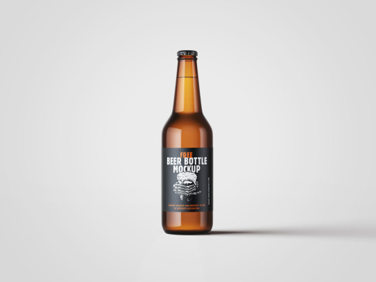


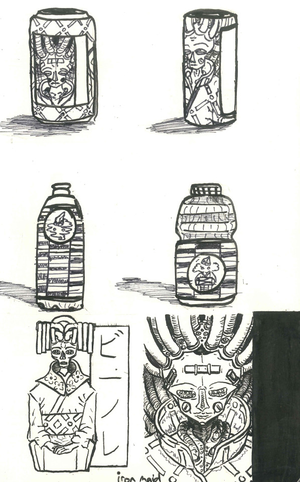
Week 10 - Mock-Up Hunt
As I scoured the internet for a bottle I kept coming across good ones to use, but they were usually paid ones or were just bannered ones.
What I mean by bannered, is that they are are rectangles wrapping around the botttle. I am planning for mine to still wrap around but as a free flowing PNG image. Examples up top.
This basic mock-up does suit the tone/theme of my design though and helps bring out the complex illustration.
Also I did make a pattern for the drink but decided not to use it as it made the design messer and harder to look at.
0 notes
Photo

Week 9: Label Diagram
Self Directed Brief
In our groups we looked for beverage design to analyses. We chose this one, as it had colourful and simplistic like features that managed to capture our attension easily. The other products in it’s line do the same yet range in different colours and settings.
0 notes
Photo
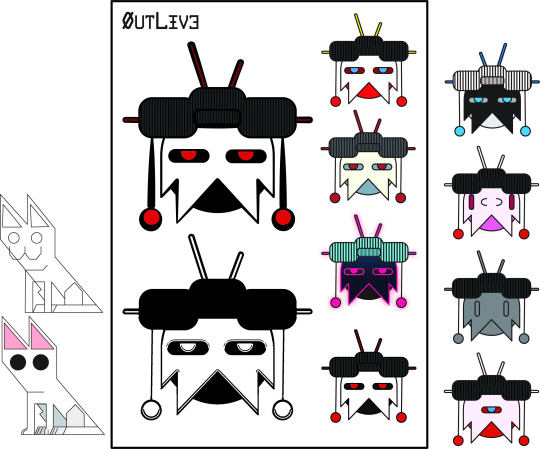
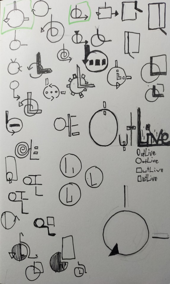
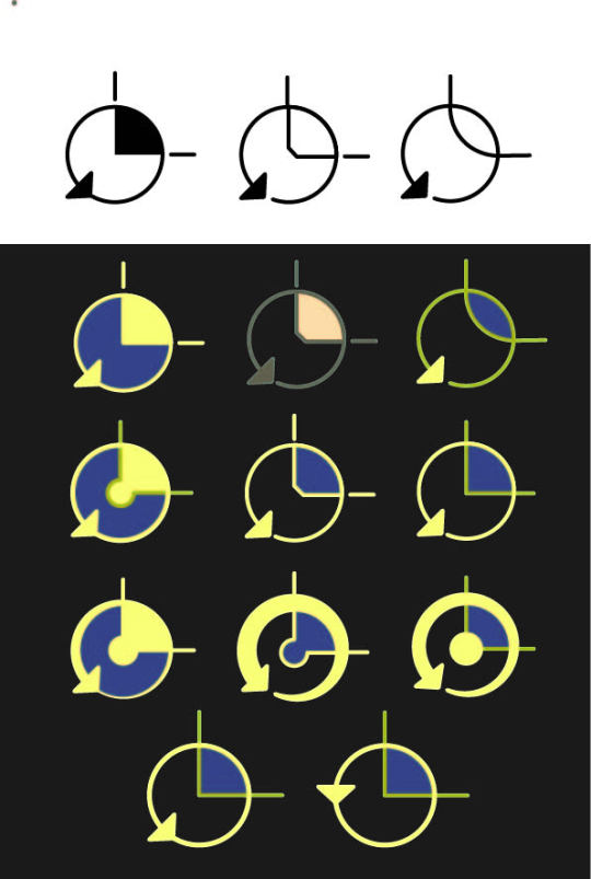
Week 7: Logo Design
The first image is of a logo process I created before one of my mood boards where chosen.
Once a mood board was chosen, I started on another logo design as the old one didn’t suit the chosen mood board.
Logo Name: OutLive
The last two photos show my process of creating the logo.
The circle arrow represents:
1. The long lasting, forever updating machinery.
2. The O in OutLive
The right-angle line represents:
1.The liner timeline organic life live on. It has a start and an end.
2. The L in OutLive
0 notes
Photo

Week 6: Elevator Pitch Documentation
Based layout of mood boards and information from an example in class.
Rearranged and edited mood boards to fit a landscape position in InDesign for the presentation. Also deleted some images to clean them up more.
Saved files and exported copies as JPEG’s, then imported them to PowerPoint slides.
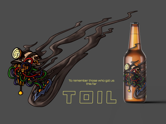
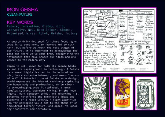
The Iron Geisha design used to be a beer but I changed it the last second to an energy drink, as it’s more suitable for the intended audience.
I added subtitles to the elevator pitch as my mic was not the best, making it a bit easier to understand what i was saying.
0 notes
Photo
Week 5
Advice Post
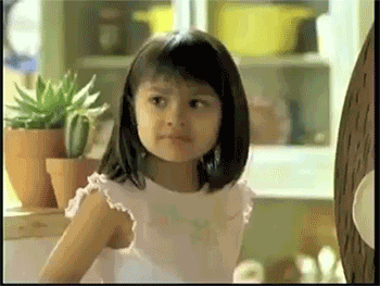
Do you have two mad ideas but don’t know which one to choose. Well, why not both? Combining the best parts of two or more things could make whatever you're doing better.
I saw this advertisement way back in the day when I was little and somehow remembered it, and was kinda the first thing I thought about to use for this weekly task.
Video:
https://youtu.be/YSTJ5Xe-E8c
0 notes
Photo
Week 4
Mood Board Adjustments
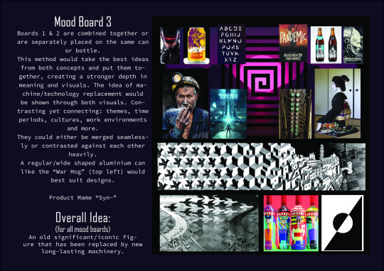
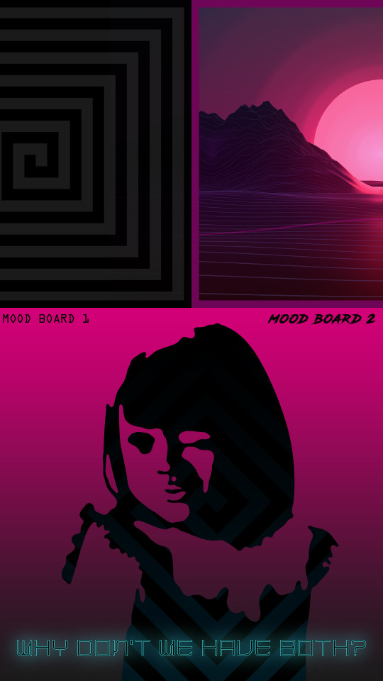
The first two designs had no changes made to either of them as both were just as strong as each other. However, there was a suggestion to possibly merge the two designs together in some way to double the appeal and/or impact of the design.
Design Sketches
The bottom pictures are early sketches and inkings of the figures, patterns, and layouts that I would like to design. (Except for the middle ones on the last photo)
0 notes
Photo
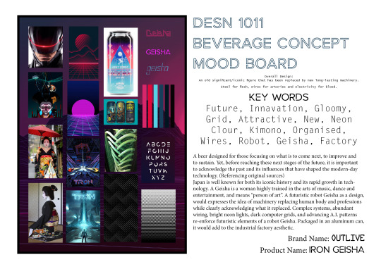
Week 3
Beverage Design Mood Boards
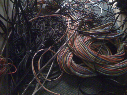
Main Overall Design Idea:
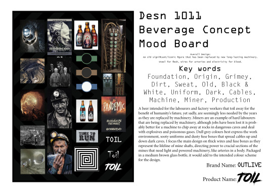
To remember an old significant icon that has been replaced by new long-lasting machinery. Steel for flesh, wires for arteries and electricity for blood.
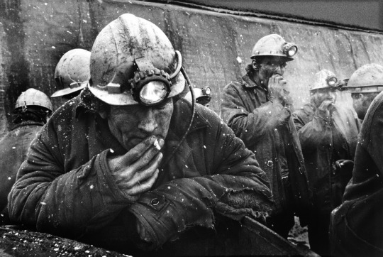
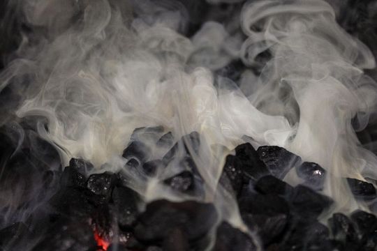
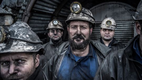
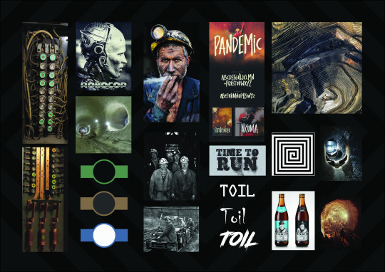
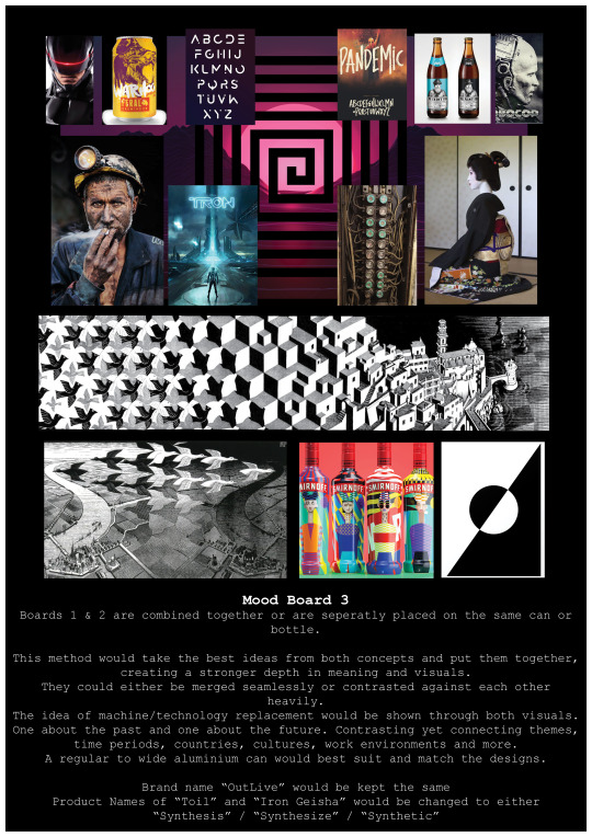
Mood Board 1: Toil
This visual direction focuses on labor that is being replaced by machinery.
I chose mining and miners as a focal point for one of the designs because this type of job is dangerous and is suited for automated machinery. Keeping miners safe with advance machinery is very beneficial but sadly increases unemployment levels considerably.
Visual Idea: Old Dull Robot Miner
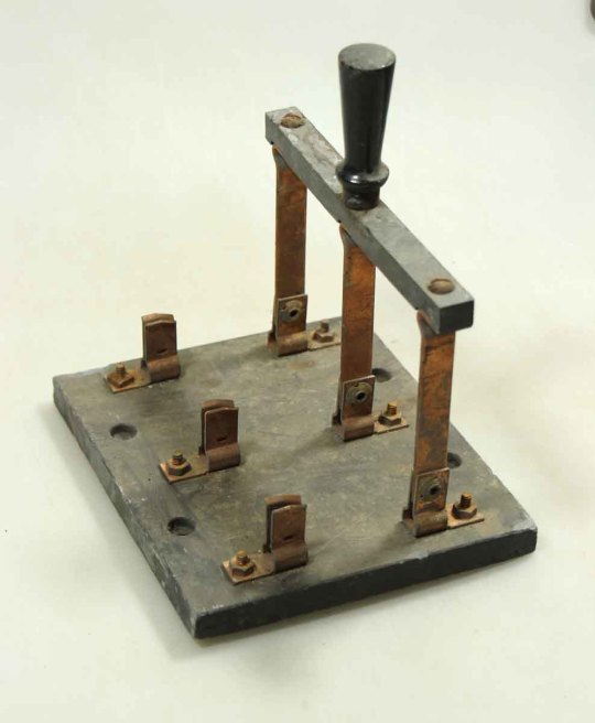
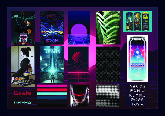
Mood board 2: Iron Geisha
This visual direction focuses on services that are being replaced by robots.
Like the miners, the service industry is in as much danger of unemployment. The self-serve systems at fast-food franchises and supermarkets are an example of this and was an influence on the idea of the drink design. I was also influenced by movies and comics (e.g. Ghost in the Shell, Tron, Blade Runner) that focused on the far future and how deeply robotics will be integrated into our modern lives.
Visual Idea: Advanced Bright Robot Geisha
0 notes
Photo
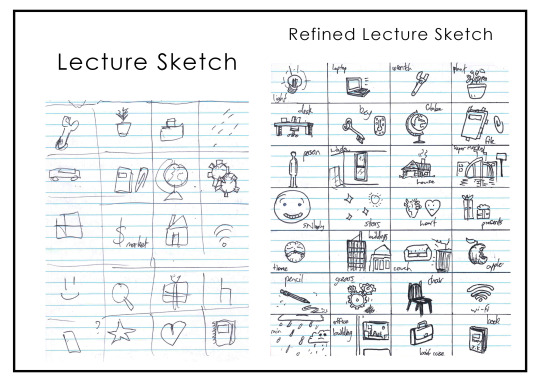

Week 2
Lecture Sketches
The first lecture sketch is just basic shapes, simple and broad. However, some I made too simple, making it impossible for me to remember what it was meant to be. E.g. the rhombus in the bottom left corner.
The refined version is much easier to understand, yet some are hard to guess as I put too much detail in a small space. Such as the office and supermarket
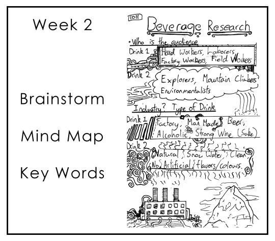
Brief Task 2: Defining
Using the concepts from Brief Task 1, I was able to set two ideas/themes I wanted to explore and expand. With this in mind, I used a Narrow / Expand type process to find which one I wanted, and then how I could expand the one I chose.
Brainstorming
The two ideas/themes were polar opposites. Natural vs. Industrial. They each had certain aspects that match a type of drink. Natural themes correlated with water and juices. Where Industrial themes best-incorporated soda and alcohol.
In the end, I fused the two themes together but focused it more on an industrial theme. This is because the world seems to be rapidly increasing in industrial expanse and nearing the end of it’s traditional and natural self.
Mind Map
Beer suited the theme best for it is a drink that is mature, old, new and constantly manufactured from many places around the world. From that I expanded the many things that beer can be related to. ‘New objects are always wanted but should pay recognition from their innovated origins and history’. This is the mindset I wanted my design to emphasize.
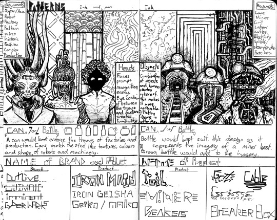
Keywords
From the mind map, I settled on four main keywords which all had sub-keywords. I then underlined the sub-keywords that identified the boundaries and materials for my design to incorporate and show. I did some quick visuals to further cement the keywords.
Audience
I wanted the drink to make recognition to those who do hard labor and work in tough conditions (miners, servants, construction and factory workers), and those who design for the future, letting them know that their work is accounted for and that this beer a reward for there services.
Notes
After re-reading the mind map and keywords I added some extra keywords at the bottom that I forgot to add or didn’t have room for.
Links to my Pinterest that further sets the mood and theme of my design.
https://pin.it/6kquGMH
https://pin.it/6dONszC
https://pin.it/293af4g
https://pin.it/3GGlg28
0 notes
Photo
Week 1
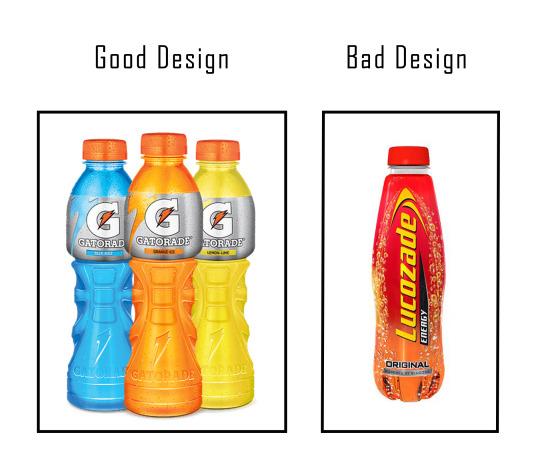
Drink Packaging Comparison
Gatorade: Gatorade is a successful product because of its unique texturing of the bottle and simplistic coloring, which comes from the actual liquid inside the bottle. The plastic wrapping band displays the drink’s information minimalistic, yet makes the logo clear and simple. These components make the product much more approachable and recognizable.
Lucozade: Lucozade is a not so successful product, this is because of the intensity of fading (and strong contrasting) colours, as well as its overuse of bubbles. Also, the shadowing and outlining of the lettering make the packaging even more chaotic and less satisfying. The texturing of the bottle is the only simplistic feature but does not make up for its weak presentation.
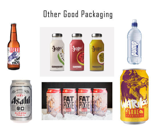
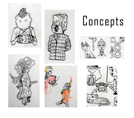
Brief Task 1: Concepts
The four beers in the middle are designs I like and take inspiration from. They both are intricate yet simple and are easily identifiable and remembered. Most also have a some-what use of a mascot on the designs and have a good sense of spacing. This is what I’d like to aim for in my own designs.
The bottom pictures are concepts that would either act as a mascot or theme/mood I’d like to use for the drink’s design.
Image references/links.
https://gatorade.com.au/product-range/electrolyte-sports-drink/
https://www.lucozade.com/
https://www.feralbrewing.com.au/beer/war-hog/
https://www.feralbrewing.com.au/beer/hop-hog/
https://www.asahibeer.com/index.psp.html
https://fatpixie.com.au/the-range
1 note
·
View note