
Last Seen Blogs

nightlightnova-blog
Nova's Safe Place

sissymaidlarissa
Sissy Maid Larissa

nightlightnova-blog
Nova's Safe Place

Photo
WEEK 13 REFLECTIVE JOURNAL
My personal objective for Communication Design Studies was essentially to learn new and interesting things about design, and after 13 weeks, I realised that design was much broader and vast than I thought – there are so many categories of design and many deep layers of history. I definitely did learn a lot, but I have a much more to learn! I really enjoyed the process of zine making and publication design and I’d also like to explore ethical design or design futures further, since we live in an age where technology is such a vital part of our lives.
As this course focused on type and zines, I found that the Melbourne Art Book Fair was a gold mine of inspiration, as all these creatives were gathered in the small space, surrounded by amazing designs and works. Throughout this course I discovered various types historical and design movements, and I found early print/type and the Bauhaus to be really interesting topics as you can still clearly see their influences in design and art today. This made me really think about how much of an influence design history has been in shaping what design is today. I really enjoyed this class; Andy and Karen were always encouraging us to think outside the box and to really exhaust all possibilities which I’m very grateful for as it has really helped me grow as a designer in these past 13 weeks.
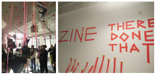
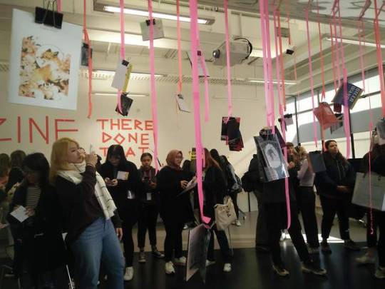
It was so exciting to see everyone’s zines that they’ve been working hard on during the exhibition today! It was great to discover new artists, and exciting to recognise some artists that others interviewed.
0 notes
Text
I love this pocket idea! I think it’ll suit the design of your creative! It’ll be interesting to see how you’ll create that extra pocket and how the layout would look :)
#inspo
the transparencies as pockets are so cool I want to integrate this into my design somehow
1 note
·
View note
Photo
WEEK 12 ASK ME ANYTHING P3
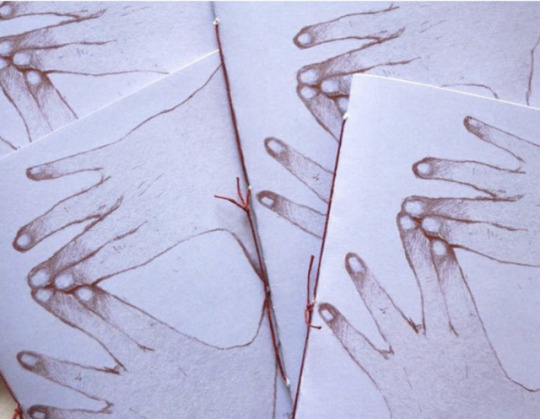
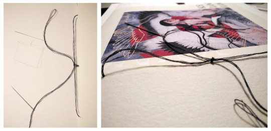
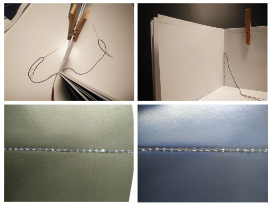
I saw these zines by dayitofu (https://www.instagram.com/p/Bsx__eBhQel/ she draws incredible artworks and she makes amazing zines!) on my Instagram feed the other day, and I love how rustic the binding looks. I haven’t had much experience with book binding before, so I had no idea how to recreate that. After some brainstorming I came up with my own (probably wrong) made up version of how to achieve that type of binding.
There’s three holes poked through the spine of the book. The thread is folded in half and threaded through the middle from the inside, leave the loop at the top. The two bits of thread are now threaded through the other holes from the inside, before threading through the loop that was made at the first step. Then pull tightly and tie a double knot.
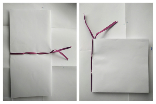
I really loved how this looked, as it was simple, effective and didn’t distract from the zine, but I still tested out some other methods to see how they would compare. I tried stitching down the whole spine, using the same method in my I&I project, however it did not look neat, especially since it was dark thread against white paper. It also was highly inaccurate since there were so many stitches. Instead of using thread, I experimented with ribbon, and used that to bind the book. In theory it would look nice, but when I actually tried it, it was too bulky and made it hard to turn the pages.
I found that scoring thick paper with something (I used a blunt needle from a compass) really helped with getting crisp folds. After trailing different materials to bind with, I then experimented with different ways of binding. I tried binding after trimming the pages to see if I could get more precise results when lining up pages, which did not work and it just made the whole process much harder. I then tried folding the paper first, then binding before cutting. This was tricky due to the thick paper, especially when trimming the sides (had a disaster for one book because the opaque paper got caught one time and resulted in me rip–cutting into a few pages) and I had to trim it by laying the book open. This did give better results as all the sides were even so I just stuck with this.
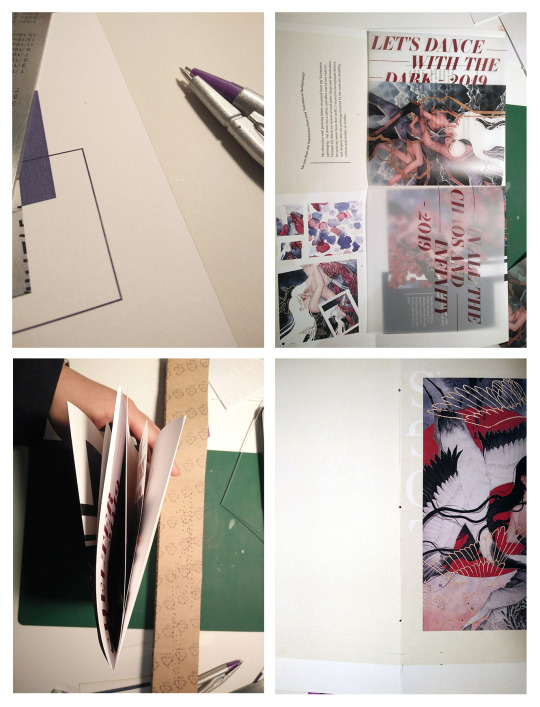
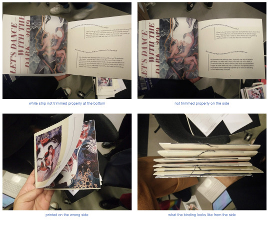
I also had a few mishaps when binding. For one, I forgot to trim the bottom of the translucent paper so it didn’t get trimmed off along with the others, leaving a strip of white at the bottom. For my paper trial ones, like I said in the other post, got printed the wrong way and for another one, I didn’t alight it properly so the transparent paper didn’t get trimmed on the side, leaving the ‘LET’S DANCE’ text fully there, not cut off like I wanted.
0 notes
Video
WEEK 12 ASK ME ANYTHING P2
Here were my initial planning stages for the zine, just some scribbled down ideas in a mock up book I made in this week’s workshop. I then started laying it out in Indesign as a book first, and at first I wasn’t too satisfied with how the layout looked as I’m so used to creating linear conventional designs, and I’m not that great with typography. Below are some pages of my initial zine.
I decided to make a copy of the zine, which helped take the pressure off, and went all out in experimenting. I really challenged and forced myself to try design out of my comfort zone, with lots more colours and making every new page different so that it stays interesting. After a while it started to get easier, as in the back of my head I kept thinking ‘its okay, there’s always an undo button’. I started playing with different compositions, using a combination of fonts and layering to keep it interesting, and I think this version is much better than my first draft.
I definitely also wanted to try using the translucent paper to add extra dimension to the works, and I found it fitting since he explores ethereal and dreamlike concepts. It also allows me to overlay text over his works without actually modifying his works, and I surprised myself with deciding to use large text for the translucent sections, but I really liked how it turned out as the red text really contrasts against the background and the illustrations. I also chose to crop some sections of the text (on the first translucent page and page 5), as I felt it made it more visually interesting (the let’s dance does gets cut when trimmed).
I then put everything into my impositions and went to Little Print, which went easily as I had gone before to print my other project. I printed a copy on bulky news print, wild paper and a few on 130gsm SRA3 sized paper that I trimmed. I really liked the feel and texture of wild paper, but it also had a slight yellow tint and the ink didn’t adhere to the paper as well due to the rough texture.
0 notes
Text
WEEK 11 ASK ME ANYTHING P1
In class, I learnt how to load up the school printer with our own paper by selecting ‘bypass tray’ when printing from your laptop. A tip we got told was to draw a small mark on the edge of the paper, so that you’ll know which way to put it back into the bypass tray when printing double sided documents.
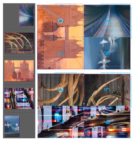
Since I decided to use my own template to fold the zine, I had to create my own imposition layout on Indesign. This wasn’t too hard, but it was a little fiddly to get the exact measurements, bleeds and trims right. I measured it so that there was 0.5mm of bleed on each edge.
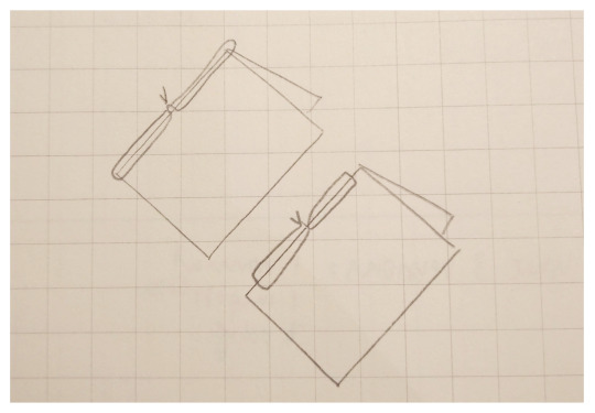
Luckily, I had also chosen to make a set of small sketchbooks for my Image and Identity Project 2, which I used as ‘practice’, so I went through the whole process of doing the impositions for that. This was actually harder, as the sketchbooks had two signatures (sets of a3 paper) totalling to 32 pages, including the extra cover and extra info cards, and it was a little challenging to place everything onto the imposition. The mock up impositions that we learnt to fold a few weeks back was very helpful in allowing me to figure out the layout. (See below)
I did a few test prints at uni (actually like 15), but somehow it never printed flipped on the short side despite having checked that option on the printer, and then when it did work, the text was flipped. I went to Little Print and asked some questions regarding what paper they had, if they wanted Indesign documents or pdfs and if they usually flip their paper on the long side or short side. The staff were all really nice and helpful, and thankfully my imposition printed out fine there. I also got to practice my binding, as I hand stitched these sketchbooks together by threading two needles onto the same thread, at opposite ends and started stitching into the pre poked holes.
Overall from this experience I learnt a few tips that will help me with the zine:
1. Poke the holes beforehand
2. Always make sure you have more than enough thread (around 4 times the height of the paper)
3. I used bulky news book print (80gsm) for the sketchbook paper which I liked the texture of, but not the slight yellow tinge, and uncoated hi-white (120gsm) for the covers, which I think wouldn’t suit my AMA zine as the ink from the folded edges were cracking, especially when I started sewing.
I don’t think I will stitch down the whole spine for my AMA zine, because without a sewing machine, it takes too long, it’s hard to poke the holes in the exact same spot (as I had to separate the book into pages of 10 to poke holes through) and if not sewn well, it really shows as the stitching is crooked in some areas. If I also wanted to sew down the whole spine, I would have to trim all the pages first, which makes it tricker to line all the pages up.
0 notes
Photo
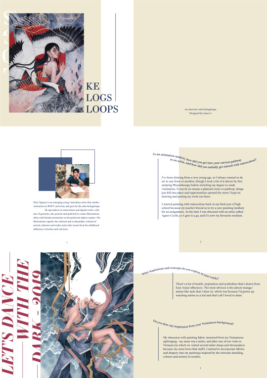
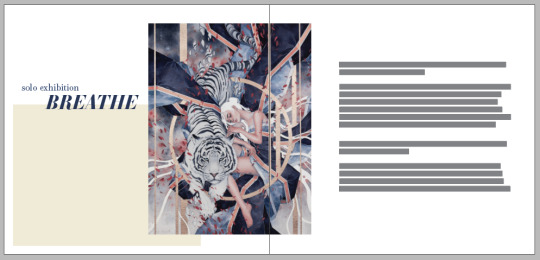
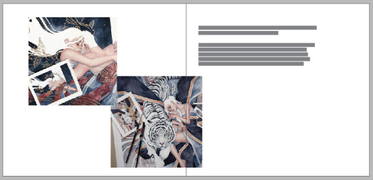
Nguyen, Hieu 2019, Inhale, Exhale, Watercolor, gouache, ink, pencil and gold leaf on Arches paper, 24’ x 14”, <https://kelogsloops.com/watercolor/2019/5/13/2019/5/13/inhale-exhale>
ASK ME ANYTHING!
Hong Yi hadn’t replied in a few weeks, so I decided to message Kelogsloops (Hieu) and Julia Benbassat. Hieu was the first to reply so I sent off these questions:
• As an animation student, how did you get into your current pathway as an artist, and how did you initially get started with watercolour?
• What inspirations and concepts do you explore in your works, and do you draw any inspiration from your Vietnamese background?
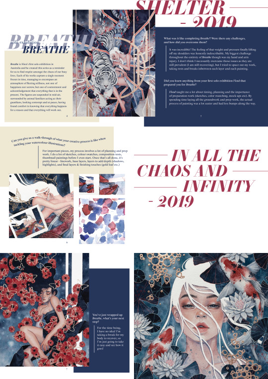
• Can you tell us a bit about your most recent solo exhibition ‘Breathe’ ?
• What was it like completing‘Breathe’ ? Were there any challenges, and how did you overcome them; did you learn anything from your first solo exhibition ‘Flood’ that prepared you for ‘Breathe’ ?
• What is your creative process like when tackling your watercolour illustrations?
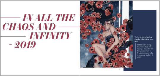
• You’ve just wrapped up 'Breathe', what’s your next step?
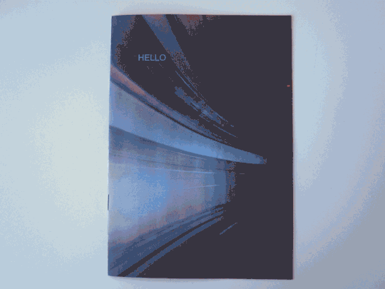
He replied almost instantly! I started to plan out how I wanted the layout to look by drawing in a mock up zine that I made. The square shape of the zine fits his works well, as a few of his works are in square format, and he is most active on Instagram, where majority of his posts are also in square format, so there won’t be many strange bits of empty space on the edges.
0 notes
Text
WEEK 10
Why design? During this lecture, we discussed design ethics with reference to historical movements, publications and design manifestos. It also made me and reflect on the reasons of why I’m doing design – is it because I want to help change and improve the world? Or simply because I like design? Colours magazine caught my eye, as they discuss social issues with the idea that presenting it mainly through photographs and images could convey as much information as pages of text, so I decided to check out some of their magazine issues. Here’s the link to all their issues if you’d like to take a look: http://www.colorsmagazine.com/magazines
I like how they call themselves ‘a magazine about the rest of the world’ and discussing how globalisation is changing the world by documenting it through highlighting ordinary people’s stories. Although some issues and photographs can be quite shocking and confronting, it gets the messages across well. On another note, I love the layout and visuals of the magazine displaying the magazine’s own unique style, as it is simple but effective in delivering its message.
HAPPINESS Issue #83 http://www.colorsmagazine.com/magazine/83
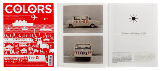
TRANSPORT Issue #81 http://www.colorsmagazine.com/magazine/81
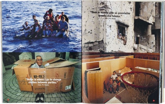
HOME Issue #27 http://www.colorsmagazine.com/magazine/27
0 notes
Text
WEEK 10
We were introduced to impositions in class, and we familiarised ourselves with how the layout works and which pages are next to which when laid flat. Each of us made a test version using templates (my pictures were all taken from the 2019 National Geographic photographer of the year competition https://www.nationalgeographic.com/travel/contests/travel-photo-contest-2019/gallery/peoples-choice-all/1/), where I learnt some useful info; there is a master page at the top right, where you can add elements that then appears on all the pages in the document, cmd d allows you to place an image, and cmd shift allows you to unlock the boxes in the template. I also learnt how to split images into two pages: by placing an image into the blue box you resize, then copy and unlock the other box and paste into place. This allows to create a seamless transition of pictures between pages. I still need to practice my alignment when stapling the pages together though, as a part of another picture was showing on the inside edge on the second page.
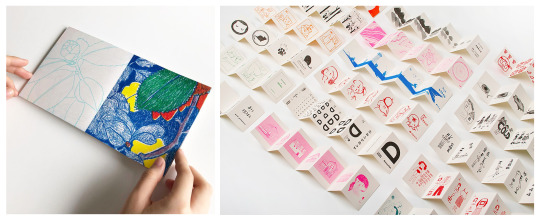
I started to explore more ways to create my own types of zines by using the imposition examples given to us, as I didn’t particularly like the size of the a3 paper folded down into an eight-page zine – I prefer the more square and smaller shapes, similar to this zine I found published by Banana Fish Books and illustrated by Eden Barrena (left https://www.instagram.com/p/Blm8g8_ATd4/) or the other zine published by them (right) with a concertina fold as it creates an interactive experience for the viewer (https://www.printedmatter.org/catalog/50794/).
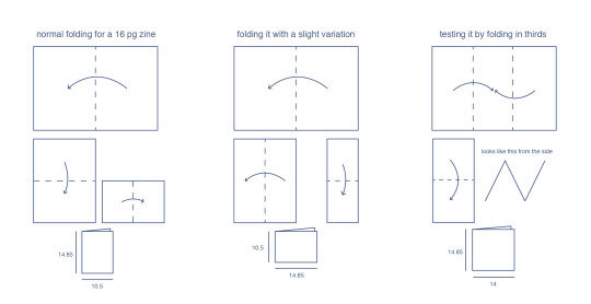
I experimented with the 16-page template and the slight variation allowed for the pages to be connected from the short edge which I liked, but the pages now felt too long so I tried with folding the pages into thirds instead (it creates a 12 page zine, which is just the right amount as isn’t too big or too small). I loved the shape and size of this so I decided to use this version, the diagrams I drew are below.
0 notes
Text
WEEK 9
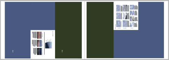
Memphis group was founded by a group of designers led by Ettore Sottsass in 1980 with the aim of creating a new design collective. The aesthetic of Memphis Group is a mixture of bright colours, graphic patterns and bold geometric patterns, the complete opposite of what was considered ‘good taste’ at the time. While doing some research on Memphis Group, I managed to stumble across their Milan collection catalogue – such a coincidence since we’re studying zines right now. There weren’t any dates on it so I’m not sure when it’s from, but here’s the link if anyone wants to take a look!
https://cdn.shopify.com/s/files/1/1058/1166/files/memphis_milano.pdf?14149556525736315536
Here’s a pg 128 and 129 from the catalogue. I love the blatant clash of colours between the products and the black and white spotted background. Despite the moiré looking pattern looking so distracting, the colours of the (I’m guessing) posters (?) are so vibrant that they become the focal point and it’s hard to look anywhere else. The background also creates a good depth of field, which emphasises the product and makes it really pop out of the page as there is such high contrast between the elements.
I went to the NGV and saw the Carlton Room Divider! It was really cool to see it in person. It’s in their collection so you’ll be able to see it on level two in the Ancient Worlds collection
Sotsass, Ettore 1981 Carlton Room Divider, wood, thermosetting, laminate, metal plastic, National Gallery Victoria, Melbourne
0 notes
Text
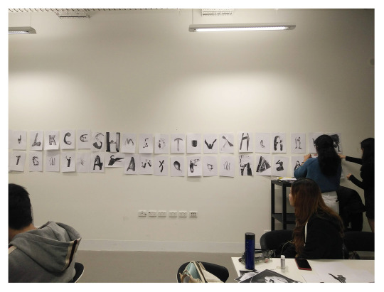
WEEK 9
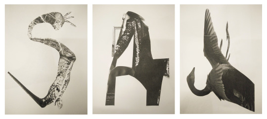
This week we participated in a creative collage activity – finding shapes and creating letterforms out of magazine pages. At first it was hard to find shapes within already completed pictures (see below for my strange looking ‘s’) but as we continued to push and cut more pieces, finding the patterns and shapes became easier. I quite liked the third letter I cut out, as it resembles a ‘r’ when horizontal, but a ‘j’ when viewed vertically.
0 notes
Photo
On my quest for interesting zine ideas, I came across this one with revealed layers. I love how the text is traveling and interacting between the different layers and I think this, or the idea of cutouts between pages, would be a fun concept to explore, or having various elements interacting between pages that still makes sense if viewed separately.
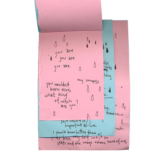
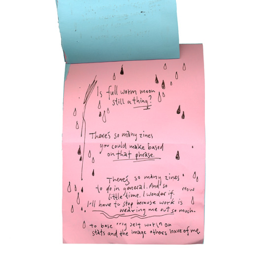
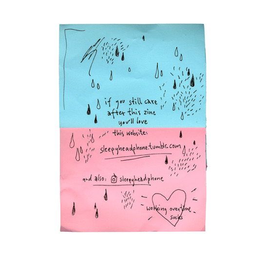
Continuing my breathtaking streak of low(est)-effort zines, here’s another uncalled for look into my brain. Yes ladies, gentlemen and nonbinary friends, I made another shitty zine, something I give myself way more credit for than I should. Times are hard though! I recently started a internship that has been sucking away all of my time and power, and I feel pretty crushed. But remeber: A shitty zine is better than no zine at all.
Als Fortsetzung meiner Strähne an low(est)-effort-Zines präsentiere ich euch heute einen weiteren ungefragten Blick in mein Innerstes. Ja, meine Damen, Herren und alle die sich anders identifizieren, ich habe ein weiteres Schrott-Zine gemacht, wofür ich mir grundsätzlich mehr auf die Schulter klopfe als ich sollte. Doch die Zeiten sind hart! Ich habe kürzlich mit einem Praktikum begonnen, das mir meine gesamte Kraft und Zeit raubt. Und vergesst nie: Ein Schrott-Zine ist besser als kein Zine.
zine by @sleepyheadphone
21 notes
·
View notes
Photo
I was looking for unconventional zine shapes, as I want to explore different shapes for my zine, and came across this. I like really like how it is set in landscape and the elements that are sticking out of the page boundaries. It also seems that the pages were originally on top of each other before made into the zine, so that when the falling petals are cut out, the cut out is seen in the next layer.
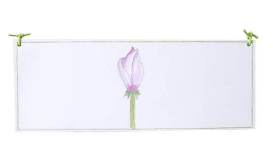
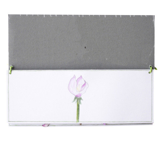
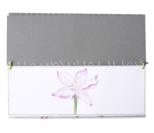
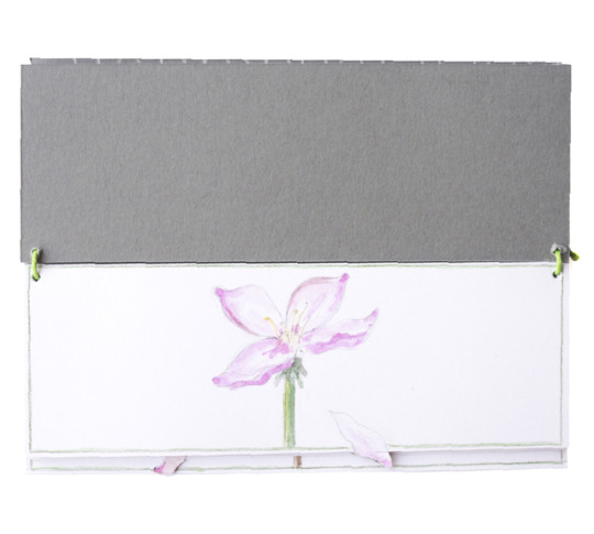
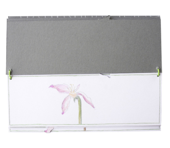
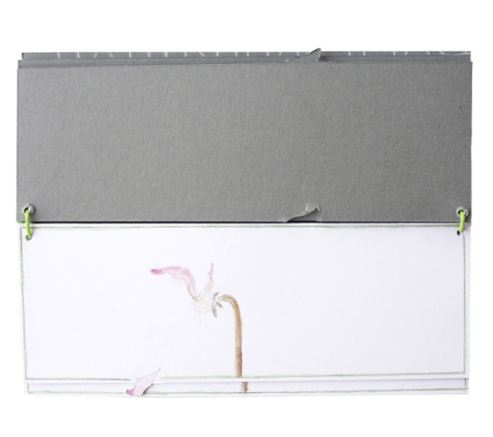
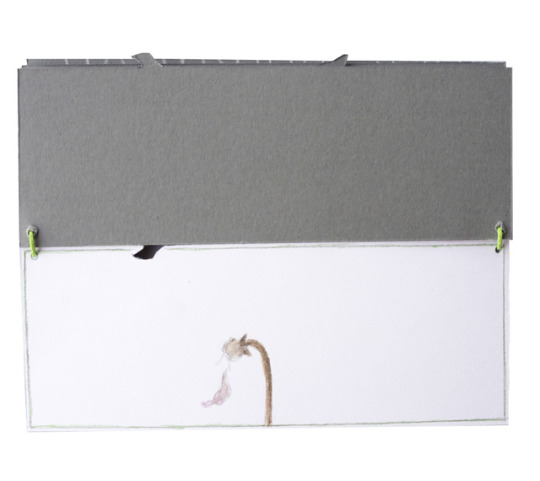
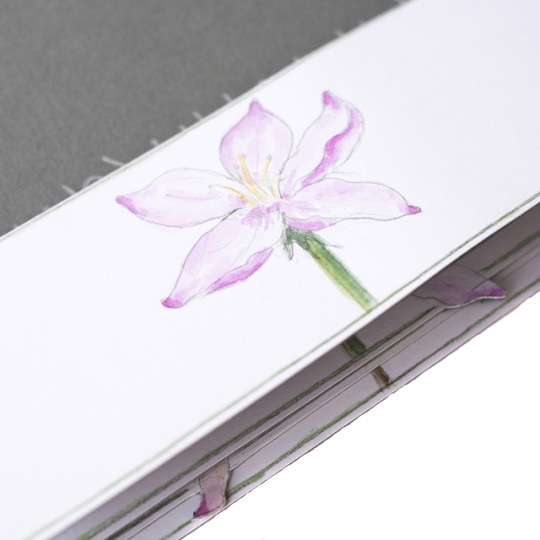
The life of a flower.
Das Leben einer Blume.
zine by @nica_ha_
18 notes
·
View notes
Photo
ASK ME ANYTHING!
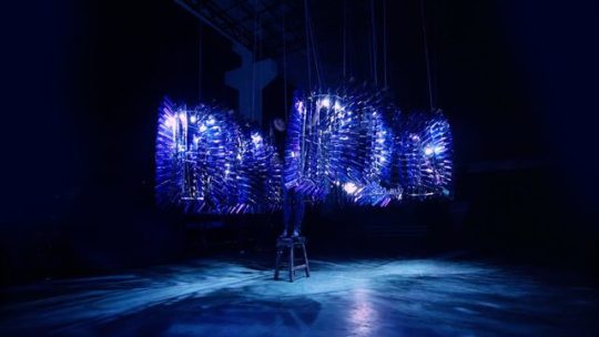
Above work: Yi, Hong 2018, Aurora, mobile phone glassbacks
http://redhongyi.com/portfolio/ Her installation works are really nice, and she often tackles social or environmental issues.
I messaged Red Hong Yi and to my excitement and shock, she replied! My questions, which I sent to her immediately, were:
• As someone who was an architect, how did you get into your current pathway as an artist, and was it always your plan?
• Many of your works are large scale projects, what is your creative process like in tackling them?
• Are many of your works site based? Are there any challenges that come with that and how do you overcome it?
• What has been your favourite material or medium to work with so far and how do you decide what materials to use for each project?
• Is there a collaboration you completed with other creatives that was meaningful and memorable to you?
• What concepts do you explore in your works? As a globally recognised designer and artist, do you feel a responsibility to give voice to social or environmental issues through your works?
She was travelling and definitely busy with other projects, so she notified me that she might not get back soon, but even if she sends me the questions after this assignment is due I’m going to practice making a zine anyway!
0 notes
Photo
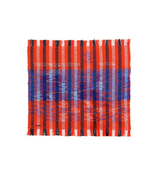
Above: Albers, Anni 1962, Intersecting, cotton and rayon, 40 × 41.9 cm <https://albersfoundation.org/art/anni-albers/weavings/#slide7>
WEEK 8
What is the Bauhaus? Prior to this I had only heard bits about the Bauhaus school and didn’t have the chance to research more into it. The Bauhaus school was founded in Weimar in 1919 by architect Walter Gropius and became the most influential modernist art school of the 20th century, and the principles of form and aesthetic founded at the school are still relevant to this day (Martinique, 2016). The origins of the Bauhaus circulated around the anxieties about the soullessness of modern manufacturing, and fears about art becoming irrelevant in society (The Art Story, n.d.). In the lecture, we discussed how little female representation there was during that time, but despite the inequality and prejudice against them – Gropius even believed that woman were incapable of thinking in three dimensions – they still managed to advance the school’s historic combination of art and function and were essential in laying the groundwork of art and design innovation for many years after (Gotthardt, 2017)
Heres a link to a good article: https://www.theartnewspaper.com/feature/weaving-walls-how-anni-albers-challenged-bauhaus-prejudice and the Josef and Anni Albers Foundation: https://albersfoundation.org/
An artist whose work I quite like is Anni Albers. She was discouraged from taking painting courses and was directed at weaving instead, much to her distain. However, through her experimental approach to material, and handling of geometric shapes and patterns, she proceeded to advance in textile art and abstract art (Gotthardt, 2017). What I find inspiring about her is that when architecture was introduced to the school in 1927, women were not surprisingly, discouraged from applying, which led to Albers creating a wall covering woven from cotton, chenille and cellophane as a reaction to this. This wall like structure reflected light and absorbed sound, she called it ‘textile engineering’, and compared weaving not to art, but architecture (Darwent, 2018). Albers used weaving to work around the exclusion of females in architecture, and this piece earnt her a Bauhaus diploma in 1929.
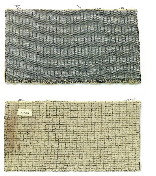
Albers, Anni 1929, Front and back of the wall-covering material for the auditorium of the Trade Union School in Bernau <https://www.tate.org.uk/whats-on/tate-modern/exhibition/anni-albers/seven-life-hacks-anni-albers>

Also, check out this nice Google doodle that celebrated the 100th anniversary of Bauhaus!
https://www.google.com/doodles/100th-anniversary-of-bauhaus
0 notes
Photo
WEEK 8
An ‘architexture’ activity where we looked around campus for letters and numbers hidden in buildings and the environment around us. Our group, (Medina, Kelly and I) found ourselves in the more secluded areas on campus; here are some of my favourite ones above!
0 notes
Text
WEEK 6-7
In our lecture this week, we continued to look at print and the evolution of type. Woodblock printing, or xylography, caught my attention as I suddenly remembered and artwork created by artist Xu Bing that I really liked and studied in high school (I had almost forgotten about this artwork and it was exciting to go back and rediscover his works again! I felt like a child who had found a hidden stash of candy that they had forgotten about). I found it interesting how movable type, woodblock and metal type print was created for efficiency combined with legibility, but in this work, Xu Bing decided to use it for complete opposite reasons, going against the purpose of moveable type.
I highly recommend looking at his other works, as they explore different elements of Chinese language and culture and the manipulation of type/characters, as it is the product of him growing up during the Cultural Revolution. http://www.xubing.com/
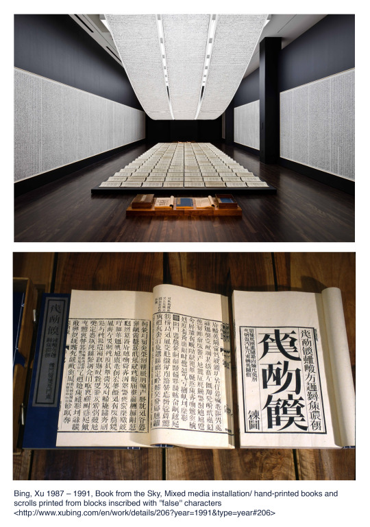
His work Book from the Sky, is an installation of a set of four books, ceiling and wall scrolls that are hand printed in the style of a wood letterpress (Public Deliver, n.d.). The books and scrolls contain 4000 invented and meaningless Chinese characters that Xu Bing invented by follow the set rules for brush strokes, radicals and compositions used for Chinese characters (Gesterkamp, 2017). Each character was designed and hand carved by Xu Bing in a Song style font that was standardised by artisans in the Ming dynasty (Bing, n.d.). Book from the Sky is a contradiction; the characters have been printed on government offical looking scrolls and books, however the text can’t be read, rendering the contents of the book to be meaningless. He highlights the absurdity of how government texts are considered important just because they are written by the government and people of higher power. This was Xu Bing’s commentary on the manipulation and misuse of language and text during Mao Zhedong’s reign during the Cultural Revolution in China (Public Deliver, n.d.), so this work was frowned upon by officials when it was first displayed in Beijing in 1988 as it was implying that language was abused and used to manipulate by those in power at the time.
Bing, Xu 1987 - 1991, Book from the Sky, mixed media installation/hand-printed books and scrolls printed from blocks inscribed with “false” characters <http://www.xubing.com/en/work/details/206?year=1991&type=year#206>
Gesterkamp, Lennert 2017, ‘Lecture: Xu Bing’s Book from the Sky and the Meaning of No-Meaning’, lecture, SinArts Gallery, viewed 21 April 2019, <http://www.sinartsgallery.com/events/xu-bing-lecture>
Public Delivery, n.d. What is Xu Bing’s Impressive ‘Book from the Sky’ All About?, Public Delivery, viewed 21 April 2019, <https://publicdelivery.org/xu-bing-book-from-the-sky/>
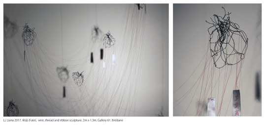
I had an artwork I made two years ago that was inspired by Xu Bing’s laborious process of hand carving characters, and manipulating type to create meaning, that I thought might be interesting to share - it was fun but challenging, and it would be nice to explore the technique again! This work 命运 (fate), explored the red string of fate myth (when a child is born, a single red string connects them with their soul mate, regardless of time place or circumstance) paired with wishing trees (where one would tie red ribbons stamped with wishes on trees, resulting in this amazing sight of ribbons draped over branches). The wire hearts are connected with red thread, and the hand carved wishes of goodwill stamped on ribbons are representative of the elements that bring the pair together.
0 notes