
Last Seen Blogs

faheyfolk
FaheyFolk

gingerkingfisher
I want soup rn

stevesbestgirl
Steve's Best Girl
minyminymo
Pointofview

fabiankochendoerfer
FabianKochendoerfer
Text
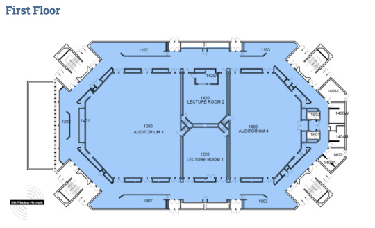
Map Workings

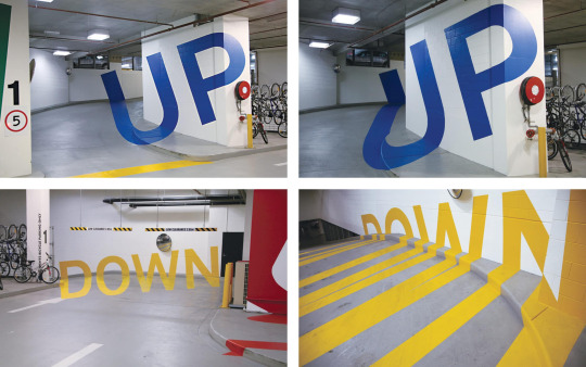
Meeting with Franc.
Suggestion about doorway indentation: make the triangles less equilateral so they don’t seem so architectural.
Other suggestion: Making stairway symbol more unified and aligned by connecting railings.
0 notes
Text
In Progress Crit 2 (Nov 6, 2019)

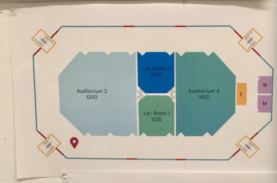
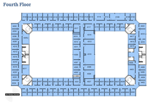
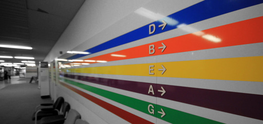
Focus: 1st floor map
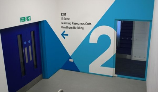
Goals: making signage on the large space above the exits; indicate what areas they lead out to (ex. Rackham Auditorium, North Quad, etc)
Feedback: Color palette is positive. The triangular indents don’t necessarily read as doorways. Elevator “E” is not clear.
0 notes
Text
In Progress Crit 1 ( Oct 23, 2019)
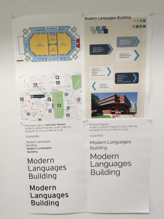
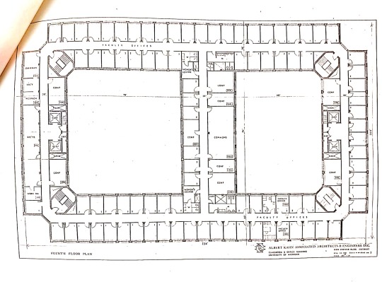
MLB Focus Problem: creating directional signage that will help people know their location in regards to the building since it is symmetrical
Deciding between two typefaces: Interstate & Raleway
Color Palette: blue scale is a first iteration; subject to change
0 notes


Text
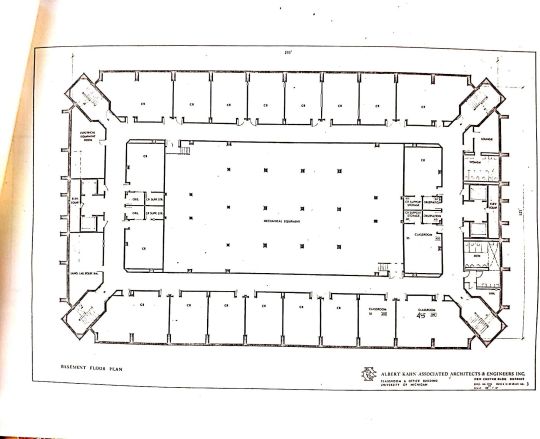
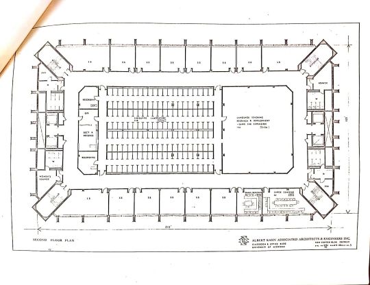
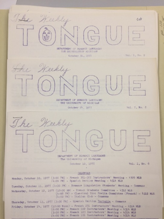
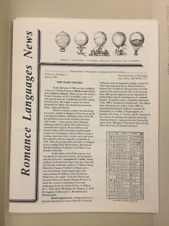
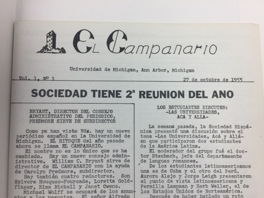
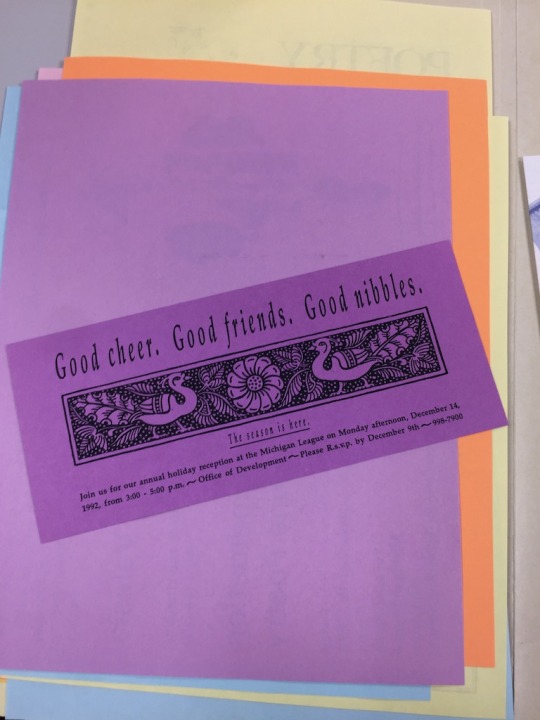
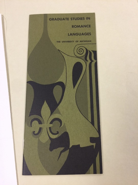
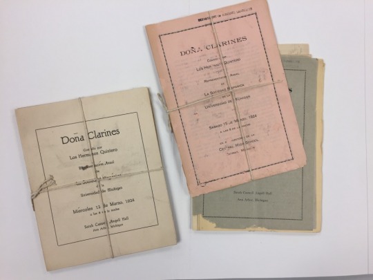
Bentley Findings
Had difficulty finding information pertaining to the MLB itself, so I began looking at the departments that were found there. Through that channel, I looked at previous student organizations, student run newsletters, and flyers that were hung up in the 90′s. I wanted to see if I could find any interesting visual styles that students used in the MLB and what kinds of events held place there.
I plan on going back to the Bentley and finding more information on the building itself.


0 notes
Text
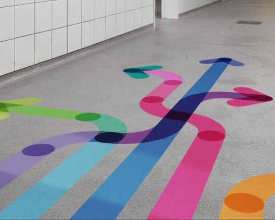
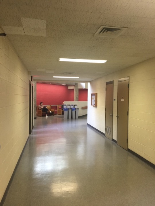
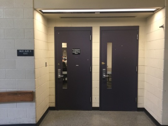
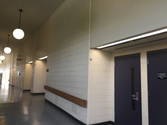
proposal
The Modern languages building is currently not very modern. Boasting high ceilings and vast amounts of blank wall space, I propose that the way finding system is renewed in a playful, mural-esque manner. The building itself is an interesting shape and currently evokes confusion upon entering as there are no indicators of your location. Each entrance appears the same currently which entails that the way finding system also needs more signs, and a system of separating each hallway in order for the viewer to understand quickly where they are in order to efficiently maneuver the building.
There is a small amount of natural light that shines through the building onto the inner walls. The rest of the building is lit with artificial overhead lights. Because of this I suggest a color scheme that can lend some brightness into the building or possibly signage that involves a metallic type to reflect light.
0 notes

Photo


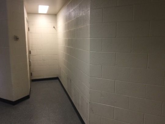

Modern Languages Building (MLB)
overwhelming amount of blank white walls, no signs, no directions
0 notes