
leahsouthernx
Leah Southern
General Art & Design 1. Read All About It
2. Black Books & Black Holes
85 posts
Don't wanna be here? Send us removal request.
Last Seen Blogs
idol-emu-otori-official-archived
(≧ ∇ ≦) /

willbass69
A Bit of what we need
yesterdaysprint
Yesterday's Print

nubar01
Bay R
protect-yangs-smile
in bees we trust 🐝
Text
Final evaluation
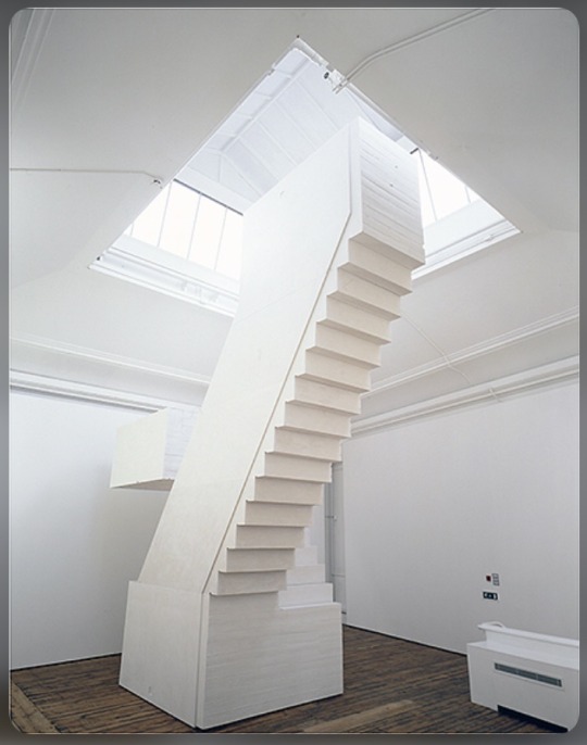
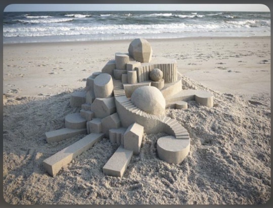
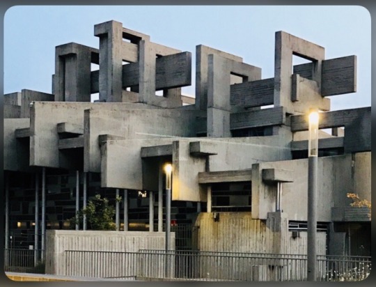
3 words to describe: structured, measured, tall

3 words to describe: stacked, random, scale

3 words to describe: lines, shadows, purposeful
3 words to describe: layers, highlights, shadows
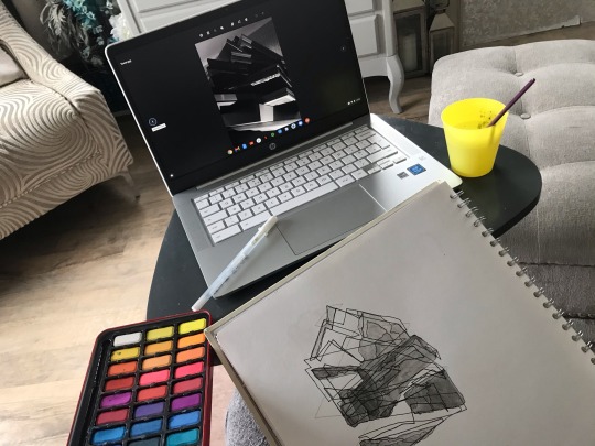
The materials and processes I have used when going through this project have varied between digital manipulation, blind drawings and watercolour. These are all ways of working that I am not familiar with yet wanted to experiment and learn from. When working digitally, it was a great opportunity to start researching into how to use Photopea (Photoshop alternative) and learn some of the basic skills. For example, how to duplicate layers and arrange them. Working with blind drawings is one that I was most confident with, and managed to push that confidence further. It stretched my skills by making me work at a quick pace yet still being deliberate with lines. Using watercolour within my work is a media I have only used a few times so this was an opportunity to experiment with. Using watercolour taught me again to be confident with myself, due to the paint being hard to change once on the page.
Creating some of my pieces wasn’t all a walk in the park, and there were a few problems I faced along the way. My main problem was not knowing how to use some of the tools on Photopea, which meant having to fiddle around until I had found the technique I wanted. Learning to resize images took me a while to figure out, which meant in the end I looked through YouTube to learn how to do this. Another problem I faced was using the coloured watercolours on my blind drawing which I really didn’t like, as I felt it made my work look messy. This was a problem I decided not to fix and to leave as a piece that I had learnt from, to not repeat again.
At first I was creating outcomes that were purely just drawings of my tower I had created. After completing a few I wanted to incorporate my actual image of my tower within the outcome and working digitally was the best way to do this. I wanted to show the outcomes with each other rather than next to each other.
Overall, this project was a great opportunity to learn and to discover how I work as an artist at hone rather than in a studio. Personally I had a lot of struggle with this, so working with new processes and techniques was a great way of pushing myself and finding interest in new ways of working.
0 notes
Text
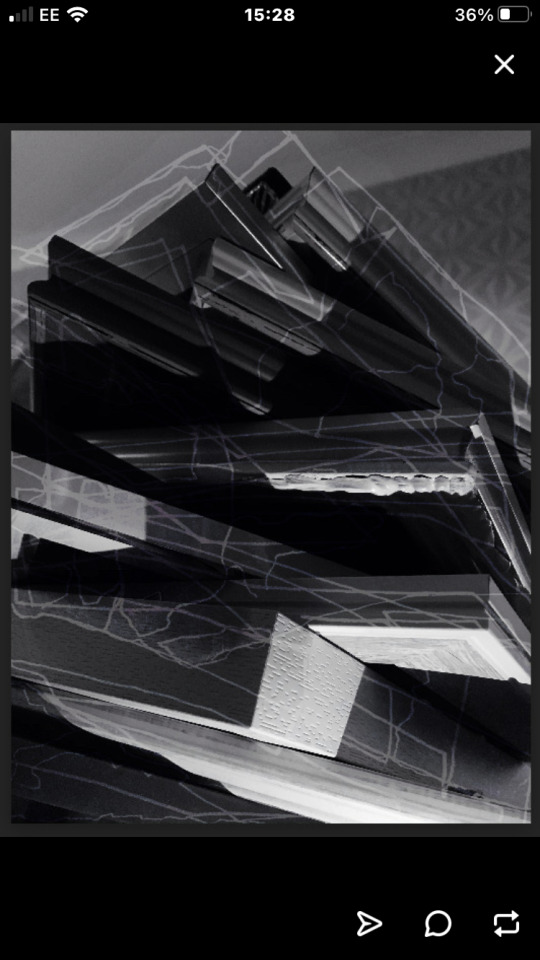
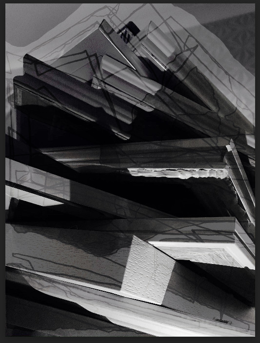
Learning new processes
This first piece was created by layering my monochrome blind drawing on top of my tower image. You can see the outline which is something I had difficulty finding to erase, however it was good to experiment with making images larger (something I recently learnt). The second piece I created once I had altered the settings again and managed to get the lines white to highlight and stand out more on top of the dark background. The second piece is my overall favourite piece as I learnt new techniques and processes throughout.
0 notes
Text
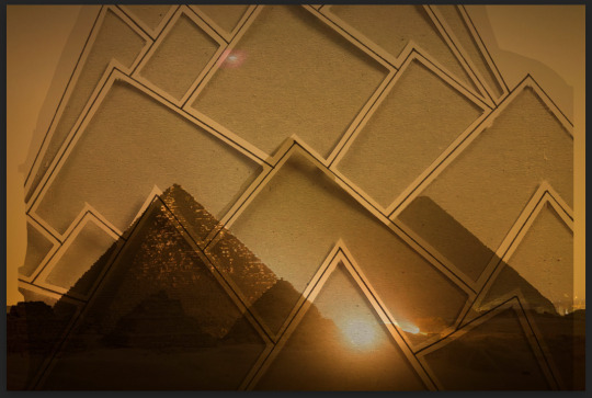
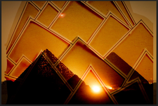
The Pyramids
These pieces were designed from taking an image of the Pyramids and my geometric cut out piece. I layered my piece on top of the image and altered the settings to create different colours and tones. A challenge I faced when creating this work was not knowing how to make images bigger on Photopea, which is why there is an outline, however, after creating this work, it was something I looked into and learnt for future work.
0 notes
Text
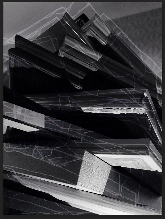
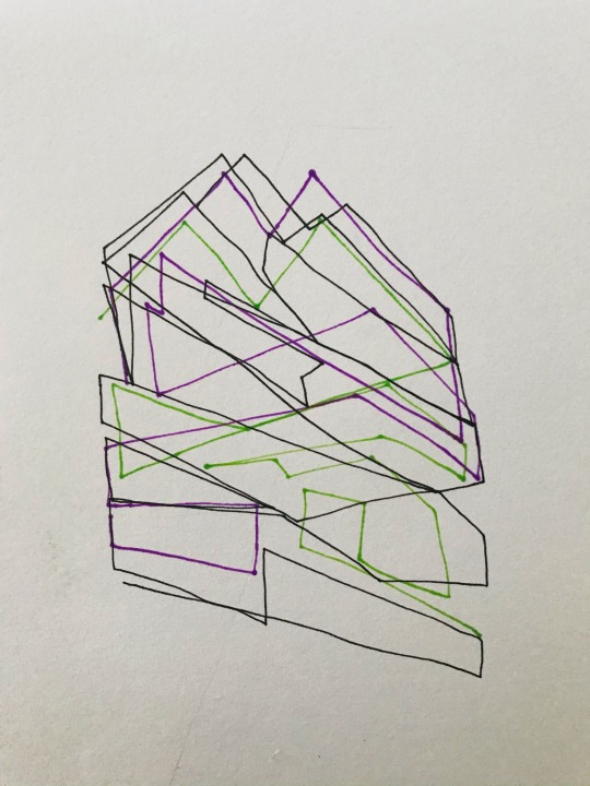
Glitch
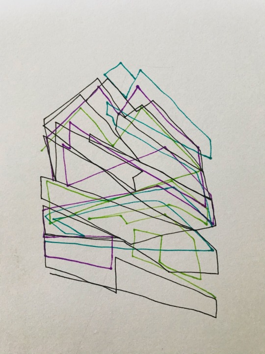
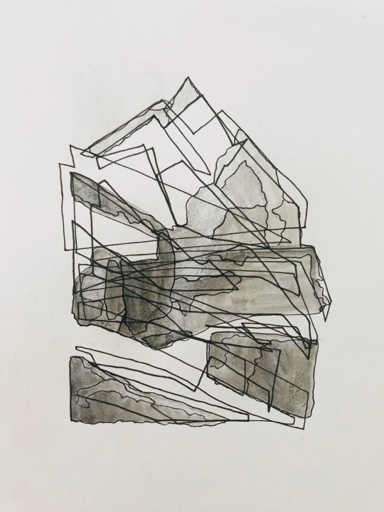
This piece was developed from my monochrome blind drawing, to resemble the idea of architecture and how buildings are built up on layers and foundations. I simply layered the pieces over each other, off-setting it slightly each time, which created the glitch effect. This is also another simple piece to create, however is chaotic to look at because of it being so dense of lines and patterns.

1 note
·
View note
Text
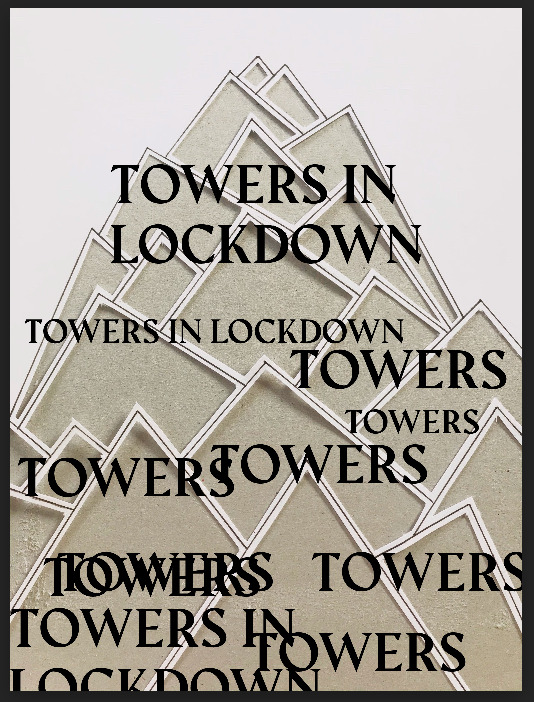
Digital manipulation
The first piece I decided to just add type onto my geometric inspired cut out piece. The black type looks really striking as a layer on top of the off-white background, so I decided to repeat this, changing the size.
The next piece I made was developed from my original piece, however, this time I added some blue and grey spray paint to create the idea of it being a tower with the sky. This is also another very simple piece however, less is more.

0 notes
Text
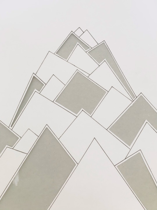
Rachel Whiteread inspired work
This piece I created taking inspiration from Rachel Whiteread who uses geometric shapes within her work. I started by mapping out the shapes I saw in the tower I had made, and then went in with a carving knife, leaving a small gap when cutting out the shapes. Initially I was only going to carve out some of the shapes, however, I decided after that it didn’t look complete without the rest being cut out too. This piece is very simple, however, is one that I will develop further digitally.
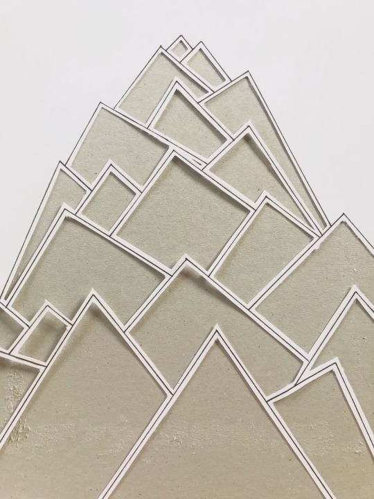
1 note
·
View note
Text
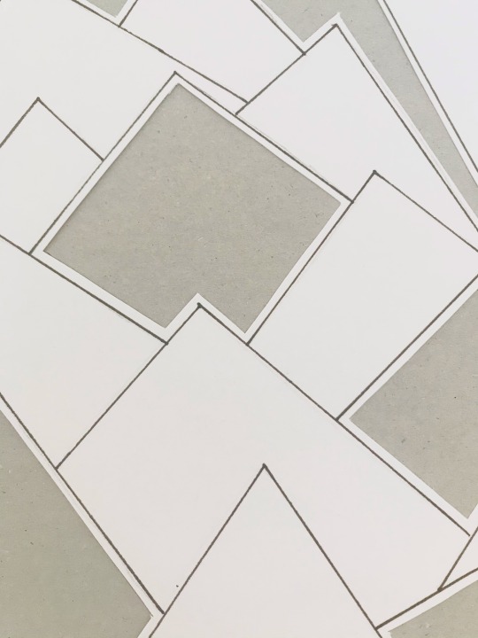
Focusing on layers
This was a quick piece I created by simply layering the squares to show the idea of how the photo frames balanced on each other. I decided to change the colours of the fine liners to make it look as if it were a blueprint map. Blueprints are a very important aspect within architecture and is something I wanted to highlight within my own work. I wanted to make my work more individual to myself and so I decided to not use a ruler and to freehand the lines. This contrasted to the idea of blueprints and how they are specific and neat.
0 notes
Text
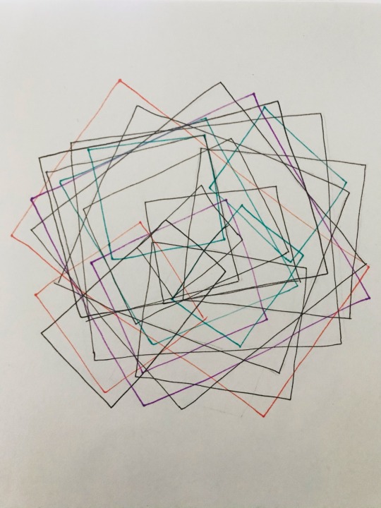
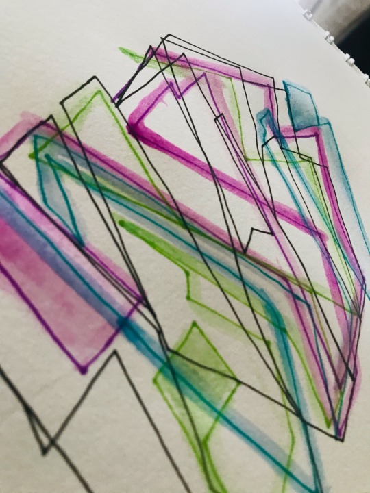
Blind drawing & watercolour (coloured)
This piece was another blind drawing (and continuous line) with watercolour. I near enough repeated the same processes of my last blind drawing, however this time I wanted to add colour. I started of with a black fine liner (0.4) and started to map out the basic outlines of the photo frames. I then repeated this process using purple, green and blue fine liners, focusing on a different part of my tower image with each colour. I then decided that I’d use watercolour along the lines I had drawn instead of the shadows.
I personally think that this piece doesn’t look as striking as the monochrome one, as I think going over the fine liners with watercolour ruined the tidiness of the piece however, it was interesting to experiment with coloured watercolours.

0 notes
Text
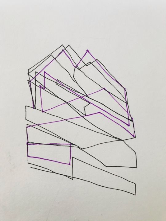
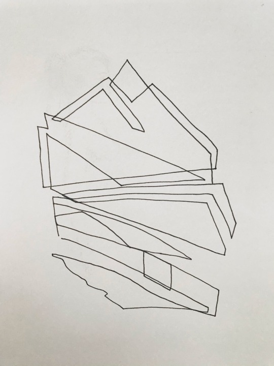
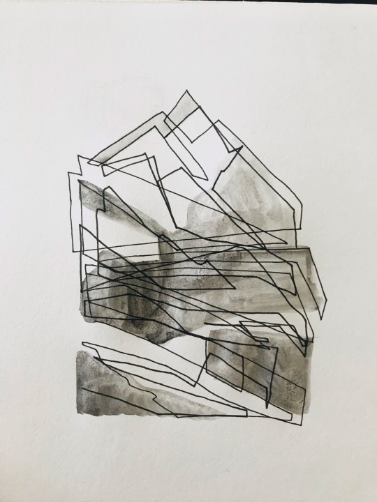
Blind drawing & watercolour
To start of, I wanted to familiarise myself with the shapes within my tower so I created a blind drawing (and continuous line). This helped me to analyse the different patterns in my tower which were made up from shadows and highlights.
I started of using a fine liner (0.4) and mapping out a basic outline of the photo frames. I then went in adding more detail and using a thicker fine liner (0.8). The next process was using watercolour to create the shadows, which meant sticking to black & white. the shading looks out of place, however this is because I replicated the patterns on my pictures onto blind drawings.
This piece is very simple, however, is something I’d like to develop further digitally, and potentially using colour.

1 note
·
View note
Text

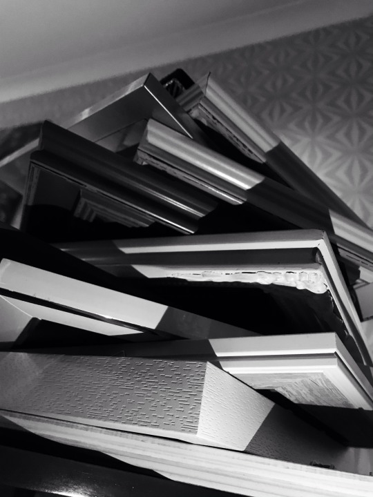
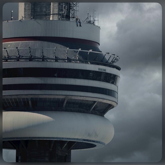
These are the photos I took of my tower I made out of photo frames. I chose to use photoframes as they are similar shapes, and I wanted to try and get the pictures in the photo too. It was hard to achieve this so it will be something I develop further myself.
0 notes
Text
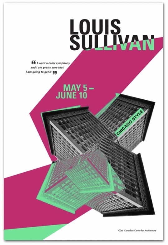
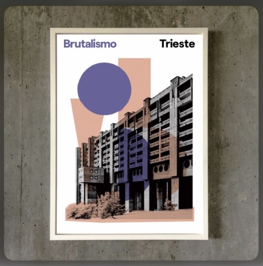
Architecture making an appearance on posters & album covers
5 words to describe: simplistic, layered, prints, shapes, advertisement
5 words to describe: abstract, arrangement, digital, repetition, contrasts
5 words to describe: pop art, layers, shapes, digital, contrasted (colour on b&w)
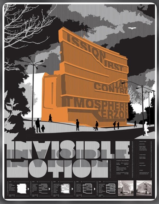
5 words to describe: typography, tones, graphic, threshold, layers

5 words to describe: estate, garage music, blocks, repetition, tinted
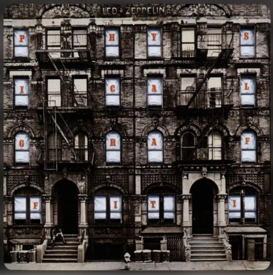
5 words to describe: vintage, front view, layers, ladders, focused
5 words to describe: simplistic, grey, built-up, tall, scale
0 notes
Text
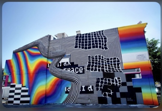
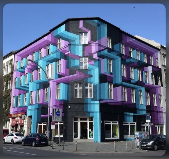
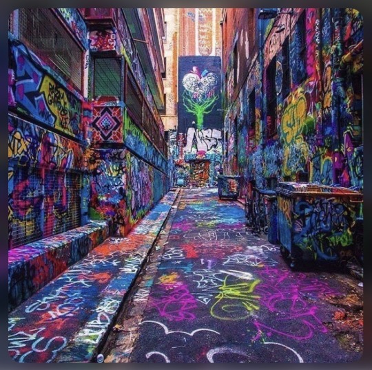
Manipulation of graffiti on architecture
5 words to describe: illusion, colourful, type, contrasted, trippy
5 words to describe: simple colours, shadows, highlights, symmetrical, manipulated
5 words to describe: bright, busy, layered, chaotic, streetart

5 words to describe: simple, 3D, illusion, modern, large scale
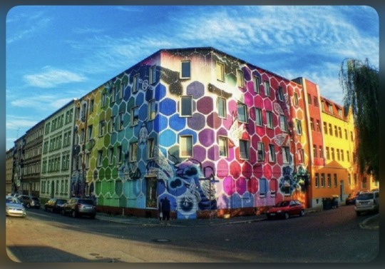
5 words to describe: repetition, patterns, beehive, colour range, modern
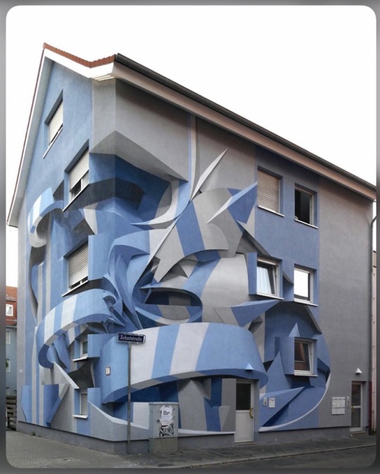
5 words to describe: complex design, 3D, hallucination, manipulated, shading
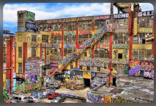
5 words to describe: urban, graffiti, vibrant colours, patterns, type (tags)
0 notes
Text
Towers In Lockdown
My new project is called ‘Towers In Lockdown’ and will contain research on architecture, different artists who base work from buildings, my own 3D structures and developed sketches of my own photography.
Dystopian & futuristic architecture:
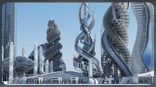
5 words to describe: intertwined, complex, technological, patterned, detailed
5 words to describe: structured, neat, shaped, network, abstract
5 words to describe: layered, fitted, arranged, shapes, repeated

5 words to describe: ordered, height, scale, dominos, plain
0 notes
Text
Creative Industry Research
Here are some examples of jobs within the creative industry:
- Advertising and marketing
- Architecture
- Art and design, including product, graphic and fashion design, artist, and art gallery curator
- Crafts, for example ceramic pottery maker, furniture maker or tailor
- Photography and video
- Editorial careers in publishing
- Journalism, depending which area you work in
Jobs I am interested in:
- Tattooing
- Art therapy
- Dancing
How to become a tattoo artist:
Learn how to draw
- Practice drawing on your own
- Study the work of famous tattoo artists
- Explore different art forms
Get an art education
- Take art classes
- Study art at college
- Get a degree in art
Establish basic design skills and knowledge
- Learn the Basic Elements of Graphic Design
- Learn the Principles of Graphic Design
Build a Portfolio
- Create a professional portfolio
- Include the right work
- Avoid common mistakes when creating your portfolio
- Create an engaging portfolio
Work with an established tattoo artist
- What to look for in a mentor
- How to approach a shop about an apprenticeship
- The cost of an apprenticeship
- Understanding tattoo apprentice contracts
Complete an apprenticeship and learn the trade
- A large upfront investment
- To learn how to design tattoos
- To learn how to operate a tattoo machine and how to work with ink
- To learn hygienic work practices
- To learn professional business skills and customer service
- To work for free for at least a year
Obtain additional pre-license certification and training
- A blood borne pathogen certification
- Training on skin diseases, communicable diseases, and disease prevention
Get licensed
- Check your states requirements
- Apply for licensure
Buy your own tattoo equipment
- The basic equipment every tattoo artist needs
Start your career
- Apply at a tattoo shop
- Open your own tattoo studio
0 notes
Text
Little Black Book & FINAL EVALUATION

EVALUATION:
Introduction
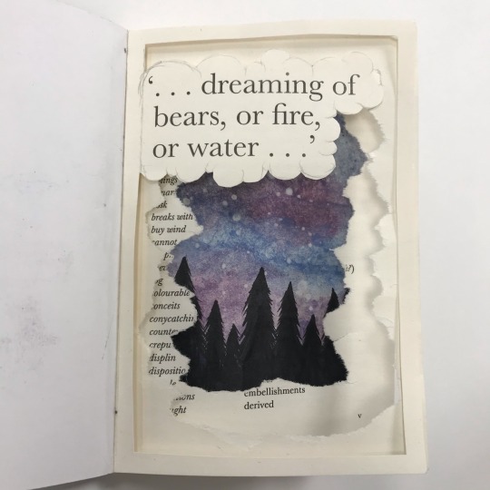
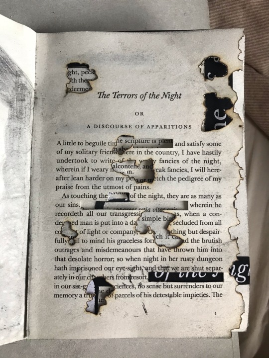
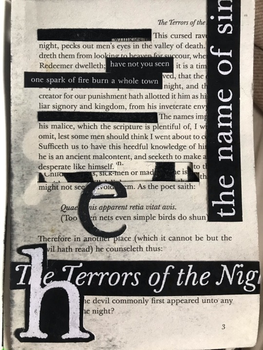
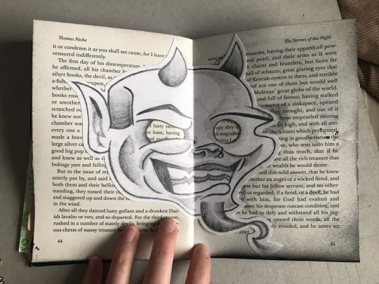
Our recent project was based on the topic of ‘Black Books & Black Holes’, with two final outcomes (one being my black book, and the other being my 2 boards). Unlike the last project, this time we had a set theme already which at first seemed more restricted, however, began to be a lot more interpretational. All of my work and my final outcomes have been based on the idea of superstition, dreaming and night terrors. This project I decided to explore more with different resources of research by taking my own photography and looking into new artists I had found, and was another opportunity for me to learn and experiment with new ways of working.
How I generated my ideas (methods)
From my last project, I learnt that using mind maps was a really effective way to plan out my project, as it gave myself a good opportunity to broaden and expand my ideas. It’s a good reference for both myself and the audience, to use to show links between research and the work I produced. I sticked to the theme based on the Elizabethan period and the superstitions on dreaming throughout, however, I gradually explored the different
The progression of ideas & how they developed
Some ideas were hard to generate, so it took me some time develop them, however, through experimentation I began to change and add to my work. An example of this is when creating my triangles, which at first, I found difficult to add detailed patterns and type to but through practice, began to find much easier and could freehand onto. Most pieces of work I didn’t have a visual for the final outcome and just wanted to see where experimentation would lead to, and I found that some of my strongest pieces of work are from doing this.
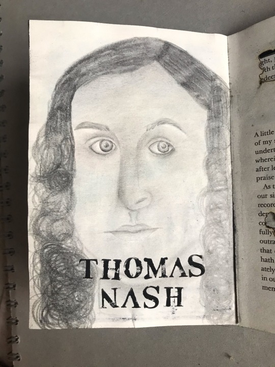
3 artists (inspiration)
Artist research was an extremely important part within this project and the three that inspired me the most were Luke Dixon, Peter Tunney & Lauren Dicioccio. Luke Dixon works with portraiture which is very realistic, however he contrasts this by creating a cartoon and pop-art style approach. His work majorly influenced my own because of his unique style which inspired me to be more analytical of details of the face, especially looking at the different tones and shades. Peter Tunney's work inspired me to look more deeply into the meaning and the messages work portrays. His work is contextual which was something I wanted to reflect within my own, which is why I focussed a lot on the Elizabethan aspect of my book. Lauren Dicioccio inspired me to focus on the different colours in the complexion of skin and hair. She focused on the different shades and tones in the face which was something I experimented with in my final outcomes and also meant that I learnt the new process of using thread.
How effective was research?
As well as researching artists, I also had to research into new techniques and processes I was being taught, so I could have a better understanding of how they work. I also completed my own research my taking photos of different things linked to my project, which helped me get into the habit of always being aware of anything resembling my topic. I enjoyed doing my own research as it was a chance to make it individual to me and my perspective of art. It also meant I had more resources to experiment with when developing my work as I used some images for blind drawings.
What new materials, processes & techniques I learnt
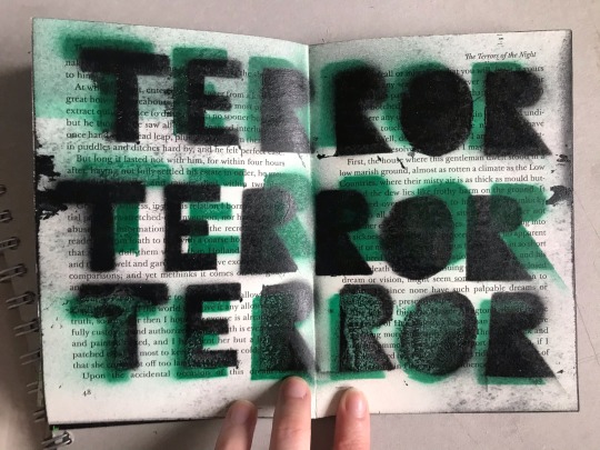
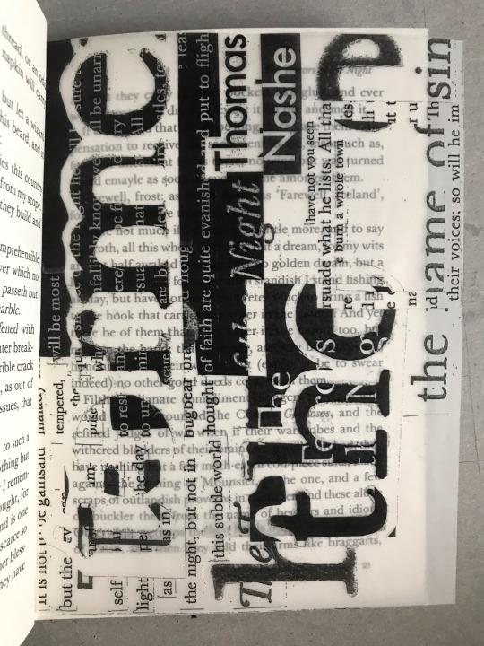
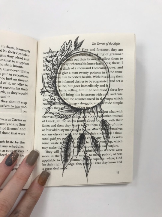
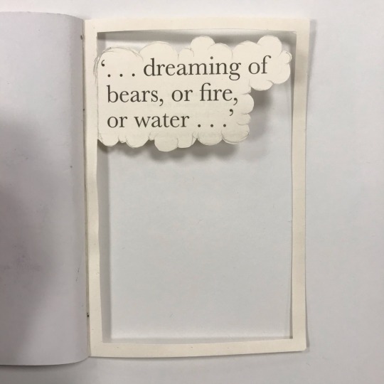
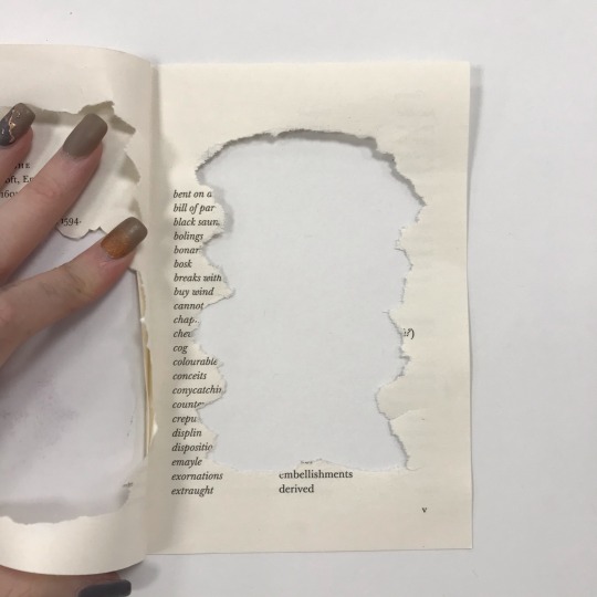
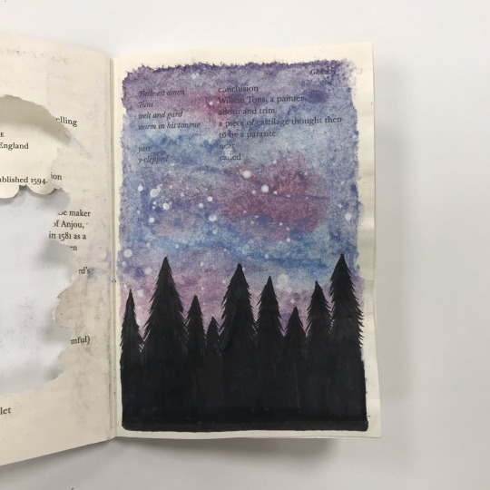
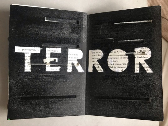
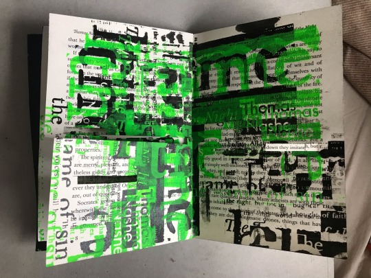
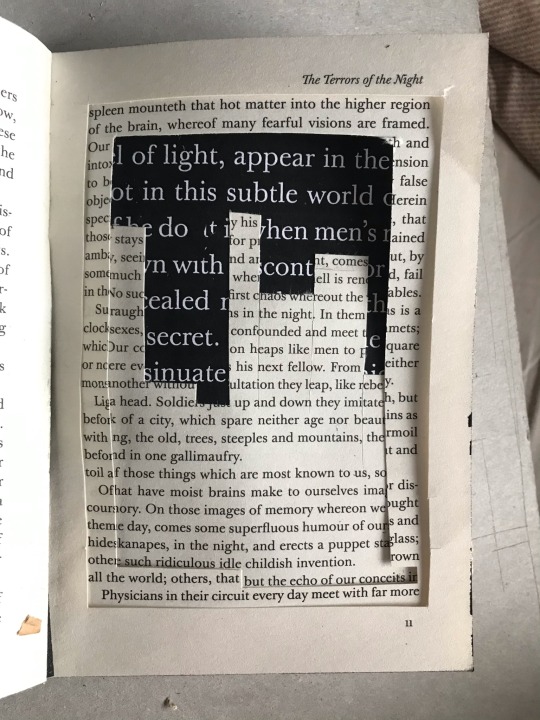
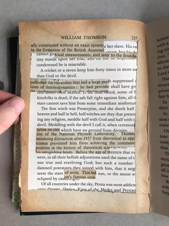
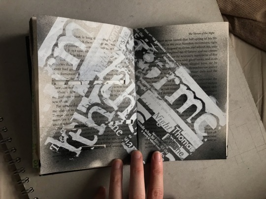
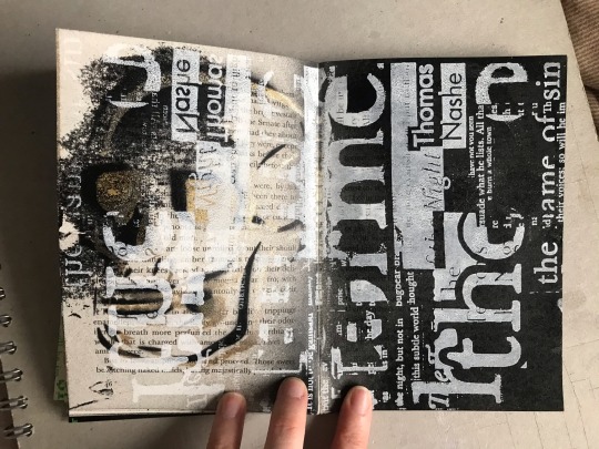
I also learnt how to work with new materials, processes and techniques. One new process I learnt was creating intaglio prints, which I had never done before. Although I didn’t like the process it still gave me experience with using new machinery and materials, which could be useful in the future. I also learnt how to use spray paints for the first time which was my favourite new technique I learnt. Graffiti work is something I am passionate about and plan to use in future projects as I also discovered I was good at it (as well as creating templates). However, the most experimented new process I learnt was working into a book, which was my final outcome. Working with new materials I could experiment on every page in my book using thread, cutting text out, sticking it back in etc. Overall, my book was purely experimenting with these techniques, materials and processes.
Thursday drawing workshops
Thursday drawing workshops was where I learnt the most, due to being pushed and challenged to not only execute a process, but also produce a large amount of work. I taught myself how to work rapidly and this was shown when creating the graphite pieces. The workshops also were a chance to experiment with blind drawings which turned out to be very strong outcomes and something I wanted to display in my portfolio.
Overall message, the audience, where would I place it? Why?
The overall message of my work is representative of superstitions, dreaming and night terrors in the Elizabethan period. I created work that explores the idea of dreaming nightmares and resembles that feeling of dreaming and reality seeming so ‘out of the ordinary’. If I could place my work anywhere, I would put it in a museum due to it being about Elizabethans. I would also use my work as a form of therapy for people suffering from night terrors, to express their emotions, meaning the audience would be for anyone.
10 words
If I had 10 words to describe my work they would be: emotional, provoking, abstract, contextual, layered, detailed, symbolic, expressive, representative and textured.
0 notes
Text
Book Art
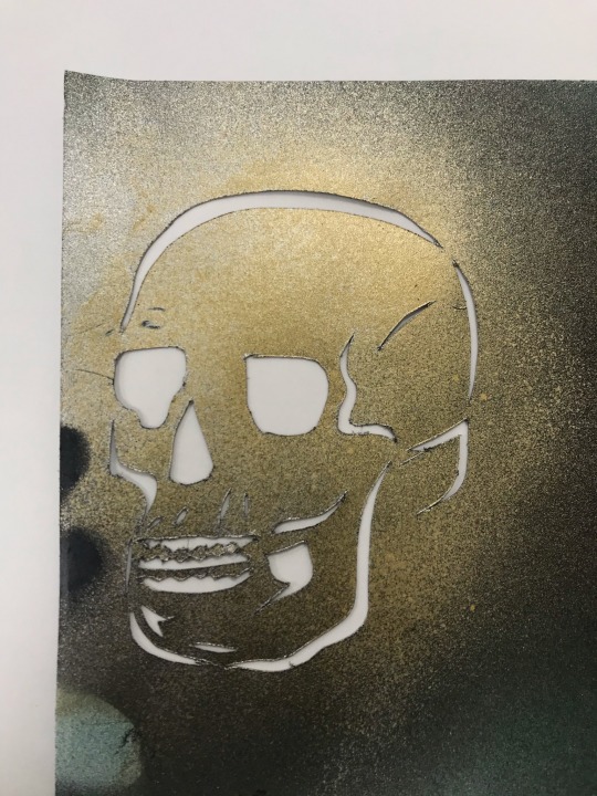
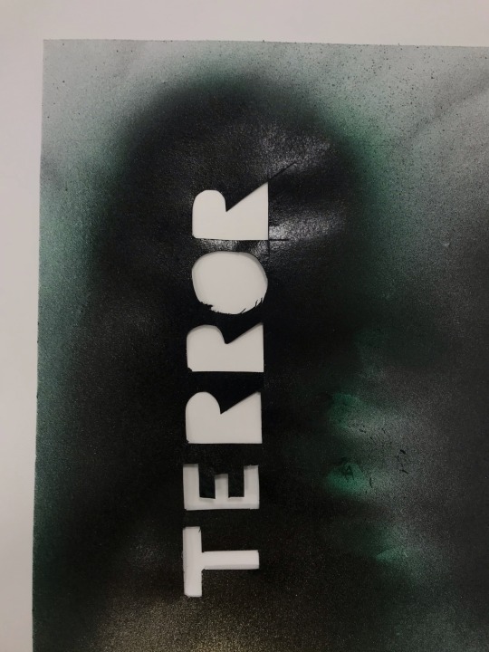
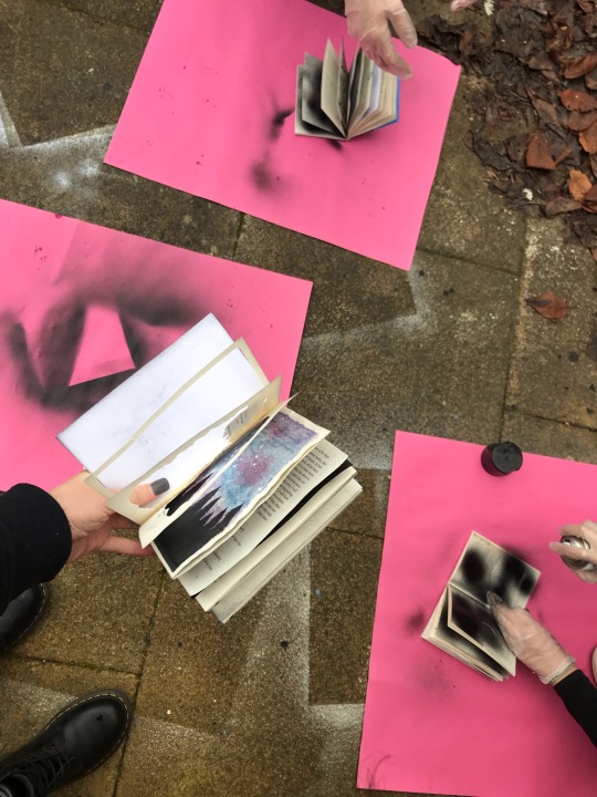
Using my own templates to spray paint designs onto my black book. This proccess worked well and is something I will manipulate more with my black book.
DAILY REFLECTION: Today’s session was my first time ever spray painting which I really had fun experimenting with. Spray painting has always been something I have wanted to try and today I even got to produce my own stencils to work with. This is a style I would like to work with in future projects.
0 notes