lauramarbm
The Wanderer
Fashion Degree in Fashion & Clothing Technology .
DESIGN DEVELOPMENT
131 posts
Don't wanna be here? Send us removal request.
Last Seen Blogs

hiddlepiddlewiddle
Lots of Loki Love

loan247
loan247

valkyrie001
VALKYR13

lovelyhellspawnzine
Lovely Hellspawn Zine

tiredandlostinthewoods
what are you doing in my house
Photo
PINK IS THE FUTURE
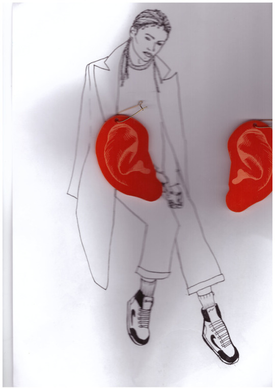
Here i scanned my two laser cut ears and one of my illustrations which i portrayed a very masculine woman giving it a unisex feel that I initially was going for.
1 note
·
View note
Photo
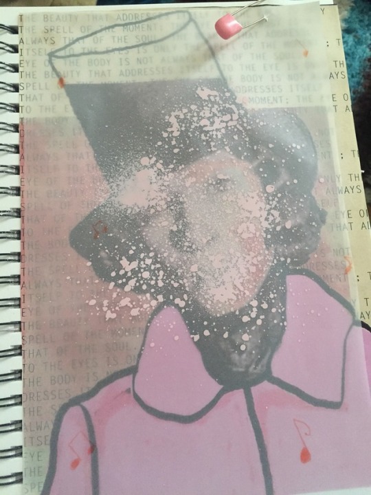
Here i tried to translate George Sand in a more positive vibe, and intimate, i thought it was interesting to work with collage and to use baby pins , I thought it was a good way to develop a promotional strategy.
0 notes
Photo
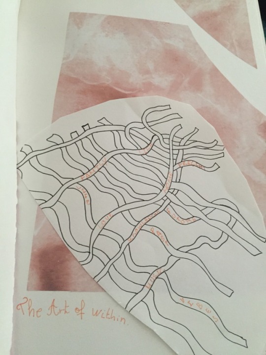
I included this image in my sketchbook because i thought it was very abstract and stuck to the fashion language that I am going for. It represents the inner feelings and the inner soul which no one can never have. It is not tangible . And i thought it was kind of the message I wanted to give to my clients. The beauty is within. Perfect for a campaign and a promotional strategy.
0 notes
Photo
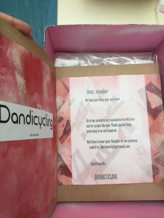
In the packaging i had an idea to elaborate a small little thank you card for my clients for being loyal to our fashion language. I think it is a good gesture and a excelent form of promotional strategy to make the customer feel invited and part of dandicycling tribe. I used cad skills and some analogue photos as the background to identify what the brand is about and what the client has purchased. This form of promotional strategy is very important to not only increase loyalty in your customers but to target new pen portraits.
0 notes
Photo
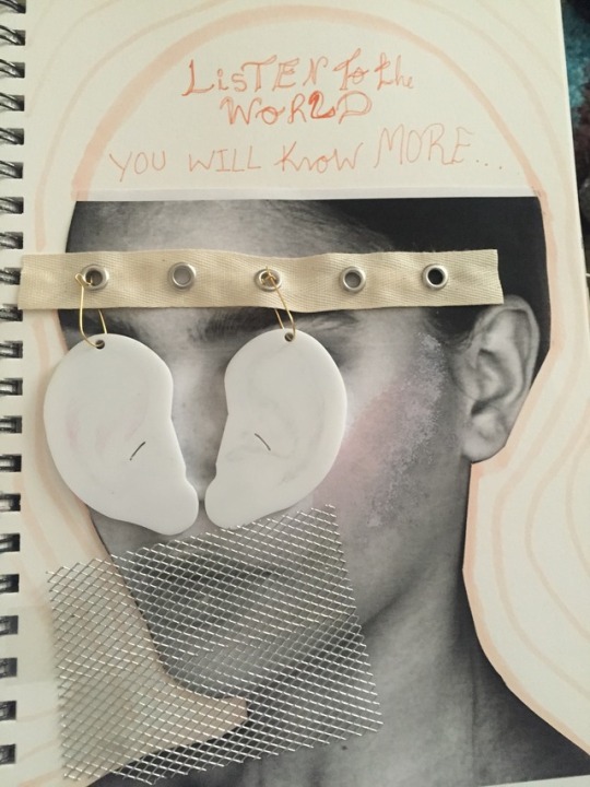
Here is an image i elaborated thinking of the importance listening is nowadays to learn more things and gain more experience. I included some of the protypes of lazer cutting items, positioning them on to the eyes. Trying to translate it as , listening is more important than judging. And the metallic sheet for the mouth cause it looks very strong and visually harsh. I thought this image worked very well with my promotional strategy, I included a background with pink waves that look like the shakra waves flowing outside the human’s body while listening. This strategic plan may increase the interest of new customers.
1 note
·
View note
Photo
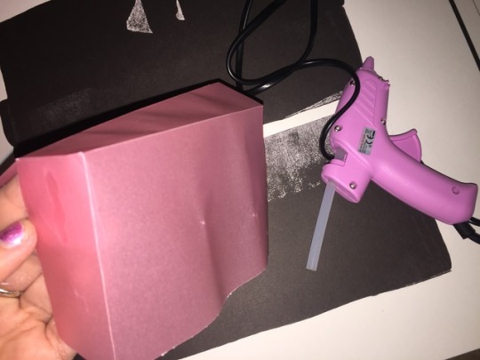

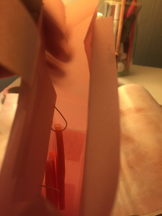
Developing accessories packaging was very difficult, i was trying to find a type of material that wouldn’t be transparent but something more see through, giving it an intimate feeling. Matching with the dandicycling concept which is all about inner beauty. And i also thought it would be interesting to reflect it and translate it into a packaging form. Ears are one of our body features we are the ones in control of what we listen or hear. I thought it was a beautiful way to translate it and put it into a product. Everything i used was plastic paper, a cutter, a product pattern to guide me to get a more symmetrical shape and a glue gun which it made the product more resistant. The disadvantage is due to the transparency you can observer bits of the glue. However if I were economically more prepared the product would have a better finish. The earrings are hanging of the box which I managed to adapt with mesh tape and a piece of pink cardboard so they look like they are flowing in the box. Making it look more attractive for my promotional strategy and for my target market.
0 notes
Photo
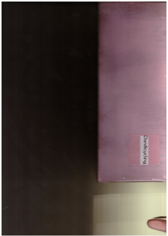
The packaging colour result. I am very satisfied and i think it matches perfectly my promotional strategy because of its faded and abstract feeling which will fit timelessly to my market target´s eye.
0 notes
Photo
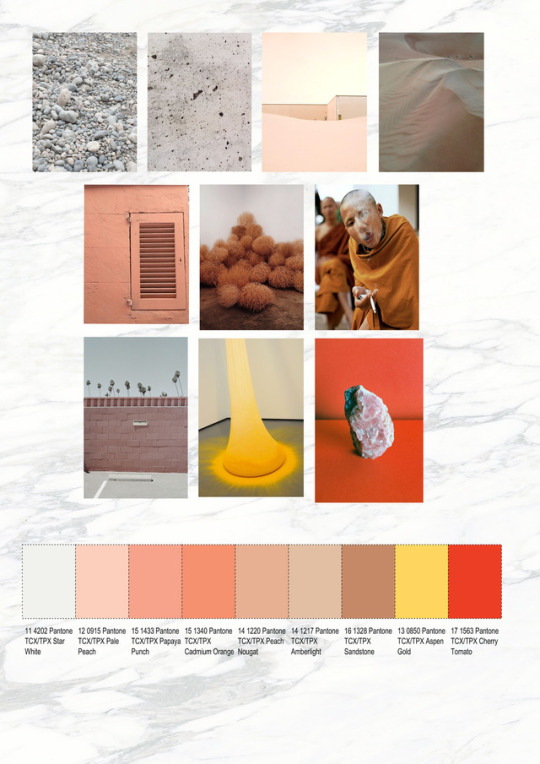
Initially these were the colours I picked to fit my packaging for my promotional strategy, I tried to keep inbetween the pinks and the white. I thought the browns, yellow and red didn´t really fit with my fashion language or my promotional strategy plan and it could confuse my market target.
0 notes
Photo

I created this moodboard because during the process, i uploaded some questions on social media about how people feel when they see the colour pink, and people in this age range replied and was very interactive, which kind of made me figure out , the clients that would actually attract more would look like the people above. They are all musicians and artist , multi creatives and recognized around the globe which i thought it was interesting fact because they are very humble and straight forward with their style and I feel very inspired by their style of life and their work. The first artist is Kalis Uchis, she is a colombian musician and lives in LA, she rocks a 50´s new look , it´s very random and fashionable, her face gives a bit of a masculine sense to me which I thought and feel inspired by. The second photo is Princess nokia, she is from Queens NY, and she is recognized globally due to her rap and her fashion language, she embraces the tomboy 90´s look and she is also into spirituality creating me a very inspirational field for me and thousands of people around the globe through out her social media, The third photo is tyler the creator he comes across as dumb childish, but he is very emotionally intelligent and you can tell by contemplating his work, he is very deep and colourfull which society these days could classify him as a very feminine guy, and I am very inspired byy his looks , his music, and all of his promotional strategy behind what he sells. I also think these people would be the people interested in my work and If i ever sent them a T- shirt on social media I think they could promote Dandicycling and it could be a good form to elaborate free marketing for the promotional strategic plan that I have.
0 notes
Photo
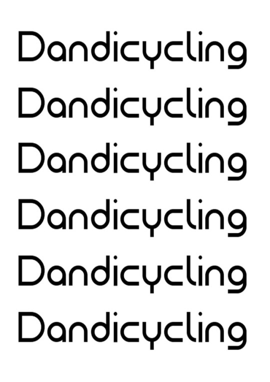
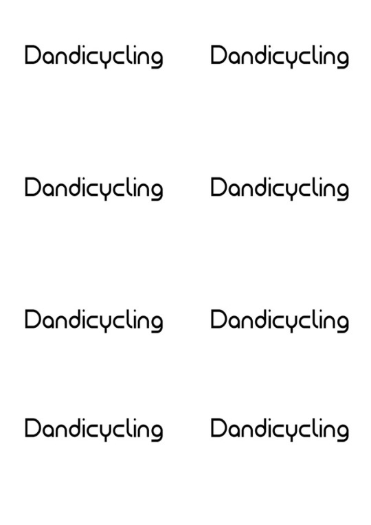
Here is the logo which i used on transfer paper and i will be applying to my timeless T-shirts, I think it will be interesting to use a clear image in a A3 scale. I will be printing them and heat pressing them , one of the promotional strategies is to create awareness, and i thought it would be a good strategy to use this logo on the front of a T- Shirt , so when my target customer buys my product they can walk around representing Dandicycling´s language, and people might like the design and they will might go online or even ask personally in order to find more information about the brand which i thought it could be a very strong promotional strategy and an easy way to make the brand more global.
0 notes
Photo
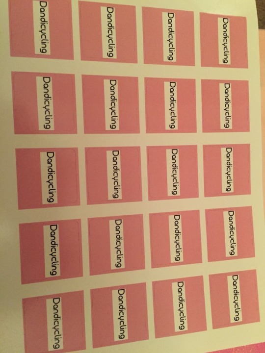
These two images are my logos which are printed on sticker paper, the above one in pink were manufactured in a printing shop so they look more professional and floaty . It flows perfectly with my promotional strategy and my target market due its colour , texture, and it sticks perfectly. The inferior layout of stickers were home made in the printer of my home which the quality decreased, and they were mat looking. In my opinion the pink stickers would go perfectly for boxes and packaging that i would use to transport so if they get wet there won´t be a problem due to their glossy texture. In the other hand the second white layout is more for inner packaging, such as, inside of the boxes, or in a invitation, or some kind of product that won´t be affected by the climate. I will try and experiment further in the future on to the products I will be manufacturing for my promotional strategy. I think the advantage of both is that they both have the Dandicycling logo which it looks timeless and that is very attractive for new customers and buyers. Reflective for my promotional strategy.
0 notes
Photo
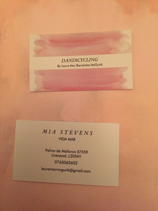
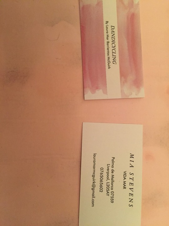
To elaborate a strong potential image for a promotional strategy it is important to have business cards with you at all times, you never know who you meet, who knows maybe one day you can meet an investor or a local boutique that sells multi brands and will be interested in buying your garments as part as their fashion language for the shop. The tools i used to create this card was photoshop and some of my handmade paintings which I lost in the process, but I managed to scan some of the paintings in time and with the help of photoshop and the opacity tool it blended and looked very neat and professional. Once i was content with the results I sent the product to print. In the process of sending I had a little trouble with the printing on-line shop , they actually didn´t write everything I wanted on the layout I designed for my cards. But unfortunately the arrived one day before our deadline so I couldn´t do much about it. But I´m content with the layout the colors and the texture of the card. I have a good feeling that Dandicycling customers will really love them. Also they fit perfectly with the promotional strategy and it could attract new customers to look it up.
0 notes
Photo
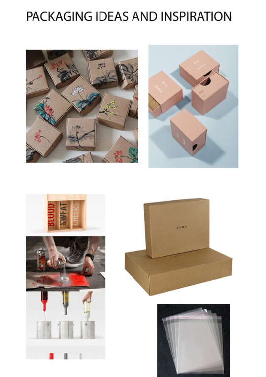
PACKAGING INSPIRATION AND IDEAS MOODBOARD
Here are a few examples and inspiration packaging for my long sleeve t-shirt of George Sand. I came across while I was collecting ideas for my final packaging. The first image appears to have hand made which gave me a great idea to make it more artisan looking for mine. From there I started to look at brands like Acne studios that also worked with pink, and I also got plenty of inspiration, initially i was going for a more mat and professional look, but as I went to several printing shops the cost wasn´t as effective so I thought I gathered a more DIY idea. I came across with the fourth image where the artist involves spray painting and I really thought it was interesting because the product could look professionally elaborated if I used the technique carefully and abstract, the fifth box is a plain brown box from Zara which they use to deliver online sales. I quite like the texture of it and I thought it would be more cost effective for my project.Finally I also thought, that if my product will be transported it should be protected due to the weather circumstances, so I looked up on online shops if I could find any type of water proof packaging bags and I came across with these ones. But I found some with health and safety writing which i thought it looked more professional for my promotional strategy.
https://es.pinterest.com/search/pins/?q=earring%20packaging&rs=typed&term_meta[]=earring%7Ctyped&term_meta[]=packaging%7Ctyped
0 notes
Photo

By seeking embroidery techniques on-line I came across on Pinterest's many ways to elaborate a clean and simple design. At first I tried to do hand embroidery on to the textile but it didn´t look as professional as the finish that the machine gave. I want it to give it a slightly commercial look in a computerized form. And looking it on a promotional strategy level , the value goes up due it´s finish adapting itself to my market target.
0 notes
Video
youtube
I really liked this song here are the lyrics to it.
[Verse 1]
Just a woman with ass deluxe
A girl with more than a little
Big curves, big bones, honey skin tone
So clap, clap for this
I'm the one that you probably miss
I'm a lot to hold onto (oh yeah she is)
It came to me that
When I was young, I couldn't understand
What I was meant to be
Now I don't shy away
I turned out okay
And we all don't need one way to look good
[Chorus]
I got body, no matter what I wear
I got body, no matter what I wear
I got body, no matter what I wear
I got body
[Verse 2]
Just a woman who's made to dance
A girl who shakes when she giggles
Gotta love all the people that I came from
So clap, clap for this
I'm the one that you notice
I'm a lot to get into (oh yeah she is)
They used to stare back
Lookin' at me, they couldn't handle it
That I was unique
Now I don't shy away
I turned out okay
And we all don't need one way to look good
[Chorus]
I got body, no matter what I wear
I got body, no matter what I wear
I got body, no matter what I wear
I got body
[Bridge]
If we don't love our bodies, trust ourselves
Just cause we hurt, we should be someone else
Don't shy away
You'll turn out okay
And we all don't need one way
[Chorus]
I got body, no matter what I wear
I got body, no matter what I wear
I got body, no matter what I wear
I got body
The fact she talks about her body no matter what she wears is a beautiful way to portray the inner beauty. I really felt inspired for my process listening to this song . I also think my target customer would listen to this and i think it would stick perfectly in a fashion film for dandicycling.
0 notes
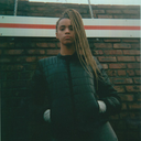
Photo
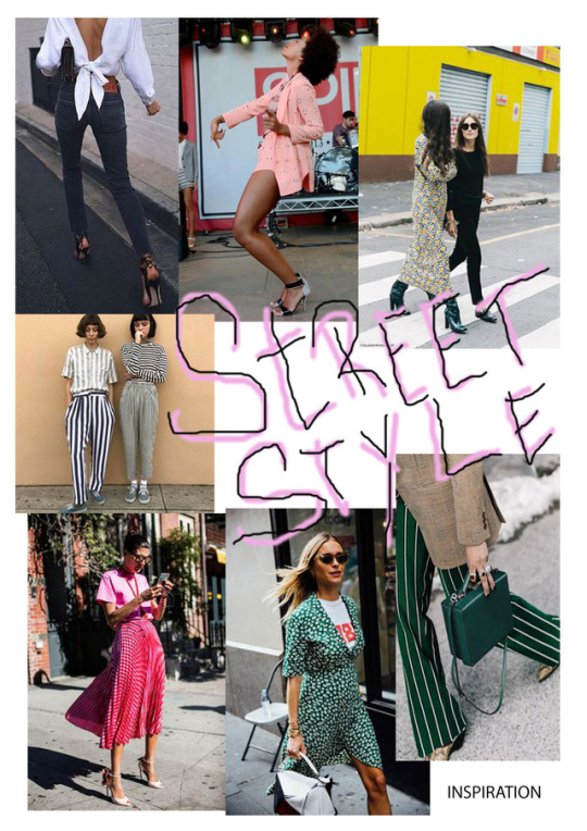
Heres a street style inspiration which i felt very inspired due to their textures, postures, location, accessories, and how they came across, i also think it could be a target customer for dandicycling.
1 note
·
View note