
laurakazmeier
Laura Kazmeier Design
Work and process documented as part of BA Visual Communication at the Arts University Bournemouth
780 posts
Don't wanna be here? Send us removal request.
Last Seen Blogs

kyleomf-blog
bruh

shesilk23-blog
Untitled
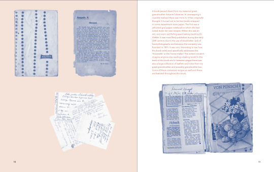
monsterofficerelatedaskthec-blog
Ask the chef
i-am-fat-trying-to-be-thin
Trying My Best

gottame-visual-graphic-design
GottaMe Design
Text
Submission
I have added a video flip through of my book to the submission to allow a better sense of the actual look and feel and length of the book since it won’t be seen in person.
Issuu publications of my final book, process book for easier viewing:
https://issuu.com/laurakazmeier/docs/compressedissuu
https://issuu.com/laurakazmeier/docs/process_book_isuu
0 notes
Text
Self Promotion
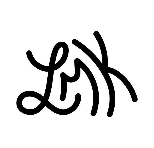
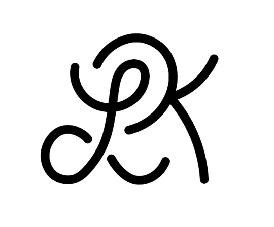
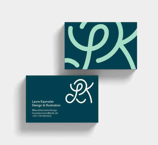
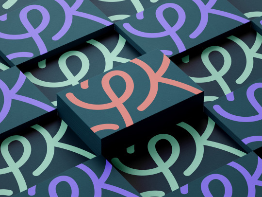
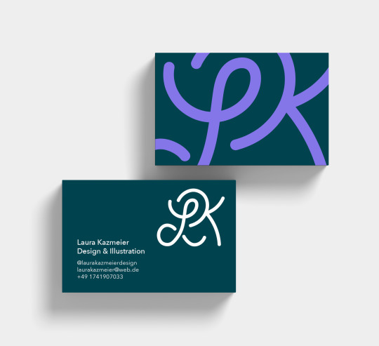
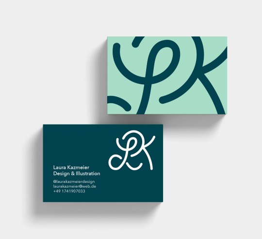
In terms of my self promotion I looked back at my logo from last year. I liked how fun it was but the M for my middle name didn’t really make sense as no one knows me by my middle name and my name is long enough as it is. Therefore I tried a few different options, ending up with just an L K logo that also feels fun and friendly. I wanted my self promotion to show that I love to use colour, that I have an illustrative side and that I am adaptable, able to create the work that the client needs. I think the energetic final logo and use of colour and variety in my business cards achieves that. Overall, I like that it feels fun but still elegant and serious. I always love when people or companies have a slightly varied business cards and wanted to do the same. Some mockups below help to showcase these better. I plan for the business cards to be printed on matte and slightly textured card, possibly I could even use the extract moon paper again.
In terms of my portfolio, I took into consideration some of Mark’s suggestions such as reducing most projects to one slide, highlighting the animal competition winning project and other illustration projects which I will continue to work on in the future. He also gave me the useful suggested to repeat my details on the last slide.
Original Logo:
Options:

New Logo
Mockups

0 notes
Text
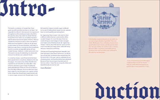
Evaluation
Overall, this unit was an incredible learning experience for me and I am very happy with the final outcome. I feel I have been able to improve my skills in editorial and hand-lettering massively and have succeeded in creating something that meets a demand, is meaningful to me and my family, and honours my ancestors. Apart from making process books in the past, where the binding method was clear, this entire process of making such a long book with this amount of content was new to me. While it might have been smarter to do something I was more practiced in, we have always been told to use the facilities and experiment as much as possible whilst still in the safety of university and this is what I aimed to do. I’m very happy that I decided to make a printed piece and finally make use of the bindery again, as it is such a rewarding feeling to have a physical final piece and I really enjoyed the process. In terms of software, it has also been a learning experience. I’ve become much more practiced in lettering on Photoshop, as well as the manipulation of imagery - I had never monotoned or halftone images before. In addition, I’ve kept up my skills in InDesign, Illustrator and Lightroom.
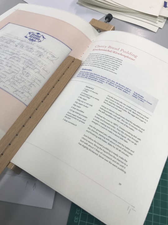
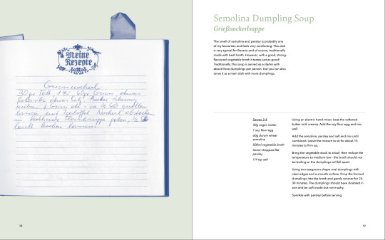
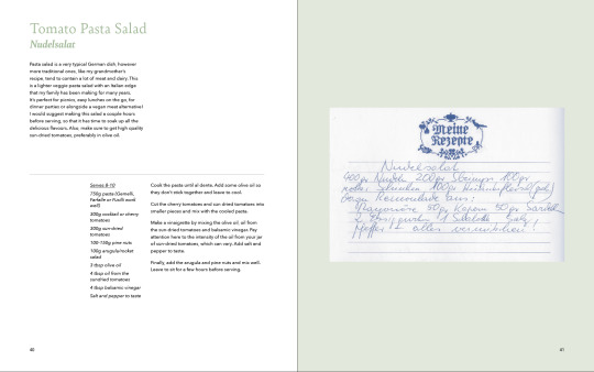
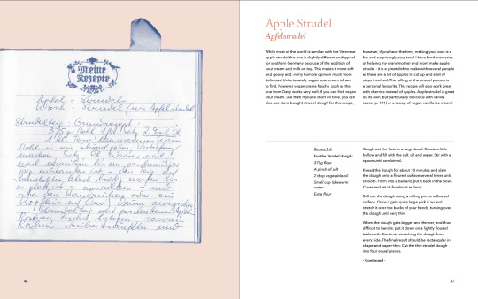
My design decisions during this project were largely influenced by research into current cookbook trends, my own primary research, and contextual research on the rise of veganism. This made me want to show a different side of German cuisine, one not dominated by meat and beer, but lighter and even vegan! German cuisine is not very well represented in the UK and there is a rise in cookbooks for lesser-known cuisines. The demand for vegan products and cookbooks was also clear in my research, and would ensure a large potential audience for my book. Furthermore, research into a wide variety of cookbooks and editorial design helped me to create successful layouts and typographic treatment in my book. Contemporary examples such as Heart & Parcel or Cook This Book were very inspiring in terms of their use of bright colour, particularly to help the viewer navigate through the book. Looking at a wide variety of cookbooks also helped me to formulate my recipes properly, which was especially important as I was translating them all and the originals from my grandmother were not at all written out like professional recipes. Finally, research into archives and projects using archival materials, was an unexpected but very useful route that strongly influenced my imagery in the book.
Experimentation was another large factor in influencing my design decisions such as colour choices, type and binding method. After considering and trialling inserts, which would have required sing stitch binding, I decided against them, instead using kettle stich to allow the book to lay flat. Seeing the final printed book, I definitely feel I have made the right decision as it looks great and is very useful. Moreover, I like how the binding is protected from the outside, however the visibility of the handmade stitching suggests how I have brought together these recipes form the past, from different books and relatives to create something new. Experimentation and research were also important in deciding on imagery for my book. After initial research, I chose to stay away from food photography, as this is an art in itself. It was also a nice link to the old books which contained little or no photography or even illustration due to the time in which they were published. Trials with illustration and other image-making later made me decide to just focus on the manipulated scans, half-toned photos of my grandmother’s kitchenware and hand-lettering. I didn't want too many elements and wanted them to feel cohesive.
Furthermore, my design decisions were strongly driven by my own hopes for the book - I wanted to create something contemporary and fun that would honour my ancestors and these beautiful artefacts. I wanted it to be practical and to celebrate my culture. Being away from Germany for the past four years has made me much more appreciative of German food and made me notice the beauty of diverse and unique cultural traditions surrounding food. Being very personally attached to the content made the project more difficult in part, but I think it also helped to ensure the outcome was really how I wanted it to be. For example, for this reason, I chose to showcase a large amount of recipes spanning several categories, and made sure all recipes would actually work!
Based on the idea of ‘veganising’ my family recipes, I allowed the theme of ‘taking the old and making it new’ to serve as a basis for design decisions as well. I feel this really helped me to truly make the book feel contemporary even whilst showing old material. I think the theme is successfully reflected in many aspects of the final book. From the content, to the manipulation of old imagery, to the way I’ve set the black-letter font and the colours I’ve used, and finally in the materiality of the book. This paper also reflected my desire to make my work as sustainable as possible. Finally, I think I have successfully created a celebration of my culture and of the idea of passing things down through the hand-lettered elements, addition of my own stories and context as well as the way I have treated and showcased the scans. I have given the scans room to be admired in the book and I feel they get enough space.
Feedback in tutorials was very valuable throughout the unit in giving me another perspective on my work. I think I took feedback well and took suggestions into consideration or trialled them. However, I did make sure to make all the final decisions myself, remembering that it was my own project at the end of the day and I needed to be happy with the outcome. I also received valuable resources for research and making, such as Plotterfun, which helped me to develop my work.
Overall, I feel I managed my time well. I was always well-prepared for tutorials and managed to present new work and development each week. I left time for experimentation with and refinement of my final outcome, getting it printed and bound, as well as documenting it in several ways to make it fit for digital presentation. I did have some trouble focusing on my final direction and got too caught up in different areas of research and experimentation earlier on in the project. Because the books I was working with were rich, I wanted to explore too many aspects of them. I do think this allowed me to create a broad body of work and I was able to learn from this research and experimentation and use aspects of it in the final piece.
Furthermore, delays due to Covid, issues with my paper order and printing problems set me back time-wise, but I think I dealt with these circumstances well. I also definitely underestimated how long compiling and writing out all the recipes would be, as well as recipe testing. I really needed to test and make a lot of the recipes to see for example, how many people they serve or get exact measurements, as my grandmother often didn’t add these to the recipes. I also didn’t want to make a cookbook where I wasn’t sure the recipes would work - I wanted to make something practical and have it be fitting for a real world market. Though I underestimated these aspects of the project time-wise, I don’t think I could have planned for it much better given the fact I had never undertaken a project like this before and never one of this size. I definitely haven’t ever worked with this amount of content - writing, manipulated imagery and hand lettering. It was a great learning experience and I think gave me a taste of what it would be like to work on a book like this in the real world. It has also given me an huge amount of respect for people who make cookbooks!
Overall, I’m very content with my final piece and there aren’t many changes I would make. Possibly, with more time, I would have considered binding the book in a hard cover. This would help to make it feel more sturdy and professional. I wasn’t sure it was something I could do and would have taken up more time but I will definitely consider doing this in the future as I want to make more copies of the book anyway. Furthermore, with more time, I might have figured out a way of printing the right colours on the paper I had initially intended for the cover, which would make the entire publication sustainable. Possibly, this would have to be done with screen printing. In the future, I would also like to create a German or dual language version of the book, as I think it could appeal to particularly young Germans considering the strong rise of veganism in Germany.
I’m proud of myself for challenging myself as much as I did with this project. I’ve definitely never undertaken a project of this scale, with this amount of content - both written and imagery. And I’m proud for managing it all during the current circumstances!
0 notes
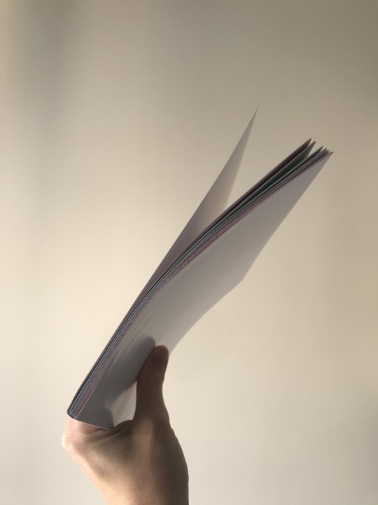
Text
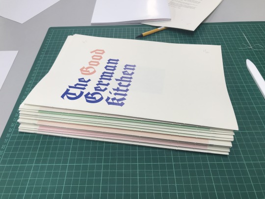
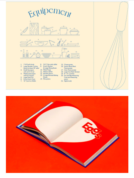
Final Photos of Book
I looked back at some of my research to see how I might want to photograph my book. I definitely wanted to highlight how thick it is and how it lays flat. After some editing on Lightroom I am quite happy with them - here is a small selection:


0 notes
Text
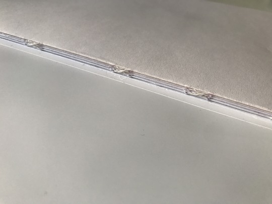
Final Printing & Binding
My book pages all printed great, I knew the colours would come out well from the test print and everything was legible. I only had to do a few reprints after noticing small mistakes over the weekend. The binding process was very long but also very enjoyable! I definitely feel it was worth going to this effort and I love how the colours I have used to divide the chapters are visible in the spine.
Unfortunately the wrong paper was ordered for my cover at first so I had to wait for my re-order to arrive on Tuesday. I had ordered the extract moon paper in 350gsm - same paper as my book pages but much thicker - however, after many attempts with Ben, it seemed the colours just wouldn’t come out right and the way the colour printed on the inkjet printer was very fuzzy/cloudy. Even after bumping up the density and saturation, the colours were very muted and wrong and the text was starting to look smudged. Eventually, it seemed there was no way to fix it so I needed paper that I could print on using the laser printer I had used for my pages. I got some SRA3-sized paper from UniPrint that was similar in colour to the Extract Moon paper in 220gsm. Luckily, it went through the printer fine and the colours came out perfectly! Though it wasn’t exactly what I wanted I’m fairly happy with the result.
Binding Process


Failed attempts at printing the cover:

0 notes
Text
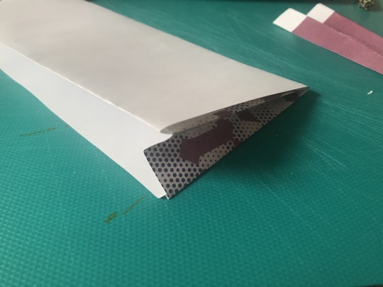
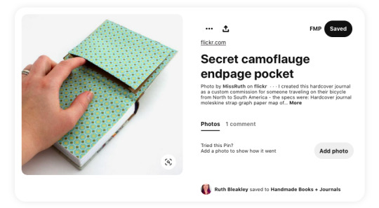
Development: Recipe Card Envelope
Creating this envelope for the recipe cards turned out to be a little more tricky than I first thought. I pretty much just looked at the one I had in a notebook of mine for reference and tried to figure it out from there. I did eventually find a tutorial on these kinds of envelopes but a bit too late by then...
I did a couple trial runs with some scrap paper, working out the measurements. My first one was much too long - I thought that the flaps would require space and the cards couldn't be underneath but it turned out they could fit in much more snuggly. My final envelope was much shorter in length. I wanted the envelope to be blue as I couldn’t source any thinner Extract moon paper to use for the envelope so any other paper would have been a new shade of white. I also thought it would be a nice contrast to the recipe cards and the last pages of the book and would match the cover.

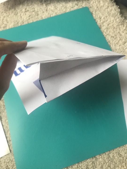
Trial run - too long.


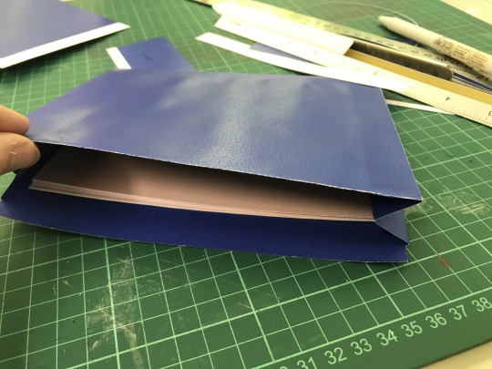
Pieces for the final envelope & a much more snug fit.

Some tutorials/examples for various envelope options.
youtube
youtube
0 notes
Text
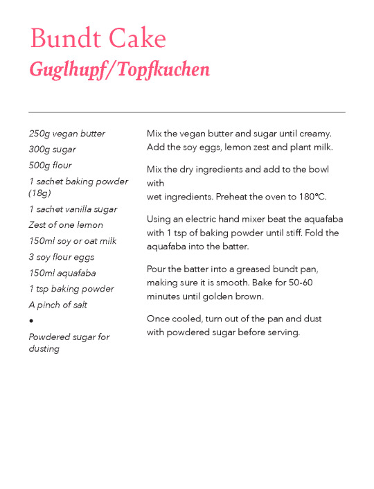
Development: Recipe Cards
I found some examples of recipe cards at home. After trialling mine in landscape, which seems to be the typical layout, I decided on portrait as this was in line with the sayings and worked well in terms of fitting the recipes in the space. The design of these was relatively straightforward and after a couple test prints I was ready to print the final ones.

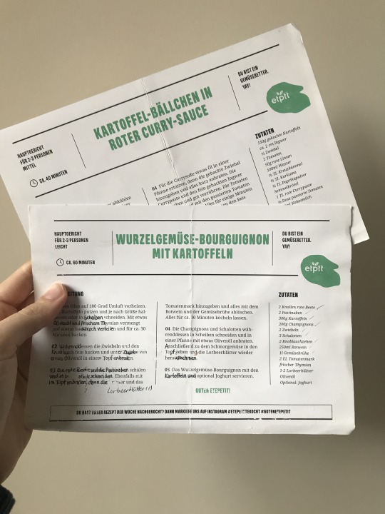
Examples of final recipe cards

0 notes
Text
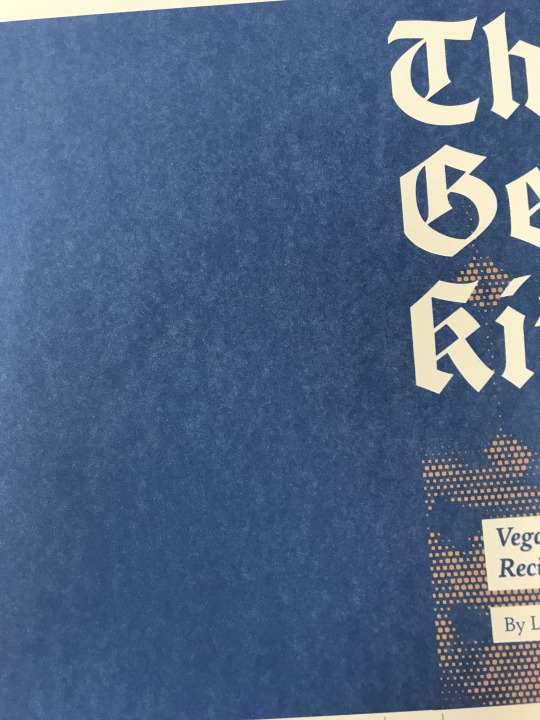
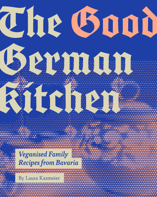
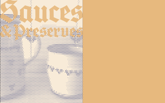
Cover Design
In my final development of the cover, I trued to be more brave with the type to match the rest of the book. I played around with varying ‘degrees’ of half-toning the images and placement of the image and subtitle. I moved the main title down slightly to make it more readable.
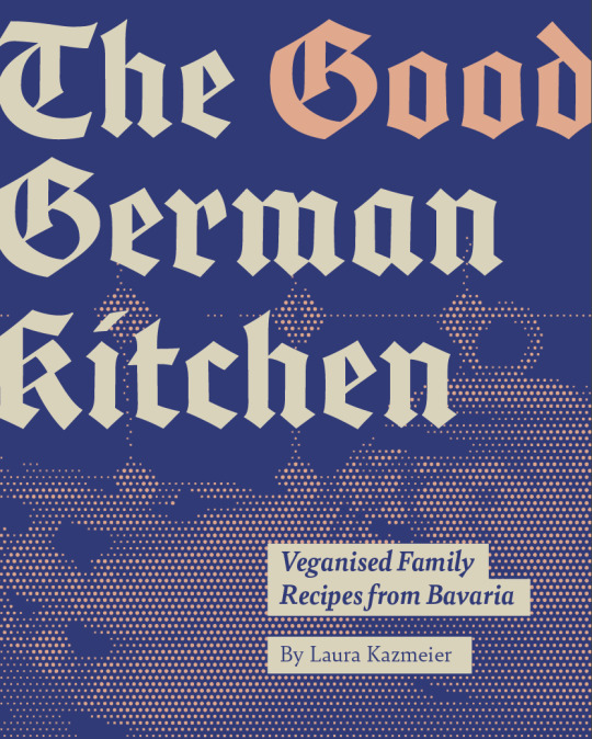
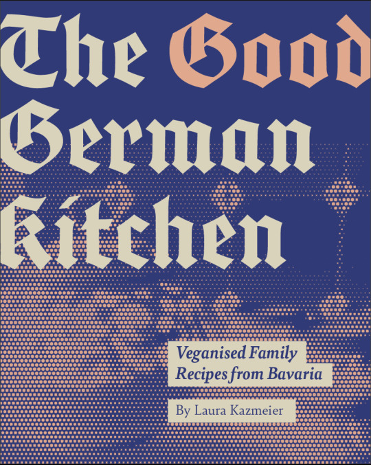
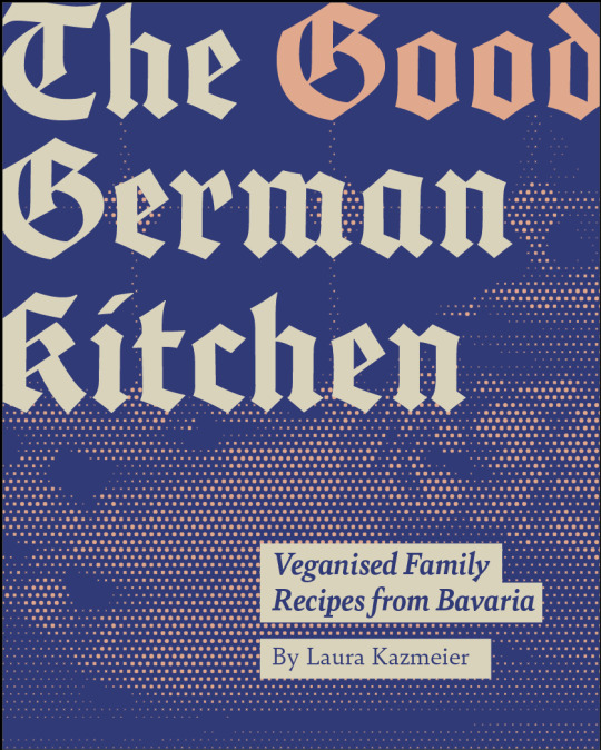
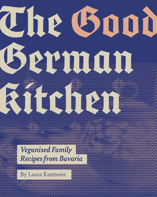
Final Cover: (colour difference because of screenshots)
0 notes
Text
Test Print
Once I received the paper, it did look slightly more yellow than anticipated. However after doing a test print to make sure I was happy with the colours and everything was readable, I was ready to do my final print!


0 notes
Text
Final Adjustments 2
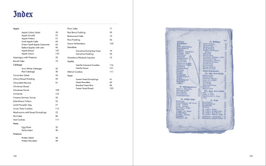
Some more final adjustments included increasing the size of the descriptions on the chapter title pages, making sure they were readable and bringing page numbers forward/changing colour where I had a background. I also completed the index page for easy navigation.

1 note
·
View note
Text
Final adjustments
After my last tutorial with Rich and Hannah I made some more changes that help make the book more cohesive. At this point, there were some elements such as translations on top of scans and halftone images of my grandmother’s kitchenware, which I introduced only in one or two chapters. They suggested that if I want to add these in, I should introduce them earlier on so that these chapters don’t feel separate from the rest. I felt this was a really good suggestion that would help make the book feel more cohesive. Here are some of the spreads I worked on:
Original use of pull out-text/translations:

Added:
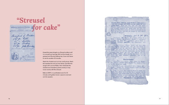
I tried to find places where there was something interesting to pull out (such as the year it was written, something specific for the time etc.) or where I felt it would be helpful to see how the content on the scan matched the recipe (especially if it was on a separate spread). I didn’t want to force it too much and I feel it’s still alright not to have this feature in every chapter.

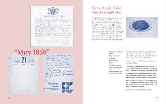

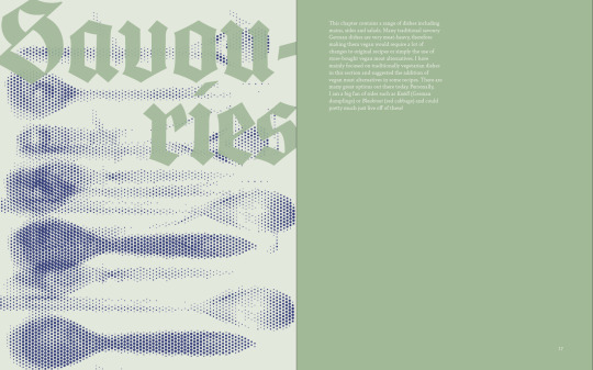
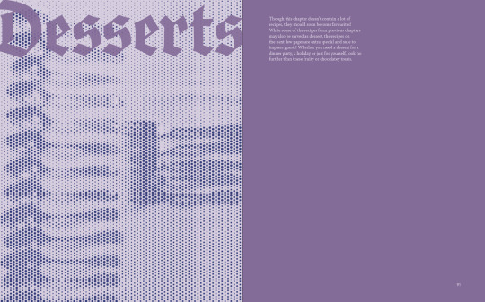
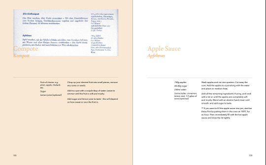
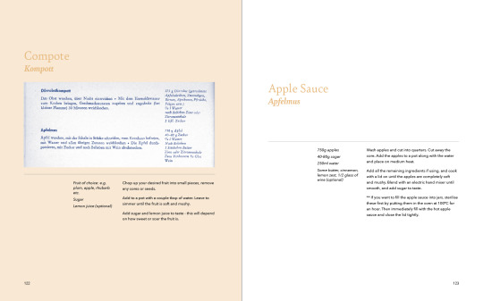
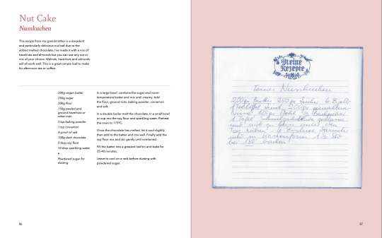
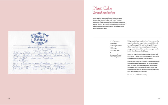
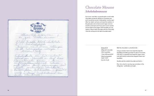
Original halftone images - I added these in where I had blank pages even after a lot of rearranging (I was somewhat at the mercy of the number of scans I had for each recipe and the sayings I had chosen to feature alongside certain recipes) - I felt it was nice to see the utensils that would be used to make/serve those specific dishes. In the first example, some wooden spoons to mix yeast dough and a small dessert bowl in the desserts chapter.
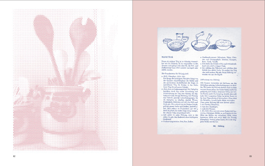
Added:
1 note
·
View note
Text
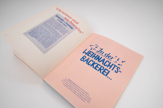
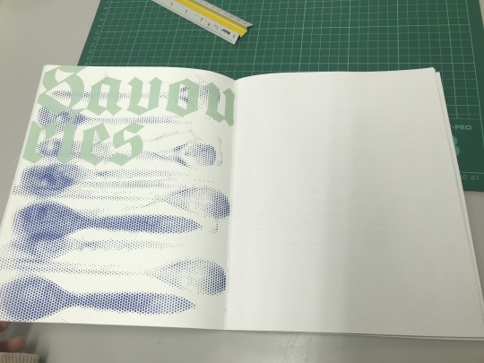
Introduction/Contents Page Development
Intro Page
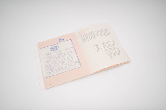
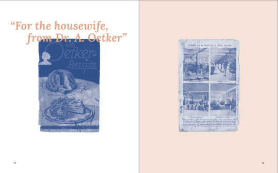
I tried to create balance in the intro page and give the scans enough space. In developing them, I also wanted to show more of the beautiful scans and give the reader a good idea of these books - especially the oldest - and kind of my journey of discovery with it and all the random bits within. The final addition of coloured backgrounds really brings in some warmth and makes these spreads more inviting.
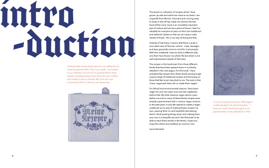
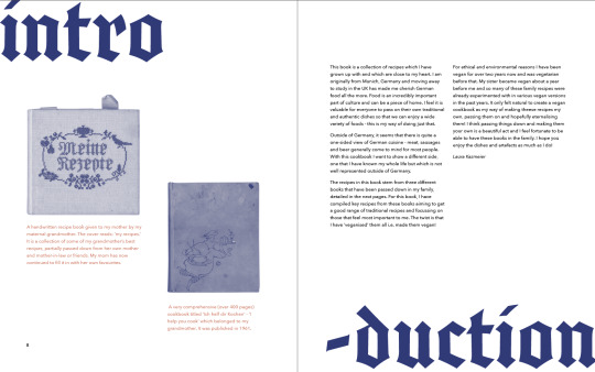
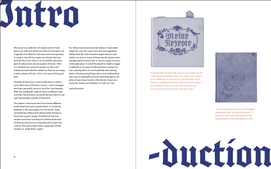
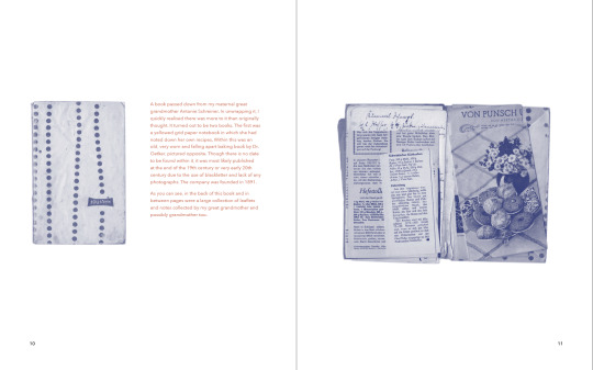
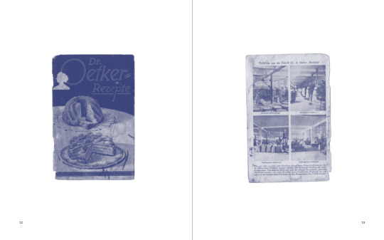
Final Spreads:
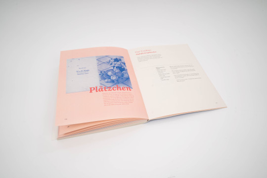
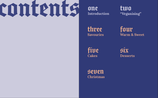
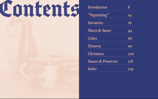
Contents Page
I felt my first idea for the contents pages didn’t quite make sense as I wasn’t adding the number of the chapter to the chapter title pages. I eventually simply wrote out the chapter names underneath each other using a line in between to echo the lines I use throughout in the recipes. I kept the contents list lined up with the top margin to mimic the look of the chapter title pages, and I felt this looked quite modern. After some final feedback from Hannah and Rich, I trialled the chapter names in the font Bely which I used throughout, to make them more readable. I made sure they were all evenly spaced and was finally in a place to add page numbers!
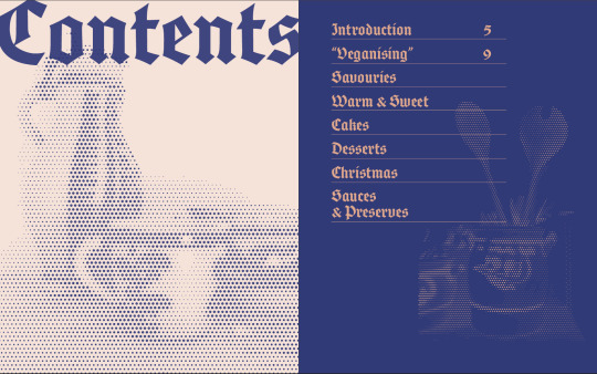
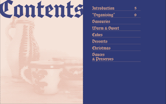
Final spread
0 notes
Text
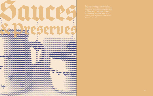
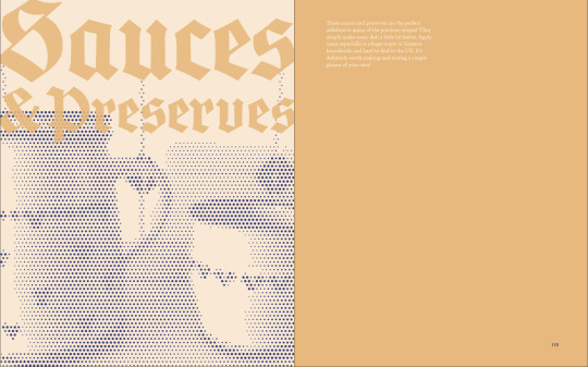
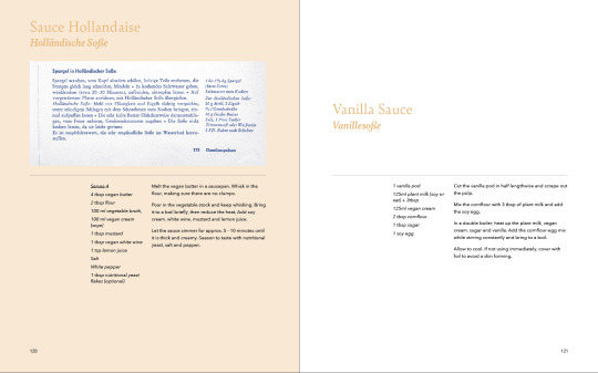
Sauces & Preserves Chapter
Initially, I had Sauces and Preserves at the end of the Warm & Sweet Chapter as the sweet ones would be used mostly for the recipes within this chapter. The sauce hollandaise was featured with the corresponding recipe in the savouries chapter. However, the more I thought about it, the more I felt this could be confusing and it would be more useful to have a completely separate chapter, as these sauces would complement several recipes throughout the book. I also felt it could feel a bit odd since I didn’t really have a mini chapter within any other chapter.
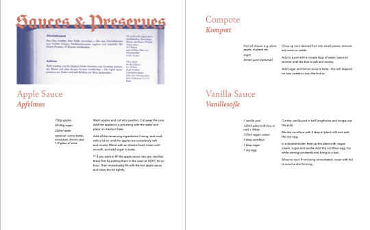
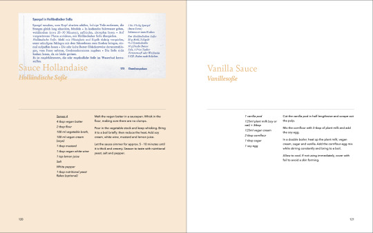
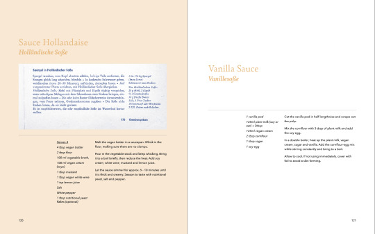
Final designs:
I ended up with this layout as it was more in line with how I presented these scans in the rest of the book. I also liked how each spread still felt quite harmonious due to the line being in the same position.
0 notes
Text
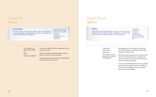
Development: Colour backgrounds within chapters etc.
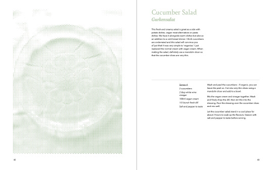
Instead of colours relating to the individual dishes I trialled using a 30% tint of each chapter colour (which I was using on the left side of the chapter title pages already) as a background colour throughout the chapter. I had really liked the idea of backgrounds behind the scans previously, but I understood the confusion it could cause when using random colours. As soon as I trialled this idea I knew it was the right way moving forward - it warmed up the spreads and made them more inviting while also still aiding the reader in the navigation of the book. I felt these coloured backgrounds worked especially well behind the hand-lettered sayings, making them look more fun and inviting.
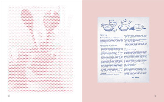
In addition to this, some final adjustments to the spreads involved using a cohesive layout of the recipes. I always kept the description aligned to the left margin of the page, with the recipe aligned to the right margin. I used a thin line to separate the two for more clarity and to echo the lines in my grandmother’s recipe book. With long descriptions, I divided these into two paragraphs, rather than one long paragraph because after further consideration I wanted to avoid a very long line length. I felt this layout worked well to create balance.
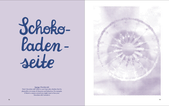
Finally, I made sure none of the writing on the scans was cut off. I presented all fully or cropped and gave all scans more space, which I felt worked well to display the beauty of these artefacts. I also wanted to keep a bit of variety in how they were displayed - in a normal cookbook obviously there would be a lot of different colourful images, whereas mine are all blue so I felt the placement and cropping added more interest and would make the reader more keen to take a closer look.


0 notes
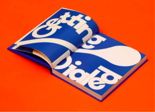
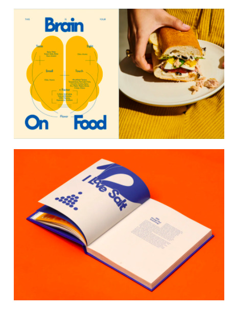
Link
Sally sent me this link after seeing my project. I really love the fun type in this and the colours - funnily enough it also uses a bright blue throughout. I think the eggshell colour background in some of the spreads here inspired me to try using the 30% tint of the colours I was using behind the title text in my chapter title spreads as backgrounds within the chapters. In this way I could make the spreads feel a bit warmer while also making the chapters feel unified and making navigation easier for the reader (see next post for development)
0 notes
Text
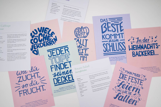
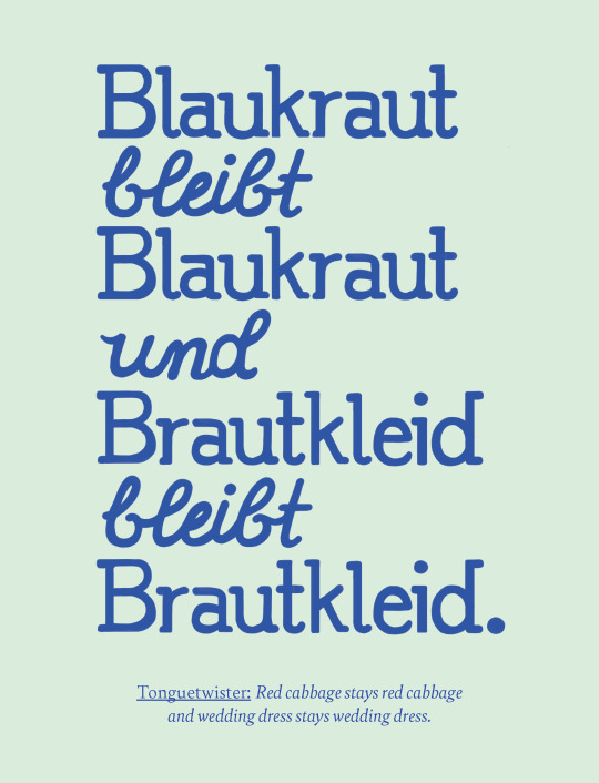
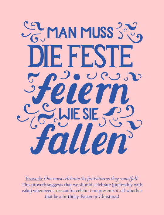
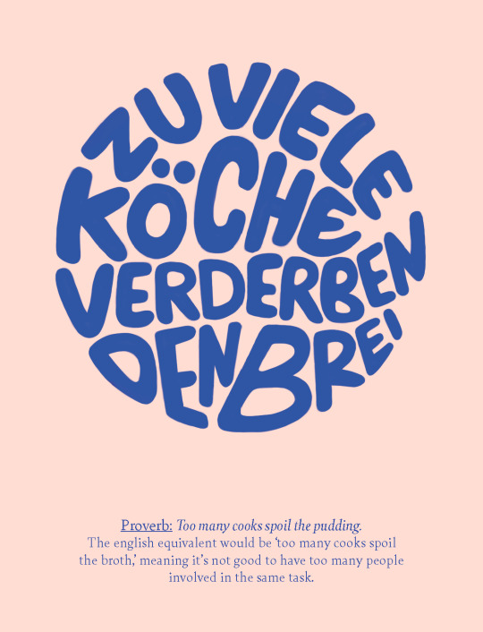
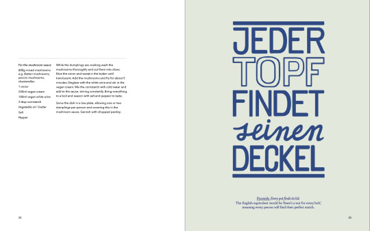
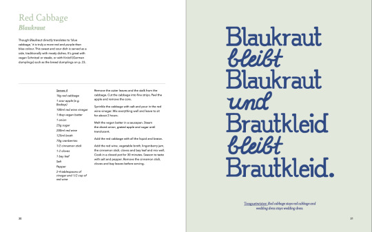
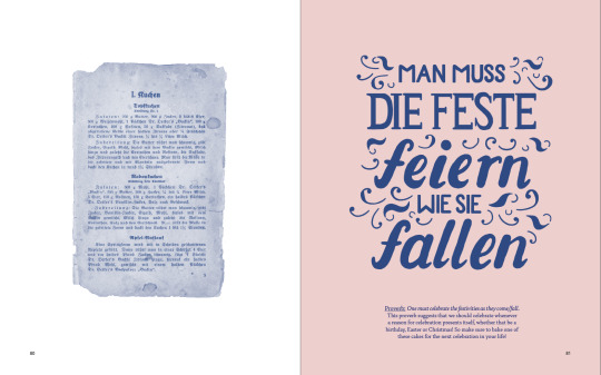
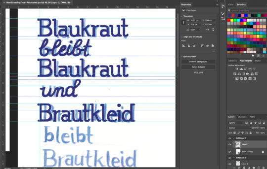
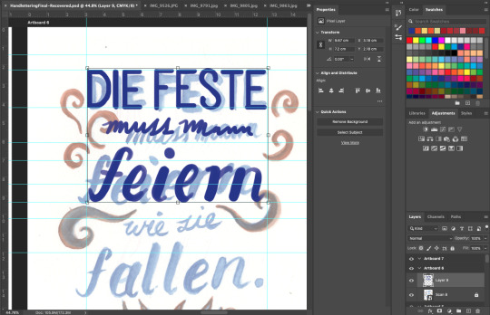
Hand-lettered Elements
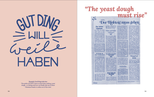
I created all hand-lettered sayings/proverbs on Photoshop. It was definitely a time-consuming process but I do feel I got faster with every one I made. Overall, I’m happy with them - I tried to keep some variation in terms of how I lettered them and how much decoration I added, so that it would stay interesting to the reader. I felt the blue colour which they all had would unify them enough, as well as the fact that they would all somehow have my fingerprint on them. I had sketched out all of the designs for them previously (see previous hand-lettering post), allowing the words to inspire how I lettered them. I simply like the idea of making the lettering match the meaning, and it can almost give the reader a hint of what the saying might mean before they read the translation.
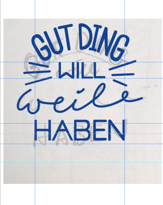
For example, In ‘Gut Ding will Weile haben’ which means ‘Good things take time’ I lettered ‘time’ in a cursive font that dragged out the word so it was wider than the rest. In this way I wanted to suggest the idea of a long time.
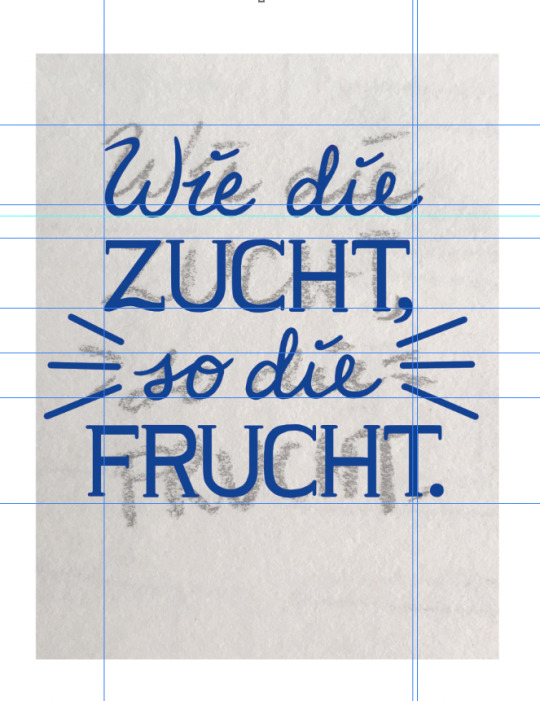
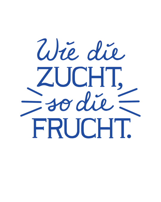
Another example: “Wie die Zucht, so die Frucht,’ means, ‘as the breeding, so the fruit’ and refers to the idea that how you discipline and raise your children impacts who they will become. In this one, I lettered the words breeding and fruit in a more traditional-looking serif font that kind of symbolised the idea of discipline and order to me.
Finally, ‘Jeder Topf findet seinen Deckel,’ means ‘every pot finds its lid.’ Similar to the English proverb ‘Every Jack has his Jill,’ it means that everyone will find their perfect match. With this saying I drew out the word ‘pot’ using only outlines, suggesting the idea of a pot as something that has empty space to be filled and covered by a lid. For this reason the word ‘lid’ is then filled in.
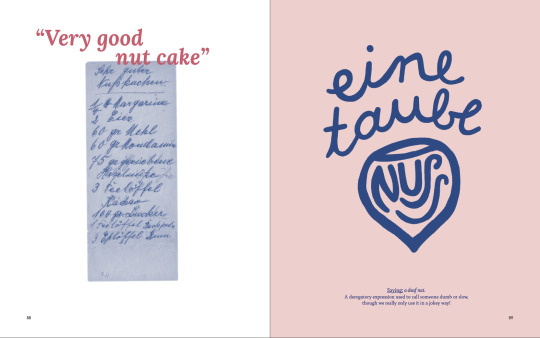
Sometimes the messaging is also more overt such as with the use of an apple outline and nut outline in the proverb: ‘the apple doesn’t fall far from the stem,’ and the saying: ‘a dumb nut.’ I simply had some fun with it and tried to keep some variation.
Some of the final hand-lettered elements:
The decorations in this one were inspired by the decorations on some of the more decorated blackletter typefaces on my grandmother’s kitchenware and on some of the leaflets. In drawing this, I referred back to a page where I had drawn these out earlier in the project when I was looking specifically at all these typefaces.


0 notes
Text
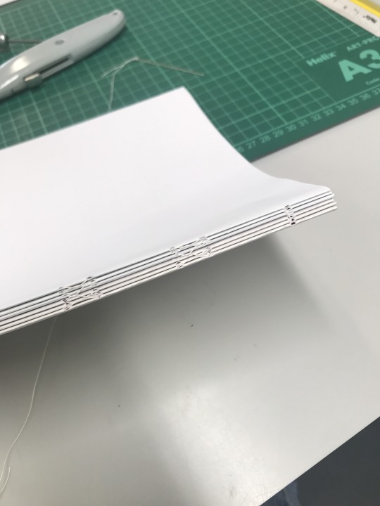
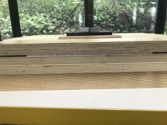
Binding Test
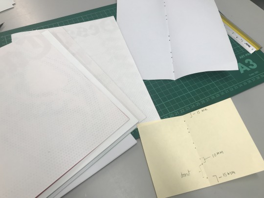
On Monday, I booked a slot in the bindery to learn the kettle-stich open bind I was planning to use for my book. Since I’d never done it before, I felt I needed a better understanding before it came to printing and making my final book. Joseph ran me through the whole process and we also discussed how I would print and how many papers I should have per signature considering the thickness of my chosen paper.
I really enjoyed the process and was very happy with the result!
Some notes for printing:
8 pages per signature
Printing: postscript file, 2-up perfect bound, specify signature size, print blank pages, centred, marks and bleeds normal. Two-sided short edge in acrobat.

0 notes