Last Seen Blogs
stellisonica
IndecisioniCroniche
astharoshebarvon
there is always a bigger fish

player-for-mac
Без названия
topwan-obikin
topwan-obikin

crypto-currency-trading
Crypto Currency Trading
Text
QUICK! what’s your fave ttpd song at this very second (i know it changes fast)!!
341 notes
·
View notes
Text
so dennis birthday on the 29th ,,, i'm gonna write something i think. will it ever see the light of day? no! but it'll be fun <3
#my posts.#i COULD write dennis fic that would see the light of day but uhhh#instead i'm committing to goofy intercourse. iykyk
2 notes
·
View notes
Photo
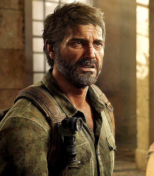


JOEL MILLER
THE LAST OF US PART I (2022) dev. Naughty Dog
#motion pictures presents ( gifs ) .#games › the last of us#love him so bad he makes me scream cry throw up
1K notes
·
View notes
Note
Did you see Lavendertowne’s Hasbin redesigns? What did you think of them?
hi there! so i'll be honest, i originally saw the thumbnail for her hazbin redesign video and sorta avoided it, seeing as i'm not a huge fan of redesigns for the show given how commonly that ties into 'lol my art is so much better!' which isn't something i like to see as an artist. but i was curious because of this ask and i sought it out, and while lavendertowne has taken the video down due to many reasons, i'll still repost the designs i found here and give some brief commentary.
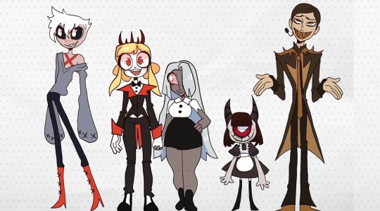
so! uh, i don't like these redesigns much. as others have already said, they're too human looking for my liking ( which is, ironically, one of my biggest complaints about the women's designs in the show! ) and they've lost most of their unique features or quirks. alastor for example has lost all his deer attributes completely, which isn't the worst thing ever i suppose, yet he wasn't given a new animal motif -- and the radio demon aspect also wasn't leaned into? at all? besides the ear piece but that's more modern & goes completely against the character's whole thing. i actually don't mind the new color pallet here other than the fact he looks more whitewashed than usual ... hmmm. and these issues are prominent in angel dust and vaggie as well, losing their animal motifs ( a spider and a moth respectively ) plus being stripped of unique traits. to be more specific, angel dust hardly looks like he works as a porn star or that he used to be in the mafia, and vaggie's exorcist eye is completely absent. i wouldn't bring this up if these aspects of them were shown in different ways, but as it stands they've just had these parts taken away and now there's this sort of empty hole, one that's been filled with a blandness. just not a fan!
for charlie and niffty, i don't think they look too bad ?? honestly, charlie's redesign is pretty good! i like the circus motif in her outfit and more lion-looking appearance ... she's sharper, a contrast to her softy personality which could make for some good development or characterization. though the crown (?) isn't something i'd keep, seeing as she isn't someone who likes reminding the people of hell about her power over them, unless it's in a compassionate manner ( aka, you're my people! ) ,,, still, i don't loathe it or anything, since i do love crowns and this one is a little more demonic looking than its actual design <3 niffty on the other hand is fine. just fine, i think. i don't like the monochrome look for her much since i believe the yellow-pink color scheme adds a lot to her overly enthusiastic personality, offset by her extreme love of violence ... but it's not bad! i suppose i have no real complaints. wish she looked more like a 1950s girlie, like with the famous poodle design on her skirt, though i could see the merit in removing it for this new take on her appearance.
all in all, these redesigns are not for me! i'll end this with a disclaimer that in spite of my distaste, i don't hate lavendertowne or anything like that. normally i love her work, or at least watching it. this is just my opinion <3
#my posts.#asks.#i didn't see the video but i guess my question from these designs are : did she watch the show?#not just clips but the actual thing. like did she know these characters in any deep ( or just a really good surface level ) sort of way?#this feels like she knew the barest minimum and had seen the critcisms about the art and then tried to fix it#without much care to the characters themselves#like. did she hear 'too much red' and wing it? 'too many pinstripe suits or suits or bows'?#obviously this isn't bad and she can do redesigns just to do them but it's an interesting observation to make!#anyway thanks for the ask! it was a pleasant surprise but a welcomed one lol
2 notes
·
View notes
Text
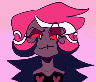

evil girlboss & her evil boyfriend ( one of her bfs anyway! )
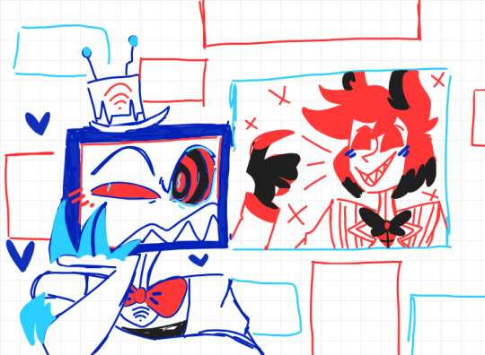
#my posts.#my art.#hazbin hotel#hazbin hotel velvette#idk what the ship name for vox/vel is but ughhh i love them dearly they deserve the world aka hell#just a girl and her gilf. who is the most arrogant asshole alive no biggie <33#anyway love velvette she is such a cutie and she is very special to me ... best girl!
12 notes
·
View notes
Text

Tyler needed to sit back and have a smoke
#visuals of passion ( art ) .#games › as dusk falls#oh this is gorgeous???? what a beautiful piece of work to see on my dash <33 its just so soulful and real !!!#makes me feel things ... phenomenal lighting and his eye PHEW!!!#oh tyler how i love thee!! anyway this is now ingrained into my mind 10/10 this made me miss this game so much
16 notes
·
View notes
Text
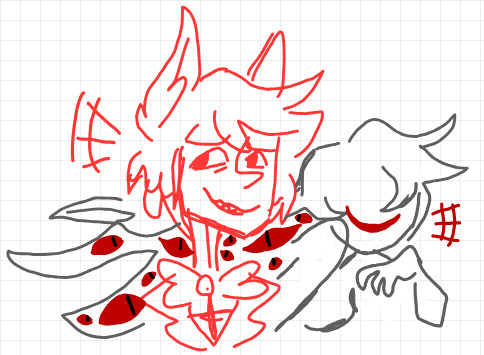
alastor & his pair of toxic not-quite besties is something that can be so personal!
#my posts.#my art.#hazbin hotel#radiostatic#not going to use the billions of tags buuuut i was having fun with these awful evil goofs <3#just mere doodles nothing crazy but oh i love them!!#big fan of the eve and alastor dynamic in my head. also bigger fan of radiostatic. if it wasn't obvious lmfao#anyway!!! maybe i'll draw these losers better sometime ... we shall see
53 notes
·
View notes
Text
i need to do more web weaves truly i do!!! that kind of art form was made for me i'm just so picky about it ( my fatal flaw for everything really )
#my posts.#once i can make more web weaves its over for you all!!!#as dusk falls web weave ... my beloved#but also i wanna do a denthony one. or a t&d one. oh! or maybe one for each#and a claudemat one which will make zero sense to anyone except me </3 but that's okay#tbh my next big project should be a web weave. something to do on the side as i write my silly hazbin stuff#hm hm ... we'll see
4 notes
·
View notes
Text
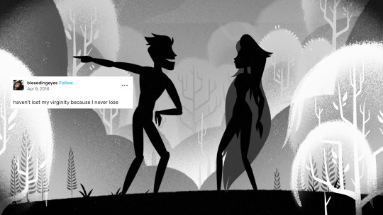


hazbin + text posts
#welcome tumbler dot com ( crack ) .#shows › hazbin hotel#BE THE MADWOMAN IN YOUR OWN ATTIC SO TRUE & REAL !!!#these are such a delight as always there's not a single miss here#haven't lost my virginity because i never lose oh adam lmfao#also love niffty always. literally forever and ever. she is just so ill#anyway!!! love all these sm they are perfect
796 notes
·
View notes
Text
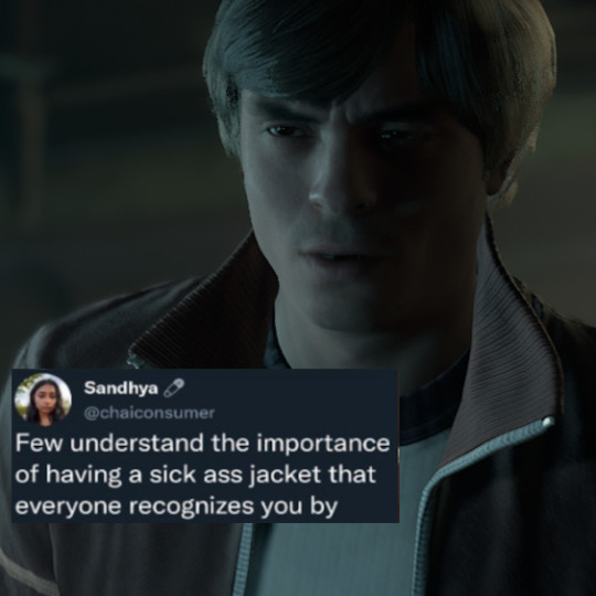
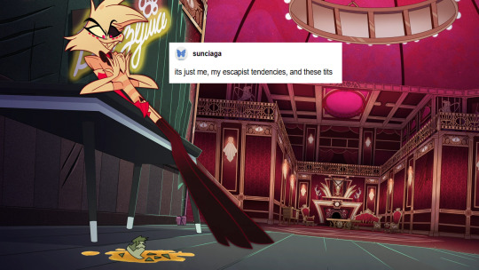
little hope + text posts
canon lines of dennis clarke dialogue
#welcome tumbler dot com ( crack ) .#games › little hope#he really do wear that thriller jacket always <3 would recognize it anywhere so real
18 notes
·
View notes
Text

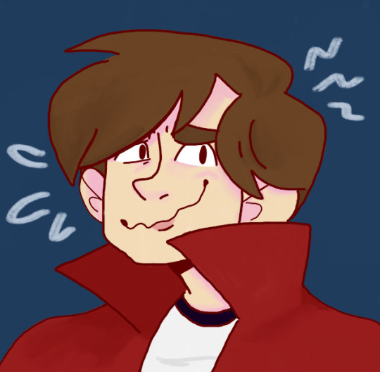
lover, lover, on the fence ! ... just some fun being had with the boys tm
#my posts.#my art.#little hope#ignore the difference in colors btw i was experimenting !! so yeah#FUNNILY enough the daniel pic is cropped ... it's actually apart of a bigger-ish piece#anyway this is low stakes practice! getting the hang of digital art again etc#still for tests they turned out ok enough <3 love you dennis love you daniel my little ( big ) guys!#also the dennis picture is based on the fact he sucks at smiling for pictures lmfao#like ... he looks like he needs immediate help. cannot pose for photos to save his life. etc#( lyric line is from swing by taking back sunday!! my dennis anthem thats on his playlist ... love love love it )
11 notes
·
View notes
Text
the a's being gay and having homo feelings for the d's and yet being so close with the t's is something that can be very personal actually!
#my posts.#the h/oa love triangle has nothing on this trio's messy ass relationship fr#like andrew tried to shoot his shot SO HARD during the firefly scene he really gave it his all 😭#'looks kinda beautiful ... don't you think?' oh andrew#smth smth the tragedy of im fated to be with you but not in the way i want ...#just. love it. rotating lh in my head when im not obsessed with hh so <33
4 notes
·
View notes
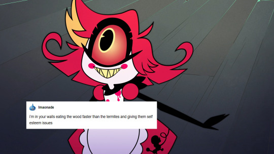
Text
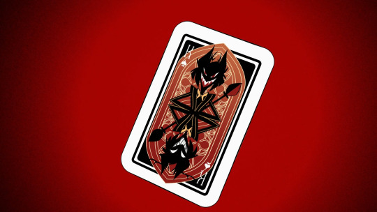


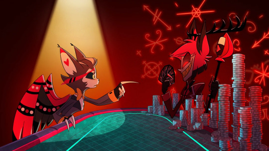
#shows › hazbin hotel#this scene soooo loud and chilling and beautiful in the most horrifying way despite it being such a quick moment#him holding all the cards!!!! becoming the king card!!!#also love husk's design here but that's neither here or there. anyway!
635 notes
·
View notes
Photo
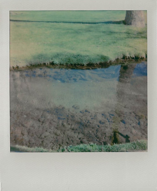
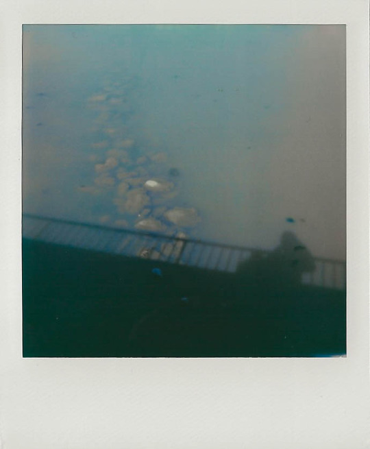
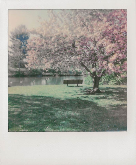
i love polaroids that look like dreams
25K notes
·
View notes
Text
love them so bad ...
3 notes
·
View notes
Text
truly need to finish up my wip masterlist so that everyone can know i have 100+ fic ideas and that they're haunting me at all times. like, i want to put all these out into the world someday but i am riddled with severe perfectionism so most of these fics haven't even been written, much less planned out. because yes! my notes and plotting must be completely perfect too! love that
#my posts.#i used to be a girlie who wrote fic all the time but then god nerfed me or smth </3#now all i feel comfortable doing is rping ... fic writing is so daunting to me nowadays its like ?? what happened#anyway! this is all coming out because your guy worked on his fic masterlist today woohoo!
5 notes
·
View notes
Text
happy valentine's day i will be out here thinking about & discussing ships ... as one does!
1 note
·
View note