
Last Seen Blogs

peytouo
peytouo
gkindexindia
GkIndex Free Java Online Tutors
northstargirl
northstargirl

danielestevolispecialistaumidita
Daniele Stevoli specialista umidità di risalita
wingdings-in-the-speedforce
Nightwing & The Flash
Text
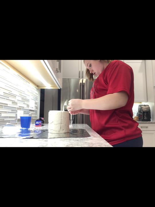
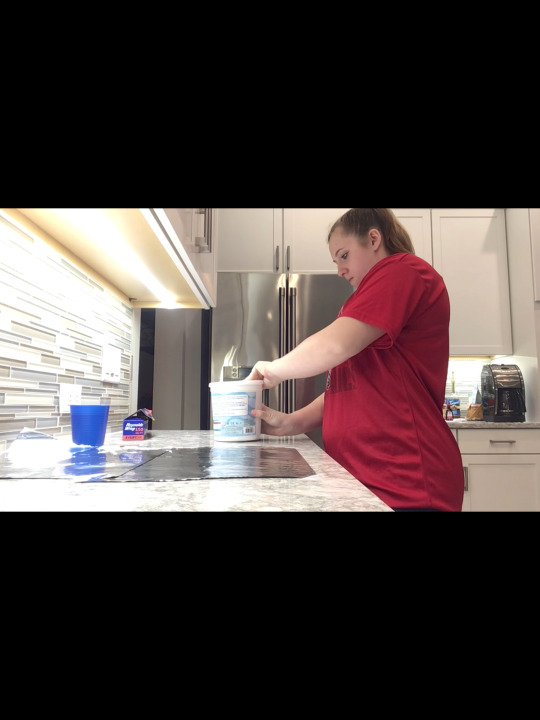
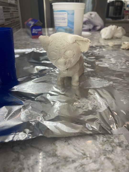
Final Assignment
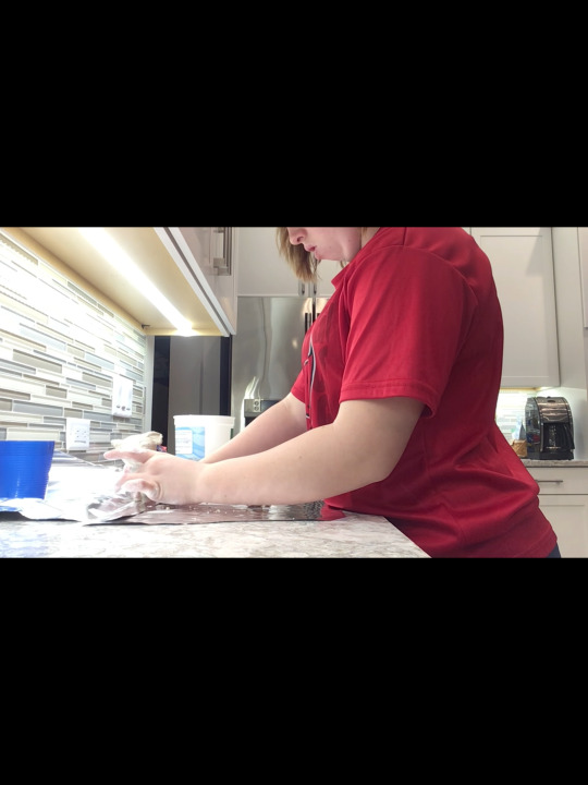
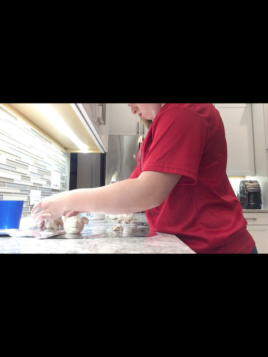
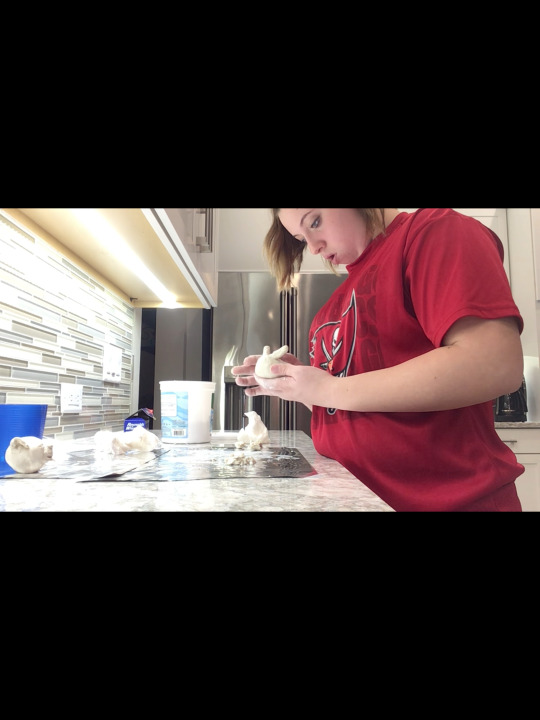
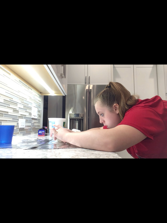
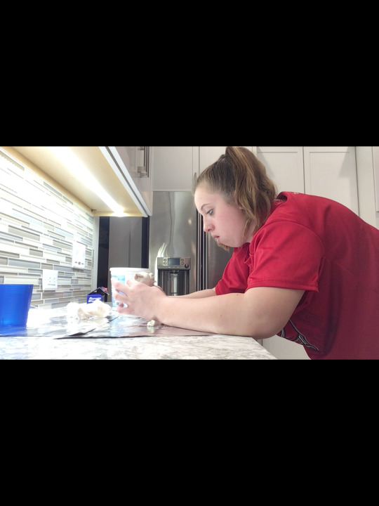
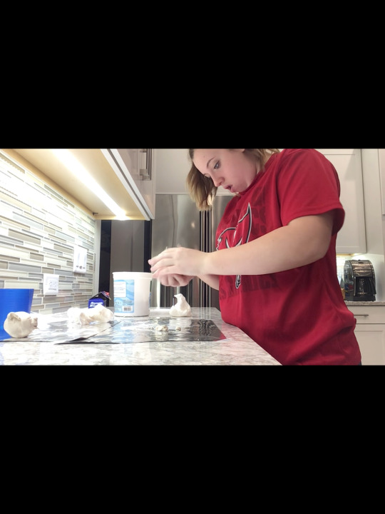
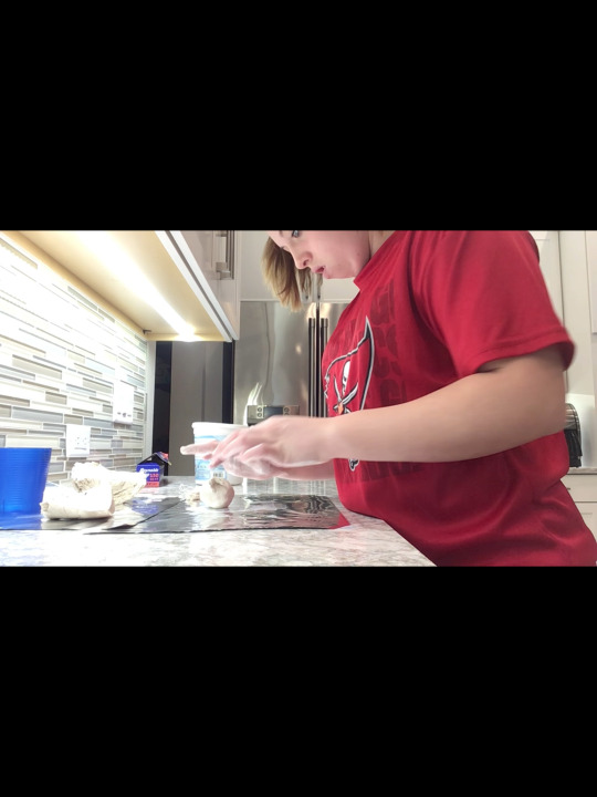
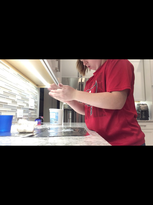
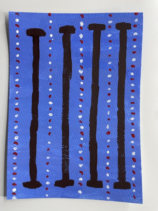
Title: "Can I Have Some Too"
I made a sculpture of my dog. His name is Maui and he is an Olde English Bulldog. I did this by using clay and a bobby-pin to add the fine details on his face. I made his head first and then his body and his legs and connected all of it together using water.
0 notes
Text
Sketchbook 3
This is Crucifixion by Antonio di Francesco da Veneziano. The work is made of tempera and gold on wood and its dimensions are 32 5/8 H x 18 7/8 W x ¾ D in. Colors used include gold, red, blue, yellow, black, and white and shapes of all kinds are used including rectangles as the cross and flags and circles as hats. The main subject of this image is Jesus on the cross. The image is very balanced with the cross in the middle and people on both sides. Unity is being shown in the image because everything is related, it is all part of the same story and it all fits together. This piece makes me feel dejected but lucky at the same time. I am religious and I know the background of Jesus’ crucifixion, so this piece reminds me of how fortunate I am to be here and living the life I am living. This art is associated with the crucifixion of Jesus which is him being hung on the cross and dying for us. The work tells us that the artist has a lot to do with religion and has experience being in chapels. I can tell what the artist was trying to say just based on the art being Jesus nailed to the cross. He is trying to get the message across regarding how important it is to study and learn about these events especially through art to see how intense and how inhumanly he was treated. Veneziano gets his message across very clearly. Just looking at this art for a few seconds you can tell what it is showing and who it is focusing on. I made my conclusions very quickly after seeing the subject of the art. I choose this piece of art because it illustrates the most important piece of history in my religion. Jesus died on the cross for us and without that the world wouldn’t be what it is today. After doing research on Venezianos’ work and learning more about what he produced and why he produced is why I made the decision to do my research on this artwork.
Source used:
Syre, C. (2003). Antonio Veneziano. Grove Art Online. Retrieved 21 Oct. 2023, from https://www.oxfordartonline.com/groveart/view/10.1093/gao/9781884446054.001.0001/oao-9781884446054-e-7000003321.
0 notes
Text
Sketchbook 2
The 6 principles of design are unity and variety, balance, emphasis and subordination, directional forces, repetition and rhythm, and scale and proportion. Unity is when there isn't much of anything happening in the art work, the book used an example of an artwork that just has a yellow cube leaning against a wall. On the other hand, variety is what usually what gives an artwork more characteristic. However, if you have to much variety, the art might not look as appealing to the eye. For example, if you walk into somebody's house and there are square, circle, and triangle shaped pictures mixed around all over every wall, you might think that is a little no much variety. Whereas if they have some square and some circle pictures mixed around on a few walls it might won't be as much variety and calm down the intense look. Balance is making something equal. For example, when you build a house, usually all the windows on the front are the same shape. Meaning theres not some square windows and some trapezoid windows and some triangle windows, they are usually are squares and rectangles. If the house was symmetric but you put some triangular windows on half of the house, it wouldn't be balanced anymore. Emphasis is used to draw attention to some specific detail. When I write my notes for some of my classes, if I was a specific word or definition to stand out to me, usually I write it in a different color or highlight it so it stands out over the rest of the note. Subordination is what tones back the emphasis of something in an art work. The book uses Titian's painting Noli Me Tangere to show that the people are put in the center of the painting to give them emphasis but they are lighter colors than the rest of the painting because their actions are supposed to be what stands out. Directional forces are used in art to appeal to they eye, they show the viewer what they are supposed to look at next but its not like an arrow showing us, its just known by the viewer. For example, the book uses an example from Jockeys Before the Race to show how the viewer interprets the action in the art. We have learned to read left to right top to bottom so when you look at an artwork usually you look left to right, top to bottom unless you notice otherwise from the context of the painting. Repetition is when something keeps coming back. For example, if you are telling a story to someone and you keep saying "and then", you are using a lot of repetition and sometimes it can be to much. Rhythm is repetition but has some changes to it. For example, if you made four paintings of the same house and put some kind of animal in the yard in the same spot every time, thats rhythm. Scale is the size of something compared to another thing. If you drew a picture of a family standing in a line and there were two parents and three kids one kid was 10-years-old one kid was 7-years-old and one kid was 3-years-old, you are going to have to scale them all down a little more compared to the last one. Proportion is the size of something to another or to everything. Using the same example as above, you might be comparing the size of the 7-year-old to the entire family or you could compare them to the 10-year-old and you will get different results.
In Vincent Van Gogh's Old Man with His Head in His Hands (figure 6.7 page 99) the artist uses the man in the chair as the focal point but he also has what looks like a fireplace and some wood in the background behind the man. Because the work is in black and white, the use of shading is very important and his shading was done very well in my opinion. We can see the implied lines in his pants and the bricks on the fireplace. While he emphasizes the figure of the man, he doesn't overdo it because we still notice other parts of the painting and we still notice his actions.
Color has effected me in a lot of different ways including what i wear and the colors i see in my every day life. I wear warm colors normally because that's what i think looks best on me. My room is decorated in a modern but welcoming way. The intensity of both the modern look and the welcoming look are not to overwhelming to make it unwelcoming but they also aren't not enough to not give it that welcoming feeling. The best color scheme I could use to represent my life is some sort of blue and gray color scheme. My favorite color is blue and my eyes are blue but a lot of what I have is blue but when I use blue I also usually use gray.
I choose to paint a swimming pool because swimming is something that I am very passionate about. I swim 5 days a week year around so it is pretty much my life at this point and I don't know where I would be without swimming.
5. I know about these logos because they appear on things that we use every day. When I choose what I am going to wear in the morning, sometimes I choose my outfit based on the brand/logo. Logos are very important because without them there would be no way to differentiate between different things. For example, your favorite pair of pants is adidas but you have nike pants that look the exact same but are not nearly as comfortable. It is going to be a lot easier to differentiate between the two if there is a logo rather than putting both pairs on and figuring it out that way.
I understand the value of logos because from a young age we are taught that people wear certain things and certain brands and those are the brands that everyone then wants to have. This has helped me learn and realize what all the different brands I see in my daily life are and how they effect the way we live. The Apple logo for example is a huge part of a lot of peoples lives, so its important to know what it looks like so you can identify something Apple from something thats Samsung.
0 notes
Text
Logos
The logos I see around me right now include; Under Armor, Apple. Speedo, The North Face, Jolyn, Dove, Tampa Bay Buccaneers, NFL, Target, Walmart, TYR, Bath and Body Works
0 notes
Text
My name is Kelly and and a little known fact about me is that I have been swimming for 6 years with breaks in between.

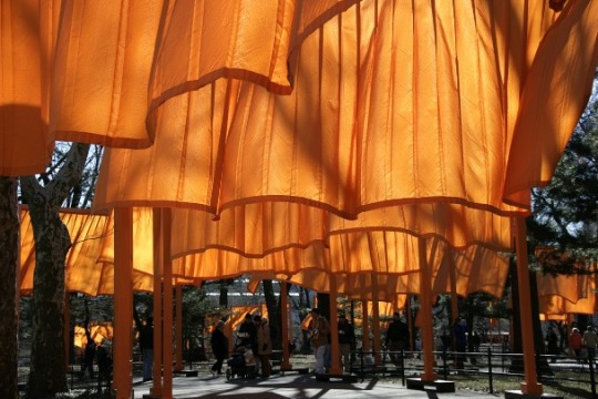
Christo and Jeanne-Claude 1979-2005 The Gates. Steel, vinyl, fabric; 7,503 gates 16’ tall, 23 miles.
When I first opened the document and saw this art, it took me a few seconds to figure out what I was looking at, but I instantly thought of the Tampa Bay Buccaneers creamsicle color, I am a Bucs fan.
5 interesting facts...
1. The color saffron was used in The Gates because they were supposed to make the pathway feel like warm shadows due to the golden hue they gave off.
2. These gates cost 21 million dollars to build.
3. They are located in Manhattan New York, and the contrast of them can be seen 52 miles north off New York City.
4. The color of the gates and fabrics matched exactly, and they covered 23 miles all together.
5. The creators of these gates funded all 23 million dollars by themselves by selling pieces related to these gates before building them.
The way I think about this art did change since the first time I looked at it, knowing the meaning behind it. When I first saw it, I was confused as to what it was exactly and what the purpose of them was. After doing research and reading different articles about them, I learned that they were created to represent a change, and renewal, and a difference in anything that had been done before. I feel that when most think about New York City, we tend to think about the tall skyscrapers and cars, not beautiful works of art out in nature, such as these. I now see the shadows these create and the warm golden ceiling they give off as you walk under them.
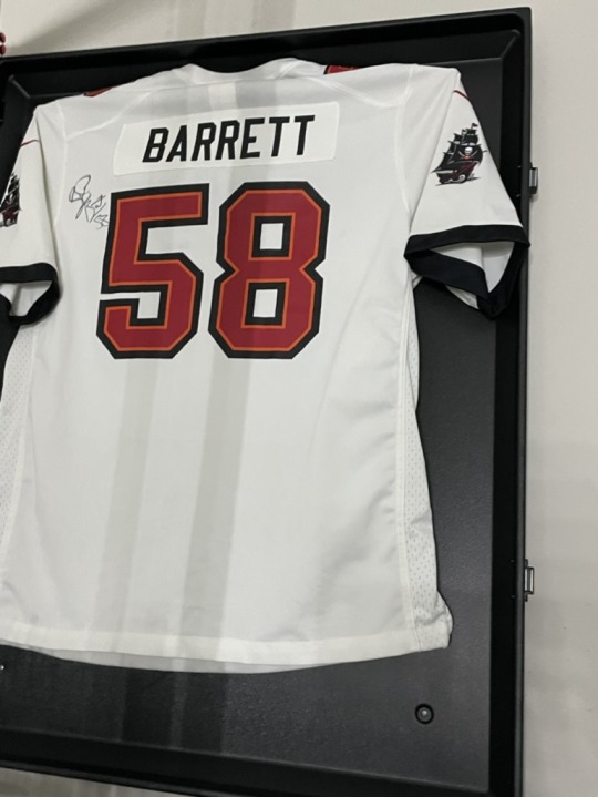
The work of art I chose to share is my Shaquil Barrett jersey I have hanging in my room. The media used to create this jersey include polyester and a blend of polyester and elastane. The use of this jersey is to protect players while they are playing their sport and it is something fun for fans to wear to sporting events. I do think that this jersey is beautiful, the meaning behind the jersey and why I have it is what makes it meaningful to me. My dad suffered 4 strokes and became paralyzed on one side, however he works for the Tampa Bay Buccaneers. When the organization found out about this they got both my favorite and my sisters favorite players to sign jerseys and gift them to us. To me that is very special that they did that for us because I think that professional athletes tend to have a stereotype of not being the best people all the time but after this i learned that is not true in any way. The reason behind why I have it is very upsetting but I am very thankful for it everyday.
I am 16 years old. I am a female and I identify as a female. I am from Pennsylvania but I moved here 4 years ago. I am white. For fun, I like to hang out with my friends and my boyfriend. I am a part of a few clubs at school including Junior Advisory Board and National Honors Society and I am a member of the swim team, also the captain. I am a lifeguard at the Manatee County Pools. Something that makes me uniquely me is that I have a very low attention span so my friends and family know when they are with me we always need to be doing something or I will get bored. I am also very responsible for most kids my age because I help with a lot due to the health restrictions of my dad.
0 notes
Text
My name is Kelly and and a little known fact about me is that I have been swimming for 6 years with breaks in between.
Christo and Jeanne-Claude 1979-2005 The Gates. Steel, vinyl, fabric; 7,503 gates 16’ tall, 23 miles.
When I first opened the document and saw this art, it took me a few seconds to figure out what I was looking at, but I instantly thought of the Tampa Bay Buccaneers creamsicle color, I am a Bucs fan.
5 interesting facts...
1. The color saffron was used in The Gates because they were supposed to make the pathway feel like warm shadows due to the golden hue they gave off.
2. These gates cost 21 million dollars to build.
3. They are located in Manhattan New York, and the contrast of them can be seen 52 miles north off New York City.
4. The color of the gates and fabrics matched exactly, and they covered 23 miles all together.
5. The creators of these gates funded all 23 million dollars by themselves by selling pieces related to these gates before building them.
The way I think about this art did change since the first time I looked at it, knowing the meaning behind it. When I first saw it, I was confused as to what it was exactly and what the purpose of them was. After doing research and reading different articles about them, I learned that they were created to represent a change, and renewal, and a difference in anything that had been done before. I feel that when most think about New York City, we tend to think about the tall skyscrapers and cars, not beautiful works of art out in nature, such as these. I now see the shadows these create and the warm golden ceiling they give off as you walk under them.
1 note
·
View note