
kitig88-blog
Crystal's Mastery Journal
Full Sail University
20 posts
Don't wanna be here? Send us removal request.
Last Seen Blogs

lucian-03-blog
Jeyps03

rugpjucio-naktys-rugiuose
one more night

fildelabroderie-blog
Fil De La Broderie

the-chucking
Music is Laughter to the Soul

allhailreign
"History Is Written By The Survivors"
Text
Month 12 Journal Reflection
Each Course
Mastery: Personal Development- Month one was the first course that introduced me to APA format and professional writing. In the media design industry, writing is a part of the job even if some of us wished it wasn’t. Sometimes clients might not care what you do or why you do it. But, some want to know a reason for everything. Month one helped me begin to understand how to write professionally in my writing, academically, and on the job. I was by no means perfect, but I started the process, and that is what matters. This month also helped me to understand what it is to be a master in your profession.
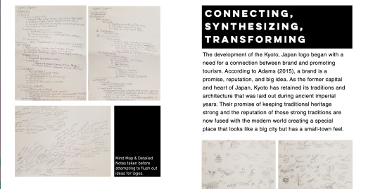
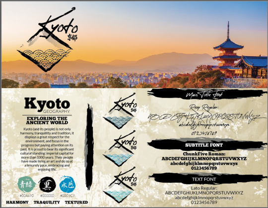
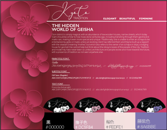
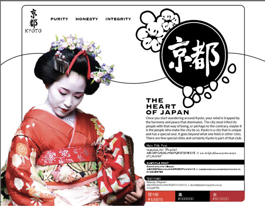
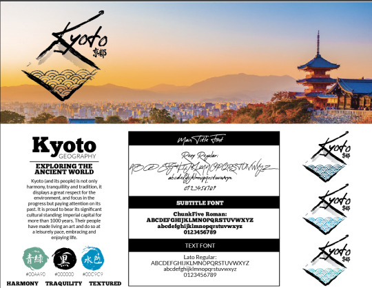
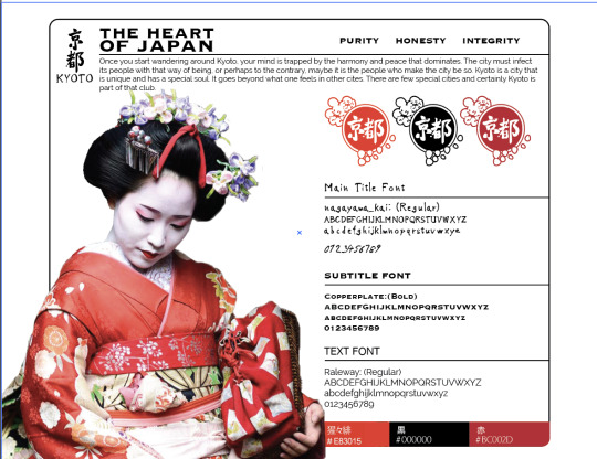
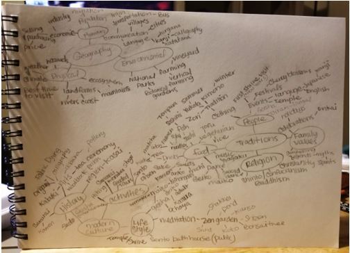
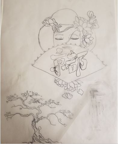
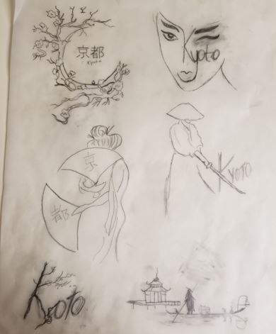
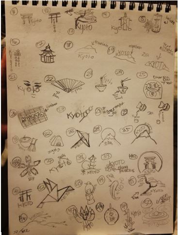
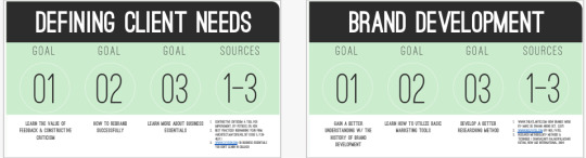
Defining Client Needs- The focus on Month two was on a city logo to attract tourism. During this course, I got to learn about promoting tourism through research and sketching logos for Kyoto Japan. Cities are broad topics because they are known for several things. So, I got to dive deep into research to uncover what makes a city like Kyoto so enticing to travelers and locals. As a media designer, these skills will be super helpful to me. I’ve helped clients before, but now I understand how to dissect a city from all angles in order to create a logo fitting for the clients’ needs.
Brand Development- Month three did not teach me anything new but instead helped me to further perfect my craft. Branding and logos are my favorite digital design work, so I knew how to do that. But, this month delved deeper into the concept of what a brand is, and that was so helpful. With that knowledge, it was so much easier to develop ideas for the Kyoto city brand which in turn will make my future designs easier to come by.
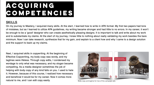
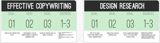
Effective Copywriting- This was my first time dealing with copywriting, but this course helped me to understand its importance and made it so much more bearable. I was able to take the copy and apply it to a campaign. Regarding my personal and professional development, I learned how to edit body copy to say what is essential to the advertisement, write headlines and taglines that would stand out and grab someone’s attention, create different types of testimonial ads, and how to write up a campaign idea. All these skills will help me when I need to maintain a client create content or edit their content to fit the parameters of a project and how to advertise for said client.
Design Research- This course taught me how to take the voice and tone of a brand and the vision board theme into the wordage and the look/feel of a design. It also helped me not just to make any decision lightly. Now when I design I know that everything needs to have a purpose so that the client’s brand is an experience for the consumer from beginning to end.
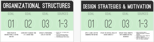
Organizational Structures- While we did work on motion graphics and that is a skill I want to perfect it was the storyboarding and story journal that felt more important to me personally. The more skills I can get down the better. So, storyboarding helped gain the necessary skills to frame scenes and still. The story journal helped me create different story ideas from the world around me.
Design Strategies & Motivation- Month seven was the beginning of the end for me. In this course, I learned how to build and plan for place branding. I took my work from previous assignments and built on it to produce a campaign that included a logo, vision board, dynamic board, media assets, interviews, and print advertisement. Through this course, I now can help future clients plan for big campaigns that include several components in a timely manner.
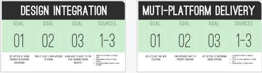
Design Integration- Month eight was a continuation of the previous months’ project. But, the purpose of the course was to develop our skills collaboration and critiques. Both skills are essential for my development as a media designer. In the media design field, collaborations happen on projects all the time. Learning how to work as a team player now and also learning what I can and can’t do will make it easier to adjust in the field. Also, learning to critique someone in a way that will help them further develop their work and learning to accept critiques was super important to take into all my future endeavors. I prefer using the rise model compared to the sandwich method.
Multi-Platform Delivery- Month nine was all about focusing on completing the campaign. I had to research what inspired me to make the design decisions and reach the final solutions. From this course, I developed a real sense of substantiating claims I made and persuading the reader to understand why I made certain decisions. This skill is beneficial because I will know how to back up all my claims when I describe my design solutions to a client.
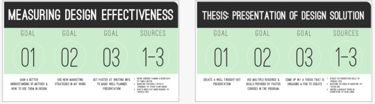
Measuring Design Effectiveness- Surveys are a lot of fun to create and present but waiting on the results is nerve-racking. Month ten I learned about creating a survey and measuring the effectiveness of my design solutions for the campaign. I tested my work against everyday people and audience members. Measuring Design Effectiveness taught me the importance of seeing how a brand’s audience will respond to my designs and if those designs are doing what they are supposed to do. When I am in the field, I know the different ways I can test my designs and how to effectively present the results to a client, so we can decide how to move further.
Presentation of Design Solution- I was starting to feel exhaustion due to working on my thesis defense site. For month eleven, I had to persuade the reader that I had reached mastery by presenting my work on a WIX site and my Behance portfolio. Regarding my development, this course left quite an impression on me.
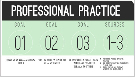
Professional Practice- Month twelve taught me about ethics and how to always consider using moral reasoning with each project I take on. Every course was necessary for my media design career, but Professional Practice felt the most imperative because if I don’t use what I learned, I could face many legal issues throughout my career. Going forward, I will always have an ethics guideline on hand throughout my career.
Techniques in each course
Month 1
Learning APA early on and making all my mistakes here and in the early months. However, I feel like I learned APA best with the copyrighting course. I was able to provide the necessary amount of references and synthesize my research to prove my mastery. Personal Triumph: I received my first hundred for the program. It made me realize I could do this.
Month 2
When I started the Logo for Kyoto Japan, I wasn’t sure how to approach the clients’ needs to make a successful logo. For example, I knew that Kyoto wanted to attract tourism with logo design so, as a design solution I research everything and anything dealing with Kyoto, Japan plus I also considered what tourists might want to see. Personal Triumph: Drawing more than a hundred different ideas for a city logo when I didn’t think I would come up with twenty or even ten.
Month 3
This course gave me the knowledge I needed to build a brand around a logo. I already had the logo but had to fulfill the project I had to build it out. Understanding what the word brand and logo meant I could then create a stronger composition that would bring in tourism and education to consumers.
Personal Triumph: Successfully creating three different concepts for a city that is hugely historic and unique.
Month 4
Effective copywriting was the foundation for my thesis project. The awareness ads, the body copy lessons, the headline, and tagline exercises made the production of the full campaign smooth.
Personal Triumph: I learned a campaign isn’t as strong without a call to action. Which I later learned during my place branding project.
Month 5
The techniques from month five were necessary when it came to any decisions regarding my project. I had to explain my reasoning behind why I used a san serif versus a serif or blue versus red. So, remembering how to connect my research and synthesize that information into an effective design solution was critical.
Personal Triumph: I learned how to differentiate between voice and tone.
Month 6
Storyboarding was essential when I was creating the commercial/dynamic board for Riga. I would have dived headfirst into making the recording without squaring away the full story. The whole process would have been a lot longer, but thankfully I learned the importance and necessity of creating a storyboard.
Personal Triumph: For the story journals, I went personal with my last entry and spoke about my depression and it was very therapeutic.
Month 7
Month seven was the start of our main place branding project, so the skills of building the plan and laying out the foundation were super helpful in completing the campaign. If I did not plan my project step by step in this month, I wouldn’t have had a timeline to work with for the future progress of the project.
Personal Triumph: Coming up with a plan to create a likable yet relatable campaign that the community would get behind.
Month 8
By doing critiques, I was able to perfect my project. The technique of critiquing helped me to push my peers and to take a critical look at my work to envision it in the best possible way. Without the in-depth critiques, I don’t think my project would have reached its full potential.
Personal Triumph: I realized what type of critique method suited my style.
Month 9
By substantiating all my claims, it was so much easier to present my project on my portfolio because I knew my reason for every decision. The final look and feel was cohesive and had a purpose.
Personal Triumph: Completing the full campaign and presenting it on my portfolio. Honestly, I never imagined how the final solution would turn out and I was so proud of the work produced.
Month 10
The survey technique helped me to learn how successful my project was which was super important since in month eleven I knew I had to create a thesis site. If I didn’t create a survey, then I would not have had the evidence needed to prove that my work was at a mastery level.
Personal Triumph: Learning that my project was successful due to the survey responses.
Month 11
The sketching technique (sampling layout) made the development of the site so much smoother and writing the bulk of the defense beforehand as well. If I did not do both methods, then creating the site would have been exhausting and many trials and errors. But since I knew the body copy and the layout ahead of it, it was so much easier to complete my thesis project.
Personal Triumph: Finishing my thesis site and feeling accomplished.
Month 12
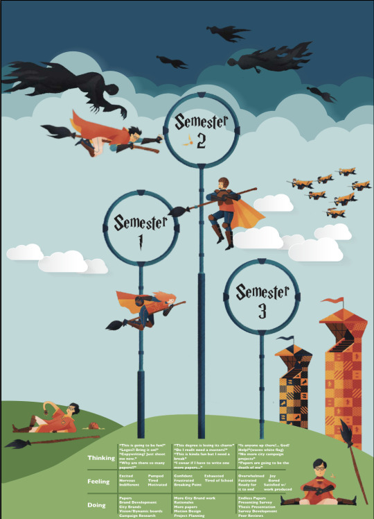
^^^ Final Project of month 12 that depicts my journey. The theme was Harry Potter because I thought it showed my journey through this program's ups and downs perfectly. This project was fun and a nice change from all the writing.
0 notes
Text
Month 11 Journal Reflection
Thesis Presentation had me in deep reflection. Seeing how far I have come from only a few months ago made me think of how much I’ve learned since month one. This course was a bit stressful, due to the lack of confides in the writing department, but I still enjoy the experience and what it taught me.
Three Main Takeaways
1) Learning how to describe my work
In the design business, some people with weaker designs are chosen by a company because they know how to articulate their concept and make that concept sound polished through their writing. When I decided to be a designer, talking about my work was nerve-wracking and honestly, it still is overwhelming at times. I did not know the right ways to say what I wanted or how to persuade someone to understand my design choices. Being a self-taught graphic designer made me feel less of an actual designer, but thanks to this course I can say that my reasoning has a backbone now and I have grown confident. By creating my Thesis Defense site, I have been able to prove my mastery in the four Degree Learning Outcomes (DLO). I was able to persuade the reader that I know without a doubt that my solutions for the client were the best, that I know how to take research and transform that into a design, that I can take what the competition is doing and make it better, by using the skills I have learned. “The ability to communicate the merits of effective design to clients can make the difference between a design proposal being accepted or rejected” (Best, 2006, p. 84). As a media designer, when I have future clients I can confidently walk them through my work and show them why my solutions work best for their company.
2) Taking apart the competition
In the past, I would look at what the competition was doing and do something different. However, with this course, I now know how to steal like a designer by finding out what’s even worth stealing from the competition and how to make it better by combining it with other designs. Thru this, I was able to see how my work was growing. As a graphic designer, I will take this step before I begin working on any project. I will research and learn every detail about the competition and what my design heroes are doing and dissect the work to create a mashup unlike any other to help my client see other angles of attack. This takeaway will allow me to be more innovative in my work.
3) Telling a visual story
“The use of stories can make your ideas stick in the minds of your audience” (Sykes, Malik, West, 2012, p. 4). I didn’t understand how creating a story through words, and my visuals would persuade the audience to see how I had Mastery over the DLOs. But after reading the quote above from this month’s reading, I realized that I would become a storyteller of sorts. Above I explained that I learned how to describe my work, but for my third takeaway, I also learned to tell a story. Through the combination of visuals, captions, and a written defense I walked the audience through my trials and errors, the use of research, analyzation of the competition, and all that I have learned. Each DLO has a beginning to the story and an ending. As a designer, this takeaway will be so important not only in talking about my work but in the work in general. When my client’s audience sees the work, I want them to experience a story visually.
https://cgarcia4662.wixsite.com/mysite
References
Best, K. (2006). Design management. Lausanne: SWI: AVA Publishing. Retrieved from https://ce.safaribooksonline.com/book/design/9782940439782
Sykes, M., Malik, A.N., & West, M.D. (2012). Stories that move mountains: Storytelling and visual design for persuasive presentations. Hoboken, NJ: John Wiley & Sons. Retrieved from https://ce.safaribooksonline.com/book/communications/presentations/9781118423998
0 notes
Text
Month 10 Journal Reflection
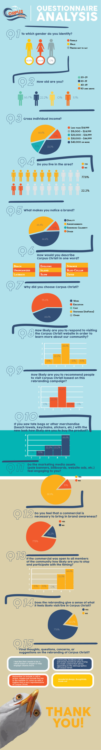
Measuring Design Effectiveness was a great learning experience. I have never created a survey for a big project like this before, but it was fun learning something new. This class taught me a lot about surveys and the best was to conduct and handle the information. It was extremely nerve wreaking awaiting the results all the responses and feedback from the actual target audience that the campaign would gear too.
I got to learn about different types of questions that I could include in my survey. An attitude question forces a respondent to make a positive or negative choice (Collins, 2010). For the rebranding of Corpus Christi one primary goal was to gauge the audiences emotional response to the campaign and attitude questions allowed me to push for either a positive choice or negative one. Qualtrics (2018) states that it is essential to keep the respondent front and center in each question. While devising the questionnaire I had to make sure that the respondent knew the question was speaking to them directly. If not it could get confusing and they would not know how to further proceed with answering. Before I began writing up the questionnaire, I had to ensure I understood the criteria for what would make the design a success so that I could best evaluate the campaign (Best, 2006). By doing so, I could then know which questions to ask to ensure the best evaluation was possible.
0 notes
Text
Month 9 Journal Reflection
Multi-Platform Delivery has been quite the learning experience due to creative burn out from projects from work. This month has made me realize that it’s not easy to balance two big campaigns alongside last minute request and social media planning. However, it is extremely rewarding when it’s all said and done. The Corpus Christi rebranding was created to keep its community and its visitors in mind. The brand aims to encourage people to get out there and seas the day.
The course helped me a lot in figuring out the final destination for the project, and I enjoyed pushing myself through the challenges that all designers have to face in order to achieve a cohesive brand. From here, I only have three more months until graduation. I plan to continue to work hard and diligently to do my absolute best in this course. My goal is to present the best work I can and to keep on challenging myself even after graduation. I am excited to see what the last few courses have in store. I can’t wait to learn more about the ins and out of media design and continue my growth as a designer.
0 notes
Text
Month 8 Journal Reflection
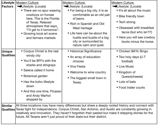
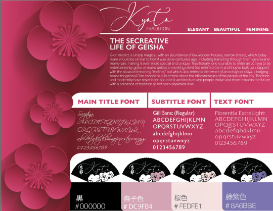
Month eight is now complete. There is only four months left of my Mastery journey. These past two months have been a roller-coaster ride of emotions. I always enjoy working on projects that entail more than one aspect. I entered Design Integration with the research and motivation for rebranding Corpus Christi. By the end of the month, the goal was to establish the voice and tone of the community, then create a design brief that would emit the same feeling as the static/dynamic board. Professor Baldowski’s lectures were veryhelpful during this process, and my peers had great questions that helped in creating the concepts and designs. I am excited to start the next step into multimedia for rebranding Corpus Christi.
Static Board
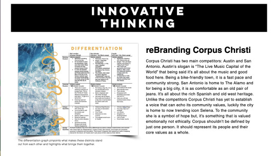
Connecting/Synthesizing/Transforming: It was imperative that the static board reflects the voice and tone of the brand. I researched color choice, font choice, and the meaning of a static/vision board for a community. Static boards define the intentions of a brand, clarify the purpose a brand is sending to their target market, keeps the focus on the goal, and forces a brand to stick to the message/tone of the brand (Gramcko, 2017). Corpus Christi has yet to establish a voice that can echo its community values, luckily the city is home to now trending icon Selena. To the community she is a symbol of hope but, it’s something that is valued emotionally not ethically. Corpus shouldn’t be defined by just one person. It should represent its people and their core values as a whole.
Problem Solving: Corpus needs to build a brand based on the people and the persona they have built with the environment. Thinking about the community can bring more engagement and increase traffic. Communicating this message and conveying it through a vision board in a clear, concise manner is quite difficult. According to the industry, as stated above, a vision board helps to provide clarity and keeps the company focused on the brand’s message. To solve the problem, the static board should only consist of the voice established for the brand. The phrase “a picture is worth a thousand words” comes to mind when thinking of conveying a complex idea in the simplest of ways. Finding the perfect harmony between pictures through contrast and style.
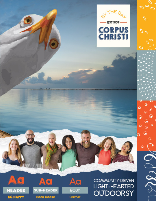
Innovative Thinking: The static board design work continues to get better with practice. Creating work that doesn’t represent anything else but the brand that it is supposed to represent is a crucial part of brand design. The look/feel/style of the board is not something copy and pasted from other companies. For this vision board, the innovation approach was executed a bit differently than how designers usually use vision boards. Vision boards are meant to define a brand. So, they were defined on something similar to a magazine cover.
Acquiring Competencies: Throughout the process, l learned how to define a brand by researching and putting myself out there. When I first started, I was designing for the brand, but I was not utilizing enough research, so there was never confidence behind the knowledge or process of the design of the brand. When I started hearing similarities and keywords used by people the intent of the vision board along with other components of the plan were easy to design and rationalize.
Reference:
Felton, G. (2013). Advertising concept and copy (3rd ed.). New York, NY: Norton & Company.
Gramcko, N. (2017, August 14). How to make a vision board for a successful brand. Retrieved from https://heartifb.com/2017/08/14/make-vision-board-successful-brand/
0 notes
Text
Month 7 Journal Reflection
Overview of the material and concepts learned this month
Design strategies and Motivation is the course that turned the tide for me. Up until this point, I was learning different concepts and skills for separate services within media design. But this month’s course and the next two will entail implementing those skills through a rebranding campaign for downtown Corpus Christi. This month didn’t technically involve a brand-new concept or skill since I was utilizing what I learned in the past but, I learned how to use all I learned to propose and plan a campaign. The month began with learning and writing about the assessment phase of the design process, basic principles of branding & strategy, differentiation, research, and how to conduct a proper interview. An assessment phase helps creators track the success or failure of a project. Throughout the course, I continued to assess the effectiveness of my design solutions. This research helped me to cognize the design process and how to perfect my way of thinking as I work on new projects. These ideas helped me when writing my project proposal and began think about the design work.
Connecting/Synthesizing/Transforming- From the moment month, seven started, I had to conduct a lot of research to create the voice of Corpus Christi for the campaign. To begin, I had to write my proposal for the project. I went back into old courses to gather feedback and references that would help reach my goal by the end of month nine. Since Corpus needed a facelift, I worked through feedback learned in Brand Development and Defining Client Needs to discover the rebranding needed to work with Airey’s seven steps to logo design. Airey (2014) explains that logo design should be simple, distinct, relevant, incorporate tradition, be memorable, and focus on one thing. I wanted to make sure Airey’s steps echoed through the place branding for downtown Corpus. When it came to the campaign tagline Felton (2016) says, if the logo doesn’t say what the product/service is, then the tagline should. I gathered further research into previous courses to apprehend how to perfect the project. The next step was to utilize different strategies like the empathy map (2014) states, “It is the motivation behind the transaction that is the key to understanding customer behavior and needs”. I had to make sure my proposal and design problem were an actual need that would bring immense impact to the community.
Problem Solving- Overall Design Problem: How can the design solutions for Corpus Christi be utilized in the voice and branding campaign to garner awareness from the target audience and encourage them to visit or stay? Unfortunately, I have not solved the full design solution for this problem yet but, the answers are all in the interview that was conducted. The plan is to design a voice that connects the city name with the audience, use print ads, create commercials, design an interactive advertisement, and use social media marketing. So, this multi-media medium solves brand awareness. Bruce (2015), explains how multimedia marketing, is a method of conjoining different forms of media to reach your viewers and build brand recognition. With this method of marketing, Corpus will have access to their target audience through the use of different platforms.
Innovative Thinking- As stated above, I researched the competition and found that none of them use oceanic symbols and only use shapes that highlight Texas or its Hispanic/Latin culture. So, I realized that the branding would be unique in comparison to the neighboring cities. I approached innovation as I always do in my work which is to say I did substantial research and came up with an idea of a potential design that I did not see used anywhere. Vision board are not new to the media design industry, so it’s hard to say what I am doing is innovative. What makes the work unique and original is how I do it which is I make sure it’s not something the competition did already. The voice will be of Corpus Christi and there is no place just like it. The vision board captures Corpus Christi brand and the campaign’s purpose which again makes it unique to the community. The focus is clear, straightforward and viewers won’t consider it is for any other city besides Corpus Christi.
Reflection of course and Future Plans- I have completed month seven which leaves me with five months left until completion of my mastery program. I had a wonderful experience with this course because I feel like I am already producing some of my best work. Each month feels like an improvement from the last. I didn’t know how I would get through this course, but I did, and I feel so proud of myself for making it through. My plans from here are to continue to perfect my craft and to see this campaign through to the end. I have so much more to learn, and I want to acquire all the knowledge I can.
Research used during the design process:
0 notes
Text
Month 5 Journal Reflection
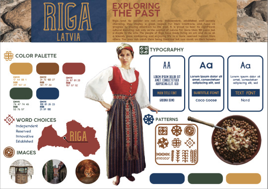
This month was a bit of a challenge because design research is not just researching it’s about using correct wordage in order to enhance the research of the project. I had to push myself to create work that feels authentic to me but also follows the parameters of the project brand. The assignment was to create a narrative fitting for our chosen city in the effort to promote tourism. My purpose was to encompass the history and beauty of the city. I used words like the pride of latvia, ancient for old, and battle of the eras to bring the audience an experience. The voice and tone represent the ancient past and allows the viewer to encounter it.
Synthesizing
Two concepts that I felt had a connection were in Basics Advertising 02: Art Direction by Nik Mahon. Mahon (2010) stated that the idea of a brand proposition should do the art directing for the designer and suggest the imagery. An example would be if a brand is telling someone it will make them feel 10 feet tall then the images should be from a high viewpoint looking down. This concept connects with what Mahon said about designers looking beyond the apparent product benefit, so we can find new ways of looking at the brand (Mahon, 2010). We have to work to make the audience see a brand past simple things like this deodorant will make you smell good.
For me, these connections mean that my job is to have the audience experience the “exploring the past” benefits through what the brand concept imagery is saying. I was able to use these connections in the style board and vision board. The imagery and wordage for Riga suggest that the audience will encounter its charming traditions of the city. The benefit of the brand concept is not merely touring a new place but stepping into the city’s past and experiencing the majestic culture and history of this cultural city.
Problem Solving
One design problem I ran into was during the wordage brainstorming phase for the theme. Riga is a very ancient city in a modern world. I had to make sure that the brand tone and voice which is aged and historic was still present in narrative. So, when I started laying out sentences for the narrative, everything was very vague and unfocused. This solution was to find a focal point. I needed a connection between theme and narrative. But I knew the foundation I built was a good place to start.
As I was working on the preliminary sketches, I thought of the elements that highlight the traditional aspects while also creating a clean vision board that would translate will as a brand. With this solution, I was able to give the user an experience and also give them something they have regularly seen.
Innovative Thinking
A standard design, or something that should be a standard, is the use of typefaces. In the Principles of Beautiful Web Design, Beaird and George (2014) stated, “Every font family has its own unique identifiable characteristics that help us categorize fonts and font families” (Typeface Distinctions). With every project, I research for hours typefaces that work with each project. For the city of Riga, I wanted the heading and subheading typefaces in the infographic and brand that would represent the city. The heading Grodna and the subheading Coco Goose are opposite fonts, as one an introvert the other is an extrovert that embody its people and the look of the architecture surrounding them. The body copy text font is a serif font named Nord which is a balance between the two typefaces while still having a curved look and reserved manner.
I feel like my work as a whole is more innovative than the status quo because not only do I make sure the type matches the project, but I do unique things with the type. But for this specific infographic, I feel with more time and thought I could rework the headings to be more interactive and engaging while still staying on brand.

0 notes
Text
Month 6 Journal Reflection
Overview of the material and concepts learned this month
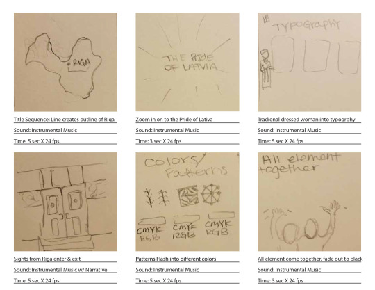
Organizational Structures is a course that took me to the world of After Effects and motion graphics. I had not done a motion graphic before let alone used after effects. In this course, I felt lost and behind in everything but, it helped on learning a new skill to utilize in the future. The materials learned this month was different tools in After Effects like using shapes, layers and how to make an object move across the screen. I also learned about storyboarding. Schneider (2017) explained the process of storyboarding in six steps and that helped to understand how to utilize my storyboards for my design projects. For the final project, I was able to research five different motion styles and learn the purpose of each in the design/animation field. There is kinetic typography, cinemagraph, 2.5D parallax imagery, animatic and motion poster. The first central concept I learned was the 12 principles of animation from Pannafino (2017) (squash and stretch, staging, straight ahead action and pose to pose, slow in and slow out, arc, secondary action, timing, solid drawing, appeal, anticipation, follow through and overlapping and exaggeration). And the second concept was story journaling which helped me to hear and see the world around me in a new way.
Connecting/Synthesizing/Transforming –
For this course, I had two major motion pieces that required heavy research. The first being the animated logo. I didn’t have to fully animate the logo because it was more about learning the importance of the storyboard process. In the article, 12 Basic Principles of Animation in Motion Design by James Panafino he mentions the principle of anticipation. The use of anticipation is to prepare the viewers for a major action the character is about to complete (Panafino, 2017). For the Riga motion graphic, I wanted the audience to feel as if they were on a fun and exciting journey. Blazer (2015), stated that storyboarding is all about clarity and capturing the detail. So, for my storyboard, I made sure to include a description of what was happening, the audio used, and the duration. For the motion style project, I researched general motion graphic. Simply because I was uncertain of what would work best for the brand and what category/style it would fall under. I decided to create a motion that would travel to Riga, once figuring this out I had to acquire some knowledge from tutorials. I used three to help me reach my design solutions. Demafiles (2017), explained how to use the essentials in creating a motion graphic through after effects. Motion Array (2016), taught viewers how to create basic transitions and lastly, Adobe (n.d.), clarified any question I had and had helpful tips and tricks. I transformed the research into an MP4 that gives the viewer an experience of traveling to Riga. Of course, I had to do some trial and error to get my work to the best of my ability which is where problem-solving comes into play.
Storyboard:
Problem-Solving
For the motion graphic, I had two problems to solve. One was making static imagery into one that would move across the screen. Problem number two was to figure out how I would make the audience feel as if they were seeing a fun new world. For the general motion graphic, the problem was getting the targeted audience to visit Riga through the use of the motion graphic by calling out attention to its charm. Creating both motion graphics was about planning a realistic storyboard and researching, according to Blazer (2015), “Storyboarding is your opportunity to work out the visual elements that best suit your story”. So, this medium solves the problem of time and money that would be spent if an animator went straight to digital and had to redo the work. So, this medium solves the problem of getting the viewer to understand the poster’s message quickly while also enticing them. To address the general motion graphic, I created the illusion of movement by using large layers of panorama static imagery to move across the frame, to enhance this effect I used multiple drop shadows. The second problem was solved by reworking my original dynamic vision board design. Due to its heavy focus on traditions I lost sight of the tone. The goal was to make a design that would make the tone of Riga clear to the audience.
Innovative Thinking-
Motion graphics as a concept are not unique. What makes them unique and innovative is how a brand uses them to get their message across to the targeted audience. So, comparing my work to others, I would say that it is unique/innovative to the brand of Riga through the usage of travel. There are little too no motion graphics for the city so, the brand would stand out. Riga’s motion graphic makes the audience feel as if they are being taking to this new world and discovering a fun and enjoyable place. What makes it innovative is the thought process behind the actual motion itself not just the transitions or sketched storyboards. Again, general motion graphics are not innovative or a new concept to the industry. But the animation style has thus far been used in a variety of way through social media platforms, tv, and websites. So, the Riga animation is innovative because I created a panorama motion graphic that would mimic paper cutout puppet show.
Final riga motion graphic:
youtube
0 notes
Text
Mastery 4.4.1
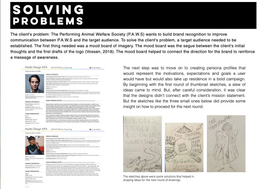
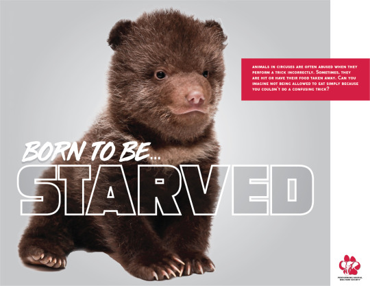
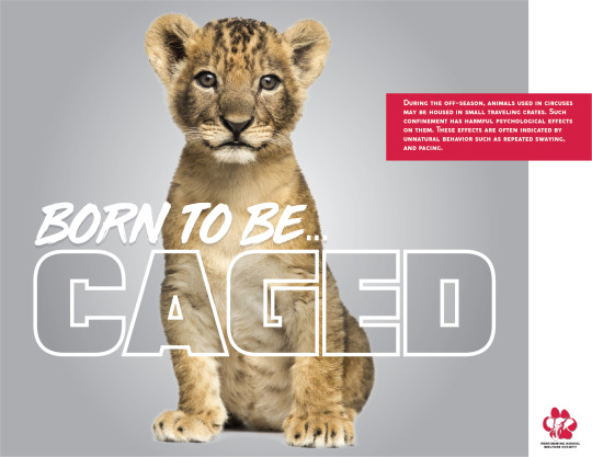
Effective Copywriting has been the most difficult course so far on my mastery journey due to the amount of writing in a short amount of time. This course not only taught me about creating and developing concepts for an ad campaign that is able to hold the same voice/tone but, how communication through writing is just as important as verbal communication. In Advertising Concept and Copy, Felton (2013) states, “Even if that message has no literal spokesperson, it always has a consciousness, and people’s response to this frequently invisible but everywhere apparent speaker becomes central to the success of the message and the brand behind it” (p. 93). The simple statement stuck with me all through this course when working on the testimonial ads and campaign paper for the Performing Animal Welfare Society (P.A.W.S).
Before I began to develop my concepts, I pictured what voice they needed to be in and if that voice would move me into action. I wanted to make sure the voice and tone were detected throughout the whole project campaign. To do that, I had to do what Smallish (2013) said in Developing Ideas and Design Concepts about working with the client and building a solid foundation to build the creative process on. I researched everything I could about P.A.W.S organization and learned everything about their mission to create the perfect voice and tone for the nonprofit. From there I moved to the target audience.
After deciding on the tone and voice to adopt, I began brainstorming on who would be targeted by these ads. “The Frame of Today- presented by Chaco and Huckberry” video helped me in this portion of the concept development and with deciding the target audience for the testimonial ads. I looked back at the list in Advertising Concepts and Copy, and one that I worked with throughout the project was nurturance: the need to provide care for others (Felton, 2013). The purpose was for the audience to feel a sense of a need to do something for animals falling victims to abuse. When I figured out my target audience, I began to do sketches.
“Rough sketches function as the first full visual prototype” (Smallish, 2013). I started by producing quick sketches. An example of my reasoning is I chose to test out all testimonials and eliminated the ones that didn’t connect with my organization or aimed demographic. For example, with the expert ad, I played around with different ideas of how to display abuse. Would it bring a shock factor or play it down? Most of the testimonials I made targeted people around their 30s. Two of the concepts where based off of family movies. I didn’t really stick to a pattern for the ads, I needed to layout all my ideas without limiting myself to a single pattern or category. Once the visual concept was developed I was able to move along to add the written copy to the ads.
My experience in writing copy was excellent. I worked on each ad slowly so once I produced a good concept for that testimonial voice I worked on a headline that would be just as impactful. I started by just writing down whatever came to mind, so for example, the testimonial had generic headlines like “no excuse for their abuse” and “trained but not tamed”. After I jotted down a variety of word combinations, I moved onto body copy because I knew the verbiage would better help me decide on a perfect headline. I made sure there was a balance of imagery and copy (Smallish, 2014). Each ad concept had one impactful image, a powerful headline, a sub-headline, the company logo. In week 3 I forgot to add the call to action but have updated it since.
Target Audience Profiles
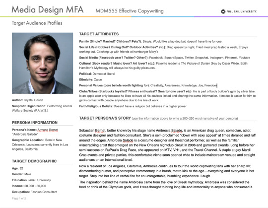

In week two, the professor covered personas and target audiences. Being a self-taught graphic designer, I know little about this, through the intense research in this course, I learned the many essentials of copy. In Advertising Concept and Copy, Felton (2013) talked about Settle and Alreck’s 15 Catalog of Needs and knowing who finds the benefits of a product or service important when trying to sell said product or service (p. 31). Meaning, before I could begin my testimonial ads, I had to know who would find donating to P.A.W.S important and who would benefit from its services. From this research, I concluded my target audience is anyone who owns or works with animals, and people who no longer want to live in a world where animal abuse is allowed. I connected the research to my personas by determining which of the needs would speak to my target audience. I deduced that nurturance (the need to provide and care for others), succorance (the need to receive help from others), and security (the need to be free from fear) would speak loudest (Felton, 2013). With this knowledge, I not only could create my testimonial ads but, I also could decide the full message for P.A.W.S Born to be… ad campaign. I had a clear direction and specific people to speak to with the campaign.
Six Testimonial Ad Sketches
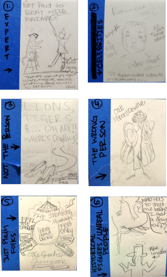
For concept one I used Felton’s (2013) expert testimonial (p. 241). The voice is from an animal trainer telling the viewers they get paid to beat animals. This is followed by a circus fact about trainers. In concept two the target market would see a celebrity as the speaker (Felton, 2013). With the celebrity as the voice, the viewer sees what famous people like them can do for animal welfare. Using a celebrity victim can also be looked at as an expert testimonial ad concept that Felton (2013) mentions. Concept three worked with what Felton described as using something associated with the person (Felton, 2013). Ruby slippers and phrase are some of the things associated with Dorothy from the wizard of oz, and a person has no change against one animal let alone two. This ad uses the shoes and memorable catch phase to show the audience that the animals aren’t the only ones that can get hurt. Concept four is what Felton (2013) called the wrong person and can also be unreal people. The viewer sees the iconic Cruella Deville and her hot line. As child we knew this person was a villain for kidnapping and abusing animals, as adult we need to be reminded. Using something familiar can create a connect with the viewer. The fifth concepted I used just plain folks which Felton (2013) stated was a person really helped by the product or service (p. 246) The purpose is to make the viewer do a double take. The onlooker sees a circus flyer event with a kids’ head in the middle instead of an animal. This helps people realize if it’s morally wrong for a child to be on display shouldn’t it also be for a defenseless animal. The sixth and final concept is historical figures used for their attention-getting quality (2013). The viewer is hearing the voice of the abused animal asking honest Abe a question he can’t answer. In the end they were all rejected because they didn’t have the shock, compassion or impact on the audience needed. I started from scratch and came up with these three comps.
Three Initial Comps

When I began developing my concept ideas, I focused on looking for the imagery that would catch the viewers eyes. Craig Smallish (2013) taught me all about hooking the viewer in through the use of great imagery combined with a headline. I looked for images that worked for the organization. Unfortunately, in week 2 there was a misunderstood with the assignment and the same sketches where turned in without formatting them on InDesign. It was hard to play catch up but the imagery along with the headline ended up turning out better than planned.
Three Revised Comps
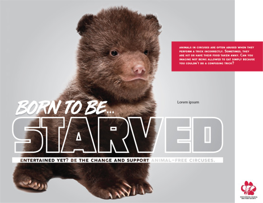
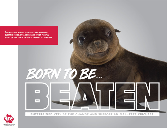

I had to rework the body copy, imagery and headline to reflect the testimonial concept, not to mention adding the call to action. The body copies were circus animal fact that got straight to the point, so the viewers wouldn’t decide it was too much to read. A hint of color used from the logo was used for the copy making the viewer eyes move around the entire ad. The call to action started with a question “Entertained yet?” This made the viewer question themselves and want to make the change. I felt it was mastery level to create a campaign without a pre-sketched testimonial that had been thought out. A professor or boss can’t always be around to make decisions, and it is left to the media designer. It was problem solving on the fly and made my project unique and cohesive.
Takeaways
How to write body copy. I came into this class not understanding the importance of copywriting and writing body copy. Through this course, I have gained a better knowledge and feel much more confident in not only writing copy but editing copy as well.
How to use voice and tone throughout an ad campaign. I always knew what voice and tone in design were. But with this course, I understood how to apply it to a full-fledged campaign. I believe the reason I did well this course design wise was that I acquired this skill and applied it in my work.
Skills in advertising. I had the basic know how with advertising or what was needed to create a great ad. Through effective copywriting, I learned how to write headlines and taglines that mean something. I learned how to combine all this information together to create a multi-media ad campaign.
Use graduate-level problem-solving skills. As I stated in three revised comps, I ran into an issue with the organization I was working with. This experience taught me how to take a problem and use graduate-level problem-solving skills to reach a solution.
References:
Adams, D. (2011, February 14). What is Copywriting and How is it Important for a Designer? Retrieved February 2, 2019, from http://www.instantshift.com/2011/02/14/what-is-copywriting-and-how-is-it-important-for-a-designer/
Felton, G. (2013). Words I: Establishing Voice. In Advertising Concept and Copy (3rd ed.) New York, NY: Norton & Company.
Smallish, C. (2013, August 16). Developing Ideas and Design Concepts. Retrieved February 2, 2019, from https://www.lynda.com/Design-Business-tutorials/Developing-Ideas-Design-Concepts/126121-2.html?org=fullsailold.edu
Smallish, C. (2014, May 27). Designing a Print Ad. Retrieved February 2, 2019, from https://www.lynda.com/Design-Page-Layout-tutorials/Designing-Print-Ad/155264-2.html?org=fullsailold.edu
0 notes
Text
3.4.3 Mastery: Project Documentation, Peer Review and Reflection TASK THREE
During the course, I have realized that vision boards might look easy but, there is a lot of thought that goes behind them. Thru this process I have spent countless hours changing my logo and trying to not only make it look good but make it function. Despite the challenges I came across I now know what a successful vision board consists of and how it should look.
Threats:
· Falling behind because of overthinking
· Time Management between all the projects I have at work and the ones I have for my classes
Opportunities:
· Reaching out and asking for help from peers and instructors
· Working on my communication or lack there of
· Actually, using my planner to work on my time management
Weaknesses:
· Time management
· Over analyze
· Confidents
Strengths:
· Welling to learn and grow
· Think outside the box
· Quick learner
References
· Quast, L. (2018). How To Conduct A Personal SWOT Analysis. Retrieved from https://www.forbes.com/sites/lisaquast/2013/04/15/how-to-conduct-a-personal-s-w-o-t-analysis/#2bacfbed28d8
· http://www.letstravelsomewhere.com/travel-inspiration/rodolfo-contreras-japan/
· https://www.vogue.com/article/geisha-culture-kyoto-japan-how-to-see-geiko-maiko
0 notes
Text
3.4.3 Mastery: Project Documentation, Peer Review, and Reflection - TASK 1
Threats:
· Falling behind because of overthinking
· Time Management between all the projects I have at work and the ones I have for my classes
Opportunities:
· Reaching out and asking for help from peers and instructors
· Working on my communication or lack there of
· Actually, using my planner to work on my time management
Weaknesses:
· Time management
· Over analyze
· Confidents
Strengths:
· Welling to learn and grow
· Think outside the box
· Quick learner
References
· Quast, L. (2018). How To Conduct A Personal SWOT Analysis. Retrieved from https://www.forbes.com/sites/lisaquast/2013/04/15/how-to-conduct-a-personal-s-w-o-t-analysis/#2bacfbed28d8
· http://www.letstravelsomewhere.com/travel-inspiration/rodolfo-contreras-japan/
· https://www.vogue.com/article/geisha-culture-kyoto-japan-how-to-see-geiko-maiko
0 notes
Text
Mastery Journal Refection
Task1: Documenting the Design Process
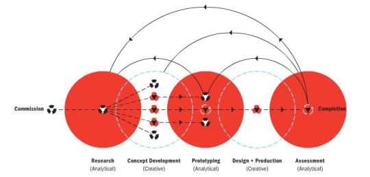
The development of my creative process this week was led by the integration between visual communication and using a research method to convey the concepts behind the design. The diagram that best illustrated my approach to this assignment was the research-driven method (look at attached image).
During the process I constantly made sure that the research and design stayed connected to the targeted audience. There was a lot of revisiting informative sites that helped with questions that kept coming to mind during the progression of my designs. As Margo Chase said, “question everything”, which has been of use to me throughout the creative process. I am not done with the final prototyping so, I must keep in mind to ask the right questions during the final phases to make a proper assessment.
Task3: Feedback Reflection
In my initial sketches, I put too much detail into the designs and didn’t edit myself enough. It was difficult staying focus on creating a logo not an art piece. So, thinking simple was not part of my design equation. However, thanks to the feedback I received I was able to challenge myself. My peers suggested to keep in mind of the size of the logo plus the detail used within the logo. If the logo is unrecognizable at a thumbnail view it should be deconstructed more. I took all the feedback into consideration and implemented them to my revisions.
The first 100sketches below
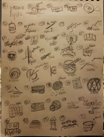
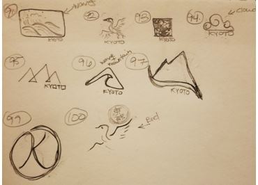
0 notes
Text
Reflections
1. What are the key takeaways that will have the most impact on your experience as a graduate student?
I had already answered this question in my intentions post. As a refresher though, I feel like branding myself and my values will impact me the most. This will determine how I approach and market myself as well as finding my demographic. The logos I make will set the stage for not only my customs but for myself. It will show who I am, my values, versatility, and if I cater to a certain group of people. The upcoming research I’ll be doing will help me find my own way of achieving brand development.
2. What are some questions and/or concerns that you may have about the program that may impact your future success?
The only concern I have is that there will be more writing than actual designs being created. I know this is a master’s program but, for someone like me who loves working with my hands it is difficult to keep interested. I’m not one to express myself through writing and sometimes not even through speech. I have always used art as an outlet and can talk to you about my designs and process. The problem is the lost translation between my speech and writing. It is something I am now working on because this can Impact my success. I must be able to write a clear propose, letter of intent, and be able to write a thesis on design. I know I can write something clear and well thought-out. I just need to be able to start doing it faster.
3. Write an action plan that includes your vision and expectations of the MDMFA program, your expected level of commitment, and your long-range goals as a professional media designer.
As a self-taught graphic designer and trained studio artist, I am confident that I would be successful in the creative services field. However, before am able pursue a career I’ll need to be properly educated in other accepts of graphic design. Since I am not formally trained as a Graphic Designer, my goal is to learn as much as possible to fully understand all the ins and outs of Media Design.
I am a hardworking, self- motivated individual who is prepared for the challenges associated with the year—long Media Design program. My professional goals are to obtain a successful freelancing service company and utilized my knowledge to produce and promote innovative ideas.
0 notes
Text
Edward Gorey
Want to see more of his amazing etchings? Go to http://www.edwardgoreyhouse.org and get inspired!
0 notes
Text
Journal LOGO!
Why Kiti instead of Crystal? Well, the short version of the story is when my nephew was little he couldn’t say my name so he came up with Kiti (pronounced by him: Key-Tea). You'd think that something like that would fade as he grow older. Nope! He’s 21yrs old now and stills calls me by this name. I’m not even mad about it, I’m actually quite fond of this nickname. Plus, it opens more design options for me.
0 notes
Text
Alberto Giacometti
An inspirational video about a legendary artists life and torment. If you can't see the video go to youtube and type in “Eternal Gaze”
youtube
0 notes