Last Seen Blogs
phoebe-spengler
what kind of scientist was grandpa?
modestplus
Modest Plus
mrs-bones-teaches
Mrs Bones Teaches
yoonisweakforthishero
gerard's wife
Text
Cultural Project - Development and Research
The prospect of developing and shooting a project based on cultures or subcultures is a very exciting opportunity. For years i have wanted to shoot a photo-project showcasing cultures in Scotland that you wouldn’t normally see within Scotland or even outside of Scotland. This country has such a vast array of scenes and cultures despite having such a small population on the world stage. From the underground dance music scene to the software and design companies based in Scotlands major city’s.
i had a few initial ideas such as documenting scotland's dance music scene, hiking culture and drinking culture, all three we are known for in scotland, some better than others. I wanted to do something accessible to the majority of the population, something that it doesn't matter about your background or financial status, you can access it. I decided to do it on football culture, football is something i hold quite close as its something i grew up with and have been constantly surrounded with. You can’t really avoid football in scotland as it is the country's biggest sport and near enough every pub or bar will show it when its on. You will also notice the numerous football pitches from the amateur grass fields to the professional steel structured stadiums dotted all around scotland.
I aim to document football culture in scotland as a whole and to inform the viewer of how scotland see’s football and how it interacts with it. I would like to capture the professional top flight teams all the way to the lower league sunday amateurs. The main focus of the project is to document the fans, without the fans football wouldn’t be as big and exciting as it currently is.
Risks and Challenges
Risks associated with documenting Scottish football culture should be properly evaluated and managed. The following are a few potential risks:
- Football is frequently associated with deep and emotional feelings, hence it is usual for rivalries to turn violent. Being aware of potential conflicts and avoiding circumstances that can endanger myself is vital. To protect my safety, this can entail collaborating with security at the games.
- Privacy and consent: While taking pictures of people in public places, privacy and consent concerns may come up. Despite the fact that people in public places have no expectation of privacy, it's still crucial to respect their right to privacy.
- Misrepresentation: Photography has the potential for influencing public narratives and attitudes. Nonetheless, care must be taken to avoid misrepresenting or stereotyping individuals or communities and to ensure that the photographs accurately reflect the reality of the situation.
- Laws relating to defamation and invasion of privacy are among the legal concerns that i must be aware of. It is crucial to make sure that any photos taken do not violate these rights within the clubs rules.
- Photographing Scottish football culture may have an emotional effect, especially when photographing delicate or contentious subjects. It's critical to recognise my own emotional reactions as well as taking the steps to deal with it.
Strategy and Objectives
Of course, gaining access to some of the top flight teams is very difficult as they have contracts signed with companies such as SNS group which typically covers any sporting event in scotland with their own photographers. Sometimes for a few of the top flight teams they will have their own internal photo and video team for documenting for their socials.
Thankfully, when shooting sunday amateur teams or even premiership teams they aren’t as strict with allowing photographers and or students in too take images. By approaching these smaller teams and gaining more access would allow me to create a better narrative and story. I think shooting at the top flight teams would be interesting for a few images especially in the ultras sections but i think having the full photo story be about them would be rather boring.
In order to even get access to the bigger teams you would firstly need to build up a rapport with the smaller teams and get images you can show the bigger clubs so they have a better understanding for what you wish to shoot.
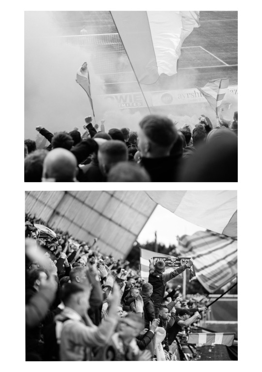
Although i do plan on attempting to shoot some of the top flight team’s fans at away games travelling to and from the stadium. Typically these do make for interesting images as pyro or smoke bombs are used. Typically these fans will be fairly rowdy, so proceeding with caution when approaching these fans is advised.
I would also like to document some iconic and some unknown stadiums in scotland. Taking inspiration from Brian Sweeneys photo series “great stadiums of the north” he documents amateur football pitches all over from the north of scotland, faroe islands and iceland. His images have a slight liminal space feel as they are commonly shot with no people in the shot and most of the time are shot when the weather is overcast, dark or rainy. The use of weather gives the images a nostalgic feel as i can recall playing on pitches similar to these as a child in similar weather, i think that's what partly draws me to the series.
Equipment
Choosing equipment is always a tricky thing as you feel like if you dont take that extra lens or two you wont come out with the shots you want, or sometimes if you have too much equipment you give yourself too much choice and you overthink it. My typical rule of thumb is two prime lenses and a zoom, usually being a 50 1.4, 85 1.4 and a 24-70. Sometimes i will take the 70-200 instead of the 24-70 but obviously its very subject dependant.
One would think taking a 70-200 to a football match would be the obvious choice, but for the images i wish to create it wouldn't work. The images i have been researching and looking at looks as thought they are shot between 24mm and 70mm. I think using a lens with a larger focal length can run the risk of creating a distant and removed feeling from your subject. I think my go to lens for the project will be a 50mm as its the closest focal length to how the human eye perceives perspective and distance. Plus, the 50mm is notorious for allowing the photographer to get in nice and close without distorting the subject.
Regarding cameras i plan on taking two, one being my Nikon D850 and a small Nikon 35mm point and shoot film camera. It would be good to only shoot this project on film and would create interesting results. Although i cannot risk relying on 35mm film to get the shots im after. Currently i think the chance of the exposure or metering being way off is quite high as it isnt manually dialled in plus it isnt the most advanced point and shoot. It is also because i may need the high resolution of the 46 megapixel D850 if im planning on cropping in close and if i need the dynamic range to push and pull the shadows.
I have decided the D850 will be my main go to camera during the project as i know i can get consistent images that are well exposed and sharp while shooting fast moving action such as crowds. Regarding the film camera i would plan on using it as a secondary camera to capture images that are more candid and use it in places where using a large professional camera would be noticed.
Since im using a film camera i will obviously require film. I plan on using two types of black and white film, Ilford HP5 and FP4. Im using these two specifically since it is a fairly common film which i can buy easily and develop easily. I like the idea of shooting some of the images in black and white as it can suppresses individual team colours and makes a stand showing that everyone is all supporting the same sport and shares similar values which is typically forgotten about in the current world of football.
Research and Inspiration
I recently had a phone call with Brian Sweeney for guidance for this project as throughout the past few years he has shot football ultras and commissioned his own projects based around football culture in scotland, most notably his series “ great stadiums of the north”. We had a fairly in-depth chat about taking certain approaches when contacting clubs and shooting fans. His advice was fairly similar to what i suggested i do when approaching clubs which was start with the smaller clubs and work your way up. He also invited me to assist him on a shoot for lower block where he plans on shooting a local football ultra’s fan group in airdrie. He mentioned ‘Lower Block’ was the perfect website and publishing company for drawing inspiration. The website features articles about european football and its fans, the articles contain beautiful user submitted images of the stadiums and fans, i can already tell this site will be one of my main sources of reference and inspiration.

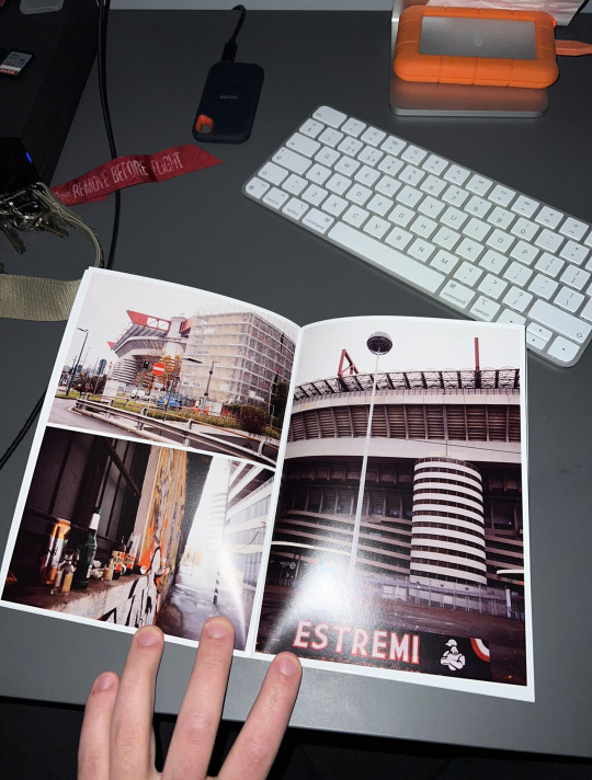
These images are of the san siro which is the home of AC Milan. These images
were taken Alex Amoros's series documenting both Inter milan and AC Milan. In
these images Alex documents the stadium and surrounding areas and focuses
on the graffiti and artwork created by the fans. As you can see, the stadium has
an influence on the surrounding landscape usually creating themed bars and
coloured wall featuring artwork from the ultras groups.
Celtic FC has a similar fan group which creates elaborate artwork such as
political murals or simply painting walls with the colours of the irish flag. Celtic
has a strong political stance as its more left leaning since the club was created
by immigrants. The club often creates banners during matches referencing its
stance on pro-immigration and its anti-israel narrative. The reason why they are
anti-israel is because they believe israel stole the land from palestine which is
similar to how the british took over ireland, so therefore they resonate with the
palestinian people.

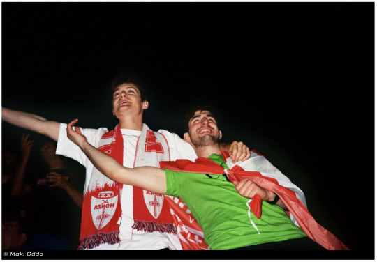
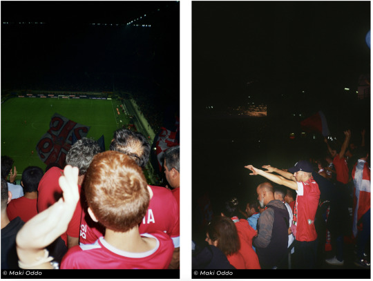
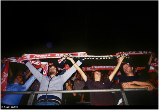
Another project i have been looking at on lower block is one by "Makl Oddo"
she documented monza FC as her grandfather was a long term fan. She was
taking images at the games during the run up to the team being promoted to
serie A in italy. I am a big fan on how these images have been shot as they
create a very nostalgic feeling and almost a throwback to 90's football culture
on the continent. Shooting the images on film using what i presume to be a
small compact point and shoot allows to you to become part of the crowd and
not to be alienated by using a large professional camera setup. At football
games nowadays especially with clubs that feature ultras fans group people are
growing more and more skeptical as there is typically a large police presence
and or undercover police. For example, at one of Celtic FC's recent games
there was 4 undercover police standing beside the ultras section. the fans
quickly realised who the were and took a picture of them and placed the
images on twitter.

I have also been looking at John Ingledew’s series on Chelsea FC in the 90′s which documented how chelsea plummeted from top of the league to the mid table team and in the worst case the division below and then rocketed back to champions of Europe. What drew me to these images was how timeless they look, not just through the use of black and white but also the fact what people wear and how they act has not changed from the modern day game.

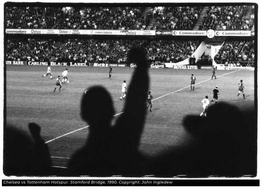
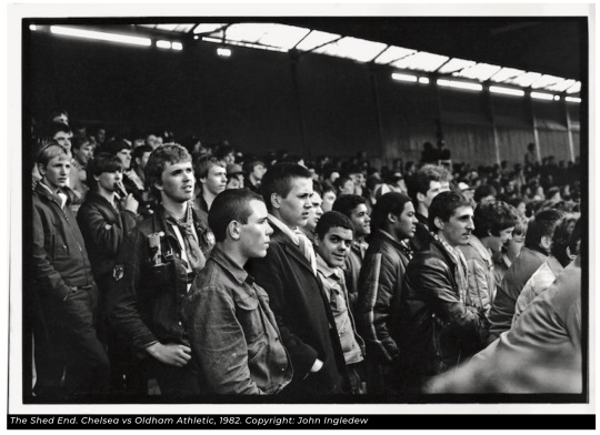
I think what make these images successful is they give a spectator view of the game instead of the perspective from the sidelines where the photographers usually are. I also enjoy the fact the images capture the reactions of the players and give an insight as to how the fans were feeling at the time since their team had just dropped a league.
One thing i have noticed in all the photo projects i have researched is that they are either shot on film or include film photography one way or another, I think this quite interesting and thought out. As previously mentioned most football fans are quite wary of cameras inside stadiums and even more so amongst the crowd taking images of the supporters. By shooting on film it almost disguises you as a novice or some random tourist. Especially now that film has become fashionable again in the last ten years or so its not uncommon to see people using a film camera and i think most people still see it as a novelty so i imagine people do not take you as seriously if you’re using a film camera rather than a professional digital set-up.
For example, a few years back i was experimenting with a bit of street photography and i was using a professional DSLR and a 24-70. Obviously this isn't the most subtle of setups but i was still trying to be inconspicuous and even going as far to taping up logo’s on the camera and lens. But, as soon as you raise the camera to your eye people instantly notice as if its some sixth sense. My theory is that people associate big professional cameras with press and journalists shooting some sort of news story, therefore when they see it they instantly glance over to see whats going on.
Then a week after that shoot i went back out with a fairly small point and shoot film camera. Instantly i noticed i could raise the camera to my eye and look through the viewfinder and nobody would bat an eye. Like i previously said i think a lot of people see film cameras as a novelty and a bit of fun therefore they do not think about it as much.
Applying this knowledge to when it comes to shooting this project i think will be very helpful. My original plan was to only shoot on digital but to get the images i want it would be wise to shoot on a mix of film and digital.
Shooting plan
Im already quite fortunate going into this project as i knew the head of marketing over at Kilmarnock FC as i had previously done a shoot for him when he was at his last job, so i already knew i could rely on him for access to some kilmarnock games and hopefully some connections.

I knew i wanted to shoot celtic or celtic park as i have a been long term fan of the club so it would be quite special to feature the current squad in the project or even the stadium. Firstly i decided to get into contact with Gregg over at Kilmarnock as i could be guaranteed to shoot at least one match. We firstly had a call discussing what my project is about and what i aim to achieve.
I also reached out to the liaison officer at Celtic FC as he directly deals with fan enquires directly. I thought this would be a good place to start regarding possibly being granted a press pass for an up-incoming home game. I reached out over email explaining my situation and the images I aim to get.

From here we organised a call and went over the technicalities with allowing me into shoot a home game. Sadly it was going to be very difficult due to SNS Group having a contract with the club and by allowing an external photographer in would be a breach of contract regardless of what they are shooting. John did suggest reaching out to the Celtic TV team and put me in touch with one of the videographers but i didn't get a response sadly. Although me and John came to an agreement where i would be allowed in to shoot aspects of the stadium that you normally couldn't get access too on the normal tour such as the standing sections, pitch-side and the back corridors featuring artwork.
I also reached out to Hampden for the possibility of shooting the Celtic vsRangers cup final. Since i did not have any connections there i did go on linkedin and looked up who worked at hampden and sodexo. Linkedln is a wonderful platform for finding names of people who work behind the scenes of these places.
I reached out to Rory MacDonald who is the marketing manager at Hampden with a message explaining who i was and what my project was about and then he put me in touch with someone at the Scottish FA who handled the press side of matches.


As you can see I wasn't able to get a pass as im presuming its due to them only allowing publication photographers / in house teams access to the match since it was one of the biggest if not the biggest match of the season. I would get in contact again but from the final till the project due date they did not have any matches that i wanted to cover unfortunately.
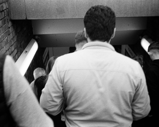
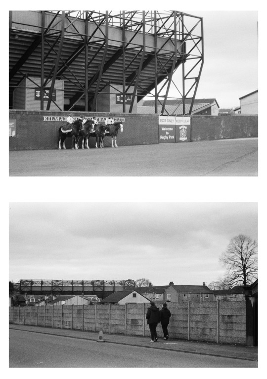
First Shoot - Celtic Park
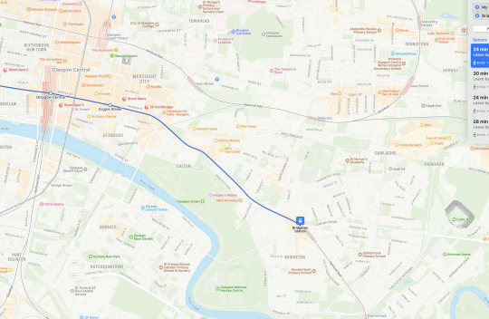
Since my first contact with John i have been lucky enough to be granted a private tour of sorts from the disability access officer who was more than happy to take me behind the scenes and allow me to shoot. I was able to walk around for about an hour taking photos of the standing section, the artwork inside the corridors and the stadium itself. Getting to the stadium was very easy, i stay in hillhead so it was a case of headed to the subway station and then getting off at buchanan street and then walking to central station to then get the train to Bridgeton station. From Bridgeton station it would take a 17 minute walk, i was due to be at Celtic Park for 11am therefore ideally i would liked to be there 15 mins before.
Route from Glasgow Central to Bridgeton station
Walk from Bridgeton station to Celtic Park

I was originally worried it would be a fairly rushed tour where i could only go to one spot and shoot but thankfully i was allowed to take my time and was able to ask questions about the club. Below is 32 images i selected that i deem as usable and would contribute to the project.

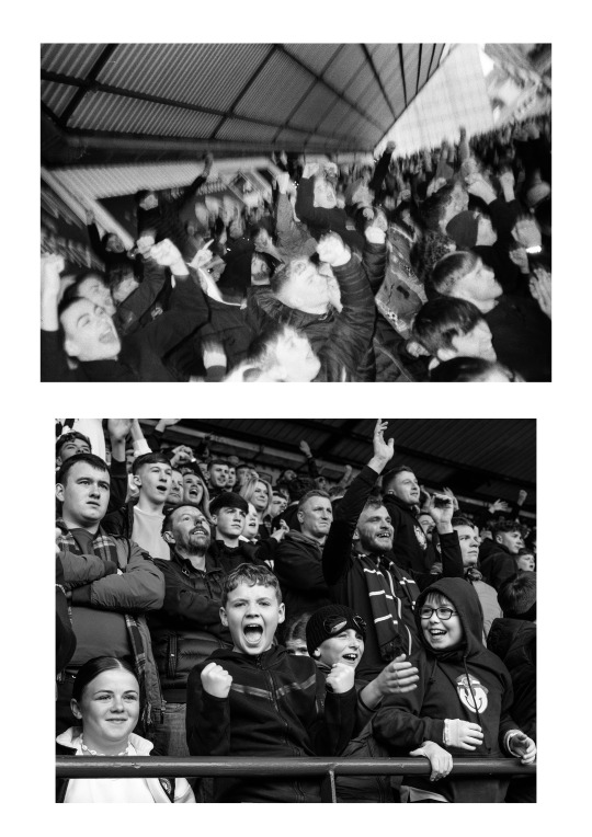
As you can see most of the images are of the artwork and stickers as i think they are able to represent the club and its ideologies nicely. I think from each game i shoot i would like to get images of the stadiums and behind the scenes as its not something you typically see as often therefore making the series a bit more interesting, an example of this would be these images.

One of the main points for this project is context more than anything. For example, if i’m simply taking images of just fans there isn't much context than it just being people enjoying themselves. Since the project is about Scottish football and its culture as a whole then its the images like the ones above that provide the depth. By showing these types of images it also shows and gives indications towards the individual subgroups within the sport as a whole such as the ultras fans and the implications they have with the clubs and the police.
Selecting the images
Out of the 32 images from Celtic park that i had condensed down from the original 244 i have chosen 6 to be used in my wider project. I will discuss why each image was chosen and how it will contribute to my project.
Image One -
I chose this image for the fact it shows off the standing section at Celtic Park, which is far as i’m aware the only one in the top flight scottish football. What drew me in the most was the thin sliver of light that stretched across the standing section giving the image a bit more contrast. I also enjoy the leading lines in the image, leading from the standing section towards the seated section and then to a large triangle of light which once again adds something dynamic to the image. I flipped this image to black and white as this area of the stadium had a lot of different coloured stickers, signs and logos which i feel take away from the sliver of light and leading lines. I also cropped the image to 5:4 as i prefer this aspect ratio mainly due to the fact i feel like regular 16:9 is either too wide or too tall for most images, cropping into 5:4 i feel gives more emphasis on the subject within the frame and is easier on the eyes.

Image Two -
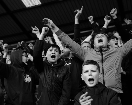
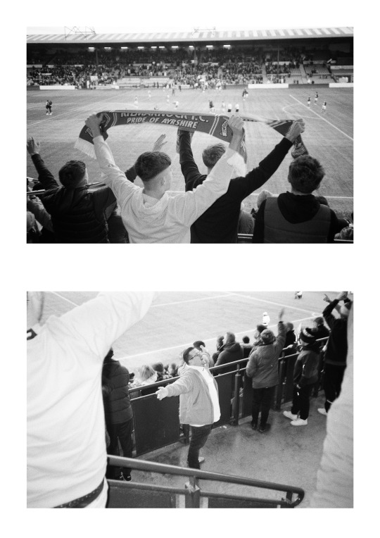
This is one of the images that i mentioned would give more context to the overall project. The more formal analysis of the image would be that it represents the Green Brigade and the Bhoys interaction with the club and the fact they have their own standing section which in itself shows the club is willing to give them a platform to create their atmosphere and display their messages. But, in a more contextual analysis an image like this contributes to the message that this project wishes to project and that is that scottish football isnt just people gathering on a muddy pitch on a sunday. I want this project to show how passionate people are about their teams and how they are almost passed through the family like heirlooms.

Image Three -
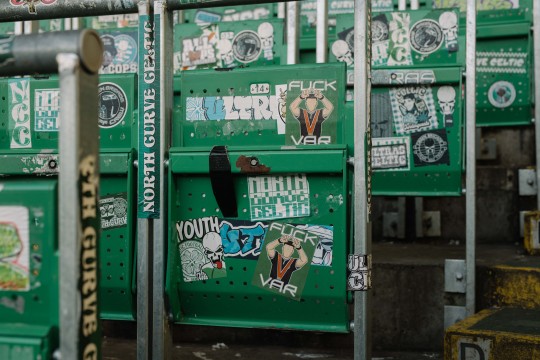
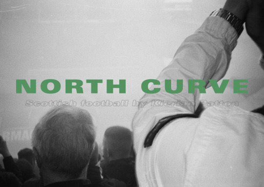
Another image of the famous standing section with the back wall decorated with the words “ NORTH CURVE “. Typically most ultras fans regardless of the teams either settle in the north curve of the stadium or behind the home team’s keeper. Im a fan of this image as its not one you get to see, the. only time you will see images of this wall is when its game day and the standing section is filled with home support.

Image Four -
I wanted to include an image or two which showcased some stickers in the standing section as a lot of them were politically motivated and others not so much. Taking pictures of the stickers which are faded and have clearly been there for a long time which can compliment the dedication of the dedicated fan group who have stood beside the club for so long. I included this image for context as i believe it contributed to the overall story of this project.

Image Five -
Similar to the previous image but this image showcases more of the stickers that the ultras fan group have created. You will notice there are a few stickers that aren’t the usual Celtic colours such as the “nautica 10 ans” sticker near the bottom. This sticker symbolises the long term relationship the green brigade and Paris St.Germains ultras group have established as they both share similar views and ideologies. This relationship is something i would loved to of documented but it would fall into a longer term project as gaining access and getting their trust would be very tough.

Image Six -
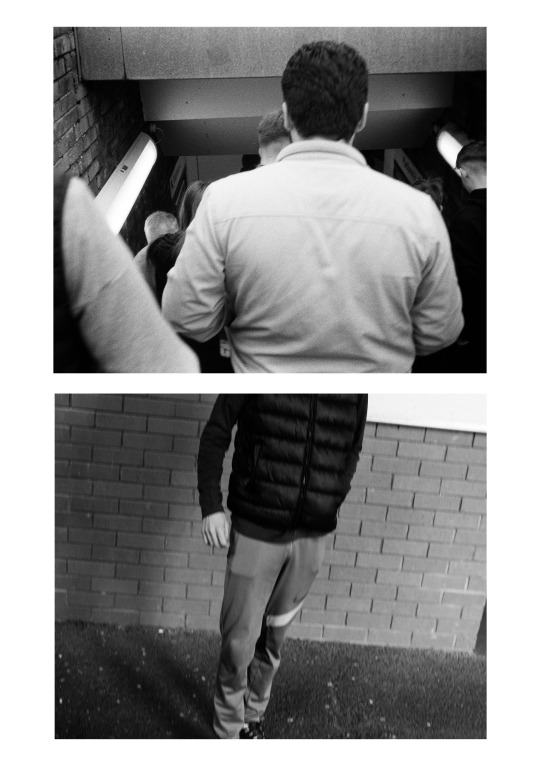
This image was taken in the corridor below the standing section. The corridor was full of murals like the one below. I decided to choose this image as it directly relates to the other images since it features the same logos and colours. I think images like these draw the overall project together by showcasing that it is about the more hardcore fans of scottish football.

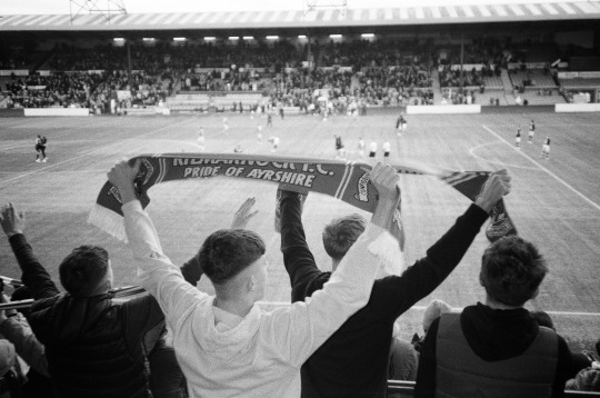
Second Shoot - Kilmarnock Vs Hearts (Rugby park)
Like i mentioned previously i have stayed in contact with Gregg McEwan and we had set out an idea of the games i wished to cover, kilmarnock vs hearts was one i wanted to cover. I liked the idea of shooting two smaller teams in the league as it hasn't been covered as much as the two old firm teams. I spoke to Gregg regarding whether there were ultras fans on either side and he said “each side do but they arent that big” then i asked where about they sat so i know where to position myself.
Around a day before the match i got sent through the press accreditation list containing who got access where and everyones roles. ( see below )


Kick off for the game was 3pm, therefore i had to plan ahead in terms of what train i will get and how long it will take to walk from the station to the stadium. Ideally i wanted to be at the stadium roughly 30 minutes before kickoff, this gives me plenty of time to drop my kit off in the press room and then locate which security gates i can walk between to get to each stand.
Below is the route from station to stadium.

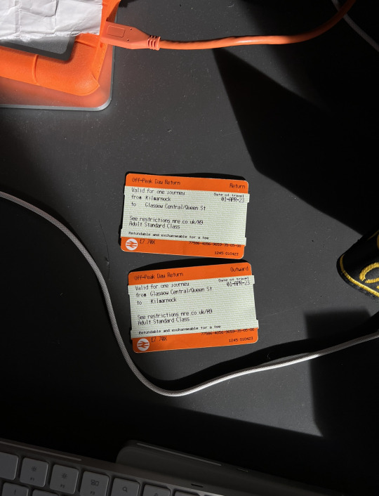
Train tickets - Glasgow Central to Kilmarnock
Stadium arrival
After arriving i made my way to the press entrance and had my name ticked off the list and then made my way to the press room where others had already setup. I then got given my press pass which would allow me everywhere but the behind the scenes offices.


Upon arriving into the press room laid my kit out and had a look at what i needed. Since i was unsure where i could go i did pack multiple lenses just in the off chance i was away from the main body of fans. I ultimately decided to keep things light if i am shooting amongst the fans while keeping a low profile. I didnt want to risk damaging any of my kit despite having insurance nor hit someone with my camera. I took out my D850 and a 50mm lens with a small film point and shoot.
I was unsure what camera i would use the most as i believe both had their own uses. For example, i would use the dslr for capturing high res portraits and pictures of the fans celebrating or just watching the game. If i was taking pictures of the fans celebrating i couldnt risk missing the shot so by using a camera with an advanced auto focus system and that could fire of multiple frames a second i was confident in my ability to get ‘the shot’. I would use the film camera as a general camera whether it was to shoot wide shots of the fans or specific detail. I was not worried about getting images of any of the players as this isnt what the project is about, the only time an image would feature a player would be when they run up the fans in the stands and interact with them celebrating.
Shooting
There wasnt a huge number of fans from either side but they did have numerous hardcore fans from either side. Hearts had a sizeable turn out for one of the non old firm teams which was good to see. I positioned myself amongst the crowd at the back of the stands so i could see what was happening and who was creating the most action. I wanted to spend the first 45 mins in the hearts section and the other 45 in the kilmarnock section. but ultimately i wanted to go with the flow since hearts could score multiple goals therefore the atmosphere in that section would be the best to shoot.


contact sheets from the game


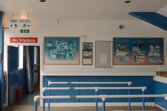

before getting into the main body of images, i took these while i was getting on of the famous pies at halftime and what struck me the most was the look of the place, the old images of the trophy winning teams of by gone days and ex superstars. In most stadiums it has been completely modernised and images like these are stored away or just gotten rid of so its interesting to still see these images hanging up. I would like to integrate this imagery into the series but my only concern is having images of the fans and then having these before or after, i dont think it would link very well but ill try and see how it looks in the final series.
Picking the finals - Film


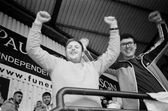


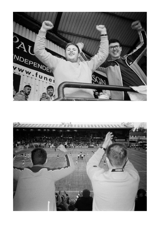
I picked these images for a multitude of reasons. One of the reasons being as i believe they captured the game perfectly, kilmarnock won this game against hearts which was fairly unlikely as kilmarnock were near enough bottom of the table and hearts were third in the table behind celtic and rangers. judging by the images of the crowd they were fairly happy about it. Another reason why i chose these as some gave me nostalgia for going to football matches with my Dad, moments i hold close. Its such a common occurance to have the football ground out the way and sometimes amongst houses so the walk from the car, bus or train is quite a strange one. As you are in a huge crowd walking past someones front room and going up little side streets where any other day the place would be very quiet apart from the odd dog walker. Some of these stadiums seem very out of place and random, some even giving off a liminal space sense of emotion.
I think overall images of outside the stadium also gives the image series a bit of context regarding the football experience and culture as a whole. I think if it was images of only the fans the series would really be about scottish football culture as using the terms culture implies more than just people in the stands.
Out of this selection of images the first one would be my favourite as theres not any defining symbols or ideas of locations for where the image is from or who is in it. I believe it is an image which would symbolise the ‘away day’ experience which typically involves a large group of people travelling by bus or train, could make a good front cover for a zine!
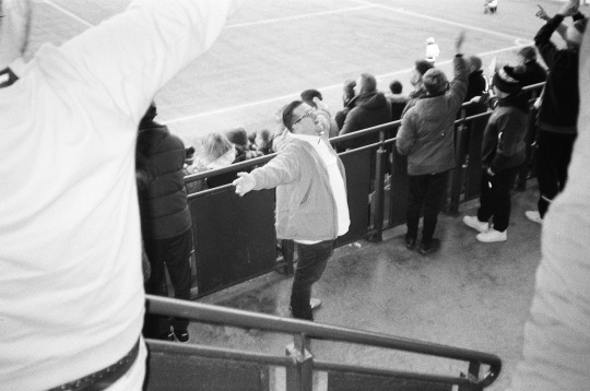
Picking the finals - Digital


Similar to the last group of images this bundle has a bit more focus on the fans. The first three sums up the general feelings of the hearts fans, first they score then suddenly kilmarnock put two past their keeper then its all over. I cropped these images to 5:4 as i much prefer the look compared to the crop straight out of camera as i felt it was too wide. By having the crop at 5:4 it allowed me to allow for more focus on subjects as when i had it at the original crop there would be points where id have half of someones face in the image and it took away from the image overall.
Out of the digital bundle i have three favourite images. The first one being the third image of the hearts fans after kilmarnock just scored. I like this image not only for the reactions of the fans but more for the conclusions i can draw from it. You will notice that the more prolific reactions are from the younger fans and the older fans maybe in their 30′s are a lot more reserved. I think this is because when you are young you can get away with more things and they arent taken as seriously but when you have a job and a probably a family you cant be seen making gestures like what the younger fans are doing.
My second favourite is the second last image for the composition. When i shooting this i wanted to just get the younger fans leaning over the railing but when i shot the image the other fan appeared in the bottom left of the image. Only when looking back at the image after the game i noticed it. Initially i didnt like it very much but cropping it to the 5:4 ratio allowed the image to feel a bit more balanced for a normally awkward composition.
Lastly i like the last image too as its a good sum up of the younger fans in scottish football. These fans would of grown up going to matches with their dad or family when they were younger but i think due to covid and growing up during that time they were unable to attend matches in person. So by dressing like this and being the ones to incite chants and gestures they are almost making up for lost time, gone are the days of adidas sambas, blue jeans and stone island apparel. Its time for the nike tech tracksuit, nike airmax and north face jackets. You could draw some symbology from the image based on how he is standing, his slight awkward and hand placement could symbolise the attempted integration they have into the football scene with all the older fans and attempt to find where they place on the hierarchy.
Celtic Vs Kilmarnock
This is the game i was looking forward too the most as celtic always have a very good turn out for away games. In this case celtic took up the full away stand, therefore i decided to position myself in these stands for the whole game. This is because celtic is dominating scottish football at the minute and have only lost one game therefore a lot of kilmarnock fans didnt turn up as they knew they would lose, which they ended up doing.
When shooting the Celtic Kilmarnock game away i was amongst the Celtic support specifically between the two ultras groups the 'Green Brigade and the 'Bhoys' both previously part of the same group but split due to internal conflicts and beliefs. I know they are typically suspicious of people with cameras so i made sure to speak to both groups before kick off to just let them know I'm here with a camera and their faces wont be in the images. The paranoia stems from undercover police being present at the home games in their standing section so i don't blame them for the suspicion.


screenshots from some videos i took
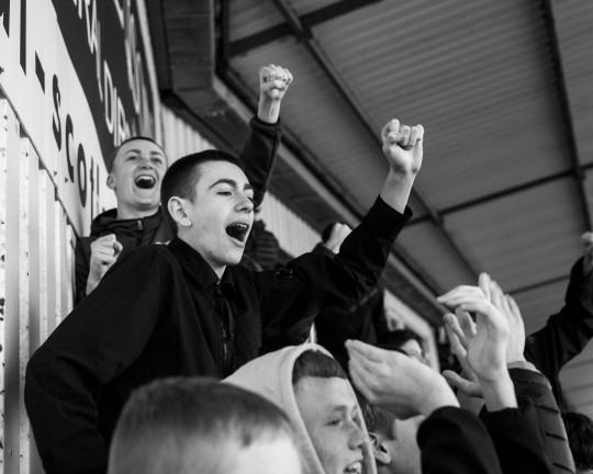
Learning what i did last game i used the same approach which was look around and see who looks like a good subject and or who is making the most noise. Like i previously said i couldnt shoot the ultras fans since they didnt want their faces in the images either. Thankfully in the first half celtic scored 4 goals so fir that first 45 i was able to get a lot of images i was happy with since the atmosphere was great.
Final Images - Film

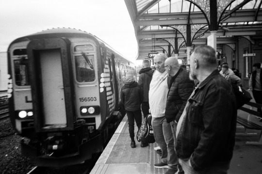
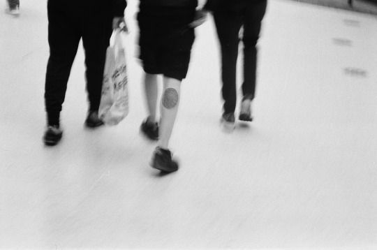
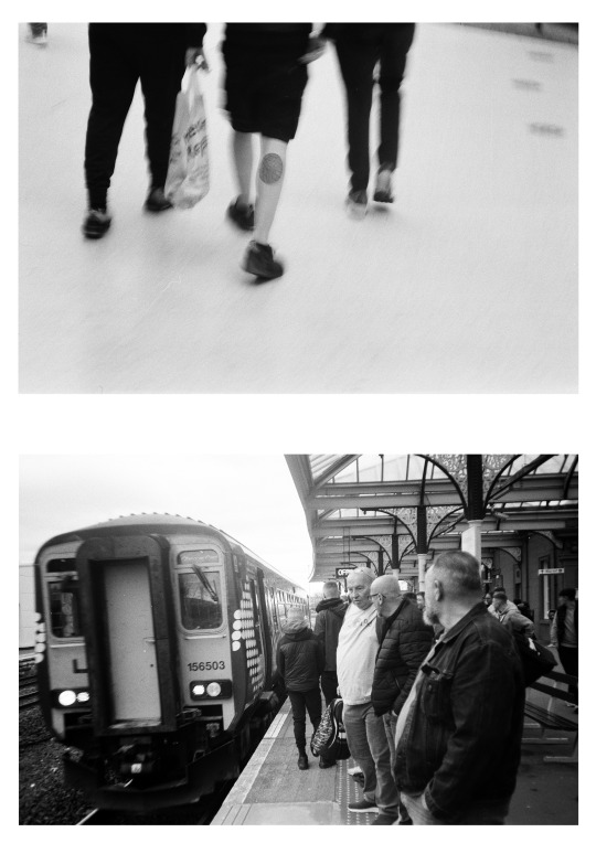
I didnt get many images on film, if i remember correctly i only shot 12 frames out of the 36. I got these three im happy with, the first one im a bit iffy with as it strikes me as quite a random image. But, like i said when i was talking about the previous images from the last game part of football culture is taking public transport to these grounds so i guess it does add some context to the project overall.
The second image would be a good one to accompany it as it depicts three people walking through a train station with a bag full of beers. But what also adds to the image is that the person in the middle has a celtic cross on his leg which is the same symbol you can find on the back of older celtic tops and inside the stadium.
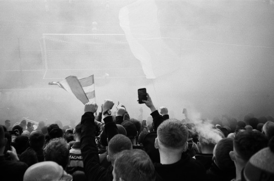
Finally the third image shows off the smoke bombs and pyro the celtic fans used at the game to add to the atmosphere, again since smoke bombs are used so often in matches.
Final Images - Digital

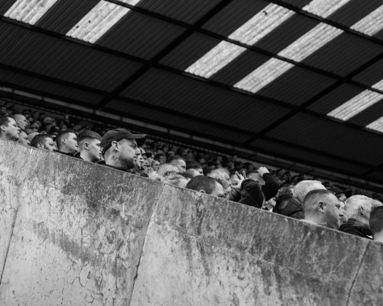
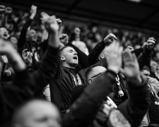


I am very happy with how these images turned out because i think they have added a bit more variance to the project. I like how i managed to get some images of the ultras fan groups too as its quite rare to see images of them.
One of my favourite images would be the second one as the composition is a bit more thought about. What i like the most is how all the fans are looking in the same direction and how the composition is made up of geometric shapes such as triangles and squares.
Another image i enjoy is the last one as it shows how varied the ages of people are who go to some of these matches and it contributes to the overall project.
Presenting and displaying the work
Since most of my images are in a 5:4 format i will need to be careful in how i display it as having a 5:4 image in a standard A3 landscape frame may look a bit unbalanced.
Looking at articles from Lower block when i was in my development stage i was fairly inspired to create a zine. I think this project would work best as a zine mostly because there is such an abundance of images. If i displayed 25+ images it would only work if i had my own gallery show which a the current stage isnt viable. Therefore having the images in a zine and then printing multiple copies it would raise awareness of the project and then hopefully would allow me to create a gallery show at the end of the day.
Hypothetically speaking having a gallery show would be quite an interesting opportunity to display the work. Because scottish football is engrained in our culture it would make sense to display it in and around buildings that relate to football. For example, this series would work well displayed in some of the hospitality suites at Hampden since it is Scotland’s national football stadium therefore multiple teams play at the park.
Getting in touch with Lower Block
Recently i won a competition on instagram to win a zine of my choice from lower block and i decided to pick this one mostly because the san siro is being demolished and rebuilt in the current year or so therefore it would be like owning a piece of history having a zine about it.

I spoke to the person who runs the pages and asked about submissions.


He then sent me over some questions.
Where are you from? Where do you now live?
Originally from Dunblane just beside Stirling in Scotland, it's usually easier to say " ever heard of andy Murray? the famous tennis player? yeah his hometown haha".
But recently i made the move to Glasgow to improve my network and finish my degree.
Profession (how you describe yourself) - if not a photographer?
This is always a tricky question as i see myself as a fairly flat person, id often describe myself as an introvert mostly which is quite an odd personality to have when
photographing people or shooting in public. Usually other than shooting you can find me at the top of a munroe and being from Scotland its a fairly typical thing to go up one every weekend.
Who do you currently support and why? How long have you supported them?
Currently supporting Celtic! its a team my dad and his dad and so on has supported. The interesting thing about supporting a football team in Scotland is that a team is passed down to you
like a family heirloom. Like you're told when you are young that this is your team regardless of what happens whether they get relegated or win the champions league, its something you just stick by them.
I remember times growing up where my dad would mention celtic legends and speak about famous goals and performances.
Any particular footballing idols from your time growing up (and why) First big name player saw live?
Sadly didn't get to see him in person and I'm sure everyone who supports celtic will agree with me when i say this but it has to be Henrik Larsson, the man was a god. Scoring 174 goals in 221 matches across
his career at Celtic, not to mention his scoring streaks in Europe, he was ahead of his time as a striker and could be argued at the time he was one of the best in Europe. No wonder Barcelona snatched him up after leaving celtic where he
continued to score. Sadly getting tickets to any game at Celtic park was always a struggle you or your dad had to know a guy who knows a guy who had a season ticket who couldn't attend. Only being to Celtic park a handful of times was a
common occurrence for most, but recently i got to see Celtics current striker Kyogo Furuhashi who has been at the top of his game since his arrival and i believe he will turn into a club legend.
First match attended as a fan? Any early memories from that match or attending / playing football growing up?
Most matches i attended was when i was fairly young therefore i cant remember much, one springs to mind and its when i went to see manchester united play another league team. We were
fortunate enough to get hospitality since it was my uncles birthday treat. I always used to play football growing up and i was part of my local youth team "Dunblane Soccer Sevens" where i played defense.
I remember the Saturday morning car rides to amateur league grounds to play other local teams in a freezing cold November.
What is it / was it that drew you towards football as a fan? Any experiences that connected you to football and football culture?
I think its something i have always had an interest in, i remember there was a time period where i wasn't super interested in football but id always check the Celtic score whenever they played.
Like i said your team is a family heirloom and its something you will always have in your heart regardless of whether you are invested in football. Only really in the past few years I've gotten more
and more invested into my team as a whole, especially since the incredible job current manager Ange Postecoglou has done. But speaking on Scottish football culture as a whole is quite an interesting thing as its
so ingrained into Scottish society its hard to miss. One thing that really sticks out about it all is how invested people are in their teams even to the extent of not wearing an item of clothing that is the same colour as your
football rivals but at the end of the day you can still have a laugh with someone who supports another team. Its always surprising to see the week in week out turn out for games too, for example Celtic has one of the highest
average attendances for home games in Europe which i think speaks for itself regarding the passion people have for their teams.
Tell me a bit about this project. How did it come about? What was your inspiration for it? Any interested anecdotes or obstacles that you have to overcome? What does the name mean?
So I'm currently studying for my BA in photography and the project came around as we were given a brief where we had to document a culture, whether that be a sub culture, food culture or car culture, it just had to fall
into the category of a culture. Straightaway i wanted to document football culture in Scotland since its so engrained into society. At the time to my knowledge i had not seen a project which documented football culture from a
fans perspective, yeah whatever you get photos of fans taken by guys on the sidelines with huge lenses but its so flat. I wanted to be amongst it getting genuine reactions and documenting how good the atmosphere really can be.
The only issues i really ran into was getting access to some clubs as they have a contract with a media group in Scotland that basically have a monopoly on photographers at not only football matches but most sports events, most know
my feelings about this so i wont bother going into detail about it here. Thankfully i know a few people behind the scenes at some clubs due to previously doing work for them who managed to issue me a pass for some games.
When shooting the Celtic Kilmarnock game away i was amongst the Celtic support specifically between the two ultras groups the 'Green Brigade and the 'Bhoys' both previously part of the same group but split due to internal conflicts and
beliefs. I know they are typically suspicious of people with cameras so i made sure to speak to both groups before kick off to just let them know I'm here with a camera and their faces wont be in the images. The paranoia stems from undercover police
being present at the home games in their standing section so i don't blame them for the suspicion.
What kit did you use for this project?
Kit-wise i wanted to shoot fairly light as i didn't want to clock someone over the head with a lens when celebrating. So i used a Nikon D850 and a 50mm, i wanted to use a DSLR to capture some action as I've found the hard way
that a film point and shoot is rubbish for getting anything spontenous or fast moving action. I also decided to use the D850 so i can get all the resolution i can so I'm able to print large eventually when i decide too and just so i can get a
bit more control over the image in post as i like to mess about with the colours. Then for a few more candid images i used a film point and shoot loaded with Ilford HP5 or FP4, i mainly used this to get random images of the crowd celebrating goals or
the end of the match.
When / how did you get into photography?
I only properly got into photography when i got my first camera at 16. Like most 16 year olds you're into hanging out at the skatepark with your bike or skateboard, that hobby translated in to watching countless bmx videos on
youtube and wishing you could make your own edits. So i tried my hand at making bmx clips for youtube and realised quickly i was better at taking photos of people on bikes rather than creating videos. From there it was a general interest till i
finished high school at 18 where i wondered if i could take photography a bit more seriously. I took a year out after high school where i developed my craft and ultimately decided to not study engineering or computer science at university but to
take up a photography course at Edinburgh College, i didn't take it as serious as i should have so i didn't get into second year. I then took the same course at City College in Glasgow where i thankfully finished the course with good marks and now
I'm at the same place doing my BA in photography.
Any photographic / artistic influences?
Currently, I've been looking at Brian Sweeneys work, specifically 'Great Stadiums of The North'. He documents all these stadiums in Scotland and in places like iceland that you would consider as a sunday league pitches.
there is something really nostalgic about the work and liminal and I'm all for it.
What was it about taking pictures and telling stories through images that interested you?
I liked the idea of bringing more awareness to scottish football as a whole, since somtimes i feel like the atmosphere and the passion goes un-noticed amongst the other leagues in Europe. It sounds cliche but using photography to convey a sense of feeling is a big thing for me. For example, a few years back i did a project on liminal spaces but all the locations were places where i had grown up and felt some sort of nostalgia for which ended up creating a melancholic feeling around the project.
First match / footballing event attended as a photographer or with a camera?
Id say back in 2018 when i shot kilmarnock vs motherwell, i think i just did it for the experience mostly. I was sat there amongst the pros on the sideline with a sh*tty zoom lens and just shot images for fun really.
Do you have a favourite photograph that you have taken?
Not really, im never really satisfied with my work enough to be like “wow yeah thats the shot” since i study photography im always in the mindset of being like ‘what if’. But currently, i am happy with how this project is going, its only a matter of time before i find flaws in the images and shoot more.
For you, what makes photographing football lifestyle / culture such a fascinating subject? What is it that appealed to your visual senses?
I think its such a longstanding subculture that has developed in recent years with the advent of twitter and instagram. Now more than ever ultras groups such as the Green Brigade at Celtic can reach out to followers to contribute to the match day atmosphere. Previously you had to be part of the inner circle to be in on the tifo’s and pyro displays. So documenting the subculture in modern times is interesting now that more than ever people of all ages is getting involved. For example, in my project people as young as 15/16 are sitting amongst the ultras who tell stories of ‘The Jungle’ at Celtic park which is nuts.
As a photojournalist and a fan what are your thoughts / experiences of different football subcultures? For example; connections between football, music and fashion and style. The food and drink. The architecture of the grounds. Kit / training kit design / boots and balls. Footballs place within community and society and the power of football to bring people together. (These are just some ideas that resinate with me for reference).
I think football has always been a working mans sport. Most towns and cities in Scotland or even the UK have some sort of football team whether its a Sunday league team or a European winning side so i think naturally football will link up with fashion and design. Up in Scotland i haven’t noticed a huge shift towards a more mainstream culture. Although one thing i have noticed is the slight change in styles of clothing. Gone are the days of Adidas sambas, blue jeans and stone island jackets, ive noticed people are shifting towards Airmax 95′s, nike tech fleece tracksuits and North Face jackets.
Best advice ever given and what advice or tips they would pass on to any aspiring photographer?
Be a people person at the end of the day especially when shooting projects like this. Being quiet and awkward gets you nowhere when doing this sort of work. I like to think i’m quite a confident person but when shooting this project and having to point the camera towards ultra groups is quite scary stuff. People appreciate it if you speak to them and make some sort of connection before you stick a camera in their face.
Best place(s) to signpost for; sales / exhibitions / promoting this project or other work(s) / getting in touch for editorial or commercial commissions and licensing / keeping up to date with you and your work?
Im still choosing the final images for his project and may create a gallery show. But in the meantime follow my instagram “kierian.jpg” or drop us an email “[email protected]
What's next? Do you have any future plans / other projects you’re working on?
From now finish my photography BA, try and shoot a few more football games before the end of the season and then we will see haha.
Anything else you’d like to add?
Until the last rebel.
Before these questions i had sent over a sample zine thats purpose is just to show the work and it wouldnt be the final project.


From here im going to start creating mockup covers for a potential zine. i would like to keep the inside pages of the zine fairly straightforward with just white backgrounds and image placement.


Some design inspiration i have been looking at, im quoye drawn to this type of design for numerous reasons. One of which being the bold graphic lettering and how the words are placed onto the title page. Its proven that a photo zine doesnt need to be something boring and flat, it can be a reflection of the images via the use of design. I also like the colours used, some are more bold than others and a bit more muted.
Design mockups

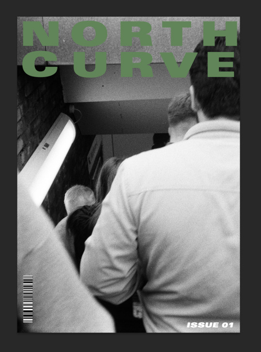


Above is a selection of posters which could all be for my zine. I already have a favourite but before that im going to discuss why i dont like the other three. The first two posters are fairly similar but i believe the reason why i havent chosen them is because they are too simple and arent thought out. When looking at the poster my eye is immediately drawn towards the shoulder of the guy in the white jacket and not towards the title. For a zine this is obviously something very important as someone may look at the poster for a second before they look away, therefore you have second to catch their attention and the title should be the thing that does that.
The last poster is better than the two previous as it features an image of someone sticking their fingers up at the opposition fans which is a good symbol for what the zine is about. My only issue with this is that the typeface, lettering and placement. I feel as though my name could had been a different font and to be shifted to below the picture, similar to were the ‘01′ is but on the opposite side.
My personal choice is this one, the cover does everything right in my opinion. Funnily enough this title took next to no time to make compared to the other ones. I like how balanced and timeless the over feels, it doesnt feature any strange design techniques and the text placement is fairly timeless. I originally wanted to have the cover feature super modern text and design practices but my worry was that in a few years time current trends could be considered ugly. Whereas keeping the cover simple and timeless eliminates that completely.
Evaluation
Overall i am fairly with how this project turned out and despite it taking a slightly different approach from the original plan i still gained invaluable experience and images while shooting this project. Originally i was going to focus on one team and one group of fans but due to circumstances out with my control i had to improvise. Thankfully i had a contact at kilmarnock who sorted me with press passes to shoot two games. Initially i was skeptical with shooting other teams which had smaller turnouts for games but i ended up getting some great images.
I think if i was to reshoot this project i would have reached out to more amateur clubs in Scotland or the central belt. In my experience going to these amateur games as a child there was always a good atmosphere and turn out. Since the clubs would be a lot smaller it would be easier to be granted access to shoot during matches.
I think going forward with this project would be a great idea as i have proved that even in 2 matches i was able to get a zine worth of work. The potential to expand this body of work is massive, one could even extend the work to Europe and attend matches there. I could even use this body of work as a pitch to allow me access to some bigger matches with bigger clubs as it shows i am capable enough to keep my head down and shoot what i need to shoot, thankfully Gregg over at Kilmarnock even said he will vouch for me if i need access to any game in the the premiership.
I wish i took more time to sit down and design a proper zine. Sadly down to my own timekeeping i was only really able to design the front cover but thats my fault. If i had started designing the zine in conjunction with shooting i would of been able to design the inside pages and possibly even added the questions and answers which i got sent from Lower Block. The staff at Lower Block did say however if i do create a physical zine from this project at some-point down the line they will happily promote it however they can.
I would deem this to be a successful project in my eyes which gave me a great body of work that i would be able to show news, publishers and football clubs in future if i decide to expand this project. The project has allowed me to develop my own social skills and negotiating skills, when shooting members of the public i think its always important to speak to them as if you weren't planning on taking pictures of them. What i found is that striking up a conversation about a player or asking a question about the club as an outsider allows them to open up therefore you develop a human connection which then in turn makes them an easier subject to shoot as you had just gotten over the hard part.
0 notes
Text
Major Project Research and Development
The key for creating an idea for a major project is always a tricky one as you want to push yourself out the box and challenge yourself but you always want it to be achievable. By having a project with is outwith your skill set or knowledge you’re setting yourself up to fail more than anything. You will find yourself scrambling around in shoots or struggling to research the topic. But, finding a project which you’re passionate about and one you have previously had experience with is the key for creating a successful project.
For me, i have always had an interest in commercial and advertising photography which is mostly studio based. I have been infatuated with set and prop design and creating large abstract compositions. Tying this interest in with the fact i’ve worked in local pubs to five star bars in hotels i do share an interest in cocktails and the process which goes into them. Therefore i have decided to combine both of these interests and create a series of ten studio images which will feature intricate set design and use of props to showcase glassware containing fake cocktails and liquids.
Thankfully, this project is going to feature no models or sitters, nor do i meed to rely on any external bodies who may interrupt my shooting time. I chose to do this project as it meant i wouldn’t need to to rely on models, stylists or make-up to create my images. By having a project of which only relies on you gives you plenty of freedom to plan your time thoughtfully and carefully without the risk of having someone cancel. Plus i quite like working on intricate things like this by myself in the studio. It allows me to fully concentrate on the task at hand which is needed to create such compositions and careful use of props.
The idea of doing this stemmed from the thought of basing my major project on something tangible that i can use for my portfolio post BA. Since after this BA i would like to be a commercial advertising photography, why not use this opportunity to create something which i can use for real world experience when meeting with agents and clients. I don’t see much of a point on creating a major project on something like music photography when i will never wish to be a music photographer nor will i use the images in my portfolio.
Inspiration & Visualisation
For the style i wish to recreate i have noticed that there aren't a lot of photographers with this distinct style. Typically the style features very abstract compositions and almost a CGI feel to it. The style relies heavily on the use of props and styling. One of the main pillars of success for this type of style is gathering the correct props. Obviously this can and may be fairly expensive so it would be wise on my part to ‘raid’ charity shops and other discount homeware shops to get the props required. So far, my work has very kindly allowed me to ‘borrow’ some nice geometric glassware which i will use for my shoots. Another person on my course is also giving me two new carafes which fit into the style of props and styling i’m looking for. Below is a rough mood-board of images from Antosh Sergiew.

Risks and Challenges
A risk assessment was conducted for a photo shoot including cables, glassware, and COVID-19.
Glassware: Risk of injury due to accidental glassware breaking.
Prevention: Take caution when handling all glassware and keep it away from table edges. Give everyone handling glasses protective protection, such as gloves and goggles.
COVID-19: Risk: Contact with infected people who are close to you could expose you to the virus.
Mitigation: Prior to the shoot, confirm that everyone entering the studio has received their COVID-19 immunisation and has tested negative for the disease, maintaining social distance is recommended.
Risk: Tripping hazards brought on by wires and cords that are in the path.
Mitigation: To prevent trip risks, make sure that all cables and cords are tucked away or securely taped to the ground. To prevent electrical risks, all equipment needs to be securely grounded.
Overall, it is crucial to carefully organise the shoot, identify any potential dangers, and implement appropriate mitigation strategies.
Thankfully since my project doesn't require myself to book models, stylists or hair and makeup. This gives me a good advantage and a lot of freedom when it comes to shooting as i can plan my studio time without relying on others. The only time i may need another person is an assistant, but im not worried about this too much. This is because i can connect my camera to my phone via bluetooth. This means i can be across the room with live-view on my phone adjusting the set and moving things around. Of course, having an actual assistant would be useful, but i can always use my phone if i’m unable to source one. Fairly often i prefer to work along in a studio environment when working with product as it allows me to concentrate and be very efficient.
Prop sourcing is another challenge i will need to face with this project. I think sourcing props is only as hard as you make it. If you are set on the idea of this one prop needing to be this one shape, colour and made by this particular designer i think you will struggle finding what you need, and obviously typically designer props will be expensive. But i think keeping your mind open and sourcing props that are a certain size, category and material will be a lot easier. For example, i’m currently looking for a white or grey textured large table cloth. I could go to Ikea or a fancy homeware shop near my flat and find it, but i would be paying a fair amount of money for it, which obviously when you’re a student is not ideal. Therefore, it would be wise for me to speak to my mum as she works part time in a furniture shop and has done interior design for the past 30 years. I would ask her if they have any old samples in the shop that she could get for free, another point would be is to check charity shops or the ‘barra’s’ as they typically have a large collection of homeware things for cheap.
Lastly, another small point regarding moving objects and glassware. As you will know glass and other glossy objects are magnets for finger prints and debris in general. Therefore, as per the suggestion of Mr. Kuzmak i should invest in a cheap pair of soft gloves in order to move around glassware and objects effectively. By practising this technique it eliminates a lot of time in post production dedicated to removing fingerprints and dust.

Deconstructing the images and style

Taking a standpoint where you aren’t viewing the work as an image but more of a piece of art and almost letting it be a 2D piece of work. What i mean by this is that by viewing the work in such a way allows you as the viewer to see compositions and shapes within the work. In this case, i can see the parallel lines lapping over one another to create interesting leading lines within the image. The edge line of the green piece of cloth guides your eye from the plants on the left, through the acrylic squares and then finally guides you onto the edge of the frame. On a side note this type of leading lines would work great in a gallery by allowing the viewer to subconsciously be guided on to the next piece of work.
In order to aid in the composition and the overall success of the image the photographer has created visual uniformity through the use of shades of green. One thing to bare in mind when i am creating this body of work is to plan in advance colours and textures and whether or not they fit in with each object.

Going with the them of abstract this image tends to focus on props and ensuring they share similarities such as shape. What also makes this image successful is how the images has balance overall which is key when it comes to creating product imagery. I am a big fan of the use of colour, mainly because the colours are slightly muted yet still compliment one another. I also enjoy the beige backdrop as it lowers the contrast of the overall image and allows the fruit and paper shapes to take centre stage. By using a white piece of paper for the background i believe it would add too much contrast to the image and takeaway from the overall feel.
Following on from the concept of viewing these images as artworks and then deconstructing them. This image is a lot more abstract than the other two as it uses objects and props that you wouldn't commonly find in an average home. Viewing this now makes me question whether or not its an advertisement for the objects or its merely a more conceptual approach to showcase the photographers skills and ideas.
I do think when creating this work i want to find a balance between something commercial viable and something conceptual such as the images you see above. I believe that the defining factor between these two image styles is through the use of props and objects. For example, in the two images above if we replaced the props used with common items you would find in the home it would look like an advert from Ikea. But, because the objects look almost high-end one of a kind props it does reinforce the idea of which the images are meant to be conceptual and or experimental.
Another thought to consider is the use of lighting. You will notice that all of the images have fairly simple lighting setups. I think these images will typically have no more than three lights; including a key light, fill light and some sort of rim light. For the images that have some harsh shadows i do believe a light with a bare bulb will have been used. Using a flash head with just the bare bulb is commonly used to recreate the sun. The effect you get from it is very harsh and sharp shadows, which for this type of commercial work is very attractive. Most of the work will feature objects and textures which will feed into the overall composition, in this case shadows and how large or small they are will contribute to the feel and composition of the image. That, is not to say that soft-boxes and other modifiers aren't used, i think it comes down to a stylistic standpoint. Like i previously mentioned, most of the images i am referencing will have sharp shadows, but i do think a soft-box has been attached to a few lights in order to fill some shadows on objects.
Visualising my ideas - A series of sketches.
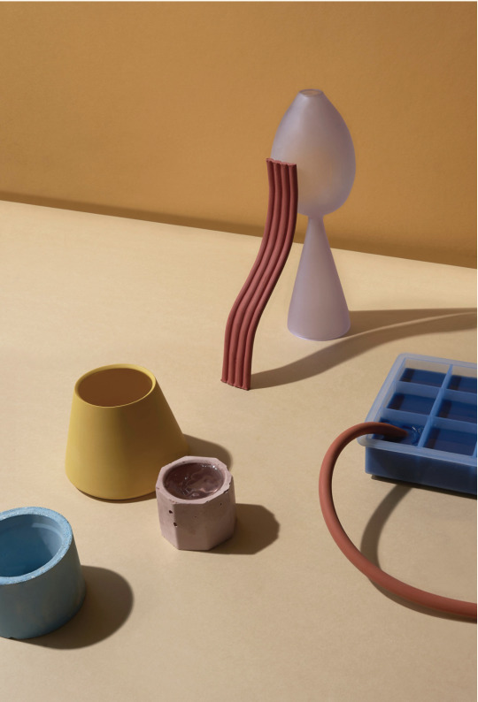
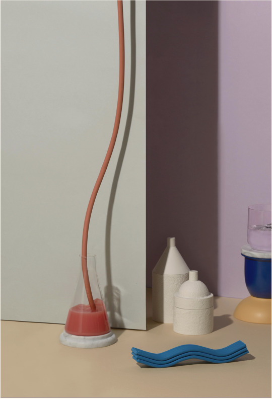
I have created a series of sketches which visualise my ideas for the studio work. i think it is key for photographers who are shooting in the studio to create sketches to aid in creative direction and keeping yourself on track. In the sketches i have created it depicts a studio set featuring objects i currently have and plan to use, right now its predominantly glassware that i own and two backdrops. I would like to source more props such as cloths with different colours and textures e.g curtains and table-clothes.


Visualising these ideas and creating some sort of concept work is very important not only for me but also product photography in general. I believe that going into the studio with a solid understanding of what i require from myself is imperative. This is because of the limited time scale but more of the fact i wish to leave room for adjustments and experimenting after getting the image i’m after. There has been times where i find myself getting the image i went and then moving things around a little after ends up giving me a better image than i previously wanted.
Visualising your ideas is a habit you can form beyond this project. For example, we just had a talk in from Susan Castillo and she was saying that for most shoots she will do a sketch whether its in photoshop or in a notepad. She touched upon the fact that creating a sketches will also help convey your idea and concept to the client and allow for changes or for both parties to agree on the idea.
Props and objects
As you can see my props all share similar attributes as one another. Like i previously mentioned having objects that are similar only contributes to the composition and overall image. Another reason why i aim to keep this consistent is its commercial viability, as i do aim to include these images in my portfolio to use post BA. When sourcing props i did have a tough time finding objects which match the style I am looking for. When we had a recent talk with Susan Castillo i asked her a few questions regarding her props and she mentioned that she doesn't go looking for specific ones more like she stumbles across them. One example, of this is that she would often take apart every day objects such as lamps and use pieces from that.
I have found a website that custom makes photography props, they create posing blocks for product photography of all different shapes and sizes. The objects are made out of MDF and come in a ready to paint white finish.
Below are some props i’m planning on purchasing


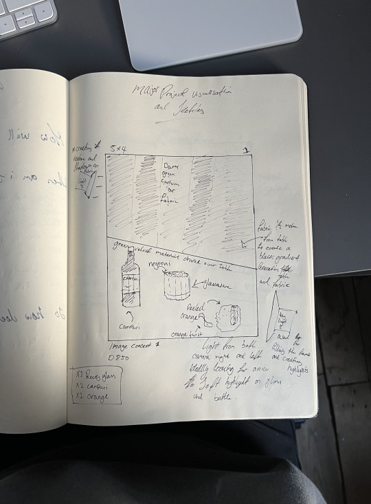
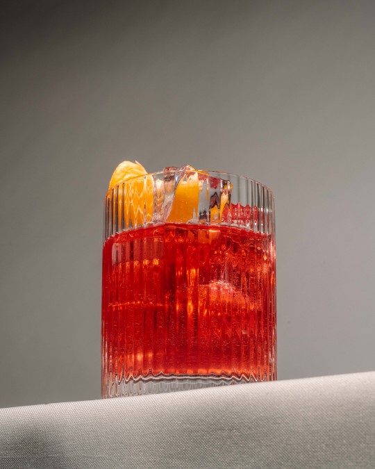
First Shoot -
This first shoot was intended to be an experiment and use it as a reference point for my future shoots. The plan was to use only a few props and see what i could come up with. Currently i dont have many props other than glassware, although i do have a grey table cloth that my downstairs neighbour gave me.
I believe that shooting directly onto the wooden surface, stylistically not work. My aim for the images is for them to have a commercial viability to them. I think that my high end glassware would not work on the marked wooden table.
Props i plan on taking are
- Grey table cloth
- Iron (for ironing out creases in the cloth)
- Rocks short glass
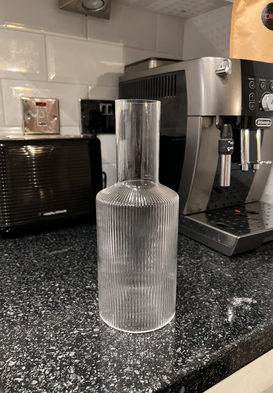
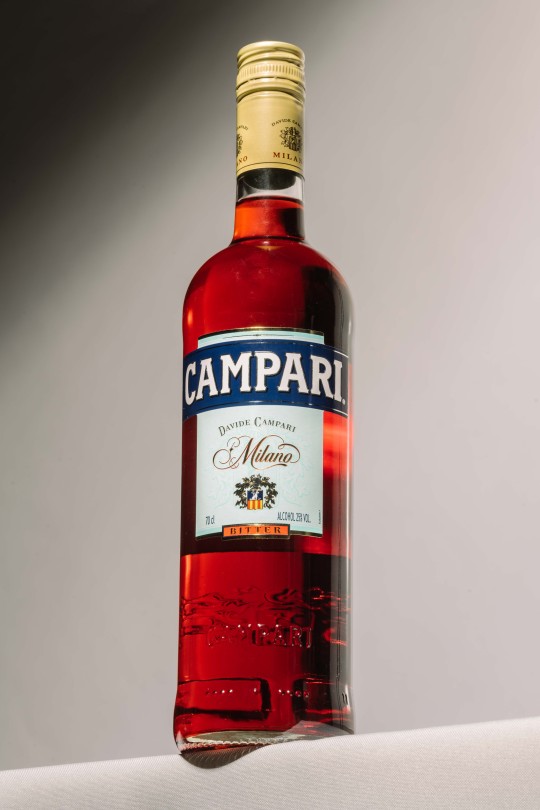
- Rippled Carafe
- Campari Bottle
This is the inspiration i plan on referencing when i'm shooting despite it being an experimental shoot.


One thing i would like to translate from these sketches into the shoot is the use of lines and sharp angles. Often utilising such shapes can compliment the composition and draw the viewers focus into the product at hand.
below is a lighting setup since i forgot to take an image of my setup.
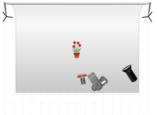
(the flower is the bottle of campari and glass and there would normally be a table but there wasnt a table icon)
IMAGES


As you can see the images progressed from the standard images which you can see evidence of in my proposed sketch. Like i previously mentioned the aim of the project was to develop some ideas and take those ideas and develop them further going forward for other projects. Towards the end of the shoot i started to focus more on the the glass and bottle, it almost turned into an advertisement for campari.
I found out that by placing red or green card around an exposed flash head with no modifier aside from the standard cone and created a snoot using the card i was able to create a gel like effect. I decided to try this technique as i have used it previously which gave me great results. It works by creating a colourful light around the object due to the light shining through the card but in the middle there is a thin beam of light which can be pointed directly at the object like in this scenario.


I am a fan of how these two images turned out. You can say they are very simple and not very technical but when something simple is done well it stands out. I think what i could improve on in these images is adding a few more props or adding a window or ripple effect over a light for the background. Adding some texture and shape to the images background could allow for a more appealing and dynamic image. Although, looking at the image in an alternate universe i could see the image being used as a two page spread advertising the drink with large white text either side like this.
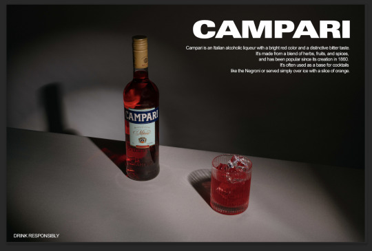
As you can see i used quite bold lettering and design for when it came to creating this mockup. I used bold lettering as it best reflected the brands bottle logo and the overall feel of the image.
More images

With these last three images is where the shoot took a natural turn. I was satisfied with initial images where they were very simple and featured simple lighting. With these images i took inspiration from a sketch i did where i shot from a low angle looking up at the object.

Out of the three of these images i prefer the second one as it reminds me of a campari advert from the 80′s so it has a nice charm to it. When editing the image i used a preset i created which imitates a classic film look where there is a slight green tint the shadows with soft highlights.
Before editing:

Im not a fan of the other two images as overall i dont believe they contribute to the overall narrative of my project. Granted this shoot was about experimenting and finding a bit more guidance with my project and to possibly develop any new ideas.
i think going forward with this project i think its important for each shot to feel considered and deliberate. Personally if take an extra bit of time planning how im going to shoot my images and what to consider what is in my images i tend to create better images. Take this first shoot for example, i went into this shoot to experiment and ended up with good images. I feel as though if i went into this shoot knowing the placement of objects and lighting i could of created a higher end, more considered image i feel. With commercial and product photography, images need to be considered and well thought out.
Since typically these shoots will have a large budget and there is typically a tight time constraint which then equates to a higher level of stress and concentration required on set. Going into the shoot without a clear vision in your head of what you wish to shoot will only damage your images if its shooting at such a high level. Ideally i wish to go into every-shoot with a clear vision of what i require image wise can only benefit me.
For the next shoot i will be taking less images with a slower approach to building sets.
Second Shoot.
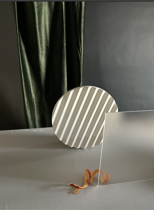
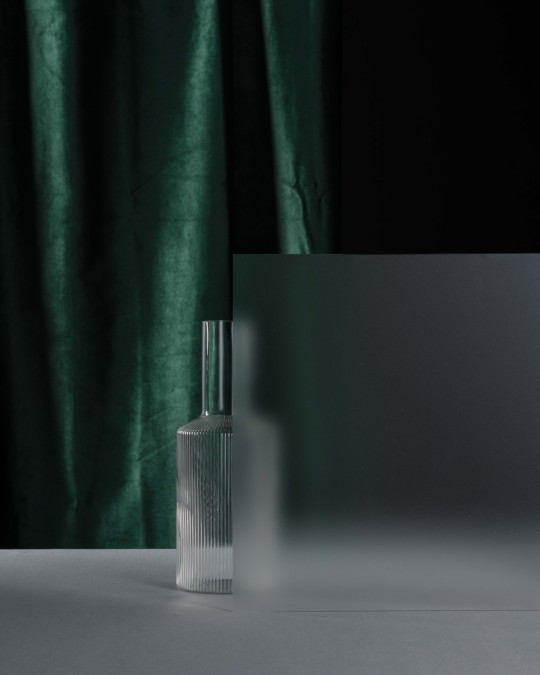
In this shoot i planned on taking a more abstract approach and including more props. Of course including more props in my library allows for a greater opportunity to create a more diverse range of images. I bought these three props to include in my set design. I bought these props as i seen in my inspiration that a few images had similar props, this wasnt to directly copy these images but create a similar style and a base of which i can build upon.


I got the last prop since i was constantly looking at it but for a while i couldnt justify the price as i didnt realise how expensive it was. As soon as i got the product it was very solid and had a great finish. I used similar props as last time but this time integrating new props which i can style.
Inspiration -
Drawing inspiration directly from my main photographer i have been looking at ‘Antosh Sergiew’. His clean cut yet bold style i think is a good representation how the industry is currently going style wise therefore i aim to re-create it but in my own way.

The setup


Bag of props
When i first started shooting i had orginally had in mind that i wished to use the colleges new Fuji GFX medium format camera. Since my project was about commercial photography which is studio based and the type of photography im doing, i deemed it appropriate to use the same tools which the professionals would use in the field. Sadly, we could not operate the camera via a tether as the mobile iMac that is in the studios was not updated with the latest drivers / plugins for the camera on both lightroom and capture one. I then attempted to get the free plug in for use on my macbook but it still didnt work. Alex Reilly commented that he has the paid plug in on his mac and it worked fine but he suggested that it wasnt a case of the plug in being paid but more like an issue with the tether cable itself and or the cameras input.
Nevertheless i had my Nikon D850 with me and a selection of lenses as backup. I mainly wished to use the Fuji so that i could get a large degree of colour accuracy and dynamic range, both of which is very beneficial to product photography in the studio.
My Nikon did the job perfectly well regardless of the set backs.
Shooting -


As you can see the images started off fairly straight foward as i was just getting my exposure correct all while building the set. From there my images progressed into becoming more considered with minor adjustments and then finally towards the end it became more experimental. Luckily during the shoot Naomi who i was sharing the studio with at the time allowed me to borrow an orange rind which was twisted and add it to my set.
I think it instantly lifted my images and added a splash of colour into them which is what they needed as the images were already quite dark due to my props. From there i added an A3 sheet of frosted perspex into the scene which added a whole new dynamic to the image, this combined with the orange rind helped contribute to my images.
Image selections -

These are the three images from the overall bank of images i shot. I chose these as they had their own unique style and had a great overall look and which can contribute to my project massively.
Image One -
A simple yet well executed image, i think this is a great image which shows even with minimal props you can still create a good image. I think what makes the image is the frosted perspex as it creates nice shape and seperates the background from the table and i feel like it adds a nice balance to the image.
If i was to reshoot the image i would possibly add a second object behind the frosted perspex which could potentially offset the overall balance of the image but could still work with the composition.
Image Two -
My second favorite of the three as it adds the pop of colour which i believe would only contribute well to this scene i built. If i was to redo this image i would start with bringing the orange rind and perspex forward just so the top of the rind isnt touching the horizontal line of the table. Then from there i would edit the image differently by boosting the exposure by one stop and then masking the grey background in the top right and making it almost black. From there i would try and crop the image to 5:4 as i feel like for this scene and composition the image is too tall vertically.
Image Three -
0 notes
Text
Time
The concept of time in relation to photography has always been a fascinating one for me. You not only think of time as an object but also as a concept, how you spend your time throughout the day or how you spend it with certain people. When I first got this brief, the initial idea is to always shoot something physical where you can see how time has affected it, such as an old watch or dried out flowers. But expanding on from that to see and think of time as an idea and concept can allow you to think how you spend your time.
My idea is to showcase an image or series of images that you may need to think about. We often spend a lot of time with strangers day to day. For example, when I stand at traffic lights with strangers for a few minutes, we all share the common goal of progressing to our further destination. Another example would be is spending time riding on the subway with people you have never met, sitting and standing within inches of each other but not saying a word or acknowledging their existence.
Could you associate this self isolation with strangers with just being British? Always keeping to yourself and just getting on with it? Especially now with the times we are currently in people are feeling more and more isolated from one another.
The idea I have came up with is photographing groups of strangers standing at traffic lights opposite me. I thought of this idea when I was standing at traffic lights surrounded by a group of people. The idea is that the short increment of time we spend with strangers doing our daily commute or waiting in line is interesting. I can associate these groups of strangers at traffic lights into almost as if they are a small family for the two minutes they are standing there. It reminds me of family photos at large gatherings where some know each other more than others and they just stand shoulder to shoulder.
Moodboard /Inspiration

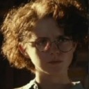
I have also been looking at the work of Philip diCorcia. His work is mostly street photography and some posed work. His images are between the liens of truth and fiction, often featuring real people and real places. I see his work his work both being cinematic and theatrical, he is known for using strangers in his images and shifting furniture, lights and uses precise framing to gain the image he wants.
I think some of his work captures the uncertainties of modern life and how there is always an unknown. A lot of his images were shot during the early adoption of technology and when the internet was in its earliest stages.
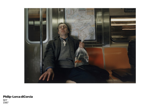
Take this frame for example, you would expect to see this as a frame from a film. The way he is holding a bag of goldfish that he could of gotten from a pet store or even a fairground. This can raise a lot of questions about him as a character, this goes hand in hand with his staggered cold expression on his face and the fact nobody is sitting near him either raises a lot of questions. In regards to my work i would like to shoot some of my images on the subway but i would worry about gaining permission from the subway staff and not annoying the passengers. But i suppose shooting on the subway is one way to get a true reaction from someone as there is no phone signal on the entire line.
Another image from Philip features a man on the ground surrounded by his newspaper and glasses, presumably just fallen over too. An older man in his 50′s with a clean suit and polished shoes raises a few questions, such as why is a man of his stature laying on the ground? did he read something in the newspaper that shocked him? a point or an idea i take from this is it symbolises how technology is rapidly advancing at a rate where he feels left behind and out of his element. The man laying on the ground could symbolise old society and customs collapsing into the new age of politics, society and technology.

How i would like to link this into my idea is showing not only the time you spend with strangers on day to day basis but also the current uncertainties of the time we are in. Using my idea of people standing at a crosswalk together and making it seem like a small temporary family and reinforcing the idea that we are all in this together.

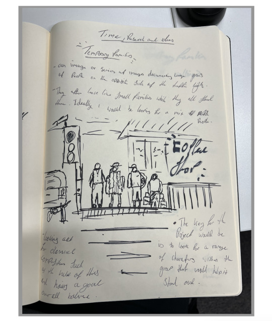
Where and when am I shooting?
There is a large crossroads traffic light system just up the road from me on byres road that features eight spots where you can cross the road. On a typical afternoon you can get between 6-12 people standing per section, even more when its 8:30AM during rush hour.
This crossroads has enough variation in people and in areas to cross for me to get some images. In terms of timing ideally anywhere between 8-10am weekdays and 12-3pm weekends, this is when I think the crossroads will have the most people and the biggest variance.

First Attempt
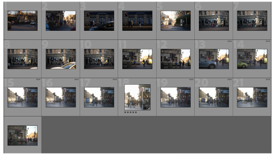


First attempt thoughts
I am a fan how the first few images came out, I have realised a few things that I will need to do going forward. One of which being where I’m standing at the crossroads the first image is always the busiest as most people are coming up towards byres road and in the second one people are always on that side of the road as presumably that’s where all the shops and restaurants are. So going forward I will be shooting from either side of this section. I did shoot at the other sections but I hardly got anyone there apart from 2-3 people. Ideally id be looking for groups bigger than 8 as it means they will stand closer together which will enhance the effect I’m trying to achieve.
I shot these on an 85 1.4 so I can get the separation from the background and so I can get the reach as between each cross walk is around 50feet, having the 85 can comfortably reach. I shoot both of the images above at 1.4 because like I previously said I wanted the separation of subject and background. If I shot these at f14 in the example below the background is too messy and I don’t get the ‘3D’ effect I am after.
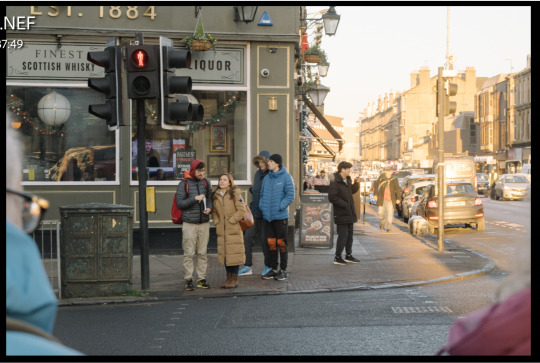
As you can see the subjects blend in with the background too much and it seems a little flat. You will also notice the two previous images I am happy with I cropped them into a 1:1. This is due to the fact there is too much negative space above and to the side, by cropping to 1:1 it eliminates this. Another reason is by having at 1:1 it allows the viewer to concentrate more on the people which is the highlight of the image and almost confines them into their own little scene.
Second Attempt -
When i came and shot for the 2nd time i felt a bit more confident in what i was looking out for and the type of people i wanted in the image. I did venture into town seeking different types of compositions and scenes. But it appears i have the best consistency if i shoot a few minutes away from me on byres road.
I did manage to get one of my best images so far while i was in town, specifically its just down from the college at the crossroads. What i believe makes it a successful image is how straight and uncomfortable everyone is standing. It reminds me of a school photo or having a family photo taken. I also enjoy how minimal it is regarding the background and foreground. I did previously mention how i wanted large groups of people but i do think it also works well with small groups granted the image is as minimal as this.

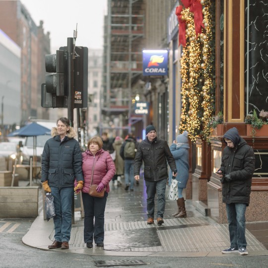
This second image was a bit more into town. Im on the fence as i think the image is too busy. What i mean by this is that the background has a little too much going on despite being shot at 1.4. Although if i shoot in town ill have a constant stream of people coming through the crosswalks, so in theory i would have a high chance of getting the image i am after.
Planning for 3rd attempt -
So after compiling what i know so far regarding timing, location and composition i am able to figure out the types of images i am after. Location wise for my third attempt i’m going to keep shooting on byres road as it offers the greatest amount of backgrounds i can shoot onto. What i mean by this is that there is 8 crosswalk areas around the crossroads. I can go between all 8 of them to capture different groups.

I managed to get three shots that i am happy with, they are all shot from the same angle and feature the same background. I have come to realise that it doesnt matter on the group size in the image, its more the type of people in. the images and their expressions.

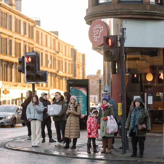

Out of the three i prefer the second one more for the large group of people with different expressions. For example, you have a man and presumably his girlfriend holding a box on the left of the frame and in the middle you have a mother who’s picking her daughter up from school and on the right an older lady who has a bit of a shocked expression and odd stance. But looking at the image as a whole the group flows together and it works really well.
Im not a fan of the first image just because the older couple is looking directly towards me and i think it takes away from it. However, i love the interaction the small girl and presumably her gran is having, the girl is shouting or saying something to her and her gran is trying to reason with her. These are the types of subjects i would like to have in my images, but it is tough having one or even more of these in an image. If i was to get these images consistently i would need to be waiting around for a long time and sadly i don’t have that time, maybe in future i could revisit the series?
Out of the three, the third image is my least favourite as the subjects in the image are too spread out. I think if there were a few more people in the middle with interesting expressions or actions it would make for a better image.
Final Images -
When choosing my final images its important to take into consideration the way i would like to display them. I think in my case there isnt a standalone image that could convey what i want. I think my images look better as a series or diptych.


Placing the images as a diptych works really well but im going to crop the canvas as theres too much negative space on the top and bottom.

This looks a lot better, i have thought about adding text onto the image saying “were all in this together” to further reinforce the idea that in the current times there is so much uncertainty and all we can do is hang in there.
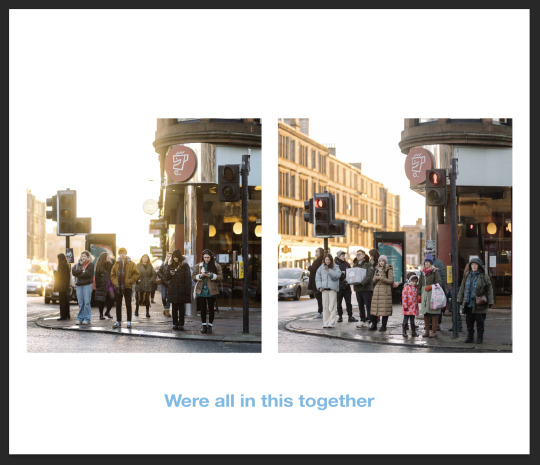
From here im going to play around with font, colour and letter spacing. I want it to get the message across but look very subtile.

So far yellow works the best for colour, now its time to work on the font and spacing.

Brought the letter spacing a bit together, changed the font to times new roman and made it italics. So far im happy with this but im going to look at the colour of the font a bit more.
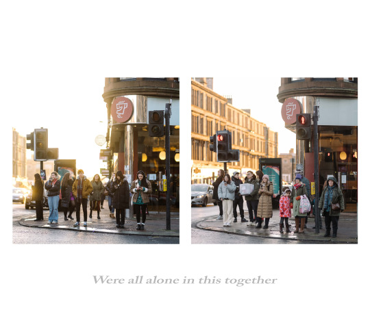
As you can see i changed the wording to read ‘were all alone in this together” i did this for two reasons. One being it is a title of album by the artist ‘Dave’. The album focuses on she short comings of life and how nothing truly turns out to how you want it to be but you just get on with it and i think that ties in wonderfully to my project. The second reason is that it works with the concept of my idea being that you may feel alone but the time you spend with strangers day to day and realising they are all there for the same reasons as you but you dont realise it.
I could see this work being printed large and showcased in a gallery. The reason why i say printed large is that having such a large piece in front of you it almost consumes you and brings you closer and that is one of the points of the image and piece. Printed small it wouldn't have as big of an emotional impact to some. Below i have created a mockup.
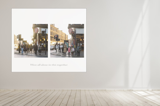
Evaluation -
Initially I struggled to come up with an idea for time, I wanted to shoot something that shows a physical representation of time such as a watch or dried flower. But then since the brief was fairly open I decided to think about time as a concept and how we as people experience it day to day.
I often thought abut how much time we spend with strangers per day whether its commuting, shopping or waiting. Then I was stood at the cross walk not far from my flat and it was a busy Saturday afternoon and I thought to myself how everyone on the other side of the crosswalk looks like a small family. I then came up with the idea to shoot images of people on the other side of the crosswalk, this goes hand in hand with the amount of time you spend with strangers per day.
From there I then began to research the work of Philip DiCorcia, his theatrical yet cinematic work was quite influential on me. Especially his image “Fred” of the older man laying on the ground, I managed to pull some ideas from it and one of them being that the old man symbolises the decline of the old world and how society was rapidly developing with new technology and ideas from this I drew an idea of total uncertainty from the image and I linked it in to the main idea behind my work which was that in the end we are all here for the same thing and we are all in it together. During times like we are in there is a lot of uncertainty and often liked the idea that everyone despite not knowing one another could all be put into a theoretical family while standing waiting for the same thing, everyone sharing the same goal and idea.
From there I started hanging around the crosswalk near my flat and capturing whoever stood at the other side. I did get a few images that I was happy with and they all seemed to stem from the same spot on the crosswalk, so they all shared the same background. After finalising my images I then decided how I would want to display them. Knowing that a single image wasn’t enough on its own I placed two of them into a diptych. I was very happy how it turned out in this format, I then I added text at the bottom which read “were all alone this together” which is a reference to an album by the artist “Dave” and his album discusses how it doesn’t matter how much people are struggling or feel alone our end goals and dreams are all the same. I think adding text to the work elevated the meaning and ideologies behind it and also brought meaning to the images in a sense.
If I was to reshoot this project I would spend a lot more time at varying times during the day to get as many chances as possible to get the ideal subjects in my images. I do think the choice to place the images as a diptych was a good idea but I often think if I had more images I was happy with I think it could be a stronger series If I placed them into typology.
0 notes
Text
Ten portraits
Receiving this brief before i headed to Italy with my friends for a week, i knew for a fact i wanted to shoot my brief while i was there. We would be travelling to many places such as Torino and Genova plus a few coastal towns. My original idea before this was to shoot my neighbour Alistair as he was quite the handyman, he would often make or repair things that either my parents or neighbours needed. I previously shot portrait’s of Alistair for a HN2 project and they turned out very nice. Unfortunately, before i could pitch the idea to him his health took a small turn and i didn't want to add any stress to him and thats when i went for my Italy idea.
Since we had to incorporate our images into a zine i knew design would have to go hand in hand with photography. I loved the idea of doing something similar to a photo-book your family would put together, hastily put together and stuck down with tape. But i would also take design elements from well put together zines and use bold lettering and colours. I essentially wanted to create a portrait of Italy through the eyes of someone who has never been before, my plan is to include portraits of the locals i see.
Design Inspiration -


As you can see ive been focusing on light tones of blue and white lettering, this is to reflect the bright images that’ll be used in the zine. You could almost say its anti-design by using off centre lettering and placement of text. I was planning on using this type of design as i’m imagining my zine being placed amongst others on a shelf, by using this type of design language id want it to stand out.
Photography Inspiration -


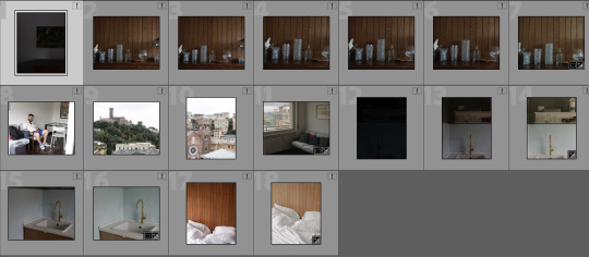


I wanted to take an almost candid photos style when it came to shooting in these places and not go for the classic tourist images of white sandy beaches. I wanted to look for interesting shapes and shadows, local characters and fun take on locations and people.
Zine front cover mockups -
I created three mockup front covers for my zine and ill go into which one i prefer.
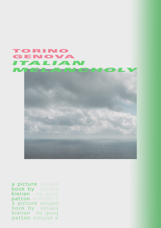

As you can tell the designs are quite abstract and they all feature certain design principles, such as repetition and gradients. I think my favourite is the third as it contains the bright blue and pink lettering that i think will work with the best with images produced. As the idea is to colour match sky to the images so there is a natural visual flow to the zine.
Equipment -
I am always cautious with taking photo equipment abroad and travelling with it. Even though i had camera and lens insurance i still took a few precautions such as taking my backup Nikon D810 as i didn't want to risk my primary camera being stolen or broken. I also took a sharpie and filled in the white Nikon logo to be a bit more inconspicuous.

i also took only two lenses which was a 50mm and an 85, this is mostly because i wanted to travel light and i wanted to avoid putting my equipment in the planes cargo hold. With the precautions i took i dont think it affected the quality of the images i got at all, i think only having two lenses forced me to get creative and that combined with taking a slow approach to shooting was perfect and yielded some good results that i’m pleased with.
At one point during the trip my lens barrel got extremely loose so i spent a good portion of the trip attempting to find very very small screwdrivers with no luck. I was even going into mechanic shops with google translate attempting to speak to the owners, with some luck i found a small jewellery maker who helped me out. Despite him speaking no english at all and swearing a lot in italian we managed to fix it.

Shooting -

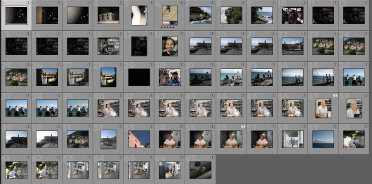
For someone who was in another country for a week you would think i would of shot a lot more frames. But i took a slow approach to shooting, almost as if i was shooting on film. I believe that instead of shooting as many frames and hoping for the best would be rather inefficient compared to slowing down your process.
Like i previously said i tried to focus on the small details and shadows, for example. In our apartment it was a very old school styled flat with wood furnishings and 70′s green kitchen cupboards. I spent a little bit of time shooting the apartment as had featured interesting ornaments and furniture like the images below.
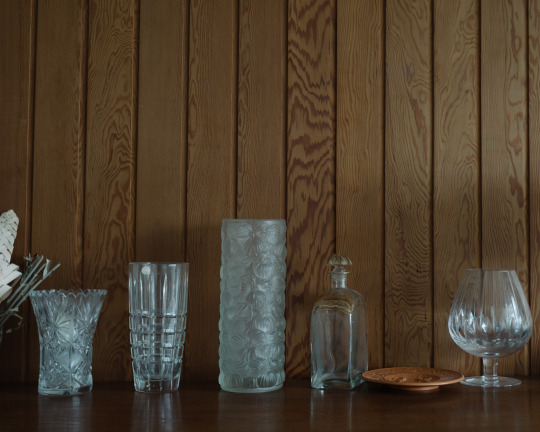

Getting portraits of shop owners and sometimes random people in the street was a lot easier than i thought. Typically by explaining to them via google translate of course that you were a photography student and you wanted to take a photo of them for your course they are more than happy to allow you to. Usually they spoke enough english to allow you to direct them a little bit also.
I also managed to do some street photography, i did this mostly as an ode to random photos your parents would take of random streets and of the sea to stick in the photo album too.
Final Images -
I eventually narrowed my images down to ten, it is a good mix of abstract, portraits and street photography. I specifically chose them as they mix in well with the style of design i am doing for the zine.


Zine Design and Implementation -
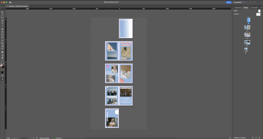

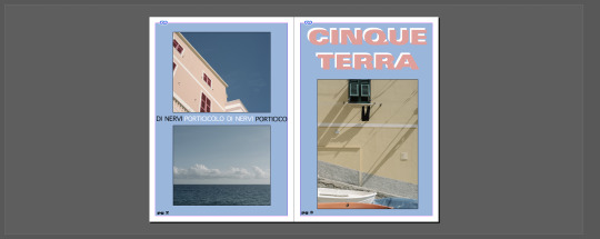

As you can see i used a simple range of colours which i used the dropper tool to sample colours from my images so the zine can flow better visually. I also sampled design elements from my inspiration, such as breaking up shapes and lines by overlapping text over images. I also tried to use only three fonts to force myself to get creative on sizing text and shaping it. For example, on the forth page instead of typing “cinque terra” once and having it commonly off to the side of the image, i repeated the words three times and cropped them in to form a shape and to create a bridge between to separate images.
As you can see i also added circles in some of the corners too the pages mostly to fill negative space and add an abstract element to my work. I added inner shadows to the circles to give them more depth and for a 3D effect too. On some of the images i added a tape vector to reference the fact i wanted to his zine to be reminiscent of an old photo album.
Evaluation / Conclusion -
Overall I am happy with how this came out, initially I was struggling to find an idea for my ten portraits. As once I read the brief I install thought it had to be portraits of people and from there I found it tricky to find a subject which would be interesting both to look at but to also put into a zine. My first idea was to photograph my neighbour Alistair who liked to tinker with things in his garage such as building small shelves for his house or just doing general repair work. I had previously taken some very successful portraits of him for HND2 and I wanted to improve on what I previously shot by potentially moving him inside the house and to shoot his thimble collection. Unfortunately when I went to speak to him to pitch the idea I found out his health took a small turn and he previously wasn’t in the best of shape, so I didn’t want to add any more stress or interfere. That’s when I came up with my Italy idea as a few days later I was headed to Italy where I decided to create a zine that was abstract by design but contained characteristics of which you would find in an old photo album your parents would put together from one of their holidays.
I would deem the design element of the zine very successful, I am proud of my design. I researched numerous design elements of which I adopted into my own and then placed them amongst the images I shot. As a reference in my workbook I spoke about how I limited myself to only three fonts for the whole zine, this was to force me into getting creative with what size I made the font and the placement on the page.
For the images I personally think they could of been a bit better and wished they linked together throughout the zine a little better. The images by themselves are nice images but as a series I think they leave a bit to be desired. The direction I would of loved to take it in would be a reference to my HN2 graded unit project on liminal spaces, by taking a graphical stance when it came to shooting my images to keeping things very minimal and almost 2D. In future if I was to revisit this project I would take a different approach when it came to shooting. For example, I would research the exact locations I was going and have a look at what local shops there were to potentially get a portrait of someone who worked there. Another example would be creating a story board or even a shot list of images that I wanted to capture. The benefit of this would be is that I could see exactly how the images would link to one another if not have a greater understanding of how the zine may look once it’s done. I do also wish I shot some images on film and included them into the zine, I say this as I think having film images that were shot on a cheap point and shoot would convey more of the fact I wanted the zine to feel like a photo book your parents put together. Overall Im happy with how it turned out regarding the design aspect of the zine but I would rather the images were a bit more up to par in terms of how they linked to one another in the zine.
0 notes
Text
Response
After the incredibly striking and informative talk we had regarding Glasgow's past in relation to tobacco lords and much more. The point of the brief was to see what you could draw upon for inspiration to then develop an idea. For example, it was a very wet day and everyone got soaked by the rain, therefore you could do a series about rain. Or, the guides touched upon Robert Burns poetry and the hidden meanings behind some of his work, therefore you could do a photo series on poetry.
My initial idea is to do something related to the rain as i had previously seen some images from the photographer Christophe Jacrot. His series ‘wet scotland’ was beautiful, he placed a plane of glass in front of the lens and allowed it to get very wet and then shoot landscapes with the glass in front of the lens to create a painterly effect, it was very reminiscent of the artist ‘monet’’s paintings, below i will include a mood-board.
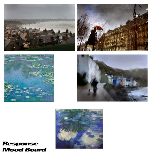
I liked the idea of shooting concrete pavements or floors as you would get a really nice reflection from them whether it be traffic lights, car headlights or even if the clouds if it isnt over cast. But, the tricky part is finding a suitable surface that isnt too textured such as tarmac or tiles. If you look at the top right image on the mood board that is a prime example of the type of surface i would ideally like to find, something with little to no texture and holds the rain well.
Test shots -


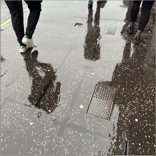
I think my test shots came out alright despite quickly shooting them on my phone. But my biggest issue is was finding a suitable road or pavement with the texture i need, i looked around Glasgow’s city centre for a few hours and i couldnt find anything that suited my needs, i think this is reflective upon the engineering and design if glasgows and pavement, As you will know scotland gets very cold, therefore we need surfaces that can stand up to the cold and can stand up to the heat of the summer. Therefore we create textured and hard surfaces that re mixed in with small rock chips like the pavement above so that they wont crack or degrade over time.
But, if you look at the image of paris on the top right of my mood board, since its a hot climate most of the year their roads and pavement's can be smoother and less textured as it does not rain as often, therefore you can get the desired effect.
Idea change
Due to this i’m going to change my idea completely. I was reminded of an article that the bbc posted a while back which was discussing how during the george floyd protests in glasgow that activists had placed temporary street names below the usual large and old street names in the city centre. The temporary street names that were placed were named after famous political figures such as rosa parks and more recently named after Sheku Bayoh after he passed away due to an incident with the police.
The whole point of this activism was to educate people on why some streets were named after people and who these people were. For example, buchanan street was named after wealthy plantation owner and tobacco lord, Andrew Buchanan.
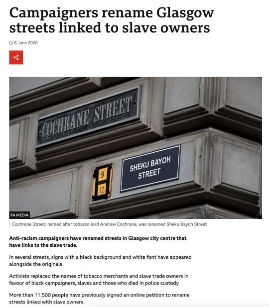
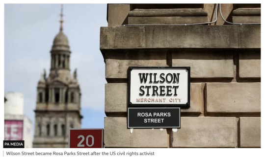

Id like to create an image or a few images that can symbolise peoples lack of knowledge when it comes to Glasgows past history and what it was a part of. For example, when i first read the article i was very surprised and intrigued about the history of these street names. When i spoke to others about this they also did not know about the meanings behind some of the street names or much about glasgows involvement with tobacco exports and plantation owners.
Mood board 2 -
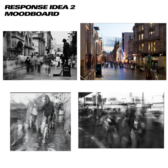
Plan -
I have decided to shoot two images that both show the lack of understanding and knowledge about glasgows past involvement with the tobacco lords and how alot of people dont know the hidden meaning behind some of the street names. My idea is to shoot a long exposure during the day on buchanan street and Cochrane street featuring the street name. I would like to include people and cars in the frame of them moving past the street name, obviously since it is a long exposure people will be blurry and lack any distinct features, this is to symbolise that it could be any member of the public that has the lack of awareness about the history of these streets.
Locations -
As i previously mentioned i will be shooting on Buchanan Street and Cochrane street, but one of the biggest keys is for the image to feature the large street sign thats typically plastered onto the wall of the opposing building. If i dont include the street name it defeats the purpose of the image and turns into a regular long exposure.
Buchanan Street - Top Down

Buchanan Street - 3D Streetlevel -
Where i have placed my marker is where i plan on shooting. This is because it is a very busy crosswalk which will alow me to capture a lot of people crossing and a few cars going by. But, the most important thing is that on one of the buildings, specifically the apple one it has a large sign that reads buchanan street.
Cochrane street - Top Down
Cochrane street - 3D Streetlevel -
This is the angle i plan on shooting from as on the side of city chambers features a large sign displaying the street name. I did have a walk around city chambers attempting to find other corners with the same streetname but this is the only suitable one i could find as it had a good amount of foot traffic.
Equipment -
Since i am doing a long exposure i will obviously require a tripod and since it is during the day i also plan on getting a variable ND filter from the college store. I do have my own filter but unfortunately it is a cheap one and decreases the sharpness of the image rather noticeably. lens wise i plan on using my 24-70 2.8 as it is variable zoom therefore i wont need to be swapping and changing lenses while im shooting. Im planning on using this lens not only for the variable zoom but for my equipment safety, im always mindful in using my expensive gear in public especially if i have a bag or two with me that i need to place somewhere.
Shooting -


After shooting for just over an hour i was able to gain the images i was after. Since it was such a simple image for both streets that i needed i had to make sure i nailed it. One of the biggest factors for me was making sure the framing was correct, baring in mind the street sign was the biggest highlight of the image. Secondly, i had to make sure i had the correct amount of blur. What i mean by this is that if i shot a 30 second exposure i would see very faint outlines of people if not see any of them at all. So dialling in the exposure time was pivotal to my success. I settled on an exposure time of 0.6s which was the perfect amount of time to get enough blur so that there i sno defining features on the subjects but also enough to still make out they were humans and to add a bit of shape to my image.
Images -

It was straightforward picking out what images i wanted, my final submission was going to be two images. What i was looking for was images that made the street sign the highlight of the whole image and for the people to be blurry but still retain some shape.
Submission images -
These are the two images that I have chosen to submit, these are out of camera raws with no edits. Obviously the images need some work such as straightening and cropping.
The reason why i have chosen these two as my finals is that they are both visually similar. What i mean by this is the main wall cuts off on the left of the frame in both images and both street signs are mounted on their respective buildings. I am very happy with how my human subjects turned out with the 0.6s exposure, this exposure time was the sweet spot for creating the look i was after.
Rejected Images -

Image 1 -
This image is a prime example of where the exposure time was far too long, in this case it was 10 seconds. By having the exposure time this long it has allowed unwanted highlights and textures in the road which is a bit too distracting and also the fact the buchanan street sign is too small in the image.

Image 2 -
I was thinking of shooting this series in landscape but the issue was that the street signs are roughly 30 feet off the ground. To get people and have the sign visible enough was near enough impossible, the framing would’nt create the composition i was after.
Image 3 -
This is a prime example of what i meant above, if i got closer to the sign i could fit in less people walking by. If i went further away, you wouldn’t be able to read the sign.
Editing -
So i tested out both of my final images in both colour and black and white and straight away i preferred black and white. This is because since both of the images are in the city centre there are a lot of colours and patterns which take away from the images a whole. By converting them to black and white i am able to shift the focus more onto the blurred human subjects and the street sign.
Image 1
Image 2

Final Edits -

Conclusion / Evaluation -
Firstly I did find this brief overall quite tricky due to the open nature of the brief and how it comes down to how you interpreted the day. It was the idea that your images did not need to be on the topics that were discussed by the guides but it could also be on certain aspects of the day. In this case, some people concentrated on the rain as it was extremely wet that day and a lot of people got soaked. I was originally going to do my response project on the rain, but with reasons out with my control I was unable too. My rain idea was photographing the streets and roads just after it rained heavily so I could capture the myriad of colours and shadows on the ground, I was inspired by the great paintings of ‘Monet’ and how he captured water and interpreted shapes and colours. My second artist I used for inspiration was ‘Christophe Jacrot’, his often melancholic yet visually striking featured landscapes with a pane of glass over his lens which creates a watercolour painting effect. I then decided to change my idea as I could not get the proper effects and images I was after.
I changed my idea to two images that would symbolise the lack of understanding when it came to the history of Glasgow and what It was associated with. I would deem this idea successful as what I set out to achieve I managed to do. Which was create two images featuring peoples movement with a slow exposure which I meant to symbolise how people pass these streets daily and don’t know what the story is behind them and since the subjects are blurred out due to the exposure time it symbolises that the subjects could be anyone, it could be you or even your friends due to the subjects in the image having no defining features.
Overall I would deem this project to be challenging at times regarding coming up with a suitable idea or response to the brief. I think I struggled to come up with an idea as I previously said was due to how open ended the brief was. If I was to go back and redo the brief I would re-visit where we had the tour in order to visually see the statues and cathedral again to gain an idea of what could be done.
In terms of shooting I am happy with the results I came out with as they for the inspiration I was previously looking at. It didn’t take much time actually shooting in the streets to create two images I was pleased about, I deem this to be due to the fact I did a lot of planning in my online workbook to figure out what streets would work the best, I also went for a look around the streets and surrounding areas for suitable angles and potential compositions.
0 notes
Text
Cameraless - Risograph
For our cameraless brief we have been given the opportunity to create work through unconventional methods such as scanotypes, cyanotypes or risographs. I have always been very interested in graphic design and i often say that if i wasn’t doing photography i would be doing graphic design. I had known about screen printing and that process for a while and the results it could create. I was then introduced to a risograph machine. The whole process fascinated me, the ability to rapidly print out images using a single colour combined with a certain colour of paper to create an image with a similar texture to screen printing sounded incredible.
Inspiration
Since i already had some interest in graphic design before i was introduced to this brief i knew where to look for inspiration. My usual go to is a site called trendlist.org, it features over 200 pages of all sorts of graphic design, it can be refined into graphic design disciplines such as screen printing, neon, duotone and geometric. Specifically i have been looking at bold posters, designs with thick lettering, bright/intense colours and textures. Below is some inspiration from trendlist.org

As you can see all three of the examples above share a similar design language of bold lettering and colouring. What interests me the most in the first example is how the designer incorporated images into design, the off centre images are made to feel balanced in the overall composition of the design by having the text on the top and bottom to be bold which adds balance to the design, my aim is to add some form of text into my design whether or not it relates to my images.
I bought a book recently by Taschen that features the work from the Bauhaus design school between 1919 and 1933, immediately i flicked to the graphic arts section in hopes of finding screen printing or similar and i came across these 4 posters that feature the design language i am after, they feature

Attempt 1 -


This first attempt was more of an experiment and getting to grips with how the machine actually worked. I found out that you can connect a computer up to the machine and then print via the computer, which can allow for a lot more creativity in terms of using images or shapes. My next plan is to design some sort of poster in photoshop and mess around with type faces.
Like i last mentioned i want to recreate 90′s rave posters and integrate some photography onto the posters.
Photoshop attempts - experimental typefaces

Since looking at trendlist i was infatuated with creating a bold and heavy design similar to some of the design language previously seen. This bold and intense design was dominant with designing rave posters in the 90′s. Below i have attached some inspiration that i’ve been studying.


Attempt 2 -
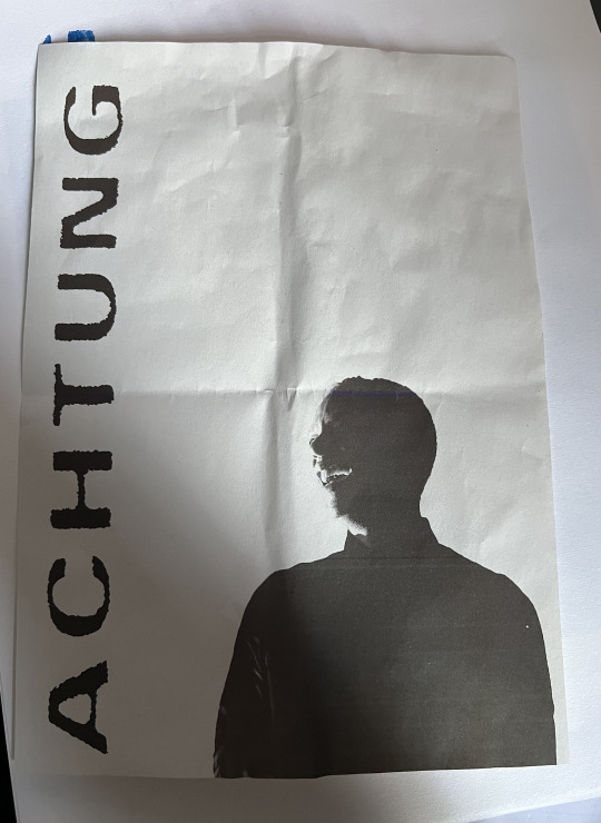
I ended up sticking with the last example as i much preferred the text, i also added some rough texture to the text so i can replicate the rough screen-printing look.
When we ran it through the risograph machine we experimented with different coloured inks too. Orange or blue is my favourite, i would love to see how some of these inks work on different coloured paper such as red or green.
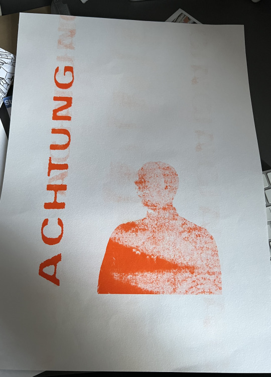

Attempt 3 -
For this attempt i decided to change up the design completely. I decided to firstly change the paper colour as i think the more abstract designs i was planning suits the neon red and green paper they had in the store. i also decided to once again go to trendlist to research.

these are the designs i came up with.

Im so happy how these two turned out once they had been printed. I think the natural progression from this would be is to incorporate more images onto the page rather than it being taken up by text. I will stick with the red and green paper as it still keeps the 90′s rave poster idea that i had originally.
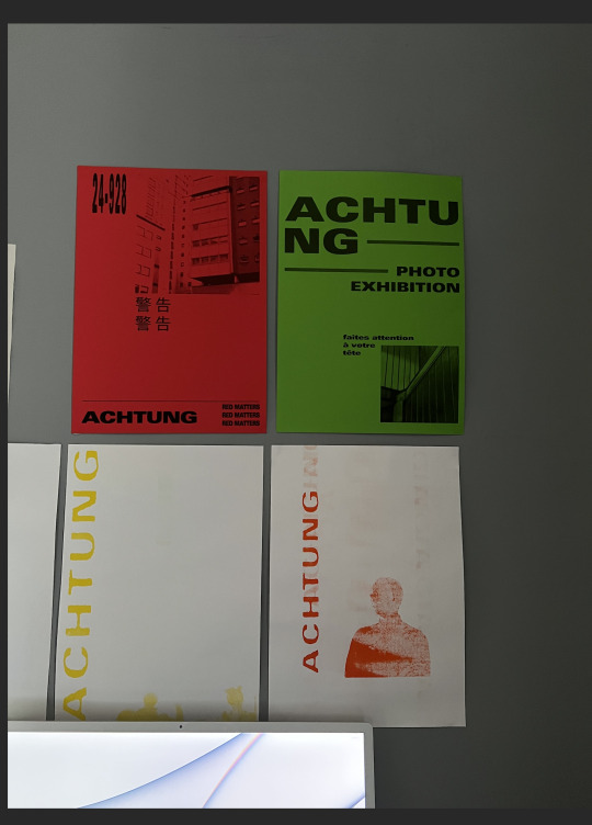
Im going to stick with the same design principles as the red and green posters. As you can see i have used some architectural images i took recently, so i would like to follow the same theme by using these types of images.
After looking at further design elements via trendlist.org i have came up with multiple new designs.


Below i have attached some examples of Bauhaus works that employ a distinct abstract and geometric style of which i drew inspiration from.
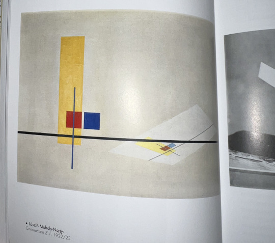
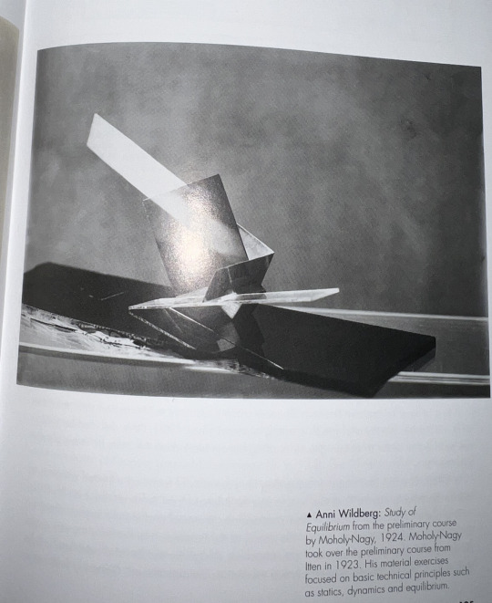


So far im overall very happy with my risograph’s. Initially in the beginning i wasn't too sure of it all as initially, i though in order to print something you had to create physical shapes and then scan them in. But realising that you can connect the computer and upload files was a huge breakthrough. My initial idea was to create a series of 90′s inspired rave posters using images that i had captured from club nights, but i struggled to come up with many ideas as there isnt much content i can research and apply to my own work. Sure, there is hundreds of 90′s rave posters but most were very complex and i wasnt able to find a way to implement my photography into the posters in a way i was happy with.
Thats when i decided to create a mockup zine idea. The zine would feature architectural images of glasgow and i would implement design elements to both bring the zine together visually and compliment the sharp brutalist nature of the images. I think going forward im going to research more brutalist buildings in glasgow, shoot them and then implement them into more designs. Hopefully in the long run i will have enough content that will allow me to potentially mass print it into a zine.
I would like to use an external risograph print studio to further experiment with colours and papers used. I do wish i could use two different colours on red paper but i was apprehensive as we only have 4 colours in the college, but i feel like if i tried to add any of the other colours to the red paper it would be too dark to make a noticeable difference. But, if i had used the multitude of colours on the green paper i could of gotten some interesting effects, unfortunately i lacked the time towards the end of the trimester to create these posters. But since this is a continuous project i will in future be experimenting with colours, images and paper types and shapes.
Mockups -

0 notes
Text
Typologies
I have always had a fascination with this style of photography as it brings basic and everyday objects to life by showing them in a series with similar objects. For example, if i took a single photo of a hand dryer it would not be that interesting, whereas if it was in series with 8 other varying shapes and sizes of hand dryers it would be more appealing. I think the trickiest part of this project could be looking for basic everyday objects that could be turned into a series.
I have noticed that if i go out specifically looking for objects i tend to struggle to find one that fits the bill. Then the next issue once you have found your object would be to find more of the same object or subject. So you could say there is almost a grey area of objects or subjects that could fit within the brief and be achieved realistically.
Inspiration
One of the photographers who i have been looking at is Jeff Brouws, his entire career was based upon shooting typologies, mainly shooting suburban mid west america in the 60s-90s. This time period in the midwest was amidst a boom of consumerism and pop culture. Due to this Jeff was able to take advantage of this by photographing strip malls, bright neon coloured suburban housing and drive in’s. What i think makes his work so successful and to make really any typologies shoot successful is having the same focal length, perspective and editing the same. Bare in mind that the whole point of this genre is for things to be the same and consistent, straying from this defeats the purpose of it.


Typology attempt 1 - Coffee

This is my first attempt at a typology, i wanted to keep it simple as i wanted to experiment with laying things out in photoshop and the 1:1 square format. I am happy with how this has turned out for my first attempt, next time i will be trying it with 9 images instead of 4.
Attempt 2 - Tenements
Since moving to Glasgow i’ve been infatuated with the different styles of paint, tiles and ornate features of different closes in tenements. For example, the close in my building features a two tone red and white with a thin black line snaking down the wall separating them both.
I think for my final submission it will be 9 images in a 3x3 format as i believe it is the most effective in showing how repetitive subjects are. Having four images like the example above isn't enough to convey the feeling i am after.
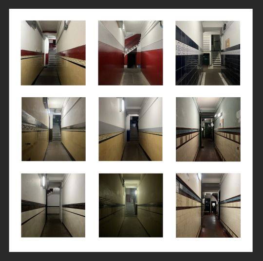
Attempt 3
Originally for my third attempt i wanted to shoot cctv cameras as i think its a fairly achievable and interesting subject, considering they are everywhere and come in all shapes and sizes. But the one thing i struggled with was the consistency and conformity in a series. What i mean i by this is that since cctv cameras vary so much in shape and model and where they are positioned in regards to the location make it difficult to have consistency which is important when doing typologies. For example, lets take my 2nd attempt and look at it. The reason why this was successful is because its shot from the same angle, focal length and of the same long corridor. My worry was that id have to adjust not only the type of cctv camera i shoot but also the angle and focal length, therefore i have decided to shoot something else that is a bit more consistent, and that is glasgow's classic brutalist architecture.
i have always had an interest in glasgow's architecture, specifically the brutalist kind, from the geometric car parks, the sharp walkways and spaceship-esque offices they are all beautiful in my eyes. But i wanted to focus on the more minute detail, the materials used, how lines cross one another and how textures compliment one another.
I managed to do a typology that focuses on looking upwards towards modern office blocks. i have been interested in the modern architecture and how sharp lines of glass interject with grey solid concrete. Some of the buildings in the typology were built in the 80′s/90′s, so its interesting to see that the old and the new buildings work together since the design principles are still the same.
For my final attempt instead of focusing on buildings as a whole i decided to focus on the textures of buildings. In this case i visited a brutalist landmark in Glasgow. Currently a half abandoned office block it still features prominent brutalist features such as sharp concrete corners and ‘block’ design.

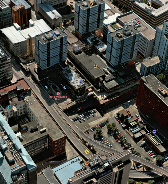
While wandering around the building and surrounding walkways i noticed that there was a big variation on textures and materials used in construction. There would often be different shapes and sizes of tiles and different coloured concrete. I also found it fascinating how time had affected this building since its construction. The once white walls stained with light green mould, the tiles and floors penetrated by weeds.
Some segments of the building had very interesting glasswork of which you rarely ever see nowadays, take this stairwell for example. Now blocked off its surrounded by a cascade of hazy textured glass that give off a spaceship appearance.
Textures -
I had attempted to place some of the images i shot into a triptych, but in my opinion it doesn't work as well as a standard 9 image typology would. I feel as though the images aren't interesting enough to stand on their own as as triptych. I feel as though if there were part of a 9 image grid it would make it a bit more interesting as all the images share a similar style and features. I think the key to keep in mind for creating the final image is having the line at the bottom of the frame where the wall meets the floor would be important in consciously linking the images together. I would also need to make sure the images that are similar looking aren’t too close to one another as it could allow you to over look the details in some of the images.
Final Image
Evaluation -
I am happy with how my project turned out overall, this brief allowed me to explore an avenue of photography of which I had previously never researched or experimented with. Channeling the thought process of taking images of seemingly regular everyday objects and turning them into an interesting group of images by simply combining them with images of the same object was a very interesting and rewarding experience. It has opened up another way of thinking in terms of not looking at objects as they are but more of what they could turn into by looking at multiple variations of the same object or subject.
In future I would love to revisit typologies and study it further and hopefully implement into future briefs within my degree going forward. For this brief I took it from an architectural stance, how could I implement Glasgows brutalism and seemingly endless concrete and glass offices into a typology. I decided to focus on the details such as the materials used and how the buildings look from ground level gazing up at them. My final typology was focusing on the textures and materials used in this famous brutalist landmark in Glasgow. I did enjoy how it turned out and I think it makes for an interesting typology but in future I do wish I could find other brutalist buildings in Glasgow and shoot images of them to include into one hole typology and not have just one building in the group of images. I think including one or two other buildings into the series would allow for greater variance and potentially allow myself to gather all the typologies and merge them into a book or zine.
1 note
·
View note
Text
Moving Image Research
I have always been fascinated with moving image and our roles as photographers within this. Ever since now that going forward photographers are expected to know how to shoot, edit and deliver videos. For example, i did a corporate job recently where i was doing headshots and then i was expected to create a short 1 minute long clip that summed up this large business meeting that was getting held in the office. It was to be posted on linkedin to bolster the company’s overall image and make them appear very professional and organised.
Saying that my only real experience with moving image is corporate video! i have always fantasised about creating something, more, something personal in a sense. One of my ideas was to create a portait of someone who has recently moved here from a different country and it would include them doing a voiceover of their experiences of lonliness when they first moved. It would include asking them questions such as “do you ever regret moving over?” or “is there anything you long for here that you could get back home?”.
The plan is to evoke an emotional response from the sitter and maybe even the viewer. But, not only do i plan on having just a voiceover, i also plan on having mark mann style scenes where the sitter is speaking into the camera showing emotion when talking about his personal struggles with moving here. I also plan on showing static scenes, such as a scene of clouds rolling overhead or trees swaying in the wind. Tying the voiceover into a physical representation in a scene is key. An example of this would be if someone was speaking about travelling i would show a clip of the road rolling by while looking out of a car.
Inspiration
Having the scene match the voiceover is key for this moving image project and i believe it will further evoke the emotional response i am after. I would also like to incorporate a musical score over the video. I have a few ideas of where i would search for this, i could even use the musical scores from some of my favorite films such as ‘bladerunner 2049′ or ‘the place beyond the pines.’
Both films feature very unique music styles and create a deep emotional story line that has the main protagonist long for a sense of belonging.


All of these examples above convey all the same sense of loneliness and separation. This is through the use of including negative space in the composition around the subject. I would aim to use similar techniques when shooting my moving image to help tie everything in visually with the soundtrack and voiceover.
I have also been looking at a filmmaker / youtuber Will Derbyshire. His work is beautiful to say the least. His work is often based around travel, people he has met or what is going on in his life at that moment. The films have an amateur feel to them which remind me of the videos your parents would take on holiday or little snap shots on the family camera. Often when i watch his videos i’m hit with a wave of nostalgia or a sense of longing to be transported back to holidays when i was young.
I aim to take inspiration from parts of his videos such as composition and colour grading. Ive noticed that in his videos they all share a similar soundtrack which is usually an off beat piano playing over usually ambient sounds from the location such as wind, footsteps or police sirens. Having these ambient sounds i believe can add more depth to my moving image, by having just the soundtrack and a voiceover it feels a little 2D and flat. For a moving image piece that i’m creating for the sole purpose of provoking emotion having that extra layer of audio to my work can aid massively.
https://youtu.be/u0SFECKSonU
https://youtu.be/ERNcJlU6Dsw
Soundtrack
Picking a soundtrack for this project is also very important, by choosing the wrong one it can distract the viewer and take away from the story. A soundtrack is merely there to aid in telling the story and to convey the intended feelings. I already have a solid idea as to what genre the score will be. I have been fascinated with ambient music and some light piano pieces. There is one album i keep going back to and thats burial’s Untrue album, it captures ghosts, lost features and life’s liminal spaces. I often refer to the album as feeling like you’re standing waiting for a bus on a rainy December night in the city. The album feels like it romanticises being alone and wandering the city late night in the rain.
I think certain tracks from this album could work well with my moving image as the film is about moving from your comfort zone and trying to find yourself in this new place you’re in. Tracks such as this one below i have linked are melancholic and almost a eulogy to the feeling you get when you’re walking home from a night-out or from work in those dark wet winter nights.
I would love to put this track over the finishing sequences of shots.
https://youtu.be/GbfrgJls7n4
Storyboard & Voiceover


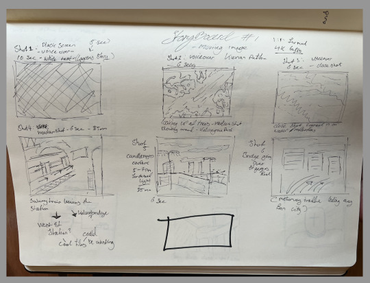

First rough copy i am happy with.
youtube
There are a few things i could change towards making a final rough cut, i’d like to get a bit more variance in terms of city scapes to add into the visual side of things, i think the key is to find things that are seemingly normal but quite beautiful. Things such as golden leaves on a wet pavement or a quiet park with leaves falling. Having these simple yet stunning visuals play into the idea that all these places are the same as back home but they have little differences that can make a big impact.
I would also like to film Logan and include some sort of close up of his face towards the end of the video just sp it puts a voice to a face, i think doing this will make it a bit more relatable and will contain more of a human element. I may also look into adding a few sound effects such as a film spool and the beep countdown as my film is 16mm film inspired, so i believe it would add a but more depth to the film.

I thankfully managed to get a hold of logan and shoot some close ups, medium shots and long shots of him stood in my back garden. I shot a fair good amount of clips so i could have a bit variance in post and then deice what ones i prefer. Below are stills pulled from each clip i could of used.

clip 1

Clip 2
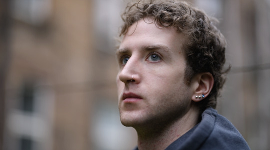
Clip 3

Clip 4

Clip 5 ( a touch out of focus sadly )

So i think out of all of these clip 3 holds the most emotion in it, in the other 4 clips logan is either looking away or has too much negative space around him which takes away some emotion. When logan is square onto the camera with an extreme close up it holds some value and emotion which can bring alot into my film, like i said earlier it brings in a human value to it which can aid a lot in trying to convey emotion.
The next step was to bring the clip into premiere pro and overlay the 16mm film effect over the clip. With and Without
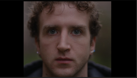

AS you can see the effect does brighten up the overall image so i would compensate this by dragging and dropping a lumetri colour effect onto the clip, this then allows me to do basic exposure correction and colour correction.

Of course when in import the clip it wont be cropped either, so for the film effect overlay to line up i would need to crop the video. I do this buy going to video effects > transform > crop and then i would drag and drop it onto the clip i would like cropped.
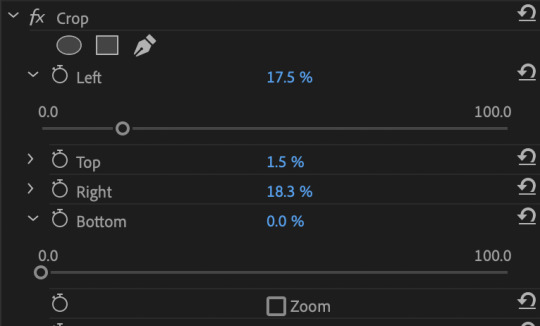
Different streetscapes
I ended up going for a fairly long walk around the streets near my flat just after it rained in the hunt for anything visually interesting in the usual “mundane”. I already had a decent idea of what i needed, one of which was to shoot in the park at the end of my street, it was small shared park which usually featured small families or people playing with their dog, to capture the simplicity of this was key.


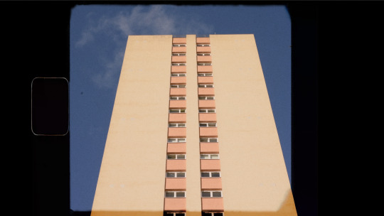
Almost final
youtube
As you can see i have added a few more street scenes to the video which has made it a bit more visually appealing, i also adjusted the timing on some of the clips as they were a second or two too long. I think from here i have my core film its just a case of adding the clips of Logan and adding small sound effects and adjusting timing
Sound effects
I thought that just having the film open up with the soundtrack was a little too simple and boring. Plus when you see films that have used a similar visual style to me by using a film effect they will always include a sound effect of a film reel starting up.
youtube
youtube
Final Version & Evaluation
https://youtu.be/Rf4M5BZ__Oo
Moving image Evaluation - Kierian Patton BA3
Evaluation
Overall I would deem this a successful project from start to finish. I would say I had done sufficient research into the type of moving image I wanted to create and then I experimented with sound effects and visual effects to create my moving image. When looking into pieces of media of which I could draw inspiration from I found myself dis- covering a visual style and story telling from a select few creators on YouTube. By dis- covering the exact visual style I was after so early on was crucial to the development of my moving image. It allowed me to have a streamlined process of firstly writing up a short script and general idea and then expanding it into a comprehensive story board. From there I was able to convey exactly what I required off my actor Logan at the time, and when it came to editing I had already pre-visualised the pacing and timing of the moving image.
Researching the soundtrack that would go into my moving image was tricky as I wished to find something melancholic yet hopeful. As you may be able to guess that was rather difficult, I found that almost placing myself in the actors shoes in terms of what he may be feeling when speaking about his time moving countries was extremely beneficial in grasping an idea of what musical genre or sub genre I would need to explore. I ended up setting my sights on Burial, his music emulated the trend of “hauntology” in the early 2000’s and pushing the boundaries of breakbeats, dubstep and jungle at that time. I used the first 30 seconds of the track “Etched Headplate” from his critically acclaimed 2007 album “Untrue” as I liked the vocals at the start and then from the same album I used the song “In McDonald’s” for the rest of the moving image to create a feeling of nostalgia and melancholy. If I was to shoot this project again I would use another actor as I found myself struggling to secure Logan to shoot for a day or two as he was very busy and sometimes he wouldn’t show up to the shoot, I later found he had a few personal issues going on which I understood. I was not the biggest fan of the voiceover for my moving image as I felt as though it sounded very scripted and slow, if I was to redo it I would sit Logan down in an interview type of scenario and fire off questions and then get a more genuine response and allow him to speak as if it was a normal conversation and not filmed. Overall, I am happy with how my moving image turned out. From looking at visual references on YouTube to researching the music and sounds and to finally piecing it all together in post production. There are a few things like I reiterated previously is that I would use a different actor or actress who had a more flexible schedule and I would also change the pacing of the voice-over as I felt as though it was too regimented sounding.
0 notes
Text
Photo Imaging - self portrait
I have been looking at Andy Warhol, i previously looked at his work and he has shot self portraits that i find quite inspiring. Most of the self portraits are up-close and quite simple in terms of lighting and framing. But what i like about them is the soft focus and how the focus just gently falls off his face.
I also think the focal length of the lens also plays a part in the overall human and ‘3D’ aspect of it all. If i was to take an educated guess i think it would be shot on a 50mm at 1.4 or 1.8. What could also create a similar effect to this would be using a medium format camera and a 35mm lens as a 35 on MF is the equivalent to 50mm on a FF camera.
Another key to making this successful is absolutely making sure the focus is spot on, since the image is so close to the subjects face i think having the focus just off, for example on the ears would completely take away from the image.
Thankfully i am able to hook my camera up to my phone which allows me to remotely trigger my camera, so in theory it should be straight forward enough. Another part of replicating the photo is having very soft light. Ideally i would like to have a roll of proper diffusion paper to drape over a window but i think a white bedsheet would do just as well.
1 note
·
View note